Wherefore art thou, Corbuseo?

le-corbusier-teaching

Correspondent Malcolm Millais, author of Exploding the Myths of Modern Architecture (2009) has sent me a 29-minute BBC clip of a radio show, “Great Lives,” starring the modernist Sir David Chipperfield rattling on about Le Corbusier, one of, no, perhaps the founding modernist. I am going to “live blog” this curious bit of radio, so to speak, beginning, mere moments into the broadcast, with Chipperfield’s relevation that one of Le Corbusier’s houses outside Paris, probably the Villa Savoye, has to be rebuilt every five years because it keeps “crumbling.”

c-53:25 – Chipperfield: “It’s alien, a disconnect from history. It’s wiped clean of texture, a poem of modernity.” Interviewer Matthew Parris: “Where is it?” DC: “It’s just outside of Paris.” MP: “It still exists?” DC: “Yes, they rebuild it about every five years because it literally crumbles. He had a terrible relationship with his clients because it always leaked and – typical architect stories – but it’s still there and remains an inspiration. … [But] those poems of of beauty of the early modern architecture have been transformed by the 1970s into faceless social housing blocks or mundane corporate architecture in city centers.”

Yada yada, yeah, we all know that, though Chipperfield still seems to think Corbu’s work was inspirational. What a drooler!

Well, let’s try to find Corbu himself on this thing.

4:35, Corbusier, speaking in a French accent (he was Swiss): “Man, woman and children of the world live a life they should not live, work a work they should not work. And the answer is the major problem of today and tomorrow. You must take 2,000 people together and build a big house with one entrance only for 2,000 people so they will be quickly in their own home where they will find silence and total solitude.”

Okay. Does that make sense? I listened again and again and that is what I heard and have transcribed. Well, so what? It’s the sound of the voice of the master – that is all. Totally.

Well, before you know it, Parris brings in Flora Samuel, a professor of architecture at Sheffield University, who (5:20) absurdly claims that Corbusier was trying to bring architecture back to nature when in fact he was channeling this whole machine-culture thing (“A house is a machine for living” and all that). Shall I labor to put down her words? No! Go to the tape if you want to hear her, and meanwhile I will try to track down more Corbusian gems.

Corbusier's 1925 Plan Voisin to rebuild Paris

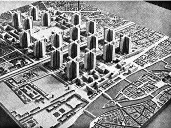
Corbusier’s 1925 Plan Voisin to rebuild Paris

But first, Chipperfield again, who is asked by Parris whether Corbusier wanted to change architecture to fit people or change people to fit architecture: “Clearly he was a megalomaniac as well, and his pretensions to have the ambition to reshape cities – well, one would not even consider it now. I mean, his proposal to destroy half of Paris could be seen as tongue in cheek but I don’t think it was.”

How disingenuous, by the way, to introduce the notion that we really cannot be sure that Corbusier was serious in proposing his Plan Voisin, to demolish the Marais district and replace it with 60-story towers in a greensward riddled with highways. This plan of his and its totalitarian seriousness is well established. But let’s see if we can find any more Corbu on tape.

I have become an expert in a small way on documentaries about modernism that seem to praise their subjects in terms most of us would find more akin to condemnation. Nothing I’ve seen – and I’ve done two posts of this sort lately – matches in that sense the degree of this radio interview. At one point, Chipperfield notes that after World War I Corbusier was “thinking of rebuilding cities before they needed [after WWII] to be rebuilt.” What a brain! Good grief. … On I plow through this tape, and soon after that I find a snippet of Corbusier on tape again:

Corbusier (14:30), about his Plan Voisin or his Villes Radieux, not sure which: “So the cities will be green, the distances will be reduced, and the traffic will be organized. The automobile will be totally separated from the pedestrian.”

Immediately after, Flora Samuel leaps in to note, as nonchalantly as she can manage, that it didn’t really work out very well where it was tried around the world. She actually suggests that the Plan Voisin was really just a huge publicity stunt. And she actually believes that it was the rich people that Corbusier “experimented” on.

At about 20.00 Parris askes his panelists “how concerned we should be that he [Corbusier] worked for Mussolini, expressed hopes for what Hitler could achieve, he collaborated with the Vichy regime, does it matter? Does it reflect on the value of his work?”

Professor Samuel replies that it reflects on the man but not the work. Sir David dodges the question but suggests that at bottom Corbu was focused on the individual. The conversation is suffused with the moral niceties of working in world architecture today – would you build a police station in Tibet? (No, says Chipperfield, somewhat dubiously). It comes as almost no surprise that Corbu’s being “unkind” to his wife is a throwaway line of Chipperfield’s after Samuel describes his supposed forays into feminism. This is becoming monotonous!

I do recommend listening to the interview, linked above. It really pops the eye (or the ear). It is hard to wrap your mind around the fact that these three people are on radio to praise Corbusier, and probably even believe that this is what they are doing. What do you think?

Posted in Architecture, Book/Film Reviews | Tagged , , , , , , , , , , , , , , , , , | 1 Comment

Helluva Helvetica

go-to-helvetica

Helvetica is a 2007 documentary about the Helvetica typeface that is brutally honest about its subject. After half an hour drooling over its simplicity and how it took over the world in just a couple of minutes after its introduction in the 1950s, the font comes in for a beating that includes being called fascist – fascist because it is ubiquitous and because suddenly it symbolizes the corporate mentality that most typographers (inventers of fonts) seem to find hateful, though it is mother’s milk to them. That practically everyone in the film has a German accent doesn’t help!

783px-Helvetica_Neue_typeface_weights.svgWhy do so many documentaries about modernism seem to revel in exposing the underbelly of their subject?

A documentary I saw the other day, and posted about here, did the same thing, though Visual Acoustics: The Modernism of Julius Shulman ripped its subject a new asshole with a minimum of conscious self-criticism. Same with Herb and Dorothy, a 2008 documentary about two doddering New York collectors of contemporary art. A while back I saw My Architect, a 2003 documentary about the modernist architect Louis Kahn by his son Nathaniel, in which not only was the father’s poor treatment of the women in his life exposed but so was the difficulty of finding the entrance to his buildings. Lou Kahn is revered by all right-thinking architects, so naturally his buildings are abominable. I can’t recall, aside from the bit about finding the door, whether the son found his father’s work off-putting. I don’t recall that he liked the way his mother was treated. Mies van der Rohe treated his wife badly, too, though I’ve never seen a documentary about him. I’m sure it’s out there.

Honesty is, of course, a very large virtue in a documentary, and Helvetica certainly indulges. But these films all seem to feature in high degree an unconscious recognition of how ugly and stupid their subject (not the purveyors of various forms of modernism but modernism itself) comes off to anyone who has not already drunk the Kool-Aid. Or maybe I’ve just drunk a different flavor of Kool-Aid that predisposes me to think movies about modernism are filled with unconscious self-loathing.

Nah.

But how can you fill an entire documentary about Helvetica fonts without any but the slightest pictorial reference to the serif fonts that dominated typography in the decades, nay the centuries, leading up to the advent of Helvetica? There are many references to the supposedly staid serif fonts that were designed with little cues – the caps and feet on ascenders and descenders – to help guide the mind’s eye to more easily grasp word and meaning. And there is no discussion of how removing those little helpers makes type easier to read. It is merely assumed to be the case. Indeed, in all the clips of typefaces unrolling before the eyes of the viewer, only twice do fonts resembling, say, Times Roman show their face. It’s almost as if the producers were afraid that if a serif font were seen by the viewer, the claims made for Helvetica would be immediately exposed as frauds.

And they would indeed, so the producers of Helvetica are at least adept propagandists for their fascist subject. There are so many parallels between Helvetica and modern architecture that it makes your head spin. I wonder whether the producers of films like this even begin to realize how much comfort they give to the enemy!

Posted in Art and design | Tagged , , , , , , , , , , , , | 5 Comments

The birth of classical architecture

Theories of how classical architecture sprang from a wood hut seem plausible enough. Some gradual progression was obviously involved. But somehow, when rendered in the form of a step-by-step history, however evocatively illustrated, it seems to lose all plausibility, elucidating transitions that generously partake of the highly unlikely. Classicism probably emerged less rudimentarily, bursting onto the scene rather suddenly, the child of genius or a set of geniuses in one or more relatively advanced societies, however ancient, possibly in several far flung corners of the globe. Yet seeking roots in pre-history is natural, human, all too human.

Calder Loth sent the one below, by Sir William Chambers, from his Treatise on Civil Architecture, to the TradArch list. So I rebroadcast it in the form of a wish that all readers may enjoy the blessings of the new year, and that their affairs evolve in 2014 as beautifully as this:

classical

Posted in Architecture, Art and design | Tagged , , , , , , , , , | Leave a comment

April 7, 2005: Architecture and haute couture

William Van Alen (center), architect of the Chrysler Building, at a society party celebrating the completion of his building in 1931.

William Van Alen (center), architect of the Chrysler Building, at the 1931 Beaux Arts Ball, where leading architects dressed up as their buildings.

A comment from Thomas Hayes about my last post, “‘Wrong Way’ Corrigan Public Library,” called to mind that I’d once compared, in my Providence Journal column, architecture and fashion design. Here, as a “Blast from the Past,” is that column, reprinted courtesy of the Journal:

Architecture as haute couture
Publication Date: April 7, 2005

Van Allen and his wife at party.

Van Allen and his wife at party.

LAST YEAR, I read Higher, by Neal Bascomb, about the race to construct the Empire State Building and the Chrysler Building. A picture of architect William Van Alen wearing a costume to look like his creation, the Chrysler Building, came to mind on Tuesday morning as I prepared to deliver a lecture to the Pembroke Club. My theme was architecture and ladies’ fashions.

To be frank, it was a last-minute, in-the-shower sort of an idea, but I went with it anyway, and it seemed to amuse the indulgent ladies listening at the Brown Faculty Club. “Only a man could come up with a nutty idea like that,” they were probably saying to themselves. But as I spoke, and even later in the day, the idea kept growing on me.

Look at the photo of Van Alen and his wife, with the Chrysler Building’s crown on his head. Lovely as the pre-modernist Art Deco building is, no man would wear it as a hat in real life. And no woman would wear such a hat in the real world — unless she were a model at a fashion show of haute couture.

Same shot as at top, showing full regalia of party goers.

Same shot as at top, showing full regalia.

Fashions in dress have changed greatly, if slowly, over the centuries. People have always worn clothes much like the clothes other people wear. More money buys nicer clothes, and while women’s fashions might diverge more than men’s from basic form, a shirt is a shirt and a dress is a dress. Except on the runway of a fashion show of haute couture.

Likewise, houses have changed greatly, but slowly, over the centuries. People have built, bought or rented houses they could afford, houses much like the houses sought by other people. You could always locate the front door effortlessly. At levels where people pay for their own accommodations, modern architecture has never caught on.

Different versions of Van Alen's Chrysler Building.

Different versions of Van Alen’s Chrysler Building.

Of more substantial buildings, the same pattern prevailed – until the middle of the 20th Century, when modern architecture suddenly took over among buildings chosen by committee.

Tom Wolfe described this shift in From Bauhaus to Our House: “But after 1945 our plutocrats, bureaucrats, board chairmen, CEOs, commissioners, and college presidents undergo an inexplicable change. They become diffident and reticent. All at once they are willing to accept that glass of ice water in the face, that bracing slap across the mouth, that reprimand for the fat on one’s bourgeois soul, known as modern architecture.”

Workers on the Chrysler Building. Photo by Margaret Bourke-White. I could not resist including this shot.

Workers on the Chrysler Building. Photo by Margaret Bourke-White. I could not resist including this shot.

And yet I don’t recall ever seeing modern architecture compared to haute couture. Maybe that’s because the comparison never really made that much sense until recently. As long as modern architecture was about “utility,” “purity of line,” and that sort of thing, it was merely boring. A glass box was a glass box. All the glass boxes on Manhattan’s Park Avenue look pretty much the same, including the Seagram Building (1958), the big daddy of glass boxes.

But in the 1990s, modern architects started to don new party hats. Each had to be not just different but way different. “Egotecture,” it was called. The buildings of Frank Gehry, Rem Koolhaas, Rafael Moneo, Renzo Piano, Sir Norman Foster, Zaha “Ha-Ha” Hadid, etc., look nothing like other buildings, or, for that matter, like buildings at all.

Increasingly, they resemble the sort of clothing that you snicker at when you see the most haute of haute fashion shows on TV. Deconstructivism, Minimalism, Blobism, the new architectural styles roll out, each one sillier than the one before, winking and smirking their way down the runway (or rather, alas, the street) as the public tries to tune out. They are not architecture but haute couture.

In spirit, they recall Philip Johnson’s Glass House (1939), his own residence in New Canaan, Conn., of which he said, “Sleep here? I could never sleep in this house. That’s why I built the guest house.”

Look at the photo again. The oddest thing about it is that the funny hat sits on top of the head of a man. Have you ever seen a hat like that on a man? Of course not. (Now isn’t the time to mention the Vatican.) Men would never put up with such tomfoolery. Even if women could afford it, most would not be seen in most of the ridiculous “clothes” worn on the runways of New York, Paris or Milan. And if they did, men would not put up with it.

But in architecture, the “slap across the mouth” is not only accepted but de rigueur. And the public puts up with it — so far. Modernism has finally achieved the feminization of architecture.

Mock-up at Parcel 9

In Providence’s Capital Center, a display at the construction site of the materials and style of a project — called a mock-up — is in place behind a tree in a corner of Parcel 9 farthest from where the public can actually look at it. I can’t imagine why.

In any event, if the time has come to kill off WaterFire, as The Journal’s Andy Smith argued in Sunday’s paper, the guillotine is under construction.

David Brussat is a member of The Journal’s editorial board. His e-mail is: dbrussat@projo.com.

Posted in Architecture, Art and design | Tagged , , , , , , , , , , , , , , | 3 Comments

“Wrong Way” Corrigan Public Library

A gentle depiction of the 1954 addition, by Howe, Prout & Ekman, to the Providence Public Library. It could be worse, nevertheless it blocks the excellent original. Worse still is what you enter through this "basement" entrance.

A gentle depiction of the 1954 addition, by Howe, Prout & Ekman, to the Providence Public Library. It could be worse, nevertheless it blocks the excellent original. Worse still is what you get behind this “basement” entrance.

Dale Thompson has retired after 25 years as executive director of the Providence Public Library. I make no comment on her accomplishments, except to note that over that span she – and the library’s board – oversaw the renovation of the library and the return of its entrance to its original main facade on Washington Street in the 1990s, and then, horror of horrors, a return, in 2005, back to the dull entrance on Empire Street used since the opening of a modernist addition, in 1954, that failed to live up to the 1900 original, designed by Stone, Carpenter & Willson.

DSCN0844The addition not only blocked views of the original but offered a decidedly desultory ambiance for library users. Essentially, the basement suddenly became the main lobby.

This switch was designed to support the library’s phony claim of having created a new branch in the central branch, a bid for more city money (the library is private). The gambit failed, straining relations between the library, the city and the city-funded branches, which have since split off to form their own library system for the neighborhoods, taking the city money with them.

To add insult to injury, this past year, in a program ridiculously called “Opening Our Doors,” the library reopened its original entry on Washington – but only to the 1 percent, which was invited to lease the space for parties. I have no beef with renting out the library, but I do have a beef against not taking the opportunity to reopen the original entrance to the public as well.

The photos below attest to how the public has been ripped off by the library’s heroically flawed management in recent decades. The original facade is scarcely seen by the public, and the best interior spaces are off limits to the public. May the new director, Jack Martin, formerly of the New York Public Library, prove to be an improvement. Welcome to Providence.

DSCN0851

DSCN0852

DSCN0841

DSCN0842DSCN6754DSCN6758DSCN5501DSCN5518DSCN6762DSCN6769The final photo is, of course, what is inflicted upon library users today. May change be on the agenda.

Posted in Architecture, Preservation, Providence | Tagged , , , , , , , , , , , , , , , , , , , | 7 Comments

Julius Shulman shot modernism

The Stahl House (1961), overlooking Los Angeles, photographed by Julius Shulman.

The Stahl House (1960), overlooking Los Angeles, designed by Pierre Koenig and photographed by Julius Shulman.

Don’t I wish! The architectural photographer in fact probably did more to promote and then to revive modern architecture than anyone after it was briefly sidetracked by postmodernism. Above is perhaps Shulman’s most iconic photograph, of the Stahl House overlooking Los Angeles. But it is also one of the very few photographs of houses by Shulman that contain people.

Last night I watched the film Visual Acoustics: The Modernism of Julius Shulman, and it may come as close as anything has to shaking my animus against modern architecture. His photos are truly glorious and they do make many modernist houses and buildings look beautiful. But the film is brutally honest – unconsciously so, it seems to me – about the hard work of making photographs that distill the essence of modernist “masterpieces.”

Shulman made a point of abstracting the subjects of his photographs. His photos were shot in black and white because it favored abstraction. He was a master of composition, catching the purity of line to perfection, producing shots that caused the house, inside or out, either to recede to a point of infinity or to jump out at you from the photograph. Both techniques captured a sort of beauty that omitted the fact of the house itself. Shulman made sure the windows were clean clean clean and that the furniture and accoutrements of living were just so – which is to say, as they would never be during their operation as “machines for living.” My guess: Most of these houses were not machines for living but machines for partying. To host a fabulous cocktail party was the true goal of the generally wealthy people who had these houses built.

Although no figures were stated in the film, the Stahl House was built on land purchased for $13,500. In one scene, either Shulman or someone else says the seller of the land probably chortled at having fobbed it off on some rube for more than it was worth. A property on a ledge overlooking Los Angeles? I doubt it. Even if the land was sold cheap to a couple without wealth, the Stahl House is the exception that proves the rule. The houses photographed by Stahl are mostly houses that are abstracted from the life of their cities, set in splendid isolation even if lofted above, like the Stahl house, for all to see.

Still, it’s a fascinating movie filled with warnings about the power of savvy promotion to thrust a dubious product down the gullets of that most gullible class: the wealthy.

Posted in Architecture, Art and design, Book/Film Reviews, Photography | Tagged , , , , , , , , , , | 1 Comment

FLW on Corbu – Let’s you and him fight!

Le+Corbusier,+Mies+van+der+Rohe+y+Frank+Lloyd+Wright

Le Corbusier, Ludwig Mies van der Rohe, Frank Lloyd Wright

Here’s Frank Lloyd Wright taking a poke at Le Corbusier. Much fun, with the Great Man’s insecurities, if that is what they were, exposed. But still no cape. Maybe Corbu swiped it.

Here’s the vid on YouTube.

Hey, what’s Ludwig doing here? Beat it, Mies, this is between Corb and me.

Posted in Architecture, Book/Film Reviews | Tagged , , , , , , , | 2 Comments

No style war at the North Pole!

A stroll, or troll, on the Internet in search of imagery depicting Santa’s workshop at the North Pole dredged up a host of theories, some of the mind, some of the commercial imagination. The commander in chief is away this evening. “Ho ho ho! Big footprint!” … Merry Christmas!

polar_express_wallpaper_4-normal

elves-north-pole

santas-workshop-base_1

SantasWorkshopAdventCalendar-Full-150dpi

santa-claus-village-1

36-Santa-Clause-North-Pole-8-10-for-website

108 sm

Santa-Claus-Village

Santas-Workshop-Elves

Santa_North_Pole

Posted in Architecture, Art and design, Photography, Uncategorized | Tagged , , , , , , , , , | Leave a comment

Bad Mad Men

Mad-Men-Season-5-Post-700x525

See them (the bad mad men) lurking in the background? Please don’t remove the foreground (the bad mad, often angry, women)! So here’s Dan Bishop, production designer for Mad Men, describing (I think in Dwell magazine, as my source seems to have implied) some of the thinking behind the show’s famously ’60s set style:

“We stayed with a fairly warm palette, because I think Matt [Weiner, show creator] kind of just appreciated that.  It’s just the whole show, in a funny way, we don’t want it to be – a lot of modern architecture is pretty cold, and we’ve never been, I don’t think anybody actually, is a particular fan of that.”

I’ve never seen Mad Men but have developed a sort of a “thing” about it because of its relentless promotion of modern architecture. Many observers seem to detect a nostalgia for ’60s style in the show. But maybe the architecture and interior design is really supposed to “reflect” what its producers consider the relatively sinister aspects of the behavior of men and women in a corporate culture that eventually went from bad to worse.

Percy was not pleased with the renovation. ... Filed under Case Study 3219: Cluck Cluck Fuck (Photo: John Clark; Dwell)

Percy was not pleased with the renovation. … Filed under Case Study 3219: Cluck Cluck Fuck (Photo: John Clark; Dwell)

Perhaps Bishop felt free to open up because he’d seen the regular feature in Dwell* consisting of photographs of hip young men and women caught in the act of contemplation in their modernist houses and apartments. The author of the feature pens the hipsters thoughts, generally depressing, often taking off directly on the sterility of their home environment.

[In searching for this feature online I came across a 2010 column on Mad Men by my former colleague at the Journal, Froma Harrop, mainly on aspects of the show’s culture other than its architecture.]

* The feature is not, in fact, from Dwell but about Dwell and the culture it flacks. It is from a website called unhappyhipsters.com. This I discovered in another column by Froma, called “Hipsters Without Walls.” She describes the website as using photos from Dwell to make fun of hipsters. Here is a recent selection from unhappyhipsters.com. One of them is above.

Here’s a rueful piece by L.A. Times architecture critic Christopher Hawthorne from 2010 about the Unhappy Hipsters phenomenon (which in my opinion has not slackened even in 2013).

A shoutout to Michael Mehaffy for shooting that quote to the TradArch list!

Posted in Architecture, Art and design, Book/Film Reviews, Uncategorized | Tagged , , , , , , , , , , , , , , , , , | 4 Comments

Illustrations for “Paradise Planned” column

Here are illustrations for today’s column, published earlier, called “Garden suburbs as ‘Paradise Planned.’ ” Eventually they will appear with the Journal’s online version of the column as they once did with my old blog, and will be linked weekly from my new blog.

Bird's-eye view of Glendale, Ohio, founded in 1851 and considered the first garden village in America. (All images courtesy RAMSA unless otherwise noted.)

Bird’s-eye view of Glendale, Ohio, founded in 1851 and considered the first garden village in America. (All images courtesy RAMSA unless noted.)

Royal Crescent, Bath

Royal Crescent, Bath (en.wikipedia.org)

Prior Park, also in Bath, by Lancelot “Capability” Brown (de.wikipedia.org)

House designs for Blaise Hamlet, outside of Bristol

House designs for Blaise Hamlet, outside of Bristol

Riverside, outside of Chicago, designed by Frederick Law Olmsted

Riverside, outside of Chicago, designed by Frederick Law Olmsted and Calvert Vaux; considered the first planned community in the United States

Diagram of garden city theoretical layout by Ebenezer Howard

Diagram of garden city theoretical layout by Ebenezer Howard

Chart outlining influences on populations by Ebenezer Howard

Chart outlining influences on populations by Ebenezer Howard

Preferred garden city road patterns by Raymond Unwin

Preferred garden city road patterns by Raymond Unwin

Seaside, Fla., designed by Andres Duany/Elizabeth Plater-Zyberk

Seaside, Fla., designed by Andres Duany/Elizabeth Plater-Zyberk

Diagram of urban block, Poundbury, Dorset, by Leon Krier

Diagram of urban block, Poundbury, Dorset, by Leon Krier

Waterfront of Celebration, Fla., plan designed by RAMSA

Waterfront of Celebration, Fla., plan designed by RAMSA

Street in Kentlands, Md., plan designed by DPZ

Street in Kentlands, Md., plan designed by DPZ (mocorealestate.com)

Posted in Architecture, Book/Film Reviews, Photography, Uncategorized, Urbanism and planning | Tagged , , , , , , , , , , , , , , , , , , , , , , , , , | Leave a comment