
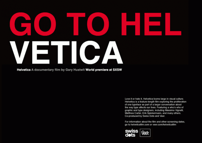
Helvetica is a 2007 documentary about the Helvetica typeface that is brutally honest about its subject. After half an hour drooling over its simplicity and how it took over the world in just a couple of minutes after its introduction in the 1950s, the font comes in for a beating that includes being called fascist – fascist because it is ubiquitous and because suddenly it symbolizes the corporate mentality that most typographers (inventers of fonts) seem to find hateful, though it is mother’s milk to them. That practically everyone in the film has a German accent doesn’t help!
 Why do so many documentaries about modernism seem to revel in exposing the underbelly of their subject?
A documentary I saw the other day, and posted about here, did the same thing, though Visual Acoustics: The Modernism of Julius Shulman ripped its subject a new asshole with a minimum of conscious self-criticism. Same with Herb and Dorothy, a 2008 documentary about two doddering New York collectors of contemporary art. A while back I saw My Architect, a 2003 documentary about the modernist architect Louis Kahn by his son Nathaniel, in which not only was the father’s poor treatment of the women in his life exposed but so was the difficulty of finding the entrance to his buildings. Lou Kahn is revered by all right-thinking architects, so naturally his buildings are abominable. I can’t recall, aside from the bit about finding the door, whether the son found his father’s work off-putting. I don’t recall that he liked the way his mother was treated. Mies van der Rohe treated his wife badly, too, though I’ve never seen a documentary about him. I’m sure it’s out there.
Honesty is, of course, a very large virtue in a documentary, and Helvetica certainly indulges. But these films all seem to feature in high degree an unconscious recognition of how ugly and stupid their subject (not the purveyors of various forms of modernism but modernism itself) comes off to anyone who has not already drunk the Kool-Aid. Or maybe I’ve just drunk a different flavor of Kool-Aid that predisposes me to think movies about modernism are filled with unconscious self-loathing.
Nah.
But how can you fill an entire documentary about Helvetica fonts without any but the slightest pictorial reference to the serif fonts that dominated typography in the decades, nay the centuries, leading up to the advent of Helvetica? There are many references to the supposedly staid serif fonts that were designed with little cues – the caps and feet on ascenders and descenders – to help guide the mind’s eye to more easily grasp word and meaning. And there is no discussion of how removing those little helpers makes type easier to read. It is merely assumed to be the case. Indeed, in all the clips of typefaces unrolling before the eyes of the viewer, only twice do fonts resembling, say, Times Roman show their face. It’s almost as if the producers were afraid that if a serif font were seen by the viewer, the claims made for Helvetica would be immediately exposed as frauds.
And they would indeed, so the producers of Helvetica are at least adept propagandists for their fascist subject. There are so many parallels between Helvetica and modern architecture that it makes your head spin. I wonder whether the producers of films like this even begin to realize how much comfort they give to the enemy!


It should be noted that the Smithsonian has published text standards for their museum signage; which discourage the use of San Serif fonts. Though it recognizes such fonts (like Helvetica) are eminently legible (i.e., the individual letters are easily distinguishable even in low-light conditions and for those with visual impairments — and, as such, are ADA-compliant), any full body of text (like a printed explanation next to a display) composed of a sans serif font is very difficult to read. It has opted to “split the baby” by recommending the use of a simple serif font — as it strikes the right balance between legibility and readability.
Much Modern Architecture appears preoccupied with ensuring that the individual building is “legible” — that it stands out and can be recognized in almost any situation. And, conversely, if there is any solid criticism of Traditional/Classical Architecture it’s that it can be overly concerned with the “readability” of the urban fabric — at the expense of unique opportunities. This latter condition is best represented by the heavy emphasis on a mundane application of a uniform street grid — that doesn’t offer opportunities to terminate vistas with socially/culturally significant buildings & spaces.
I’ve had a couple of interesting discussions with other community planners about the relationship between text fonts, graphic design, and urban design. I’ve noticed a great similarity between the concept of “kerning” and proper building placement along a street frontage. I believe good urban design is not unlike finding the balance between readability and legibility. We shouldn’t eschew modern forms only because they aren’t “classical”, but take a careful assessment of such buildings’ relationship to their surrounding context.
On a similar topic, I was impressed with another documentary filmed by Gary Hustwit titled, Urbanized.
Although a little too steeped in Landscape Urbanism for my tastes, in that it focused too heavily on iconic buildings that offered little back to the surrounding urban context (though he did film some stunning exceptions), it did have some wonderful interviews. One particularly intriguing one was with Enrique Peñalosa Londoño, the former mayor of the Capital District of Bogotá, Columbia. Londoño asserted that the common cornerstone of all democracies is that everyone is equal before the law — and as such, a bus carrying 100 passengers should be entitled to 100-times the road space as a typical single-occupant vehicle. I would argue that applies to funding also.
In the U.S. I would go one step further and argue that any politician that prioritizes roadway improvements for single occupant vehicles without providing equal consideration for transit (or pedestrians) is actually guilty of violating the Equal Protection Clause of the constitution’s 14th Amendment. Further, if such a politician ever received campaign funding contributions from the road construction industry, under the 1871 Civil Rights Act (also known as the Klu Klux Klan Act) such a politician’s personal holdings (his personal bank account and real property) may be seized to compensate the aggrieved party. Specifically, Section 1983 of the Act (which makes this seizure possible) has been used effectively in the West to reverse government decisions that favored public land-leases for ranching over more lucrative leases that would permit the land to lay fallow and recuperate from over-grazing. The threat of seizure forced the politicians to award the public land leases to the environmental group that was out-bidding the ranchers. Since the law obligated the state to award such contracts to the highest bidder, and the politicians were ignoring the highest bid (essentially elevating ranchers to that of a special, higher-status group), the court indicated that the politicians were abusing their public office.
LikeLike
My apologies if you have already seen this. The follow up comments are instructive as how people see the font.
http://www.creativebloq.com/typography/helvetica-reimagined-hotel-9134493
LikeLike
You’re right about the comments.
LikeLike
Oh, this is much better: a piece with which I can disagree 90%. The 10% is the horror of Helvetica as text. Reading long lines of sans serif fonts is eye-glaringly mind deadening.
Reading serif faces on highway signs at 75 mph is simply deadly.
Both type styles have their places in the graphic world.
That MOMA doesn’t use anything but Helvetica in their publications and wall placards doesn’t matter: most of their wall placards speak a language only the most sophisticated curators understand.
By the way, some might object to your somewhat sneering reference to “German” accents. I bet a lot of those Helvetica fans are Swiss.
Oh, yes, when Herb & Dorothy started collecting, I doubt they were doddering. Herb died soon after the movie was finished. At his age you and I will both be doddering,too.
Cheers,
LDD
LikeLike
Lew, I wonder when was the last time you saw serif signs on highways? I imagine that a serif highway sign would be quite readable. … “Ve vant you to use Helvetica, or ve vill report you to ze authorities.” The Germans are big boys and can handle a “sneer.” They recognize and have atoned for much worse than sneers in the last century. … As for Herb and Dorothy, if I recall, clips in the film of their early visits with artists display a less than facile conversational ability. The very fact that they would make a fetish of collecting uncelebrated modernist artists suggests a desire to frame themselves as human novelties, which ought to raise eyebrows. I suspect they were doddering even as young collectors. I will stand corrected and apologize if I am wrong. As for the artists whose work they collected, Tom Wolfe captured them well enough in “The Painted Word.”
LikeLike