Hint, hint: Rebuild Penn Sta.

prrbookF82.png

Pennsylvania Station (upenn.edu)

Michael Kimmelman’s recent piece, “How to Transform Penn Station: Move the Garden,” revives the idea of moving Madison Square Garden into Farley Post Office (supposedly Moynihan Station someday). The Timesman unpacks some excellent ideas but doesn’t mention the one that would finally atone for New York City’s gravest sin.

He does not mention rebuilding Pennsylvania Station, built in 1910 and demolished in 1963, as originally designed by McKim Mead & White. Apparently, the idea of extending Penn Station into the old Post Office building (also by MMW) originally also included moving the arena there. (The famous motto “Neither snow nor rain,” etc., is emblazoned above the colonnade.) Since relocating Madison Square Garden has bedeviled every plan thus far, the idea of moving the arena across the street into Farley is the linchpin of a Beautiful Idea masquerading as a Grand Compromise.

Architect Richard Cameron has proposed a realistic plan to rebuild Penn Station, which I’ve reported on extensively, including my post “Rebuild McKim’s Penn Station.” It should take center court in any new plan.

Kimmelman understands that extending Penn into Farley cannot square the circle, and realizes that the current plans for a Moynihan Station seem to grow increasingly tedious. One critic of the latest idea, announced this week by Governor Cuomo, is quoted by David Dunlop in his Times story “Penn Station’s 5th Redesign Fails to Charm Some Critics.” The critic shrugs: “From ‘Wow!’ to ‘Meh’ in five easy steps.” Except that I’d certainly challenge the initial “Wow.” All five designs have dashed ice water – in the form of modern architecture – on the excitement generated by the original proposal to merge Penn with Farley.

Little plans, as Daniel Burnham said, “have no magic to stir men’s blood.” So far no plan, however big, to correct the error erected atop the grave of the original Penn Station has striven to reach for grandeur. The only way to recast the idea in a manner that will stir the blood of New Yorkers – who keep getting slapped upside the head by development – is to restore the original Pennsylvania Station.

That Kimmelman makes no mention of the obvious solution to this Big Apple Rubik’s Cube may be laid to his leading role in the architectural establishment. But his article reveals that it can be done. Yet it can happen only if New Yorkers oust the tiny experts – including their governor – who claim to speak on their behalf.

13PENNSTATIONJPSUB2-master1050-v3.jpg

Renovation sponsored by Gov. Andrew Cuomo. (New York State Governor’s Office)


Posted in Architecture, Architecture History, Art and design, Development, Preservation, Urbanism and planning | Tagged , , , , , | 6 Comments

Pritzker arrests development

2016-pritzker-prize-slide-TRIJ-videoSixteenByNine1050-v2.jpg

The first building used by the New York Times to illustrate the work of Chilean architect Alejandro Aravena, this year’s Pritzker Prize winner, chosen yesterday, looks as if it were made of wooden toy blocks.

No further comment necessary.

Okay, one more. Neo-Brutalism. Ugh! Heroic? Not!

Sorry, that’s four comments. My cup runneth over.

Posted in Architects, Architecture, Art and design, Humor, Other countries | Tagged , , | 3 Comments

The “of our time” bugaboo

DSCN9970.JPG

Photo of addition to 215 Jefferson St., Alexandria, Va., taken by Brent Brolin in 1972.

I have just concluded Brent Brolin’s Architectural Ornament: Banishment & Return, written in 1985 and republished in 2000. It tells the history of how the meaning of innovation and creativity was lost in the 19th and 20th centuries, leading to, among other curiosities, modern architecture. There are too many quotable passages in the book, but here is one that deftly describes one of modernism’s most stubborn shibboleths:

“The style of the times” looms over the past 150 years like the Holy Grail of design. Red herring is a more apt term. Designers claiming to search for a style of our times really mean “a style I like.” It is another weapon to use against those whose vision of our times differs from that of the designer. Searching one’s creative soul for the expression of our times is at best a thankless task; at worst it is a crude form of self-deception. There is no one “style of the times.” That unhappy occurrence would only be possible in a homogeneous or totalitarian culture. There are many versions of “our times,” each valid for those who hold it.

He follows with a paragraph describing how architects nowadays are forced to personalize their work, differentiating it as much as possible from that of competitors. In the process they unintentionally debunk their “of our time” credo. But they don’t care. Why should they? They know that this blatant inconsistency in the foundational thinking of modern architecture will not be mentioned by the establishment’s stable of architecture critics.

We live in an age of designer architecture. Like designer jeans, it demands that the author’s name be writ clear, so the public knows what value to place on the work. But because architects do not yet sign their buildings, they must resort to the symbolic signature – the personal style. Designer buildings express personal styles and idiosyncrasies regardless of context. You can tell a Le Corbusier building wherever it is. With an occasional exception in the oeuvre of each, you can say the same of Wright, Mies, and so on, down to the present-day line-up of stars.

While I was reading this book, my old friend Steve Mields sent me, unbeknownst, a copy of Brolin’s earlier book, The Failure of Modern Architecture, written in 1976. It promises to be even more fun, possibly even more so than the first paragraph of Freaky Deaky, by Elmore Leonard, which he also placed in his Christmas package. (Steve included a note just inside the novel’s cover that, minus a couple of expletive deleteds, reads: “Bonus Paperback! Chapter One is the funniest beginning chapter of any book I have ever read, ever!” I found Chapter Three even funnier than Chapter One – but it is not an opening chapter.

Imagine my delight to find inside the back cover of Brolin’s Failure, as I looked up its copyright date, a 1972 typewritten note in a plastic baggie from the author to “Occupant” of 215 Jefferson St. (pictured above at the top of this post), in Alexandria. Illustrative of Brolin’s generous and aesthetically broad-minded spirit, it reads:

Nov. 2, 1972

Dear Sir: I was visiting my brother in Alexandria and happened to drive by your house. The addition to your house struck me as a particularly happy meeting of old and new architecture. I am an architect myself and so was curious to know when the addition was built and who had the good taste to do it this way.

I would very much appreciate it if you had time to drop me a card. Thank you very much.

Sincerely,

Brent C. Brolin

P.S. I am enclosing a photo of the addition which I took at the time and hope you enjoy.

Apparently, “Occupant” replied because the photo is printed near the end of his 1976 book, with a caption noting that the 1782 Georgian house’s addition, with its large fan window, was built in 1967. The architect was David R. Rosenthal. The windows of the addition may have been washed by Steve, who in addition to being perhaps the most underrated humorist of his day, is a fenestration cleanliness engineer. He has a practice of acquiring books from the libraries of his clients, either by purchase or donation.

Steve also included a 1967 “First Day of Issue” envelope for a stamp honoring a “Plan for Better Cities” upon the 50th anniversary of the American Institute of Planners (of which Steve’s father, my father’s best friend, was a member). The envelope has a hilarious engraving of a group of city planners (all white males in suits) around a table conceiving a new project, which is also revealed on the envelope. I will post on this soon, with additional remarks about friends, friends’ fathers and city planners.

Posted in Architects, Architecture, Architecture Education, Architecture History, Art and design, Development, Humor, Preservation, Urbanism and planning | Tagged , , , , , , , | Leave a comment

RISD rides to 195 rescue

CHtpNZUWsAEhPvk.jpg

Proposed Wexford Science + Technology project on I-195 land. (gcpvd.org)

Governor Raimondo has invited the Rhode Island School of Design to help bring more innovation to the I-195 corridor. She has also hired the state’s first chief innovation officer, former CIA wonk Richard Culatta, who will work in splendid isolation from an office at Rhode Island College. Having also recast the corridor’s redevelopment team, hired a couple of PR firms to rebrand the state, and pushed through the General Assembly a slate of funding faucets to incentivize development, the governor seems to be serious about goosing the so-called Knowledge District toward a more robust expansion.

Let us hope the I-195 Redevelopment District Commission does not just pick up where the old team left off. The commission’s online booklet Toolkit for Developers is “innovative,” not innovative. It is filled with calls for innovation but is illustrated by the conventional wisdom. For each development parcel it proposes a selection of designs that amount to a mash of modernist massing with a mixture of tech and trad materials – an attempt to balance elite and public tastes that pleases nobody. The early design of the most ambitious project, by Wexford Science + Technology, does not even pretend to seek such a balance but goes all-in for a completely outdated exercise in glass-box modernism – as if time had stood still in the Miesian 1960s, with a few Gehry whoopee cushions thrown in for good measure. Likewise, at South Street Landing next door, plans are to block views of the site’s Beaux Arts power station – soon to be a state nursing school and Brown University offices – with a garage and two dorm sited so as to degrade views of the project’s iconic structure with yet more sterile, “building-as-machine” style boxes.

This is not innovation. It is an attack on the civic character that is one of the state’s very few competitive advantages.

So here’s hoping for a more genuinely innovative thrust, something that strengthens both the brand and the beauty of the Ocean State and its capital city – something that embraces design inspired by the architecture of the world’s most beautiful cities, including that of Providence, which already has more of it than almost every other American city.

Now there’s a new idea!

south-street-landing-housing.jpg

Proposed two dorms next to Beaux Arts power station at South Street Landing. (gcpvd.org)

Posted in Architects, Architecture, Architecture Education, Architecture History, Art and design, Development, Providence, Rhode Island, Urbanism and planning | Tagged , , , , , , , , , , , | Leave a comment

The future of Charleston?

Screen Shot 2016-01-11 at 3.34.00 PM.png

Proposed WestEdge mixed-use development, Charleston, S.C. (WestEdge)

Say it ain’t so, Joe! Say it ain’t so! Why does such a lovely, lovable city as Charleston seem so eager to commit civic suicide? It would not be easy. Charleston is healthy and strong. But, sadly, it is headed the wrong way.

Charleston-South-Carolina

Charleston (harbourviewcharleston.com)

Charleston is a city whose historic architecture makes it great. Unlike Providence, whose beauty has been preserved by poverty and inertia, Charleston’s beauty is the result of action taken by civic leaders since 1931, when it passed the nation’s first historic district legislation. For Charleston, beauty has paid off. Its citizenry possesses an unusually intelligent feel for why beauty is good for their city. They recently drove off a proposed new architecture building for Clemson University’s local campus because it did not fit into its historical setting. Smart.

The citizens who participated in that fight were not “anti-development”; rather, they were pro-Charleston. They recognize that a city’s karma can evaporate before anyone realizes what’s going on. In fact, that is what has happened to most American cities, many of which were once lovely in the way that Charleston remains lovely. They did not have civic leaders wise enough to say “No!” to their own local Clemsons. And so ugly multiplied, slowly but surely, yet faster than anyone could imagine. Each incursion of architectural dilution seemed too incidental to drive concern. Eventually, beauty vanished, leaving mere outposts of charm – “museums,” as it were; a nice downtown commercial block here, an imposing historic mansion there – hardly sufficient to generate ambience. Citizens of most cities nowadays try to ignore their built environment and turn a blind eye to design issues facing their communities. Many civic leaders do not even realize their city has lost something vital, or understand that its disappearance has raised an eternal barrier to their city’s health, vitality and prosperity.

Charleston’s historic heritage remains strong, but with WestEdge its civic culture is heading down a problematic policy glide path.

Screen Shot 2016-01-11 at 3.30.09 PM

Offices at WestEdge.

Charleston recently bid a fond farewell to its mayor of 40 years, Joe “Say It Ain’t So” Riley, known for his sensible and creative policies to preserve Charleston’s historic fabric. But Riley, God knows why, supported the ugly Clemson building noted above, and he also supported a new development, a large high-tech mixed-use plan called WestEdge, part of which will undergo design review this week. WestEdge, as currently proposed, will solidify the correlation of forces that over time could strangle the beauty of Charleston.

Though inside the Charleston historic district, WestEdge would fill acres of vacant land near the Ashley River, two blocks or so from the nearest historic neighborhood, with some 4,000 new jobs in medical research and apartments for some 2,500 new residents. Sounds unobjectionable, but it will put huge new pressure on the city’s greatest asset – its historical neighborhoods and their famous houses, whose prices are already unsustainably high. The four buildings in the first phase are scheduled for completion in 2017.

Screen Shot 2016-01-11 at 3.32.47 PM

Residences at WestEdge.

Too bad if that happens. What Charleston needs to meet the challenges of its future is more Charleston – not anti-Charleston environments that each narrow the opportunity to add new fabric as alluring as that which is mother’s milk to its economy. The big idea is to build more places that people really like a lot. That will reduce upward pressure on the value of historic properties in Charleston, and assure that new neighborhoods and developments start at a higher valuation. After all, a historic district is nothing but a regular neighborhood built before the rise of modernist architecture, planning and development. Places that people love are expensive because they are a limited commodity in America. Build more of them. We are not talking rocket science.

The historic fabric of the city represents the most effective “business model” for new fabric. There is nothing about the practical needs of medical research, let alone city living, that requires ugly glass boxes of the sort planned for WestEdge. There is no reason that what Charlestonians (and their visitors) love about the city cannot be, in essence, replicated on the WestEdge site – without sacrificing a single goal of the WestEdge development.

Providence has encouraged much similar development that cuts against its brand, undermining one of its few competitive advantages (its beauty). Unlike Riley in Charleston, the last three mayors of Providence have lacked the insight or the capability to address threats to the character of the city.

CHtpNZUWsAEhPvk

Proposed Wexford mixed-use project in Providence. (gcpvd.org)

Neither WestEdge nor Wexford, the development proposed along the I-195 “Knowledge District” corridor in Providence, will directly threaten their city’s historic fabric. But they will set a tone and a direction for municipal redevelopment policy that will eventually erode their character and create a riptide against the prospect of getting their architectural mojo back.

It is understandable that the developers of research development parks believe that their projects must partake of “high-tech” design. This notion goes back at least a century, when architectural theorists began to assert that the Machine Age required a Machine Age architecture. There was absolutely zero practical or philosophical reason for that. What society got was merely a metaphor of building-as-machine. The implied promise of efficiency was not realized, but remains the central deception of modern architecture.

The architects of today are still laughing all the way to the bank, along with the developers, and they will continue to chuckle into their sleeves as long as civic leaders believe that to move into the future, cities must be made of buildings that look like machines.

Charleston may well be the first city to say no. Its history suggests as much. Will it happen at Wednesday’s BAR meeting? Well, let’s hope the chance of that is better than of your winning the $1.3 billion Powerball lottery. (Still, good luck with that, too!)


Posted in Architecture, Architecture Education, Architecture History, Art and design, Development, I-195 Redevelopment District, Preservation, Providence, Urbanism and planning | Tagged , , , , , , | 2 Comments

Fogarty building never liked

EP-305279884.jpg

Fogarty Building, in Providence. (Providence Journal)

Now that it seems as if the Fogarty Building will finally come down, the Brutalist government structure next to the Providence Journal Building downtown was treated to a love-fest in the Journal today. “Time’s Up” reads the headline of reporter John Hill’s story. “Too old to be hip, too young to be venerated,” he groans on the building’s behalf.

In fact, the Fogarty is unpopular because it is ugly, and its ugliness is too blatant to be wished away in a cloud of words. I’m surprised that Hill did not find anyone to quote on rebranding Brutalism from ugly to “heroic” – the latest intellectual froth in art circles following the publication of a new book along those lines called Heroic: Concrete Architecture in the New Boston.

Although Hill’s story and his accompanying piece about the Brutalist style commendably offer alternative viewpoints, their central assumption that the Fogarty and its style were once popular is false. Brutalism has always been disliked by the public – and why not? It is a style that is based on a credo of the public be damned. Architects of the modernist era treat the the public’s dislike of their work as a feather in their cap.

Modern architecture – with Brutalism as the most straightforward example – emerged from a history going back two centuries or more that traces artists’ increasing frustration with public (or “bourgeois”) taste. The public has always preferred tradition to novelty in design. By the early 20th century, artists – including artisans and architects –  were so mad at the public that they embraced design that openly poked public taste in the eye. Now that the market for art and architecture no longer arises mainly from the middle class but from the corporate elite, artists and architects no longer suffer financially from the public’s dislike of their work.

Brent Brolin’s pathbreaking Architectural Ornament: Banishment and Return, written in 1985, tells the story well and with a profusion of illustrations. One of his themes is that, with Immanuel Kant’s call for artists to seek freedom in novelty, most artists, architects and craft workers have misunderstood the true springs of creativity and innovation. For thousands of years, artists and architects conceived of innovation and creativity as the result of individual artists’ search, using both talent and precedent, for ever greater virtuosity in the application of method and craft to design. The result was an ever-rising level of beauty in art, architecture and commercial products. That changed as novelty at any cost became the focus of design. Having cast out traditional ornament based on nature, however, and having substituted new inspiration based largely on machine culture, there remained a very limited kit of design tools, and as those were used up, novelty had to reach out farther and farther beyond tradition to meet the requirements of a self-limiting “creativity.”

As Brolin writes:

Modernism’s philosophy is exclusive, not inclusive, and therefore its forms have changed remarkably little in the past eighty [now 110] years. The buildings published in today’s professional journals are, by and large, just exaggerated versions of earlier modernist exercises – Mies through a fun-house mirror. The near century-old shapes of modernism are pulled and stretched, chopped apart and reassembled, to be sure, but they rely on the same simple, barren geometry that characterized the style from the beginning. They use the same restricted form vocabulary that was introduced eighty years ago, and they refine it by taking away from the form rather than adding to it. They tend to be as sterile and inhospitable as their ancestors, and equally hostile or indifferent to their architectural contexts.

The result is around us for all to see – not least in the Fogarty’s Brutalism.

Tear it down.

Posted in Architects, Architecture, Architecture Education, Architecture History, Art and design, Development, Providence, Providence Journal, Urbanism and planning | Tagged , , , , , , , | 5 Comments

Rise and fall of Haverhill

Screen Shot 2016-01-09 at 2.05.36 PM.png

John Massengale sent to the Pro-Urb listserv a 45-minute documentary, “Woolworth’s: Remembering Haverhill’s Shopping District,” produced just last year by Historic New England. He said it was more than you might want to know about the northern Massachusetts shoe-manufacturing town on the Merrimack River. But I watched the whole thing and a more delightful film of that sort I don’t think I’ve ever seen. Throughout, a collection of elderly memoirists recount their time downtown. Again and again they reiterate the importance of proximity and walking (“Nobody had a car!”) to Haverhill’s vitality. They say the funniest things (intended and unintended).

Screen Shot 2016-01-09 at 2.08.43 PM

To look at the lunch counter at the Woolworth and to marvel that it ran the length of the store – then to imagine how many times the store (which had “everything”) would fit into a typical Walmart today. So sad. And toward the end, as John points out, they start discussing Haverhill’s decline and the folly of the urban renewal that was supposed to turn it around. Here are some remarks from John:

This is longer and has more information about Haverhill, Mass., than most people will want, but around 33 minutes they start to talk about sprawl, the downtown dying, and then urban renewal and urban removal. Including why Haverhill thought it was best to tear things down. [John quotes:]

“The way the federal government was running the urban removal program was all or nothing.”

“We’ll give you hundreds of thousands of dollars, all you need to do is tear everything down”

“I call it ‘1960’s ugly.’”

Around 42 minutes they show new buildings, which are only slightly better than 1960s ugly. They would benefit from a bunch of John Andersons.

Screen Shot 2016-01-09 at 2.09.58 PM.png

Posted in Architecture, Architecture History, Art and design, Blast from past, Development, Preservation, Urbanism and planning, Video | Tagged , , , , , , | 1 Comment

Painting in Porto, Port.

MM painting Tibães (2).JPG

Malcolm Millais, author of Exploding the Myths of Modern Architecture, is a British engineer and architect who has retired to Porto, in Portugal, where he has taken up the pastime of painting – as Churchill did after his Gallipoli military disaster in WWI (he was Lord of the Admiralty) ended his political career, or so he thought. Malcolm has emailed me a couple of his works, which I find delectable, styled with a sort of dreamy realism. These two paintings seem to invert the effect achieved by Providence photographer Richard Benjamin – whose photo of Waterplace Park that I use all the time looks more like a painting than a photograph. Malcolm’s work is a painting that looks like a photograph – and yet not without an enchanting element of primitivism. Maybe that reflects more the subject than the technique. I wonder whether Malcolm’s friends at the Old Portuguese Stuff blog know of his work. It is not old yet, so it may not qualify, nor is Malcolm Portuguese – but he does live in Porto, and the paintings seem to be of scenes in Portugal (assuming they are not entirely imaginary). Anyway, I hope you will enjoy these two, and I’ll post more if he sends them.

Windows Vinhais.JPG

Posted in Architecture, Art and design, Other countries, Photography, Providence | Tagged , , , , , , , , | Leave a comment

Two lovely local buildings

DSCN9960.JPG

I don’t know what’s gotten into me, but I thought I’d just post photos of a couple very nice local buildings, a house and a school office, on the East Side of Providence. Maybe the 40th anniversary of the East Side Monthly, run by Barry Fain (a lonely voice, once upon a time, pushing for tradition on Capital Center Commission’s design panel) and his compatriots. Its anniversary issue, filled with much grist for memory, just came out.

Anyhow, the offices of the Wheeler School at 216 Hope Street are on top. Built in 1913 and designed by F.W. Sawtelle, its Elizabethan Revival design strikes me as among the most enchanting in Providence. And on the bottom is the Bessie and Harry Marshak House, at 549 Wayland Ave., built in 1931. Not sure what to make of its design – eclectic, surely, said to be the work of architect Harry Marshak himself – with its brickwork featuring a huge rough inlaid medallion to the right of its arched, many-paned, ceiling-high front window, and its charming second-floor balcony above its elegantly hooded corner entry. I just noticed this house a few days ago, and I have been back to ponder it several times since. The link takes you to a description by Robert O. Jones in the Gowdey Collection of the Providence Preservation Society.

DSCN9957.JPG

Posted in Architects, Architecture, Architecture Education, Architecture History, Art and design, Preservation, Providence | Tagged , , , , , , , | 13 Comments

Garages can be beautiful

Figure-12.jpg

Staunton Parking Garage, in Staunton, Va. (Photo by Calder Loth)

Here is the column I wrote for the Providence Journal about the design of parking garages, as promised in “Garage design in Providence.” Seeing the latest proposed garage design, a friend thought at first that the headline was “Garbage design in Providence.” Understandable.

In September of 2013 I wrote a column based largely on garages in Richmond, Va., where city officials seem to understand that a garage need not be a place people must try to ignore. A garage can be made to fit into the setting of a city. Since most municipal officials seem unable to understand that every building can and should be made to fit into the city, getting them to think sensibly about garage design is to attempt a high hurdle.

As yesterday’s post suggests, that is especially true in Providence, which is odd because, as one of the nation’s most beautiful cities, Providence has examples of beauty that city officials have to walk by every day. They must walk by with their eyes closed. Why more of them don’t get hit by cars (or, very popular these days, buses) I have no idea.

Now they will have to walk by the new garage built by Johnson & Wales University in downtown Providence, which at least tries to fit into its cityscape, and comes close to real success. Bravo to JWU!

Below is my old column on garage design. Many of the garages outside of Rhode Island cited below may be seen in the linked essay by Calder Loth, on the Classicist website of the Institute of Classical Architecture & Art, from which I got most of my information for the column.

***

Parking decoration is vital for cities
September 5, 2013

The question of what a parking deck or parking garage (both are the same) should look like is easily answered, notwithstanding that almost all cities answer the question incorrectly.

It should look like a building that belongs in a city. That’s what it is and that’s what it should look like, not a giant set of concrete shelves.

In downtown Providence, only the Arcade Garage, across Weybosset Street from the Arcade, even tried to get it right. Its brick façade, bullnosed columns and tower of arched apertures appear to blush at the insipidity of its attempt. Other local garages treat this important civic function as if form were a sort of curse.

Give me acres of asphalt surface parking lots instead; at least they offer the prospect of something better down the road.

An exception to the urban miasma of “structured parking” in most cities is Richmond, Va., which must qualify as the mecca of parking decks. In his Aug. 27, 2013, essay for the Classicist Blog of the Institute of Classical Architecture & Art, where he is an adviser, Calder Loth describes parking decks that get it right, most of which seem to inhabit the Old Dominion.

As senior architectural historian [ret.] at Virginia’s Department of Historic Resources – the state’s equivalent of the Rhode Island Historical Preservation & Heritage Commission – Loth has been observing architecture for decades. His essay on parking decks should be required reading for all planning officials.

“Regrettably,” he writes, “many of the decks of recent decades are as visually stifling as the surface lots. These vapid works of naked engineering are little more than concrete shelving to store our vehicles, blaring the fatuous rationale that form follows function.”

Loth begins with Richmond’s Sixth Street Garage, an Art Deco deck designed by Lee, Smith & Van der Voort and built in 1927, a “pioneering demonstration that a parking deck can be a work of architecture.” It has two towers emblazoned with winged automobiles and a cornice of sculpted wheels. Between its piers are mullions that suggest office windows.

Although you can easily tell it is a parking deck, it does not boast of its parking deckness, and that is its strength. But perhaps I give it too much credit. In 1927, the ugliness we take for granted (and not just in parking decks) was not mandatory. Trying to fit even a garage into the urban fabric was not yet verboten. By 1947, those halcyon days were gone.

Loth gives too much credit, I think, to a parking deck in New Haven, Conn., designed by Paul Rudolph in the so-called Brutalist style. Most garages, wrote Rudolph, “are just office structures with the glass left out,” adding that he wanted there to be “no doubt that this is a parking garage.”

He succeeded. Alas. Yet Loth refers its swoopy Brutalism as a “masterpiece of concrete formwork.” Maybe it is a masterpiece of concrete formwork, but it is not a masterpiece of a parking garage.

Loth takes his readers to a few other states to praise garages of recent vintage in Santa Fe, N.M., Charleston, S.C., and Savannah, Ga., but he returns to Virginia to describe three splendid parking decks: that of St. James-Beth Ahabah, a work of forthright classicism in downtown Richmond built jointly by two houses of worship; a deck appended in the 1980s to an 1893 Planters National Bank, which picks up deftly on its Romanesque Revival style; and a deck at the Darden School of Business at the University of Virginia, in Charlottesville, with a Tuscan colonnade that makes learned reference to the original campus by Thomas Jefferson.

Of this Loth quips, “Some might ask why a parking deck should be thusly dressed up. The answer might be ‘Why shouldn’t it?’ ”

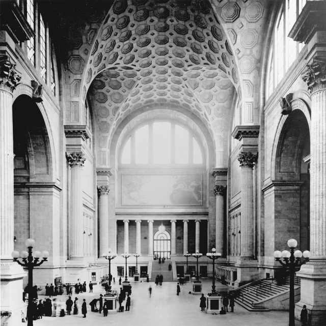
I have left myself little room to discuss what he calls “the grandest parking deck in this survey,” in Staunton, Va., which opened in 2000, modeled after the Baths of Caracalla in ancient Rome – on which New York’s Pennsylvania Station itself, built in 1910, was modeled. “We might ask,” Loth asks again, “what is the most welcome sight for a visitor entering a strange city. The answer, of course, is a place to park, so why not treat it with fanfare.”

Why not indeed? The plain and simple answer to which most planning officials and parking magnates are oblivious is obvious to those in Richmond. The question remains why. Calder Loth is too diplomatic to answer directly. Yes, their brains are stuck in park, but why?

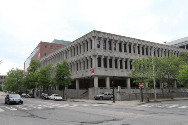
A garage being built in Providence by Johnson & Wales University may show promise. It is not complete. When it is, I hope it will grace a future Calder Loth parking-deck survey. [That garage is pictured below.]

Copyright © 2013. LMG Rhode Island Holdings, Inc. All Rights Reserved.

***

DSCN3612.JPG

Recent Johnson & Wales parking garage in downtown Providence. It is not the one straight ahead but to the left of the street. (Photo by David Brussat)


Posted in Architecture, Architecture Education, Architecture History, Art and design, Development, Providence, Providence Journal, Urbanism and planning | Tagged , , , , , | 3 Comments