Give modernism a beating

Screen Shot 2016-06-17 at 2.41.15 PM.png

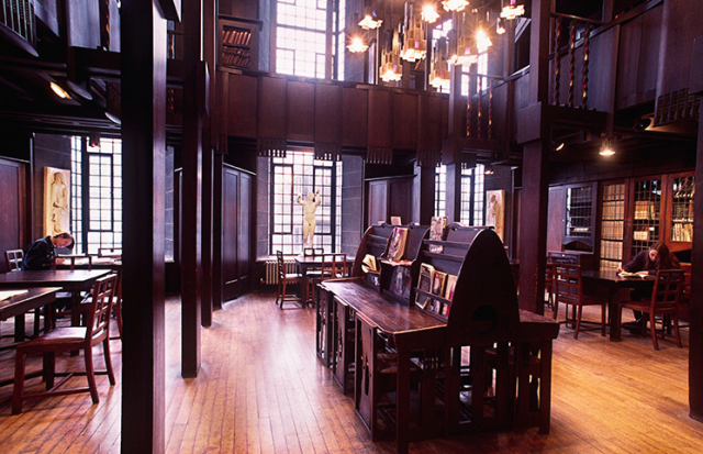
Scene from “Beat Girl” with model of City 2000.

This list of architectural models in movies that look askance at modern architecture through the lens of film was linked from a piece in Architizer warning architects not to go see The Architect, a movie coming out soon. It mentioned The Fountainhead, the Simpsons’ takeoff on Frank Gehry and others, even Beat Girl, a 1960s British film introduced to me by my former editor at the Providence Journal, Ed Achorn, who has written a couple of fine books about old baseball; my favorite is about a miraculous pitcher named Old Hoss Radbourn, the Providence Grays and the first World Series.

In my post earlier today, “Architects and The Architect,” I said I’d repost my column from 2004 on the architecture of Beat Girl, how “City 2000” was loathed by the architect’s daughter and how it baffled his ritzy new wife-to-be. I have quoted at length from those charming passages.

So, without further ado, here is my column on Beat Girls:

***

Give modernism a beating

January 8, 2004

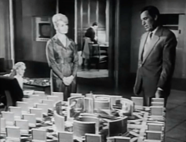
I FELL IN LOVE the other day with Beat Girl, a British film about a teenage girl whose father, an architect, takes a sexy Parisian as his second wife. The pouting beatnik daughter dislikes her immediately, as she has long disliked her father’s life’s work, which he calls “City 2000.”

The dialogue that follows unfolds in the scene pictured above.

Why do I love this film? Read on.

Stepmother: Darling, what is in that huge box over there, a body?

Jennifer: That’s just about it. Only it’s more like a skeleton in the cupboard.

Father: It’s my toy, and Jennifer’s jealous of it.

J: Jealous? Of the stupid city?

S: The city?

J: Superman stuff, and then some.

S: Show me the city, please!

J: You’ll be sorry.

F: [Chuckles] She may be right, you know. If I get the city out, you’ll be up till dawn. It’s my life’s work. It’s meant more to me than anything in the world. Hasn’t it, Jenny?

J: Yes. That’s true.

F: I call it City 2000. Crime, filth, poverty, noise, hustle and bustle – those things will be unknown. An almost silent place, soundproofed with the use of flying bevelled walls of concrete, which also serve to cut wind and rain. Jennifer says it will be like living in a tin can, but I don’t think that’s really true. You know, psychologists think that most human neuroses come from too much contact with other humans. Now, in my city–

S: Darling …

F: –a man can be as alone as if he were 10,000 miles from anywhere in the country.

S: Paul …

F: Hmm?

S: I’d like to see Jennifer to bed.

F: All right, darling. Don’t be long.

[Upstairs, the two women engage in quiet female combat. At last comes Jennifer’s parting shot.]

J: And don’t kid yourself he’s in love with you. He’s in love with City 2000.

“City 2000” resembles what Le Corbusier wanted to do to Paris, but even more it resembles Brasilia, the new modernist capital of Brazil, planned and built in the late 1950s and ’60s. In fact, later in the film, the architect has persuaded a financier from some Latin American country to back its construction, with help from his brother, a corrupt legislator.

The fascinating thing about Beat Girl is that it was made in 1960, when modern architecture was in its heyday. It had achieved by then the status of orthodoxy, a domain of old fogies and therefore a target of youthful rebellion. Little has changed. Take, for example, the newlywed couple on the sitcom Wings, about life at the small airport on Nantucket.

I have tried on and off for years to acquire a script of the one episode I saw of the show. This past week, I put on a full-court press. No luck. But several members of the Tradarch List, a Web group devoted to traditional architecture, knew of the episode and have sent me details. For example, here, courtesy of John Cluver, is the official description of Episode 129, written by Howard Gewirtz. It aired on Nov. 21, 1995, and is called “So Long, Frank Lloyd Wrong”:

“Joe and Helen’s initial fortune at landing famous architect Y. M. Burg to design their new house soon turns sour as he suggests a house shaped like a giant 7.”

Milton Grenfell, of Charlotte, N.C. [now an architect practicing in Washington, D.C.], sent his recollection of a friend’s description:

“The line I still recall was when the wife says to her husband in despair, ‘A number 7? But it won’t blend with anything around it!’ To which her husband replies, ‘Not unless the guy with the vacant lot next to us builds a house shaped like a number 8.'”

Most of the episode revolves around the newlyweds’ efforts to assign each other the task of telling the architect thanks but no thanks, and how to do so without hurting his feelings. (Good luck! Architects have notoriously thin skin.) Maybe it’s a good thing I couldn’t find the script. It would have been painful to decide which gems to cut from a whole episode so others could fit in this column. Parts of the one scene from Beat Girl might also have had to be cut.

In 1943, Ayn Rand – a Beat Girl of a wholly different sort – wrote The Fountainhead, about a modernist architect in a field then dominated by classicists. Today, with modernism now the establishment, her Howard Roark would be a classicist. For, despite public disdain and Hollywood derision, modernism maintains its grip on architecture.

Still, this holiday my favorite card came from my brother Guy: Santa has failed to negotiate the bizarre angles of a modernist house. His sleigh overturns, his reindeer dangle in their traces, and Santa says . . . Well, let’s just say his second and fourth words are “contemporary” and “architecture.”

The beat goes on.

[Click to view full YouTube video of the film Beat Girl.]

Copyright © 2004. LMG Rhode Island Holdings, Inc. All Rights Reserved.
Record Number: MERLIN_217668

Posted in Architecture, Book/Film Reviews, Uncategorized | Tagged , , , , , | Leave a comment

Architects and The Architect

Screen Shot 2016-06-17 at 10.57.27 AM.png

In “The Architect,” Miles Moss’s clients react to his design for their house. (trailer)

A soon-to-be-released movie called The Architect has ruffled the feathers of the community of architects. The movie portrays architects stereotypically, as we have come to know them. As an architect, the main character is arrogant, vain, egotistical, holier than thou, looks down his nose at his own clients, and resists others’ resistance to him and his work by issuing clichés.

This I gather from the trailer of The Architect, which accompanies the article “No Joke: Upcoming Movie The Architect Is a Disaster for the Profession,” by a columnist who styles himself “The Angry Architect,” on the website Architizer. The trailer is pretty damning. But if it is any consolation to individual architects, the movie is not really about architects in particular but architecture in general – or what it has become and is today.

Architecture today – or rather modern architecture, the default stylistic template for most of the profession – is arrogant, vain, holier than thou, looks down its collective nose at the public, and resists opposition to it and its work with clichés. To the limited extent that individual architects reflect the cliché, responsibility lies with a salient fact about their work: it is very often ugly, or alien to common perceptions of how houses and buildings should look. From its contrary attitude, which the profession wears like a feather in its cap, flow the situations that result in the clichés spouted by the architect in The Architect.

“Often,” says protagonist Miles Moss, played by James Frain, “the opinion of the client must be disregarded for his own good.”

“I don’t know why people hire architects and then tell them what to do,” Moss tells one of his clients, who replies, “Because it’s their house?”

The individual architect working for one of the many firms struggling to acquire clients let alone satisfy them rarely reflects this sentiment. Many modern architects work hard to put a happy face on the junk their profession expects them to produce. But those clichés perfectly capture the attitude of the profession and its establishment toward the public. The public dislikes modern architecture, so modern architecture disdains the public.

Clichés and stereotypes arise and capture the public imagination because they tend to reflect and reinforce existing attitudes. Though many architects who practice modernism fail to fulfill the stereotype, they suffer because the architectural establishment reflects the stereotype and is indeed responsible for it. The American Institute of Architectus is having a hard time connecting with the public, and that makes working in the field harder for the architects it represents. “The cliché, c’est moi” could be the AIA motto.

Screen Shot 2016-06-17 at 11.16.53 AM.png

Wings episode “Goodbye, Frank Lloyd Wrong, aired in 1995.

The Architizer columnist regrets that architects are in bad odor these days. This movie trailer calls to mind the 1995 episode of Wings, “So Long, Frank Lloyd Wrong,” where a famous architect gives a newlywed couple a wedding present of a design for the house they want to build, which turns out to look like the numeral 7. The plot revolves around whether the bride or groom should tell the architect they don’t like it.

There is another movie called The Architect, made in 2006, about what happens when a public housing project designed by the film’s protagonist incites higher crime and dissolution of the tenant families, which causes problems in his own family. The film evidently harks back to the infamous Pruitt-Igoe project in St. Louis that was torn down just a couple decades after it was built. (Pruitt-Igoe was by Minoru Yamasaki, the same architect who designed the World Trade Center.) I have it in my Netflix queue.

Fortunately for architecture, architects, their clients, the public and the world, this is easy to change. Unfortunately, architecture has become a cult, to use a mild term, and the establishment has every reason to resist change, and all the power it needs to avoid the intervention that is required.

“The Angry Architect” at Architizer has every reason to be angry, but his (or her) thoughts on architecture lead him to misunderstand those reasons. An informed public can be part of the cure, and the film is a source of truth, intentionally or not. Let’s hope that the box office receipts of The Architect run very high. The world would be much better for it.

The Architizer piece by “The Angry Architect” links to “From ‘The Fountainhead’ to ‘The Simpsons’: 10 Fictional Architecture Mock-Ups in Movies and TV,” many of which I have never seen (including the Simpsons’ spoof of Frank Gehry). My Netflix queue is sure to grow! But one of the mock-ups on the list is City 2000, the architect’s Corbusian concoction hated by his daughter and confusing to his sexy second wife in the 1960s British film Beat Girl. I wrote about this long ago, and I will try to repost it.

Hats off to Kristen Richards for running the Architizer material on ArchNewsNow.com.

Posted in Architecture, Book/Film Reviews, Video | Tagged , , , , , , , | 1 Comment

Rybczynski on concert halls

auditoriumtheatre.org.png

Longitudinal section concert hall in Chicago’s Auditorium. (auditoriumtheatre.org)

I have not spared the architecture critic Witold Rybczynski my critique of his dithering on the greatest architectural questions of our time, but his latest piece, “The Concert Hall, Reimagined,” in Architect journal on the removal of concert halls from their urban contexts is excellent. I just wish he’d read the damned thing!

Screen Shot 2016-06-16 at 12.26.05 PM.png

Auditorium facade. (zbaren.com)

If he did, he might rediscover some plain truths, eternal verities and the like that still apply to architecture, however anathema to its establishment. Foremost is his apparent (and gratifying) disdain for the ugliness of the new iconic halls – and their abandonment of civic life. Both apply not just to modernist concert halls but to a damning degree of the broader swath of modern architecture. Were he to apply his thoughts in this article to the extent they are applicable to modern architecture generally, he would have to come to see that, regarding architecture’s style wars, it’s way past time for him to get off the fence.

Rybczynski speaks kindly of the Auditorium in Chicago designed by Louis Sullivan and Dankmar Adler, completed in 1886, and he includes a longitudinal section (a drawing that lets you see through walls into the structure of a building) of the hall. It shows how so much of the Auditorium was part of the fabric of Congress Street and Michigan Boulevard. At the top of this post I have placed a similar longitudinal section of just the concert hall part of the building. It does not illustrate Rybczynski’s point as well as the section that he uses in his article (reprinted below) but it does a better job of showing off Sullivan’s love for incorporating artistic embellishment into the buildings structure. It also shows how the art of architectural illustration has fallen off since then.

The modernists that Rybczynski normally coddles kidnapped Sullivan long ago and placed him in a museum exhibit case whose label describes his legacy as a “precursor to modernism.” Don’t believe a word of it.

Kudos to Architect magazine for running the Rybczynski’s piece. Architect is the mouthpiece of the American Institute of Architects, a stronghold of modernist sentiment in the field, so the article must have caused unease among its editors and the institute’s apparatchiks. Their consciences would be clearer and their minds more at ease if the organization promoted the full range of styles in American architecture. Nowadays, the AIA is even airing TV ads hoping to mollify the public’s disdain for modernism. It will have to do a lot more than just run an occasional piece friendly to traditional design.

I have placed the longitudinal used by Rybczynski and an illustration of the broader city context below, both from a fine website about the Auditorium, auditoriumtheatre.org, that originates at Roosevelt University, in Chicago.

Screen Shot 2016-06-16 at 11.25.12 AM.png

Longitudinal section showing concert hall space amid Auditorium. (Architect)

Screen Shot 2016-06-16 at 11.28.37 AM.png

Illustration of Chicago setting of the Auditorium Building. (auditoriumtheatre.org)

Posted in Architecture | Tagged , , , , , | Leave a comment

Worthy R.I. Hall of Fame

DSCN8924.JPG

Model of proposed Rhode Island Heritage Hall of Fame, in Bristol. (HOF website)

Rhode Island has had a hall of fame, as distinguished from, let’s say, a sports or a music hall of fame, since 1965. It is, however, one of only four states without a true home for its pantheon of venerated citizens. The Rhode Island Heritage Hall of Fame‘s 757 inductees reside on lists, in folders, in the drawers of archival shelves – in limbo, as it were. Now, at last, a venerable edifice, a veritable history museum, has been proposed for it in Bristol.

My friend Steve O’Rourke urged me to attend a press conference where a model of the building was to be on view at the conference center of Conley’s Wharf, near State Pier 1 on the west side of the Providence River south of the Hurricane Barrier. Eager to applaud any elegant new building slated for Rhode Island, I gathered my enthusiasm and hurtled down Allens Avenue, arriving before the festivities and in good time for a drink with Steve, who is a longtime member of the hall’s board of directors. He is also a genuine Rhode Island hero who, as head of the Providence Housing Authority for a quarter of a century, transformed one of the nation’s worst public facilities to house the city’s poor and elderly to one of its best.

Screen Shot 2016-06-14 at 9.44.08 PM

The Pantheon, Rome. (traveldigg.com)

To the credit of the Heritage Hall of Fame’s board and its chairman – Patrick Conley, who is also the state’s historian laureate – the building will be classical. It is to be modeled on the ancient Pantheon, in Rome, built circa 126 A.D., and on the architecture of Thomas Jefferson. He and fellow founder George Washington selected the classicism of civilization’s first ancient democracies as the most appropriate symbolic language for America’s democracy. Since the nation’s tradition of religious freedom – the “soul liberty” of founder Roger Williams – originated right here in colonial Rhode Island and Providence Plantations, classicism is the appropriate language for our Hall of Fame.

The model, sitting in the conference room on what must be the longest wooden table in the biggest little state, was admirable, although the devil is in the details. One of the state’s leading architecture firms, Robinson Green Beretta, is to be involved in the expurgation, one must trust, of the model’s demons, such as, for example, the sparse balusters along the roof balustrades of its flanking pavilions. Notwithstanding that, the model’s debt to Rome’s Pantheon was immediately evident, and gratifying.

Its expected location next to Roger Williams University seems entirely fitting. And yet one might feel a sort of longing to see it arise not in Bristol, which needs so little help, but in the state capital of Providence, which needs so much. However, the land has already been acquired thanks to the generosity of the Herreshoff family, and Providence has, alas, been a rough host to the Hall of Fame’s board chairman. Conley’s experience trying to revitalize the industrial zone along that stretch of the Providence has the state’s inaugural historian laureate looking understandably askance at the idea of building the Hall of Fame in the Renaissance City. So be it.

I have little to add to the debate over how the facility is to be financed. The Journal ran an editorial supporting the concept but groaning at the initial idea of a state lottery. In the 18th century, Brown University, Newport’s Trinity Church, its Brick Market, Providence’s First Baptist Church, and its Weybosset Bridge (located where the College Street Bridge is today) relied on public lotteries for financing. Noble precedents, to be sure, but hardly likely in our post-38 Studios slough of despond. Neither Conley nor others at the event seemed upset at the Journal’s opinion. I don’t really care how the Heritage Hall of Fame is financed as long as it is built.

A smaller facility might be easier to finance and ultimately easier to run. The hall’s program – it will also be the state’s history museum – seems mighty ambitious (see its website) but much of it could well be housed in a smaller rear pavilion, and a smaller event tent to its rear – the board seems to think its 757 inductees might suddenly come alive and demand accommodation sufficient for all at once. A better alternative for some of that space behind the domed hall might be a lovely garden for the perambulation of visitors.

For all its quirks – including its “been down so long it looks like up” attitude – Rhode Island deserves a home for the paragons of its admirable history.

DSCN8910.JPG

Patrick Conley speaks to news conference about the Hall of Fame. (Photo by David Brussat)

Posted in Architecture, Rhode Island | Tagged , , , , , | 3 Comments

Tinker at Providence Place

Screen Shot 2016-06-14 at 3.01.16 AM.png

Providence Place in 2000. (Fragment of photo by Richard Benjamin)

Providence’s downtown mall is getting its first big renovations since it opened in 1999. So said the Providence Journal on Sunday in “Providence Place mall in line for first major overhaul .” J.C. Penney shut its doors last year, lasting a surprising nine years after Lord & Taylor closed in 2006. Both were tucked into a large but awkward rear location well off of the concourses of the mall’s three shopping levels. Neither seemed to attract much foot traffic. Far from the madding crowd is less than prime for anchor stores.

WPRO asked listeners in January 2015 what they wanted to see replace Penney’s. They wanted a Target, Bloomingdale’s, Best Buy, Nieman Marcus, Toys ‘R’ Us, even an Ikea and a few other big stores, but not a bookstore. Oh yeah? The mall became uninteresting to a sizable segment of the market when Border’s closed in 2011. The mall management made a mistake not moving heaven and earth to grab a Barnes & Noble. Instead, another shoe store has bored shoppers. Yet another shoe store. Unbelievable.

So it would not have been a shock to learn of plans to shoehorn another dozen shoe stores into the Penney’s square footage. (After all, Providence is a walkable city, and while that’s good for the soul it’s bad for the soles.)

So imagine my surprise when I heard that the mall now plans to lease two of the three old Penney’s floors to … more cars! Yes, more parking in a place with abundant parking. It is fashionable to hate the parking at the mall. Not me. Unless you are a mall garage newbie, it is easy and cheap to park there – getting out is another story. The current plan includes renovations to the entire parking system, and I hope that includes simplifying the way outta there. It has always been a confusing exercise in spaghetti. The plan also includes more (but hopefully not worse) machines for paying in the mall shopping areas. Not to mention more (and, one must hope, better) greenery and maintenance outside.

I do not believe they need more parking, but they may not have been able to find stores to to take the Penney’s space, and they still have not revealed plans for the remaining floor – probably because there is no plan.

I say bookstore. Barnes & Noble remains a possibility, at least in theory. We Rhode Islanders must drive to Seekonk, Greenville or, worse, Route 2 in Warwick or deepest, darkest Middletown to get to a major bookstore from the capital city. That is embarrassing. I may have to burn my low-number Athenaeum share, No. 41, originally owned by Resolved Waterman and deeded to me by Tony “Spy in the Sky” DiBiasio decades ago.

So here are my recommendations:

  • Bookstore!
  • Turn back on the elegant lighting along the curved Macy’s façade.
  • Place one of the additional parking pay kiosks somewhere between the cinemas and the rooftop parking. How they left that stretch uncovered beggars the imagination.
  • Change the escalators so that you don’t have to loop around to go up to the next floor. That probably irks shoppers more than anything else about the mall, and that includes parking.
  • Dump the additional two parking levels and put in condos or a hotel. Or for that matter why not a putt-putt course, or an Olympic-size swimming pool? Possibilities abound. Only the imagination limits the options.

Think, guys!

The Providence Journal’s story quoted retail consultant Jeff Green on that:

He suggested Providence Place might consider adding multi-family housing, a limited-service hotel or even office space, an approach taken by one of Metro Detroit’s largest malls, where Ford Motor Co. plans to help convert an old Lord & Taylor department store into work space for about 2,100 employees.

The mall has been a major shopping success on the basis of sales per square foot since shortly after it opened. It has brought millions of people into Providence – if not into the city’s old commercial district, though there was never a good case that not building the mall would have helped much to animate Downcity. Buff Chace has done an excellent job of that so far, but he’s done almost all the heavy lifting – lofts, retail, food – by himself. More people doing more of that would have brought downtown even more alive.

And by the way, except for the state’s historic tax credit program, never has a set of tax breaks helped the city and state more than the Tax Treaty between the city, the state and the mall’s first owner, Dan Lugosch of the Providence Place Group. I recall doing a 12-part series on the mall’s design back in the mid- to late-1990s. Some of my colleagues at the Journal joshed me that it should be named Brussat Place. Ah! Those were the days!


Posted in Development | Tagged , , , , , | 2 Comments

Beautiful Brutalist buildings

Screen Shot 2016-06-11 at 11.47.05 AM.png

Centro de Exposicoes, Salvador, Bahia, Brazil. (Fran Parente)

Contradiction in terms? Not to architecture critic Jonathan Glancey; still less, one must assume, to Peter Chadwick, who has devoted an entire book, This Brutal World, from which Glancey has selected his favorites in “Ten beautiful Brutalist buildings” for the BBC. For chiefly rhetorical reasons, Brutalism is my favorite modernist subgenre – its name comes from béton brut, which is French for raw or rough concrete but means much more in the real world where people make mental connections, usually based on their obvious first impressions. For that reason, I commend Chadwick for the title of his book.

I had a tough time choosing the photo atop this post. I chose the one whose thumb stuck out most sorely as an example of Brutalism – stuck out because although the other nine are ugly in and of themselves, this one seems to be the dictionary definition of what people might mean when they speak of a modernist building as “an alien spaceship.” Of course, the text accompanying the image of the 1974 exhibition center in Brazil pretends not to notice that it looks like an alien spaceship. I think that is hilarious, but perhaps by 1974 modernists had completely lost the ability to imagine what everyday people think of their work. (I would not want to be the guy under the overhang getting into his car.)

Glancey’s selection is fascinating. The one above the alien spaceship is London’s Trellick Tower, a 31-story hulk built in 1972 and designed by the Hungarian emigré Ernö Goldfinger. Glancey does mention that Goldfinger “lent his name” to a James Bond villain – an interesting choice of words – but not that the reason was that Ian Fleming chose the name to express what is widely believed to be his deep dislike for Goldfinger’s work.

Farther down there is the Hemeroscopium House, in Madrid, that seems to be a study in I-beams and girders writ large. This certainly cannot be defended as an example of a modernist building designed to express its structural philosophy. It was built recently, in 2008, long after most modernists had dropped any pretense to “honesty” in design. (It was a ridiculous pretense, anyway. One would like to think dropping it constituted a shift toward reason if not beauty in design. Not likely.)

Boston City Hall, which the last mayor wanted to demolish but wimped out, is on the list, naturally, and so is the Orange County Municipal Center, in Goshen, N.Y., whose citizens wanted to demolish but only partly got their wish – enough, however, that modernists and preservationists abed with modernists boo-hoo’d loudly around the world. I wonder why a building that no longer exists in its pristine form (if you can call it that) got on the list.

Hats off to Kristen Richards for putting this romp on ArchNewsNow.com, her vital global roundup of architecture news and views (in English).

Screen Shot 2016-06-11 at 12.41.22 PM.png

Hemeroscopium House, Madrid. (Roland Halbe)

Posted in Architecture, Architecture History, Uncategorized | Tagged , , , , , | 4 Comments

Revolutionary new museum!

Screen Shot 2016-06-10 at 6.41.09 PM.png

American Revolution Museum, Yorktown, Va. (Photo by Calder Loth)

About a year ago, the American Revolution Museum at Yorktown was completed, replacing the Yorktown Victory Center – a quotidian slanty modernist version of colonial (it is brick) – with a classical, quasi-Palladian building of considerable merit. Today, Virginia senior architectural historian Calder Loth sent its main entry portico as his Friday photo of the week on TradArch – in black and white to highlight the detailing on a dull day.

Screen Shot 2016-06-10 at 6.39.35 PM

The facility it replaced in 2015. (ARM)

The conversation about the photo among the classical discussion group wandered around, shifting between the building at hand and generalizations about other serious attempts, occasionally imperfect, to achieve beauty through classicism. One such comment was especially engaging, coming in response to a note of regret expressed earlier by another commenter, who said the new history museum’s could use dentils, or some other element of detail, to punctuate the horizontality of the building’s long cornice. Which inspired Joel Pidel to comment thus:

Compositions are quite flaccid these days. There is little “movement.” It’s just kinda “there.” For background buildings, this is generally okay, but it still could be improved. There’s a rationalizing tendency in contemporary classical architecture that needs to give way to a more artistic logic and sensibility, which we seem to have lost with regard to composition. Center this, align that, clean lines, full entablatures, canonic proportions, et al. Often missing from the composition are interruption, overlap, syncopation, scale changes, rhythms and rhythmic changes, elision, omission, compression, tension, simultaneity of “readings,” foreground/middleground/background planes, etc. And of course, there is the issue of ornamentation that accentuates/highlights surfaces and allows the eye to feel and move along them, or focus on them as ornamental objects rather than patterns. We could use any number of historic and contemporary classical buildings to illustrate this, especially those with obvious historical precedents which are themselves not as successful as the original.

[Even after decades of classical revival] we don’t “see” very well, still, and our sensitivity has to be heightened through more thorough, more careful “looking” at and living with the masterpieces (to the extent possible). We have to return to understanding how things “move” by establishing relationships between the parts within the whole, in an analogous way to how our eyes move around a painting. The painting itself doesn’t move, but we come alive to it because of the composition, where our vision can be both moving and at rest simultaneously.

The building was designed by Westlake Reed Leskosky, a modernist firm based in Cleveland. And hats off to them for taking a dip into classicism – an experiment that most modernist firms refuse (are afraid?) to indulge. Although I think Pidel was speaking more generally, the firm’s relative unfamiliarity with classical work may be evident not so much in excessive horizontality as in the extent to which its proper horizontality is largely unrelieved. Dentils running along its cornice might have offered a pleasing rhythmic counterpoint, as suggested by the first commenter. Still, the main portico itself seems, to me at least, to provide plenty of relief.

The museum has a Palladian feel – one commenter described the architects as having sought to capture Palladio’s Villa Emo in the rear-view mirror. Its major departure from strict Palladianism, however, is its lack of symmetry. The main portico is way to the right, with a smaller entrance in the middle, and a secondary frontage set back to the left. But this is how classicism expresses creativity – a venial sin if a sin at all.

I applaud the American Revolution Museum for replacing its modernist facility with one more in keeping with both its setting in Yorktown and its mission in history. Not to put too fine a point on it: Revolutionary!

Screen Shot 2016-06-10 at 6.52.01 PM.png

Posted in Architecture | Tagged , , , , , , | Leave a comment

Why art is not progressive

Screen Shot 2016-06-09 at 11.00.20 AM.png

William Hazlitt, the British essayist and critic of the early 19th century, wrote “Why the Arts Are Not Progressive” for the Morning Chronicle, of London, in 1814. He argues that science is progressive but art is not:

What is mechanical, reducible to rule, or capable of demonstration, is progressive, and admits of gradual improvement; what is not mechanical or definite, but relies on genius, taste, and feeling, very soon becomes stationary, or retrograde, and loses more than it gains by transfusion.

I recall a simile addressing this subject, I think by Hazlitt in some other essay: Art is like a mountain, with artists climbing swiftly to higher and higher peaks from which to gather in the benefits of a longer view; but soon the summit is reached and the artists who come later can no longer expect to reap the same benefits from their climb.

Hazlitt believed that each separate art reaches its summit soon after each art is conceived, and later artists are doomed never to reach the perfection of its early masters. But this is often not the case – Beethoven proves it. There are certainly bursts not reliant on improvement in the tools of art. Yet over the long span of time decline has, alas, been all too evident.

So far as I know, Hazlitt never wrote of music. This may be why his piece passes unnoticed in a recently written essay of great thoughtfulness by the Dutch-born classical composer John Borstlap. “The Myth of Progress in the Arts,” written for the Future Symphony Institute, takes a closer look than Hazlitt (who was also a painter) at the thinking and working of artists and comes to a similar conclusion. But his perspective, which unlike Hazlitt’s includes art’s century of sharp decline, sheds a different angle of light on the truth that the arts are not “progressive.” Regarding the results of the recent century of “progress,” he writes:

The current situation in both the visual arts and in (serious) music is not the result of a linear, “progressive” development in the various art forms, but of the flow of a broad delta that spread its many streams since the stream banks of traditional art gradually lost their more or less stable form after the demise of the ancien régime.

I like Borstlap’s simile of art as a wide river delta no longer benefiting from the firm guidance of the embankments upriver.

The composer’s long essay examines the development of art lately and over the ages with a comprehensiveness of outlook that commands attention. It might be considered an exposition of the theme of timelessness that is being discussed by classical architects and theorists. Timelessness is an umbrella for thinking that poses “the eternal virtues” against the muddled thinking that has led the arts into their current gulch. Borstlap makes no specific mention of the likes of Foucault and others who look down their noses at the idea that an embankment shoring up the steady flow of principle is a good thing, and no bar at all to innovation. But they are there cowering between every line. They have held art in thrall far too long.

The New Symphony Institute, whose wonderful motto is “Orchestrate a Renaissance,” works diligently toward just that end. Thought leaders in this broad initiative of a revival of the arts, including architecture, such as Roger Scruton and Leon Krier, are associated with the institute. There is much more excellent material, equally thoughtful, at its website.

A doff of the hat to Tim Kelly, who sent John Borstlap’s essay to TradArch.

Posted in Art and design, Books and Culture | Tagged , , , , , | Leave a comment

Hitler’s revenge on America

Screen Shot 2016-06-08 at 1.02.48 PM.png

The journal Places has published, as the inaugural installment in its Future Archive series of forgotten writing of the past century, a 1968 essay for Art in America by Sibyl Moholy-Nagy called “Hitler’s Revenge.”

The essay is introduced by Despina Stratigakos, interim head of architecture at the University of Buffalo, who explains that Moholy-Nagy was the wife of bigshot Bauhaus artist and teacher László Moholy-Nagy, who emigrated to Chicago from Germany during the 1930s. She began her career as a critic after her husband died, and achieved a degree of influence that put her on a par with Jane Jacobs and Ada Louise Huxtable. She has been marginalized since her death in 1971, possibly because she criticized, from inside, much of the work of her husband’s fellow modernists. Stratigakos writes:

Perhaps her combative writing style — and ability to land punches — has contributed to that eclipse; where others lauded, she condemned, and her targets included some of modernism’s greatest stars.

Her writing style or her targets. You be the judge. Either way, Places is to be commended for retrieving Moholy-Nagy from the dustbin of history.

Moholy-Nagy was an actress and scriptwriter in Berlin before meeting her husband, who seems to have stifled her aspirations. She later criticized her husband’s Bauhaus colleagues for, in Stratigakos’s words, their “formulaic functionalism: modern architecture stripped of its early spiritual and idealistic aims and transformed into the dehumanized servant of technology and big business. … [and for] kill[ing] off the evolution of the indigenous skyscraper, which had given the nation’s cities a ‘unique American profile.'”

Moholy-Nagy wrote her essay in response to the proposal by Marcel Breuer for a modernist tower over the Grand Central Terminal. This was the plan that sparked a lawsuit ending with the U.S. Supreme Court supporting the city’s landmarks commission. Moholy-Nagy cited its “lack of relationship to its environment,” which she saw as a key demerit in the modern architecture that sprang from the Bauhaus. (Back then Park Avenue was still lined with traditional towers; now Breuer’s monstrosity would fit right in.)

She wrote that Breuer’s proposed Grand Central Tower featured “the browbeating symbolism of a negative ideology that was already bankrupt when the dying German Republic unloaded it on America.” Here, she wrote at the outset of her essay, was Hitler’s revenge:

In 1933 Hitler shook the tree and America picked up the fruit of German genius. In the best of Satanic traditions some of this fruit was poisoned, although it looked at first sight as pure and wholesome as a newborn concept. The lethal harvest was functionalism, and the Johnnies who spread the appleseed were the Bauhaus masters Walter Gropius, Mies van der Rohe, and Marcel Breuer. Recoined by eager American converts as ‘‘The International Style,” functionalism terminated the most important era in American public architecture.

Moholy-Nagy recognized the high status given by Americans to the refugees from Nazi Germany. Stratigakos says Moholy-Nagy “wants to alert the reader to a different, less heroic narrative.” I salute the courage of Stratigakos, but she does not know the half of it.

The Bauhauslers not only replanted their aesthetic poison in American soil, they assured that the poison would not be recognized as such, and that any antidote would be difficult to administer. They accomplished this by purging the architecture schools of all but modrenist theory, twisting architectural history to impugn the motives of traditional work, crushing the crafts on which traditional architecture depended, and brainwashing professional organizations so to exclude the influence of any but modernist practice and practitioners.

In short, they reorganized the field of architecture along the lines of a cult – or to be more dramatic, along the lines of the totalitarian regime that they fled. No other profession has permitted such an indignity to be perpetrated against it. And though there are cracks in the foundation of modernism’s hegemony, so it largely remains today. Hitler’s revenge indeed!

Hats off to Michael Mehaffy for sending the Moholy-Nagy essay to Pro-Urb as part of a discussion of post-structuralism in architecture.

Screen Shot 2016-06-08 at 1.04.14 PM.png

Posted in Architects, Architecture, Architecture Education, Architecture History, Art and design, Development, Preservation, Urbanism and planning | Tagged , , , , , , , , , , , , | 4 Comments

Macintosh library reveals all

Screen Shot 2016-06-07 at 9.54.58 AM.png

Macintosh Library at the Glasgow School of Art before fire. (historytoday.com)

Today is Charles Rennie Macintosh’s birthday, the 148th anniversary of his birth in 1868. Hats off to Joel Pidel and Paul Ranogajec for memorializing the event with the picture above. Paul also linked to an article in Archinect, “The architects trying to restore Macintosh’s library to its former glory,” by Robert Urquehart, about the restoration of the Glasgow School of Art, which was terribly damaged by fire a couple of years ago.

Architects and architectural historians debated whether to honor Macintosh by restoring his building – including especially the library, which was almost completely lost – as it had been or by casting about for a design that would reflect his stylistic sensibility in a contemporary manner. Fortunately, cooler heads prevailed and Park/Page Architects, a Glasgow firm very familiar with Macintosh, was hired to restore the building. Research required prior to the meticulous work of reconstruction is well under way, and has generated some remarkably interesting insights, as expressed in Archinect:

Is it really possible to recreate the work of a truly remarkable and visionary master-craftsman of the past? “On what we’ve learned so far, I think it would have to be realised that the interiors were perhaps not as finely honed as they appeared to be on the surface,” notes [GSA research fellow Dr. Robyne Erica] Calvert. “Any anxiety that we now lack the kind of craft skills that were employed to create the building is very clearly unfounded – the fire has revealed that while the surface of spaces like the library appeared highly hand-crafted, this was actually a well-designed façade, and the actuality is that the room was pieced together like ‘tea room shop fitting’, as Ranald MacInnes of Historic Environment Scotland so aptly put it.”

What does Dr. Calvert mean by this? “Nails were hammered wherever they were needed and finished surfaces covered up rough and readily available materials underneath. The space was not so precious in its construction, made in a workshop off-site and assembled in situ, almost like we might use ‘flat-pack’ material today,” she explained.

“We knew that a variety of local labour was used and that it wasn’t made with the idealised ‘Arts & Crafts’ approach that many assumed, but [the] beauty of the finished result belied this: seeing the evidence of all of it first-hand was still somehow surprising. It has given us an opportunity to reflect on Mackintosh and his working methods, and the way in which his mastery was about creating the ‘look’ of space in a manner that left one feeling every detail was finely wrought, when the reality ‘under the surface’ tells a much different story.”

Wow. This reveals the magic of Macintosh’s work, and by extension the work of every architect/craftsman whose imaginative design is built by artisans who put their personal stamp to some degree on the personal stamp of the architect – yet do so in an off-hand manner that suggests the impossibility of gaining the same result via the sort of mechanized system of which modernists are so enamored.

Happy birthday, Mac!

Posted in Architects, Architecture, Architecture Education, Architecture History, Art and design, Other countries | Tagged , , , , , , , , , | 5 Comments