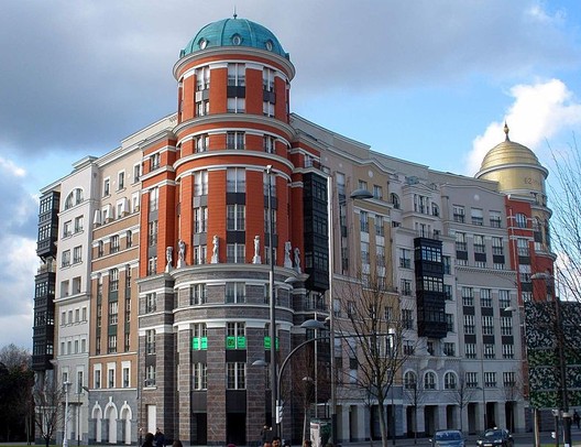
Edificio Artklass, in Bilbao, Spain. (Wikimedia user Zarateman)
ArchDaily.com has run a piece praising, if generally misunderstanding, six examples of new classical architecture. One applauds, and yet one would rather that it had appeared in Architect, the mouthpiece of the American Institute of Architecture. That would make it even more significant than the hit piece on modern architecture’s solipsism, “How to Rebuild Architecture,” published the oped page of the New York Times. Still, how can one not be glad to see it appear in today’s benighted architectural media!
The opening of “6 Classical Buildings that Are Younger Than You Think” sums up the importance of its appearance in this forum:
For the best part of a century, architectural discussion has been dominated by modernism and other related forms of futurism and functionalism. For some, this constant invocation of the radically new has begun to look quite tired.
No more so than its impact on the world’s built environment, I’d imagine! But how did those words get past the editor and into the first paragraph?
“Proving that New Classicism doesn’t haven’t to be backwards-looking,” Dario Goodwin assigns this quality to his six chosen buildings again and again, heedless that all human endeavor is backward-looking. Science, sports, fashion, automobiles, technology, cuisine, retail, crime, high finance, war, diplomacy, politics, agriculture, etc., all look backward for precedents useful to move into the future, as all architecture once did. Modern architecture and some of the arts are the only fields that bray fatuously that they do not look backward, even as they do so more-or-less slyly. (Many artists are beginning to join the classical architects in this brave new worldview.)
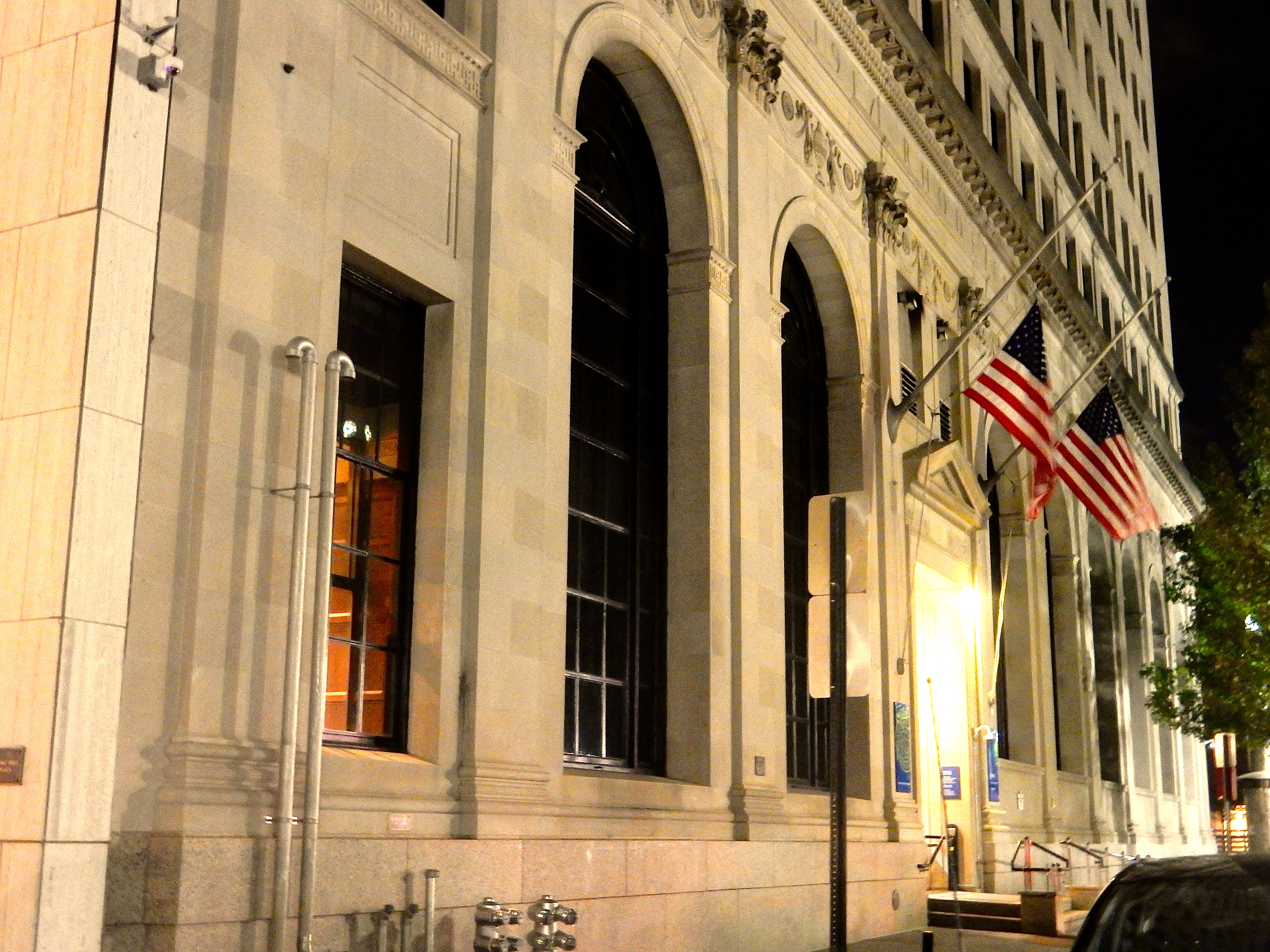
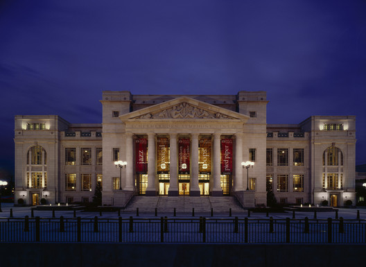
Architect David Schwarz has two buildings among the six, his concert halls in Las Vegas and Nashville. Of the latter, Goodwin writes:
The long history of classical form and Greek imitation in Nashville does soften the incongruity of the hall, but heavy reliance on imitating other concert halls from Vienna to Amsterdam does miss out on the sense of place that the Schermerhorn was intended to evoke.

Schermerhorn Hall, Nashville. (Hedrich Blessing/Steve Hall)

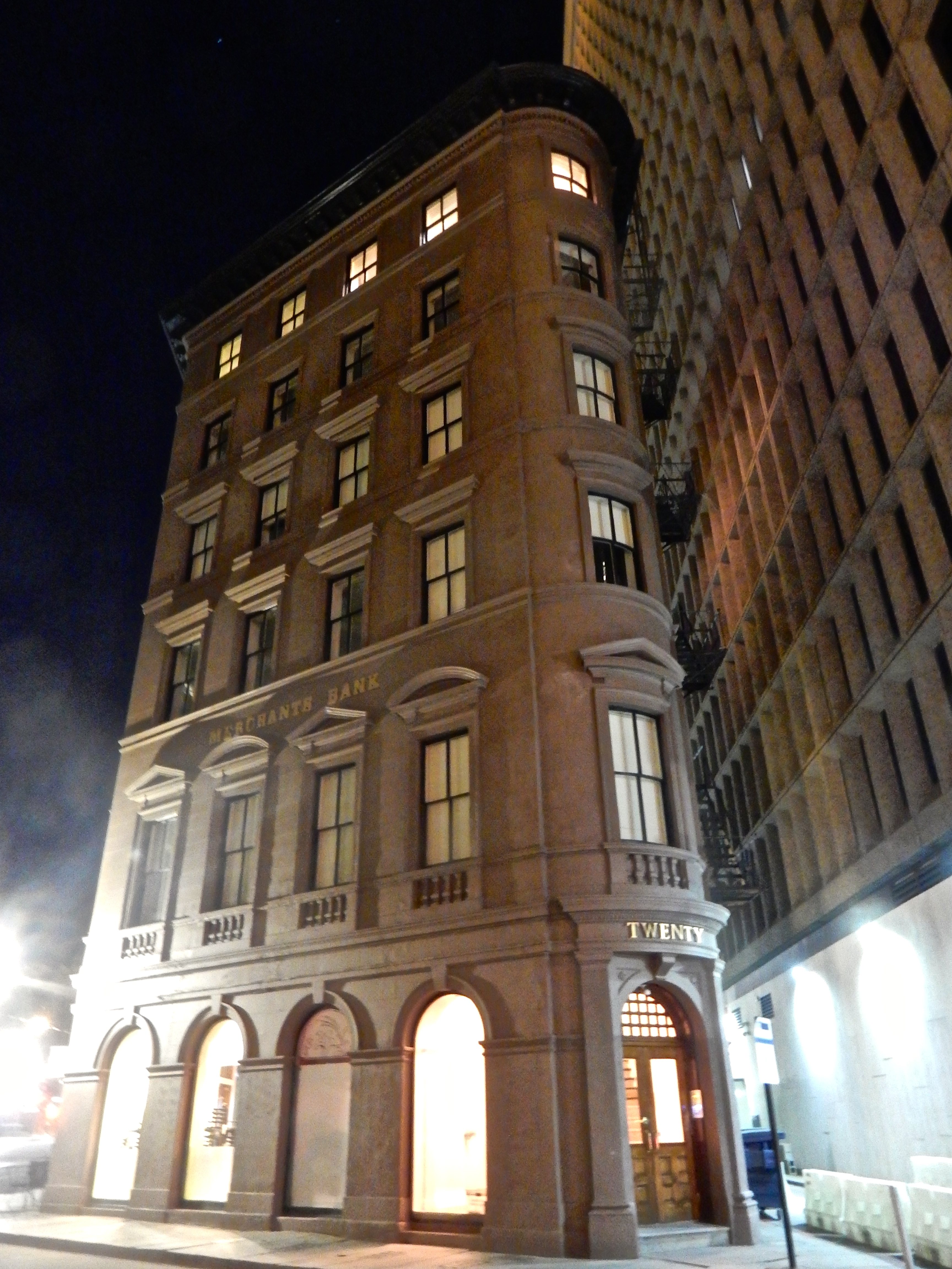
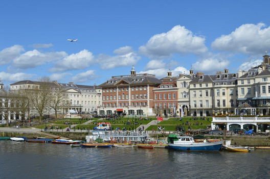
Richmond Riverside. (Flickr user Matt Brown)
Frankly, I cannot figure out what he means. Although Nashville’s fine collection of old buildings helps the Schermerhorn fit in, the reliance in Schwarz’s design on past precedent causes it to “miss out on the sense of place” it was supposed to evoke? How so? Unless Goodwin means to suggest that it is regrettable that the new concert hall does not fit in with Nashville’s proponderance of relatively recent and ugly modern buildings, it is impossible to grok a plausible meaning to that sentence.
Later, describing British classicist Quinlan Terry’s Richmond Riverside – so beautiful that some tourist guidebooks describe the complex outside of London as a collection of historic buildings – Goodwin describes Terry as “a favorite of the establishment.” One can only roll one’s eyes and wonder which establishment? Certainly not the one that controls building in Britain. Perhaps he refers to the establishment of one known as the Prince of Wales. Terry may well be his favorite architect, but even the war Charles won against the real establishment architect, Sir Richard Rogers, was lost when an arguably less obnoxious but still modernist set of buildings prevailed in the battle of Chelsea Barracks. Favorite of the establishment indeed!
The only one of Goodwin’s six buildings with which I was unfamiliar is the Edificio Artklass, in Bilbao, Spain, designed by Robert Krier and Marc Breitman. What a lovely ensemble! A sublime blend of multiple styles! (Or “pastiche” in modernist jargon.) Goodwin describes it as “an attempt to echo the traditional style of the Ensanche district of Bilbao, resulting in a more local flavor without sacrificing modernity.” Duh!
Does he imagine that most new classical stuff is built with old-fashioned plumbing and other functional elements that were once cutting edge – but oh! the cutting edge of the past stopped at the edge of modernism! So many modernists like to exclaim that hiring a classicist to design a building would be like asking a doctor to bleed you, or to apply the four humours to the diagnosis of your ailment! Give me a break!
This is the level of conventional modernist argument against new traditional architecture. Goodwin’s many errors (too numerous to discuss here) suggest that he, too, sips the Kool Aid and is genuinely surprised that the buildings he writes about in this article are not as old as he assumed they were.
Who might the anonymous editor be who put the idea for this article in his head? Does ArchDaily have a fifth column operating in its offices? Or is some editor suffering the ennui of constant “futurism and functonalism” that Goodwin refers to in his opening line? Or is Goodwin himself so bored that he has decided to rattle some cages?
Don’t know the answer, but the mere question fills me with joy, and I rise to high-five the author, regardless of his motivation or fawlty erudition.