The jury in the design competition for a World War I memorial near the White House in Washington, D.C., has narrowed more than 350 entries down to a final five. One of them, arguably two, are classical, and already the cynics are in full conspiracy mode.
I consider myself one of the cynics. The structuring of design competitions to exclude traditional entries is ubiquitous. So I buy into the theory that one of the 26 classical entries was selected to be dumped in the second round after providing the jury plausible deniability in the fairness sweepstakes. Except that the best classical finalist is not the worst by a stretch. In fact, it is quite good. And the other arguably classical entry is not half bad.
With only 26 of 350 entries classical, it is hard to argue that the selection was rigged by the jury – 40 percent of the finalists are traditional. (Classical architecture is a category of traditional architecture, although the many types of traditional sprang from ancient classicism.) Still, all the judges were modernists after the one judge allegedly sympathetic to classicism, Laurie Olin, was replaced with another mod.
But let’s overlook the conspiracy theory, which is unlikely to be exposed even if it holds any water. This memorial is important to me because one of my favorite watering holes is the rooftop café of the Washington Hotel, from which you can look down on the current Pershing Memorial Park. It doesn’t look like much, and it would be nice, while tippling, to have an imposing monument to look down on to the west when you are tired of looking down on the Treasury Building and its lovely colonnade to the north.
So let’s briefly analyze the finalists one by one, eyeballing the images on the website of the National World War One Centennial Commission. (Starting with the most classical finalist on top, I have ordered the images according to my assessment of their quality, best to worst. My opinion lacks the rigor of our thoroughbred classicists but is meant to bring my classical-tribune-of-the-public’s eye to bear on each entry. Click to enlarge, and then click again after placing your cursor over the part you want to examine even more closely.)
***
The best finalist, above, is a classical entry that wants to be a victory arch, but the arch seems plunged in a pleasant little grotto with a pond at the base of the arch that cries out to span a larger opening. This is the only proposal among the five that reads “memorial” and “monument.” All the others read memorial: one with dignity and the other three with a sort of vague symbolic mawkishness now mandatory for memorials today. Only this one also seems monumental – designed to commemorate a victory, soaked in sadness – that speaks a design language that will be legible a century from now. It does not need all the words etched into the arch’s abutment.
***
The above finalist is a park centered upon a statue of Gen. John “Black Jack” Pershing, commander of the American Expeditionary Force, retained from the existing memorial and surrounded by way too much flat stone surface, sitting upon a raised platform within a stone wall lined with bas-reliefs of the war – some are quite good – outside of which wall are trees. This memorial lacks the monumentality of the more forthrightly classical finalist above. It is hard but gentle. But it also lacks the sheepish reluctance to admit to being a war memorial that sullies the next three.
***
The third best finalist’s memorial seems like a maze, or a miniature golf course, but its winding path through grass and trees may also be a metaphor that reflects the architect’s misunderstanding of that distinctive feature of World War I – the trenches. Who knows! But it seems like a nice place to take a walk without being overly reminded of the depressing fact that a bloody war (our side won, and long ago to boot) is the subject being recalled.
***
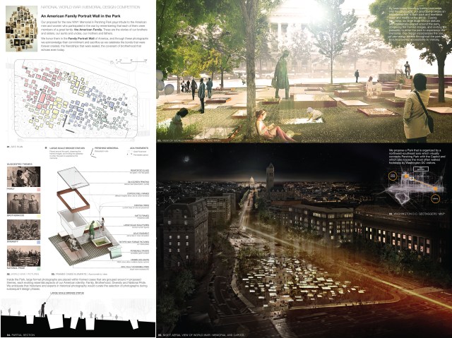
The fourth finalist – I do not want to use the word “best” any longer! – is an array of sunken museum exhibits displaying old photos of families that saw their loved ones sent “Over There,” some of whom did not return (a fact that seems to have been overlooked in the presentation). Four exhibit themes feature Family, Brotherhood, Diversity and National Pride. This qualifies as the most mawkish memorial, but refuses to embrace the goofy sculptural modernism of the vast majority of the 325 or so non-traditional entries.
***
 The fifth and the oddest memorial proposes, in essence, a book rendered as a park. It consists of an allée of cast glass monoliths “inscribed with text that recollects a comprehensive historical account” of the war – through which text may be seen cascades of water pumped through this long series of glass features, which sit atop bronze plinths that reflect the metal of the deadly machinery of war. There are the obligatory grass and trees. This finalist, too, avoided the most extreme modernist tropes. Bravo.
***
And indeed so did they all. Acolytes of Frank and Zaha can take no joy from this selection of victors. The most classical entry is clearly the superior. Its only real competition the jury left on the cutting-room floor.
Here is an account of the five finalists, with judges’ notes, by the Associated Press.


Pingback: WWI jury’s memorial mistake | Architecture Here and There
Pingback: More on WWI competition | Architecture Here and There
Pingback: The meaning of the memorial | Architecture Here and There
What to say? I think back to my grandfather who would simply scratch his head at all of these. Probably opt for the more stoically traditional – the very first, arc de triomphe – like. The rest leave me scratching my head – lit underground boxes too much like graves; #2 suffers from poor presentation in print form; the golf course appeals to my modernist nature and calls out for people by its unusual topography to stop and see where they are going, which way, and what is around them. The last is perhaps the most unusual. Keeping for those with non-crosses – would that work? Might be the most dramatic….
LikeLike
You are right about the finalist whose design was difficult to read. A couple of the ones lower down were, too, but it is hard to tell whether from bad design or bad presentation.
LikeLike
Thought you might enjoy this: – slightly tongue in cheek.
http://fredoneverything.org/a-treatise-on-the-nonexistence-of-art-pretty-nearly-anyway/
LikeLike