Delft tunnel in Amsterdam

Screen Shot 2016-08-14 at 11.20.01 AM.png

In the Cuyperspassage pedestrian tunnel, in Amsterdam. (materia.nl)

Amsterdam does everything it can to make it fun for walkers. You can see naked ladies in shop windows. Even the new tunnel from its central train station for pedestrians and bicyclists, called the Cuyperspassage, is bedecked with 46,000 blue Delft tiles depicting the sailing ship Rotterdam amidst the herring fleet in ages past. Here is a description, author uncredited, from the website Materia.nl, which seems to focus on high technology. The virtuosity of designer Irma Boom’s reimagining of a historic Delft tableau by Cornelis Boumeester on display in the Rijksmuseum gives rise to hope that beauty is not lost to every conception of high tech.

Lining the pedestrian side of the tunnel, these smooth, hand-shaped tiles are part of a spectacular tableau designed by Dutch designer Irma Boom. The tableau references a restored work by famed Dutch tile painter Cornelis Boumeester, whose works depicting the warship Rotterdam and the herring fleet is part of the Rijksmuseum collection. Boom however replaces the original crest on the stern with the Amsterdam coat of arms and added large and small vessels, crashing waves, seagulls and herring busses.

The mouth of the tunnel entrance itself represents a gentle approach to modernist design. As part of its work on the station, the firm Benthem Crouwel Architects designed the tunnel, which is used by 15,000 a day. And when the tiles eventually doff their cap to modernism, as described below, it is okay, because they have already done the heavy lifting of tradition.

As pedestrians and cyclists move through the passageway from the city, the tableau fades away as you move towards the Ij-river, before emerging again in the form of an abstract gradient of light to dark blue. This transition from classic Dutch imagery to abstract pixelation represents the journey from the historic district of Amsterdam to ‘new Amsterdam,’ as well as the evolution of Dutch artistic style over time.

… O-kay! I’d say that has it just about right. (A doffing of my own cap to my wife, Victoria, who sent me this fascinating tunnel article.)

Screen Shot 2016-08-14 at 10.57.17 AM.png

Entrance to the tunnel. (materia.nl)

Posted in Architecture | Tagged , , , , | Leave a comment

Credit for temple in Philly

Screen Shot 2016-08-12 at 8.16.23 PM.png

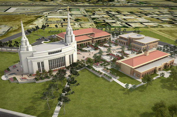
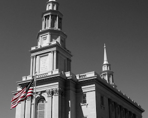
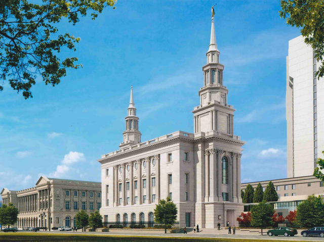
Rendering of new Mormon temple in Philadelphia. (deseretnews.com)

The level of astonishment aroused by the new temple in Philadelphia for the Church of Jesus Christ of Latter-day Saints is not limited to this small corner of the archipunditsphere. My recent laudatory post, “Mormon temple in Philly,” has generated more desire to recognize those responsible for its design than any other classical building I’ve written about. Here is my attempt to do justice.

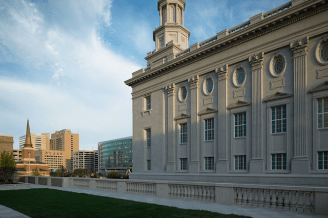
Mostly I will quote those involved citing others involved. Chief among those are the LDS officials in Salt Lake City who decided that a classical temple would be appropriate in Philly. To most people, this does not seem as if it would be a hard choice. But in a world where even the Roman Catholic hierarchy in Rome cannot be relied upon to select church designs that church goers will like, the pressure on ecclessiastical establishmentarians to knuckle under to the conventional wisdom (various versions of the Church of St. George Jetson) is intense. The decision was brave. Even during this period of rethinking in Salt Lake City, the church has commissioned a temple in Rome of that ilk. We are talking an awful lot of pressure, society being already marinated in the palpably untrue. But it is, I believe, pressure that has been resisted on behalf of Mormons in the Philadelphia area, among others, and should be resisted on behalf of Mormons everywhere.

A rendering of the Rome temple is below. It seems almost absurdly like the Philly temple. Both have two steeples. Is this a Mormon thing? No. Some LDS temples have two steeples, but based on a Google image search, just as many have one or three or four or more. This one is rather traditional, in a modernist sort of way. (Still, count me thankful that it seems to be outside central Rome.)

But I am straying. For reasons that will become clear, I cannot name the top church official(s) who made this courageous decision to resist the will to modernism in church design. But I can name some key players in the design process or, better yet, allow Roger Jackson to do so. He is the head of the Salt Lake City firm of FKKR Architects, which does a goodly amount of work for the LDS. I put out word on the TradArch list seeking those responsible for this excellent design, and Jackson responded with a cornucopia of interesting detail and process insight. Here is his email to me, which he has given me permission to print, and I have done so almost in its entirety.

***

I was asked to prepare a brief history of the design and description of the building for the client, which I’ll share  an excerpt of here.

Perkins+Will, one of three firms interviewed by the Church of Jesus Christ of Latter-day Saints for the Philadelphia Temple Complex, was awarded the project in January 2009.

Temple Design: Perkins+Will was initially requested to design a contemporary temple similar to the temples at Oquirrh Mountain, Utah; Rome, Italy; and Preston, England. A recent exhibit of Modern LDS architecture held at BYU was also suggested for reference. Perkins+Will and the Church’s temple design group developed and took forward a design that was initially approved, but ultimately the direction from senior Church leadership shifted and a Classical design direction was pursued.  At that point Perkins+Will suggested inviting FFKR to participate in the design of the temple (August 2010).  Given their depth of expertise in both temples and Classical design, FFKR was directed to design a traditional building to fit into the vernacular and architecture of the surrounding area.  With design approval in 2012, the design team moved forward together with Perkins+Will as executive architect and architect of record for the site design, underground parking garage / plaza, and the Temple Services Building; and FFKR as architect of record for the temple.  Perkins+Will provided design services for the temple’s architectural interiors as well as Furniture, Furnishings and Equipment design.

That’s all true.  The original design by P+W was, and would have been, a good building, but it was quite contemporary and ultimately not appreciated by senior church leadership.  We (FFKR, and me in particular) were asked to take the original design and make it more traditional and more fitting within the architecture of the city.  We spent several days wandering downtown and studying the beautiful civic and public architecture of the city.  We carefully selected precedent buildings to guide our work.  The LDS temples have a certain look, a “brand” if you will, but that word is too crass.  It is important to church leadership that the temple buildings look familiar, look like a temple, and that the membership can recognize it.  Secondarily, it is important that the buildings fit in with the architecture and building culture of the city they are in.  We are very deliberate about that in all our temple projects.  (You can look up our other temple projects in Kansas City, Mo.; Brigham City, Utah; Hartford, Conn. (in construction) and Tucson, Ariz. (also in construction).)

I was the principal designer for the exterior of the building. As we worked, the floor plan morphed and changed a bit as we worked to make the inside and the outside fit. Most of the design work was done by hand with hundreds of sketches exploring many many alternatives. Parallel to my sketching was Scott Woodruff working in SketchUp. When he’d catch up to me, or I to him (or when my tracings of tracings started to lean and distort), Scott would print me new elevations to scale and we’d continue. Everything is built on the patterns and proportions of Ware’s “American Vignola.” (Warning!!! Some of the know-it-alls on TradArch will say AV is way too boring and pedestrian and that there are other canons that are better. Maybe, but AV is the easiest and clearest canon of the orders there is. If designers everywhere would just use that and not get themselves lost in the weeds, the world would be much more beautiful.) SketchUp is perfect for traditional buildings because so many elements repeat. Others I mentioned, Steve Goodwin in particular, helped develop many of the various details, and Kevin Harrison built it all in REVIT [a brand of architectural design software] as if he were preparing the shop tickets.

The interior architecture and all the furniture and everything inside was developed by Scott Thompson and David Sheehan at P+W. Scott is a real talent, and experienced with, and knowledgeable about, traditional and historic interiors. They designed it, and we, as the architect of record, worked out all the details and built it into the REVIT model and construction documents. This was no small task.

All of this was done very collaboratively between the two firms, and working with the Church’s designers. All are very sophisticated builders with talented and seasoned professionals guiding the design, interior design, and project management. This three-legged stool really worked well.

In the middle of this, the church’s temple department had hired a couple of young designers educated at Notre Dame’s School of Architecture and other schools, in an effort to push more classical design into the temple projects. We were well down this road when they joined the team, but they were really helpful to us and were a great resource for precedent images and references, etc. These designs wouldn’t be what they are without their influence: Brad Houston, Spencer Dennison, and Paul Monson.

I’ll give a little background on our team. I went to architecture school at the University of Utah in 1984, a very modernist school. Of course we had history classes, but it was a slide show in a dark auditorium and then never talked about again. Working at FFKR in 1987, I had the great fortune to be assigned to a significant adaptive re-use, remodel project and seismic upgrade of a great building in downtown SLC – the Hotel Utah conversion to the Joseph Smith Memorial Building. I fell in love with old buildings and started to teach myself all the history and traditional/classical architecture I could. Several historic buildings later, we were invited to be the architect for the LDS temple in Vernal, Utah (the conversion of an old meeting house into a temple), then for the reconstructed temple in Nauvoo, Ill., and several more since then.  The Nauvoo temple received the Palladio award (2003) and it was there, at the Traditional Building Conference, that I discovered the ICAA and met Christine Frank and Steven Semes. [Semes initiated this call for credit where credit is due with a comment on my blog.] Who knew people were thinking about this and talking about this, and actually trying to do this?  It changed everything for me. Now I had a more direct source to teach myself  more.

Steve Goodwin’s story is nearly parallel to mine, having worked on some of these same projects.  He, however, had the opportunity to attend the ICAA’s winter intensive a few years ago.  The rest of our office, or at least the people working on these temple projects, is learning classicism and traditional architecture from us and from the local ICAA chapter.

[Here Jackson sent more material after I had pressed him for inside dope about why the LDS has shifted back toward tradition in its temple designs, at least to some degree.]

The question of design styles and design sympathies in the Church’s temples is a really good question. It is an on-going ever-evolving process for sure, and something we talk about often, amongst ourselves and with them. There are several factors at play here, including the personal preference of the Church’s leadership (not design professionals),  and the opinions of the design managers with whom we work, and their bosses. I don’t think there is any sort of official direction for the design of the temples. No one ever talks like that. It might be overly simplistic to say, but I think that current Church leadership likes more traditional designs. It could be just that simple.  But in the middle of this, the new temple for Rome, Italy (by another architect) was approved, and it is much more contemporary than others of the same time period. I also think, and this is just my own thoughts, that the designs moving forward will still be traditionally flavored, but will be simpler and more restrained. Our own project in Tucson, Ariz. (and others I’ve seen in the works lately) is evidence of that.

I hope this helps. A good resource for seeing these temples is the Church’s own website ldschurch.org or the private website (with more and better photos and information about all the temples) ldschurchtemples.com

***

Roger Jackson concluded his valuable comments by quoting back to me one of my favorite refrains: “Joy in modern architecture is a learned response.  Joy in traditional architecture is instinctive.” I think the more that LDS leadership recognizes that truth, the more likely they are to please more Mormons with their church designs.

Late in the process of developing all this information I got an intriguing email from Jason R. Dunham, of Nequette Architecture & Design of Birmingham, Ala., who wrote:

There has been criticism for a long time regarding the contemporary/modernist temple designs coming out of the LDS Church. Especially considering the wonderful early designs, mostly out west in Utah, Canada, etc., built in the mid 19th Century and early 20th Century. Finally, someone decided to do something about it. A valiant effort was made by an ICAA/NU member (and member of the LDS Church), Bradford Houston, who took a lead design position inside the LDS Temple department to begin to change the tide amongst the leadership. Fortunately, his influence was effective and a handful of the more recent temples have been inspired by traditional/classical principles and precedents.  I applaud this effort, and despite the Philadelphia Temple’s imperfections, is a big step in the right direction for the LDS Church.

Screen Shot 2016-08-12 at 8.14.25 PM.png

Posted in Architecture | Tagged , , , , , , , , | 6 Comments

Photochromatic coloration

Screen Shot 2016-08-11 at 7.58.26 AM.png

Bridge houses in Bad Kreuznach, Germany. (Library of Congress)

Here, in “Please Don’t Take My Photochrome,” courtesy of Geoff Manaugh at BLDGBLOG, are a good bunch of photochrome photographs of European and North African buildings housed at the Library of Congress. Manaugh writes: “Each image has a strangely volumetric beauty, enhanced by subtle depths of shade, that results from a development and printing process that also produced these otherworldly intensities of color.”

Yet, the sensibilities of today will mock these photos as virtually colorless. This merely demonstrates the mass deadening of perception that requires that only bright color is deemed colorful these days. Subtlety, whether in coloration or in virtually any other aspect of decoration or form, is out of style. Only boldness that pokes you in the eye or whacks you upside the head counts as creative nowadays. It’s the same in architecture and product design. If it’s not way different it’s not different at all.

Are all the buildings in these photos history? Even in Europe I dread to suppose that they are all long gone, as long gone as photocromy itself as an art or as a tool of documentation. The houses on the bridge pictured above, however, survive, according to Manaugh. The mere fact that he makes note of this suggests that most of the rest have been demolished. Manaugh also notes where “small moments of modernity” pop up, such as in the scene of the finicular (vertical cable railway) in Marseilles. But look just above at the tubes emerging from the buildings by which the nuns (?) stroll in Algiers!

The shots capture how time adds grace to architecture of a certain age. Some cities could serve as subjects for this beautiful photographic technique. New Orleans, Charleston, Providence, Boston – almost any city with a stock of old buildings that have not had their venerable qualities “restored” out of them.

Manaugh offers a link to more of these images from the Library of Congress. If you value the stroking of your senses, you will press that button!

Screen Shot 2016-08-11 at 8.18.49 AM.png

Nuns (?) passing through street in Algiers. (Library of Congress)

Posted in Architecture, Photography | Tagged , , , , , , , , , , | 1 Comment

Mormon temple in Philly

Screen Shot 2016-08-09 at 10.54.29 AM.png

Mormon temple in Philadelphia approaches completion. (Pinterest.com)

The Church of Jesus Christ of Latter-day Saints has put up a lovely new temple in Philadelphia, one whose traditional design has raised the eyebrows of the city’s leading architecture critic, Inga Saffron, who writes for the Inquirer. She praises the genuine quality of its forthright classicism, but readers may be forgiven for wondering if her plaudits are reluctant – that she feels a church in the 20th century has no right to look like a church.

Here, from “Mormon temple: Radical conservative upstart,” is Saffron’s lead, in which she takes my own line that new classical architecture is radical:

The new Mormon Temple on Logan Square may be the most radical work of architecture built in Philadelphia in a half-century. Clearly, that’s not because the gleaming classical tabernacle offers a fresh, 21st-century take on architectural form-making, or because the designers inventively use new materials, or because they stretch the limits of technology. It’s radical because it dares to be so out of step with today’s design sensibilities and our bottom-line culture.

Screen Shot 2016-08-09 at 11.40.35 AM.png

Temple front (Photo by Lizzy Gruber)

But really, Inga, this epitomizes the old saw that the it’s not Johnny who is out of step but the rest of the troop. Johnny is in step and in fact the rest of the troop is out of step. From the standpoint of any reasonable outlook on our built environment, not to mention the sentiments of the public, the Mormon temple is in step with what the times ought to be, and most of the clunkers nearby, seen in the picture on top, are out of step.

As Saffron points out, the temple was designed by a pair of firms better known for modernist buildings – or, as she puts it, “modern buildings” – as if a new building just erected were not by definition a modern building. Not modernist, necessarily, but modern. It is by such rhetorical flim-flam that the modernists maintain their stranglehold on culture. I wonder whether here Saffron is praising the two firms or chiding them:

The double-spired temple was jointly designed by two firms that generally are in the habit of making modern buildings, Perkins & Will in Atlanta and FKKR Architects in Salt Lake City, but they have gone all-in to make the Mormon sacred center a credible classical building.

Although I hold them in contempt of beauty for most of their work, I praise them here because they have courageously embraced real architecture, be it as an experiment, a sop to profit, or a joke. Any way you slice it, good for them! What the mainline architecture firms around the country and around the world don’t realize is that if they were to start designing buildings people liked, their profits would soar.

Classicists on the TradArch list have been mulling over this design, noting that the Mormons’ attempts at classical churches in recent decades give off more than a whiff of the McMansion. Here is architect Daniel Morales:

I see all the faults you see and more, but I also see them in many historical classical buildings.   The pilasters are too crowded, the plinths unrelated, the entablature above the ground floor has a stunted cornice, and the spire seems to slump away from where it should have risen.  More importantly though, I see an affirmation that this kind of attention to detail and the unapologetic attempt to create beauty from a tested language bodes well for us.

Those are the kinds of details I lack the erudition to pick up on, and so do most people, which is why they like classical more than modernism – the latter’s details are almost entirely obnoxious to normal, intuitive human sensibilities, while classical details need not be perfectly canonical (or perfectly noncanonical) to be perceived by most people as lovely.

But Saffron cannot move briskly along that archi-critical highway without her blinders on, so she concludes:

Some might wonder why the Mormons chose the early American architectural style. Many of their most beloved temples, like the one in Washington, are unrepentantly modern.

Most beloved of highfallutin critics like you, Inga, not most people. If the only Mormon temple in a community is modernist, it will be popular with its congregation, which has no choice in the matter. Like most congregations condemned to worship in the various versions of the Church of St. George Jetson, such ecclessiastical abominations only make it harder for believers to figure out the mysterious ways of the Lord.

Chapeaux off to Kristen Richards, who put Saffron’s piece on the entirely indispensable ArchNewsNow.com, which reminded me I should check out those TradArch emails.

Screen Shot 2016-08-09 at 12.14.43 PM.png

Side facade of temple. (phillymag.com/Intellectual Reserve Inc.)

Posted in Architecture | Tagged , , , , , , | 5 Comments

Duo Dickinson on Trump II

Screen Shot 2016-08-07 at 5.42.27 PM.png

Donald Trump (second from left) at a project site. (Common/Edge)

Three months ago, Connecticut architecture critic Duo Dickinson warned architects that the crowds with pitchforks backing Donald Trump might someday come for them. “Architects’ Trump moment” was well conceived. His latest venture into that political gulch, “Donald Trump as Architecture’s Nightmare Client,” is even better.

Trump thinks he’s right about everything, just like an architect’s nightmare client – often a major developer. To my surprise, Dickinson admits that many architects think they are right about everything, too.

Trump is a stereotype that architects recoil from (and yet occasionally earn a living through). The reason we work for them may be simple narcissism. Many of us are not-so-different from the Trumps of the world. Like a lot of self-directed leaders, the mirror should not just be a vanity vehicle—a good long look may reveal some deeper truths architects tend to shy away from.

So true. And yet, shortly after, Dickinson commits what commentators on the politics of foreign affairs used to call “moral equivalency.” Here he equates a crooked architectural establishment with the profession’s small segment of dissed traditionalists.

Modernist dismissal of any allusion to anything but other Modernist architecture is laughably tone deaf. The fearful outrage of a reactionary traditionalist minority is equally dismissive and judgmental.

That’s like putting the imperfections of the free market on a par with the sins of the totalitarian state. “The fearful outrage of a reactionary traditionalist minority”? Huh? Being oppressed by the architectural establishment is very different from modernists’ tone-deafness to the “allusions” made by their twee architecture. Dickinson comes close to throwing away the credibility he has built up in this essay.

Notwithstanding that – and I could notwithstand it all night, and quadruple the length of this post – please read Dickinson’s brilliant essay – again, on the Common/Edge website.

Posted in Architecture, Uncategorized | Tagged , , , , , , | 3 Comments

The good, the bad, the ugly

Screen Shot 2016-08-05 at 10.52.23 AM.png

Winning proposal for new home, in Smithfield district, for Museum of London. (standard.co.uk)

Simon Jenkins writes of plans for two new arts venues in London, one good, one bad. The bad, alas, builds on a former Olympics site, in the Stratford district, “ploddingly” rebranded as Olympicopolis, and exhibiting failure in its attempt at post-games life. The good one, a new home for the Museum of London, which understandably wants to flee its Barbican site, relocates in a way that refrains from wrecking but rather builds on the merits of its new host, the old Smithfield meat market. His piece is “The Best Way to Bring Life to London’s Two New Cultural Quarters,” in the Evening Standard. Two quotes, one from the bad, another from the good. First the bad:

Last week, after a decade of planning, a new “cultural quarter” was unveiled: museum-land meets Thamesmead. It is a row of three piles of boxes, a pastiche of 1960s Brutalism. They are supposedly for an art college, a ballet theatre (with a measly 600 seats) and an outpost of the V&A museum. A couple of apartment towers will loom over the site. It is as far from today’s “smart city” of integrated urbanism as could be imagined.

Now the good:

Switch to our alternative exemplar, Smithfield. Here is a classic down-at-heel neighbourhood, like the former Covent Garden or Borough or Portobello. Adaptable buildings line ever-changing streets and alleys. … [W]e heard last week of the winner of a competition to move the Museum of London to Smithfield from its location in the Barbican. The brief said simply that the museum should fit into the existing market fabric. It should re-use the old façades and streets. … The new museum, to be designed by Stanton Williams with Asif Khan, will respect the neighbourhood. It cannot impose an architectural egotism. Streets will remain. Spaces will inter-penetrate, old meld with new. … It will do what a museum should do, which is to civilise and energise its surround- ings. It will have no need to call itself Smithfieldopolis.

I have pastiched together the second quote. I went to the winner’s illustrations and while they do maintain some old facades, in the effort to “meld the old with the new” I see too much ego in the illustration. Maybe, with cost cutting, a pinch of the common sense that reality often mandates, and such-like, a more modest and more excellent attempt can be made to carry out that plan. Shamefully, the idea is for the London Symphony Orchestra to move into the Barbican site rather than the site proposed by Leon Krier, in Regent Park, which is far superior. (See my post “Krier’s symphony for London.”) Jenkins’s article also contains some valuable thoughts on the increasingly regrettable detritus of Olympic “villages.”

Screen Shot 2016-08-05 at 11.08.08 AM.png

Proposal for “Olympicopolis” in Stratford, London (The Guardian)

Posted in Architecture, Uncategorized | Tagged , , , , , , , | Leave a comment

Block Island weather station

Screen Shot 2016-08-03 at 10.56.03 AM.png

Former weather station on Block Island. (photo by Cliff Vanover)

My South County correspondent, Cliff Vanover, mapmaker extraordinaire, sent me the photo above of a fine old house on Block Island’s Beach Road. It was originally built and for a long time served as a weather station for the U.S. Department of Agriculture. Notwithstanding the sign in the photograph below, it is now privately owned. My correspondent’s name made me wonder whether it sits atop one of Block Island’s famous bluffs – a cliff, you see. I have asked for guidance on this.

The weather station was placed on the National Register of Historic Places in the decade-long congressional stint of former U.S. Rep. Claudine Schneider (R.-R.I.), affectionately known hereabouts as “Schneidine.” The nomination papers for the register describe the 1903 house, designed by the Washington, D.C., firm of Harding & Upman, as “a stark white Neoclassical block,” which I find ungenteel, but it continues much more pleasantly:

The portico, parapet and and surface ornament give the building a restrained monumentality and the dignity which the Chief of the Weather Bureau sought for his observatories. …

A single-story portico, supported by paired Doric columns, and a shallow, pedimented, central pavilion stretch across the southerly facade. The exterior is enriched with finely-drawn detailing, in- cluding channeled pilasters at the corners, a full entablature and an eared tablet, framed by scrolls, in the center of the frieze on the facade. The windows, capped by cornice moldings, have twelve-over-one double-hung sashes.

There was once an “instrument tower” on the flat roof. I imagine it must have been a reasonably ornate affair. At some point the instruments, which might have emigrated over time from the tower to the roof in full view of passersby, were eliminated and the house was sold by the weather service to a private individual. But it’s hard to imagine the “Chief” ever allowing the instruments to cavort on the roof in their mechanical nudity. After all:

By employing a design with the formal dignity of the Classical Revival, the Chief of the Weather Bureau hoped to bolster public respect for the weather service and its forecasts.

Even at this late date, my respect is bolstered by the agency’s decision to install one of its observatories in such a magnificent building. But it is diminished, somewhat, by the decision made in 1950 to abandon it. The station was moved to the local airport. Is there an agency presence on Block Island today? If so, I don’t even want to know what it is housed in. Still, if it is nice, readers are invited to let me know. Stranger things have happened.

In fact, the nominating papers describe changes in the portico and in the cornice balustrade that might have been restored to their original charm by subsequent owners. Does anybody know its more recent history?

A meteorological station of the same design was built at the same time among the grand hotels of Narragansett Pier. Does it survive?

Screen Shot 2016-08-03 at 10.56.16 AM.png

Posted in Architecture | Tagged , , , , , | Leave a comment

Tale of two library entries

Screen Shot 2016-08-02 at 10.25.12 AM.png

Clockwise from upper left: Library at Northwestern; Brutalist library at NWU; Washington entrance of Providence Public Library; Empire entrance at PPL.

Here is last month’s blog post for Traditional Building magazine. It applauds a recent Palladio Award winner, HBRA Architects of Chicago, for reopening a library entrance at Northwestern University that was closed in 1970 after a Brutalist new library was built. I compared this righting of a historic wrong to the as yet unrighted wrong of closing the beautiful Washington Street entrance to the Providence Public Library. Maybe someday the firm that rights that wrong will win a Palladio award.

Traditional Building has run a monthly blog post by me since January, and I’ve been running these a month later on Architecture Here and There. I have not run posts taken from AHAT because its readers have already seen them. For the last couple of months my posts for TB have been either from AHAT or a combination of AHAT and other material that readers have already seen there. The Palladio Awards, which are sponsored by Active Interest Media, which publishes TB out of Boulder, Colo., were celebrated in New Haven, Conn., on Tuesday, July 19. Here are the winners.

Posted in Architecture | Tagged , , , , , | Leave a comment

Lisbon’s new coach museum

Screen Shot 2016-08-01 at 7.25.47 PM.png

New coach museum in Lisbon. (Thomas Meyer/Demotix/Corbis)

I’d hate to be the architect of a new building that was described this way:

With its white cobblestone pavements, Moorish-tiled facades, and pastelarias (cakeshops) on every corner, visitors to Lisbon frequently feel that they’ve stumbled into a fairytale. So it comes as a surprise to discover that the new National Coach Museumhome to 70 glass, gilded and glamorous historic carriages – puts a brutalist end to such fabulist fantasies.

Fantasy Carriages Sparkle in Lisbon’s New Coaching Museum,” by Valerie Waterhouse in Travel + Leisure, is not exactly a ringing endorsement of the new museum, whose theft of Portuguese treasures from the old coaching museum in a glorious old palace sparked so much outrage and controversy a year or so ago.

Last summer I seconded the public’s outrage in “Lisbon coach catastrophe,” which got thousands of hits.

Citizens were right to feel wronged. Their nation’s coaching heritage used to be exhibited in a “much-loved, neo-classical Royal Riding Arena, which has acted as the 110-year-old museum’s main home until now.” Now refers to the new clunker by Brazilian celebrity architect Paulo Mendes da Rocha, who is, of course, a Pritzker Prize winner – which in plain language means designer of clunkers.

Waterhouse describes the new museum as “brutalist,” lower-casing the first letter, no doubt because she confused the modernist style widely known as Brutalism with the brutal effect that the style has on users and passersby. It comes from the French term for rough concrete, béton brute. The Penguin Dictionary of Architecture describes Brutalism as “handled with an overemphasis on big chunky members which collide ruthlessly.”

(Sometimes I get the impression that the widespread effort to burnish the reputation of Brutalism has caused an unintentional, and understandable, confusion in the public mind that modern architecture is a form of Brutalism rather than the reverse. In a way, it is.)

Waterhouse, who is certainly not riding the sort of hobby horse I ride on this subject, tried to put the best face possible on the new museum, suggesting twice that the museum’s architectural sterility allows its contents to shine all the more. But what about “form follows function”? Well, certainly when the old saw is invoked, form usually does not follow function. And form surely does not follow function here.

Thankfully, the old Riding Arena remains open to the public, and some of the coaches remain. Better to view eight coaches in a jewel of a museum, built in 1786, than 8,000 coaches in a “brutalist” box. The jewel is across the street from the box, and the box certainly diminishes the setting of the jewel.

I cannot resist a parting shot, from Valerie Waterhouse’s piece:

Visitors approach across a cobbled plaza, and enter a vast steel, glass and concrete box – raised on columns – via elevators or unadorned stairs. Once inside, the airy space has little to distinguish it, apart from a series of trapezoidal windows, some of which frame the Tagus river outside.

Screen Shot 2016-08-01 at 8.02.30 PM.png

Former Portuguese coach museum in Lisbon. (dreamstime.com)

Screen Shot 2016-08-01 at 8.01.50 PM.png

Inside the old coach museum. (lisbonstopover.com)

Posted in Architecture | Tagged , , , , , , , , | 1 Comment

Time to redo Lincoln Center

Screen Shot 2016-07-29 at 6.29.28 PM.png

Proposal, in 2000, for a new Lincoln Center by Franck, Lohsen & McCrery. (City Journal)

The Future Symphony Institute has reprinted on its website three plans to rebuild Lincoln Center, published in the autumn 2000 issue of City Journal, the quarterly of the Manhattan Institute. “A New Lincoln Center,” though or in fact because it is quite long, is a joy to read. Myron Magnet, the journal’s editor, before inviting three classical architects to describe their individual plans, launches such a memorable case against the architecture of the current Lincoln Center, and against modern architecture generally, that I would reprint the article even if it were completely without any timely rationale for doing so.

I sent a query to FSI asking about that. Its founder and director, Andrew Balio – he is also principal trumpet for the Baltimore Symphony Orchestra – replied with a plausible argument.

Indeed, the New York Philharmonic has begun the campaign to raise $500 million to renovate the inside of what is now called David Geffen Hall, formerly Avery Fisher. They have raised $100 million from Mr. Geffen. … It is a shame because they all need to be replaced with something such as you see in the article. For some reason, it has been deemed that Lincoln Center is worthy of historic protection status. I, and many , many people, do not share that view. So, it is still relevant!

To be sure. How magisterial for New York were the Lincoln Center to be rebuilt along lines reminiscent of New York at the apogee of its 20th century greatness even as pressure builds to do the same thing with Pennsylvania Station. New York can afford to do this. America can afford to do this.

On the other hand, maybe the current Penn Station into which we scuttle like rats should receive heritage protection status. It is verging on half a century long in the tooth, isn’t it?

Again, Magnet wrote his piece in 2000. His three classicists were Quinlan Terry, Robert Adam and the firm of Franck, Lohsen & McCrery. The FLC proposal brought to mind its proposal just a year or so later, also printed in City Journal, to rebuild the World Trade Center. If that classical plan had been selected, it would have been completed far sooner, for far less money, and Manhattan would have fallen in love with it.

It is too late for the World Trade Center, but a classically rebuilt Lincoln Center and Penn Station would work the same magic for New York City.

To conclude, I take a paragraph from Myron Magnet’s passages leading up to the three proposals. A tough job; still, choosing just one from the entire procession of his critical remarks must be described as a thankful task.

Most critics, as the individual buildings opened between 1962 and 1969, charged that they failed because they weren’t modernist enough. In fact, the reverse was the case: they were insufficiently traditional. As it was, the architects of the three principal buildings fell between two stools. As they attempted to cling to their modernist principles while at the same time making a nod toward the tradition of classical architecture, they created a kind of proto-postmodernism: modernist buildings with some traditionalist doodads tacked on. Lacking postmodernism’s smart-aleck “irony,” though, these buildings really are nothing but kitsch – sentimental and insincere evocations of something meaningful, without any understanding of, or passion for, the underlying ideal. So perhaps the best critic of the complex was Lyndon Johnson’s wife, Lady Bird, who at the Opera House’s opening gushed: “Ah have an impression of red; Ah have an impression of gold; Ah have an impression of chandeliers.” Crude impressions of bygone elegance, shreds and patches of tradition, is what Lincoln Center’s architecture is all about.

Screen Shot 2016-07-29 at 7.09.53 PM.png

Lincoln Center (wikipedia.org)

Posted in Architecture | Tagged , , , , , | 3 Comments