Mormon temple in Philly

Screen Shot 2016-08-09 at 10.54.29 AM.png

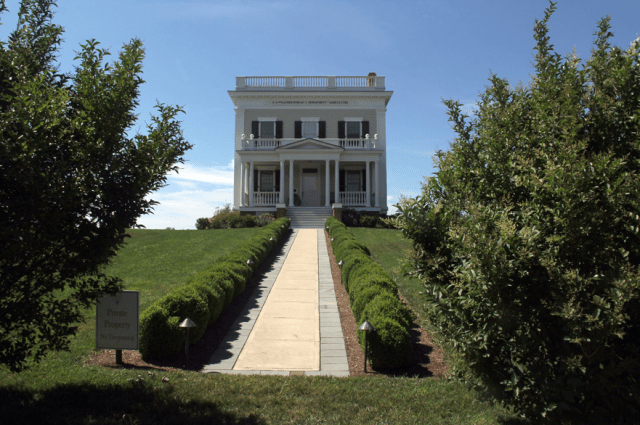
Mormon temple in Philadelphia approaches completion. (Pinterest.com)

The Church of Jesus Christ of Latter-day Saints has put up a lovely new temple in Philadelphia, one whose traditional design has raised the eyebrows of the city’s leading architecture critic, Inga Saffron, who writes for the Inquirer. She praises the genuine quality of its forthright classicism, but readers may be forgiven for wondering if her plaudits are reluctant – that she feels a church in the 20th century has no right to look like a church.

Here, from “Mormon temple: Radical conservative upstart,” is Saffron’s lead, in which she takes my own line that new classical architecture is radical:

The new Mormon Temple on Logan Square may be the most radical work of architecture built in Philadelphia in a half-century. Clearly, that’s not because the gleaming classical tabernacle offers a fresh, 21st-century take on architectural form-making, or because the designers inventively use new materials, or because they stretch the limits of technology. It’s radical because it dares to be so out of step with today’s design sensibilities and our bottom-line culture.

Screen Shot 2016-08-09 at 11.40.35 AM.png

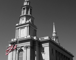
Temple front (Photo by Lizzy Gruber)

But really, Inga, this epitomizes the old saw that the it’s not Johnny who is out of step but the rest of the troop. Johnny is in step and in fact the rest of the troop is out of step. From the standpoint of any reasonable outlook on our built environment, not to mention the sentiments of the public, the Mormon temple is in step with what the times ought to be, and most of the clunkers nearby, seen in the picture on top, are out of step.

As Saffron points out, the temple was designed by a pair of firms better known for modernist buildings – or, as she puts it, “modern buildings” – as if a new building just erected were not by definition a modern building. Not modernist, necessarily, but modern. It is by such rhetorical flim-flam that the modernists maintain their stranglehold on culture. I wonder whether here Saffron is praising the two firms or chiding them:

The double-spired temple was jointly designed by two firms that generally are in the habit of making modern buildings, Perkins & Will in Atlanta and FKKR Architects in Salt Lake City, but they have gone all-in to make the Mormon sacred center a credible classical building.

Although I hold them in contempt of beauty for most of their work, I praise them here because they have courageously embraced real architecture, be it as an experiment, a sop to profit, or a joke. Any way you slice it, good for them! What the mainline architecture firms around the country and around the world don’t realize is that if they were to start designing buildings people liked, their profits would soar.

Classicists on the TradArch list have been mulling over this design, noting that the Mormons’ attempts at classical churches in recent decades give off more than a whiff of the McMansion. Here is architect Daniel Morales:

I see all the faults you see and more, but I also see them in many historical classical buildings.   The pilasters are too crowded, the plinths unrelated, the entablature above the ground floor has a stunted cornice, and the spire seems to slump away from where it should have risen.  More importantly though, I see an affirmation that this kind of attention to detail and the unapologetic attempt to create beauty from a tested language bodes well for us.

Those are the kinds of details I lack the erudition to pick up on, and so do most people, which is why they like classical more than modernism – the latter’s details are almost entirely obnoxious to normal, intuitive human sensibilities, while classical details need not be perfectly canonical (or perfectly noncanonical) to be perceived by most people as lovely.

But Saffron cannot move briskly along that archi-critical highway without her blinders on, so she concludes:

Some might wonder why the Mormons chose the early American architectural style. Many of their most beloved temples, like the one in Washington, are unrepentantly modern.

Most beloved of highfallutin critics like you, Inga, not most people. If the only Mormon temple in a community is modernist, it will be popular with its congregation, which has no choice in the matter. Like most congregations condemned to worship in the various versions of the Church of St. George Jetson, such ecclessiastical abominations only make it harder for believers to figure out the mysterious ways of the Lord.

Chapeaux off to Kristen Richards, who put Saffron’s piece on the entirely indispensable ArchNewsNow.com, which reminded me I should check out those TradArch emails.

Screen Shot 2016-08-09 at 12.14.43 PM.png

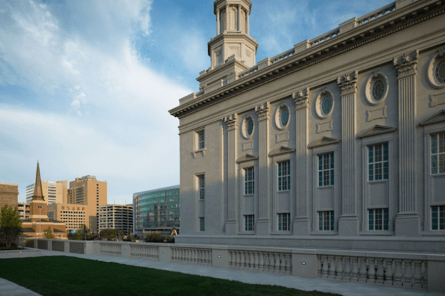
Side facade of temple. (phillymag.com/Intellectual Reserve Inc.)

Posted in Architecture | Tagged , , , , , , | 5 Comments

Block Island weather station

Screen Shot 2016-08-03 at 10.56.03 AM.png

Former weather station on Block Island. (photo by Cliff Vanover)

My South County correspondent, Cliff Vanover, mapmaker extraordinaire, sent me the photo above of a fine old house on Block Island’s Beach Road. It was originally built and for a long time served as a weather station for the U.S. Department of Agriculture. Notwithstanding the sign in the photograph below, it is now privately owned. My correspondent’s name made me wonder whether it sits atop one of Block Island’s famous bluffs – a cliff, you see. I have asked for guidance on this.

The weather station was placed on the National Register of Historic Places in the decade-long congressional stint of former U.S. Rep. Claudine Schneider (R.-R.I.), affectionately known hereabouts as “Schneidine.” The nomination papers for the register describe the 1903 house, designed by the Washington, D.C., firm of Harding & Upman, as “a stark white Neoclassical block,” which I find ungenteel, but it continues much more pleasantly:

The portico, parapet and and surface ornament give the building a restrained monumentality and the dignity which the Chief of the Weather Bureau sought for his observatories. …

A single-story portico, supported by paired Doric columns, and a shallow, pedimented, central pavilion stretch across the southerly facade. The exterior is enriched with finely-drawn detailing, in- cluding channeled pilasters at the corners, a full entablature and an eared tablet, framed by scrolls, in the center of the frieze on the facade. The windows, capped by cornice moldings, have twelve-over-one double-hung sashes.

There was once an “instrument tower” on the flat roof. I imagine it must have been a reasonably ornate affair. At some point the instruments, which might have emigrated over time from the tower to the roof in full view of passersby, were eliminated and the house was sold by the weather service to a private individual. But it’s hard to imagine the “Chief” ever allowing the instruments to cavort on the roof in their mechanical nudity. After all:

By employing a design with the formal dignity of the Classical Revival, the Chief of the Weather Bureau hoped to bolster public respect for the weather service and its forecasts.

Even at this late date, my respect is bolstered by the agency’s decision to install one of its observatories in such a magnificent building. But it is diminished, somewhat, by the decision made in 1950 to abandon it. The station was moved to the local airport. Is there an agency presence on Block Island today? If so, I don’t even want to know what it is housed in. Still, if it is nice, readers are invited to let me know. Stranger things have happened.

In fact, the nominating papers describe changes in the portico and in the cornice balustrade that might have been restored to their original charm by subsequent owners. Does anybody know its more recent history?

A meteorological station of the same design was built at the same time among the grand hotels of Narragansett Pier. Does it survive?

Screen Shot 2016-08-03 at 10.56.16 AM.png

Posted in Architecture | Tagged , , , , , | Leave a comment

Tale of two library entries

Screen Shot 2016-08-02 at 10.25.12 AM.png

Clockwise from upper left: Library at Northwestern; Brutalist library at NWU; Washington entrance of Providence Public Library; Empire entrance at PPL.

Here is last month’s blog post for Traditional Building magazine. It applauds a recent Palladio Award winner, HBRA Architects of Chicago, for reopening a library entrance at Northwestern University that was closed in 1970 after a Brutalist new library was built. I compared this righting of a historic wrong to the as yet unrighted wrong of closing the beautiful Washington Street entrance to the Providence Public Library. Maybe someday the firm that rights that wrong will win a Palladio award.

Traditional Building has run a monthly blog post by me since January, and I’ve been running these a month later on Architecture Here and There. I have not run posts taken from AHAT because its readers have already seen them. For the last couple of months my posts for TB have been either from AHAT or a combination of AHAT and other material that readers have already seen there. The Palladio Awards, which are sponsored by Active Interest Media, which publishes TB out of Boulder, Colo., were celebrated in New Haven, Conn., on Tuesday, July 19. Here are the winners.

Posted in Architecture | Tagged , , , , , | Leave a comment

Lisbon’s new coach museum

Screen Shot 2016-08-01 at 7.25.47 PM.png

New coach museum in Lisbon. (Thomas Meyer/Demotix/Corbis)

I’d hate to be the architect of a new building that was described this way:

With its white cobblestone pavements, Moorish-tiled facades, and pastelarias (cakeshops) on every corner, visitors to Lisbon frequently feel that they’ve stumbled into a fairytale. So it comes as a surprise to discover that the new National Coach Museumhome to 70 glass, gilded and glamorous historic carriages – puts a brutalist end to such fabulist fantasies.

Fantasy Carriages Sparkle in Lisbon’s New Coaching Museum,” by Valerie Waterhouse in Travel + Leisure, is not exactly a ringing endorsement of the new museum, whose theft of Portuguese treasures from the old coaching museum in a glorious old palace sparked so much outrage and controversy a year or so ago.

Last summer I seconded the public’s outrage in “Lisbon coach catastrophe,” which got thousands of hits.

Citizens were right to feel wronged. Their nation’s coaching heritage used to be exhibited in a “much-loved, neo-classical Royal Riding Arena, which has acted as the 110-year-old museum’s main home until now.” Now refers to the new clunker by Brazilian celebrity architect Paulo Mendes da Rocha, who is, of course, a Pritzker Prize winner – which in plain language means designer of clunkers.

Waterhouse describes the new museum as “brutalist,” lower-casing the first letter, no doubt because she confused the modernist style widely known as Brutalism with the brutal effect that the style has on users and passersby. It comes from the French term for rough concrete, béton brute. The Penguin Dictionary of Architecture describes Brutalism as “handled with an overemphasis on big chunky members which collide ruthlessly.”

(Sometimes I get the impression that the widespread effort to burnish the reputation of Brutalism has caused an unintentional, and understandable, confusion in the public mind that modern architecture is a form of Brutalism rather than the reverse. In a way, it is.)

Waterhouse, who is certainly not riding the sort of hobby horse I ride on this subject, tried to put the best face possible on the new museum, suggesting twice that the museum’s architectural sterility allows its contents to shine all the more. But what about “form follows function”? Well, certainly when the old saw is invoked, form usually does not follow function. And form surely does not follow function here.

Thankfully, the old Riding Arena remains open to the public, and some of the coaches remain. Better to view eight coaches in a jewel of a museum, built in 1786, than 8,000 coaches in a “brutalist” box. The jewel is across the street from the box, and the box certainly diminishes the setting of the jewel.

I cannot resist a parting shot, from Valerie Waterhouse’s piece:

Visitors approach across a cobbled plaza, and enter a vast steel, glass and concrete box – raised on columns – via elevators or unadorned stairs. Once inside, the airy space has little to distinguish it, apart from a series of trapezoidal windows, some of which frame the Tagus river outside.

Screen Shot 2016-08-01 at 8.02.30 PM.png

Former Portuguese coach museum in Lisbon. (dreamstime.com)

Screen Shot 2016-08-01 at 8.01.50 PM.png

Inside the old coach museum. (lisbonstopover.com)

Posted in Architecture | Tagged , , , , , , , , | 1 Comment

Time to redo Lincoln Center

Screen Shot 2016-07-29 at 6.29.28 PM.png

Proposal, in 2000, for a new Lincoln Center by Franck, Lohsen & McCrery. (City Journal)

The Future Symphony Institute has reprinted on its website three plans to rebuild Lincoln Center, published in the autumn 2000 issue of City Journal, the quarterly of the Manhattan Institute. “A New Lincoln Center,” though or in fact because it is quite long, is a joy to read. Myron Magnet, the journal’s editor, before inviting three classical architects to describe their individual plans, launches such a memorable case against the architecture of the current Lincoln Center, and against modern architecture generally, that I would reprint the article even if it were completely without any timely rationale for doing so.

I sent a query to FSI asking about that. Its founder and director, Andrew Balio – he is also principal trumpet for the Baltimore Symphony Orchestra – replied with a plausible argument.

Indeed, the New York Philharmonic has begun the campaign to raise $500 million to renovate the inside of what is now called David Geffen Hall, formerly Avery Fisher. They have raised $100 million from Mr. Geffen. … It is a shame because they all need to be replaced with something such as you see in the article. For some reason, it has been deemed that Lincoln Center is worthy of historic protection status. I, and many , many people, do not share that view. So, it is still relevant!

To be sure. How magisterial for New York were the Lincoln Center to be rebuilt along lines reminiscent of New York at the apogee of its 20th century greatness even as pressure builds to do the same thing with Pennsylvania Station. New York can afford to do this. America can afford to do this.

On the other hand, maybe the current Penn Station into which we scuttle like rats should receive heritage protection status. It is verging on half a century long in the tooth, isn’t it?

Again, Magnet wrote his piece in 2000. His three classicists were Quinlan Terry, Robert Adam and the firm of Franck, Lohsen & McCrery. The FLC proposal brought to mind its proposal just a year or so later, also printed in City Journal, to rebuild the World Trade Center. If that classical plan had been selected, it would have been completed far sooner, for far less money, and Manhattan would have fallen in love with it.

It is too late for the World Trade Center, but a classically rebuilt Lincoln Center and Penn Station would work the same magic for New York City.

To conclude, I take a paragraph from Myron Magnet’s passages leading up to the three proposals. A tough job; still, choosing just one from the entire procession of his critical remarks must be described as a thankful task.

Most critics, as the individual buildings opened between 1962 and 1969, charged that they failed because they weren’t modernist enough. In fact, the reverse was the case: they were insufficiently traditional. As it was, the architects of the three principal buildings fell between two stools. As they attempted to cling to their modernist principles while at the same time making a nod toward the tradition of classical architecture, they created a kind of proto-postmodernism: modernist buildings with some traditionalist doodads tacked on. Lacking postmodernism’s smart-aleck “irony,” though, these buildings really are nothing but kitsch – sentimental and insincere evocations of something meaningful, without any understanding of, or passion for, the underlying ideal. So perhaps the best critic of the complex was Lyndon Johnson’s wife, Lady Bird, who at the Opera House’s opening gushed: “Ah have an impression of red; Ah have an impression of gold; Ah have an impression of chandeliers.” Crude impressions of bygone elegance, shreds and patches of tradition, is what Lincoln Center’s architecture is all about.

Screen Shot 2016-07-29 at 7.09.53 PM.png

Lincoln Center (wikipedia.org)

Posted in Architecture | Tagged , , , , , | 3 Comments

The ‘architecture’ of CVS

Screen Shot 2016-07-27 at 12.59.26 PM.png

The pace of development drags in West Warwick, R.I., as in many other places, and the allure of a CVS drugstore grows. CVS, whose national headquarters is in Woonsocket, will not, it appears, even give special dispensation to a fellow municipal denizen of the Ocean State. The company insists on the ugliest architecture it can get away with. The Arctic Village Redevelopment Agency was recently turned down flat when it tried to get CVS to offer more embellishments for its proposed store in that community.

In the case of Arctic, it is supposedly the developer, who plans to build the building and lease the space to CVS, who is the villain. But if CVS raised the level of its architecture all across the board, not to good but to acceptable, it would still profit. The developer rejects improved architecture because it knows that’s the standard response at CVS to citizens who want to improve their communities. If developers insisted on something better, CVS would have to submit. If CVS insisted on something better, developers would have to submit. If citizens (customers) insisted on something better, both would have to submit. The cost of mouthwash might end up rising a penny. Or not.

On top of this post is a photograph of a decent CVS in Bexley, a suburb of Columbus, Ohio. At the bottom of this post is the CVS designed and pre- approved for Arctic – the one that the AVRA bent over backward to ask kindly for improvements. One sometimes has to resist the temptation to conclude that CVS hates the people and communities that are its meat and potatoes. Else why would it inflict this on them?

On CVS, Ignorance, and Bad Formula Retail,” by Andrew Faulkner, is from a blog in St. Louis, nextstl.com, that follows CVS and other big-box retail trends. Here is a key passage from Faulkner’s article:

Bexley became famous in the mid-1990’s for preferring an empty porn shop to a new McDonalds franchise. In the end it took over a decade for McDonalds to open a location. Cognizant of recent history and focused on the location, CVS worked under a stringent set of local planning guidelines to open a location at 2532 E. Main Street in 2006.

If Arctic, and West Warwick, and any Rhode Island community wants to get some respect from CVS, it is going to have to dig in its heels and demand to be respected. Most other places cannot have their citizens travel to CVS headquarters and make a big stink. But people from Rhode Island can. And most people involved in the development process – private businessmen, government regulators, regular citizens – don’t like being obnoxious. But incivility is certainly getting a leg up this year. If citizens and their elected (and appointed) leaders want to free their communities from the crap that CVS typically offers, they’ll have to grit their teeth and act like jackasses. Otherwise CVS and its ilk will not give them the time of day.

Other communities with guts and moxie have done it. Rhode Islanders have a longer history of in-your-faceness than most other places (remember the Gaspee). Maybe it’s time to consider something along those lines. And perhaps not just in regard to CVS.

Screen Shot 2016-07-27 at 9.09.20 PM.png

Design of CVS proposed for Arctic, in West Warwick, R.I.

Posted in Architecture, Rhode Island | Tagged , , , , , , | 8 Comments

Video of the modernist city

Screen Shot 2016-07-25 at 9.51.25 AM.png

Screenshot from “Spacial Bodies,” by AUJIK, from Kuriositas.

Here, courtesy of the website Kuriositas, is the city of modern architecture’s secret desire. The video of this imagined place is called “Spacial Bodies,” by AUJIK.  As described by Kuriositas, it “depicts the urban landscape and architectural bodies as an autonomous living and self-replicating organism. Domesticated and cultivated only by its own nature. A vast concrete vegetation, oscillating between order and chaos.” In short, it is the intended consequence of intercourse among the architectural theories of Le Corbusier, Mies van der Rohe, Moshe Safdie, Frank Gehry, Zaha Hadid, Rem Koolhaas and who knows what else. Filmed in Osaka, Japan. Here, residents every day get to experience the untamed order of the wild. Lucky them! If the image above already raises the hairs on your neck, go ahead and watch the video. It is architecture on LSD. Of course, this is a vision of design in submission to nature’s whim rather than design emergent from nature’s order.

Posted in Architecture, Video | Tagged , , , , , , | 3 Comments

“Strikingly modern” house?

Screen Shot 2016-07-23 at 6.36.53 PM.png

“House of the Week,” Saturday, July 23, Providence Journal (Photo by Sandor Bodo)

On Saturdays, when the “House of the Week” beckons in the Providence Journal, my wife and I guess its asking price. Victoria is usually closer. This week, the house at 346 Claypool Dr., an appealing traditional house built in 2007 overlooking Greenwich Bay in Warwick, greets us from the front page of the Homes tabloid section of the Journal.

While I wait for Victoria to take her swing – I am guessing $799,000 – let me pick a bone with the paper’s headline writers. They take every opportunity they can to suggest that a house is “contemporary” or “modern,” in this case “Strikingly modern.” Now, let me congratulate them for using the word modern properly, albeit probably by accident. (The online version uses the word “contemporary” in its headline.)

“Modern” means up to date. Any house with plumbing, electricity, heating and cooling systems that meet current standards is a modern house, whether it looks traditional or modernist. I’d bet that every House of the Week since the feature was founded years and years ago has been, in that sense, modern.

“Contemporary” means built in the recent past. In practice, however, it is frequently used to suggest that a house is … well, modern(ist), or at any rate not traditional, though very often, as here, it is traditional. In architecture, modernist is the opposite of traditional. It is easy to tell which is which.

If the owner, who hired architect Peter Twombly to design it for him, thought he was getting a “contemporary New England cottage,” he had better look more closely. It has a very few modernist tics – a Corbusier-style nautical stair rail in the rear, for example – and its furniture and furnishings lean toward the modernist. Still, its exterior is very much that of a traditional house, and quite nice.

As for whether it is a “cottage,” it is either too large to be a cottage in the normal sense, and too small to be a cottage in the Newport sense. Its 3,046 square feet of living space is twice as much as Victoria, Billy, Gato and I live in. That does not qualify as a cottage in either sense. But calling a house a cottage does sound cool and warm. Go for it.

Maybe I am being a fussbudget for even bringing this up. Maybe I am too much a stickler for using words as they are traditionally used. Language changes, and since “Realtors” (as reporters are instructed to call real-estate agents) don’t think “modernist” is a word that sells very many houses, I expect to see modern and contemporary slightly twisted to make more houses seem about as hip as the headline writers want to be themselves.

(Victoria just now guessed $700,000, below her usual acuity and more than a million below the actual asking price.)

Screen Shot 2016-07-23 at 7.33.51 PM.png

334 Claypool Dr., where the owner of 346 Claypool lived before he built it.

Posted in Architecture | Tagged , , , , , , , , , | 5 Comments

Pollan deconstructs design

Screen Shot 2016-07-22 at 8.19.58 PM.png

Michael Pollan’s A Place of My Own (1997) is the story of how a successful author of well-known books on food tries to free himself from the grip words had on his life by building a cabin for himself by hand in his own backyard. Of course, he does have an architect friend design it for him. He just wants to pound the nails and get the joists plumb and the floor level on his own. But, as usual, he feels he must read a lot about design and, so doing, he runs into trouble. Here is a passage from his chapter on the design process.

***

Take Peter Eisenman’s Tokyo office tower. What had baffled me [about it] as a building, or model, began to make a certain amount of sense once I’d read the accompanying text. Eisenman’s deconstructivist design is meant as “a kind of cultural critique of architectural stability and monumentality at a time when modern life itself is becoming increasingly contingent, tentative, and complex.” Evidently the wrenching dislocations and foldings of space in this building will help office workers in Tokyo experience the dislocations and contingencies of contemporary life on a daily basis. …

Making people feel uncomfortable is not merely the byproduct of this style but its very purpose. It sets out to “deconstruct” the familiar categories we employ to organize our world: inside and outside, private and public, function and ornament, etc. Some of it does seem interesting as art, or maybe I should say, as text. But it seems to me it’s one thing to disturb people in a museum or private home where anyone can choose not to venture, and quite another to set out to disorient office workers or conventioneers or passersby who have no choice in the matter. And who also haven’t been given the chance to read the explanatory texts – the words upon words upon which so many of these structures have been built.

Likening this kind of architecture to a literary enterprise is not original with me. Eisenmann himself claims that buildings are no more real than stories are, and in fact has urged his fellow architects to regard what they do as a form of “writing” rather than design. The old concept of design – as a process of creating forms that help negotiate between people and the real world – might have made sense when people still had some idea what “real” was, but now, “with reality in all its forms having been pre-empted by our mediated environment,” architecture is free to reconceive itself as a literary art – personal, idiosyncratic, arbitrary.

For me, the irony of this situation was inescapable, a bad joke. I’d come to building looking for a way to get past words, only to learn from an influential contemporary architect that architecture was really just another form of writing. This was definitely a setback.

Posted in Architecture | Tagged , , , , , | Leave a comment

Dicey dioramas of ruin porn

Screen Shot 2016-07-20 at 12.41.58 PM.png

Lori Nix and Kathleen Gerber have fashioned what might be described as apocalypic dollhouses to create an end-of-the-world sensibility. The result, from an article in Architizer titled “The Beauty of Decay: These Stunning Dioramas Depict Perfect Post-Apocalyptic Architecture,” brings to mind “ruin porn,” specifically photographs recording the decay of buildings in Detroit, and especially rooms in those buildings. But Detroit may be on the rebound, and revival is definitely not on the Nix/Gerber agenda.

What may also not be on their agenda, something they may not even have noticed, is the division in their work between traditional and modernist interiors. This has ramifications for the broader world of architecture. It seems that of their twelve dioramas, the first six show decay in rooms designed with traditional or even classical features, whereas the last six are, more or less, modernist interiors – one seems to be traditional renovated with a modernist sensibility (the old optometry classroom).

Like films whose set directors subconsciously have the good guys inhabiting traditional settings and the bad guys inhabiting modernist settings (see the Star Wars series), the Nix/Gerber dioramas show that intricately embellished interiors decay more elegantly than modernist interiors featuring purity of line and unembellished surfaces.

In these dioramas things seem to have gone beyond the point where, despite the headline, actual beauty has been lost. But it seems evident that, based on their relatively late stages of decay, it probably took longer for the first six rooms to lose their charm than the last six rooms.

Be it on an interior or exterior, time and weather apply a graceful patina. Architecture ages more like human beings than machinery. Age reveals character in people, whereas it haunts the unnatural materials of which machinery is made. Nowadays, of course, a room can often be made of materials common to machinery. They warp, rust, fade, stain, spoil and streak without the guidance offered by detailing and ornament, be it in buildings or antique machinery. Just compare an old Royal that has sat in an attic for twenty or thirty years with a Macintosh of like vintage.

It’s a good thing Architizer used the photo at the bottom at the top of its article, or I might have sat here wondering where they found these deliciously grubby rooms. What virtuosity of assembly, of art!

Hats off as well to Kristen Richards for putting the provocative set of photos by Nix and Gerber on her indispensable (and free) ArchNewsNow.com compendium of daily news from the world of architecture.

Screen Shot 2016-07-20 at 12.41.25 PM.png

Posted in Architecture | Tagged , , , , , , , , | Leave a comment