How to create great streets

Screen Shot 2019-08-25 at 8.47.44 PM.png

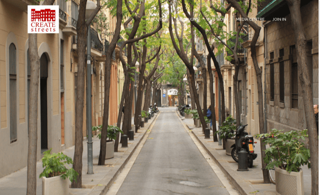
One of three photos that rotate slowly on home page of Create Streets’ website. (Create Streets)

Headquartered in London, Create Streets seeks to teach Britons and their place-making institutions how to make better cities and towns. Its mission does not hesitate to include beauty in its remit. Its founder, Nicholas Boys Smith, is now co-chairman (along with Sir Roger Scruton) of the Building Better, Building Beautiful Commission, which proposes to bring beauty into British housing policy. The main concerns of Create Streets’ activities and research are reflected in the commission’s newly issued interim report.

Screen Shot 2019-08-25 at 10.10.40 PM.png

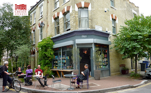
A second Create Streets image.

In Great Britain no less than in the United States, the revival of beauty as a factor in architecture and planning faces opposition from organizations that have spent the last half-century or more ignoring or denying the relevance of beauty in place-making. Beauty has been for decades the topic that dare not speak its name. Even as beauty has managed to creep back into the discussion, a definite tiptoeing through the tulips remains as a supposedly practical strategy for getting along and remaining relevant in a realm of scant design diversity.

Yes, beauty is the focus of a new commission of the British government, and the word is used regularly in its interim report. However, the building types used conventionally to “build beauty” for centuries, described with words like “traditional” and “classical,” are not named but only hinted at in lame euphemisms and roundabout formulations. Of course, the report is the work product of a government commission, so bureaucratese is hardly unexpected.

A certain squeamishness afflicts even those organizations most explicitly interested in beauty, however, especially if they promote traditional and classical architecture. One example is the Institute of Classical Architecture & Art in the U.S. Another example is the Congress for the New Urbanism, also in the U.S., which, to judge by its mission statement and the images on its website, has largely abandoned the traditional streetscapes that forged its early, lightning-swift transformation into a popular urbanist movement.

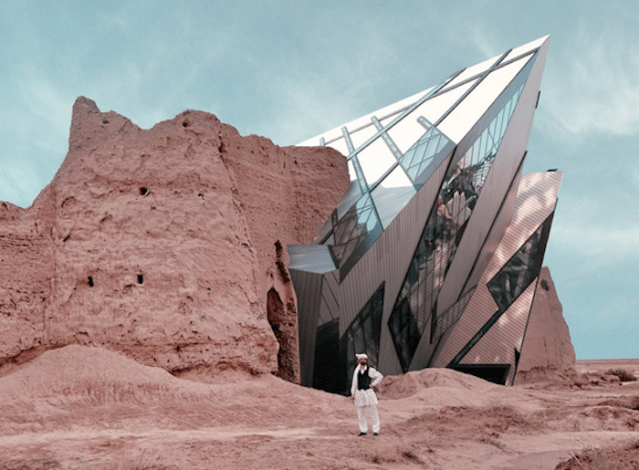
Even Create Streets has succumbed, to judge by its home page’s rotating images. Two of the three shots, top and middle in this post, are unabashedly traditional. The third may or may not be a photograph. It suggests a street in Amsterdam, with buildings scaled to create intimacy along a canal. Except that each design appears stiltedly pro-forma. Their creepy sets of mechanical “originality” and interlocking formulae face off across the canal. The façades conspire to create a brooding animosity. What’s with the lowering sky? It is as if the website designers were under pressure to include a modernist example, but despaired of finding a photo of an actual great street, so they made one up. Perhaps. Whether this is a photo or a render, the buildings collectively undermine the intimacy promised by their obedience to the dictates of scale and diversity, never mind the principle of beauty. How exasperating.

The understandable human reluctance to confront modern architecture head on makes it difficult for proponents of beauty to use words or pictures to articulate a cohesive message. Some will argue that such evasion is merely a temporary measure to facilitate progress. Eventually, however, this “can’t we all just get alongism” must be overcome if beauty is to be achieved rather than merely advocated.

Screen Shot 2019-08-25 at 8.48.39 PM.png

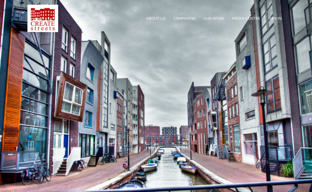
A third image on the Create Streets opening home-page screen is decidedly modernist.

Posted in Architecture, Urbanism and planning | Tagged , , , , , | 5 Comments

Renoir’s “problem nudes”

Screen Shot 2019-08-22 at 8.09.00 AM.png

Detail of “Bather With Blonde Hair” (1903) by Pierre-August Renoir. (Clark Art Institute)

I have not seen “Renoir: The Body, The Senses,” an exhibition at the Clark Art Institute, in Williamstown, Massachusetts, but an online correspondent sent me a titillating review of it by Peter Schjeldahl of The New Yorker, which is entitled “Renoir’s Problem Nudes.” I have absolutely no idea why my correspondent sent it to me (nevertheless I shield h/er identity), but it seemed like it might be some sort of challenge, so much so that I replied [trigger warning] “I wouldn’t touch that with a ten-inch pole.”

Still, this is a blog about design, mostly architectural but not exclusively. An Impressionist nude like Renoir’s “Bather With Blonde Hair” sits somewhere between a classical nude and a modernist nude, between a Titian nude and a Picasso nude. In architecture, an Art Deco building sits somewhere between a Wren and a Gehry. In both realms of art, a minor revolt against tradition precedes a major revolution, also, naturally, against tradition. Schjeldahl seems to view Renoir as the subject of a “purge” by “the more politicized precincts of the current art world.” The Clark exhibit has teed up Renoir as a stand-in for sexism. Art radicals are invited to swing away. He writes:

Everything in Renoir that is hard to take and almost impossible to think about, because it makes no concessions to intelligence, affirms his stature as a revolutionary artist. He stood firmly against the past in art and issued a stark challenge to its future. You can’t dethrone him without throwing overboard the fundamental logic of modernism as a sequence of jolting aesthetic breakthroughs, entitled to special rank on the grounds of originality and influence.

In that passage Schjeldahl presents Renoir as a revolutionary when he was, as an Impressionist, more of a hesitant dissident, dancing on the walls of the compound, as Tom Wolfe put it in another context, eager to be in the Salon even as he thumbs his nose at it. His nudes didn’t have the same sort of problems as a Picasso nude, with both eyes to the left of her nose or her breasts wandering around somewhere in the thoracic zone. Even Picasso’s nudes were natural compared to the nudes (if you can call them that) of the Cubists, who themselves were modest compared with some of the nudes who emerge after abstract painting went around the bend, at which point it was hard to recognize the body, let alone whether it was clothed or not. A similar progression in architecture, with a brief Art Deco/Stripped (but not nude) Classical period, followed the painting revo by about two decades.

I assure readers that this post is far less titillating than Schjeldahl’s New Yorker review, which itself must give way to the comments that accompanied my correspondent’s email, which shall remain under a cloak of censorship. Aside from the titillating, there is much fascinating material in the review that goes completely unacknowledged in this post.

Although I suppose it doesn’t make me any less sexist (to be a man is to be sexist, right?), to at least put my relative modesty on display, below is the sort of nude I prefer. It is by Jean Auguste Dominique Ingres, and is less sugary than the Renoir (to use the word Schjeldahl uses), with a more intelligent face. Is it entirely classical? I don’t know, but it’s classical enough to trigger my appreciation.

Screen Shot 2019-08-22 at 12.39.18 PM.png

“Odalisque in Grisaille” (c. 1824-34) by Jean Auguste Dominique Ingres. (Wikipedia)

Posted in Architecture, Art and design | Tagged , , , , , | 10 Comments

A tale of two fountains

Screen Shot 2019-08-19 at 3.40.21 PM.png

New British water fountain, left; old British water fountain, right. (reaction.life)

Nicholas Boys Smith is a founder of London’s new-urbanist Create Streets organization and is now the co-chairman of the British government’s Building Better, Building Beautiful Commission along with Sir Roger Scruton. Boys Smith had replaced Scruton after the latter was unjustly hounded by a social-media mob from the post, but now, with Scruton’s vindication and return, they serve together.

Given the dunderheadedness of the housing department leadership, it was a miracle that Scruton was so nobly replaced. It is worthy of note that the leadership did apologize and reinstate Scruton. As if to commemorate the event, Boys Smith has just written an almost Scrutonian essay, “We should build for the future, not just for the next few weeks,” about Britain’s new water fountains. Referring to the illustration above, he writes:

The fountain on the left is not just, to quote widespread criticism on social media, ugly, top-heavy, crass, garish and jarring but it is an object. Its form, positioning, colour and nature says “I am a temporary plastic thing meeting a need as cheaply as possible. I won’t be here for long.” Ironically, for a fountain intended to lance the dragon of an overly-disposable culture, it is itself a disposable object. It is not part of the city. It is not civil. It does not talk to the street or the neighbouring buildings but advertises at them. It might almost be selling sunglasses. Or blue paint. It is built for the next few weeks.

The fountain from 1859 is not an object but a modest bit of vernacular architecture. It is part of the city. It is civil. It talks to the past with its Romanesque arches and mini columns. But it is also clearly of its time and place with the pleasing busyness and over-elaboration in which the Victorians delighted. It is built to last and says so in stone.

Screen Shot 2019-08-19 at 4.28.17 PM.png

Athenaeum waer fountain. (AP)

It recalls the newly restored 1873 public water fountain on Benefit Street in front of the Providence Athenaeum. More to the point, it recalls The Golden City, whose author, Henry Hope Reed, began by pairing instances of classical architecture alongside modern architecture in New York City in order to show the superiority of the former, which was self-evident, requiring no explanation.

Boys Smith argues persuasively what in a sane world would be perfectly obvious: the importance of beauty not just as a balm to the eye in a largely hideous world, but as the key to humane endurance. Objects of beauty endure because people love them and sacrifice for their maintenance, repair and survival. The result is a lasting civic pride that instills love of place and of country, and also – as Scruton often points out – serves as a model of and inspiration for self-restraint, manners, and civic good behavior. (Almost all mass shootings occur in or near modern architecture and, I’d argue, not just because such settings are so common – in both senses of the word.) Nobody but a few cranks cry out to save “midcentury modern.”

So many seek so hard for a way to promote sustainability in a world frightened by the prospect of global warming and climate change. The answer is sitting in plain sight. It is called beauty – or sustainability, or to be more specific, classical and traditional architecture: the old way of building that prevailed for centuries prior to what architect Steve Mouzon (The Original Green) calls the Thermostat Age.

Screen Shot 2019-08-19 at 6.33.02 PM.png

Katrina Cottages, in Mississippi.

Windows that open and close admitted cool breezes or kept cold winds out. Thick walls conserved heat in the winter and cool in the summer. Verandas, shutters, deep window reveals, overhanging roofs and canopies over windows were features that moderated the sun’s hot rays and husbanded shade. Even site placement could help a house take advantage of terrain and local seasonal variations to maintain comfort.

The old-fashioned instruments of temperature regulation noted above – just a few of many – are available today, especially in places that we most revere. Instead, in our era, the HVAC industrial complex (air conditioning, furnaces, vast service crews, etc.) does the job at a hefty cost to wallet and climate.

How the older climate features are arrayed and decorated on any given building, old or new, and how they interact on a street, create a sense of place whose beauty incentivizes preservation. Preservation – not for historic reasons necessarily but for reasons of sustainability – avoids the waste of energy and materials inherent in the short lives of modern architecture. Constructing one building that lasts a century on a site wastes a lot less of everything than two or, more likely, three modernist buildings on the same site over the same stretch of years.

Much of this is stated or implied in Boys Smith’s example of the old and new water fountains of London. He writes:

A hospital is a noble building built for a noble purpose. It should not be built to look disposable and cheap. We need to rediscover the confidence and ability to create public buildings and objects of popular beauty and civic pride. When our approach to design is trapped by a narrowly utilitarian approach we build unsustain-ably and for the short term. Quick green not deep green.

freegreatpicture.com.png

Red booth. (freegreatpicture.com)

Boys Smith concludes with an example history provides of another famous piece of British street furniture: the telephone booth. The famous red structures were designed by Giles Gilbert Scott, who was inspired by the tomb of architect Sir John Soane’s wife Eliza. (It is actually not in a sylvan setting but in a cramped London churchyard.) Thousands were installed after 1924, when Scott won a competition of the Royal Fine Art Commission. (How art commissions have changed!) Then, in the 1980s the red booths were officially replaced by tedious modernist kiosks. Even as the modernist kiosks failed to engage the hearts of the public and soon began deteriorating and disappearing, the red booths, as they vanished, gathered value and inspired organized protectors.

[T]he classic, popular, beautiful pattern has not just survived, it has astonishingly made a revival. Many were listed. Charities and companies exist to find kiosks new homes and uses. Engineers and designers make good livings helping communities achieve this. Kiosks have been re-invented as defibrillators, pocket libraries, repair booths, even coffee shops.

Maybe Boys Smith and Sir Roger will, in their official capacities, begin a campaign to block the ugly new water fountains and replace them with restorations of the beautiful older models. The beauty commission should be recommending precisely that model for the affordable housing Britain so urgently needs – a model that would serve admirably to solve the housing needs of the United States. And not just housing but major public and private structures as well – for example, Penn Station in New York City.

Good policy is not so difficult after all.

theguardian.png

Tomb of Eliza Soane, wife of Sir John Soane, in Old St. Pancras churchyard. (The Guardian)

Posted in Architecture, Preservation | Tagged , , , , , , , , , , | 2 Comments

Destroying history to save it

Screen Shot 2019-08-16 at 8.36.25 PM.png

Daniel Libeskind’s Royal Ontario Museum addition superimposed on Rostam Castle. (Dezeen)

Placing iconic modernist architecture into ancient historical sites can help preservationists think about how to save neglected landmarks.

Allow that sentence to revolve in your mind for a minute and see what insights might be generated. … Huh? Not much happening, eh? Well, the line “We had to destroy the village to save it” may arise in the recollection of some people viewing the photomontages by Iranian architect Mohammad Hassan Forouzanfar. Six of his montages can be viewed in Dezeen, and also on ArchNewsNow.com as part of editor Kristen Richards’s policy to keep us all laughing out loud. (See my last post, “City hall as happening place.”)

In “Architect overlays famous modern buildings on Iran’s ancient palaces and castles,” India Block, for Dezeen, writes:

Forouzanfar has collaged these images to examine the tension between visions of the past and the future, and start a conversation about preservation.

Neither the architect nor the writer make any real attempt to spin the bull into anything resembling a coherent idea, except to assert that tension (of the “creative” sort, no doubt) was involved. Most of the article’s commenters appeared to grasp the scam. So I popped this right into my growing file of unintentionally humorous modernist posturing.

Of course the works of architects like Zaha Hadid, Daniel Libeskind, Norman Foster, and I.M. Pei are their own in-jokes, but it struck me as maybe a little bit obscene to juxtapose them with fragile UNESCO World Heritage sites. For an Iranian to do that to the historic treasures of his own country seems damnably subversive. Maybe that’s the idea.

Indeed, Forouzanfar’s concept does quite clearly suggest that the object of the exercise is destruction, supposedly acceptable to Dezeen under the pretense of preservation.

The Taliban’s destruction of the paired Buddhas of Bamiyan, Saudi Arabia’s destruction of historic sites in Mecca (to make room for modernist hotels and shopping malls), the Islamic State’s destructive rampages against the ancient archaeological sites and artwork of Nimrud, Ninevah and Mosul in Iraq, and in the ancient city of Palmyra in Syria (to give only a few examples from recent decades) suggest that this attack on Iranian heritage by modern architecture fits a distinct pattern.

[I would clarify that the Mecca demolitions are also motivated by thinking against idolatry under the Saudi Wahhabi (or Salafist) ruling sect similar to that of ISIS and the Taliban.]

Such horrors are hardly a laughing matter. The indigenous cultures of the developing world have long been targeted by neo-colonialist elements of modern Western culture with the eager participation of elites in the targeted nations, many having only recently secured independence from imperialist overlords. Furthermore, modern architecture has been used to help destroy historic cities and towns throughout Europe and America, and to ruin the investments of families who buy homes in historic neighborhoods as well.

Maybe that sounds overwrought to some readers, but modernism’s founding architects (Corbusier, Mies, Gropius, etc.) believed that the new architecture they pioneered, in which references to the past were strictly forbidden, also required the eventual eradication of all historical architecture. This was in line, not coincidentally, with the recognition of Lenin and other thinkers that “socialism in one state” was doomed to failure. Its economic rivals could not be allowed to undermine progress toward the radiant future.

So maybe these articles that have cracked a good chuckle in this corner are really not so funny after all but more a matter, as the red-diaper set used to say, of “boring from within.”

Posted in Architecture, Preservation | Tagged , , , , , , , , , , , , | 9 Comments

City hall as happening place

Screen Shot 2019-08-14 at 5.35.38 PM.png

The fun city hall of Kiruna, Sweden, 95 miles above the Arctic Circle. (fastcompany.com)

Still feeling the glow from “Introducing Gerhardt Fjuck,” and figuring I had dipped too often into the bottomless well of Monty Python’s “Architects Sketch,” I happened upon a piece from Kristen Richards’s ArchNewsNow by Emily Nonko on the website Fast Company. It is a serious laugh riot: “The community hub of the future isn’t a library or a shopping mall, it’s city hall.”

Seriously? The writer wonders that so few municipalities around the world have felt the need to transform their city halls into “community hubs.” In contrast to “the monumental city halls of yore, with echoing corridors and forbidding facades,” Nonko applauds those architects and planners who are reconceptualizing the staid old idea of city hall and

replacing it with something more human and playful. To their mind, city hall is a space for citizens to act out democracy alongside their elected officials—and perhaps grab a coffee or see a show while doing it. In the face of global unrest, online polarization, and the increasing commercialization of public space, city halls are quietly becoming the communal living room of the future.

Nonko moans that places like Kiruna, Sweden, 95 miles north of the Arctic Circle, have taken the lead from more stick-in-the-mud places like the United States. She notes that Kiruna City Hall has no guard station and you don’t have to sign in. Berlin’s national assembly has a glass dome by Norman Foster from which Germans can look down (their noses?) at their representative government at work. Democracy! Transparency!

What if local government stepped up and invested in a living room for all its citizens? What if our city halls welcomed us in, not just to submit paperwork or gawk at architecture but to celebrate, protest, peruse artwork, sunbathe, and read, right alongside our elected officials?

Nonko’s article goes on and on, with laugh line piled atop laugh line, for why indeed shouldn’t government be fun? Maybe some civic constituencies want municipal cafés and cinemas to compete with private tax-paying enterprises beyond the walls of city hall. Perhaps, after paying their taxes or attending in person their representatives’ latest follies (maybe viewed from above such shenanigans are easier to perceive!), citizens just want to stick around to embrace the inner child of their democracy. Sounds reasonable to me!

No. A thousand and one reasons leap up, waving their arms for attention in the competition for why city halls do not have cafés, cinemas and tanning salons within their capacious walls. Nonko ignores them all, and the result is a humorous tour-de-force that, long as it is, rewards perusal. Have fun!

Posted in Architecture, Humor | Tagged , , , , , , , , , | 3 Comments

New bridge in Providence

Screen Shot 2019-08-11 at 9.29.36 PM.png

The new pedestrian bridge over the Providence River opened Friday. (Photos by author)

The new pedestrian and bicycle bridge in Providence has nudged me out of my lane. Its design is modernist. I like it. This does not compute.

Screen Shot 2019-08-11 at 10.02.51 PM.png

Pont des Arts, in Paris. (Wikipedia)

I’d still prefer a traditional bridge, such as the one inspired by the Pont des Arts in Paris proposed, not long before his death, by the man responsible more than any other for the Providence renaissance. That would be Bill Warner. He was the architect who conceived of moving the Providence River, uncovering it, and lining it with river walks and lovely arched bridges, features that he also designed. He also conceived of the plan to relocate Route 195 to the south so that it no longer splits the Jewelry District from downtown. The pedestrian bridge sits on that old highway bridge’s abutments. Warner’s proposal for a pedestrian bridge across the Providence River, linking the two sections of the so-called “innovation corridor,” was thrown overboard after Mayor (now U.S. Rep.) David Cicilline decided to hold a design competition for the bridge, which was, I believe, rigged to allow only modernist entries.

So I have every reason to feel disdain for this bridge. I figured it would be one of those projects that would be improved by “value engineering” – that it would be trimmed, willy-nilly, into a traditional bridge. That’s what I had hoped, at least. Saved by the budget cutters! But that did not happen. The competition winner, InFORM Studio of Detroit, dropped a proposed bridge café as a cost-cutting measure, and the bridge opened on Aug. 9.

Screen Shot 2019-08-11 at 9.58.34 PM.png

Pedestrian bridge at sunset in July.

A few weeks ago, I saw from a distance, its wood flaming in the early evening sun (see the photo at left), and was smitten. On Sunday I strolled the span with my son, Billy, and while my flame for the bridge has dimmed – as had that of the wood now lit by a less brilliant sky – that very wood and its allure were difficult to resist. The sinuosity of the span’s curvaceous path across the river overpowered the metallic features that might have sunk the bridge had they not been rescued by its wooden elements: its sides, its deck, the arm rests atop its railings, and its curvy slatted seating – in short, almost all of it. The metal railings are the primary threat, indeed almost the only threat, to the natural feel achieved by the bridge’s wooden elements.

Screen Shot 2019-08-11 at 10.16.38 PM.png

Pedestrian bridge railing.

Yet even those metal railings – ten horizontal ranks of steel cording stretch between vertical steel posts, which seemed to be an obligatory reference to Le Corbusier – are set at a steep slant that leans over the bridge’s edge, and by following the curves of the span contribute to its voluptuosity. The steel posts are paced so as to offer a continuously pleasing rhythm as we crossed the bridge, further strengthening its opulent form. It appears that value engineering failed to rob this bridge of its luxury, which may account for its running 700 percent over its original $3 million budget. The bridge’s charming but modest forest of plantings cannot be blamed for that. (See Madeleine List’s story in the Providence Journal, “$21.9 million later, pedestrian bridge opens in downtown Providence.”)

Water under the bridge, as they say. The public will forget.

IMG_0386.jpg

View to east from pedestrian bridge.

Views from the bridge to the east are a delightful mixture of Fox Point’s wide variety of traditional architectural forms, cuddled among the trees. The view of downtown to the north from the bridge is one we all love, and the new bridge’s view of it is closer than from the Point Street Bridge and the Route 195 (“Iway”) bridge. It’s a much better view all the more because you need not risk your life to take it in, as you must from those two bridges, which form much of the view from the new pedestrian bridge looking south.

Plan your visit for the late afternoon or early evening, when the setting sun lavishes its golden rays on the Brazilian wood of the bridge’s northerly side (if the sides are made of the same wood as the deck).

Screen Shot 2019-08-12 at 2.43.02 AM.png

I-195 commission map showing Fane Parcel 42 (pink) blocking view of Wexford (brown).

But don’t forget that much of the view along the riverbank to the west is plug ugly, with that blotch of God’s wrath on architecture called the Wexford Science and Innovation Center (or whatever) adding to the carnage the I-195 commission seems intent upon inflicting on the Jewelry District. But, hey, in several years the view of the Wexford will be mercifully blocked by … the Fane tower! (I, for one, doubt it will be built.)

Okay, so my nose is a little out of joint from having to admit I like something modernist. It has happened before, but not so frequently as to dilute the pleasure of surprise. Go and you will see what I mean.

Screen Shot 2019-08-11 at 9.41.32 PM.png

Screen Shot 2019-08-11 at 9.42.48 PM.png

Screen Shot 2019-08-11 at 9.44.16 PM.png

Screen Shot 2019-08-11 at 9.28.51 PM.png

Screen Shot 2019-08-11 at 9.37.11 PM.png

Screen Shot 2019-08-11 at 9.48.09 PM.png

Screen Shot 2019-08-11 at 9.35.47 PM.png

Screen Shot 2019-08-11 at 9.49.40 PM.png

Screen Shot 2019-08-11 at 9.51.22 PM.png

Screen Shot 2019-08-11 at 9.38.00 PM.png

Screen Shot 2019-08-11 at 9.52.27 PM.png

Screen Shot 2019-08-11 at 9.53.37 PM.png

Screen Shot 2019-08-11 at 9.50.37 PM.png

Posted in Architecture | Tagged , , , , , | 10 Comments

Introducing Gerhardt Fjuck

Screen Shot 2019-08-07 at 7.37.09 PM.png

Comedy Central has put out a wonderful video spoof of modern architecture in the guise of Gerhardt Fjuck, an apparent play on Bjarke Ingels, the Danish designer of some of the world’s most ridiculous buildings. Videographer and humorist Arturo Castro plays Fjuck as someone everyone would just love to punch in the face, and who has designed the world’s five worst buildings, all icons of modernism that every viewer knows and hates.

Screen Shot 2019-08-07 at 9.07.01 PM.png

Bjarke Ingles (Wikipedia)

Entirely implausible. Nevertheless: Fiction meets reality.

As the editors at Comedy Central engagingly inquire, “Have you ever watched Daniel Libeskind or Bjarke Ingels speak in hollow truisms about inspiration and ‘creating the world’ and thought it was an elaborate joke, perhaps a Comedy Central sketch?” Well, this is that sketch.

The Man Behind the World’s Ugliest Buildings” is four minutes long and featured on Castro’s new show Alternatino.

“Architecture begins with a thought, a dream, a single line. But then you build it. And all of a sudden, the dream, you can touch her, she is real.” It is the culmination of all the ridiculous fundraising, condo-sales, and vapid inspirational videos out there. We won’t spoil the rest for you.

Enjoy.

Posted in Architecture, Humor, Video | Tagged , , , , , , , | 5 Comments

See “Divine Providence”

Screen Shot 2019-08-05 at 10.16.28 PM.png

On Sunday, Aug. 11 at 2:30 p.m., in the elegant RISD Auditorium (1940), the Rhode Island International Film Festival will feature Divine Providence: The Rebirth of an American City. Tickets may be reserved at this link for $10. How it qualifies as international may be open to question, but the documentary was in the works for at least four years, and I am glad its director, Salvatore Mancini, has finished the job. He says that it

focuses on the history and transformation of downtown Providence. The film traces Providence’s rise to greatness, defined by a handful of iconic architectural gems, examines the reasons for its decline, and then looks closely at the complex workings behind its triumphant rebirth. The film celebrates this special moment in Providence’s history, and the individuals who made it possible.

Screen Shot 2019-08-05 at 11.06.13 PM.png

Salvatore Mancini (NewWorks RI)

I saw it a few weeks ago at a far less elegant location: Brown University’s List Art Center, completed in 1971 as designed by the American Nazi architect Philip Johnson. Though I would quibble with a couple points made during its 57 minutes, and will do so after I see it again, I do not hesitate to proclaim the film’s overall excellence. The photography is lovely, the pacing is exquisite, and, along with these many shots and clips, the description of several featured buildings by my fellow architecture critic Will Morgan will make you want to see the buildings in person. This is a must-see, especially for newcomers to Providence.

Of the waterfront auditorium at the Rhode Island School of Design, the 1986 citywide survey of historic architecture by the Rhode Island Historical Preservation & Heritage Commission states:

Philip D. Creer, architect. A 5-story, steel-frame, brick-and-stone-clad structure in a modernized Georgian Revival mode. Its interior is a particularly fine example of the Moderne of the 1930s. The Georgian-cum-Moderne exterior was designed to harmonize with the Colonial and Federal buildings nearby and represents a continuation of the school’s [now discontinued] contextual architecture built beginning with the College Building at 2 College Street. Unfortunately, however, a number of architecturally interesting buildings were demolished to make way for this building, including John Holden Greene’s Granite Block of 1823.

One might quibble with this last judgment, since the demolished buildings were replaced, arguably, by something as good or even better. That has not been the case with more recent RISD buildings, especially the new wing of the RISD Art Museum, which is inferior to the parking lot upon which it was erected. Such history and such argumentation are what make Mancini’s documentary so fascinating, whether you agree with its judgments or not.

Screen Shot 2019-08-05 at 11.01.26 PM.png

Rhode Island School of Design Auditorium on Providence River’s east bank. (Wikimedia)

Posted in Architecture | Tagged , , , , , , , , , | 9 Comments

Return to ‘The Golden City’

Screen Shot 2019-08-02 at 11.06.43 PM.png

Henry Hope Reed (1915-2013) in front of the New York Public Library. (The Architect’s Newspaper)

I kid you not. The other day a correspondent wrote me out of the blue suggesting that I read a book called The Golden City, by Henry Hope Reed. “Curiously, Ron,” I replied, “I’m reading The Golden City right now.” This is probably my third or fourth reading of Henry Reed’s masterpiece, which is perhaps most famous for juxtaposing photographs of classical and modern buildings and ornament in New York City. His case against “the Modern,” as he called it, was made directly and with sublime force, a picture being worth … etc. But he supplied words as well. Below are some of them.

The passage, on page 54, must be read with a pinch of melancholy. In it he reveals his sense of an imminent collapse of “the Modern,” which by the time the book was published in 1959 had evicted classicism from the architectural establishment. Reed’s optimism was, alas, premature.

Already the fashion that would be taste has its academy, far more rigid and orthodox than the old classical academy. Without a single exception education in the nation’s architectural schools is confined to the “form follows function” approach. Textbooks have been written according to Modern strictures, and lately an emasculated form of history has been admitted to provide a prop for today’s originality. Yet with all their orthodoxy and power, ensconced as they are in key positions in museums, architectural firms, and schools, the Modernists remain uneasy. They who once prided themselves on being rebels are no longer rebellious. Against whom can the heroes of this “permanent revolution” raise their swords? All is not comfort in the bare office whose very aspect is a sign of weakness. Their contempt for the past and the living world about them, as a former trustee of the American Academy in Rome remarked to the author, is the best evidence by far that we are witnessing a temporary craze. No doubt there will be plenty of high blood pressure when the inevitable change takes place, but it will not stop the coming of a new architecture, new painting, and new sculpture when taste in its traditional sense, i.e., knowledge of the best examples of classical art, once again takes command.

Maybe it is a mistake to spotlight these words. The modernists’ command of the industry has strengthened considerably since Reed penned his book. He died in 2013, living more than long enough to see what happened, and how. The founding modernists – Mies, Gropius, Corbusier – were authoritarians, and their DNA infects the second, third, and fourth generations of modernist architects, even if few practitioners are actually aware of it. Every time they design a modernist building they express modernism’s retrograde principles, which are baked into their work and would cause them to shudder if they were more self-aware.

Bit by bit, however, they do grow more self-aware, for the strength of the truth is growing, too. The natural beauty and sustainability of tradition, and its basis in science, is becoming more well known. The public is learning that its preference for a house that looks like a house is not merely “a matter of taste.” The networks of classical and traditional architecture show impressive growth. Larger numbers of young people seek careers in the arts and crafts allied to classical design. The difficult battle for more traditional curricula in architecture schools is having its impact. The slowly expanding number of major commissions for traditionally designed development projects girds the success of traditional firms. Each new traditional project helps the public understand that beauty is possible today, and is not, as the modernists insist, some lost relic of yesteryear.  These trends are forcing architectural history, discourse, and practice toward an unnaturally suppressed cyclical change.

Murder will out.

As time goes on, Henry Reed’s ghost is sure to spin more gently in his grave.

Posted in Architecture | Tagged , , , , , , | 2 Comments

Save the Crook Point Bridge

Screen Shot 2019-07-31 at 11.37.35 PM.png

View from the bikepath below Dr. Agnes Somlo’s apartment at Wingate. (Photo by author)

Call me a stick in the mud, but climbing the 111-year-old Crook Point Bascule Bridge stuck in the up position since 1976 is not on my bucket list. However, since the last train chugged across the Seekonk River, pimpled daredevils in their uncounted swarms have made the rusty trek aloft sans sherpas, imperiling their own lives. Last year, the state of Rhode Island quietly decided to demolish the dangerous eyesore and nuisance.

Excuse me. I say it is art.

For me this goes against the grain. I prefer art that takes pride in beauty. Still, the bridge is central to the picture-window view of my dear mother-in-law from her comfy new apartment at the Wingate assisted-living center, overlooking East Providence from next to the IGA, now known as the Eastside Marketplace. Without the Crook Point Bascule Bridge saluting Agnes (Dr. Somlo to you) from downriver, I’m not sure she would feel as happy with her recent residential downsizing. Certainly the joy of my own frequent visits with Billy and Victoria would diminish, slightly, without the iconic centerpiece of her view to partake.

The old bridge is no less art than a nicely framed painting above the sofa.

Screen Shot 2019-07-31 at 10.31.28 PM.png

The Crook Point Bascule Bridge circa 1921. (Providence Journal)

The Journal’s Patrick Anderson reported today in “R.I. puts Providence’s distinctive drawbridge down for demolition” that the state plans to spend $6 million to get rid of the bridge, perhaps by 2027. “But the longer the bridge has thrust awkwardly into the sky between Providence and East Providence,” writes Anderson, “and the more decrepit it’s become, the more distressing the idea of losing it seems to many in the area. The bridge’s dark silhouette has been screenprinted on popular T-shirts, its symbolism of urban decay studied at Brown University and its rusted metal tagged by graffiti artists.”

See? The Crook Point Bascule Bridge is art. Even the Journal says so.

But if you still doubt that it should be saved, consider a state transportation project that RIDOT is now fast-tracking. I refer to the demolition and replacement of the Henderson Bridge, just upriver from the Bascule. Six million dollars could turn its underwhelming initial design into something much nicer, featuring a structural arch or a set of elegant pylons. Or it could help finance a shift that would bring the bridge over the narrowest stretch of the Seekonk, enabling the reconnection of Providence’s Waterman Street to East Providence’s Waterman Avenue. They end across the river from each other; their remarriage could be the beginning of a beautiful relationship, if developers are encouraged to build nice communities along each embankment. (See “Make Mr. Highways smile.”)

Whether for the purposes of art or urban design, the bridge should be saved. And if not for that, then to prevent the stupidity of throwing $6 million away for nothing. (Which sounds more in the policy line for RIDOT since the end of its glory days of moving railroads, moving rivers and moving highways, just a decade or two ago.)

No. Rhode Island’s Mt. Everest should be preserved.

Screen Shot 2019-07-31 at 10.30.03 PM.png

Closeup of the undercarriage of the Bascule Bridge. (Sandor Bodo/Providence Journal)

Posted in Architecture, Preservation | Tagged , , , , , , , , | 11 Comments