Ridiculouser and ridiculouser

img_12_1397344907_8d484e12f4e4be523e567a92356831a0

I’m sure some readers will think I’m getting tedious, but there seems to be no end to the asininity parading as architecture. The above abomination has been proposed for Queens. Will there ever be a time when real people find this so revolting that they … revolt? Here is the article at ny-curbed.com. Even they seem to perceive its absurdity. Don’t they have an opinion? Don’t they use their eyes? Their brains? Yes, I know, I’m getting monotonous. But so are these insults to everything human. Imagine having to live in Queens once that’s built. No, I cannot think it will be built. No, a thousand times no.

Posted in Architecture | Tagged , , , , | 2 Comments

Joze Plecnik. Gone fishing

Zapornice na Ljubljanici. (panoramio.com)

Zapornice na Ljubljanici. (panoramio.com)

Joze Plecnik in 1933.

Joze Plecnik in 1933.

The bridge above, in Ljubljana, Slovenia – I am assuming it is a bridge and not a dam – is by Slovenian architect Joze Plecnik (1872-1957), whose architectural style evolved, I gather, toward a sort of edgy Art Nouveau. He was born when Slovenia was part of Austro-Hungary, and died well before its peaceful but largely unnoticed, in the West, separation from Jugoslavia. Plecnik spent part of his life working in Prague, especially adding many bits and parts to Prague Castle. Plecnik was caught up somewhat, but clearly not disastrously so, in his field’s growing resistance to traditional form. This bridge proves that Plecnik had a great sense of humor.

Plecnik is, I believe, one of the architects Andres Duany hopes, in his upcoming book, or treatise, called Heterodoxia Architectonica, to reclaim for classicism after they have spent decades in absurd modernist re-education camps. (Louis Sullivan is another such prisoner of modernist architectural revisionism.)

I have looked without success for confirmation of news that a longstanding exhibit of Plecnik’s work, with a host of fabulous wooden models, at Ljubljana’s city museum was closed because current new Slovenian architecture being promoted by the authorities (often, says my source, quite good) looks tepid next to Plecnik.

In short, I am fishing for evidence of modernism’s totalitarian bent. The facts may not bear out my meme, but I lack facts. Meanwhile, below are a couple more images from Ljubljana, which I gather is considered one of the next undiscovered tourist destinations.

View of Ljubljana, with Triple Bridge, by Plecnik, just below center.

View of Ljubljana, with Triple Bridge, by Plecnik, just below center.

View over Triple Bridge toward Franciscan Church of the Annunciation.

View over Triple Bridge toward Franciscan Church of the Annunciation.

Posted in Architecture, Architecture Education, Humor, Other countries | Tagged , , , , | 9 Comments

More architectural humor

Salt-Lake-Mid-Century-Modern-Home-14Actually, some of the best humor is unintentional, so welcome to “How to Remake Your House into a Midcentury Modern Masterpiece,” or whatever it’s called. Very funny video, apparently from the HGTV network, Home and Garden TV. The question is whether it is really a parody. I think not. It is funnier in earnest. It is here. I am still looking for something that rises to, or at least toward, the level of Monty Python’s architecture skit. Good luck!!!

Posted in Architecture, Humor | Tagged , , , , | Leave a comment

Romantic humor

Manastirea Voronet, in Romania (casa-lina-sucevita.ro)

Manastirea Voronet, in Romania (casa-lina-sucevita.ro)

Life is odd, and so must be, by definition, blogmaking. I was trolling YouTube – “architecture humor” – trying to find something to match Monty Python in its ability to bring more readers to my blog. When I posted Monty Python’s skit on architecture my blog back in March, I got more hits by far than ever before. So I tried again and came across a video called “Manastirea Humor,” and a sign for “Manastirea Humorului,” which I figured might not be funny but might fit in with my meme that architecture around the world may be traced back to its own native forms of classicism. I thought this might be an example from the Far East. I googled Manastirea Humorului and found that it was a village in Romania. I am a quarter Romanian, a quarter Hungarian, a quarter German and a quarter Norwegian. But I almost never find things that tickle my Romanian quarter. This does. But it falls more under the category of beauty than humor. Still, you may view it here. (Yes, I plan to return to the search for something funny.)

Posted in Architecture, Humor, Other countries | Tagged , , , , | Leave a comment

Blast Past: Biltmore nose job

BILT_7-640x480 As mentioned in my last column about the Dean Hotel, the Biltmore almost received a sockdologer right in the kisser back in 2003. I condemned it as a “nose job for the Biltmore” in a column back then, and it was never built. The local architecture firm 3SIX0 did not much appreciate my analysis, any more than they liked my thumbs down for their Sopwith Camel Gas Station pedestrian bridge (with Friedrich St. Florian) a few years ago. (Though I assume they liked my praise for their interior design of the hair salon in the Smith Building, where I lived at the time.) Their bridge design took second place in what I believe was a rigged competition – rigged to exclude any but modernist designs. I keep hearing that the bridge design submitted by a Detroit design firm, which won, will still be built as part of the Route 195 land project, but I have seen no evidence of that. [Update: It is set to open soon.] Anyway, my column on the Biltmore nose job follows, and you may read the architects’ defense of their proposed proboscis for the hotel here.

A nose job for the Biltmore?
September 11, 2003

MY FIRST TWO WEEKS in Providence, in 1984, were spent at the Biltmore Hotel, courtesy of The Journal. Until I moved downtown in 1999, my “commute” from Benefit Street took me along Dorrance Street, in front of the Biltmore (built in 1922), and under its entrance canopy. I figure I’ve walked under it 14,000 times.

It is like an old friend. Now the Biltmore wants to trade in its old canopy for a new one.

The idea is to extend its reach so that it protects automobiles from the rain, and not just people on foot, like me. Designing the new canopy is a Providence firm called 3SIX0, whose creative brilliance can be seen at Lumiere, the ritzy new hair salon in the Smith Building, behind City Hall. 3SIX0’s canopy design was unveiled officially at Monday’s meeting of the Downcity Design Review Commission.

Weeks ago, as a courtesy, the panel was shown a preliminary version of the design. It looked like the love child of a row of elm trees and an Erector Set.

In architectural terms, the proposed canopy partook of Art Nouveau, like Paris’s Métro canopies. It undulated voluptuously in form, but was unadorned. Art Nouveau, like Art Deco a bit later, features ornament of considerable exuberance, albeit not classically inspired. The canopy had no ornamental scheme at all. It looked more like a modern sculpture accidentally attached to the Biltmore.

Most of the panel took a reticent stance toward that initial proposal, expressing a commendable reluctance to permit such a major change in the building. The panel’s job is, after all, to protect the historical character of downtown. Was the initial design intended to test the panel’s willingness to approve a major change that would clash with the hotel’s historical character? Or was it just too early in the design process for detail to be provided?

On Monday, a more subdued, more graceful version of the canopy was unveiled. It was less robustly undulating but, alas, no more robust in the level of ornamental detail provided. Most of the panelists stood by their reticence. The architects were asked to return with evidence of how the canopy would fit into the hotel’s broader historical context.

To convince the panel that the design was indeed historical, much was made of how its curvy form reflects supposed “Adamesque” influences on the Biltmore’s design. The Scottish architect Robert Adam (1728-92) popularized, in England and America, a more whimsical approach to classicism, especially in his interiors. And the Biltmore does feature Adamesque undulation in the lobby. Outside, the facade is a relatively straightforward mixture of Beaux-Arts and Neo-Georgian styles. It does not undulate. It calls to mind an Italian palazzo. The existing canopy even sports a ducal motif.

Any new canopy must try to relate primarily to the exterior of the Biltmore, not the interior.

Soon, presumably, the design will begin to show the sort of detailing that might enable an undulating canopy to fit in with the hotel’s classical facade. Or it should be candidly admitted that the panel’s protection of historical character is indeed being challenged – a legitimate challenge, but of a type that I believe will (and already has) hurt Providence.

One panel member, Barbara Macaulay, urged the panel to embrace change. She was seconded by architect Friedrich St. Florian, who also spent his first two weeks in Providence at the Biltmore. Referring to the old canopy’s modest size, and the possibility that it was an afterthought of New York architects Warren & Wetmore, he called it a “pimple.”

Better a pimple than a carbuncle on the face of an old friend, as Prince Charles put it in 1984. In the end, at the Biltmore as at the National Museum, in London, to which Charles referred, a creative solution that also respects history can be found.

Capital Center update

A disappointing turnabout in the design of Parcel 6, between the Moshassuck River and the railroad tracks, was unveiled at the Capital Center’s design-review meeting on Tuesday. After three work sessions, a low apartment block’s overly horizontal (and hence suburban) look had been largely eliminated, providing greater verticality and hence compatibility with the historic architecture of nearby College Hill. But now they’ve replaced brick with metal in bays that were already too “techy,” re-introduced the look of horizontality with alternating layers of colored brick on the primary façades, and, on a second apartment block, dumped gables and added elements that make its three wings look like they belong on a completely different building.

In short, the architects listened to Prof. Derek Bradford, the panel’s arch-modernist (it has no classicists). The others, having applauded months of progress, had nothing but applause for its reversal.

David Brussat is a member of The Journal’s editorial board. His e-mail is: dbrussat@projo.com.

Posted in Architecture, Architecture History, Art and design, Blast from past, Preservation, Providence | Tagged , , , , , , | 7 Comments

My 777 conspiracy theory

jet777A little (okay a lot) off topic, but like many I cannot forget about the poor jet and its passengers and their fate.

But didn’t the abrupt switch away from the possibility of a hijacking and the constant focus, thereafter, on satellite images of wreckage that turned out to be trash and now on pings seem a bit suspicious to you? It did to me. So finally, in desperation, I sent this comment to a blog I follow, the Riparian Times:

I cannot get anyone to listen to my relatively simple conspiracy theory (does that mean it cannot be a conspiracy theory, which only come in the complex variety?). It is that the plane was hijacked by terrorists, either the pilot, his co-pilot, terrorists among the passengers, or some combination. They tried to make it look like the plane had ditched, then flew it to a deserted island or up to Khazakstan, Pakistan or someplace where a newly paved landing strip awaited. Meanwhile, the Malaysian authorities, maybe pressured by the U.S., got the search focused overtly on a loss at sea but covertly continued to play out the possibility of a terrorist hijacking – not for ransom (alas for the passengers) but to have a jet to fly into a tower on some not too distant tomorrow. So the media, perhaps in cahoots or perhaps because they are easily played anyway, has been focusing on the fake sea crash since the too-abrupt switch from coverage of the pilot’s computer and the switching off of the electronics and the crazy satellite routing evidence. No mention thereafter of his political interests or the breakup of his marriage, and no mention – shh! – of the possibility that there remain alternatives to a sea crash since no real evidence, even to this date, has emerged to support it. Meanwhile, the CIA and everyone in spooksville are trying to find that plane on land, and when they find it they will make a big deal of hoodwinking the whole world to focus on the pings and the satellite shots of “wreckage” for weeks. Well, that’s my theory and I’m sticking to it.

Actually, I think this is the last best hope for the passengers. I’d rather believe that they have a chance (at the cost of maybe the terrorists getting away with stashing a jetliner), however slender, than consign them to the deep with so little evidence.

Posted in Uncategorized | Tagged , , , , | Leave a comment

Column: The Dean and The Sportsman

The Dean Hotel, on Fountain Street in downtown Providence. (Photo by David Brussat)

The Dean Hotel, on Fountain Street in downtown Providence. (Photo by David Brussat)

Word in 2012 that the Sportsman’s Inn, on Fountain Street in downtown Providence, half a block from The Journal, was to become a boutique hotel was not altogether welcome.

The likelihood of a cheesy, hip-wannabe hotel with a gauche modernist canopy designed to affront passersby, like the one proposed for the Biltmore in 2003, rose inevitably to mind. Or a plasticky “blend” of the old and new, as had been planned by the Sierra Suites chain in 2006 but never built on the site, next door, of a pleasant 1915 building whose last tenant, prior to demolition, was a McDonald’s.

Moreover, I was keen to retain the frisson of having a house of …

To read the rest of this column, please visit The Providence Journal.

Posted in Architecture, Art and design, Preservation, Providence, Urbanism and planning | Tagged , , , , , , , , | 2 Comments

Beauty and the river

riverwalk

This lovely photo appeared in today’s Journal, taken by staff photographer Bob Breidenbach. It shows a reflection in the Woonasquatucket River of the Waterplace Luxury Condominiums as a class of touring students strolls the riverwalk at left, passing from beneath the gently arched Exchange Street Bridge, in downtown Providence.

Here is what Bob had to say about taking the photograph:

Mary Murphy, photo editor for the day, sent me out to try and find a weather photo because of heavy rains earlier. I walked around downtown with no luck as the rains had stopped and all the umbrellas were put away. I walked down to the water park and noticed the reflections on the water while walking under a bridge. I waited for a while and noticed a man walking along the path. I made the photo but he did not want to be identified. A few moments later the students came by and luckily their teacher was fine with me taking the photo and gave me the info I needed. It was just a matter of putting myself in the right spot and then waiting for someone to walk onto the scene. Thanks for your interest.

Naturally, it’s just like, well, notice this, notice that, wait around and poof, a photo! I’m sure there’s more to it than Bob describes, but photographers treat their art with a becoming modesty.

Posted in Architecture, Art and design, Photography, Providence, Urbanism and planning | Tagged , , , , , , , | Leave a comment

More from “Wolf Hall”


Gargoyle at Salisbury Cathedral. (commons.wikipedia.org)

Gargoyle at Salisbury Cathedral. (commons.wickipedia.org)

Here’s another passage from Hilary Mantel’s Wolf Hall, the pageant of Anne Boleyn’s investiture as Henry VIII’s queen:

And looking down on them, those other Londoners, those monsters who live in the air, the city’s uncounted population of stone men and women and beasts, and things that are neither human nor beasts, fanged rabbits and flying hares, four-legged birds and pinioned snakes, imps with bulging eyes and ducks’ bills, men who are wreathed in leaves or have the heads of goats or rams; creatures with knotted coils and leather wings, with hairy ears and cloven feet, horned and roaring, feathered and scaled, some laughing, some singing, some pulling back their lips to show their teeth; lions and friars, donkeys and geese, devils with children crammed into their maws, all chewed up except for their helpless piddling feet; limestone or leaden, metaled or marbled, shrieking and sniggering above the population, hooting and gurning and dry-heaving from buttresses, walls and roofs.

Why can we no longer even think of having such menageries entertaining us from above in our cities? Since when has mankind become so sterile that it cannot bring this to pass?

Posted in Architecture, Art and design, Books and Culture, Humor | Tagged , , , , , , , | 1 Comment

Past blast: Confusion of the design reviewers

WashingtonStSierraSuitesAs an enticement to read Thursday’s column about the new Dean Hotel, on Fountain Street in downtown Providence, I offer a blast from the past. In 2006 the city permitted a developer to pull down the building on Fountain next door to the Sportsman’s Inn (now the Dean) and the building behind it, facing Washington Street, to make way for a Sierra Suites chain hotel (to be entered on Washington). The company’s architect from Wichita, Kansas, offered a pathetic pastiche or postmodernist junk heap, which is pictured to the left. It was roundly (and rightly) denounced by the Downcity Design Review Committee, which asked the architect to go back to square one. This column, “Confusion of the design reviewers,” resulted from the meeting at which he unveiled the new design. (I could not find a picture of the new design.)

Confusion of the design reviewers

February 16, 2006

THE DEVELOPERS of a proposed Sierra Suites hotel on Washington Street, in downtown Providence, unveiled a new design this week — completely different in style from and yet identical in spirit to the one hooted off stage by the Downcity Design Review Committee last month.

The committee was right to diss the design last Jan. 9, and rightly dissed it again on Monday.

“It looks like something you might find along a highway to an airport,” Providence Preservation Society Director Jack Gold told the committee last month. Committee Chairman Glenn Fontecchio reminded the developers that Providence “isn’t a city that is historic just because it has architectural gems [but] because so much of the city is intact. The fabric of the city, the scale of the streets are intact.”

Denny Meikleham, of LodgeWorks, in Wichita, Kan., leads a hotel-development team that includes several local property owners. Last month he said: “We wanted feedback. We got it and we’ll fix it. We’ll come back and it will be a beautiful building,” one that will, he added, better suit the neighborhood.

Last month’s version was postmodernism at its worst, a bastard child of the not-quite-sufficiently neotraditional Westin Hotel and the unapologetically suburban Radisson, at India Point. The developers returned Monday with a building equally bland. Having jettisoned the gables, arches and balconies that were the best parts of the original — executed, however, with the usual extreme poverty of decorative imagination — the new version, you could argue, would indeed better suit the neighborhood.

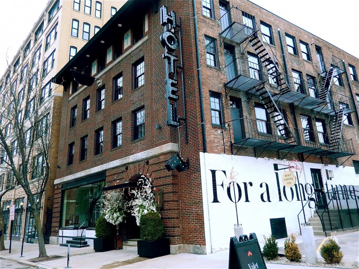
Its mostly brick lower four-story façade — of eight vertical bays, separated by pilasters with capitals, containing windows divided horizontally by spandrels and lintels — does reflect the commercial architecture of Washington Street better than the original design’s clunky faux-Victorian style. The upper seven floors are boring, but are set back in a laudable effort to fool the eye into perceiving a less massive structure. Yet the fashionably inarticulate, beetle-browed cornices of the roof give the game away. They exude the cheap, the plastic, the suburban; they undermine confidence that even the well-conceived lower parts of the façade will be carried out well. The jig is up! Like the original design, it is yet another attempt to fudge the old and the new.

To its credit, the committee sent the developers packing and their architect, Jeff Krehbiel and Associates, also of Wichita, back to the drawing board.

Standing in on Monday as chairman for Fontecchio, who was absent, committee member Clark Schoettle said, “I consider this a starting point, not an ending point” — adding, however, that the design “has come a very long way.” Committee member Barbara Macaulay said she “would like to see another pass-through.” Though properly skeptical, the panel nevertheless offered no coherent rationale for its objections. Its stance was epitomized by Macaulay, who said: “It’s fine with me that it’s modern, but I think it needs a little bit more care and elegance. I’m just asking for it to be better.”

The developers’ impatience with the committee’s ambiguity was understandable. Their local lawyer, David Barricelli, expressed his clients’ exasperation: “With all due respect to everyone on this committee, I think a lot of the criticism is personal, subjective opinions about what things should look like and what things should not look like.”

He hasn’t the slightest idea how right he is.

Every developer who appears before this committee must grapple with the contradiction between the committee’s mission to protect the historic character of downtown and its members’ taste, more or less openly expressed, for modern architecture.

It’s really as simple as that. No wonder developers always seem to leave these meetings pulling at their hair, their eyes bugging out in frustration.

If the members of the committee would only put aside their personal tastes (or, rather, in most cases, their elitist conception of their profession’s idea of “progress”) and carry out their mandate to protect the historic character of downtown, design review would not be so difficult in Providence, and the city’s beauty would not be constantly at risk.

This goes not just for the Downcity Design Review Committee but also for the Capital Center Commission, the Providence Historic District Commission, the City Plan Commission, the Providence Zoning Board, the Providence Preservation Society, and whatever panel oversees the area to be created by Route 195’s relocation. And Mayor Cicilline, too.

Design review in Providence should demand architecture the public will love. The design reviewers all know pretty much what that is.

Cities should exalt the qualities of elegance and comfort, civitas and civility. Providence is one of the few in America where that goal remains realistic. If this were understood and embraced by design reviewers, developers would know what is expected of them, and this stupid churning would cease.

David Brussat is a member of The Journal’s editorial board. His e-mail is: dbrussat@projo.com.

* * *

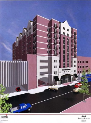
Sierra Suites’ original design at left; design unveiled Monday, at right

Journal archives

Posted in Architecture, Blast from past, Providence, Urbanism and planning | Tagged , , , , , , | Leave a comment