Repost: Happy or Hayworth

Remember when the AIA invited Pharrell Williams to keynote its last annual meeting? I don’t know whether that ever happened, but I had reason to revisit the post I did on March 22 criticizing the AIA for inviting Williams, and expressing my bafflement at the line “What it feels to be a room without a roof.” I still feel that criticism was valid, but I did click to watch the “Happy” vid again and the scales fell from my eyes. A room without a roof is, of course, a public square, a civic plaza, a space surrounded by walls – the facades of buildings – but without a roof. And if the walls are ugly, it’s a room without a view.

Groovy! Let’s all clap in time, look up, and look at the sky! Is not the sky just another word for a perfectly wonderful roof?

Well, that’s a philosophical question well above my pay grade, but I repost my original reaction to the AIA’s invitation with this tart rejoinder to my own confusion. Click on “Happy” and be happy. Note, however, that to survive in most of the environments used as backdrops in the video, a roomful of happiness would be required to ward off depression. And also don’t forget to click the link to the video of Rita Hayworth clips backing up The BeeGees’ “Stayin’ Alive.” Now there’s something that is sure to make your happy happy! (And then to stoke yourself up even more, click the link to the video of old movie scenes shot in the old Penn Station. Ahhh!)

David Brussat's avatarArchitecture Here and There

Pharrell-Williams-First-24-Hour-Long-Interactive-Music-Video-Happy-Pharrell-WilliamsThe American Institute of Architects has announced its basic lack of seriousness as an organization by announcing that the artist who recorded “Happy” will be the keynote speaker for its upcoming convention.

Now, I just watched/listened to “Happy” for the first time just now and found it much more enchanting than I had expected. As a guy who never claps along, I almost clapped along. I don’t know what it is to feel like “a room without a roof,” but I don’t think that this line gives Pharrell Williams the authority to address a convention of architects, however existentially silly they may be (and indeed are).

But if I were going to commit institutional existential silliness, I would prefer instead to hear what the artist who put together this clip has to say. It is a video of scenes of Rita Hayworth dancing in movies stitched together into…

View original post 82 more words

Posted in Architecture, Art and design, Old Video | Tagged , , , | Leave a comment

Gentling gentrification

Canberra, a pretty picture, with fog that doesn't hide enough. (The Guardian)

Canberra, a pretty picture, with fog that doesn’t hide enough. (The Guardian)

Plaza in downtown Canberra. (spinecenter.com.au)

Plaza, downtown Canberra. (2008downunder.blogspot.com)

Aborigines in a Canberra public space. (2008downunder.blogspot.com)

Aborigines in a Canberra public space. (flickr.com)

Public (?) space in Canberra. (flickr.com)

Public (?) space in Canberra. (skyscrapercity.com)

Healthy plaza in Canberra. (clearwisdom.net)

Healthy plaza in Canberra. (clearwisdom.net)

Active space in Canberra, but it's inside. (orbyxsystem.com)

Active space in Canberra, but it’s inside. (venere.com)

Public street in Canberra. (skyscrapercity.com)

Public street in Canberra. (flickr.com)

Find the public space in downtown Canberra. (flickr.com)

Find the public space in downtown Canberra. (orbxsystems.com)

Downtown Canberra. (nationsonline.org)

Downtown Canberra. (spinecentre.com.au)

How it's done in Copenhagen. (The Guardian)

How it’s done in Copenhagen. (The Guardian)

A stinging rebuke to Australia’s capital city of Canberra, and thence to just about every other city that has embraced the placemaking agenda, comes from Oliver Wainwright in the Guardian, “50 years of gentrification: Will all our cities turn into ‘deathly’ Canberra?” Such happy places – Canberra was declared the best city of the year for the second year in a row by OECD – are described as having assigned to public space (and often “public” space) the role of making places for people instead of cars.

This Canberra has done, supposedly, but some people can’t figure out why the city keeps winning accolades. Neither can I. Just look at the picture above. Canberra has too many stinking ugly buildings! (My Google search – “downtown Canberra” – found not one lovely building, let alone a lovely plaza.)

[My heart goes out to the victims of a lone-wolf terrorist of Iranian descent, who took 17 hostages in a Sydney cafe. He killed two and was himself killed in the raid to free the hostages.]

http://www.theguardian.com/artanddesign/architecture-design-blog/2014/dec/12/50-years-of-gentrification-will-all-our-cities-turn-into-deathly-canberra

Wainwright takes aim at Jan Gehl, the Danish guru of livability who recently joined starchitect Richard Rogers on a panel in London to discuss how to make cities better. Both gentlemen, he said, had anodyne prescriptions for civic liveliness to which most people can hardly object: more open space downtown, more bike lanes, better mass transit, etc.

Wainwright points out, however, that too many of today’s public spaces amount to a gentling of gentrification – private spaces in which an obedient public is permitted to wander. These places often are lobbies without walls fronting the residential towers of the super-rich, who almost never actually live there – “safe-deposit boxes stacked up in the sky,” as Wainwright tartly puts it. He reminds readers that Rogers opposed this sort of thing, gated communities, back in 1997:

“A new type of citadel has emerged,” he wrote in Cities for a Small Planet. “At the touch of a button, access is blocked, bullet-proof screens are activated, bomb-proof shutters roll down. The appearance of the ‘wrong sort of person’ triggers quiet panic.” Fifteen years on, this could be straight from the sales brochure of any one of his new developments.

Wainwright blames this on capitalists. I would blame it on financial pirates who have hijacked the free market. Maybe they’re the same thing, but certainly the billionaire’s influence on civic space has grown while the average citizen’s influence has shrunk. In the half century considered by Wainwright, private money has financed more and more “public” spaces. That’s because over that same span the public sector has taken upon itself so many undoable tasks, spending so much money adding new layers of feckless bureaucrats every time this or that social engineering project blows back on society. The result is a fiscal bottom line for municipalities large and small that has no nooks or crannies left to shelter money for public amenities.

To me, nothing better demonstrates this dolorous trend than the sterile inhumanity of the buildings brought to you by Sir Richard and his ilk on behalf of the 1 percent. The sinister towers they design glower from on high down upon the street and the plaza, stacking the deck aesthetically and financially against the work of Gehl and other placemakers such as Fred Kent of New York’s Project for Public Spaces.

Rich people are going to bid up the cost of place-made spaces as long as it is illegal or difficult or somehow déclassé to build spaces that people love. The spaces that people love are always – okay, almost always – surrounded by buildings that people can stand. This is as true in Canberra as it is in London, New York, Boston and Providence.


Posted in Architecture, Development, Other countries, Urbanism and planning | Tagged , , , , | Leave a comment

Browbeating Boston’s brand

View toward Prudential Center and 111 Huntington Ave., with the tiara. (worldradiomap.com)

View from Christian Science Center toward Prudential Center and 111 Huntington Ave. (center left), with “tiara.” (worldradiomap.com)

Marty Walsh has taken over as Boston mayor after 20 years of Tom Menino, who used to decide what sort of hat new buildings would wear – most famously, the “tiara” of a glitzy tower called R2-D2, near the Pru. That’s how closely the late Menino was said to have micromanaged development in the Hub. Walsh, who once ran the city’s building trades union, told a business roundtable on Wednesday that “too often, new buildings have been merely functional.” He wants developers to “reach beyond their comfort zone.”

Beacon Hill. (dguides.com)

Beacon Hill. (dguides.com)

Back Bay. (content.time.com)

Back Bay. (content.time.com)

South End. (boston-discovery-guide.com)

South End. (boston-discovery-guide.com)

Financial District. (wikipedia.org)

Financial District. (wikipedia.org)

Seaport District. (bostonmagazine.com)

Seaport District. (bostonmagazine.com)

For an infinitesimally brief moment I interpreted his remarks, which I read in Boston Globe columnist Dante Ramos’s piece “Marty Walsh Goes Up Against Boring Architecture,” on Thursday, as positive. The new mayor wants beautiful buildings, not just functional ones, even if that means pushing developers to reach beyond the architectural establishment’s lazy adherence to modernist orthodoxy.

Good! But no. In fact, Walsh wants bolder modern architecture, and warned citizens groups against getting in the way. Walsh wants Boston to go all in on ugly.

“We should aim for world-class design,” he told his audience. “Our historic buildings reflect our unique past. New buildings should project the values and aspirations of our growing city. We can balance the old and new.”

Most people will think those words make good sense, but what Walsh means is that Back Bay and Beacon Hill are old hat, that Boston needs no more buildings that people love, but instead needs more modernist architecture of the type that has already shredded Boston’s brand.

What is Boston’s brand? Good question. More so than Providence but less than most other American cities, Boston has allowed its beauty to be severely eroded over the past half century by architecture that tries not to fit in. It’s as if commerce, technology and innovation won’t take root unless the buildings they occupy shock or startle. That is what innovative has come to mean. Since the nation’s most creative era of industrial development came and went long before the onset of modern architecture, that is obviously false.

Walsh is not alone in believing that creativity in architecture means adherence to the profession’s longstanding orthodoxy. Modern architecture is more than a century old. It, too, is the past. So Boston must choose between a past that offers beauty and one that offers ugliness. The functional buildings that Walsh condemns are those whose architects, stranded between the razzmatazz of their professional instincts and Menino’s resistance to it, have tried to have it both ways. Compromise in design rarely satisfies anyone.

To find the truth of the matter, one need only ask where people go in Boston. Locals and visitors alike flock to Newbury Street, Beacon Street and Faneuil Hall. Beacon Hill, Back Bay and the North End are what the world thinks when it thinks of Boston. They are Boston’s true brand.

Fortunately, the decades have been kind to Boston, generally protecting its loveliest neighborhoods. Modern architecture has mostly been directed into secondary districts unworthy of protection in the minds of the powers that be. Commonwealth Avenue above Mass. Ave. is one such sump. The areas near the Prudential Center and upper Boylston Street have failed to stave off the worst modernist brutality. The Financial District is a hodge-podge where the old and the new maintain an unpleasant standoff. Menino’s own Seaport (or “Innovation”) District is a vast cesspool of gargantuan sterility – except for the rehabbed old brick buildings that serve as apartment complexes. The South End’s extensive historic fabric has been slapped upside the head by just the sort of functional architecture Walsh protests – the inevitable result of compromise between what Menino wanted during his years and what Walsh now seems to think he wants to replace it with.

As columnist Ramos reminds us, Menino did not “invite architects to follow their muses.” Good for him. But while restraining architects’ worst impulses (that is, their “muses”), he did not push them to embrace the best practices of the past. So he left Boston with more than enough “boring” buildings. At least that’s better than what is likely to result if, as Walsh wants, architects are let off their already overlong leashes.

Great modernist architecture is rare because genius is rare, and only genius is capable of inventing truly great new shapes from the grist of their own egos. Most architects had their respect for beauty purged in architecture school; their professors failed to replace that respect with genius. Modern architecture by mediocre architects is boring at best and repulsive at worst. Traditional architecture by mediocre architects is boring at worst but can be quite attractive, because they are willing to learn from past genius.

Mayor Walsh should ask developers to hire architects confident enough in their abilities to revive the best practices of the past to move into the future. That way lies beauty without the difficult requirement of genius. Boston’s most beloved districts arose that way, and there is no reason whatsoever that new places of beauty cannot and should not arise there again.

Posted in Architecture, Architecture Education, Architecture History, Development, Preservation, Urbanism and planning | Tagged , , , , | 5 Comments

The Granoff showdown

Stone walls and elegant gate at Granoff estate. (providencejournal.com)

Stone walls and elegant gate at Granoff estate. (providencejournal.com)

At Wednesday evening’s meeting of the Blackstone Neighborhood Organization, at the Central Congregational Church, some attendees reported they’d seen surveyors at the Granoff estate. This suggests that Paula and Leonard Granoff may attempt to complete their supposedly incomplete application for a property subdivision. Their neighbors’ lawyer, Bill Landry, was at the BNO meeting and emphasized that even if the Granoffs are unable to fully complete it, the City Plan Commission might vote next Tuesday to respect their attempt and approve the application anyway.

Landry added that the commissioners would be less likely to do so in the face of a crowd of neighbors from the wards that put the next mayor, Jorge Elorza, in office.

The commission will meet at 4:45 p.m. at 444 Westminster St. The Granoff application, which was “continued” from the Nov. 18 CPC meeting, is the first item on the agenda.

Both the commission chairwoman and the commission’s legal counsel seem more eager to approve the proposed subdivision than strict propriety would dictate. They should be objective tribunes of the public interest under the law. By public I don’t mean the BNO, which is an interested party in its own right, like the Granoffs. I mean the general good as articulated by the law enacted by the general public’s elected leaders for the city as a whole.

But the BNO and its supporters in the Blackstone neighborhood are citizens, too, no less so than the Granoffs. Issues of property development are where the city politics hits the road. Because of the apparent intensity of feeling on the commission, emotions may be running higher than normal on Tuesday, especially since Lawyer Landry seems to have the goods on the legal issues involved. So there may well be fireworks.

If the Granoffs’ big-foot lawyer, Tom Moses, is unable to convince the commission to ink the subdivision application, the Granoffs will have to re-apply or try again to sell the land undivided, possibly to a developer who might want to go through all this again under new zoning that allows a subdivision into fewer parcels (presumably but not necessarily less profitable). If the commission does approve the subdivision application at this meeting, it is likely that an appeal of its decision will be made to the Zoning Board of Review. Its ruling would be based solely on the existing record – no further testimony on any issue from either side. That means a heavy turnout on Tuesday can affect the evening’s result, but also help fortify the neighbors’ ability to win an appeal, if necessary.

I will be at Tuesday’s Plan Commission meeting as much for its possible entertainment value as for my concern that a poorly conceived subdivision could destroy one of the most charming blocks on one of the city’s most elegant boulevards.

Posted in Architecture, Development, Preservation, Providence, Urbanism and planning | Tagged , , , , | Leave a comment

Disproportion by definition

“The Sleeping Odalique,” by Jean-Auguste-Dominique Ingres.

Above is my promised second reclining nude by Ingres, “The Sleeping Odalisque,” to be delivered after responses to my post “Naked proportion.”

My promise to post another reclining nude by Ingres was slowed down by an apparent insufficiency of response. But the discussion of proportion is too important to stumble on a mere number. Is there really anything more to say about a reclining nude after all is seen and done? Who, after all, wants to comment on the proportion of a reclining nude when she is there to feast your eye on? (In fairness to a certain proportion of  readers, I should probably post a reclining nude of the male persuasion, if possible.)

kim-kardashian-grace-jones-jean-paul-goude-paper-676-body-image-1415802314In the nick of time comes an intellectual debate in Paper Magazine, an online journal at Vice.com, which has published an essay by Eleanor Morgan called “Getting to the Bottom of Kim Kardasian’s Alien Appeal.” It discusses what the headline suggests, but it is really about the celebrity’s ample bottom line. “Is it real or is it Memorex,” I asked a friend, who voiced an understandable skepticism at my bringing the subject up. But since this thread of posts discusses the subject of proportion in architecture, I have decided to post the photo of Kardashian in order to riff on Roger Scruton’s main (architectural) point that beauty is really less a matter of proportion than of the detail of the architecture in question. A beautiful building achieves that status not because it obeys an arithmetical ideal but because its aesthetic features trigger a positive response in the observer.

That reasoning may sound hopelessly circular; I trust readers will be more titillated (intellectually) than offended. This is, after all, a family-oriented architectural blog. I promise, however, that reader response will not trigger yet another nude, reclining or otherwise, except for the reclining male nude below, offered in a spirit of fairness and diversity.

“Reclining Male Nude” (1837), by Aleksander Lessing.

Posted in Architecture, Art and design, Development, Humor | Tagged , , , , , | 2 Comments

Placemaking under siege

Waterplace at dusk on a WaterFire night, in the year 2000. (Photo by Richard Benjamin, RichardBenjamin.com)

Waterplace at dusk on a WaterFire night, in the year 2000. (Photo by Richard Benjamin, RichardBenjamin.com)

Audun Engh, of INTBAU, the International Network of Traditional Building, Architecture and Urbanism, recently sent to TradArch readers an update by Ellie Violet Bramley on the work of Jan Gehl, the pioneer of city livability. Bramley’s article in the Guardian, “Is Jan Gehl winning his battle to make our cities livable?,” notes the Dane’s long climb back to rationality from architecture school, where he was taught, as he puts it, “to do modern cities, with highrises and a lot of lawns and good open space – good, windy spaces.” Gehl’s advice is heavy on markets, bike lanes, public transit, people watching and sittability (my word, homage to Camillo Sitte). All of this is very good, indeed essential, but not quite adequate to the task.

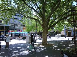
I posted in June about an event sponsored by the New England chapter of the Congress of the New Urbanism, at which a documentary about Gehl, The Human Scale, was shown and a panel then discussed the film from a Providence perspective. In that post, “Human scale in Providence” [my link tool is still down, so please use this blog’s search engine], I described asking the panel about a proposal by internationally known restaurant designer Morris Nathanson, of Pawtucket, made decades ago as Providence sought to animate the new Waterplace Park. Nathanson’s taverna idea, which he got from Greece, was to set up tables in parks, squares and other public spaces and hire young guys and gals to serve those tables for one or more nearby restaurants. Youth are young and can run to and fro with orders and meals, just like those guys in black are always running to get your car. What an idea for a cheap action agenda item to promote placemaking in almost any civic space, be it Waterplace Park or Kennedy Plaza, in Providence, New London, New York, New Delhi … Anywhere!

I did not mention in the post (which reprints my column from 1995, “What to do at Waterplace”) that the response to my bringing up Nathanson’s idea in the question and answer session was that the panelists looked at me like I had two heads.

I resurrect this embarrassing moment because CNU is among the organizations at the heart of placemaking in America, and attendees, not to mention panelists, at its events are, you would think, among the citizens most open to ideas for making some place.

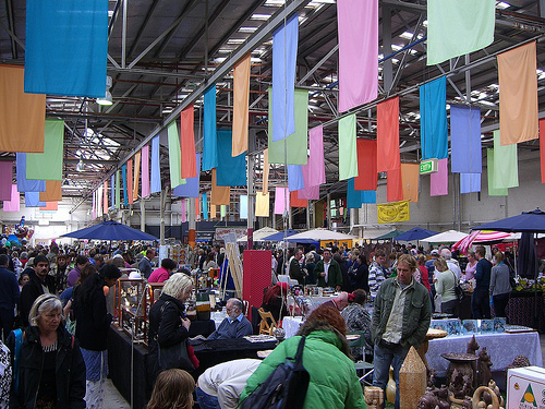
I have been thinking a lot lately about PPS – not the Providence Preservation Society but the Project for Public Spaces. PPS is a national organization based in New York that seems eager to accomplish what Jan Gehl has tried to accomplish – to animate public spaces. The organization has done thousands of projects in all 50 states and many cities abroad.

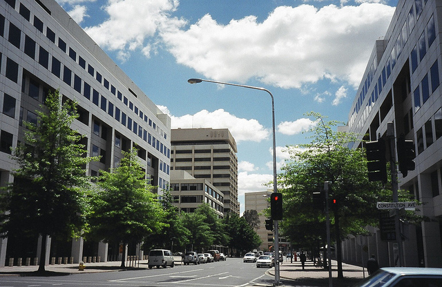
In recent decades placemaking tends to be attempted in places set amid tall glass and steel buildings of little charm that glower down on the people in those places. To judge by the film, Gehl seems unaware that public places surrounded by sterile modernist buildings, tall or short, experience a constant undertow against the success of such efforts.

PPS does seem more aware of that. In a summary of the second annual meeting of the Placemaking Leadership Council (an arm of PPS), its “Architecture of Place/Community Anchors” discussion group is described as having made important observations. It notes that placemaking requires buildings that are “not simply making an iconic design statement.” “Space,” the summary continues, “should both reflect and enhance the identity of the neighborhood.” “Often,” it observes with no small regret, “architecture students are trained to believe that their roles are to be ‘cultural critics,’ or that violating expectations is a higher calling than satisfying them.”

Just so.

Yet preservationists, who you’d think would be the chief allies of placemakers, need to engage a revaluation of values. Instead of campaigning to protect “midcentury modern” architecture and supporting new architecture that erodes districts whose sense of place survives against all odds, preservationists should protect the sense of place by promoting new buildings that “both reflect and enhance the identity of the neighborhood.”

For, if you read John Massengale and Victor Dover’s excellent new book, Street Design: The Secret to Great Cities and Towns, and, frankly, virtually every other book written in the past few decades on streets as instruments of placemaking, you find that the beauty of the buildings along the street is the common denominator of every great street pictured and described therein. Same goes for plazas, squares and other civic spaces, most of which are bounded by streets edged on one side by buildings facing “place.”

Many of Dover and Massengale’s recommendations are useful and even vital, but they are secondary. Placemakers must embrace this fact. The Placemaking Leadership Council, at its September meeting in Pittsburgh, raised a lot of issues that may help placemakers get government and private bureaucrats out of their siloes to help promote the increasingly robust placemaking movement. But tasks will be more difficult to accomplish, and they will confront a sort of ennui in turning thought into action, if they neglect the need to upend the current establishment in architecture. Modernism is inimical to place no matter how eagerly its practitioners join placemakers in seeking more bike lanes, better transit and more official assistance in returning our cities to livability.

Of course, placemakers such as Jan Gehl and PPS president Fred Kent must work with the cities they have. They cannot snap their fingers and eliminate buildings that glower at people from the edges of place. But they can and must introduce a more vigorous advocacy of new placemaking architecture based on the principles that animated cities for hundreds and thousands of years. As Gehl says, cities must recover the accumulated experience that “has been lost in the translation to modern times.”

Nothing is more topsy-turvy today than architecture. It remains the only field of human endeavor in which the use of precedent – building on past knowledge – is contrary to professional practice. Placemakers seem to understand intuitively that modern architecture is the big obstacle to successful placemaking, but seem reluctant to fold this knowledge into their action agendas.

“We have to turn everything upside down to get it right side up.” That is Fred Kent’s motto, and PPS must lead all other placemakers to take to heart its most basic implication.

Posted in Architecture, Development, Preservation, Providence, Urbanism and planning | Tagged , , , , | 6 Comments

Architecture is qualiadelic

My link tool is still down so please click on No. 14 in Blogs I Follow, at far right, to find out how to get Tony Brussat’s new book for free.

David Brussat's avatarArchitecture Here and There

Qualia are features of things. (en.wikipedia.org) Qualia characterize the features of things. (en.wikipedia.org)

My brother, who lives in Oregon, has just published a book. It delves into the most intimate and profound aspects of ritual, and how engaging with one’s own patterns of ritual creatively can improve one’s life, and open one’s mind to insight about the world around you. The book is called Matter, Qualia, Mind and Cosmos. I asked him to write me something that could help me connect his thoughts with the concerns of architects. Here is what he sent me:

Architecture is very qualiadelic. The perfect building is as elusive as the perfect snowflake. Both form around qualia: snowflakes form around hexagons and buildings form around the designs of architects. They are inevitably flawed – every snowflake is unique and so is every building – but therein lies the charm. Alas, if a snowflake is too unique, if it strays too…

View original post 251 more words

Posted in Uncategorized | Leave a comment

Naked proportion

"La Grande Odalisque," by Ingres,

“La Grande Odalisque” (1814), by Jean-August-Dominique Ingres, Louvre.

Here is Roger Scruton’s passage regarding the human body and its proportions, from Chapter 3 of The Classical Vernacular:

Imagine a beautifully formed body – as depicted by Ingres, for example. Here we see a certain kind of perfection, in the lengths and disposition of the limbs, in the proportions of the body to leg, head to neck, and so on. And imagine a purely mathematical version of this figure – the head replaced by a oval pumpkin, the legs by tubular sandbags, and what you will. The mathematical relations would remain; but the beauty would have disappeared. It would cease to be appropriate to speak of proportion. For the proportion of a figure belongs to it only as interpreted. It is as a head that the oval relates to the column upon which it rests, and as a body that the column relates to the head. And not just any head or body: the head and body of a young woman, in whose eye shines the light of reason, and who therefore looks at us out of the picture.

"The Birth of Venus" (1486) by Sandro Botticelli, Uffizi

“The Birth of Venus” (1486) by Botticelli, Uffizi

The mathematics of the perfect body may be disturbed without doing violence to the grace and beauty, provided that the details retain their significance, and call to each other in the right tone of voice, so to speak, across the spaces that divide them. Thus, in Botticelli’s Venus we see a most extraordinary distortion of the neck, an elongation of the arms, and a thousand departures from our common-sense anatomy. But what grace is there, nevertheless. It is just this kind of grace that may survive in the vernacular use of columns and architraves, even in the most surprising places, and detached entirely from the context that gave rise to them.

As soon as three readers comment on this post, I will as a reward pop “A Sleeping Odalisque” by Ingres into my next post. So you will want to have something to say.

Posted in Architecture, Architecture Education, Architecture History, Art and design | Tagged , , , , , , | 3 Comments

Scruton on proportion

A system of proportion relating it to the human body. (mlahanas.de)

A system of proportion relating it to the human body. (mlahanas.de)

As an advocate of classicism I’ve always been sort of absent without official leave from discussions of proportion. Perhaps that is because it involves mathematics, which I have tried to keep at arm’s length throughout my life. Thank God for the science of arithmetical estimation! Anyhow, the key to beauty is said to be a system of proportion enunciated in the orders. Looking at architecture, however, I have never been able perceive proportion at work. I have always been willing to assume that proportion does its good work regardless of whether I can follow it in action. A set of columns, regularly spaced, is about my speed. It’s enough for me to judge whether a set of windows in a façade is well or poorly designed by the extent to which my nose wrinkles at their placement, and I am willing to assume that if I don’t like the placement, it must be either because of some awkwardness that I can detect, or because it violates the canons of proportion, which are Greek (or Roman) to me.

So, on my way through Roger Scruton’s The Classical Vernacular, I was more than pleased to read the following, in Chapter 3, “Classical Vernacular”:

The Orders were originally associated with complex systems of measurement, and a meticulous attention to proportion. Even when questions of geometry are downgraded or ignored, however, the details for the Orders may still be used to impose vertical posture. Indeed, it is by virtue of the mouldings, string-courses and cornices derived from the old pattern books, that the disproportionate buildings of the early twentieth century were able to stand side by side so agreeably: as we can easily witness in Lower Manhattan. …

There is much food for thought on proportion in the passages between the above quotation and the one below, including a declaration that the orders are an “emancipation from measurement,” and then a passage suggesting that the “lip-service” to measurement paid by Renaissance treatises led to the blunderings of Le Corbusier, enabling the modernists to argue that proportion does the important work actually accomplished by detailing, and thence to argue that the detailing can be omitted without undermining the work done by proportion – all hooey, writes Scuton, who continues:

The Orders identify particular junctures in the wall or colonnade as points of drama and transition. Here the movement is gathered up, arrested, and then passed on with a renewed impetus. Base, capital, architrave and cornice; string-courses; plinths and attic storeys – all are picked out with shadows and given their specific character. The geometry of the building is made perceivable, since the lines that are related to it are endowed with a beginning, middle and end, and the whole into which they are integrated has the character of a composition, in which competing forces are resolved and harmonised.

By this very process, the need for a precise geometry is overcome. The details themselves come to acquire the marks of order, and acquire a harmonising potential that allows them to be transferred from building to building, bringing even the wildest and most erratic movement under a kind of civilized control. Once the pattern has been established, the builder has at hand a method for generating harmony in the absence of measure, and for perpetuating the memory of proportion in a composition by which the strict Pythagoreans would probably be outraged.

The next passage is about “proportions in a beautifully formed body – as depicted by Ingres, for example.” I will put it in another post following this one, because I don’t want to assume a degree of elitism on the part of my readers that would require them to read unnecessarily lengthy posts. Dividing up this set of quotations taken from Scruton pays homage to proportionality in the distribution of blog posts. So, onward and upward.

Posted in Architecture, Architecture Education, Architecture History, Art and design, Urbanism and planning | Tagged , , , | Leave a comment

Architecture is qualiadelic

Qualia are features of things. (en.wikipedia.org)

Qualia characterize the features of things. (en.wikipedia.org)

My brother, who lives in Oregon, has just published a book. It delves into the most intimate and profound aspects of ritual, and how engaging with one’s own patterns of ritual creatively can improve one’s life, and open one’s mind to insight about the world around you. The book is called Matter, Qualia, Mind and Cosmos. I asked him to write me something that could help me connect his thoughts with the concerns of architects. Here is what he sent me:

Architecture is very qualiadelic. The perfect building is as elusive as the perfect snowflake. Both form around qualia: snowflakes form around hexagons and buildings form around the designs of architects. They are inevitably flawed – every snowflake is unique and so is every building – but therein lies the charm. Alas, if a snowflake is too unique, if it strays too far from its hexagonal qualia, it won’t endure. The same is true for architecture: as it strays from a certain aesthetic harmony and attempts, consciously, to be too sublime, it is doomed.

Matter, Qualia, Mind and Cosmos tells the story of qualia – and the journey of consciousness – through landscapes of value, sense, cognition, and aesthetics.

My brother’s way with words is out of this world. And I am not referring to his use of unfamiliar terms like qualia, qualiadelic and ritualing. I mean that even amid a discussion that most doctoral candidates in philosophy would find recondite, Tony finds a way to describe a natural phenomenon, a reality, or a truth in a manner so magical that it carves out a space in your brain to live. His book is fun to read, and offers insights on everyday life of which you were entirely unaware before reading them.

You can get a free copy of Tony’s book at amazon.com. (My link function is malfunctioning for the moment. Don’t know why.) The illustration atop this post is not from the book but from a Google search of the term “qualia.” For some reason, most of the images called up by the search were of exotic ocean locations seen from the inside of wooden cottages of a distinctly contemporary design.

[My link tool is still down so please click on No. 14 in “Blogs I Follow” to the right of this post to find out how to get Tony’s free book.]

Posted in Architecture, Art and design, Book/Film Reviews | Tagged , , | 2 Comments