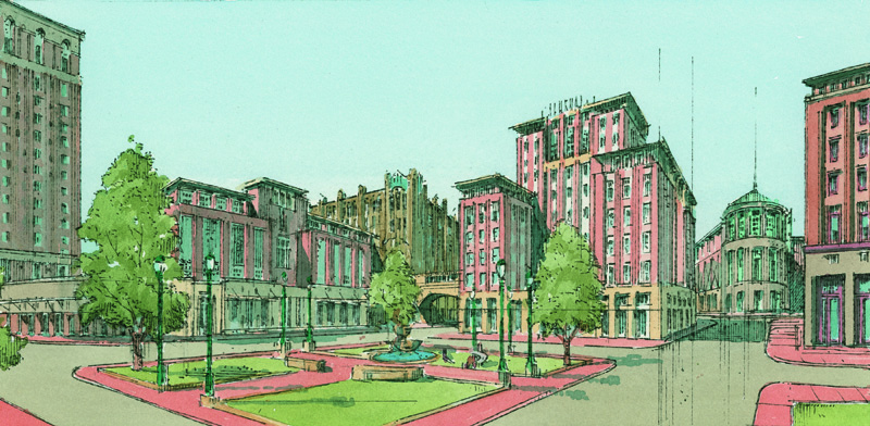
Proposed new buildings and redesigned Emmett Square, 2005. (Cornish Associates)
The expected purchase by Arnold C. “Buff” Chace of the Providence Journal’s headquarter’s building – not the old Journal building of 1906 but the “new” one of 1934, designed by noted Motor City architect Albert Kahn – is extraordinarily good news. I hope it goes through. Chace has said he hopes the Journal’s recent buyer, NewsGate, will keep the Journal operation as his tenant. A big-city newspaper that is not located downtown is already half dead. The Journal should stay on Fountain Street.

The end of the Journal building near Emmett Square. (midcenturymundane.wordpress.com)

Westminster Street. (tripadvisor.com)
In addition, Chace has expressed his desire to build four- or five-story commercial and residential buildings on the two lots across Fountain where Journal employees park. They would be included in the purchase from Belo, of Dallas, the Journal’s former owner. Chace has eyed those two lots for years, since 2005 when urbanist Andres Duany was last here to help plan the next moves downtown. In a charrette, Duany showed two new buildings, both attractive, one on the lot near the Biltmore Hotel and another replacing the Journal’s green, snub-nosed parking garage facing a revamped Emmett Square.
Howard Sutton, the Journal’s publisher at the time, was said to be irked that he was not consulted by Buff about these theoretical essays in potential architecture sketched onto land owned by the Journal (or rather Belo). Not that anything was likely to happen then – even though the real-estate bubble had yet to burst – but rancor between the two probably did not help promote downtown development.
If Buff acquires the land now he can build what he wants on it. No better development strategy could be imagined than filling in vacant lots used for parking with buildings used for profitable enterprise. Not one of the five downtown buildings razed during the regrettable administration of Mayor (now Congressman) David Cicilline have been replaced by new buildings. That spate was the worst in downtown since 1978, when Paolino Properties demolished the Hoppin Homestead Building (1878). They are all still parking lots.
It is axiomatic that the more parking lots a downtown has, the less reason people have to use them. The city should tax empty lots higher as an incentive for property owners to build new structures (including garages) in their stead, or to sell the land to entrepreneurs with the balls to do something with them.
Most downtown offices do not have much dedicated parking, nor should they. Observers have reason to hope for an intelligent phasing-in of additional tenants at 75 Fountain St. and development proposals for the lots. An increased difficulty of parking downtown and its increased cost only increases the allure of living downtown. If more people live downtown and walk to work, there will be more parking for those who do not. Providence will grow, and its growth will spark more growth. Someday, Providence could become a real live city with a real economy and enough money flowing in to solve its rolling fiscal crises.
In comments following the breakage of news that he was buying 75 Fountain St. and the two parking lots, Chace not only expressed his desire to build on the two lots but asserted that the residential market downtown could absorb hundreds of new units. He described to Rhode Island’s NPR radio news two projects that are already under way in downtown through his development firm, Cornish Associates:
[Chace] said 44 additional housing units will become available when the conversion of the Kinsley Building on Westminster Street is due for completion in June. Chace said his firm bought two other properties on Westminster Street last year that could yield 55 more housing units, if the financing can be made to work with possible help from the city and state. Although the financing is more complicated without additional funding for the state historic tax credit program, Chace said, “We think there is the demand for hundreds more [units].”
Here is a story from last June’s Providence Business News that expands on the NPR story:
The Lapham Building is the latest addition to Cornish’s Westminster Street holdings as the developer tries to expand the cluster of fashionable downtown residences it’s created further southwest toward Empire Street. Last fall Cornish purchased the Kinsley Building at 334 Westminster, also to convert into apartments, and the former Roots Cafe Building at 276 Westminster, which it is reopening as the Aurora nightclub. It also owns 270 Westminster next door to the Aurora, which it plans to convert to apartments.
Chace has been trying to buy the Old Journal Building in recent years, but the estate of its late owner is as intent upon cutting off its nose to spite its face as the guy who purchased it at the wrong moment decades ago. Good luck!
Most readers of this blog are familiar with Buff Chace’s renovation of buildings downtown. His 199 units thus far and several blocks of new shops have brought new life to the city. He was this reporter’s landlord from 1999 to 2010 when he lived in a wonderful loft on the fifth floor of the Smith Building, the first Cornish rehab. Buff has helped to preserve downtown’s historic character by maintaining the traditional look of all of the old buildings he has renovated, allowing modernist features only in the interiors.
If he acquires the Journal building and its lots, and begins for the first time in his downtown program to build anew, he may perhaps be expected to rededicate himself to preserving the downtown as a place people can love. Otherwise it is unlikely that his new round of rehabs and new residential buildings would have the same appeal as the great places to live, work and shop that he already has under his belt.