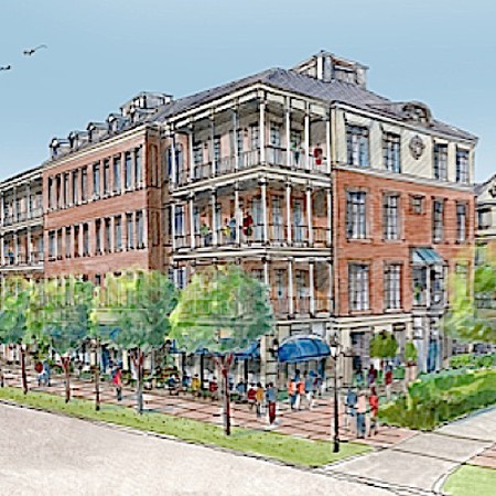
Proposal for Sgt. Jasper site by Bevan & Liberatos. (bevanandliberatos.com)
Beach Company, which had submitted what I thought was an elegant proposal to replace a midcentury modernist clunker of an apartment tower with three shorter but larger mostly residential buildings of seemingly high design on the edge of Charleston’s historic district, has withdrawn its application for a zoning change that would have enabled its proposal.
Original Beach proposal. (charlestoncitypaper.com)
The preservation community in Charleston that had defeated Clemson’s proposal to plop a modernist architecture school into the historic district came out against this proposal. The rationale seemed to jibe with the desire of wealthy neighbors in single houses not to have more traffic. A deeper reason appears to have been that the developer, Beach, could not be trusted with the architecture. Beach is not going away. It owns the land and pledges to return with another proposal.
Meanwhile, Christopher Liberatos and Jenny Bevan have proposed, instead of three larger buildings, to fill most of the land with more single houses. Presumably that would have been the best idea from the beginning – basically continuing the fabric that already characterizes the neighborhood. But there may be some doubt whether there is a market for the houses – even though actual historic houses there are going for top dollar. And it may be that Beach doesn’t think it could make enough money that way. And there is, as always, the fear that it could wimp out on the architecture.
As some have pointed out, that part of Charleston needs more density and more diversity in its population. Many of the upper-crust houses are the second (or third? or fourth?) homes of out-of-towners and are unoccupied much of the year, causing a vacancy on the street. That assumes [Warning! Stereotype alert!] that such folk are normally out and about when they are in town, rather than shuttling among each other’s houses for high tea and fine dining. (Sorry!)
Let us hope that Beach’s next proposal will be some sort of finer-grained compromise between its original proposal and the high-minded B&L proposal, which I have reprinted above. It has been suggested, for example, that two families can live in a walk-up that looks like a single house for a single family. If some of the houses were of that sort, the density and variety of people would be increased. The proposed grocery store might also be retained in the next proposal, though perhaps of a lesser size and without its round-the-clockness, which I like but might cause some others to tremble.
What should not be lost is Beach’s original desire to design a place that at least arguably looks like Charleston. I would warn Charlestonians, however, that a developer who feels offended by overzealous opposition can try to take revenge by proposing an ugly project that meets code. That happened in Providence when preservationists and local monied folk joined forces to oppose a building that would have blocked views of a historical stretch as seen from the upper floors of various corporate headquarters across the Providence River in downtown. The developer, Old Stone Bank, was deeply offended. The result, known as Old Stone Square, by Edward Larrabee Barnes, seriously degrades what must be one of the nation’s great cityscapes. It is not the kind of “compromise” any lover of historical architecture could have wished for.
The photo below shows the building, and the stretch of South Main Street, to the right of the historic Old Stone Bank building (dome, extended wings, 1898), that an earlier version would have blocked. The earlier version was to have been a sort of postmodern take on Georgian Revival, fitting in with the courthouse at left, but it was sacrificed to keep the view open from towers such as the one at the far right – at a very high cost indeed. (The photo was taken in early 1990s as the Providence River was daylighted and turned into a beautiful traditional system of parks and river walks.)
Perhaps we will know more by April 12, when TradArch list members meet in Charleston to confabulate on the future of the classical revival.

Old Stone Square at upper right center. (flickr.com)