Karam at Triangle Gulch

Rendering of entry facade of proposed hotel on Parcel 12, seen from Woonasquatucket River. (First Bristol)

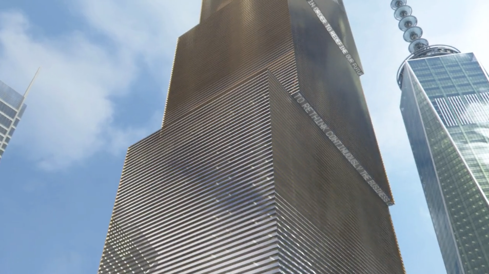
Rendering of entry facade of proposed hotel on Parcel 12, seen from the Woonasquatucket River. (First Bristol)

James Karam, head of First Bristol Corp., walked into a buzz saw on Tuesday morning when he showed his proposed design for an extended-stay hotel in downtown Providence to the design review committee of the Capital Center Commission. Karam’s proposal looks as if it may have the bones of a good building, but it’s not there yet. The panel members know it is not there yet but lack the desire, and the gravitas, to encourage Karam and his architect, Rolf Biggers of BMA Architectural Group, from Amherst, N.H., to move the design in a more genial direction.

Site plan of Parcel 13 with latest hotel proposal. (First Bristol)

Site plan of Parcel 12 showing latest hotel proposal. (First Bristol)

Rendering of entry facade close up. (First Bristol)

Rendering of entry facade as seen close up. (First Bristol)

Rendering of hotel from Burnside Park. (First Bristol)

Rendering of hotel as seen from Burnside Park. (First Bristol)

Rendering of earlier proposal arrayed along Memorial Boulevard, seen from Burnside Park. (First Bristol)

Rendering of earlier proposal arrayed along Memorial Boulevard, as seen from Burnside Park. (First Bristol)

View of Parcel 12 from intersection of Steeple with Memorial. (Photo by David Brussat)

View of Parcel 12 from intersection of Steeple with Memorial. (Photo by David Brussat)

The triangle of vacant land Karam wants to build on, Parcel 12, is at the northeast corner of the public open space filled by Kennedy Plaza and Burnside Park. Union Station’s five buildings sit across Exchange Street and the downtown branch of the U.S. post office sits across Steeple Street. Karam’s challenge is to offer a building that fits into its space with the same grace and dignity that his Hampton Inn does over on Weybosset Street.

Parcel 12 – or Bad Sculpture Park, as I like to call it – was created by the late Bill Warner as part of his plan to move the confluence of the Woonasquatucket and Moshassuck rivers from under the post office to the middle of Memorial Square – which in those days (the 1980s) was called Suicide Circle. Warner also designed the river walks and the lovely bridges and parks in a traditional style.

Karam’s building would be eight stories. Capital Center guidelines for Parcel 12 require 15 stories – a number pulled out of a hat.

The most important facet of the parcel is the triangle’s gentle curvature along Memorial Boulevard, which follows the curve of the Woonasquatucket River. That side of the hotel should also curve along the river.

How that curve emerges – whether to pick up the edge of the post office or the stone and wrought iron railing that elegantly disguises its utilitarian facade – is secondary to the need for a curve.  The two other facades should meet to form a public entrance at the corner of Exchange and Steeple; or they should be set back, like the facet of a jewel, to create a plaza of greater or lesser size before the entrance.

The wiggle room among these sets of alternatives should provide Karam’s designers with enough flexibility to build a hotel. At yesterday’s presentation, his effort to resolve the difficulty of building on a triangle by dodging the simple and obvious solution of a curve in the northeast façade was rightly criticized by the panel. But the panel was useless, and predictably so, when it came to the architecture.

Karam’s proposal has good bones in that it looks like it wants to be a traditional building that fits into its historic context. The proposed design features cornices, stringcourses, rectangular windows arrayed with symmetry along the façades, and various types of stone masonry or stone-veneer facing. But the current plan fails to live up to its own aspirations.

For example, it confuses cornices and stringcourses. The multiple cornices of varied sizes and widths and heights and styles should be simplified into a single cornice at a single level of the roof edge, with a single but more ornate embellishment. Ditto the stringcourses, which should also encircle the building, separating one or maybe two sets of stories rather than “celebrating” changes in the “bumpouts” of massing.

The windows should be set back farther into their façades, giving the walls a greater feeling of strength, have at least a hint of lintels, and more mullions. The masonry, which has already retreated from four to three colors, should retreat to just one or two – a rusticated base and for the upper stories a brick or stone veneer closer to the base in shade.

This is very basic, fitting the building into its setting while differentiating it from its neighbors, and leaving many options for the design’s improvement.

For centuries, this simple approach enabled architects to create urban settings whose buildings worked together without hindering play among various styles. But today and for the past half a century this development strategy has been anathema to most establishment architects and city planners, including many design review panels. Members of these powerful bodies tend to be modernists to some degree. They promote styles they realize most of the public dislikes, and thus they often seek to disguise the true meaning of their recommendations. Their disdain for public taste usually results in comments that are naturally confusing to the developers who appear before them.

Derek Bradford, the longtime Capital Center design reviewer and RISD professor, is the local champion of modernist obfuscation. He was on the panel yesterday. You can hardly detect his dulcet British accent anymore, and he was hard to hear. But his discourse was still filled with words like “pastiche,” “function” and “punched windows” that indicate that his commitment to modern architecture downtown remains as strong as his opposition to buildings people might actually love. To that extent, Karam should listen to what Bradford has to say, and do the opposite.

Karam’s proposal is the first new building to be offered for Capital Center in a long time. In pushing for modernism in a traditional downtown, even after a decade (the 1990s) when new traditional design prevailed in the district, the commission and its design panelists have shown great irresponsibility, encouraging designs (such as GTECH) that have come close to killing the appeal of Capital Center, undercutting hundreds of millions in public investment to reopen and reanimate downtown’s rivers.

Cities that want to succeed should build on their strengths, which the commission has prevented Providence from doing in Capital Center since the beginning of this century.

Now the Route 195 Commission is following in the Capital Center’s footsteps, and owners of the eight empty parcels that remain in the Capital Center district are trying to latch onto some of the money the state and the city want to use to encourage development on that new land.

Before that happens, let’s hope the latest new building proposed for Capital Center will bring development in Providence back to its senses. Jim Karam can help.

Posted in Architecture, Art and design, Development, Providence, Urbanism and planning | Tagged , , , , , , , | 3 Comments

Flemish “park” on Bellevue

The photo above and those below focus mainly on the grounds of Bellevue House, in Newport.

The photo above and those below focus mainly on the grounds of Bellevue House, in Newport.

I was invited by Arthur Mark, chairman of the Bill Warner Bridge Coalition, to a “meeting” in Newport of the U.S. affiliate of the Royal Society of the Arts, an organization based in London. Arthur is a Fellow, and so was our host, Ronald Lee Fleming FRSA. We met at his house, known as Bellevue House, at 304 Bellevue Avenue, had lunch, listened to the new director of the Redwood Library, Benedict Leca, talk about the future of libraries, and then took a tour from our host of his grounds.

The house was designed by Ogden Codman Jr. and completed in 1910. It is not Marble House or The Breakers and, so far as I know, may not qualify as a “cottage,” a term of arch modesty favored by the wealthy families of the Gilded Age. It surely qualifies as a mansion by anyone’s reckoning. But while the mansion is impressive enough, what turned the head of your journalistic classicist – who visited Bellevue House a few years ago on a tour hosted by the New England chapter of the Institute of Classical Architecture & Art – was the grounds and their profusion of follies.

In architectural terms, a folly is a piece of garden architecture without any more utility than to set off the beauty of nature – already well tweaked by landscape architecture – with that of art. Britain’s greatest parks (private estates) have only one or two follies; here there are follies around every green corner – enough to create an elegant village, and each turned by Fleming to a use above and beyond its noble uselessness.

I took a few pictures of the house but mostly of its grounds, where I found here and there statues of monkeys, for which animal-lover Ron Fleming has considerable affection.

DSCN7563 - Version 2

DSCN7601

DSCN7565

DSCN7568

DSCN7583 copy

DSCN7664

DSCN7660

DSCN7587

DSCN7652

DSCN7657

DSCN7668

DSCN7607

DSCN7655

DSCN7595

DSCN7620

DSCN7629

DSCN7673 2

DSCN7617

DSCN7658

DSCN7647

DSCN7676

DSCN7585

The final image depicts the design, being carried out for Fleming by J.P. Couture, of a personal library to be placed on the grounds at the end of a canal and bridge called “The Year of Living Dangerously.” The only danger I perceive on these grounds is the danger of never being able to bring oneself to leave. It may be hoped that Ron Fleming’s sense of placemaking, about which he has written extensively, will indeed leave here, however, and be communicated through the Royal Society of the Arts and Newport’s Redwood Library to the four corners of the world.

Posted in Architecture, Architecture Education, Architecture History, Art and design, Landscape Architecture, Rhode Island | Tagged , , , , , , , , , | 4 Comments

Inside Lisbon’s new garage

Inside Lisbon's Coach Museum.

Inside Lisbon’s Coach Museum.

Sebastião Durão has sent me two photos from inside the new Coach Museum in Lisbon. He adds: “You should illustrate your post with some pictures of the inside of the new garage, sorry, museum. Isn’t it lovely?”

museu_dos_coches_fotoAntonioCotrimLusa_20411146_664x373

His point and its sarcasm are more than just. Among the hundreds of comments my original post on this subject received are some that defend the new museum because the old museum was in need of repair and expansion. Perhaps they are right, but as I said in a general reply to such comments, how does that excuse spending so many millions on something so ugly and so threatening to the beauty of Lisbon? Its architect, Paulo Mendes da Rocha, has achieved celebrity there by bringing a tainted prize – the Pritzker – to Portugal. But are there no Portuguese architects who can produce beautiful buildings that respect the country’s cultural traditions? Modern architecture puts the greatness of Portugal at risk – as it does to the culture of every nation where it is permitted. And, alas, that is, I am afraid, all nations. (My original post: “Lisbon’s coach catastrophe.”)

Posted in Architecture, Art and design, Development, Other countries, Urbanism and planning | Tagged , , , , , | Leave a comment

Boogie nights in Providence

A guy named Buck's food truck. (Photo by David Brussat)

A guy named Buck’s food truck. (Photo by David Brussat)

Saturday night saw the culmination of the first annual Providence International Arts Festival, and your roving correspondent was there. With son Billy and superbuddy Maria Ruggieri, we parked and set off down wild Washington Street on our way to WaterFire. I miss Sound Session, which closed Westminster Street for years, and look forward to the Foo Festival of AS220, which still closes Empire toward the end of summer. But a closed Washington Street offered a visual delight. As did the parking lot behind the Great Façade on Weybosset Street, next to the Providence Arcade. It was transformed into an intimate concert space – a perfect use for the site.

So did Kennedy Plaza, where RIPTA’s inartful replacement of Art Nouveau bus waiting kiosks with sterile glass and steel sheds was “covered up” by delightful demonstrations in the realm of public art. “Creative Capital,” my eye! But, hey – we’ve got music and light and color and joy! Can’t we just fuggeddabout public policy for a sec?

Downtown was magical from one end to the other, but my camera dejuiced after I took the video below just east of Washington’s intersection with Empire. Pulsation may not be my ambience of choice, but Washington certainly was lively and animated. Shot this video – Hi, Maria! – and then stopped at a lively food truck for Totally (yummy!) Buck Naked Fries – and then on (cameraless) down Washington, on through KP, over to WaterFire, and finally back to the car via a Sol Chariots pedicab and on home without liberating comatose camera from the Ruggierian purse.

But as the new adage has it, and contrary to the old adage, reportage delayed is not reportage denied! Viva downtown Providence!

Posted in Architecture, Art and design, Providence, Urbanism and planning, Video | Tagged , , , , | Leave a comment

Cellini’s stab at Turk daggers

Antique Turkish Imperial Dagger sheath, circa 18th century. (101antiquesword.com)

Antique Turkish Imperial Dagger sheath, circa 18th century. (101antiquesword.com)

I recently began to read the famous autobiography of the goldsmith Cellini (1500-1571), which he wrote from age 58 but concluded about a dozen years before his death. From the pages of the rambunctious Florentine artist we get perhaps the most vivid picture of  life in Italy during the Renaissance. Here is ruminates on his attempt to outdo the Turks at daggers, from which he digresses into a discussion of intercourse among flora and fauna.

It was about that time [after months of plague in Rome] that some small Turkish daggers fell into my hands. The handles, as well as the blades, were made of iron, and even the sheaths were. They had been engraved by iron tools with patterns of beautiful foliage, in the Turkish style, which were nicely filled in with gold. I was seized by a burning desire to try my hand at that kind of art as well, which was so different from the others; and when I found that I could manage perfectly well I made several daggers of that sort. For a variety of reasons these were much finer and far more durable than the Turkish ones. One reason was that I cut much deeper and my undercutting was far wider than that of the Turkish craftsmen. And again, Turkish foliage work is only based on arum leaves, with a few small sunflowers, and although this is quite pretty, unlike our designs it soon loses its charm. In italy we have several kinds of foliage design. The Lombards do very beautiful work by copying the leaves of byrony and ivy, in magnificent loops which are very pleasing to the eye. The Tuscans and Romans improve greatly on this because they copy the leaves of the acanthus, commonly known as bear’s foot, and show its stems and flowers all twisting and turning. It gives a charming effect if one has some birds and various kinds of animals engraved on the work as well; and his choice here shows what sort of taste the artist has.

The design for some of these animals can be found by the artist in nature, in wild flowers, for example, like those known as snapdragons; and a skilful artist can work in various beautiful ideas derived from other flowers. People who are ignorant about such matters call those artistic fantasies “grotesques,” This name has been given them in modern times from their having been found by students in certain underground caves in Rome, which in ancient times were used as dwelling-rooms, bath-houses, studies, halls, and so forth. These places are underground, because they have remained as they are while the level of the ground has risen over the years; and in Tome such underground rooms are called grottoes. That, then, is the origin of the name “grotesques.” But that is not the right names; because, just as the ancients loved to create monsters by having intercourse with goats, and cows, and horses, and calling their hybrid offspring monsters, so our artists create another sort of monster by mingling different kinds of foliage. So monsters, not grotesques, is the correct term. I designed my foliage in this way, and when it was inlaid in the work I produced was much more impressive than the Turkish.

Posted in Architecture, Art and design, Books and Culture | Leave a comment

Propriety of prose and vase

Vase by Piranesi. (poster-bargains.com)

Vase by Piranesi. (poster-bargains.com)

Laura Heery sent me a few pages from Essays on the Nature and Principles of Taste, by Archibald Allison, published in 1832. Her communication arose from a discussion on Pro-Urb last month over the relationship of style to character in architecture. The lines from Allison are delicate, and in the (dare I say it) style of their period. Heery introduces them by noting, “In history, ‘style’ debates held little risk of being interpreted as decoration of sealed boxes.” How true! And she then makes a personal aside:

I worked as an architectural designer for Philip Johnson in the 1980s, when we generated projects side-by-side, some authentic expressions of historical forms and others that were cartoons.  A “wallpaper” of repeating Palladian windows on the skin of a 50-story tower finally drew fire from critics and citizens, for the flattening of architecture to merely sardonic wit and “style.”

I believe I know that silly building in Boston. Seeing it, how could one not remember it – and yet that is not the measure of greatness in design, is it?

Anyway, here, for those who don’t mind a few extra commas, normally omitted in our 21st century writing, is one of the passages from Allison:

Funeral urn. (jonesfuneral.com)

Funeral urn. (jonesfuneral.com)

In all the different kinds of ornamental forms, in the same manner, instead of there being any one determinate proportion of uniformity and variety beautiful, there are, in fact, as many varieties of beautiful composition as there are varieties of character; and the rule by which we judge of this beauty, in every particular case, is by the correspondence of the composition to the character, which is the form intended to express. To give the same proportion of uniform or of varied parts to every species of ornamental form, to forms of splendour, of magnificence, of gaiety, of delicacy, or of melancholy, would be to sin against the very first principle of composition. The beautiful form of the vase, for instance, is employed in many different kinds of ornament, and may either be magnificent, elegant, simple, gay, or melancholy. In all these cases, however, the composition is different. A greater proportion of uniformity distinguishes it when destined to the expression of simplicity, magnificence, or melancholy, and a greater proportion of variety, when destined to the expression of elegance or gaiety. We immediately perceive also that there is propriety and beauty in this difference of composition; and if we are asked, why it is so, we readily answer, because it accords with the peculiar character which the form is there intended to have. If, on the other hand, the proportion is inverted, if the vase upon a tomb has all the varieties of a goblet, or the latter all the uniformity of the funeral urn, we immediately perceive an impropriety and deformity, and as readily explain it, by saying, that the composition is unfitted to the expression which the object is intended to have.

I reprint this passage as a species of curiosity, not only for its archaic cadence and punctuation but for the simplicity and fundamental quality of its perception. The language is ornate but the idea is simple. Is there impropriety here? I don’t know. What I do know is that you are no more likely to hear its like in a school of architecture or design today than you are likely to find a rhinoceros in the garage of its president.

Posted in Architecture, Architecture History, Art and design | Tagged , , , , , | 2 Comments

BIG copies the future!

BIG's design for 2 World Trade Center. (wired.com)

BIG’s design for 2 World Trade Center. (wired.com)

Proposed judicial tower for Paris. (Renzo Piano)

Proposed judicial tower for Paris. (Renzo Piano)

It is alleged that Bjarke Ingels Group (BIG), the architect selected to design 2 World Trade Center, has engaged in copying the future. Mary Campbell Gallagher, the redoubtable defender of Paris against skyscrapers via SOS Paris, observes that Ingels’s 2 WTC design may have been cribbed from Renzo Piano’s design for a skyscraper in Paris where courtrooms and judges are to be housed – a sort of stacking up of the French judiciary. Gallagher sent me and TradArch a brief description of how the two designs resemble each other:

You recently discussed BIG in comparison with Renzo Piano [“BIG kicks Foster off 2 WTC?”], who you said might be kookier than the reigning Brits. In fact, the shape of BIG’s proposed design for 2 World Trade Center is an almost exact copy of Piano’s national courthouse (TGI) for Paris. I doubt the courthouse in Paris will have a basketball court like the one shown in the 2WTC video. But BIG’s design has exactly the same stepped boxes as Piano’s. It has the same garden terraces. It just plain looks the same. BIG is kooky and original? BIG is uniting Tribeca and the financial district? Hooey.

Soon after depositing her comparison, architectural historian John Massengale wrote on TradArch: “I’d call Piano’s tower different than BIG’s, because it’s much lower and it doesn’t lean.” To which Gallagher replied: “BIG’s building is banal and imitative. Is leaning enough of a difference to make a difference? Certainly to the engineers, but not to me.”

Hanging Gardens of Babylon. (Wikipedia)

Hanging Gardens of Babylon. (Wikipedia)

The buildings are not identical but modern architecture prides itself on the novelty of its designs, and by that standard Ingels may be said to have cheesed Piano’s conception – in a word, copied the future. Of course, Piano may himself have cheesed some predecessor’s conception. Both the Piano and Ingels designs are of the stackbox style, and while Piano’s design lacks the key “leaning tower” effect that Ingels has captured (without proper credit to Pisa, of course), both have proudly copied the pleasant but indubitably clichéd feature of garden balconies rising into the sky on outstepped blocks, each several stories in height. I’ve seen renderings of the Hanging Gardens of Babylon that pick up that theme, and to far greater effect. O Progress, thou deludeth thyself!

SANAA design for New Museum of Contemporary Art, in New York. (archdaily.com)

SANAA design for New Museum of Contemporary Art, in the Bowery district of New York. (archdaily.com)

For that matter, Judith Dupré, author of the marvelous book Skyscrapers (which is almost as tall as one), informs me that SANAA, a recent Pritzker winner, designed a New Museum of Contemporary Art in the Bowery, completed in 2007, that stacks its boxes as well, though it boasts a dandified hip-thrust the others lack, and lacks the others’ balcony gardens. But as Tim Kelly archly points out on TradArch, “If BIG looked to other buildings as precedent, then great!  It’s a step toward the cure.”

Just so! For a disquisition on copying, emulation and invention, see David Mayernik’s new book, The Challenge of Emulation in Art and Architecture, to be reviewed by Philadelphia classicist Alvin Holm in the upcoming edition of Traditional Building.

Posted in Architects, Architecture, Art and design, Development, Urbanism and planning | Tagged , , , , , , | 2 Comments

Update on Gehry Ike design

Frank Gehry. (news.artnet.com)

Frank Gehry. (news.artnet.com)

A press release summarizing the proposed U.S. House of Representatives’ appropriations bill for several departments says it zeros out funding for the Eisenhower Memorial Commission. According to Justin Shubow, president of the National Civic Art Society, Congress has eliminated federal funding for construction of the memorial for the past two years; this year, if the Senate goes along, Congress will kill funds not just for construction but for the commission itself. Here is the line from the press release:

Eisenhower Memorial Commission – The bill provides no funding for the Eisenhower Memorial Commission, extends the authority to build on the present site, and requires that all construction funds be appropriated before construction begins.

That the legislation would extend authority to build the monument on the same site suggests that Congress may be gearing up to have the General Services Administration sponsor a new (and presumably fair) design competition to memorialize the nation’s 34th president and commander of allied forces in Europe during World War II.

Congress had already given it several score of millions before shutting the spigot two years ago, so the Ike commission probably has enough money in its kitty to hang on, paying staff to write nasty press releases about people who oppose the Gehry design. The fact that the bill also says the commission cannot start building the memorial until the entire construction cost has been raised is another one of its thousand cuts, which are mounting up.

What’s not mounting up is private funding. Not long ago the commission spent hundreds of thousands on fundraising – more than the amount raised!

News of this legislation certainly should please all who want the Gehry design to go away. The Great Architect has already said he would disassociate himself from the project if, in an effort to compromise the design back into Congress’s good graces, its gargantuan steel “tapestries” are eliminated, as recently proposed by Rep. Darrell Issa, who has overseen several congressional investigations into the Gehry fiasco.

Now, I don’t want to start beating a dead horse too soon, but the way to get a memorial to Ike built bestest and fastest is to take Gehry up on his offer.

Here’s Artsy.net’s Gehry link: https://www.artsy.net/artist/frank-gehry

Posted in Architects, Architecture, Art and design | Tagged , , , , , , | Leave a comment

Ungainly BIG steps skyward

“Timber!” shouts Bjarke Ingels in video. Only kidding. (Silverstein/Vimeo)

Rumors of BIG’s taking the 2 World Trade Center job from Sir Norman Foster erupted as news today. Silverstein Properties, the owner of the WTC site, has hired Bjarke Ingels Group and has released a video to instruct the rest of us of the clichés that will apply to the project from now on.

In this rendering, Norman Foster's design is second from left. (Foster + Partners)

In this rendering, Norman Foster’s design is second from left. (Foster + Partners)

Stepped gardens. (Silverstein/Vimeo)

Stepped gardens. (Silverstein/Vimeo)

The video, “The New 2 World Trade Center,” was produced by Silverstein and sent to the TradArch list by Gary Brewer, who also sent an Architects Journal piece, “BIG reveals replacement for Foster’s World Trade Centre scheme,” by Laura Mark. Brewer opines: “If you watch the video you notice two things: he is young and charismatic. He is a bit like Duany thirty years ago but he is an architect not a planner. He will be with us for a long time. Where is the traditional version of him?”

Well, I could name more than a few, I think, except that Ingels has the fawning press that any of my nominees would have if the field of architecture weren’t so crooked.

Speaking of crooked, the proposal for 2 World Trade Center, as you’ll see in the video, features a set of boxes planted stepwise atop one another, reaching up 80 stories in leaps that widen horizontally as they rise, offering a twisted appearance from a distance and no doubt from close up as well.

But who cares! Each stepped balcony will have its own garden!!! That ought to earn it a platinum LEED sustainability junket if anything will. Be still my beating heart!

Here is one of the more absurd passages from the Architects Journal story, which quotes Bjarke Ingels in full fantasia regarding the derivation of his building’s elements:

The design of 2 WTC is derived from its urban context at the meeting point between two very different neighborhoods: the Financial District with its modernist skyscrapers and TriBeCa with its lofts and roof gardens. The design combines the unique qualities of each, melding high-rise with low-rise and modern with historical.

What a crock! It is an ungainly staircase threatening to tip over. The last major structure in the WTC redevelopment plan would throw a hammer into the gearbox of what symmetry remains of SOM’s dumbing up of Daniel Libeskind’s original WTC master plan. Foster’s generic slant-roofed glass had matched, in a quaddy sort of way, the design of 1 WTC. The BIG design comes off snazzy in the Silverstein/BIG vid, of course. The imagery is quite lovely, I must admit, though I hardly expect the finished product to gleam with such noble plasticity. Still, don’t take any wooden nickels. Big Modernism doesn’t get much closer to beauty than this.

BIG dances with TWISTED. (Silverstein/Vimeo)

BIG dances with TWISTED. (Silverstein/Vimeo)

Is modern architecture allowed to do that? Careful! Someone might accuse Foster of committing beauty. No wonder the hook was deployed to yank him off the stage. No such concern need wrinkle the BIGgian forehead.

[Here is my post on this, “BIG kicks Foster of 2 WTC?” from June 5, in which I mocked the idea that traditional architecture is conservative by wondering why Silverstein didn’t hire Bob Stern to design a building for Rupert Murdoch and Fox News.]

Posted in Architects, Architecture, Art and design, Development, Urbanism and planning, Video | Tagged , , , , , , , | Leave a comment

Kimmelman warns on Frick

The Frick Collection. (nyc-architecture.com)

The Frick Collection. (nyc-architecture.com)

Michael Kimmelman, in his “Critic’s Notebook,” has a generally sensible response to the question of what next for the Frick now that its proposed classical expansion has been withdrawn. After wandering around for a while and making some sensible suggestions, he unpacks some ideas. One he’s heard of by Helpern Architects ends up with more space than the jettisoned proposal, partly underground and partly by repurposing space on the second floor. But then he continues:

The Frick might also do well to think out of the box, about acquiring nearby real estate or remaking the library building into a true 21st-century research center, instead of preserving its antiquated book stacks. It might think smaller and smarter. It might think about modern architecture.

Fine, fine, fine … then: “It might think about modern architecture.”

See? Watch out. I said so earlier. Tragedy could still happen at the Frick.

Posted in Architecture, Architecture History, Art and design, Development, Preservation | Tagged , , , | Leave a comment