While we’re still on Corbu …

Screen Shot 2018-04-08 at 6.45.26 PM.png

Exaggerated visualization of how King Minos’s palace might have looked. (John Good)

Came across a passage in James Crawford’s fascinating Fallen Glory, a collection of mini-histories of famous buildings, many ancient, and the societies that grew up around them and their implications for societies today. The chapter “Modernism’s Labyrinth” follows archaeological digs in Knossos, the ancient Minoan city on the Mediterranean island of Crete.

Screen Shot 2018-04-08 at 6.11.31 PM.png

Theseus slays Minotaur, Jardin des Tuilleries, Paris. (Wikipedia)

It seems that Arthur Evans found what he thought was the lair of the mythical Minotaur, part man and part bull (Ovid), that dwelt in the Labyrinth designed for King Minos by Daedalus and son Icarus (before his wax-winged accident) until it was slain by Theseus.

Recent posts have pushed the idea of rebuilding ancient ruins, but the following passage about Minos’s palace frames an argument against it. Evans used a recent material, reinforced concrete, to build what he considered to be a plausible “reconstitution” of the palace, or at least parts of it. He admitted that “to the casual visitor who first approaches the site … the attempt may well at times seem overbold, and the lover of picturesque ruins may receive a shock.”

Here Le Corbusier makes an appearance, which needs no comment. Just read it and let it rattle around inside your skull. Crawford writes:

The result was stark and – to many observers – quite unsettling. Concrete is a utilitarian building material: severe, bold and unashamedly functionalist. It would become a favourite of Le Corbusier, the Swiss-French architect and self-styled doyen of modernism who came to prominence in the 1920s with a new world view that imagined cities and houses as “machines for living.” It is a great irony that Evans appeared to have “unearthed” this vision for the future in the very beginnings of western European architecture. If you believed the “reconstitutions” of Knossos, then Le Corbusier wasn’t breaking new ground, merely going back to first principles. The English historian R.G. Collingwood was particularly scathing in his assessment: “The first impression on the mind of a visitor is that Knossian architecture consists of garages and public lavatories.” For Collingwood there was “no taste, no elegance, no sense of proportion,” just a building fit for “comfort and convenience – a trade, not a fine art.” It was a review that would have made Le Corbusier proud.

Proud, to be sure, since Collingwood seems to credit Corbu with some degree of concern not just for the convenience but the comfort of the users of his buildings. For that matter, Evans’s reconstruction, however “functional,” far outstrips Corbu’s work in that minor matter known as beauty. Concrete can be fashioned so as to produce beauty, but the architect has to desire it. (A Google search of “concrete beauty” offers almost no evidence, however.)

bernardgagnon.png

Partial reconstruction of ruins of King Minos’s palace, in Crete. (Bernard Gagnon)

Posted in Architecture | Tagged , , , , , , , , | Leave a comment

This joke’s on you, Corbu!

Screen Shot 2018-04-07 at 3.26.15 PM.png

Of course the Corbusier who designed this church was not “Le” Corbusier. Too bad for the rest of us! Would that the pictured church were Corbu’s chapel at Ronchamp, and would that it were now as forgotten as the church above. No criticism meant of Indianapolis’s Tabernacle Presbyterian Church, of course, only that its beauty would be locally recognized, and might not strike anyone as a good example of how they used to build churches. Not to mention how to draw them – architectural draftsmanship now aims more to conceal than to reveal a designer’s intentions.

TPCfacebookpg.png

Tabernacle Pres. today. (TPC Facebook)

The drawing is from the January 1932 issue of Pencil Points, which became Progressive Architecture in 1940. In the pages of PP the battle of styles between classicism and modernism played out toward its dismal outcome, with the defenders of tradition making their objections at an increasingly higher pitch – until … silence.

Most of the issues of Pencil Points, which was founded in 1920 as a magazine for and about architectural draftsmen and their work, can be found at the USModernist.org. This link is to the January issue but you can click on other issues by visiting where all of the surviving issues have their separate links. The editors of USModernist.org are always on the lookout for people who find old issues up in their attics.

Running through its PDF pages, I was on the lookout for any review of the exhibition of mostly European modern architects being exhibited at the Museum of Modern Art under curation of Henry-Russell Hitchcock and Philip Johnson. I don’t know quite how, in scrolling through the January 1932 pages, my eye was caught by the name beneath the drawing of the Tabernacle Presbyterian, designed by J.W.C. Corbusier, as excellently sketched by architectural draftsman F.H. Stahl. Or why, really, since the MoMA exhibit did not open until the next month.

Since it is so easy to copy things from Pencil Points into my blog, I don’t know how I’ll manage this trove, either. In my pro-tradition, anti-modernist discourse, if Corbusier did not exist he might need to be invented. Pencil Points will certainly be useful.

Posted in Architecture, Preservation | Tagged , , , , , , , | 1 Comment

We dodged the HQ2 bullet

Screen Shot 2018-04-06 at 1.10.46 PM.png

R.I.’s HQ2 proposal saw the Superman Building strap on glass hip-waders. (

Providence would have been slaughtered if Amazon had decided to build its second headquarters – HQ2 – in Rhode Island and its capital city. So for the loss of 50,000 well-paid jobs and sundry other benefits, we should not blame Amazon but thank it and instead blame Rhode Island’s proposal, which cried out for rejection. Now that Governor Raimondo has released Rhode Island’s secret plan to snag the online retail behemoth, we can see how predictable and uninteresting it had to have been to Amazon’s leadership.

The Rhode Island Commerce Corporation, which was responsible for assembling the proposal, would have offered economic subsidies to make up for Rhode Island’s toxic business conditions, employee training to make up for Rhode Island’s mediocre K-12 education system, and transportation improvements to make up for Rhode Island’s crumbling infrastructure and backward public transit system.

Amazon would have been out of its mind to have fallen for this.

R.I. releases details of pitch for Amazon ‘HQ2’” is the Providence Journal’s story on this by Patrick Anderson. It has enough details to curl your toenails. Go to the CommerceRI website for the gory details, which will make your hair stand on end. The subsidy package is called “Nimble Government and Responsi-Bold Incentives.” Whoever came up with that should be instantly sacked. As for the quality of life in Rhode Island and its capital city, nobody can deny its strengths. Yet even here officials felt they had to gild the lily: “News Flash! World’s Tiniest State Pops Out Coolest City.” Well, what about Andorra, Liechtenstein, Luxembourg, Malta, Monaco, San Marino and, if you want to call it a nation, Vatican City? Entire countries tinier than Li’l Rhody.

Read the document itself, entitled “The Lively Experiment,” only partly redacted in its financial section. Leaving aside quality of life here, there is nothing about the proposal that separates it from offerings from the least mesmerizing of cities and states applying to host HQ2.  Rhode Island failed to make the cut because Amazon doubted its ability to absorb 50,000 new jobs. At least that’s what they told us.

Rhode Island should have insisted (diplomatically, of course) that Amazon must fit into Rhode Island, not vice versa. Amazon must build headquarters that would strengthen Rhode Island’s brand, not weaken it. The state should have assumed Amazon was sophisticated enough to value a proposal that forced it out of its HQ2 design box. Rhode Island should have said it would not put up with architecture that treats people like cogs in a machine. And if Amazon is in fact not sophisticated enough to grasp the boldness of such a pitch, so be it.

We must keep in mind that it was not Amazon but the state that suggested that the Superman Building strap on a pair of glass hip-waders. Look at the other images from the proposal below. They are a death wish. We’re lucky Amazon is looking elsewhere.

Screen Shot 2018-04-06 at 1.39.52 PM.png

Screen Shot 2018-04-06 at 3.56.34 PM.png

Screen Shot 2018-04-06 at 4.02.23 PM.png

Screen Shot 2018-04-06 at 4.03.56 PM.png

Screen Shot 2018-04-06 at 1.40.30 PM.png

Screen Shot 2018-04-06 at 1.40.55 PM.png

Posted in Architecture, Development | Tagged , , , , , , , | 12 Comments

Carpionato’s latest 195 plan

2nd carp design.png

A few days ago I received, at my request, the latest iteration of plans for a large development on the east embankment of the Providence River by the Carpionato Group. The company had made a presentation of its plan to the Jewelry District Association back in January. I discussed that plan here, and its original proposal from 2013 here. It is apparently now called “The Row at College Hill,” even though it’s really in Fox Point.

Carpionato’s president, Kelly Coates, asked me in January to withhold from this blog images of his presentation to the JDA, which I did, expecting to run those illustrations after the firm presented them to the I-195 Redevelopment District Commission. But I waited and waited, and finally asked what had happened. So then they sent the images. What I got the other day was a somewhat different set of plans from those presented in January.

The project remains extraordinary in terms of comparison with other projects arising in the 195 district. The rest are all modernist, intrinsically alienating to most people, whereas the Carpionato designs for the east embankment are, in the main, highly traditional and likely to be popular with most users. But the latest version exhibits a watering down – cost cutting, no doubt – from the January plan, which had evolved considerably from the original design proposed in 2013. Its roofs are flatter even than they’d become by January, and it seems to have grown in square footage, necessitating a blockier massing of buildings, though little or no evident increase in their height. Square footage has grown from about 421,500 in January to 480,000 today. Some subtle changes in detailing are also evident, although you can’t be sure that’s not because a different illustrator was used (unidentified in any of the sets of documents emailed to me).

Atop this post is the latest rendering, which is shown again below as part of a progression that stretches from 2013 to January to now. After that is a pair of axonometric sketches from 2013 to now. From these you can judge the extent of the changes so far. While still far superior to every other plan submitted to and approved by the I-195 commission, the recent direction of design evolution is regrettable – so far, in a relatively minor way.

As always, God (or the devil) is in the details.

(The Jewelry District Association will host an update this project and others in the Route 195 corridor (including the results of the JDA survey on the Fane tower) in a meeting at 5 p.m. on Tuesday, April 10, at South Street Landing. The Carpionato project and two new proposals I’ve never heard of before – Spenser Providence and Post Road Residential, whatever they are – will come before the I-195 commission a day later, at its meeting at 5 p.m. on Wednesday, April 11, at its headquarters on Iron Horse Way.)

Again, the sets of images below proceed from the original to the latest:

Screen Shot 2018-04-04 at 1.02.43 PM.png

Screen Shot 2018-04-04 at 1.34.55 PM.png

3rd carp design.png

Axonometric sketches from the original to the latest available (in January):

Screen Shot 2018-04-04 at 1.17.12 PM.png

Screen Shot 2018-04-04 at 1.15.06 PM.png

Screen Shot 2018-04-11 at 10.13.40 PM.png

Posted in Architecture, Development | Tagged , , , , , | 10 Comments

Catesby Leigh on Penn Sta.

Screen Shot 2018-04-03 at 7.48.52 PM.png

Rendering of Pennsylvania Station rebuilt to modern specifications. (Jeff Stikeman/NCAS)

The National Civic Art Society, in Washington, has named the critic Catesby Leigh, one of its co-founders and early board chairmen, as its research fellow for 2018-2019. This salutary honor will enable Leigh to continue studying the phenomenon of monuments, and also enable his involvement in the latest project at NCAS (of which I am a member). I convey my congratulations!

One monument America lost in 1962 was Pennsylvania Station, designed by Charles Follen McKim of the firm McKim, Mead & White, and completed in 1910. It was razed in an act of cultural barbarism described at the time by the late critic Vincent Scully’s lament that “one entered the city like a god,” but “now one scuttles in like a rat.”

Of course train stations are supremely utilitarian structures but Penn Station transcended its utility, emerging as nobility. That’s no longer allowed these days, but the NCAS has embraced a proposal by Brooklyn architect Richard Cameron to rebuild Penn Station as originally designed. The project would naturally include changes to suit the needs of today, as if anyone has to be assured of that. And yes, some do require, or pretend to require, such assurances. They are called modernists.

Leigh wrote a memorable, indeed, a beautiful essay on the option to rebuild, “Penn Station, Reborn?,” published at delicious length in the Summer 2016 edition of the Manhattan Institute’s quarterly, City Journal. Leigh deftly parses the interlocking difficulties of the plan and how it can solve the dire transportation infrastructure problems facing the New York region today. He has done so in such a manner as to make the seemingly impossible sound perfectly logical – and even affordable. Leigh writes:

[T]he old Penn Station was not architecture “of its time” but architecture for all time. Cameron puts the cost of rebuilding it at $2.5 billion. Demolition of 2 Penn Plaza as well as [Madison Square] Garden could move the price tag up to $3 billion. But thanks to Hudson Yards and the High Line, property values in this neighborhood have risen dramatically. Even under existing zoning, the station’s reconstruction would yield millions of square feet of transferable air rights that would make a big dent in that price tag.

More than affordable, after finishing Leigh’s essay, readers come away with an almost spiritual assurance that rebuilding Pennsylvania Station can help revive the nation, pulling us together again – as a train station ought to do.

The result would be a stupendous public resort like Milan’s Galleria Vittorio Emanuele II, with a major transportation component built in.

“One entered the city like a god.” Yes, and we can do so again.

Screen Shot 2018-04-03 at 7.26.30 PM.png

Rendering of the Grand Waiting Room of a proposed rebuilt Penn Station. (Jeff Stikeman/NCAS)

Posted in Architecture | Tagged , , , , , , | 4 Comments

Krier on designer hypocrisy

Screen Shot 2018-04-02 at 4.38.59 PM.png

Old town of Luxembourg City, with its modern city center on horizon. (Spectator)

Screen Shot 2018-04-02 at 4.48.42 PM.png

Above, house where Leon Krier grew up in Luxembourg; below, building that replaced it.

Léon Krier, the architectural theorist and master planner of Prince Charles’s new town of Poundbury and of Guatemala’s new town of Cayala, commented on my recent blog post “Före och efter lådmodernism” (“Before and after box modernism”). Krier refers to Arkitekturupproret, a website involved in Sweden’s resistance to modern architecture. (The site’s title translates into “Architecture Uprising”; hit the site’s “translate” button if you read English.

Then, after discussing the primary differences among hypocrisy types, Krier laments the destruction of his home city of Luxembourg, and the appalling aesthetic blindness of its mayor. Referring to the twin before and after photos of Stockholm in my post, which originated at the Swedish website and displayed the brutality of the difference between traditional and modernist urbanism, Krier writes:

This kind of lament has been published for most cities and towns in the world. Arkitekturupproret demonstrates the growing upheaval of the in-born aesthetic sense and judgment of humans against its desensitisation through modernist brainwashing, spread via education.

Hypocrisy in matters of ethics is fundamental in maintaining good manners and peace in the routine relations and economy between individuals, families, nations, and societies in general. Hypocrisy in matters of aesthetics, however, has led to the worldwide destruction of aesthetic culture in architecture, urbanism and the fine arts since World War II.

This novel form of hypocrisy does not, in fact, alter personal judgment but the individual’s expression of it. That is why you hear educated people say, ”I don’t like that prize-winning building” or “that contemporary art object, but then I am no expert.” As if you had to be an expert to know what woman to love or what landscape to like!

The peak of perversion in the field was reached when Lydie Polver, the mayor of Luxembourg, introduced the four-volume lamento on the destruction of my once beautiful hometown, stating that the before/after illustrations demonstrated that Luxembourg had gained in beauty by its modern(ist) redevelopments.

Following his reply to my post, Krier sent a couple of photographs of recent developments in Cayala, the new traditional town outside of Guatemala City that has turned out to be very popular. But its popularity has generated further development, not always entirely positive. He writes:

In Cayala, construction has started for another 30 palacitos in the Lirios quarter. The very success of the project unfortunately drives the numbers of square footage and floors beyond my vernacular comfort limit. Only great classical design can now manage to save the overloaded ship. The 3 to 5 story walkable height limit is for me fundamental for building “The Good City.” It is a constitutional matter. Once that limit is violated, greed and hubris take over and become the master of a fatal (“urbicidal”) game.
.
Here is a website with more articles by and about Leon Krier.
.
Below are shots of Cayala sent by Krier. In the first shot, Krier and Hector Leal, head of the town’s lead developer, Grupo Cayala, look toward Cayala. Below is a closer view of the center of Cayala. Architects Pedro Godoy and Maria Sanchez (who took the first shot), who are natives of Guatemala and whose firm, Estudio Urbano, has led its design, are graduates of the School of Architecture at the University of Notre Dame. The final shot of the Paseo Cayala, with Guatemala City beyond, is from the UK Guardian.
.
Screen Shot 2018-04-02 at 4.41.41 PM.png
.
Screen Shot 2018-04-02 at 4.42.07 PM.png
.
Screen Shot 2018-04-02 at 5.05.40 PM.png
Posted in Architecture | Tagged , , , , , , , , , | 3 Comments

Nailing art at the Hammer

Screen Shot 2018-04-01 at 2.42.54 PM.png

Telephone poles and other objets d’art at the Hammer Museum, in Los Angeles. (Hammer)

Actors Will Ferrell and Joel McHale have helped to produce a hilarious six-minute advertising spot for the Hammer Museum, at UCLA, in which they pretend to be baffled by works of art at the museum’s latest exhibit, “Stories of Almost Everyone.” Whether the film, “Baffled by Conceptual Art?” and its humor are a fraud depends on whether Ferrell and McHale “get it” or not. Are they dupes of the museum staff and the 30 artists in the exhibit? Or are they in on the joke?

If so, they, the artists and the museum staff are equally the dupes of their own convoluted pretense to profundity. They all look down their noses at museum visitors who express bafflement, the sort whom Ferrell and McHale portray in the film. That is, the rubes whose foreheads wrinkle when they see a purple pillow that’s only been slept on by acrobats (Ferrell: “Yeah. This is really good.”); telephone poles lying on the floor (McHale: “That’s an artist saying, ‘I got 25 people to carry telephone poles up stairs.’ That gives me a strange joy”); a long yellow rectangular box leaning up against the gallery wall whose art consists of whatever you may imagine it contains; a mess of sneakers that took about a day to lay out on a patch of floor; a pair of socks randomly placed, about which you are supposed to wonder whether the night guard could resist changing their placement without telling anyone; the museum’s mail piled in a corner of the gallery daily at 4:20 p.m. for the length of the exhibit, to which Ferrell responds, “Here’s my concern” … what if someone sends fresh oysters; and other stuff deemed art by the museum.

“I don’t know if this is art,” McHale says at the end, adding, “It’s definitely art. … I think.”

Whether Ferrell and McHale are actually co-conspirators with the museum staff in the making of this film, with its mockery of normal attitudes about what art is, it is actually the visitors they portray whose take on the art – that this stuff is not art – reflects the deeper understanding of art. The art in this gallery should be surrounded by air quotes.

I’ve always believed that if I run over my bicycle with my car and lean the bent-up remains against a gallery wall, it is not art. It does not have a value in the range of five or six figures. It does not deserve anyone’s respect.

I still stand by that belief, even if the “artists” at the Hammer Museum buy into this fraud. Whether they realize it or not, or whether they merely think they have latched onto a “good thing,” they are part of an intellectual trend of long standing that seeks to undermine the stability of language and thus our confidence that anything is really what we think it is in our society. It is in the truest sense subversive, and not really all that funny.

Call it postmodernism, structuralism, constructivism, deconstructivism or whatever, art and architecture are the only fields in which the wacky trend has supplanted common sense within the establishment. That’s okay for art, since it’s so easy for most people to disparage and disengage. Architecture is one of the practical arts, however, and while it is easy to disparage, it is impossible to disengage.

Let’s see Will Ferrell and Joel McHale do an ad on modern architecture!

Posted in Architecture, Art and design, Video | Tagged , , , , , , , , | Leave a comment

Före och efter lådmodernism

Screen Shot 2018-03-30 at 7.46.51 PM.png

The two photos above and below show Stockholm decades ago and today. (Arkitekturupproret)

Stockholm före och efter lådmodernism” – “Stockholm before and after modernism” – displays the deadly effect on the urban fabric of the Klara district of Sweden’s capital city after decades of urban renewal and modern architecture. Except for the lonely church, buildings that lined the finely grained quarter’s streets in the photo above have been ripped out and replaced by clunky architecture out of scale with the humanity that was naturally born and once typical of every city and town.

Now the lower picture characterizes all too much of nearly every city and town throughout the world. Neighborhoods that have avoided this fate are called historic districts. These are just normal parts of cities erected before World War II. They have been given special protection from the bulldozers of modernity, but the protections came too late to spare huge swaths of many cities, not to mention their suburbs, which never had a chance.

By now we’ve become all too accustomed to the suffering that has been inflicted. Most people barely notice it any more, just as a prisoner eventually gets used to his chains. But he knows he is bound, not free, and more often than not it shrinks his spirit. A lot of humanity’s ills can be attributed in some degree to modernist architecture and planning – not just the ugliness and sterility that replaced beauty and charm in our surroundings, but our very humanity itself – our ability, our will, to address the problems, big and small, of life and of society.

The photos, from the Facebook page of the website Arkitekturupproret, were sent to me by Audun Engh, of the International Network for Traditional Building, Architecture and Urbanism. INTBAU is a global version of the ICAA, the Institute of Classical Architecture & Art.

The before-and-after posting was the good work, speculates Engh, of Albert Mehr Persson, who is a key player in an “extremely successful” architectural rebellion against modernism under way in Sweden. Better late than never.

Posted in Architecture, Urbanism and planning | Tagged , , , , , , , , , | 7 Comments

James on Ruskin’s Venice

Screen Shot 2018-03-27 at 7.49.56 PM

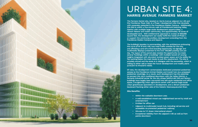
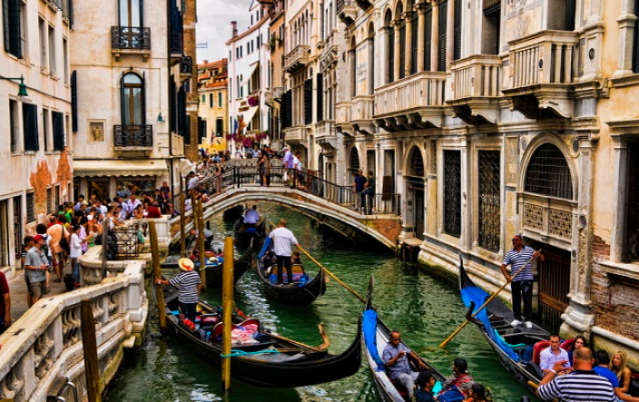
Gondolas on a canal in Venice. (thelocal.it)

In addition to narratives of place in his novels, Henry James wrote much about his personal travels, including visits to Venice, to which I’ve had the pleasure of a single blissful visit. The excerpts I’ve taken from his writing on Venice come from “Italian Hours” in the Library of America edition of his Collected Travel Writings: The Continent. (I also have his volume, in the same set, acquired separately, of writings on Britain and America.) I am indebted the Project Guttenberg, whose existence freed me from the arduous labor of transcribing so much text by hand … so I can quote at length, which is pretty much de regueur with James.

Below are snippets from a long passage on James’s reaction to John Ruskin’s thoughts in his magisterial The Stones of Venice. James, who wrote journals of his travels between 1870 and 1910, had a conflicted relationship with that book, written in 1851-53, when architects were going mano a mano over Gothic and Neoclassical styles (that is, Roman Catholic and Church of England). Whatever its faults may or may not be, Wikipedia quotes Roger Scruton that The Stones of Venice was “the greatest description in English of a place made sacred by buildings.” Well, here goes:

[Ruskin] has indeed lately produced several aids to depression in the shape of certain little humorous—ill-humorous—pamphlets (the series of St. Mark’s Rest) which embody his latest reflections on the subject of [Venice] and describe the latest atrocities perpetrated there. These latter are numerous and deeply to be deplored; but to admit that they have spoiled Venice would be to admit that Venice may be spoiled—an admission pregnant, as it seems to us, with disloyalty. Fortunately one reacts against the Ruskinian contagion, and one hour of the lagoon is worth a hundred pages of demoralised prose.

This queer late-coming prose of Mr. Ruskin … appears addressed to children of tender age. It is pitched in the nursery-key, and might be supposed to emanate from an angry governess. It is, however, all suggestive, and much of it is delightfully just. There is an inconceivable want of form in it, though the author has spent his life in laying down the principles of form and scolding people for departing from them; but it throbs and flashes with the love of his subject—a love disconcerted and abjured, but which has still much of the force of inspiration.

Among the many strange things that have befallen Venice, she has had the good fortune to become the object of a passion to a man of splendid genius, who has made her his own and in doing so has made her the world’s. There is no better reading at Venice therefore, as I say, than Ruskin, for every true Venice-lover can separate the wheat from the chaff. The narrow theological spirit, the moralism à tout propos, the queer provincialities and pruderies, are mere wild weeds in a mountain of flowers.

One may doubtless be very happy in Venice without reading at all—without criticising or analysing or thinking a strenuous thought. It is a city in which, I suspect, there is very little strenuous thinking, and yet it is a city in which there must be almost as much happiness as misery. The misery of Venice stands there for all the world to see; it is part of the spectacle—a thoroughgoing devotee of local colour might consistently say it is part of the pleasure.

The Venetian people have little to call their own—little more than the bare privilege of leading their lives in the most beautiful of towns. Their habitations are decayed; their taxes heavy; their pockets light; their opportunities few. One receives an impression, however, that life presents itself to them with attractions not accounted for in this meagre train of advantages, and that they are on better terms with it than many people who have made a better bargain. They lie in the sunshine; they dabble in the sea; they wear bright rags; they fall into attitudes and harmonies; they assist at an eternal conversazione.

I have made allowances for the patience of the modern reader by dividing James’s long paragraph (just over half of it quoted above) into five teeny weeny little paragraphs. … Okay, okay. I will run the rest of the paragraph (and maybe divide it up into three or four paragraphs. No one will accuse me of looking down Henry James’s nose at my readers!

It is not easy to say that one would have them other than they are, and it certainly would make an immense difference should they be better fed. The number of persons in Venice who evidently never have enough to eat is painfully large; but it would be more painful if we did not equally perceive that the rich Venetian temperament may bloom upon a dog’s allowance. Nature has been kind to it, and sunshine and leisure and conversation and beautiful views form the greater part of its sustenance.

It takes a great deal to make a successful American, but to make a happy Venetian takes only a handful of quick sensibility. The Italian people have at once the good and the evil fortune to be conscious of few wants; so that if the civilisation of a society is measured by the number of its needs, as seems to be the common opinion to-day, it is to be feared that the children of the lagoon would make but a poor figure in a set of comparative tables. Not their misery, doubtless, but the way they elude their misery, is what pleases the sentimental tourist, who is gratified by the sight of a beautiful race that lives by the aid of its imagination.

The way to enjoy Venice is to follow the example of these people and make the most of simple pleasures. Almost all the pleasures of the place are simple; this may be maintained even under the imputation of ingenious paradox. There is no simpler pleasure than looking at a fine Titian, unless it be looking at a fine Tintoret or strolling into St. Mark’s,—abominable the way one falls into the habit,—and resting one’s light-wearied eyes upon the windowless gloom; or than floating in a gondola or than hanging over a balcony or than taking one’s coffee at Florian’s. It is of such superficial pastimes that a Venetian day is composed, and the pleasure of the matter is in the emotions to which they minister. These are fortunately of the finest—otherwise Venice would be insufferably dull.

Reading Ruskin is good; reading the old records is perhaps better; but the best thing of all is simply staying on. The only way to care for Venice as she deserves it is to give her a chance to touch you often—to linger and remain and return.

Back in 2005, Victoria and I sat for a while in seats of lush maroon velvet at Florian’s, which still famously exists. I can’t recall what we sipped, and I had a hard time not thinking of the Austrian-born Providence architect Friedrich St. Florian. This was not long after his National World War II Memorial opened on the Mall in Washington. Ah! Beautiful! … But maybe not as beautiful as Venice.

Since not too long ago I reviewed Salvatore Settis’s If Venice Dies, which makes much of how almost nobody who lives in Venice works at anything but catering to those who visit Venice, I must add one lengthy phrase from a later paragraph:

… [T]he vexatious sense of the city of the Doges reduced to earning its living as a curiosity-shop … .

It seems that Venice has survived being a curiosity shop for centuries. Maybe only its visitors fail to understand that the Venetians might enjoy it – those who can still afford to live there!

Posted in Architecture | Tagged , , , , , , , , | 3 Comments

Mittell on Smith’s Bulfinch

Screen Shot 2018-03-26 at 12.27.26 PM.png

Norton Street Home, in Edgartown, by 2018 Bulfinch laureate Campbell Smith Architects.

My old friend and former Journal colleague David A. (“D.A.”) Mittell Jr. has written an account of the Duxbury, Massachusetts, firm of Campbell Smith Architects, which won a Bulfinch in the category of residential construction under 5,000 square feet in size. The Bulfinch Awards are sponsored by the New England chapter of the Institute of Classical Architecture & Art.

Mittell’s column (Politicus No. 1,513) primarily ruminates over the life and career of the firm’s founder, Peter Smith, his friend and neighbor growing up in Duxbury. It has little to do with the Federal-style house in Edgartown, on Martha’s Vineyard, for which the firm, founded in 1980, is honored. Smith’s partner, Pamela Campbell, founded their marriage in the same year. The firm’s project manager, Christopher DeOrsay, designed the house. Mittell writes that its “Federal style persisted in places like Martha’s Vineyard after it had gone out of fashion nearer to ever-trending cities.” And that’s about it for the house itself, which is fine because it is better seen than declaimed.

Still, many readers are sure to enjoy Mittell’s fondness for anachronisms, vocabulary and literary cadence from the antiquarian vernaculars of New England. “Webster Road went up the sand-girt hill from Cedar Street” is one such locution in this essay. Girt is the past participle of gird, as in “gird your loins.” I don’t know whether the word itself is anachronistic or antiquarian, but its use by a writer in 2018 certainly is. Anyway, you can find more such gems in Mittell’s piece, which was written for the quaintly named Duxbury Clipper, by clicking on the link below.

A Visit With Peter Smith and Campbell Smith Architects Politicus 1513

Campbell Smith Architects’ achievement will be celebrated with that of seven other Bulfinch laureates at a gala on April 28 in the Harvard Club at 374 Commonwealth Ave., Boston. Festivities begin at 6 and more detail and reservations can be found on the Bulfinch Page at the website of the New England chapter of the ICAA.

Posted in Architecture | Tagged , , , , , , | Leave a comment