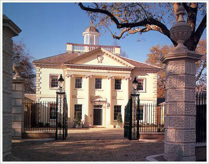
Ionic Villa (1900) by Quinlan Terry. (wirednewyork.com)
Above is a photo of a Palladian mansion in London’s Regent Park designed by Quinlan Terry, completed in 1990. It is really quite undeniably beautiful. Really? Undeniably? Well, maybe not quite. “We might expect the house,” writes critic Alain de Botton in The Architecture of Happiness, “to have been recognized as one of the superlative buildings of contemporary London, and Anglo-Saxon heir to the Villa Rotonda, and yet, in reality, the structure has garnered less flattering verdicts, and, among the more forthright, outright ridicule.”

Villa Rotonda, by Andrea Palladio
Of course, the less flattering verdicts come exclusively from de Botton’s crowd who hate new classical architecture. Ridicule? Naturally, any new building that hews to principles of beauty that have stood the test of time – 400 years in Palladio’s case – must pall next to buildings that are “of our time.” One is expected to bow down way low and doff one’s cap to such buildings, most of which are ugly, cold, sterile, impractical, prematurely decrepit structures that induce vertigo when they are not threatening to collapse, if they have not already.
Such buildings are considered to be “of our time” because they aim to reflect the era in which they were built, an era (we are told) of danger, crime, war, poverty, hunger, racism, sexism, pollution, corruption, profligacy, ignorance, insincerity, waste, etc. Modern architecture is not supposed to ameliorate humanity’s flaws and problems but to reflect them. And it does!
Terry’s Ionic Villa, which to my eyes seems indisputably beautiful, is a failure, according to de Botton’s much more highly paid and widely acclaimed powers of observation and reflection, precisely because it follows a set of principles – those of Palladio – designed to produce beauty.
The villa’s problems are multiple. Its forms seem out of sympathy with their era, they communicate feelings of aristocratic pride, which sit oddly with contemporary ideals, the walls are too creamy in colour, while the materials have a lustre and flawlessness that mar the impression of aged dignity which endows Palladio’s own villas with charm.
Huh? Where to begin? We’ve already dispatched the “out of sympathy with our era” complaint. “Aristocratic pride”? Is that supposed to be worse than the hubris of today’s financial aristocracy whose starchitects de Botton favors? It’s certainly not as ugly. “Sits oddly with contemporary ideals”? Does he refer to the ideal of cultural genocide that his favorites pursue in sucking up to their elite kleptocratic clientel among the world’s worst tyrannies and autocracies? Or the titanium-plated unsustainability at the heart of every modernist building? What to make of the accusation that the Ionic Villa has “walls too creamy in colour” and “a lustre and flawlessness that mar the impression of aged dignity” that Palladio’s villas achieved. Might not the Villa Rotonda have had what de Botton might consider a regrettable lustre and flawlessness when it was new – over four centuries ago!
What a collection of trumped-up charges! The world, and certainly American suburbia, is filled with failed efforts to toot the Palladian horn. Why such an obviously lame effort to dump on this one magnificent mansion? Clearly the answer is that de Botton feels mightily threatened by what Terry achieves in his Ionic Villa, in all his work, and what is achieved by the growing number of architects pursuing the classical revival in Palladian and other (often more heterodox) attempts to re-establish the idea of beauty as an appropriate goal for architecture today.
And he is right to feel threatened – which is why the Institute of American Architects is so adamantly opposed to a level playing field for major design commissions. He, it and all modernists know, in their bones, that if a truly level playing field were ever established in the apparatus that directs development in America and elsewhere, it would not be level for long. The rush to resume building attractive cities would tilt the playing field back toward tradition before you could utter the words “radiant city”!
And humanity has every right and every reason to resist the continued dominance of the architectural cult that has trashed the built environment around the world. Our era? No, our error. But no, not our error. We are the victims and it’s time we rose up against the victimizers. Architecture has the power to make us happy, as de Botton seems to vaguely perceive. But how can architecture that reflects our flaws rather than our ideals possibly make us happy? His charming book is a thickly veiled attempt to gently embarrass us into continuing to knuckle under to the hatred of beauty that motivates the architectural establishment.
Gee, I feel like I’m standing on a soapbox! Let me end this post before I rise up from my chair and start shouting at my computer!