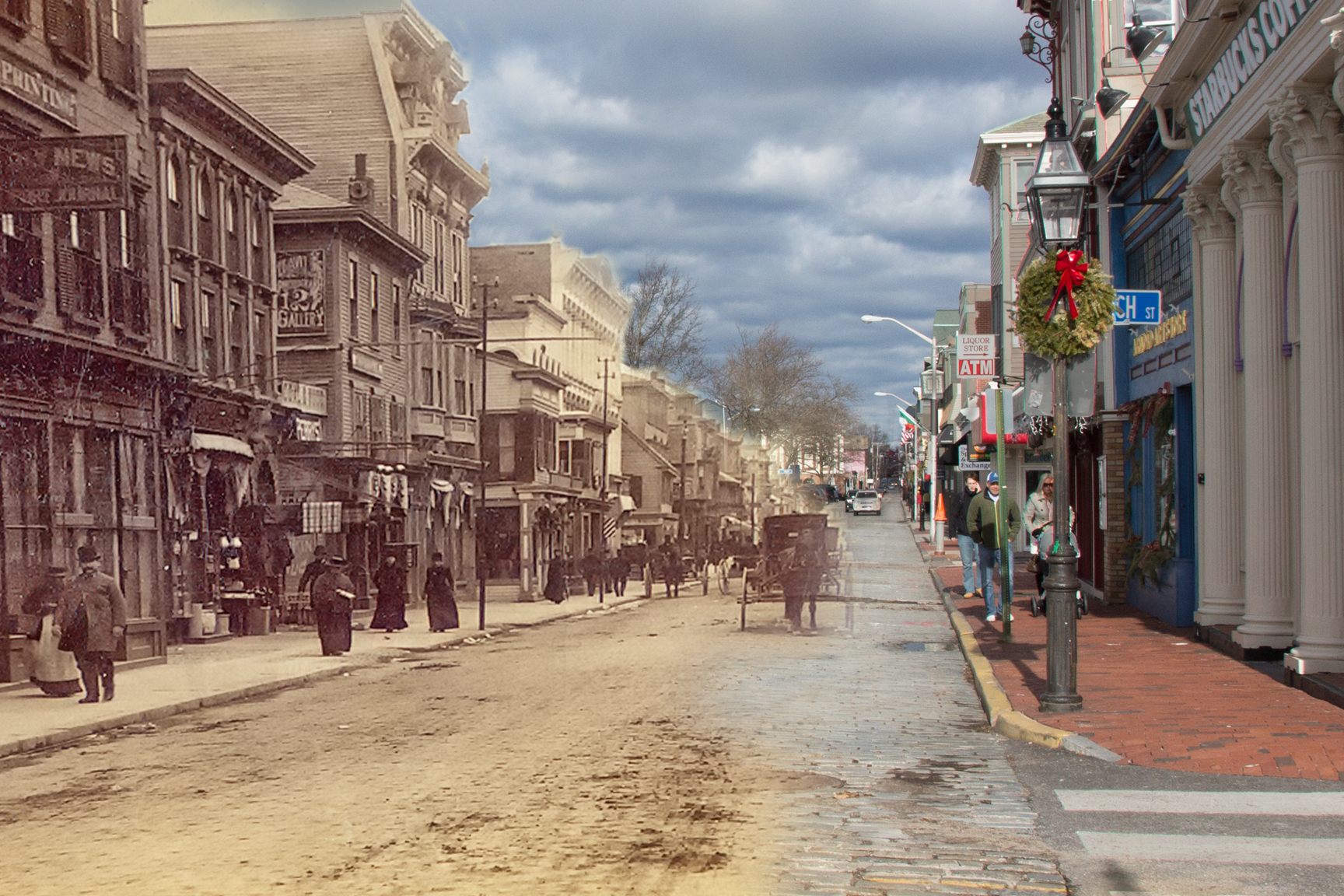
Espaces Abraxas, by Ricardo Bofill, in the Paris suburb of Noisy-le-Grand. (MessyNessyChic.com)
A riveting photo essay about public housing primarily for immigrants to France, based on an exhibit of the photography of Laurent Kronental, brings to mind the damage to the world done by founding modernist Le Corbusier. “A poetic vision of Paris’s crumbling suburban high-rises,” by Jordan Telcher for The Washington Post, offers a startling vision of major structures many hardly knew existed.
Another photo essay drawn from the same exhibit, on the website MessyNessyChic.com, with no author named, is called “Inside the Real-Life ‘Hunger Games’ City: A Decaying Parisian Utopia.” It makes a similar effort to find some redeeming value in what is widely considered, and admitted as such in both pieces, a massive failure of architecture.
Le Corbusier’s earlier high-rises were not for the poor but were taken up by planners in the United States and around the world as models for public housing. After their inmates displayed the often violent angst that arose with seeming inevitability in these alienating places, many have been torn down in recent decades. Corbusier proposed to tear down the heart of Paris. The photos in these two collections show buildings that, even at their worst, are much more elegant than what Corbu had in mind for the Marais district.

Tee shirt from demo of Hartford Park tower, in Providence. (Brussat archives)
I was invited by Stephen O’Rourke, director of the Providence Housing Authority, in 1989, to witness in person the demolition of one descendant of Corbu’s hatred for mankind. Like most of “the projects,” this high-rise was modernist in design, almost a knockoff of Corbu. I will give it credit for its strength: dynamite was unable to topple the forbidding monolith: a boom, a puff of smoke, the building tilted by maybe some 20 degrees, and the party was over. All I got was a tee-shirt that said, “The Leaning Tower of Providence.” The building was eventually taken down piece by piece. (In the early period of his quarter of a century at the helm of the PHA, my friend Steve led an almost miraculous reform of the agency from one of the worst public housing authorities in the U.S. to one of the best.)
The Parisian projects from the postwar years gave rise to online comment about Ricardo Bofill, who designed some of the more well known and is widely acclaimed for his postmodern work. I am uncomfortable with the photos that display a sort of quasi-classicism in some of the buildings. Of course, the Nazis used stripped classicism on a bloated scale to exhibit what Hitler certainly and Speer probably considered the civilized brutality – we’ll grant one of those two! – that infused the Third Reich.
The photo essays got me to thinking about the “good” and the “evil” of architecture.
It is interesting to see that the typical modernist scheme to crush humanity, masquerading as design genius, can be accomplished in a quasi-classical modality as well. It is also interesting that Bofill’s Noisy-le-Grand project, Espaces Abraxas, will be a movie set for the finale of the Hunger Games cinematic trilogy. If you look at futuristic movies, you very often find that the bad guys have modernist headquarters whereas the good guys (or, more often, the victims of the bad guys) have vernacular settings.

Inside the Death Star. (blog.al.com)
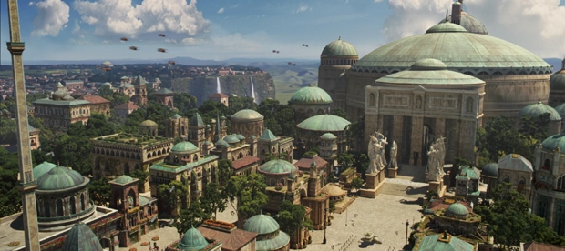
Naboo, from “Star Wars.” (lucasfilm.wikia.com)
This tendency is very strong in the Star Wars movies, directed by George Lucas. It is very revealing, and I would guess the he was channeling his subconscious intuition rather than trying to make a “statement” about good and evil architecture. But who knows. Maybe he was. Stranger things happen in Hollywood. If Lucas were dead, the plans for his museum in Chicago would have him spinning in his grave.
(Tips of the hat to Brett Van Akkeren for sending the WP photo essay to the Pro-Urb listserv, which discusses urbanism and the New Urbanist movement, and to Gary Brewer for sending the MessyNessy piece to the TradArch list.)