Betsky waxes nostalgic

90.jpeg

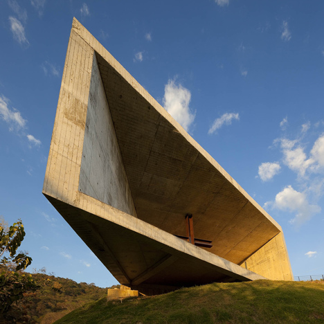
Proposed 2 WTC, by Bjarke Ingels Group. (BIG)

Aaron Betsky, regular columnist of Architect, mouthpiece of the American Institute of Architects, sees, in “Starchitects: The Next Generation,” the old guard of modern architecture being muscled aside by a new guard, who are winning big commissions and beginning to taste the sweet smell of success. Don’t drink too deeply, Betsky intones.

Yes, it warms my cockles to see Norman Foster booted by Bjarke Ingels for the 2 World Trade Center job and Frank Gehry edged aside by Joshua Prince- Ramus (mentored by Rem Kookhouse) for the concert hall at Ground Zero. Betsky hopes the new kids on the block won’t poop on the block as the oldsters have.

It makes you forget the battles of the titans who once fought for the right to put their respective stamps on the [WTC] site and then either didn’t get the nod or, when they did — like SOM, Daniel Libeskind, AIA; Fumihiko Maki, Hon. FAIA; and Santiago Calatrava, FAIA — failed utterly and at a great cost, both to the urban environment and to taxpayers.

Above all he praises “work that shows us new ways to address the pressing social, environmental, and, yes, aesthetic, issues that confront us,” forgetting (momentarily, no doubt) that the older generation thought that’s what they were doing, too. And the older generation before them. Etc.

I even enjoyed feeling the hairs standing to attention on the back of my neck when I read about all the thinking that’s going on:

As in many parts of our culture, we are so meta that we are meta-meta, self-consciously citing citers who were self-consciously citing other citers with an irony that coils around serious purpose to swallow more attitude.

This was his reaction to the recent brouhaha over Patrik Schumacher’s criticism of the Chicago Architecture Biennial and its critics. (See my post “Diss the Chicago biennial!“) The major domo in Zaha Hadid’s shop (the next Prince-Ramus?) was as baffling as ever, outdone in his meta-meta-metaphysics only by his critics, who waxed incomprehensible in explaining the hurtness of their feelings. As if any of it is anything new. (Even the trads enjoy counting how many angels can dance on the head of a pin.)

Well, Betsky cites his own age and his own books and his own mentors of long, long ago – and of today! Watching the factotums of the avant garde wax nostalgic never grows old. It is fun to read, especially if your eyeball muscles cry out for the rolling cure. Betsky never lets us down.


Posted in Architects, Architecture, Architecture History, Art and design, Development | Tagged , , , , , , , , , , | Leave a comment

A boulevard, not a highway

sectional-view-of-concept-550x206.jpg

Cutaway diagram of proposed Route 6/10 boulevard. (Architect’s Newspaper)

The next big Providence project for a city that has seen many might be to turn the old Route 6/10 connector into a boulevard. The Providence Journal reports that the state’s transportation authorities seem surprisingly receptive to the idea as an alternative to replacing one monstrosity with another.

Current-Site-Conditions-Looking-East-Towards-the-Mall-State-House.-Federal-Hill-is-to-the-Right-the-Valley-with-its-Mill-Buildings-to-the-Left.-550x306

The connector today. (A/N)

The Route 6/10 connector is the gulch you look into from your table at DePasquale Square on Federal Hill. It merges the two highways that carry traffic back and forth between downtown and points west – from  the neighborhoods of Olneyville and Hartford Park to the city of Hartford, Conn.

Parts of the old connector feel as if they are shaking from the weight of traffic – or maybe that’s just potholes.

Bike and transit advocate James Kennedy has been leading the charge for this idea, along with the Coalition for Transportation Choices, Move Together PVD, and other transit-oriented civic groups. Here is the Journal’s article, “Rethinking the 6/10 Connector,” by Patrick Anderson, that describes the state of play on the 6/10. The Architect’s Newspaper has more: “This Tangle of Highways in Providence RI Could Give Way to a Green Boulevard.”

The state has to fix the aging highway just as it is now fixing Route 95’s old segment through downtown, an expensive project already delayed. Route 195’s deteriorated and unsafe span over the Providence River has been relocated and replaced with a redevelopment corridor. The city that once contemplated running Route 195 right up the river to the edge of the State House lawn (in the ’50s, of course) has removed the road from atop its river (the former world’s widest bridge according to the Guinness Book of World Records) and laid down a new waterfront with a dozen elegant bridges lined by parks and river walks. That project, conceived by the late architect Bill Warner, involved burying the Northeast Corridor rails under Smith Hill and moving the confluence of the Woonasquatucket and Moshassuck rivers as they merged at the head of the Providence River.

In short, given what Providence and Rhode Island (and the feds) have done over the past three decades, the idea of ripping down the 6/10 connector and replacing it with a tree-lined boulevard at ground level seems almost Simple Simon. It is a no-brainer. Except for the foregoing history, it is exactly the sort of brilliant plan that most city and state transportation bureaucracies might be expected to reject out of hand.

(As ours did when it came to the brilliant idea for a Ship Street Canal, conceived by architect Paul Pawlowski in the 2000s. This would have made the 195 corridor much more attractive to developers. Its rejection by both the city and the state will be paid for by successive rounds of tax incentives and subsidies. They will cost Rhode Island dearly even if they succeed in sparking development, which looks like an iffy proposition right now).

I recall when Providence was daylighting its rivers, revitalizing the old downtown with loft rehabs by Buff Chace, and building Providence Place there was much talk that “the neighborhoods” were being stiffed by all this downtown development: an error in judgment, as downtown is for everyone’s benefit, and its development creates jobs and enriches the city physically and financially. But there’s no doubt who this boulevard idea would benefit. It would be, arguably, a first really major effort to spend not only money but creativity and imagination directly to the advantage of what largely are disadvantaged Providence neighborhoods.

City and state leaders should start to really push this idea. Who knows, some people might end up thinking it was their idea.

[This post goes onto my blog but not out to my blog send list recipients until my email server quits intercepting my bulk posts under the suspicion that they are spam. I am sorry to say that for the time being those who want to read my posts will have to visit my blog, or get them on social media. I will see if I can send to TradArch and Pro-Urb lists without punishment. – David Brussat]

site-map-550x360.png

Map of proposed replacement for Route 6/10 Connector. (Architect’s Newspaper)

Posted in Architecture, Art and design, Development, Landscape Architecture, Providence, Rhode Island, Urbanism and planning | Tagged , , , , , , , , , , , , | 10 Comments

“Sorry ’bout me building!”

maxresdefault

Beetham Tower, in Manchester. (YouTube.com)

[This post goes onto my blog but not out to my blog send list recipients until my email server quits intercepting my bulk posts under the suspicion that they are spam. I am sorry to say that for the time being those who want to read my posts will have to visit my blog, or get them on social media. I will see if I can send to TradArch and Pro-Urb lists without punishment. – David Brussat]

***

High winds in Manchester, England, whistle past the 47-story Beetham Tower, causing it to emit a low-pitched moan (said to be in the key of “B below middle C”). “What’s the loud noise in the city centre? The Beetham Tower whistle, of course” is how the Manchester Evening News reported this recurrent civic horror, apparently caused by the wind “playing” a steel blade at the building’s crest, described by Wikipedia as “a façade overrun accentuating [the tower’s] slim form.”

Here is the YouTube video of the singing skyscraper.

When the Beetham opened in 2006, one critic said it “torpedoed” any hope of Manchester garnering coveted status as a UNESCO World Heritage City. The building’s designer, SimpsonHaugh & Partners, cites its form as a symbol of Manchester’s post-industrial revival. When the building proved also to have a set of pipes that might turn green the gills of the singer Tom Jones (Sir Thomas is still belting it out at 75), SH&P’s Ian Simpson, who lives in a Beetham penthouse, apologized to the city.

When’s the last time an architect apologized? (The profession’s credo is “Never Apologize, Always Explain.”)

The building’s whistle may be obnoxious but modern architecture lays claim to utility as its credo. The noise is clearly intended as a warning siren to alert Mancunians of high winds afoot. Rather than criticize it, the city should reject Ian Simpson’s apology.

Perhaps the Beetham Tower also utilises the wind-tunnel effect to create a stiff breeze to maintain pedestrian verticality and locomotion. The wind at their backs! How useful as they stroll downtown Manchester, ever at risk of fainting from the ugliness of the Beetham Choir! Modernism’s utility to the rescue!

Hat-tips to Cliff Vanover and Jules Pitt for sending this story to me and to the TradArch list.

Posted in Architects, Architecture, Development, Humor, Other countries, Urbanism and planning | Tagged , , , , , , , | 6 Comments

Kitsch or not too kitsch?

RGEa1Im.jpg

“The Offering,” by Luke Hillestad (oil on linen)

The question of kitsch has arisen often in discussions of architecture. A house whose classical portico is not backed up by the orders in the rest of its makeup might be kitsch. Or a house whose classical portico is backed up appropriately may be kitsch if it is in an inappropriate neighborhood, thus overstated in its context. But is the above painting, “The Offering,” by Luke Hillestad, kitsch? I don’t think so, and yet Hillestad describes himself as a “kitschpainter.” He seeks to raise the reputation of kitsch.

a_friend_in_need

Dogs playing poker: classic kitsch.

thomas_kinkade_oil_painting

Painting by Thomas Kincaid. (bloggernews.net)

So I may not understand what he means by kitsch. It has always been one of those words that arrives protected by a battalion of nuance. A painting of dogs playing poker seems to define kitsch, but if so why do people argue about the word? A village scene by Kincaid might be a better definition of kitsch. But “The Offering” hardly falls into either category.

It showed up on Reddit – a social media platform used mainly by young men – and won a lot of praise. One commenter described himself as “pretty uneducated” about art, and then proceeded to describe the symbolism of the three women in the painting. One was holding a phallic symbol. Another had antlers on her head. Did that make it kitsch? The artist replied:

I like this. The offering is met with innocence and intrigue and the expressions are a mixing of the spiritual and sensual. You may be naïve about Art, but it does not seem to hinder your interpretation of the picture.

It seems to me that a lot of the art world entertains itself by counting the number of angels that can dance on the head of a pin. Not that there’s anything wrong with that. Criticism of criticism of criticism is what makes the world of art (and architecture) go round. Steve Dombek saw the painting on Reddit, sent it to me, and writes:

[Hillestad] refers to himself in one comment as not an artist but a “kitschpainter,” and refers to a movement to reclaim the word “kitsch” as non-pejorative. Hillestad says “the heart of kitsch is its earnest sentiment. Kitsch is a category that ranges in quality up to the greatest masterpieces.”

As filmgoer, I always cringe when a reviewer criticizes a movie’s director for “manipulating his audience.” Hey, that’s what I want him to do. I want him to make use of all the tools that filmmaking puts at his disposal. Yes, do tug at my heartstrings! Do scare the bejesus out of me! Similarly, I want a painting to toy with my emotions, not just my intellect. “The Offering” does that. In addition, it is just plain beautiful. If that makes it kitsch, maybe the world of art is as topsy-turvy as the world of architecture.

An interesting topic! Here is Worldwide Kitsch, a website that goes into it more deeply.

[This post was first published on Saturday but many recipients missed out because my email server (Gmail) is persuaded that my posts are spam. I am seeking a resolution to this confusion, but dare not post further, for now, as a new post, sent with my usual bulk email distribution list, seems to violate a daily quota of sent emails – another bafflement, which, if triggered, bars my sending out any emails at all.]

Posted in Architecture, Art and design, Books and Culture | Tagged , , , , , , | Leave a comment

Long competition shortlist

Cardedeu-by-EMC-Arquitectura_dezeen_784_2.jpg

Cardedeu, by EMC-Arquitectura (Dezeen)

Aside from repeating the headline that the World Architecture Festival’s shortlist for World Building of the Year 2015 is way too long, there’s not much to say for this year’s candidates. Nor even a lot to say against them. Most of it’s been said before, here if not elsewhere. There are some striking entries, but they do not look like buildings. Maybe that’s the whole idea. If the winner is the building that looks least like a building, then the world of architecture is upside down. So what else is new?

World Building of the Year 2015 shortlist announced” was sent to me by Malcolm Millais, architect, engineer and author of Exploding the Myths of Modern Architecture. He called the contest shortlist unencouraging and uninteresting, which may qualify for understatement of the year.

The first one, a meeting hall of rectangular concrete through which one may peer to a lake with mountains beyond, benefits from its Salvadoran setting. But it still doesn’t look like a building. It is a landscape in a gallery that will not hang any picture without the most austere frame, even if the picture within the frame is extraordinary. We’ve all been there before. In fact, it is a chapel. You can make anything these days and if you can step inside of it you may by right call it a chapel. But my favorite is another rectangular concrete building with an even more acute angle – or maybe it is the same building without the generosity of being photographed at dusk with its scenery in the background: actually I just checked and it is the same building, Cardedeu, by EMC Arquitectura, shorn of any reason to feel affection for it.

Honesty in packaging! A venerable principle of modern architecture honored mainly in the breach! But choose your camera angle with care! And for those inclined to pray there, watch out – step too far onto the prow of this house of worship and you and it might tip right over.

So look at the shortlist, 338 “buildings” in 31 categories. (Did I mention that the shortlist was too long?) If you can figure out any standard by which they measure each against the other to choose a winner, please let me know! And I’m informed that the winners are already announced and that I won’t like them, either! World Architecture Festival without end!

Cardedeu-by-EMC-Arquitectura_dezeen_sq.jpg

Same as the above, from a different angle and time of day.

Posted in Architects, Architecture, Architecture Education, Art and design, Photography | Tagged , , , , , , | 2 Comments

Why Angry Birds are angry

DSCN9830.JPG

Screenshot looking down at Thanksgiving parade during broadcast. (CBS)

You think the three television networks are the same? Not so! Last year’s Macy’s Thanksgiving Day Parade was broadcast by NBC and this year CBS got the job. What a difference a network makes!

DSCN9832

Angry Birds float at Macy’s Thanksgiving Day Parade. (CBS)

So yes, the Angry Birds have every reason to be angry. Last year, NBC shot the parade on Broadway against the backdrop of its great traditional skyscrapers (see my “Thanks for this parade“). This year, CBS placed its anchor booth to assure that glass-box modern architecture was the primary backdrop. How boring! Hope the Angry Bird float did not show its anger by pooping on the crowd!

The Angry Bird should defecate on the NBC producers. Although the anchors expostulated repeatedly that the weather for the parade was fine, it looked gray to television viewers. This was no doubt because the glass boxiness of the backdrop played such havoc with reflected sunshine that the producers forced the cameramen to use filters that grayed out the beautiful blue sky (if we can believe the anchors).

Of course, there was very little parade on the CBS broadcast of the parade. It was mainly interviews with boring stars of CBS shows, or cutting away to bad music by bad singers filmed off site or studio commercials for other bad CBS shows. And of course cutting to the regular commercials. I fast-backwarded to the Angry Bird float segment because my little boy, Billy, who was dutifully viewing the parade with me, is an Angry Birds fanatic. Then I fast-forwarded back to where we were in the parade. When you “roll the tape” fast you see more clearly how much of the broadcast is fluff. Like the cutesie actress who informed us that she grew up with a photo of Tom Selleck over her family toilet. More than I want to know; maybe more than Tom wants to know!

Ah, those CBS producers. Maybe they’ll get a Pritzker Prize for this year’s parade broadcast. Aargh! Thanksgiving indeed. Tonight I’ll give thanks that this year’s CBS broadcast of the Macy’s parade is over and pray that next year it will be back in the reliable hands of NBC. Happy Thanksgiving!

(News flash: Later this afternoon I discovered that NBC had also aired a broadcast of the parade, starting at around 4 p.m. I had thought CBS had somehow got the gig this year. Both networks did. NBC’s broadcast this year had the same backdrops as last year. And now I learn from Kristen Richards of ArchNewsNow.com that NBC’s afternoon broadcast was a rerun of its live morning broadcast of the parade. And now Will Morgan informs me that the top screenshot is not Broadway but 6th Avenue.)

[Thanks to Gayle Gertler for correcting my erroneous citation of Burt Reynolds as the actor whose picture graces Actress X’s family toilet.]

[This post was originally sent around noon on Thanksgiving. It has been delayed because my email server suddenly believes, in its wisdom, that my bulk delivery is spam. I hope you will get it, late being better than never.]

Posted in Architecture, Architecture History, Art and design, Books and Culture, Development, Humor, Urbanism and planning, Video | Tagged , , , , , , , | 3 Comments

What is architecture about?

698a4dac720d86dfe010ddda96394bec.jpg

The Backs, along the River Cam, in Cambridge. (Terence Kwan/500px.com)

Stephen Fry, celebrated British actor and humorist best known on this side of the pond for his portrayal of Jeeves, manservant to Bertie Wooster in the TV series Jeeves and Wooster, published his first novel, Liar, in 1991, which also addressed issues of class, to say the least.  The television series is based on the Jeeves and Wooster novels by P.G. Wodehouse. Below is an excerpt from Liar in which Fry’s protagonist, Adrian Healey, crosses a lawn on the Cambridge University campus, mulling its beauty’s influence on his life.

It was Adrian’s last summer, but whenever he crossed the bridge, no matter how occupied he might be, he could never prevent himself from looking across at the Backs, the green train of lawn and willow that swept along behind the river behind the colleges. With a late afternoon mist descending on the Cam, the absurd beauty of the place depressed him deeply. Depressed him because he caught himself failing to react properly to it. There had been a time when that blend of natural and human perfection would have caused him to writhe with pleasure.

Architects believe that their work improves life on this planet. Here is a simple evocation of that belief. I’m not sure what to make of it. The beauty of the Back depresses Adrian because he no longer reacts to it properly – with pleasure – as he once did. I am relieved to suspect that most observers of the scene will not be hobbled by such nuance. Not sure the word “writhe” is the best one to place next to “pleasure,” but maybe it is if you understand the character that Fry creates in Adrian. (Readers may consider that as a “trigger warning.” Liar is not for the squeamish!)

Posted in Architecture, Art and design, Books and Culture, Humor, Landscape Architecture, Photography, Urbanism and planning | Tagged , , , , , , , , | Leave a comment

AIA artist exposes mods

90.jpeg

Untitled illustration by Lauren Nassef for Architect


Above on this page, Chicago illustrator Lauren Nassef reinterprets everyday objects that have become symbolic and, rendered as speculative buildings, could be iconic. Please don’t sue her.

The passage appears at the end of an article in Architect, the journal of the American Institute of Architects, entitled “Adaptive Practices: Symbols of Simplicity Never Go Out of Style,” by William Richards. His article focuses on the Gateway Arch by Eero Saarinen, which was designed to symbolize the westward expansion of America. This need not concern us. We are interested in the drawing by Lauren Nassef, who shows a city formed from buildings designed to represent everyday objects.

Richards’s “Please don’t sue her” refers to a threat to sue Saarinen on the ground that his concept stole an idea for an unbuilt Fascist arch by the Italian architect Adalberto Libera. He never did file his suit. How can you claim to possess an exclusive right to a catenary arch, which, as Richards points out, is as much a product of physics as it is of the architect’s imagination?

Well, I plan not to sue Lauren Nassef but to praise her. Her illustration exemplifies the essential silliness of modern architecture. The public applies derisive monikers to many works of modern architecture because they look like common objects – cheesegraters or walkie-talkies (London), say, or razor blades (Boston) or, for that matter, testicles, vaginas and penises (London again, Qatar and Beijing). The public prefers buildings that look like what they are supposed to be – banks, churches, city halls or just plain houses.

And the public is right. It correctly understands that architecture as mimicry is not serious business, that its so-called “novelty” is truly the pose of a highly celebrated and well-paid poseur. A profession that can fit both mimicry and novelty into its self-concept is laying itself open to ridicule. An egg carton or a jello mold or a stapler or an orange juicer could indeed be transformed into an iconic building. That is indeed ridiculous. And sad. And ugly.

So thank you, Lauren Nassef, for pointing this out in a manner that should be legible even to someone with an advanced degree!

By the way, your talent shines even more brightly in the illustration below, also from Architect. Here you have drawn real architecture, including modern architecture before it got bored with boxes and took its turn toward neo-postmodernist shape-mongering. (I guess the guy in the cap is Matthew Postal, who describes some of his favorite buildings in New York for another article, “Sourcing the City,” by William Richards.)

Beyond the Nassef drawing below is a photo from Michael Rouchell of a building in Louisiana: “Baton Rouge already has a stapler.”

90-1

Illustration by Lauren Nassef for Architect

Screen Shot 2015-11-23 at 7.10.00 PM

Posted in Architects, Architecture, Art and design, Urbanism and planning | Tagged , , , , , , , , , , , , | Leave a comment

Descent from red to green

Screen Shot 2015-11-22 at 11.23.04 AM.png

Sceenshot of scene from cartoon “Driving,” by Nate Theis.

This “charming” video is difficult to resist, and will resonate, perhaps, with drivers everywhere, especially in big cities. Although I myself am strikingly immune to the phenomenon of road rage, driving in Providence seems to grow increasingly akin to the miserable experience mocked in this video, “Driving,” by Nate Theis and broadcast by the curious website Kuriositas. It is a bit over three minutes long but I’ll warrant you’ll watch it over and over to examine the means by which Theis illustrates his drivers’ descent into the paved urban maelstrom. Enjoy!

Posted in Architecture, Art and design, Books and Culture, Humor, Urbanism and planning, Video | Tagged , , , , , , , | Leave a comment

Our Downcity walkabout

DSCN9826.JPG

Maria Ruggieri before the Betz/Etam Cru mural on the Mathewson Street United Methodist Church. (Photo by David Brussat)

On a clear, modestly chilly evening that just about defines New England in November, hundreds were out on the streets of downtown Providence. No doubt thousands more were inside on the seats of downtown’s robust round-robin of local restaurants and nightclubs.

A good time was had by all, including me and my friend Maria on patrol, on walkabout, on the streets and seats of the town. Walkabout is the name, from the Australian outback, that we use to describe our now-and-then forays into downtown, where we were once neighbors in lofts 501 and 401 at the Smith Building – the first of Buff Chace’s building rehabs that have done more than anything else to revive the Downcity dream.

Maria Ruggieri, entrepreneur, ace jewelry designer (now there’s a Ro Dilan gal for ya!), founder of the late, great Downtown Neighborhood Alliance and for years the most outspoken member of the board of the PDID, the city’s downtown improvement district: A native of Cranston, she now lives on Broadway in the city’s West End, while I now live with my family on the northernmost reaches of the Far East Side.

aliceIt was during Maria’s sojourn upon the august PDID board that she was first to propose the murals that now grace the blank walls of buildings facing downtown parking lots – turning them occasionally into outside party rooms. I’m not so sure that I would any longer prefer, as was once my longstanding gospel, to have painted strictly architectural murals of trompe l’oeil façades on the same walls. They would’ve been excellent. But today the huge people in these murals generate awe, and certainly bring an inspirating sense of place to otherwise quotidian urban settings.

So all hail these works of art and their creators, gathered organizationally under the umbrella of an urban arts group called The Avenue Concept. The mural of the young man with his hand outstretched as a rat whispers in his ear is by Betz of the Etam Cru (parse that as you wish). The mural of Alice entering Mushroomland, facing the Betz mural across a parking lot owned by former mayor Joseph Paolino, is by Natalia Rak.

Maria and I wandered around, seeking the vacant streetscapes and empty eateries that one might expect after reading some recent commentators (such as one in the Providence Journal by Mary Ann Sorrentino, whose pessimism I debunked a while back in “Providence’s renaissance“).

Instead we found streets vibrant with people having fun. This was not Times Square, but anyone familiar with Manhattan knows that many of its streets are silent even on the most pleasant evenings. Not even New York is Times Square all the time.

We saw no empty restaurants downtown and most were crowded. We popped into then out of the new Italian restaurant, Rosalina, on Aborn Street, where Revolution used to be, next to Gracie’s. We finally chowed down at Providence Coal Fired Pizza in the Conrad Building on Westminster. One of the most lovely streets in the Western Hemisphere was at its best, lit by its long strings of tiny bulbs above the street, and animated by plenty of bustle. We barged into a private party at the Arcade, celebrating the Coffee Exchange and New Harvest Coffee & Spirits and chatted up our old neighbor Erminio Pinque, founder and leader of the Big Nazo Puppets across Eddy from the Smith. The Dean Hotel, on Fountain Street in the old Sportsman’s Inn, where we dipped into the Germanic biergarten Faust for a nightcap, was a hive of people on the way in and out, having a great time, living the “Downcity Dream” that even I long spoke of half in jest. No longer!

And so, on our walkabout, we too relived the Downcity Dream.

Posted in Architecture, Architecture History, Art and design, Preservation, Providence, Uncategorized, Urbanism and planning | Tagged , , , , , , , , , , , | 2 Comments