“From Paris to Providence”

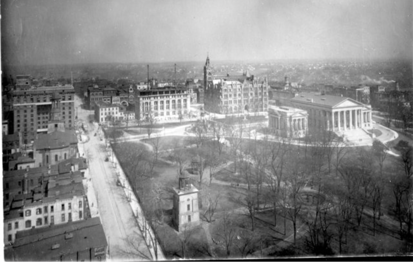
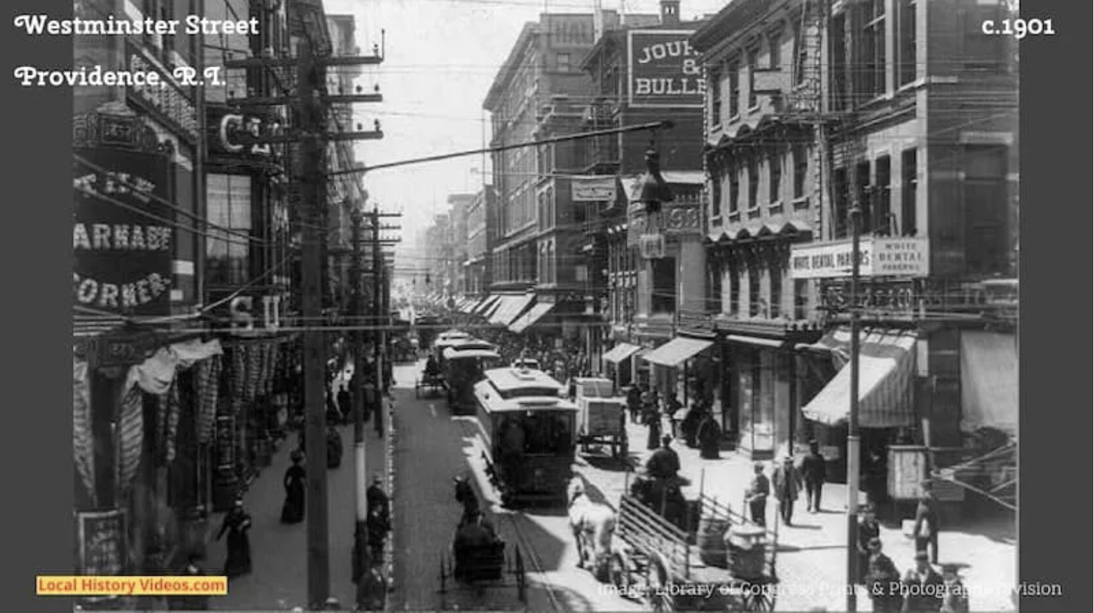
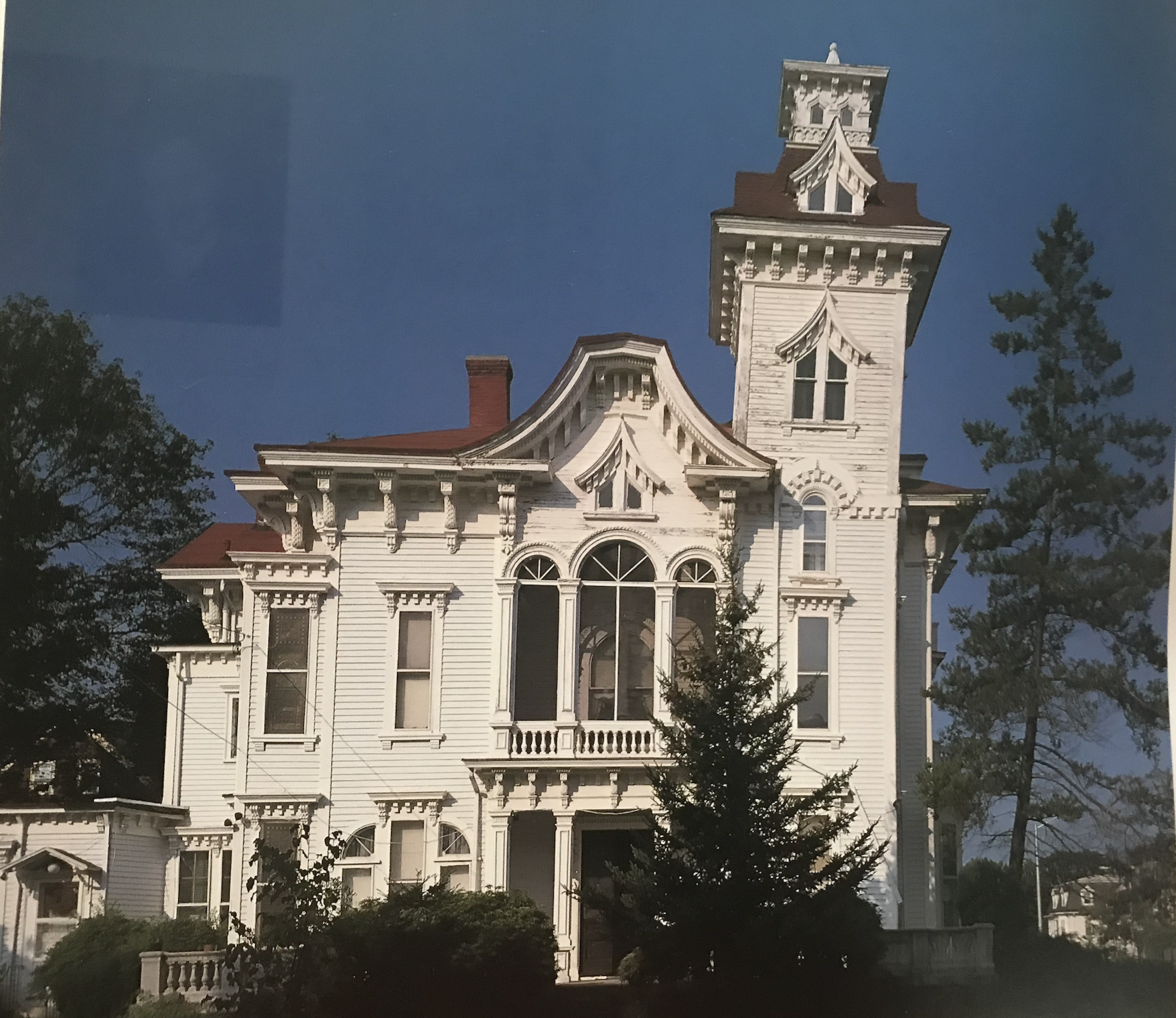
514 Broadway, the Prentice House, in Providence, where Anna and Laura Tirocchi had their dressmaking shop. Now known as the Wedding Cake House, it is a chic hotel. (Tirocchi Archive)

Providence was once a world leader in textile manufacturing, including the design and manufacturing of machinery needed to produce clothing from the more or less raw material of textiles. As the city’s importance in this realm grew, civic leaders, including some from families associated with my former employer (the Providence Journal), founded the Rhode Island School of Design. It was originally tasked to introduce a higher level of aesthetic sensibility to the design of machinery and the products of that machinery, including ladies’ fashions.

Chart by Raymond Loewy. (RISD)

Sadly, RISD has strayed from its mission. Perhaps predictably, its faculty and students have, so far as I can tell, largely bought into aesthetic philosophies that spurn tradition and its attention to detail and ornament. (I hope to receive an email from someone at RISD saying that’s not true, and chastising me for not appreciating the extent to which RISD has been incorporating traditional elements into its teaching of aesthetics.)

The other day I received a gift from the ever fecund Seth Weine, a Fellow of the Institute of Classical Architecture & Art. He sent me a catalogue from a RISD exhibition in the year 2000 entitled “From Paris to Providence: Fashion, Art, and the Tirocchi Dressmaking Shop, 1915-1947.” Describing the era of the shop’s foundation, former RISD curator Pamela Parmal, who now works for the Museum of Fine Art, in Boston, writes:

Custom-made clothing was still the rule for women at a time when the ready-to-wear trade had already become established for men’s and children’s apparel. The proper fit over a tightly corseted body could only be achieved through the services of a dressmaker; likewise, the complex draping of fabric and the disposition of elaborate trims and ornaments considered necessary for female attire. The custom process also enabled the buyer to enjoy a level of creativity and the ability to express her individuality. Clients chose their own fabrics, trims and ornaments, and worked with their dressmakers to produce the one-of-a-kind garments that suited their tastes, figures and budgets.

These garments, whether ready-made or custom-made, changed slowly over time. In 1906, the Providence municipal directory listed 890 dressmaking shops. That number was cut in half by 1920. Eventually, during the 1920s and ’30s, Parisian fashions embraced some of the elements of modern design showing up in painting, music and other arts. Maybe there is evidence here of a cause and an effect. RISD exhibition curator Susan Hay describes these changes during the Roaring Twenties, when flappers donned modern fashions and flattened their bodies as if to mimic coutures’ cancellation of sweet curvatures.

This is not, I suspect, how Hay would describe it. She takes a strictly objective view, which nevertheless seems to me a view of acceptance. Never a frown, never a raising of the eyebrows. She is a total professional. Her chapter on fashion’s evolution traces changes tracked by industrial designer Raymond Loewy in his famous chart (above left) of how ladies’ fashion evolved alongside the design of bathing suits and of the houses they occupied with their husbands. See my Journal column of 2005, on the relationship between fashion and architecture, reprinted on my blog in 2013, which includes the photograph below.

William Van Alen (center), architect of the Chrysler Building, at the 1931 Beaux Arts Ball, where leading architects dressed up as their buildings.

Hay continues:

He [Loewy] compares the changes in architecture, from the ornate houses of earlier centuries to streamlined modern architecture up to the 1930s, with developments in female dress, starting with the seventeenth century’s long, full, enormous skirts, full sleeves, and high coiffures, and ending in 1934 with the svelte, form-fitting evening gown, exactly reflecting the silhouette of gowns found in the Tirocchi shop. In the same chart, using a woman clad in a bathing suit, he shows how the very ideal of a woman’s figure changed from the plump form of the 1890s to the thin, long-legged creature of 1935.

Actually, the chart continues to the mid-’50s, with ladies showing less and less fabric, more and more skin, until, at the bottom, Loewy places a question mark, suggesting that the next stage might not be fitting for a chart gracing a family publication. And today, who knows? Women’s fashions, as represented on the runways of Parisian fashion shows, are ever more risqué in their use of materials and forms to display their revolt against tradition, but still allowing peep holes to invite the male gaze. And today, even the curator would probably be canceled for her use of the word “creature” to describe a female.

She adds:

With the coming of age of the anti-ornamental purist element in art after Le Corbusier’s breakthroughs in the late 1920s and the growth in philosophical importance of Germany’s Bauhaus school, fashion’s own “return to order” was the “classic” clothing of the 1930s. [Don’t get me going on this abuse of the word classic!]

She concludes this chapter with some of what she would classify as optimism:

The question they attempted to answer – what does it mean to be modern? – is as much in contention now as it was at the beginning of the twentieth century. The concepts of modernism are still present in the Western aesthetic at the beginning of the twenty-first century. The search for elegance in fashion at the start of the new millennium reflects the concerns and debates of the early modern period as they are revealed in fashions from the Tirocchi shop. Although their elaborate Art Deco fabrics and often exuberant ornamentation may have come to look less and less “modern” as the century progressed, among them are many garments that could be worn with great pride today.

True enough, but I imagine that the Ticchotti sisters, Anna and Laura, would be twirling in their graves today.

Let’s see if we can find a photo from a recent RISD fashion event. Ah, here we are! This is a video of the 2022 Senior Apparel Show. Some of it is transgressive, some of it not; some of it is attractive, if not especially practical, most of it is not, and toward the end even displays of sensuality are permitted. It is, all told, not as bad as I expected. Slap me on the wrist! Some of it may reflect a push toward – dare I say it? – more traditional attitudes in the culture, though far from dominant, including architecture, orchestral music, painting, sculpture, etc.

(The video of the RISD Senior show is at the bottom of this post.)

Most of the catalogue details relationship between the sisters and their wealthy clients, mostly the wives of industrialists, entrepreneurs and their leading executive staff. How the Tirocchis acquired fashions from the couturiers of Paris – well, let’s just list the essay titles: “Line, Color, Detail, Distinction, Individuality,” by Pamela Parmal; “Clients and Craftswomen: The Pursuit of Elegance,” by Susan Porter Benson; “Strategies for Success: The Tirocchis, Immigration, and the Italian American Exprience,” by John W. Briggs; American Fashion: “The Tirocchi Sisters in Context,” by Madelyn Shaw; “Paris to Providence: “Couture and the Tirocchi Shop,” by Susan Hay; “Modernism in Fabric: Art and the Tirocchi Textiles,” also by Susan Hay, who was the exhibit’s lead curator.

Even for a nontransgressive male, this is all fascinating. The catalogue may be purchased here.

Posted in Architecture, Art and design | Tagged , , , , , , , , | 10 Comments

Best trad buildings of 2022

Capital Square, in Richmond, with the original Life Insurance Co. of Virginia under construction to  next to city hall to the center left of the Virginia State Capitol, designed by Thomas Jefferson.

It grows ever more difficult and hence ever more depressing to construct these annual roundups of traditional architecture. I feel a bit of guilt arising from the headline “Best trad buildings of 2022,” because so many of them are obviously not “the best.” I think I have reason to complain that so many of the websites of architectural firms omit the date of completion of the buildings in their portfolio sections, as if they are trying to perpetuate some sort of secret – perhaps that the building in question has existed forever, and that the firm which designed it is an old institution so venerable that its founding has been lost in the fog of memory. The Institute of Traditional Architecture, founded in 2014 by Joseph D. Jutras, provides a list of the top 50 traditional firms. I challenge anyone to click on a single one whose portfolio does not omit their projects’ date of completion. (RAMSA is an exception.)

For what buildings I am able to include this year I offer thanks to Michael Diamant, founder of the Traditional Architecture website, who has sent, as he did last year, more than a handful of new traditional buildings and, in some cases, before and afters of the site. His work enables me to sustain hope that, despite my lack of patience and diligence in tracking them down, there is actually a plenitude of traditional buildings going up around the world that I simply am too lazy to locate, especially since I put it off till so late in the year.

So here are the best trad buildings of 2022. Purists among my classical readers will probably be disappointed, or even dismayed, by some of the risks taken by architectural tightrope walkers in designing some of these buildings, but they are all of them, at the very least, decidedly traditional.

***

The new offices of the Virginia General Assembly, replacing the old office with two historic 1912 facade preserved. (Virginia Department of General Services)

At the last minute I discovered that in Richmond, a new classical office building has been constructed for the Virginia General Assembly, essentially completed this past fall, although legislators cannot yet move in because supply-chain issues have delayed acquisition of office equipment they need to function as modern legislators. The architects for the building – which was built behind a pair of preserved façades of the old General Assembly Building, which was originally the Life Insurance Company of Virginia, designed by Alfred Bossom (1912) – are Robert A.M. Stern Architects (RAMSA), of New York, and Glavé & Holmes Architecture, of Richmond. (I could find no other new buildings completed this year by RAMSA.)

The new Assembly building is connected by tunnel to the Virginia State Capitol designed in 1788 by Thomas Jefferson, while he was ambassador to France. Together, Washington and Jefferson decided that classicism, embodied in part by the latter’s Virginia capitol, should be the aesthetic template for the new nation. A new parking structure for assembly members and staff, of classical design, is also under construction.

***

The Church of Santa María Reina de la Familia, in the new town of Cayala. (Estudio Urbano)

The Church of Santa Maria Reina de la Familia has been completed in the center of the beautiful new city of Cayala, in Guatemala. Designed by Estudio Urbano, it seats over 800 parishioners, and has been filled for masses since it opened in April of this year. Information about its architectural lineage, at least that which may be found online, is all in Spanish and thus unavailable to me. Maria Fernanda Sánchez may have worked on the design of this church with her colleague, Pedro Pablo Godoy. She has sent many photographs of this ecclesiastical masterpiece, which was projected for construction in the city’s original master plan by Léon Krier.

Church of Santa Maria Reina de la Familia, in Cayala, Guatemala. (Estudio Urbano)

***

The Orion Amphitheater, in Huntsville, Ala., designed by David M. Schwartz Architects. (DMSA)

The D.C. firm of David M. Schwartz Architects has designed an amphitheater seating 8,000 for Huntsville, Ala., that is already packing them in. The venue replaces Madison Square Mall, a former local hotspot in the 1980s. Huntsville, a center of stratopherical technological development, likes to say that 60 years ago its rockets shot into outer space, and that today it is providing the stage for the city’s future adventures into the musical stratosphere. It opened in May for a music festival, “The First Waltz,” honoring North Alabama’s music scene. Aside from Emylou Harris, the festival features Brittany Howard, John Paul White and Mavis Staples, none of whom are known to me. But the amphitheater, modeled after the Roman Coliseum, has the colonnade of arches and the entablatural fortitude to carry it a long way.

***

Garvey Hall, a dining facility at Catholic University, in Washington, D.C.

Catholic University, in Washington, D.C., has built a new dining hall seating almost 500 students in four rooms, seating 238, 131, 91 and 30 students respectively. It is named for John Garvey, president of C.U. from 2010 to 2022, who stepped down in June. The design work, led by Christian Calleri, was performed by Perkins-Eastman Architects in the Collegiate Gothic style, which must be considered rare by the firm, whose work is normally in the modernist vein. Garvey Hall replaces Magner Hall, or House, once a dorm in Centennial Village, a collection of very modest traditional brick dormitories that apparently were built as recently as 1988.

***

Michael Diamant sends in a number of new traditional buildings that encourage belief that Europe is finally beginning to understand the superiority of its deep architectural heritage, and is now, more and more, incorporating knowledge of its ways into the design and construction of its future. For example, in London’s Spitalfields district, a slum featuring auto repair emporia was replaced by a mixed-use complex in an Art Deco style, complete with verdant upper stories. The before and after shots (see above) show how completely new construction in a traditional style can change the ambiance of a place.

***

But as another set of before and afters from Michael Diamant shows, in the world of classical architecture, progress does not always march in a forwardly direction. Above is a mixed-use project in St. Petersburg that more than fills the space, if not the ambitions, of its predecessor, which must be considered a relatively modest apartment house of the Stalinist era.

***

The bus station proposal that was vetoed in favor of the proposal that was actually built.

Finally, here is a delightful bus station in a Polish town outside of Krakow, famous for its salt mines and completed just this year. The before and after is not really that, but rather the built and could’ve been built. I give you joy, as the late Patrick O’Brian’s Captain Aubrey would have raised his glass to toast the decision of the Polish municipal authorities.

***

As usual, since it is to be expected that not all who were sent my original request for help locating new traditional buildings received it, they are invited to suggest new buildings that, they feel, belong in this 2022 roundup. Please now help me correct my hopefully numerous oversights!

Posted in Architecture, Development | Tagged , , , , , , | 4 Comments

Penn Sta. + Best 2022 Bldgs.

Rendering by Jeff Stikeman of the 8th Avenue facade of a rebuilt Penn Station. (ReThinkNYC)

For this hybrid post I present you with the opportunity to view images and videos of a rebuilt Penn Station alongside a plea for readers to nominate the best traditional buildings of 2022. Penn Station’s restoration is a genuine prospect, though alas not in 2022. As New York’s former lieutenant governor, Richard Ravitch, recenlty said, displaying maximum exasperation: “I hope somebody lets the governor know that the citizens of New York want this goddamn station rebuilt.” By now, it really is a matter of politics in a democracy. Surveys show the popularity of rebuilding Penn Station, so let’s allow democracy to work in the nation’s largest city on behalf of all Americans, living in NYC or elsewhere.

Below are images from ReThinkNYC.com’s latest press release on rebuilding Penn Station, which contains new and thrilling images and videos. And again, I ask that readers nominate buildings, completed in 2022, that give us hope that sanity might rule in architecture on some not too distant tomorrow.

ReThinkNYC’s press release, which also contains a video explaining “through-running,” a modernization of the station that will increase the efficiency of the regional train network and, by doing so, make restoring Penn Station more affordable. Press here to read the organization’s entire press release.

Also, here are Jeff Stikeman’s illustrations of what Penn Station rebuilt according to the designs of Charles Follen McKim, of McKim, Mead & White, would look like. (I’m getting the hang of this professional P.R. linkage thing!)

Now, here is ReThinkNYC’s video of how the Waiting Room of Penn Station would look after its restoration. The video was done by Nova Concepts, with support from Richard Cameron and Cezar Nicolescu. Don’t forget to hit the “full screen” button.

View from video of Penn Station Waiting Room as it would appear when restored. (Nova Concepts)

On the press release linked to above are video explaining ReThinkNYC’s proposal for “through running” at Penn Station and beyond. You may say that “through-running” defines “in the weeds” but it is vital for the future success of the entire regional train network. We forget that Penn Station is a terminal rather than a station that trains run through to other destinations. This is the definition of inefficiency and must change. Also, equally vital, is the relocation of Madison Square Garden, now squatting on Penn Station, whose lease is up next June. A video linked through the press release suggests potential locations for the arena.

But think, as you view all these options, how important rebuilding Penn Station would be to the revival of classical architecture for America. The construction of a beautiful new pair of classical campuses at Yale University held out the prospect for such a demonstration of classicism’s power and beauty, but it turns out that not so many people visit Yale beyond its student body. But those two campuses, by Robert A.M. Stern Architects, were and are nevertheless extraordinary examples of classicism, which were nominated for best trad building of 2017.

You, too, can nominate for best trad building of 2022! Email me an image of the building. I am at dbrussat@gmail.com, and will do the research if you will send me the name and picture of the building – remember, it must have been completed in 2022. Many thanks,  dear readers, and happy holidays!

Posted in Architecture, Development | Tagged , , , , , , , , , | 1 Comment

Latest news of Penn Station

Alexandros Washburn proposal to replace existing Pennsylvania Station with one reminiscent of the original station that was demolished in 1963. (21st Century Unlimited)

In the wake of news that New York developer Vornado Realty Trust, perhaps anticipating a recession, hit pause on its plan to build ten skyscrapers around Pennsylvania Station, we have seen reports of a new and delightful proposal to rebuild something like the old station, which was demolished in the 1960s.

The new proposal comes from architect Alexandros Washburn, who served under Mayor Michael Bloomberg as the city’s  design chief. In his plan, a facsimile of the vaulted steel and glass train shed would rise in the space once occupied by the Madison Square Garden arena. The shed would sit in a frame reminiscent of the 1910 Beaux Arts station designed by Charles Follen McKim. The Garden, whose lease is up next June, would be moved, as would the office tower at 2 Penn. A classical garden similar to Bryant Park behind the New York Public Library would fill the space between the new station and the Moynihan Train Hall recently completed in the James Farley Post Office across the street – a McKim, Mead & White masterpiece completed in 1914. (Click here for illustrations of this plan.)

Washburn’s lovely proposal is not to be confused with the plan advanced by ReThinkNYC to rebuild the old Penn Station on its still-existing foundation. The earlier plan is inspired directly by the original station, completed in 1910, which would be restored. The ReThink proposal’s advanced engineering, modern shopping and updated transit connections would enable American lifestyles to inhabit the grandeur of the Gilded Age icon’s space.

It remains the preferable proposal. Washburn’s plan omits rebuilding the original Waiting Room. It was this vast structure that so impressed arrivals to New York in its halcyon days. Another design, submitted by architect Vishaan Chakrabarti, merely recasts the circular arena structure in glass. All three designs would enable a shift of the regional rail system to what is known as “through-running,” a safer, faster and more efficient method of managing trains and trackage at Penn Station and throughout the network.

Whatever their respective merits, all three designs serve to promote the discussion that New Yorkers must engage if the city is to avoid Hochul’s uninspired, and indeed dispiriting, urban renewal plan to override city zoning and demolish many historic buildings, including at least a dozen eligible for landmark status. Her plan is widely opposed in the community, and would only enrich Steven Roth, owner of Vornado, who now has doubts of his own about the governor’s plan for the district.

Meanwhile, the governor’s has sought to mislead New Yorkers about how much light her proposed renovations would admit to the station, which would be criss-crossed by the shadows thrown by the multiple skyscrapers that she proposes. “Trying to sell us on an underground station that will be bathed in natural light,” says ReThinkNYC’s Sam Turvey, “is demonstrably false and we felt it was time to better illustrate that.” Hochul’s changes, he states, would merely bring Penn up to the low standards of the Port Authority Bus Terminal. Showing New Yorkers such fraudulently sunny images is, he says, no more than “eyewash.” He dares the governor to show renderings that honestly reflect the amount of light her renovations would admit into the station.

This obfuscation is of a piece with the sly manner in which the Empire State Development Corporation has managed the project thus far, aesthetically and financially. ReThinkNYC plans to host a forum on the several design options at Cooper Union on Thursday, Jan. 26. New Yorkers would be allowed to compare the three designs (at last count) competing with the governor’s dismal plan for the station and its neighborhood, which she has likened to a “skid row.”

Photo of Waiting Room at original Penn Station, demolished in 1963. (ny.curbed.com)
Posted in Architecture, Development | Tagged , , , , , , , , | 2 Comments

Not as sexy but just as bad

Former design of Hope Point (Fane) tower, left. New design of toweer, right. (Fane)

Developer Jason Fane has cut costs by removing the pizzazz from his proposed tower design. Without the sinuous curves, it looks less ridiculous but would not fit into the Jewelry District any better, if built, than before its redesign – its third redesign. It has progressed from three bland towers in 2016 to one in 2018, and then from bland to sexy – as if architecture could aspire to ape Marilyn Monroe.

No, it cannot be done.

Silly, not sexy.

Even if it could be done, it would still stick out like a sore thumb.

Arguably (as I actually argued in a 2018 post), that design was a copycat. Fane tower architects IBI Group, of Toronto, copied an even more curvaceous design, also in Toronto, for a pair of buildings called the Absolute Towers, by MAD Architects. The Fane tower may indeed be less curvaceous than Absolute Towers, but it one ups MAD’s towers, in that the latter seem designed to portray two towers in a state of precoital arousal, whereas the Fane tower seems to portray two towers amid coitus itself. (Really? Click to see.)

Even without the histrionics, this is not exactly what is wanted for a historic city like Providence. And the new design is still way too tall – in spite of a Rhode Island Supreme Court ruling in 2020, by any logic it still does not obey the city’s comprehensive plan (but who cares about logic these days). The building violates the plan’s 100-foot height mandate by an astronomical 500 percent! Most public opponents regretted its height, but its unsympathetic design was widely considered just as obnoxious, however sexy.

The new design, described in a GoLocalProv.com article, basically takes the boring side of the building and carries it all the way around, replacing the sexy façade in which Fane took so much pride, so much so that he even dared to mock the city’s historic character as “cutesy.” Fane has also added residential floors by subtracting a couple of parking floors in the base of the tower. The old design’s moderne-style, stripped fenestration has been jettisoned in favor of what appear to be concrete slabs separating the floors. Its balconies have been substantially reduced in number and size.

The Fane team issued a press release:

After over a year of diligent redesign, the Fane Organization has made changes to The Fane Tower façade design and submitted to the I-195 Commission a package of revised conceptual design drawings for Design Review. The revised exterior concept shows smooth harmonious curvilinear lines and rounded corners that are unmatched in Providence. Recognizing local climate, the number and size of balconies has been reduced.

Note that the building is apparently now called “The Fane Tower.” I thought that was just my reporter’s shorthand. Whatever happened to the so-called “Hope Point Tower”?

None of these changes, if they reduce costs as desired, are to be desired. Better a ridiculous building that resides on a blueprint gathering dust on a shelf than a practical building that is affordable to the developer and actually rises up to poke out our eye. We have already added enough ugly to the heritage of Providence.

Posted in Architecture, Development | Tagged , , , , , , , | 19 Comments

Capital Ctr. Build-Out, cont.

Photo shot from balcony of governor’s office in State House. Providence Place at center and right, with Westin towers in rear. GTECH butts in from left center. (Photo by author)

To go through my photo library in search of color versions of the pictures that adorn Lost Providence is to experience a dark passage in my life, a period when all the buildings described in this chapter were arising. Occasionally they would tease me with hints of charm that I knew were destined to disappear. The brief passage of elegance represented in the photo above had passed, and was replaced by the ogres that arose between 2005-2009, described below following my (true) dream sequence.

***

In 1999, buoyed by the optimism of these developments [the recent construction of Providence Place and other traditional buildings in Capital Center] and suffused by the dubious idea that my writing had played a role in tradition’s recent successes, I contacted Quinlan Terry, the favorite architect of Prince [now King] Charles, who was crusading against modern architecture in Britain. I asked Terry whether he would be interested in doing a project in Providence and described the collection of parcels still available for development in the Capital Center district. He said “yes.” I contacted Joe Paolino, the former mayor, [U.S.] ambassador [to Malta] and state economic czar, who was by then back at his post in private real estate development. I asked him to serve as an intermediary between Terry and Robert Eder, the head of Capital Properties, the development arm of the Providence and Worcester Railroad and owner of almost all of the development parcels in Capital Center. Paolino, too, said “yes.” But nothing ever happened, and I never found out why. Having the prince’s favorite architect design a major project in Providence would have outraged establishment architects throughout America, if not the world. Maybe that is why nothing happened. Still, it would have been a great show, and great P.R. It would have put the city on the map.

Image of Femopolis represents my dream sequence of Quinlan Terry masterplanning Waterplace and its vicinity. I thought it might be from the World’s Columbian Exposition of 1893, but is the St. Louis World’s Fair of 1904, as used in a graphic novel planned by an artist in Portland, Ore. (Paul Guinan)

Instead, the curtain rang down on this heady urbanist vision. Capital Center Commission chairwoman Leslie Gardner declared that the district needed new buildings to be “different.” Mayor David Cicilline, asked by me to call for the redesign of Capital Center’s next building, a modernist monstrosity on Parcel 9, declared that Francis Street needed stylistic “diversity.” And it was off to the races.

The first of four buildings in the third tranche of new architecture in Capital Center, the ten-story headquarters of a lottery machine manufacturer, was completed in 2006 on Parcel 9, west of Waterplace Park, blocking views of Providence Place from downriver and generally stinking up the joint. The architect for GTECH actually plopped a sketch of his building onto a poster-sized copy of Richard Benjamin’s lovely photograph. The montage looked ridiculous, even blasphemous. The architect claimed that the design’s reflective glass would enable the building to “disappear.” Its completion proved that notion fanciful, as anybody would expect. The argument that a building won’t be so bad because it will be virtually invisible hardly stands as a ringing endorsement of its architecture.

The GTECH headquarters building (2006) squats amid Waterplace Park. (Photo by author)

The original building proposed for Parcel 9, in 1998, where GTECH eventually arose, had been the square version of a circular firing squad. As designed by New York modernist Hugh Hardy, each of its sides vied to out-uglify the others. I visited Mayor Cianci and asked him to call for it to be redesigned. He did so on Channel 10’s Truman Taylor Show. A new, far better design was proposed and set forth by Christopher “Kip” McMahan of Robinson Green Beretta, in Providence. It was shelved after a top Providence law firm signed on as lead tenant in the proposed building, only to learn that its major client, a top national bank headquartered downtown, was threatening to end its relationship with the law firm if the latter moved its offices out of a building owned by the bank. (Providence know-it-alls may enjoy filling in the scandalous blanks.)

The two towers of the Waterplace Luxury Condominiums rise just north of the park. (Photo by author)

The second and third modernist buildings in this phase are the two towers, seventeen and nineteen stories, of the so-called Waterplace Luxury Condominiums on the northern edge of Waterplace Park, completed in 2008. Some observers may find it baffling that these two buildings are considered by the public to be even less appealing than the boxy coldness of GTECH. My wife, Victoria, provided the most plausible reason for that view I have heard: it’s a reversal of expectations. People have internalized the expectation that where they work will necessarily be less attractive than where they live. Some critics have said that the towers appear to be constructed of materials liberated from the warehouses of the Providence Housing Authority. Maybe so, but they do not come near to challenging GTECH as exercises in frigidity, sterility and unneighborliness.

The Blue Cross/Blue Shield headquarters (2009) in back of the Gateway Center (1990). (SMMA)

The fourth modernist building in this set is the new Blue Cross/Blue Shield of Rhode Island headquarters, designed by the firm SMMA, whose completion in 2009 just beyond the northern edge of Waterplace Park blocks views of the State House from the Waterplace condo towers. Aside from a relatively pleasing curvature of its south-facing façade, it is a typical Miesian glass box. “Miesian” is the term of art for the flood of buildings (by architects known as “Mieslings”) that arose along Manhattan’s Park Avenue and, alas, elsewhere. This glass-box frenzy erupted after the Seagram Building (1958), designed by Ludwig Mies van der Rohe, captured the already stunted imagination of America’s newly empowered architectural establishment in the late 1950s. In defense of those architects, it may be suggested that with a toolbox of rectangular glass windows set into a metallic grid, and an outright ban on ornament, there was little potential for creative differentiation in this branch of modernist style.

Seagram Building (1958), by Mies van der Rohe and Philip Johnson. (Construction Week)

In response to the challenge posed by postmodernism, modernists shucked their rigid International Style principles and plunged into the sort of loopy-doopy somersaults, epitomized by Frank O. Gehry, the purpose of which seems to be to appear to defy the physical laws of nature. Providence has mostly managed to dodge bullets of that sort, perhaps because so little has been built since the “Great Recession” of 2008. Modernists like to insist that architecture reflect its era, so it should not surprise anyone that so much of it blows up in our face.

Scribbles by Frank Gehry that allegedly led to design of Guggenheim Bilbao Museum. (Gehry)
Guggenheim Bilbao (1997), by Frank Gehry, at Bilbao, in Spain’s restive Basque region. (Getty)

***

This blog has decided to take a breather before reprinting Chapter 21, “Waterplace and WaterFire,” and Chapter 22. “The Downcity Plan,” to attend to news events that merit attention but are gathering cobwebs instead.

Posted in Architecture, Lost Providence | Tagged , , , , , , , , , , , , , | 3 Comments

Capital Center Build-Out

View pictures, left to right, Center Place, the Gateway Center, Blue Cross/Blue Shield (to its rear), GTECH and half of Providence Place. The Westin towers are in further distance, behind the mall and GTECH, which distance seems to render smaller in size. (Library of Congress)

As you will or maybe already have seen, flipping the order of Chapters 19 (“We Hate That”) and Chapter 20 (“The Capital Center”) in this reprint of Lost Providence has predictably caused problems. Specifically the need to explain, at the start of Chapter 20, what “the analysis in the last chapter holds water” refers to. It refers to the idea that using traditional design, as Mayor Paolino did in reopening Westminster Street, will strengthen the historical character of Providence. The Capital Center build-out, in its three phases, demonstrated how that insight can be understood and misunderstood, as described below.

***

To the extent that the analysis in the last chapter [Chapter 19, “We Hate That”] holds water, its workings may be seen in the three phases of design at Capital Center referred to in Chapter 18. Rolling out over two decades as if somehow ordained by a confused zeitgeist lodged in the Capital Center Commission’s evolving worldview, the district’s first ten buildings break down into three successive phases of postmodern, traditional and modern architecture.

Providence Station, with State House in background. (Chester Smolski)

The first four buildings arose as the streets, bridges, river walks and new river channels took shape in the mid-1980s and early 1990s. Together, these four buildings are a tutorial on postmodern architecture. Providence Station, the new, relocated depot completed in 1986, was modernist, even mildly brutalist – a low flat slab of limestone sheaths with a square clock tower and shallow stainless-steel dome. The dome was said to evoke the State House dome, but it was shorn of detail, winking at tradition. The second building, a low-rise office complex called the Gateway Center, completed in 1989, snuggled up to tradition with its green, faux-copper attic roofline and bowed central front, but it kept its distance with flanking concrete façades embellished, unenthusiastically, with classical stringcourses. The third building, a residential complex called Center Place completed in 1990, also doffed its cap to the Platonic ideal of “a building” but expressed its reluctance with shallow detailing in its brick and precast façades, into which square windows were “punched,” as modernists like to say.

Citizens Plaza, triangular building erected 1990 at the rivers’ confluence, with a massive parking lot still available at this late date as development parcels. The Providence River flows south from its confluence, situated at the building’s right in this photo. (Capital Properties)

The fourth building, a triangular brown office tower called Citizens Plaza, was completed in 1990 on a temporary island as the new channels of the relocated river confluence were laid on either side of it. Violating one of the key principles of the Capital Center guidelines, it blocked views of the State House from downriver. A sliver of its dome and the Independent Man can still be seen squished between Citizens Plaza and the Hospital Trust Bank building. The triangular building seems to imagine that its three very slightly classicizing towers, capped at each corner, make up for the sin of closing down a major view corridor. Not.

Photo by Richard Benjamin captures Westin Hotel (left) and Providence Place mall at dusk near Waterplace Park, at beginning of a WaterFire event. (RichardBenjamin.com)

Those four buildings were followed by three buildings along the western edge of the district, beyond Waterplace Park and across Francis Street but still on parcels attached to Capital Center. These three buildings arose in the last half of the 1990s, advancing beyond the hodgepodge of the district’s postmodernist beginnings. They spoke in the traditional language of architecture that had characterized Providence for more than three centuries.

The Westin (now Omni) Hotel, a publicly financed facility connected to the newly completed Rhode island Convention Center in 1994, boasted actual gables, tinted green as if copper, atop a base of cast concrete and a shaft of brick. I cut my critic’s teeth during the review process for the Westin, during which Brown architecture historian William Jordy, quoted in my Journal column “A Review of design Review” (February 18, 1992), said he wanted it to be “more modern and less archaeological.”

To their credit, the [Westin] architects did not make the major changes that the initial criticism seemed to call for. How could they? The criticisms were vague to the point of pointlessness: The hotel design was a “pastiche,” it wasn’t “honest” enough. It resembled other buildings in other cities too much.

The second building was Providence Place, completed in 1999. its two classicized anchor stores were connected by a factory mill-like central stretch of brick with a three-story glass “Wintergarden” that bridged the river and the railroad tracks that ran beneath the mall. Because of its complexity and its size, extending from the Westin Hotel to the Masonic Temple near the State House, about four hundred yards, its review process was lengthy. Architects for the two anchors, Nordstrom and Filene’s, designed each end in robustly classical styles; the middle picked up on the city’s industrial heritage. Friedrich St. Florian, who soon after designed the National World War II Memorial on the Mall in Washington, D.C., was in overall charge of the exterior design. By the end of the long review process – which reflected the same inanities that had slowed the Westin design – the mall managed to retain an unapologetically traditional appeal.

Early design for Providence Place by Adrian Smith, of Skidmore, Owings & Merrill. (Author’s archives)

A surprising earlier design for Providence Place was proposed by the office of Skidmore, Owings & Merrill, whose Marilyn Jordan Taylor did the original master plan for Capital Center. A principal of that firm, Adrian Smith, inked a thoroughly classical design for Providence Place. His work on the mall suggested not only the eclecticism of the architect but his bravery, embracing American Renaissance heritage amid a period of aesthetic angst among members of his profession. Smith – who recently designed the Burj Khalifa, in Dubai, the world’s tallest skyscraper (for now) – saw his mall design jettisoned after former Outlet Company CEO Bruce Sundlun, who supported the mall project, lost the governorship in 1995. He was succeeded by Lincoln Almond, whose campaign had deployed a shifty opposition to the mall or, more precisely, to its proposed “tax treaty” with the city and state. Almond’s critique evaporated soon after his election, followed by the hiring of St. Florian to lead the mall’s exterior redesign.

The third traditional building was the Courtyard Marriott Hotel, built between Union Station and Memorial Boulevard with a sweet yellowish brick from the same quarry used for the Union Station and trim of burnt sienna (as Crayola denotes this color). The hotel, completed in 2000, was a larger version of Union Station’s five brick rectangular structures, the easternmost of which had burned down in 1941 and was not rebuilt until 1984. That its design program replicated the lost building’s style rather than “following a different drummer” was another indication that an inclination toward the city’s traditional appearance was trying to reassert itself.

From left to right are the Marriott, the second Westin tower, the first Westin tower GTECH and, behind it a portion of the Providence Place mall. (photo by Laura Landen)

These three new buildings demonstrated one of the abiding merits of traditional styles. They love one another. And they do not need to be perfectly suited to one another, or especially beautiful, to do so. Viewed from either downtown or from the governor’s balcony of the State House, the three buildings (plus a traditionally designed residential tower added to the Westin complex in 2004) evoke the camaraderie of the classical orders: they gentle the condition of Francis Street, illustrating the complementary nature of architecture that stems from the classical orders. Neither the mall, with its serial cupolas, nor the westin towers that dominate either view are paragons of classical virtuosity; their ornamental detailing ranges from somewhat lame to downright clunky. Yet they smile at the pedestrian, who has something nice to look at for a change, and whose belittlement alongside such large buildings is minimized by the palette of scales incorporated in these structures, urban and urbane.

The view from downriver toward this set of traditional buildings just beyond Waterplace spoke with equal force to the same principle of architectural camaraderie. The photograph (three shots above) by Richard Benjamin, a former photographer at the Providence Journal, looks like a painting, and not only because of the smattering of happy clouds in the sky over the horizon. Shot in 2000 near dusk at the outset of a WaterFire (more later on this phenomenon), the three traditional buildings form a splendid backdrop to Bill Warner’s traditional infrastructure at Waterplace Park. Had the Capital Center Commission continued to plan the district’s future based on a reverence for its past, Providence would have found itself blessed by the most unique new urban center in the annals of modern American planning.

***

The remainder of Chapter 20 will describe the third phase of Capital Center building design, which is composed – hold your nose! – of modernist glass towers.

Posted in Architecture, Lost Providence | Tagged , , , , , , , , , , , , , | 1 Comment

Capital Center Plan, cont.

The famous napkin from Blue Point Oyster Bar with sketches that do not include moving the Providence River, unless that is the sketch beneath the wine splotch. (Friedrich St. Florian)

This second part of Chapter 18, “Capital Center Plan,” from Lost Providence, contains new illustrations from Bill Warner’s plans for the new waterfront, allegedly but not actually conceived (or so it seems) on a white cloth napkin at the Blue Point Oyster Bar, on North Main Street, in Providence. Warning: According to an illlustration I happened upon in a Google search for more illustrations by Warner, the riverwalks he designed are to be destroyed in the current plan for Waterplace Park and replaced by fake earthen river banks. (See bottom of post.)

***

On the evening of March 19, 1981, at the Blue Point Oyster Bar on North Main Street, the white cloth napkin sat on a table. Architects Friedrich St. Florian, Irving Haynes and William D. Warner and Warner’s fiancée, Peggy, a former scenic artist for Trinity Repertory Company, sat around the table grumbling, in St. Florian’s recollection, at “what they saw as a lack of inspired planning at Providence’s City Hall.” Maps and ideas were scratched on the napkin. While a splotch of spilt wine obliterates a key sketch, none of the doodles suggested moving the rivers. Still, most agree that the evening’s cogitations led Warner, over the next three years, to the grand solution of a critical problem at Capital Center’s intersection with the rivers. “I went home and forgot about it,” St. Florian told a memorial gathering after Warner’s death in 2012. “Warner didn’t.”

St. Florian maintains possession of the napkin as if it were a sacred relic.

Warner incorporated his ideas in “The Providence Waterfront: 1636–2000,” a study backed by the Providence Foundation, the National Endowment for the Humanities and others. It was published in 1985. He suggested moving the rivers’ confluence out from under the Post Office, about one hundred yards east, so that traffic could squeeze between the edge of the Financial District and the Providence River along an extended Memorial Boulevard. That was the beginning of the Memorial Boulevard Extension/River Relocation Project, which changed the face of Providence. But that idea was stuck into his waterfront study along with proposals to improve the harbor district beyond the Hurricane Barrier, the Fox Point District at the confluence of the Seekonk and the Providence rivers, and the shoreline facing East Providence as it headed north toward Swan Point Cemetery. In fact, it might almost be said that the expensive proposal to relocate the rivers was hidden in plain view.

Plan to move the channel of the confluence of Moshassuck and Woonasquatucket rivers to create room for Memorial Boulevard to squeeze around edge of Financial District. (WDWAP)

Predictably, backers of the planned but as-yet-unbuilt Capital Center objected to Warner’s ideas, which he unpacked to authorities in stages, with the actual relocation of the river emerging last. After all, his plan would require not just moving the rivers but moving the property lines of the Capital Center’s land parcels. At one meeting, an engineer upset at Warner’s proposals threatened to absquatulate from the proceedings unless Warner’s plan was withdrawn. At another meeting, Capital Properties president Joseph DiStefano accused Warner of “smoking funny cigarettes.”

Supporters of the idea worked to secure funding for a comprehensive proposal. The money was raised. The boulevard’s extension and the rivers’ relocation were added to the Capital Center plan using mostly federal money (85 percent) after $600 million was freed up by Rhode island’s cancellation of its portion of Route 84 linking Providence to Hartford, Connecticut. Senator John Chafee pushed legislation through Congress to let Rhode Island use the cancelled funds for a rural highway on an urban highway project. (Yes, that was illegal!)

Bill Warner’s illustration of what the confluence of the Woonasquatucket (left) and Moshassuck (right) rivers might look like. An improvement over the current Citizens Bank building! (WDWAP)

Francis Leazes and Mark Motte, in their book Providence: The Renaissance City, explain the essential conundrum:

Despite senatorial blessing, it still took administrators to figure out how to define the Memorial Boulevard extension project. It was a river project unless someone could convince the [Federal highway Administration] otherwise. The challenge was to convince the FHWA that Warner’s ideas were not a river relocation project but an extension of Memorial Boulevard. [Rhode island department of environmental management director] Robert Bendick was simultaneously engaged in selling the project locally as a riverfront park designed to attract people to the city. The two efforts needed to strike a tricky balance.

Bill Warner, whose first big job out of architecture school at MIT was as director of the modernist College Hill study, clearly managed to transcend his design education by the time he had the idea that transformed Providence. He had the courage to design the city’s new waterfront in a traditional manner at a time when every waterfront project in the world was heading in the opposite direction.

Bill Warner’s illustration of what the river between downtown and College Hill might look like. The I-195 bridge would be in the distance. It’s steel arch is visible downriver today. (WDWAP)

But Warner is rightly remembered not just as the man with the plan, or even as the architect who put the plan into form, but as a master diplomat who pushed the plan through a complicated set of local, state and federal bureaucracies over a strikingly extended period of years. His final project was the relocation downriver of Route 195 from its path slicing downtown from the Jewelry district. The bridge that carries the highway over the Providence River deserves to be named the Bill Warner Memorial Bridge.

Several of Bill Warner’s traditional bridge designs, including, from top, the Exchange River Bridge, the Waterplace Pedestrian Bridge, the General Pershing Bridge (at Waterplace) and the Pedestrian Concourse beneath Memorial Boulevard. (WDWAP)

***

This last piece of news is scary, and merits a post attacking the idea. I will try to find a good photo of these riverwalks designed by Bill Warner and plop it into my next post, which I think will be Chapter 20, “The Capital Center Build-Out.” The river walks, an essential part of the waterfront’s infrastructure from Waterplace all the way to the Crawford Street Bridge – and supposedly to be ripped up between Waterplace and the Steeple Street Bridge – epitomizes Warner’s successful effort to meld tradition back into the modern city. How can the city turn around and rip it out with nary a thought? Well, maybe the blunders described in “The Capital Center Build-Out” will help clarify such issues.

Posted in Architecture, Lost Providence | Tagged , , , , , , | Leave a comment

The Capital Center Plan

Here this series of chapters from Lost Providence skips back to Chapter 18, “Capital Center Plan” to describe the origins of the plan, announced in 1978, to revitalize downtown by providing a new business district to rival the old downtown. Officials hoped it would lead to some of the new architecture that failed to emerge from the Downtown Providence 1970 plan (announced in 1961). A future chapter, “The Capital Center Build-Out,” is devoted to buildings of the Capital Center plan.

***

Even if the “Interface: Providence” plan disappeared down the rabbit hole too quickly, its legacy was stellar. Still, the legacy required another decade to gestate. Meanwhile, the next major downtown plan was announced in the late 1970s. This was the Capital Center Plan. Amtrak, the national passenger rail system that emerged from the decline and insolvency of the Penn Central (Pennsy) Railroad Company, had decided to renovate the train stations along its Northeast Corridor lines. City and state officials working with Rhode Island’s congressional delegation persuaded Amtrak to redefine “renovation” in this case as moving the tracks and rebuilding the Providence station at the foot of Smith Hill, across Gaspee Street from State House Park. The time had arrived to get rid of the Chinese Wall.

Aerial view of land set off for the new Capital Center, filled with raiload tracks and crumbling parking lots. (Historic American Buildings Survey)
Aerial view of Capital Center after initial development in 2005. Neither Waterplace Park (center) nor eopening the Woonasquatucket River, were not conceived as part of the original plan.
This aerial view  shows some of the later buildings in the district. GTECH’s edge is at far left. Providence Place mall is totally off the left edge. (nationsonline.org)

It is fun and maybe even edifying to compare the machinations that resulted in filling the old Cove Casin full of railroad trackage in the 1890s with the Rube Goldberg device of city, state, federal, corporate and institutional relationships that led, almost a century later, to the tracks’ eviction from the gulch in which the Capital Center was built. A small group of unelected bureaucrats, consultants and businessmen maneuvered, waited and maneuvered some more until the moment was right to persuade elected officials, such as Rhode Island Senator Claiborne Pell – a notorious train buff – to sign off on an expenditure of $170 million ($165 million of which came from federal highway and rail agencies) that did an immense amount of good for the citizens of Providence, of Rhode island and, indeed, of New England and the nation as a whole.

This – not just slipping a ballot into a box – is democracy. Behind the scenes, movers and shakers did what was good for themselves and, perhaps, for voters. It might be argued that the same could be said of the different set of movers and shakers in the 1890s. Perhaps three hundred trains a day through Providence at the height of its industrial ambition was a small price for a prosperity strong enough to carry the city through almost a century of economic decline. Perhaps this smacks too much of Voltaire’s “All is for the best in the best of all possible worlds,” from his satirical novel Candide on the over-optimism of philosophers. Simply put, it is sometimes difficult to identify the line between the interests and the voters. Suffice it to say, as Francis Leazes and Mark Motte emphatically do in Providence: The Renaissance City, that moving the railroad tracks was crucial to revitalizing the city in the late twentieth century.

So, having buried the tracks, what could be more natural than to fill the void with a new suburban-style office and residential district? By 1979, the “modernization” of downtown and of College Hill had long since ground to a halt. so why not try again?! Lock and load!

This aerial view shows location of Providence Place mall more clearly and includes the first Westin Hotel of 1994 but not its 2008 tower addition. (Greater City: Providence)

Skidmore, Owings & Merrill, the nation’s pre-eminent architectural firm (modernism’s answer to the Gilded Age starchitects McKim, Mead & White), was hired to produce a master plan for Capital Center. Under the plan, land largely given over to railroad tracks and crumbled asphalt parking lots would be filled with low-rise modernist office blocks. Major retail was to be excluded so as to avoid stepping on the toes of Westminster Street. A centrally located pool forming a diamond was the plan’s only acknowledgement of the city’s rivers. The decking on the world’s widest bridge was left untouched.

A Capital Center Commission was formed in 1979, and a Design Review Committee was assigned to create guidelines for the new district. Those guidelines erected principles by which the regulation of building heights, setbacks, view corridors, signage and a full range of other matters could proceed. But it also included the following fateful declaration:

Beyond these principles, however, the Plan is reticent about mandates to architectural expression. Because it may take more than 20 years to develop the 60 acres, it seems inappropriate to dictate taste or preordain conformity over that much territory and that much time. The Plan grows out of a conviction that in the evolution of cities, design is not only a mirror of the present but an intricate and evolving reflection of all that the city has been.

Almost forty years later, the result confirms the adage that a camel is a horse designed by a committee. The architectural development of Capital Center passed through three awkward phases that might be loosely described as postmodernist, traditional and modernist. This development will be more specifically described in chapter 20. “[A] high value was placed” by the Capital Center Commission’s design panel, supposedly, “on sensitivity to the historic context of the district,” wrote Leazes and Motte. The historic context consisted of downtown, College Hill and the State House. Authorities of that era could be relied upon to genuflect before the god of context before sacrificing it.

Aerial photo of Memorial Square (aka “Suicide Circle”) shows WWI memorial of 1929 and decking over Providence River, circa 1960s. (Bruner Foundation)

But before the commission had the time to fail spectacularly in expressing its limp contextual sensitivity, another challenge arose. In addition to relocating the railroad tracks, the project envisioned adding a new highway interchange for traffic to exit from Route 95 into the planned new section of downtown. The interchange was to funnel traffic onto a broad avenue, with a meridian, called Memorial Boulevard. In the initial plan, the boulevard was to travel five hundred yards to Memorial Square, an intersection where seven roads met atop the decking near the confluence of the Woonasquatucket and Moshassuck Rivers at the head of the Providence River.

Memorial Square was originally called Post Office Square, after the building under which the two rivers met to form the third, all running through granite channels built long before. By 1979, Memorial Square was known as “Suicide Circle.” Vehicles hurtled from those seven roads into a roundabout encircling a columnar World War I monument, designed by Paul Philippe Cret and completed in 1929. For five decades, vehicles and pedestrians hazarded this convoluted crossing. The new Route 95 interchange would multiply the traffic entering Suicide Circle. A series of ideas from various official and unofficial quarters to deal with this impending chaos included a city proposal to finish covering up the rivers.

In the lore of the Providence renaissance, a napkin looms large.

***

The conclusion of Chapter 18, “Capital Center Plan,” coming up on this blog soon, will describe the napkin that looms large. And how the problem of dumping traffic from I-95’s new exit onto Memorial Boulevard and into Suicide Circle was solved.

Posted in Architecture, Lost Providence | Tagged , , , , , , , , , , | 3 Comments

“We hate that,” cont.

Westminster Street, reprogrammed to open Westminster Mall to vehicular street. (Visit Rhode Island)

Here is the remainder of Chapter 19, “We Hate That.” No, for those who missed the first part, no we do not hate Westminster Street, far from it. That was a reference to the Old Stone Square in the first part of the chapter. The remainder describes the renovation of Westminster Street in the late 1980s by Mayor Paolino after it allegedly became the nation’s first pedestrian mall in 1964. His renovation of the mall was extraordinarily refined, restoring its traditional appeal of the past, which the pedestrian mall entirely rejected. This underappreciated project may have had the profound impact of bending the arc of style toward tradition in Providence, at least for a while. It appears that local planners have not felt inclined to continue the trend toward beauty. Sad. But I digress.

***

Having been convicted in 1984 of assaulting the alleged lover of his estranged wife, Mayor Cianci gave way to the son of Paolino Properties founder Joseph Paolino Sr. Joe Jr. was president of the city council when he took over the mayor’s office, and though it was not quite his father’s cup of tea, he continued his predecessor’s dedication to preservation. His signature effort was the restoration of traffic to Westminster Mall, a part of the downtown 1970 plan that was accomplished but had failed to reignite the interest of shoppers, whose abdication coincided with official efforts to revive downtown by obliterating much of it.

The mall was crowded during the noon lunch hour but empty almost every other hour. Paolino commissioned a study, the “Providence Development Strategy,” by consultants Carr, Lynch Associates and Melvin Levine and Associates, released in 1986. Within the context of a broad set of retail, office, residential, entertainment and administrative proposals, it put the kibosh on the mall, decrying the failure of a major mall overhaul in the late 1970s. More radically, the report voiced displeasure with the appearance of the mall and of downtown’s street furnishings:

In the case of Westminster Mall, added planters, lights, benches, graphic panels, canopies and a police booth/stage all tended to clutter and congest the available space, with little or no positive aesthetic effect. Indeed, the insistently “modernist” design style chosen for the lights and signals on Westminster, Washington and Weybosset Streets is sadly out of character with the rich 19th century fabric of downtown Providence.

The document recommended further narrowing the hours in which the mall was open only to pedestrians and left unclear whether vehicles should be guided by painted lines or actual curbs. Paolino chose the latter and also opened the street to traffic full time. He went on to flip the mall’s aesthetic by 180 degrees, lining a reopened Westminster with brick sidewalks; granite pavers set in circular patterns at each intersection of Westminster; ornate tree grates around new street trees with tiny leaves that filter sunlight agreeably; and twinned acorn-style luminaries on decorative lampposts that stretched onto side streets beyond Westminster. The new street furniture tended to build on the existing strengths of Westminster’s fine commercial architecture, even though the elegant ground floors of many buildings were still covered up by faux façades that contrasted awkwardly with the floors above.

Granted, many people rarely raise their eyes to admire those floors, but the highly stylized look of history cannot have failed to impress itself on their subconscious perceptions. This is how we perceive beauty – not by “understanding” it but by receiving its influence on our sensibilities, which are easy for us to ignore but difficult for us to shut down entirely.

Westminster Street, circa 1901, showing trolleys and profusion of awnings. (localhistoryvideos.com)

Paolino’s Westminster Street beautification strengthened the spine of a downtown whose preservation ethic was, as they say nowadays, “trending.” Along with the many projects noted earlier in this chapter, the sharply pleasant change in the look of Westminster Street might have helped developers and other local authorities to buy into a more open-minded attitude toward historical context as a factor in the style of new development.

Among the echelons of municipal planning staff, employees of major construction and development firms, members of design review panels and the design professionals and academics who may be expected to keep track of the latest news in architecture and planning policy, the twists and turns of debate between modernists and postmodernists surely must have affected the intellectual climate of city planning in ways that bent the arc of style toward tradition.

***

As a side note, I spent 1972-73 in Kalamazoo, Michigan, which also claims to have the nation’s first pedestrian mall conversion from a vehicular street. The next chapter in this series will flip back to Chapter 18, “Capital Center Plan,” which I hesitated to run because it may be too familiar to most readers. But there are thrills aplenty in its story, including the fabled Blue Point “Napkin,” and the beautiful classical design of Providence Place mall by Skidmore Owings & Merrill architect Adrian Smith. That’s coming up.

Posted in Architecture, Lost Providence | Tagged , , , , , , | 1 Comment