1927 editorial: Prov in 1827

Screen Shot 2017-09-30 at 11.09.33 AM.png

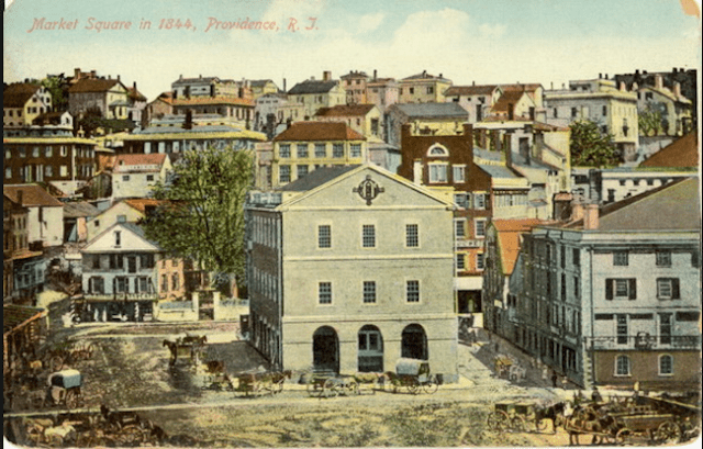
Postcard of Market Square in 1844. (Marc Levitt)

Below is an editorial from the Providence Journal, published in 1927, about the city’s appearance in 1827, two years before the Journal’s founding in 1829. The editorial was found and given to your trusty editor by Bill Whelan, author of The Highlands, on the summer colony at Bristol Neck. Bill handed a copy of the ancient editorial to me before my Lost Providence lecture to the Rochambeau Library last week. This evening I will be found at WaterFire, discussing the city and selling my book from a tent. The editorial reads:

Providence in 1827

“It gives us pleasure to notice,” said the editor of the Manufacturers and Farmers Journal just a hundred years ago, “the various indications of business and prosperity in our town in the shape of new buildings, streets extending themselves over what was a little while since marshland, hills dug down to make room for buildings, &c.”

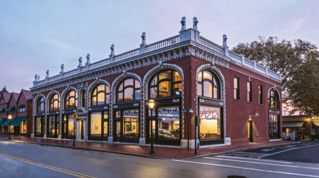
Canal street was “fast assuming the air of a business street,” with two large and elegant brick stores already completed; the nearby bridge was still a novelty and a little farther westward the magnificent Arcade had just reached the third story, deeply impressing the editor with the handsome white granite of its two facades.

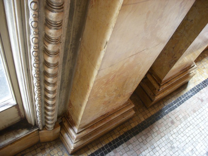
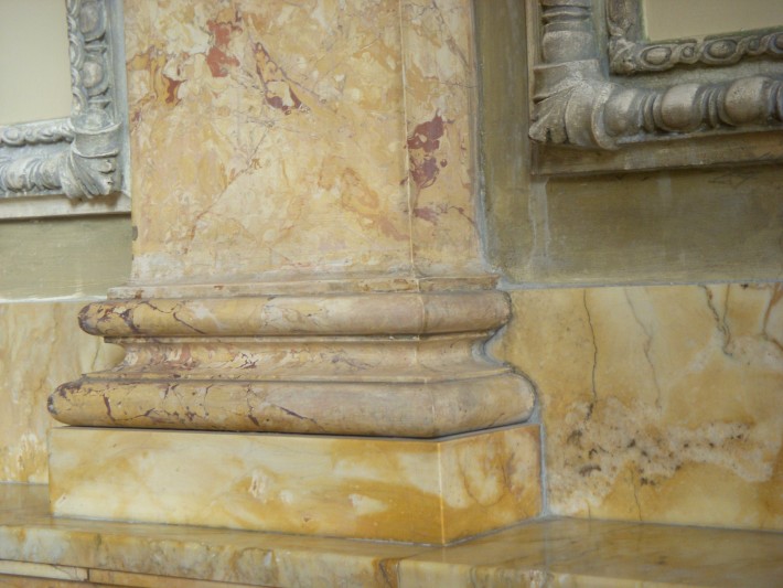
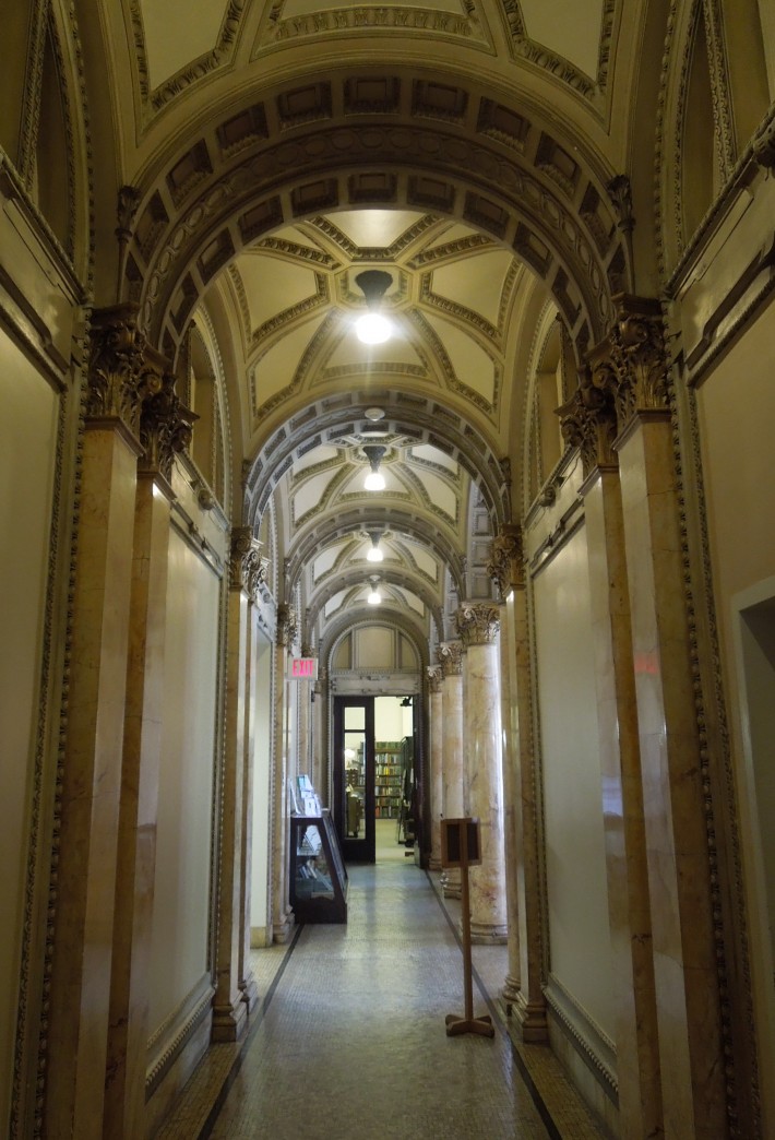
Today there is a good deal of building in progress in the centre of the city. Yet how different are the construction methods employed, how much more ambitious the proportions of the tall masses of steel, brick and stone!

One cannot help wondering by what new and ingenious devices the towers of trade and commerce will be erected in the 2027 and to what vast dimensions they will go.

And to what unpredictable changes will American industry, government and society have adjusted themselves in that far-distant year?

Not so far distant anymore! And it may be that the question might be answered a decade from today with a smile at the return of aesthetic sense to building. For it was not long after 1927 that the business and profession of architecture took a turn toward the absurd, which became conventional practice by 1950.

In 2017, although the absurd remains far the dominant mode of design in architecture, and the brand of the 1 percent, this could change. It took only a few years for architecture to go wrong, so it is possible that by 2027 the field could flip-flop again and be well on its way to rediscovering its sanity.

Social change has turned on a dime before. For example, it took only about a decade after modern architecture became de rigueur in America for the reaction against it, known as historic preservation, to transform from a niche interest focused on saving places where President Washington slept into a mass movement based on widespread anxiety generated by modern architecture.

Let’s do it again.

Screen Shot 2017-09-30 at 11.59.09 AM.png

Market Square in 1918. (Providence Public Library)

Posted in Architecture, Lost Providence | Tagged , , , , , , | Leave a comment

Audrain’s revival in Newport

Screen Shot 2017-09-29 at 7.47.19 AM.png

The Audrain Building (1903), renovated by Northeast Collaborative Architects. (Ben Jacobsen)

Last night, after my boffo lecture at Rosecliff (1902, McKim, Mead & White), I strolled down Bellevue Avenue, in the company of the Preservation Society of Newport County’s Lise Dube-Scherr, by another gem of that thoroughfare, the Audrain Building. Its glorious restoration by Northeast Collaborative Architects is featured in the latest Traditional Building. Emily O’Brien’s “Renovation of the Audrain Building,” explains the excellent work on the Audrain, designed by Bruce Price in 1903. It is joined on its block by, among others, the famous Newport Casino, also by McKim, Mead & White.

Most extraordinary was the architects’ refabrication of the lost element of the Audrain’s cornice, a balustrade crowned by a dozen upstanding lions, fallen or removed after the hurricane of 1938. John Grosvener, a founding principal of the firm, told O’Brien that “the terra-cotta elements, including the balustrade and lions, were,” as she put it, “created by Boston Valley Terra Cotta of Orchard Park, N.Y. The new lions were sculpted by Allison Newsome of Warren, R.I. Using historic photos, she first rendered the lion in clay in a ¼-scale model before sculpting it full size. Plaster molds were then created so that the 12 lions could be reproduced. Each lion weighs 350 pounds and is made of 16 pieces.”

The first floor of the building, originally headquarters of the antiques empire of Adolphe L. Audrain, is now an automobile museum, with exhibits that rotate every three months. The museum has wood flooring and a ceiling braced by massive steel trusses to uphold, on the second floor, a luxurious set of office suites, paneled and with custom millwork and coffered ceilings.

The photographs accompanying O’Brien’s article, by Ben Jacobsen, and prose imagery by O’Brien such as that of loaded Newporters racing hellbent down Bellevue Avenue in their fancy horseless carriages before the turn of the century, make this TB article a delicious read.

Screen Shot 2017-09-29 at 9.42.29 AM.png

Posted in Architecture, Preservation | Tagged , , , , , , | Leave a comment

Artist-in-chief to Louis XIV

Screen Shot 2017-09-27 at 10.05.34 AM.png

Allegory of Louis XIV, the King armed on land and at sea, 1678, by Charles Le Brun (1619-1690), preparatory sketch for the ceiling of the Hall of Mirrors in Versailles. (Photo by DeAgostini/Getty Images); Auxerre, Musees D’Art.

Charles Le Brun (1619-1690) was “premier peintre du roi, director of the Gobelins manufactory and rector of the Académie royale de peinture et de sculpture.” He was also an architect. Let’s just say that he wore a number of hats. Le Brun set himself the task, in the words of author Wolf Burchard, of creating “a repeatable and easily recognizable visual language associated with Louis XIV, in order to translate the king’s political claims for absolute power into a visual form.”

For classicists, who benefit from their own well-formulated architectural language, Le Brun’s ambition must be intriguing, whether he achieved it or not. Burchard, who has written The Sovereign Artist in order to examine Le Brun’s techniques, will lecture at the Boston Design Center at 2 p.m. this Friday at an event sponsored by the New England chapter of the Institute of Classical Architecture & Art. The lecture is free and open to the public. Reservations can be made at this link.

Amazon, which the book title above links to, offers a fascinating account of the book that should lure any classicist to hear its author discuss the artist as dictator at the Design Center on Friday. In part the description reads:

His artistic and architectural aspirations were comparable to those of his Roman contemporary Gianlorenzo Bernini, summoned to Paris in 1665 to design the Louvre’s East façade and to create a portrait bust of Louis XIV. Bernini’s failure to convince the king and Colbert of his architectural scheme offered new opportunities for Le Brun and his French contemporaries to prove themselves capable of solving the architectural problems of the Louvre and to transform it into a palace appropriate “to the grandeur and the magnificence of the prince who [was] to inhabit it” (Jean-Baptiste Colbert to Nicolas Poussin in 1664).

Posted in Architecture, Art and design | Tagged , , , , , , | Leave a comment

Beauty isn’t so difficult

On Thursday I will take my Lost Providence book tour to Rosecliff, the famous mansion on Bellevue Avenue in Newport, R.I. The event, sponsored by the Preservation Society of Newport County, begins at 6 p.m. It is open to the public, with a fee of $10 for members and $15 for nonmembers.

As I prepare my presentation for the event, the question of beauty looms large. I stumbled on a post from May 2014 about the lovely addition to the Newport Casino, then about to be announced. The next post back, I found, was this one about beauty, and not just in Prague. Please enjoy! And please come to Thursday evening’s event at Rosecliff.

David Brussat's avatarArchitecture Here and There

Prague

I took this from the bridge in the photo above, looking toward the Old Town. I took this from the bridge in the photo above, looking toward the Old Town.

How do they do it? Beauty. Other things being equal, people spend their discretionary time in places where it is enough merely to be there to feel pleasure beyond what can normally be felt at home. Building beauty is not rocket science, or unduly expensive. Most societies have, in the modern era, simply decided against it. Places like Providence have destroyed less of their beauty than other places, and built less ugliness in its place. Prague is another such place. Why don’t other places follow its example? There are explanations for this – they are not good ones, in fact they verge on evil, but they do exist – but rather than drag them out here I will simply post this piece of beautiful photos of Prague published by huffingtonpost.com.

That’s my case and I’m sticking to it.

(I…

View original post 115 more words

Posted in Architecture, Lost Providence | Tagged , , , , , , , | Leave a comment

“Lost Prov” at Rochambeau

Screen Shot 2017-09-25 at 11.07.14 AM.png

The original Rochambeau Library, at left, and its addition, right. (Rhode Island Library Report)

This evening at 7, at the Rochambeau Library, readers are invited to look and listen as the author of Lost Providence explains why the library serves as a fitting example of a phenomenon the book so ardently regrets.

No, the library is not lost. It remains standing. But it has suffered the same fate inflicted upon its former boss, the Central Branch of the Providence Public Library. The PPL’s main branch was defaced in 1954 by an insensitive addition, which also blocks the view of the original, completed in 1900, from the east on Washington Street.

The Rochambeau was defaced in 2003 by an insensitive addition, which blocks beauty from both north and south, respectively, views of the library’s elegant original Georgian facade, erected in 1930, and from the other direction views of the library’s equally elegant neighbor, the Fourth Baptist Church, built in 1910.

But even in this corner it must be admitted that the addition created more space for reading in the library. Moreover, I met my wife at its dedication in November 2003. I wrote a column for the Providence Journal about that event, “Praise for Rochambeau, not burial” (see link below) in which I tried to suppress my disinclination to like the new glass box as best I could.

After the glass box was added, the Rochambeau and the PPL’s other branches broke off from the Central Branch and created a new Providence Community Library. The split saddened many people and hopefully the two will reunite someday. For now, although the glass box supposedly had nothing to do with the schism, it may be hoped that attendees at this evening’s lecture might better understand why a glass box was the wrong design for the Rochambeau addition.

rochambeau

Posted in Architecture, Lost Providence | Tagged , , , , , , | 2 Comments

Hometown honey in ol’ D.C.

Screen Shot 2017-09-24 at 4.42.10 PM.png

I grew up along a somewhat downscale edge of the upscale Washington neighborhood of Cleveland Park. The Bureau of Standards was nearby, and so was WTTG Channel 5, a local TV station. Our house, a relatively plain but lovable semi-detached, was four up from Connecticut Avenue, with a row of large apartment complexes extending many blocks north on Connecticut opposite from where our street, Rodman, T’d with the avenue, to the several nearest of which I delivered the Washington Star when I was a boy.

Screen Shot 2017-09-24 at 5.45.35 PM.png

3015 Rodman St.

Later in my life, after college but before my first newspaper job, I lived near Dupont Circle in a room in a townhouse that had two stone balustrade balconies (the room itself had a pair of balconies; the townhouse had more). Around that time, the Metro opened and the first leg came through Dupont Circle and concluded at Cleveland Park, easing my frequent journeys to dine with my parents.

So imagine my joy when I learned just the other day that a new apartment complex has opened up right near my old stomping grounds – and a beautiful one at that, called Park Van Ness, on the site of a former skating rink that eventually housed WTTG. Its design was modernist. As I kid, I would not have cared – or at least I would not have realized that I did care – but as an architecture critic, the new building’s Art Deco style so near my old home sends shivers of joy up my spine.

Both it and its predecessor are of similar massing, a long central building with with end wings at right angles to the main mass, but there the likeness ends. What once was a parking lot is now a plaza that leads to an arch that takes you through the building to Rock Creek Park, which extends all the way from the Maryland suburbs to the core of the national capital. Nobody will miss the former building except for reasons of nostalgia. I do miss it, for such reasons alone. Its status as a skating rink elapsed long before I lived nearby, and after that few visited what was called the Van Ness Center to satisfy their need for aesthetic pleasure. But still …

Robert Steuteville, writing for the blog Public Square, which he edits for the Congress of the New Urbanism, has this to say of Park Van Ness:

Options for walking, bicycling, and transit are plentiful—as is on-street parking—and so the Park Van Ness includes fewer than one parking space per unit. A courtyard faces the primary thoroughfare.

Neighbor Justin Wood appreciates the contribution to place. “The Art Deco styling of the building feels like it’s been in the neighborhood for a much longer time than a few months. It feels natural mixed in with other older buildings.”

Great care was given to maintain the “art” in the Art Deco language. Numerous custom decorative pre-cast panels throughout the main facade evoke themes from the adjacent park. Additionally, two custom sculptures were commissioned which bookend the archway into the park. Custom paintings, also inspired by the park, are placed throughout the public spaces.

Torti Gallas + Partners won a Charter Award in 2017 for Park Van Ness.

His headline is “A gift of nature and architecture,” and he cites the view of Rock Creek Park through the archway as a gift to the community. The CNU has had and still has issues with what it considers beautiful – at least, unlike modernist organizations, it believes beauty is important. The Charter Award for Park Van Ness and, indeed, the logo for its “Building Places People Love” initiative, and most of the projects illustrated on the CNU website, suggest that CNU is beginning to see the light and is tilting more toward traditional architecture as the model for New Urbanist projects.

Most people remain unaware that the last couple of decades have seen a battle between traditional and modernist design in the movement, or at least in the CNU organization, and it would be healthy for its long-term success if people becoming newly interested in its programs engage the CNU without even realizing that. This battle is, I hope, reaching a sensible conclusion in the style wars that grip architecture as a whole.

Screen Shot 2017-09-24 at 5.24.00 PM.png

Posted in Architecture, Urbanism and planning | Tagged , , , , , | Leave a comment

“Lost Prov” and WaterFire

Screen Shot 2017-09-23 at 2.15.37 PM.png

A gondola plies the city’s intimate rivers during WaterFire. (waterfiresharonpa.org)

Today at 4:30, in the brand new WaterFire Arts Center (474 Valley St.), Gene Bunnell, the author of Transforming Providence, and I will each offer a 30-minute presentation on the revitalization of Providence, culminating in Barnaby Evans’s WaterFire Providence. We’ll then take questions. Gene’s book and my own book, Lost Providence, will be on sale at this free event. By then, it will be time to go to WaterFire itself.

To get readers in the mood for this evening’s events, I link here to a short essay I wrote about the phenomenon when it was still new. “Sex and WaterFire” begins:

Now that I’ve got your attention (to paraphrase the famous Wall Street Journal editorial), the title should really be “Sensuality at WaterFire: or, Art as Aphrodisiac.” Whatever else has been said about Barnaby Evans’ great work of art, WaterFire as a setting for love seems more noticed than remarked upon, and more remarked upon than studied in an academic vein. With this essay, that scholarly lacuna is history.

Actually, “Sex and WaterFire” is in fact about sex and WaterFire, or at least about romance and WaterFire, or psychology and WaterFire, or people and WaterFire. Well, it is about WaterFire, the culmination of civic development in the last quarter century of the capital city of Rhode Island. For much of this we may thank the late Bill Warner, but that is another of the many inspiring stories of Providence’s resurrection.

Posted in Architecture, Art and design, Lost Providence | Tagged , , , , , , , | Leave a comment

C’mon baby build our brand!

Screen Shot 2017-09-21 at 3.18.26 PM.png

Artist’s view of a jarring 1959 plan to plunk modern architecture into the middle of a stretch of historic homes on Providence’s Benefit Street. (Journal caption on College Hill Study image)

In 2015, seeking to demonstrate the depth of my naivete about politics in Rhode Island, I, in my role as citizen, wrote a letter to Governor Raimondo to suggest “a way to help improve the Rhode Island economy that is easy, fast and free.” Naturally that letter, which was delivered without the usual phalanx of interested people and organizations to back it up, aroused almost no interest in the governor’s office.

Today, that letter ran on the oped page of the Providence Journal as an open letter to the governor, under the headline “Improve Providence through design.”

As the state enters the early stages of development along the I-195 innovation corridor and gears up to propose that Amazon locate its second headquarters in Rhode Island, the idea that beauty is part and parcel of successful development is one that the governor and her economic team must not ignore.

GoLocalProv.com today published the thoughts of 17 local personages about how to structure its offer to Amazon. All of their suggestions are laudable, but none of them are much different from how all our rivals will structure their bids. My suggestion would be very different, and much bolder. The governor should say that Amazon is welcome here only if it agrees to build a campus that strengthens rather than weakens the Rhode Island brand, and that it must design a campus in one or more traditional styles that fit into the historical character of the city and state.

That would get Amazon’s attention! Or not. If not, if Amazon is going to go about deciding where to locate its second headquarters using conventional parameters, then Rhode Island is unlikely to win anyway. As I argued in “More on R.I. and Amazon,” a follow-up on “How R.I. can get Amazon,” this state does have virtues that would put it in the game – except for its poor business climate. It is possible that a bold and innovative proposal might counterbalance that glaring drawback.

As for the various proposals for inclusion in the I-195 innovation corridor, the same principles of beauty as a boon to development should be applied. Projects that are not already under way can refine their design to look traditional and hence fit into their setting in the Jewelry District. That will help all of these projects succeed, and is more likely to get a skeptical public behind development here.

All this may seem unlikely, but Rhode Island has thought big before – as when it moved its rivers and moved Route 195. It’s time to try thinking big again.

By the way, the image above is from my book Lost Providence, which tells the story of how, back in the 1960s, the city and state failed to – I would say refused to – embrace development projects that rejected the state’s legacy of beautiful architecture.


Posted in Architecture, Development | Tagged , , , , , , | 2 Comments

‘Lost Prov’ show at PPL Wed.

Screen Shot 2017-09-19 at 12.14.00 PM.png

Original front entrance (now closed) of the Providence Public Library.

Tomorrow the Lost Providence road show will appear at the Providence Public Library for a slide lecture at 6:30 p.m. The real show here, however, is the exterior of the library on Washington Street, which opened in 1900, the balustrade that you see every time you visit this blog, the original entrance, the lobby inside of the doorway, the staircase from the second to the third floor, and the upstairs hallway with offices. Rain may preclude examining the exterior on Washington Street, and remember that the current entrance is into the 1954 addition on Empire Street, so below are a few shots of the old outside, plus some shots of the interior spaces for the benefit of those who take the elevator up to the third floor instead of climbing the stairs.

Your scribbling author will be there, too, and will lecture about the book, take questions and answers, and then sign books afterward. In addition to the library, the event is sponsored by the Providence Preservation Society and the Brown Bookstore, which will be selling copies of Lost Providence.

I reader wonders whether I’ll give a tour of the library as part of the event. I’m afraid not, but the library itself gives tours of the premises.

DSCN0852

DSCN0841

DSCN0842DSCN6754DSCN6758DSCN5501DSCN5518DSCN6762DSCN6769 The view upon entering the library today through the Empire Street entrance.

Posted in Architecture, Lost Providence | Tagged , , , , , | 4 Comments

Staple this to your earlobe!

Version 2

I had to buy printer paper so I went to Staples. Four reams of normal printer paper was $21.39, including tax. A $15 “Easy Rebate” was offered to those who would fill out a form online. The form asked for my “Easy Rebate ID,” which would be found on the paper “Rebate Redemption Form” that came with my receipt. The Easy Rebate ID was nowhere to be found. But could it be:

  • The Rebate Offer Number: 17-23964?
  • The Staples Promotion Number: 17-23964?
  • The Rewards Number: 3494461134?
  • Or, under the bar code, 00030918178876102?

Silly me, I called them up. After a wait, a young woman answered, who after several minutes of consultation, and after assuring me that it was definitely not the Staples Promotion Number, informed me that it was the Rebate Offer Number (which was the same as the Staples Promotion Number). I went back to the form on my screen and typed it in, but was told to “Please enter a valid 17 digit easy rebate ID.” Huh? Well, I decided to count the digits in the number under the bar code. Lo and behold, 0030918178876102 has how many digits? Seventeen! So I typed that in. It worked. I am now assured that I will get my Easy Staples Rebate in only 4-6 weeks.

Four to six weeks! That’s almost as long as it takes to get the first issue of a magazine subscription! Doesn’t anyone realize that we live in the Computer Age? Can’t wait for the self-driving automobile!

But what about the inability of Staples to label the number under the bar code Easy Rebate ID? Was this accidental or on purpose? Evil or merely stupid? Which is worse? I don’t know, but I will have to be satisfied with an insipidity of revenge: On the form I had unchecked the “Please Send Me Emails for Junk I Don’t Want” box. Ha!

Posted in Art and design, Humor | Tagged , , , , , , , | 10 Comments