NYC, drawn from memory

Screen Shot 2018-01-16 at 7.29.19 PM.png

Section of drawing of New York City by Stephen Wiltshire. (Stephen Wiltshire Twitter)

Stephen Wiltshire’s remarkable ability to draw a city from memory came to my attention several years ago in a segment on 60 Minutes or some such show. A British citizen, he was diagnosed with autism at age 3, but his talent became apparent as a student at a special school in London. I just came across this article about Wiltshire in the article “British Artist Draws NYC Skyline From Memory,” on the Untapped Cities blog. It links to Wiltshire’s own blog, where his drawings of many other cities can be viewed.

Untapped Cities writer Rachel Fogel de Souza wrote:

Wiltshire took a 45 minute helicopter ride over the city, and then spent the next five days creating an incredibly detailed, and unbelievably accurate drawing of the entire skyline, in front of an audience. Wiltshire’s drawing isn’t just of the skyline though – individual windows on buildings are depicted, as are smaller buildings only visible through the gaps between other buildings.

After his 45 minutes aloft, how did he manage to keep his memories of Manhattan as seen from one angle separate from his memories of the city from other angles? And in front of an audience, no less! OMG! His ability to capture the essence of a skyline achieves a transcendence of drawing and photography mixed. Too bad we can’t send Wiltshire, who is 43, back in a time machine to New York and other cities long ago!

What a shame that someone, say, Samuel Pepys, never encountered such a talent in his peregrinations about the city of London. The Italian artist Canaletto, famous for his paintings of Venice, painted London as well. He came, he saw, he drew – but I imagine he did not draw from memory. The scene below was no doubt drawn on an easel while the artist stood and looked – and probably had to go out there and stand for days on end. Did he work it all the way through, or did he draw it first then fill in the colors back in his studio? Thankfully, buildings are great sitters. They do not move much at all while you are taking their portrait. The sun may move shadows as the day transpires, but maybe that’s not much of a problem in London. Nor does architecture distract the artist with idle chit-chat, for which the artist may or may not be thankful.

I wish some local opportunist would try to get Wiltshire to draw Providence. Put it up in the Industrial Trust Building. His drawing of New York City is scheduled to be installed, temporarily, inside the observation deck of the Empire State Building. I can’t wait to see it.

Screen Shot 2018-01-16 at 7.57.52 PM.png

Thames waterfront in London, with St. Paul’s and many steeples in the distance. (Georgian Cities)

Screen Shot 2018-01-16 at 7.30.01 PM.png

Stephen Wiltshire drawing Manhattan. (Stephen Wiltshire Twitter)

Posted in Architecture, Art and design | Tagged , , , , , , , , | 1 Comment

Even Soviets hated mods!

Screen Shot 2018-01-14 at 4.57.19 PM.png

In 1976 animated Soviet cartoon, last vestiges of ornament are wiped off buildings. (YouTube)

Ann Sussman, the architect/scientist whose neurobiological research has pinned down mental illness as a factor in modern architecture, sent me a video by a Russian cartoonist in 1976. It shows that even amid the official dominance of modernism under Stalin, and continuing during the, um, Brezhnev administration, modern architecture was seen for what it is and thus hated even by parts of the Soviet artistic intelligentsia.

Modern architecture was trying to put down its own revolt at this time in America and elsewhere, known as postmodernism. The mods squashed the postmods, and in a move of masterful jujitsu countered with a modernism that doubled down on its rejection of tradition (deconstructionism, blobism, etc.). Even still, a crack in the door was opened amid the turmoil enabling some archtects to seek a revival of the classical orders.

I don’t know much about the history of architecture in modern Russia, but from the high quality of some Russian classicism being built today, the same crack in the door might have been snuck through by classicists there. This video, “The Irony of Fate,” hints that the forces of sanity were not entirely crushed by Soviet modernism. (I like how the title of the cartoon seems to carom off the title “Choice or Fate,” by the famous cartoonist Léon Krier.)

[I’ve just learned through Seth Weine that this cartoon was the animated prologue to the Russian television miniseries “The Irony of Fate,” in which a Soviet male gets drunk with his friends and accidentally visits St. Petersburg taking a taxi to his apartment. He lives in an apartment that is identical to the apartment the taxi takes him to, into which, such is the uniformity of Soviet residential architecture, his own key fits. He goes in and goes to bed, not long after which the real resident returns to her flat. She is affianced, but he falls in love with her anyway. It is a romantic comedy. The link just above is not to the TV show but to the Wikipedia entry about the show. I see that Justin Lee Miller got there first with this in the comments to this post.]

Screen Shot 2018-01-14 at 12.46.31 PM.png

The phenomenon of modern architecture marches around the world. (YouTube)

Posted in Architecture, Video | Tagged , , , , , | 1 Comment

The uses of preservation

Screen Shot 2018-01-12 at 5.21.02 PM.png

Modern skyline of Rome. Compare with skyline of London at bottom. (nh-hotels.net)

The Uses of Corruption” is an essay by Theodore Dalrymple published in the Summer 2001 issue of City Journal, the quarterly of the Manhattan Institute. Dalrymple is a British sociologist and commentator who argues that Italy is more prosperous and Britain less so because the Italian government is corrupt while the British government is honest.

Corruption has been so endemic to Italy since World War II that its economy has systematically incorporated the grease (bribery and tax avoidance) needed to keep the wheels of bureaucracy turning. British bureaucrats, on the other hand, are honest, and hence they run their bureaucracy with almost perfect inefficiency.

That’s a dramatic oversimplification, but to Dalrymple it explains why, despite similar populations, similar geographic size, similar economic systems, similar political systems, similar national GDP, similar poverty of natural resources, similar class systems and similarly sized public sectors, Italy has surpassed Britain since World War II and is now significantly more wealthy and more healthy as a society.

And also more beautiful. Dalrymple identifies only one function of Italian government that performs its role as intended: historic preservation. He compares it to British historic preservation, which over half a century has been honest but ineffective, a disaster for cities and towns on the Sceptred Isle.

The long and the short of it, Dalrymple writes, is that Italy has kept modern architecture at bay while Britain has welcomed it, leaving its citizens prey to a degree of ugliness that has served Britons poorly. Meanwhile, Italy remains beautiful, and its citizens benefit.

I have linked to the essay above. Some readers may not believe I have accurately described Dalrymple’s astonishing yet compelling conclusions. Read the entire essay. It will blow your mind. I will, however, quote at length most of its passages on architecture, preservation and urbanism – and the civic importance of beauty.

Italy’s public administration vastly surpasses Britain’s in only one area: the preservation of the country’s urban heritage. This single bureaucratic success is crucial, however, for it greatly elevates Italy’s standard of living over Britain’s. The destruction of Britain’s urban patrimony and its replacement by hideous modernist multi-story parking garages and office buildings, while inflating the GNP, represent a lowering of every Briton’s quality of life. …

The official architect and town planner of the city in which I live, for example, wanted—quite literally—to pull down every single local building that dated from before the second half of the twentieth century, including entire Georgian streets and many masterpieces of the Victorian gothic revival. Fortunately, he retired when perhaps a tenth of the old buildings still remained: the rest having by then been replaced by Le Corbusian leviathans so horrible and inhuman that many of them are now scheduled for demolition in their turn, less than 30 years after their erection. The Georgian spa city of Bath offers an even more startling example: in the 1950s, the city council wanted to raze it to the ground and replace it with something more in tune with the times.

Such barbarous thoughts would never have occurred to any Italian, however corrupt or politically extreme he might otherwise have been. As Giorgio Bassani observes of the street of palaces where his protagonists live in The Garden of the Finzi-Continis: “[The] Corso Ercole I d’Este is so fine, and such a tourist attraction, that the left-wing council that has been running Ferrara for nearly fifteen years has realized it must be left as it is and strictly protected against speculative builders and shopkeepers; in fact, that its aristocratic character must be preserved exactly as it was.” Never in England.

Actually, Italian municipal policy has been even more enlightened than this passage suggests. Commercial enterprises in old towns and cities must conform to aesthetic standards, so as not to do violence to the appearance of buildings, with the result that the Italians are not, like the British, modern barbarians camped out in the relics of an older and superior civilization to whose beauties they are oblivious. Italian municipalities have also kept their cities vibrant by capping the local taxes of small businesses, thus nurturing a variety of shops that in turn nourish many crafts, from papermaking to glass-blowing, that might otherwise have died. Thus, an uneducated man in Italy can still be a proud craftsman, while in Britain he must take a low-paid, unskilled job—if he takes a job at all. Italian downtowns are not as British city centers are, the location of depressingly uniform chain stores without character or individuality, plate-glassed emporia hacked into the ground floors of historic buildings without regard to the original architecture. The Italians have solved, as the British have not, the problem of living in a modern way in ancient surroundings that, looked at in economic terms, constitute inherited wealth.

The preservation of the aesthetic quality of Italian life, but its utter destruction in Britain, whose streets have been coarsened to a degree unequaled in Europe, has had profound social and economic consequences. Where all is ugliness and indifference to aesthetic considerations, it is easy for behavior to become ugly and crude and for collective municipal pride to evaporate. It seems not to matter how people conduct themselves: there is nothing to spoil. Attention to detail, important in both the manufacture of goods and the provision of services, attenuates in an environment of generalized ugliness. What is the point of wiping a table, if the world around it is irredeemably hideous? To be sure, self-respect can encourage people to make the best of a bad job, but dependency on the state has destroyed the basis of self-respect.

In a world grown richer, aesthetic quality has obvious economic benefits. Given the gulf between the excellence of Italian design, educated by the beauties of the past, and the unremitting tastelessness of British modernity, it is not a coincidence that Italy has one of the largest trading surpluses of any nation, while Britain has one of the largest deficits.

Screen Shot 2018-01-12 at 5.18.30 PM.png

Modern skyline of London. (elba-1.org.uk)


Posted in Architecture, Preservation | Tagged , , , , , , , , , , | 8 Comments

Save Chicago’s Jackson Park

Screen Shot 2018-01-11 at 1.23.26 PM.png

The campus of the Obama Center in Chicago’s Jackson Park. (Obama Foundation)

The 543 acres of Chicago’s Jackson Park, site of the 1893 World’s Columbian Exposition, are not existentially threatened by plans to slice off 22 of its acres for Barack Obama’s presidential center. However, this park was designed by Frederick Law Olmsted and Calvert Vaux, the nation’s two greatest landscape architects, and the proposed “obelisk” design of the Obama Center’s squat Museum Building is an affront to the park’s historical character. It is for other reasons, however, that community organizers in Chicago’s South Side community are organizing against this presidential project.

Screen Shot 2018-01-11 at 7.08.34 PM.png

The original Obama Center design. (TWBT)

Just this week, the facility’s proponents announced a slenderer and less monolithic design, by the same firm, Tod Williams Billie Tsien Architects. The new version squishes it in, squashing it up from 178 to 235 feet (still quite squat), and adds a new decorative motif. The Obama Foundation also announced that the 400-car parking garage on the Midway Plaisance (a major part of the original 1893 fairgrounds) would be relocated under the Museum Building.

But look at the latest design, on top. What is that rash in the upper right corner? Taken along with the cutouts in the lower right and upper left corner – which make it look like an Escheresque version of Providence’s Old Stone Square – you can just imagine Billie Tsien and Tod Williams scratching their heads, trying to figure out how to make the structure even more wildly different than any other presidential library in history, and yet not so wildly different as to offend the sensibilities of those who live and work nearby. These include former colleagues of the president at the University of Chicago, where Obama taught constitutional law from 1992 to 2004.

That the architects failed is perhaps not Obama’s fault. Obama’s only the client, and in these sorts of high-octane jobs, the client is probably as deeply sunk in error as the architects. Still, the day after the new design was announced, 100 faculty members at Chicago greeted it with a professorial Bronx cheer of protest.

We are concerned that rather than becoming a bold vision for urban living in the future it will soon become an object-lesson in the mistakes of the past.

Yes, the project is steeped in the mistakes of the past – the recent past’s design dystopia of architects who forgot the lessons of their fathers, or their grandfathers, and kick-boxed into a cocked hat the Jeffersonian ideals of our national culture.

The professors did not object to the architecture – for they have surely quaffed as much design Kool Aid as Obama and his architects. Rather, it “destroys a historic park,” “leaves no room for economic development,” “is socially regressive,” “donates public land to a private entity” (the Obama Foundation) and “wastes taxpayer money.”

No doubt. Even without taking any offense at the assault on beauty, that’s a lot for a community organizer to chew on. So, according to the Daily Caller, the “furious” professors want the presidential center “moved elsewhere” (elsewhere on the South Side, that is).

Of course, nobody who has any respect for history could possibly disagree. To reform the design sufficiently to ameliorate merely its design deformities is probably beyond the capacity – and the will – of the president and his architects. The other complaints are beyond the scope of this analysis. Still, those who would wish to see it built without having to cringe at the result may take some comfort, perhaps, in the audacity of hope.

Screen Shot 2018-01-11 at 7.44.54 PM.png

Jackson Park originally was the site of the World’s Columbian Exposition of 1893, whose temporary structures burned down after the fair. (Wikipedia)

Posted in Architecture, Landscape Architecture | Tagged , , , , , , , , , | 9 Comments

Update on Carpionato plan

Screen Shot 2018-01-10 at 11.53.43 AM.png

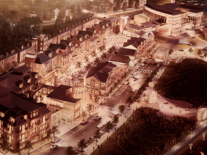
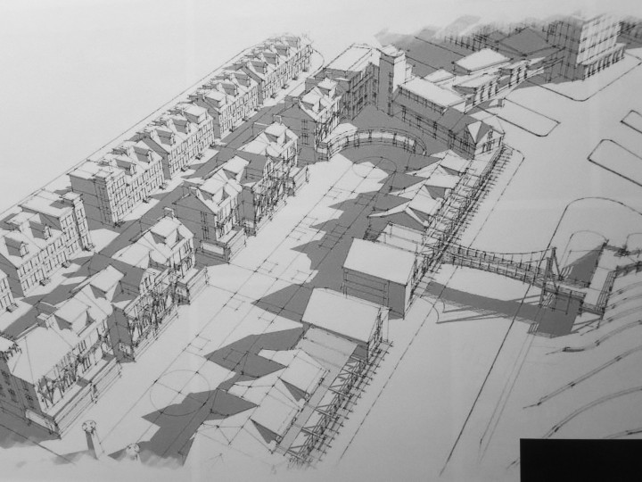
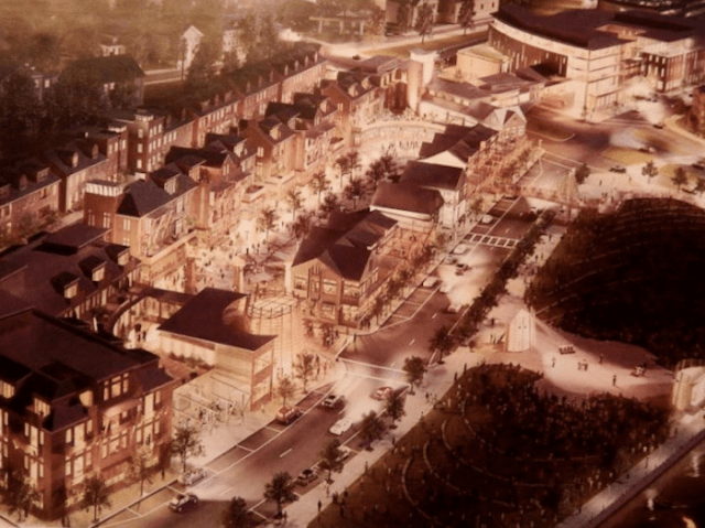
Sketch of the original 2013 Carpionato project on I-195 land. (Carpionato Group)

My intention today was to run images of both the 2013 and the 2018 proposals by the Carpionato Group for a development that was originally proposed four or five years ago. But Carpionato politely asked me to withhold the 2018 images pending their official submission to the I-195 Redevelopment District Commission, since the firm is apparently still going toe-to-toe with other developers for at least some of the land involved.

I cannot even imagine that a competing proposal would try to fit into its setting as well as this one does. The odds are against that. Industry standards frown on compatibility and continuity with their settings, let alone beauty. I would not want to put this plan in dutch, so I will hold the new images until they go public in several weeks. (My blog is not one of those creepy news organizations that are always lusting after “scoops.”)

Nevertheless, the purpose of this post is to applaud the proposal, note some of the changes since 2013, and to push the commission to act quickly and, if this plan is selected, to hold it to the highest possible design standards. I assume that discussing the new plan, using words, is not out of bounds. If it is, then why did Carpionato let the Jewelry District Association host last night’s briefing? Other people were taking pictures. What if some of those shots are published? Would that blow the lid off this project? Maybe this is a plot by the modernists!

The briefing was given by Carpionato associate Kelly Coates and held at South Street Landing, about which more in another post. It was my first visit. Coates said the firm hopes to build the project all at once in under two years, starting as soon as permitting is completed.

When the project was first announced in 2013 , the sketch above was printed large on the front page of the Journal. I was smitten. Despite the fact that architectual renderings do not necessarily reflect a plan as it will emerge from the design process or as it is built, it seemed like a very good beginning, very much at odds with most of what Providence (and the world) had seen in proposals and in finished buildings in recent decades.

The buildings in the earlier sketch are smaller than the buildings in the later sketch, but the traditional feel of the design remains intact. Both massing and style have become more commercial. The roofscape’s gables have been flattened out a bit. Because the square footage is larger, there is less room in the middle of the block between South Main and South Water streets, north of Wickenden. It no longer seems to invite the delicious possibility of the winding cozy passages cloaked in palms, flowers and verdure, and lined with shops along the interiors of blocks on ritzy Worth Avenue in Palm Beach, Fla.

There are no longer footbridges spanning South Water and Wickenden streets. The width of Dollar Street, which regulations for the 195 land rightly insist on preserving, seemed to shrink between the first and second versions, and it was hard to see on the sketch, but Coates assured his audience last night that it is still there – for pedestrians and delivery access, but not for regular traffic.

The earlier sketch featured a delightfully small number of off-kilter details on a few buildings, clearly meant to avoid offending modernists, even if they do introduce a slight measure of bipolar schism to the aesthetic. These include stretches of floor-to-ceiling glass, clunky and seemingly useless posts that slant out from balconies, that sort of thing. Modernists will be upset by the absence of more such stuff, and that their tastes have not fared better in the updated sketch. We may hope that such features as remain will be edited out as the design process proceeds, not multiplied.

Detailing and materials are vital in projects like this, which can slide into a kind of suburban shopping-center blandness during the design process. The feel of the project seems very, very nice, but at this stage that impression could be from the high quality and the delight of the sketches more than the actual intentions of the developer – notwithstanding the pleasant murmurs of assurance from Coates.

For example, during his presentation Coates noted that in designing a set of commercial buildings, “this tenant can fare better because that tenant looks better.” And vice versa, of course, extending throughout the project.

Coates spent a lot of time expressing the intention of Carpionato Group to fit this major project into the historic character of Providence and Fox Point.  If they succeed, the project’s impact could well be as influential as the impact of Yale’s two new traditional campuses in New Haven. That is an ambitious but entirely reasonable, achievable goal – not just for Providence and Rhode Island but for the nation and the world. Yes, this project is that important.

***

Here is a post, “The Carpionato proposal for 195 land,” that includes more renderings from the original proposal back in 2013.

By the way, Kelly Coates mentioned a project of 459 luxury residential units in a pair of buildings on Harris Avenue, along the Woonasquatucket River behind the Providence Place mall. Drawings suggested that it could be of almost Parisian charm. Announced a year ago, it is, Coates said, three-quarters the way through the permitting process. My post on that project from Dec. 22, 2016, is called “Carpionato rides again!?” It is illustrated below.

Screen Shot 2018-01-10 at 7.26.45 PM.png

Posted in Architecture, Development | Tagged , , , , , | 3 Comments

Today: Carpionato’s 195 plan

carpionato

Here is a column I wrote after the Carpionato Group had proposed a magnificent plan for a project in the Route 195 Corridor, taking up three development parcels east of the Providence River. Then the project sort of went away. Today, it returns. At 5 p.m., the Jewelry District Association will host an announcement by Carpionato of what I hope will be the same plan. Will it be as good? Come check it out at the newly renovated South Street Station (now part of the largely regrettable South Street Landing project). You can compare the new plan to a pair of images from the old plan above and below. And here is a link to “The Caprionato proposal for 195 land,” with more sketches.

***

Through WordPress’s blogger data tool I noticed that interest in a post from months ago had spiked, and then I saw that its subject, the proposal made by Carpionato Group last year to build on much of the vacant Route 195 land east of the Providence River, was back in the news. Carpionato has apparently submitted a bid in the process, which was news yesterday because the 195 Commission did not hand out information on submissions as expected. So it’s good that a bid (one only? I hope not!) has been made. Here’s the column I did on the Carpionato proposal when it was first aired last March. (The illustrations above and below were performed under the direction of architect Neil Middleton of TRO Jung Brannen, of Boston. The identity of the pleasing artist him/herself is, alas, not yet known to me.)

Hold Carpionato to its bold proposal
March 7, 2013

A week ago, Michael Graves, the celebrated postmodernist architect, designer and winner of last year’s Driehaus Prize for classical architecture, showed an audience at Brown University slides of his belongings in the renovated warehouse where he resides near Princeton University. These included his own paintings of Roman buildings and Tuscan scenery, which offered a sort of a sense of what they looked like.

Graves’s paintings are the opposite of the sort of image (above) used by The Carpionato Group to illustrate its proposed development of land in Fox Point that was under Route 195 before it was relocated. The main difference is that Graves’s paintings are of places that exist, while Carpionato’s image, which it showed recently to the committee guiding the 195 development, is of buildings still to come.

Odd, then, that the Italian scenes were rendered in a vaguely cubist form – okay, Graves seems a decent sort; let’s say his paintings are “dreamy” – while the Carpionato scenery that doesn’t exist was rendered in high precision.

That illustration, which ran on the first page of the Feb. 24 Journal, was so lovely that I almost wept for joy. It reminded me of a rendering of an earlier Carpionato project, now almost complete. On Monday, I drove down to Chapel View, a retail/residential complex near Garden City, in Cranston, to see how well that rendering had been transformed into reality.

Three of six granite dormitories of the abandoned Sockanosset Training School for wayward boys, erected in 1881-1895 as part of the “state farm,” have been knitted together within new structures of traditional character. The old chapel is now a restaurant, the Chapel Grille, and a lovely stone wall built by Carpionato encircles part of the complex. Still, the rendering was more pleasing than the final product.

Fine old architecture can only be diminished by new additions whose design and workmanship do not match the original in quality. And it is fair to suppose that the original jail for juvenile delinquents was itself not intended to be of the very highest quality. That the project swims in parking lots does not help.

Still, the latest Carpionato project on the old Route 195 right-of-way can be held to a higher standard and, set as it is in Fox Point, it should be. Here the Route 195 Commission should easily outperform the Capital Center Commission, which snatched defeat from the jaws of victory, inflicting GTECH and three modernist towers on the traditional cityscape built near Waterplace in the 1990s: Providence Place, the Courtyard Marriott and two (originally) Westin towers.

An alternative to the Carpionato proposal – market-based development of individual parcels – might be expected to produce, in time, a great place. Today, however, many developers feel obliged to be “creative” (that is, tediously orthodox) and might produce, in time, a hodge-podge that could be in Anyburb, USA.

Under these circumstances, a unitary plan might be more likely to result in a place people will love. The Carpionato plan has at least the charm of a composition that reads as smaller gabled buildings in a village vernacular, rather than a rack of twisted megastructures. Its style is embodied by a Ponte Vecchio-style bridge that spans Point Street, connecting two buildings. If Carpionato can get the details right, a truly attractive new part of town might emerge near the south end of historic Benefit Street.

Many developers build projects that do not live up to their advance billing. Two unbuilt proposals by Carpionato for hotels in or near downtown Providence, in 2006 and 2008, hint that it is capable of overreaching. One hotel was to have been on a triangle of land at the northeast corner of Kennedy Plaza; the other was to have replaced a produce terminal in the Promenade District, which Carpionato tore down before its financing had been secured. That is a track record that should be easy to improve upon.

The Route 195 Commission does not have a track record . . . yet. What it has is an opportunity to protect the public’s interest in good development. If there was a good reason for the legislature to give the commission its abundant regulatory power, that was it.

Maybe someday, if the Carpionato Group, encouraged by the commission, lives up to its advance billing in Fox Point, Michael Graves will return to daub Providence in oils.

David Brussat is on The Journal’s editorial board (dbrussat@providencejournal.com). This column, with more illustrations, is also on his blog Architecture Here and There at providencejournal.com.

carpionato2

Posted in Architecture, Development | Tagged , , , , | 5 Comments

Trads must step up game

Screen Shot 2018-01-08 at 8.07.45 PM.png

Christopher Newport University, in Newport News, Va. (CNU)

While channel hopping a couple weeks ago, just before Christmas, I landed on C-Span and discovered to my horror I was watching a live broadcast of the groundbreaking for Frank Gehry’s memorial to Frank Gehry – oops, I mean Dwight Eisenhower. I had been hoping, along with many Americans eager for a renaissance of Jeffersonian architectural principles in this country, that President Trump would pull the plug on that insult to Ike. Gehry has, after all, publicly expressed his dislike of Trump, but Trump did not take the bait. This was not a good moment for the president to exercise his celebrated capacity for forgiveness and restraint.

Make America Great Again indeed.

Meanwhile, the organization that had worked hardest to block the Gehry memorial, the National Civic Art Society, has gone all-in on an even more important project – rebuilding New York’s Pennsylvania Station using an updated version of the original design. At least make New York great again. But the path to success here seems considerably narrower than the path to success for blocking the Ike memorial had seemed.

The classical revival fumbled the ball after 9/11 when it failed to raise its voice during the long national debate over how to rebuild at Ground Zero. The major victory for new traditional architecture in the public eye is the National World War II Memorial on the Mall, loved by veterans and the public, which opened in 2010. Its success as a trad icon was undermined, however, by classicists who bought into the modernist narrative that its design was reminiscent of Nazi architect Albert Speer. Ridiculous. Classicists should not let themselves be sucker-punched.

America needs a big classical project to inform the public that traditional architecture is not just a thing of the past, that it can and should be built today. That it can is shown by the masterful new pair of Collegiate Gothic residential colleges that were opened at Yale this past fall, designed by Robert A.M. Stern Architects. They are big. They are beautiful. And yet, as far as promoting a classical revival, they might as well not exist. Yale is great, but it’s not exactly a crossroads of America. The two colleges have not even been acknowledged by the New York Times.

Penn Station’s revival seems to be the only major project on the horizon that could serve to demonstrate, in the United States, the practicality and the delight of new traditional architecture. The NCAS is on the case, but the governor of New York and the city’s mayor have no more of a clue than the president of the United States.

Slowly, the number of architecture school programs that acknowledge the existence of new classical and traditional work has grown over the years. And tons of traditionally styled mansions have been built for rich people, who of course may choose the kind of house they want without the say-so of a committee. Some significant new traditional churches, a pair of Mormon temples, concert halls in Charleston and Nashville, and a federal courthouse in Tuscaloosa, Ala., have been built in recent years, as have a state university campus in Newport News, Va., a new campus of the University of Southern California in L.A., a fitness center at Brown University here in Providence, and the two new undergraduate residential colleges at Yale. Nice. But that’s a veritable silence of the lambs next to the ongoing barkathon of the dogs of modernism.

Surely I have left worthy mentions off the list. Still, if we want to make architecture great again, we need to seriously step up our game.

And it appears that next year might see such a stepping up, with, I am moments ago informed, the completion expected in 2018 of a cathedral in Knoxville, at least two churches, one in Florida and another at Hillsdale College in Michigan, another federal courthouse, this one in Mobile, Ala., another concert hall, this one in Houston at Rice University, and, perhaps in time to make the next roundup, a new school of architecture at Notre Dame.

That sounds peachy, and it probably leaves many projects unmentioned, but the compilers of modernist roundups will snicker into their sleeves at the numerical disparity they will be able to point to. Sure, but add up the points for beauty and they are left choking in the dust. If only we could calculate that statistic, then the walls would come tumbling down. And yet society has learned to turn up its nose at beauty, so …

Posted in Architecture | Tagged , , , , , , , , , | 2 Comments

Try this Brutalist wallpaper!

Screen Shot 2018-01-07 at 4.24.57 PM.png

Above and below, wallpaper brings Brutalism inside. (muralswallpaper.co.uk)

Brutalist wallpaper brings the concrete dream to any room“!

Ah, that concrete dream! I must really hand it to Kristen Richards, founder and editor of the indispensable ArchNewsNow.com. She sent me the link. “You’ll love this – not!” she writes, capturing my feelings precisely. Yes, I love this – because I’m an ornery bastard who loves wallowing in the sheer folly of the idea that anyone but a masochist would want to surround themselves with Brutalist architecture – at home!

Don’t you just love that tilt? At least it is tilting away from you. Imagine walking every day into your living room with this “concrete dream” about the collapse on your head! Where to hang art, and what kind, offers a dizzying conundrum. To dodge the choice by hanging no art at all might be the easiest way out.

Brutalism “nearly always uses concrete exposed at its roughest,” goes its entry in the Penguin Dictionary of Architecture, “with an overemphasis on big chunky members that collide ruthlessly.” The Oxford Dictionary of Architecture states: “[Kahn and Stirling] loathed the term (unsurprisingly) as it put clients off, especially … where oversized rough concrete elements, crudely colliding with each other, were visible. …”

Which suggests that the Brutalism offered by Murals Wallpapers’ Concrete Effects Line is not exactly “heroic Brutalism,” as the style has attempted to rebrand itself. Perhaps a lame, tame Brutalism that could read as a wallpaper pattern may be for the best, interior decor-wise.

But if you don’t already live in a Brutalist building, or have one lurking in the view from your window, don’t despair. Bring it inside! I’m sure that’s what the folks at the website FuckYeahBrutalism.com would say. “Ahh!” I can hear them chanting “Hate myself! Hate people! Hate myself! Hate people!”

Screen Shot 2018-01-07 at 5.24.15 PM.png

Posted in Architecture, Interior Design | Tagged , , , , , , , | 1 Comment

“Let’s you and him fight!”

Screen Shot 2018-01-05 at 5.57.43 PM.png

Stedelijk Museum, in Amsterdam, with addition to left. (Cycletours Holidays)

That was my first reaction to this essay by Aaron Betsky criticizing Rem Koolhaas, two icons of modernism. In “The BASEST form of architecture,” Betsky takes aim at Koolhaas’s installation (meaning a temporary gallery) in what may be the world’s most ridiculous addition to an art museum. It is a bathtub plopped down, in Amsterdam, next to the city’s venerable Stedelijk Museum, around the corner from its famous Rijksmuseum, as yet undefaced by a new modernist wing. The latter museum features primarily classical works, with modern art featured in the former.

The summary of Betsky’s article reads “After a recent visit, Aaron Betsky thinks that Rem Koolhaas has made a mess out of a great art collection.” How could he tell? The gallery is named BASE, allegedly because it is in the basement of the addition. A video in which all is revealed may be viewed at the end of Betsky’s article, and lasts about 8½ minutes.

Betsky criticizes how jammed up against each other are the works hung on white metal panels, arrayed in cockeyed fashion, including some that lean slightly in this or that direction, for no apparent reason.

What you get in the basement level is pure chaos. The curators and installers have jammed so many objects together that you can’t properly see those Malevichs through the Mondrians and vice versa. I tried to take in giant set pieces, such as a two-panel Clyfford Still painting, and could not get far enough away from it to see its outlines, especially as the edges were obscured by people trying to look at other canvases hanging just inches away from it.

Betsky prefers the original exhibit space, where works were spread out on white walls, also apparently temporary, that turn at 90-dgree angles and stand up straight. Betsky’s preference makes sense to me. However, he is a critic who claims to understand modern architecture and Koolhaas is a modernist architect. The important thing, here as in Gehry’s Guggenheim Bilbao, is not how boldly the art rejects tradition – that’s old hat – but how boldly its exhibition space rejects tradition. Betsky should applaud Koolhaas’s gallery, or explain why his principles do not pertain here.

Betsky’s article includes a mustn’t-miss video in which a camera wanders through Koolhaas’s gallery space, appearing to cock a snook at everything Betsky says in his article. The video demonstrates how silly is the very idea of a gallery of modern art. Whether the works are widely spaced or bunched together, tilted or squared, their very inanity proves how far art has fallen this past century. And maybe I am projecting my own opinion onto the behavior of the gallery’s visitors, but it seemed to me that they were bored by it, too. The main difference is that if they were sniggering, they kept it to themselves. Still, the funny people strolling through the gallery are priceless.

Screen Shot 2018-01-05 at 5.58.09 PM.png

Shot of museum highlighting Benthem Crouwel’s 2012 addition. (Jannes Linders)

Screen Shot 2018-01-05 at 7.52.00 PM.png

Screen Shot 2018-01-05 at 7.01.25 PM.png

Posted in Art and design | Tagged , , , , , , | Leave a comment

Best snow sculpture? Maybe

Screen Shot 2018-01-04 at 4.37.20 PM.png

The one above I thought the best because of its architecture. Others on this list are perhaps better, or worse, with or without architecture. Buzzfeed’s headline: “Seriously Cool Snow Sculptures that Will Make You Want Another Storm.” Maybe. Maybe not. Still, fun. Below may be the wittiest.

***

The roundup of last year’s completed traditional architecture has been updated. To see, visit “Best trad buildings of 2017.”

Screen Shot 2018-01-04 at 4.46.05 PM.png

Posted in Art and design | Tagged , , , , , , , | Leave a comment