Original green preservation

Screen Shot 2019-03-14 at 9.22.31 PM.png

Centre Place, in Melbourne, Australia, definitely enjoys the “cool factor.” (Reddit)

Steve Mouzon, who with his wife, Wanda, runs an architecture shop in South Beach, near Miami, has come up with an interesting new calculus for making decisions on what to preserve in cities and towns. In 2010, Mouzon wrote an influential book called The Original Green: Unlocking the Mystery of True Sustainability, and he has popularized the crucial idea that love is the chief ingredient in architectural sustainability. A building, he argues, needs love to generate desire for its survival; it requires the funds for the maintenance and repair needed to last not decades but centuries. And beauty, he insists, is the chief factor generating love for architecture. Genuine sustainability is baked into building traditions that evolved for centuries until the Thermostat Age replaced a more natural sensibility with a machine sensibility. Its inherent unsustainability has led to fake “gizmo green” and bogus LEED tinkering to address the industry’s wastefulness with an impressive fecklessness.

Makes a lot of sense, all of it. So does Mouzon’s prescription for historic preservation, outlined on his Original Green blog in “A New Proposal for Preservation.” He begins with another deep but overlooked truth about architecture’s descent, over the past century, into dystopia:

[The] problem was the fact that a new building replacing an older building increasingly became a downward trade as the twin abilities to build lovably and durably faded from both design and construction. … It was not always so. For most of human history, the new building was reliably better than the one it replaced, mirroring the rise of urbanism from shantytowns to great cities over time.

The phenomenon of downward trade led to historic preservation’s shift in a very few years from a hobby of the wealthy to a mass movement. But historic preservation has been fighting a takeover by modernists for decades – nay, it had largely succumbed decades ago. The field still does very important work in its original task of saving old buildings and neighborhoods, but instead of local lovability, age (generally 50 years) is the more prevalent determining factor. The result has been that saving unloved modernist buildings is now the primary interest of preservationists. It is time for preservation to retool.

Mouzon’s proposal would move away from the 50-year criterion. It would sharpen and diversify the current blunt vocabulary for buildings in historic districts as “contributing” or “non-contributing.” His new categories are: “historically contributing,” “architecturally contributing,” “urbanistically contributing,” “urban fabric,” and “regrettable.” While the latter category has been criticized (not by me; I like it), and “cool factor district” might not necessarily be the best substitute for “historic district,” Mouzon’s proposal offers an excellent starting point for a necessary discussion.

Screen Shot 2019-03-14 at 9.40.46 PM.png

The illustration atop the home page of Steve Mouzon’s Original Green blog.

Posted in Architecture, Preservation | Tagged , , , , , | Leave a comment

Fane theater of the absurd

Screen Shot 2019-03-12 at 5.52.57 PM.png

New design of garage upholding Fane tower, unveiled at meeting. (Providence Business News)

Monday afternoon’s meeting of the Downtown Design Review Committee was the city’s first official look, in a public setting, at the design of Jason Fane’s proposed luxury condo tower. The meeting was pure theater of the absurd. It was as if the committee members and the Fane team were on different planets.

DDRC chairwoman Kristi Gelnett told the Fane architect:

I do have to say that six hundred feet in a hundred-foot zone is hard for me to swallow, and it’s way too tall for the location. … If it does happen, I would like it to be not such a complete departure from the character of the city itself.

Clark Schoettle, retired director of the Providence Revolving Fund, told him:

I think anything that can be done that can reduce the scale and height of the building and make it more compatible with nearby buildings would be important.

Screen Shot 2019-03-12 at 7.58.29 PM.png

Absolute Towers, Toronto; Fane tower.

In the late fall of last year, Providence Mayor Jorge Elorza had vetoed legislation raising the 100-foot height limit to 600 feet for the tower, largely because Fane refused to give the city final say in the design of the project. His veto was overriden by the city council, however, so the city’s role will be advisory only. On Monday, the committee expressed regret at the tower’s height and design, but showed no inclination to challenge either. And Fane’s architect, Gianni Ria, of the Toronto-based firm IBI, obliged the committee members by ignoring these complaints, focusing his remarks not on the building’s height or design but on changes in the six-story garage on which the tower – resembling two humans in coitus – would sit. (See “Fane’s Copycat Point Tower.”)

Unlike the garage’s appearance, the appearance of the allegedly “iconic” tower is widely familiar – though its style is by now a modernist skyscraper cliché. Its ilk exists in abundance around the world. But, hey, nowadays the word iconic means nutty, so let’s be nice and allow Fane to call his tower “iconic,” at least for Providence.

As for the garage, images available thus far to the public barely reveal its appearance, or it is masked by trees. Ria showed images of a new garage design that aim to portray a look resembling the Wexford technology center across the street. Whoop dee do! But the new garage design, however sterile, still looks nothing like the erectile blobs cavorting 40 stories above it. We should be thankful for small favors.

Let’s speculate what might have happened if Fane had agreed to Elorza’s demand for final say over the tower’s design, and so the mayor had not vetoed the bill raising the height limit. What would the DDRC have done?

NYCgo.com.png

Detail, Flatiron Building. (NYCgo.com)

It would surely have objected to the design of the tower for its failure to protect downtown’s historical character, as mandated again and again in the city’s comprehensive plan and zoning code. Members would have asked Fane’s architect to return to the next meeting (April 8) with a brand new design. Since downtown’s historical character mainly reflects architectural trends from 1870 to 1930, committee member Clark Schoettle, former head of the Providence Revolving Fund, would urge Fane to consider a redesign “inspired by the Flatiron Building, in New York.” Schoettle could point out that “Mr. Ria actually cited the Flatiron in his testimony as an inspiration for his tower here.”

Only kidding! That would never happen. What would happen is that the DDRC would encourage Ria to make the sort of changes that he described yesterday. And next time, the DDRC would ask Ria to consider moving the entrance curb cut to the garage around the corner, to increase the size of the fins extruding from the lower façade from six to eight inches, and to add some detail to the opaque glass panels on the lower stories of the podium to relieve their monotony. For the city to ask a developer to design a project to strengthen rather than weaken its brand is simply beyond the pale.

Design review panels in Providence are historically uncomfortable asking developers to make more than pro-forma changes in modernist designs.

After all, no official objections of any significance have been made so far to the designs of the Wexford monstrosity, the two dormitories almost finished at South Street Landing, the appalling but gargantuan garage on its other side, or any of the projects in the I-195 corridor pipeline. The Design Review Committee of the Capital Center Commission has never called for any major changes in the projects of that district, unless the designs were traditional in character. The evidence for this skittishness goes back before design review even existed in Providence.

And in fact, how would the design reviewers have any basis for seeking substantive changes in a modernist design? To make such changes, a design needs a coherent architectural language, which modern architecture does not have – even though it is a century long in the tooth.

No, it is impossible to imagine the city making any major changes to the Fane tower’s design even if it had the authority to do so. So Providence is doomed to get uglier and uglier from now on – unless the city, maybe under pressure from its own citizens, decides to get out of the modern architecture business altogether and embrace our beautiful historic character, as the city’s laws say it should.

Posted in Architecture, Development | Tagged , , , , , , , , , | 1 Comment

Fight the Fane tower design

Screen Shot 2019-03-10 at 10.07.31 PM.png

Fane tower in context (l.); Fane tower height chart; Fane tower view from downtown. (WPRI)

All who oppose the Fane tower should attend Monday’s meeting of the Downtown Design Review Committee at 4:45 p.m. in the city’s planning department – the modernist brick building at Westminster and Empire streets. The size of the crowd mustered by opponents will have a powerful effect on the tall, ugly building’s future – which will have a powerful effect on the future of Providence.

This will be the applicant’s first appearance before one of the city’s design authorities. Previous appearances have been before the I-195 Redevelopment District Commission, the City Plan Commission, the Ordinance Committee of the City Council and the council itself. The tower’s aggressive height, which violated the comprehensive plan until council gave it a pass, came closest to derailing it so far, but Monday’s meeting will be the first time other aspects of its design will be discussed. No action will be taken by the committee.

Screen Shot 2019-03-10 at 10.13.30 PM.png

Proposed Fane tower. (WJAR)

The major reason to oppose the building is not its height, the spot-zoning issue, or the lack of affordable housing. While each of those are valid reasons to object, it is the Fane tower’s rejection of the city’s historical character that will have the most dramatic and long-lasting negative effect on Providence.

Fortunately, Providence’s 2014 comprehensive plan mandates that its historical character be protected. Unfortunately, neither the city nor the opponents of the Fane tower appear to understand why it is so important to protect Providence’s historical character. Few have objected to other buildings planned, completed or under construction in the I-195 corridor, even though they are just as disrespectful to the city’s historical character as the Fane tower would be.

The comprehensive plan’s protections are honored by city officials and developers mainly in the breach, and the capital city of Rhode Island has grown uglier and uglier for half a century. Fortunately, the city is so rich in historical character that it still seems more beautiful than otherwise. But that will not last very long if the Fane tower is built. It will encourage even more ugliness. Eventually, Providence will be no more attractive than Worcester or Hartford. By the time enough people notice to call a halt, it will be too late.

Then we will see how big a factor beauty is in our economy and future.

Maybe tomorrow Fane will show up with yet another new design, something far less provocative than the original design, with its three sterile towers, the next with its single sterile tower, and now the latest with its squirmy-wormy look. Maybe a new design will fit in. Don’t hold your breath. The developer has heard little from its opponents to suggest they are serious about their objections to its design other than its height.

So, as they say, any port in a storm. Although protecting Providence’s beauty is the best reason to oppose the Fane tower, people whose opposition centers on other flaws in the proposal should gather at the meeting on Monday. This is not a public hearing, so no one except for the applicant, Fane, will get to speak. But the power of opposition to the Fane tower will be calculated by who shows up at this meeting, and that kind of power is influential at City Hall. So it is of vital importance to attend.

Screen Shot 2019-03-10 at 10.17.15 PM.png

Fane tower, if built, would occupy Parcel 42, in orange. (Providence Journal)

Posted in Architecture, Development | Tagged , , , , , , | 24 Comments

Daum’s lovely domed chapel

Screen Shot 2019-03-09 at 3.59.54 PM.png

Boch Chapel and Mausoleum, in Norwood, Mass. (Photo by Eric Daum)

The elegant classical chapel designed by the Andover, Mass., firm of Eric Inman Daum, Architect, earned a Bulfinch in the ecclesiastic category, and deservedly so. Too few buildings of any traditional character, and especially of principled classicism, are built even in New England, where you’d think the prejudice against historical styles would be weakest. In fact, new work in the traditional styles is most commonly found in the South.

Eric Daum’s Boch Chapel and Mausoleum, in Norwood, Mass., is not on, let us say, Tremont Street in Boston, or on the Common itself, so as to grab the greatest possible public attention. But aside from applauding Ernie Boch Jr., the auto magnate, musician and philanthropist, for his fine taste in buildings, the public should applaud his decision to encourage the sort of journalistic coverage of his project that most wealthy clients prefer to avoid. The chapel is on the grounds of his estate. Boch will have the enjoyment of it, perhaps second only to the future occupants of its crypt. Outside of the photos here and elsewhere, the public will rarely if ever lay eyes upon it. Too bad!

Daum won this year’s Bulfinch Award, handed out by the New England chapter (on whose board he sits) of the Institute of Classical Architecture & Art, in the ecclesiastic category. For the ornamental plaster work of the ceiling of the chapel’s dome, the firm of Foster Reeve won a Bulfinch in the artisanship/craftsmanship category.

In spite of its private location, the chapel is in its language public to the core. It is in the Greek-Revival style: “This robust and geometrically precise style,” writes Daum, “was seen to embody uniquely American virtues of honesty, integrity and directness, and was considered to be the first “national style.”

Honesty and directness shine forth from the chapel’s Doric temple form, but that does not mean a rejection of subtlety and nuance. It seems as if every facet of this building proclaims the rhetoric of precedent, at times with a twist. For example, in the building’s primary interior space, called the Great Room, its Doric columns “are a subtle nod to early 20th century Austrian architect Adolf Loos’s Villa Karma.” Loos wrote Ornament and Crime, which, as Daum points out, “served as a rallying cry of the Modernism Movement.

Yet his use of veined black marble Doric columns seems to belie his claim. The brightly veined green marble columns of the [Boch] Garden Pavilion make the statement that the beauty of classical ornament survives the Modern era.

It may be nearly impossible for any work of classical architecture to avoid commenting on modern architecture in some way. Daum’s inability to resist using the marble columns of the Great Room to make a point is much to his credit. Most observers will not know enough to grasp the point unless they read it in Daum’s description of the building. To explain the meaning of this or that architectural feature in any building may heighten appreciation of its beauty, but such esoteric explanations are not in the least necessary for an observer to feel its beauty. The beauty of the Boch temple speaks for itself and, without necessarily aiming to do so, and whether its architect agrees or not, the temple throws a shadow that puts every work of modern architecture into the shade.

There is in Daum’s description of the chapel a piling on of classical arcana that is almost as thrilling to an aficionado of classicism as the piling on of details in the temple itself. Here is an excellent example:

The entry porch of the Boch Garden Pavilion is a three-step crepidoma or stylobate upon which sit four 11′-0″ Greek Doric columns. The shafts were each turned from a single block of granite and are not fluted. The necking, a thin groove around the circumference of the shaft, separates the shaft from the capital above. The remnant above the shaft above the necking is fluted just beneath the echinus of the capital. The historic source of this combination of fluted and unfluted portions of the shaft is the Temple of Nemesis at Rhamnus. The shafts at Rhamnus were uncompleted, but their incomplete form inspired 19th century copies.

A “three-step crepidoma or stylobate“? As they say, it’s Greek to me! But let me attempt a very brief definition. The first is a multilevel platform on which a building stands; the second means a continuous base supporting a row of columns. Got that? By the way, you can just catch that partial fluting highlighted in fading sunlight just under the capital of the leftmost column in the black-and-white photograph atop this post.

I find it compelling that ancient architects were inspired to turn incomplete form into a kind of official precedent for future work, whether during the Renaissance or during the Modern Era, as shown by Daum’s use in his temple of that ancient work-stoppage. Did the workers walk off the job at Rhamnus (in Attica, the region of ancient Greece where Athens was located) and leave off at a point where the fluting stopped at an equal distance down from the capital? Or did they leave it ragged and it was evened out by later architects inspired by the famously aborted column fluting, but seeking to reflect their admiration in a more symmetrical manner?

Here is another example:

The entry, through a pair of bronze doors set in a granite surround, leads to a vestibule. To the east and west are a closet and a small lavatory, ahead the granite doorway leading to the central Great Room. The jambs of these doors in the vestibule are sloped inward in the common Grecian motif recalling the Bronze Age Treasury of Atreus, or Tomb of Agamemnon. The lintel is heavy to suggest the weight it supports, and its ends project into the wall beyond.

Maybe Daum should have gone even further, making the lintel seem to groan under that weight, bending downward very slightly (it is granite, after all) toward the middle, like an old shelf bent under its load of books.

The Doric order used in the Boch temple, or chapel, is described minutely by Daum. He mentions how the columns “taper as they rise,” but does not use the word entasis, which is the word used for that taper. Throughout classical history, columns have more or less entasis – or none at all, straight up and down. Two explanations for entasis have come down to us (that I know of), one that it was used to offset the optical illusion of a taper on a column that is actually straight, so that an observer won’t notice the illusion; the other explanation, which I prefer, is that a column’s taper is the architect’s (or craftsman’s) way of expressing the stress of the weight the column carries, which causes it to bulge out like a muscle in a weightlifter’s arm.

This is one of the many reflections of nature and humanity at the essence of classical architecture. The Bulfinch jury should be commended for recognizing the excellence of this chapel’s design, and, again, Ernie Boch for having the boldness to have it designed in the classical mode.

Screen Shot 2019-03-09 at 4.29.29 PM.png

Posted in Architecture | Tagged , , , , , | 6 Comments

Hawthorne on architecture

Screen Shot 2019-03-05 at 10.22.36 PM.png

Salem’s fabled House of Seven Gables, in 1915, the year of Henry Hope Reed’s birth. (Wikipedia)

My recent post “Modern or modernist?” described several nominations to replace those two words for contemporary architecture, or, more accurately, anti-traditional architecture. It did not discuss whether modernist architects would agree to use a new word chosen by classicists. I recalled that the late Henry Hope Reed, a founder of the Institute of Classical Architecture & Art (originally Classical America) favored the word “anorexic.” “Picturesque Secessionism” was another of his alternatives, too obscure, I thought, to be useful. In 2014, I wrote a post, “Hawthorne and architecture,” which raised these and other issues. For some obscure reason, I reprint it below.

***

In his masterpiece (and my bible) The Golden City (1959), Henry Hope Reed cites a character, Holgrave, from Hawthorne’s House of Seven Gables, in describing early attitudes toward innovation in architecture. He has Holgrave, a daguerrotypist, say to his inamorata, Phoebe:

I doubt whether even our public edifices – our capitols, state-houses, court-houses, city halls, and churches – ought to be built of such permanent materials as stone or brick. It were better that they should crumble to ruin in twenty years, or thereabouts, as a hint to the people to examine into and reform the institutions which they symbolize.

By the end of the novel, Holgrave has changed his mind, now favoring the use of stone in buildings because “the exterior, through the lapse of years, might have been adding venerableness to its original beauty and thus giving that impression of permanence which I consider essential to the happiness of any one moment.”

Good for Holgrave! But doesn’t the aging process, even if superior in traditional stone buildings over the glass, concrete and steel of modernist buildings, suggest decay as much as permanence?

Of course. Yet for our purposes, decay and permanence might as well be not opposites but one and the same. A building well along in the process of decay has aged, and age, with its implicit end in death, gets us as close as human endeavor may aspire to permanence, the eternal (leaving aside ecclesiastical theories).

But the late Henry Reed … was correct. Classical buildings of natural materials don’t just age better than buildings of what he liked to call “the Modern.” Classical buildings last longer, almost unto eternity if kept in repair, than modernist buildings because the latter are designed to reflect “the era” and hence, rather than being timeless, are pegged to a specific period in history that by definition reaches its end almost instantaneously.

It is hardly surprising that modernism’s love for unnatural materials should result in an unnaturally short lifespan, or that its aging increases its ugliness rather than fostering a venerable look, as in traditional buildings of natural materials.

Given the widespread love for toying with nomenclature, Reed naturally was reluctant to allow modern architecture’s theft of the word modern to go without protest. Yet he always capitalized it, as do many today. Using such an honorific as capitalization is too good for modern architecture, in my book, but even worse was Reed’s choice to replace “the Modern” with his own appellation: Picturesque Secessionism. I lack the room to explain it here, but the fact that it requires explanation suggests its lack of utility as a descriptive term, especially in public as opposed to professional discourse. But that’s a topic for another day.

Posted in Architecture | Tagged , , , , , , | Leave a comment

Salingaros on archiCULTure

Screen Shot 2019-03-03 at 10.47.24 PM.png

Le Corbusier believed his 1925 plan to rebuild central Paris was serious. (Business Insider)

Architecture today, at least establishment architecture, is not so much a profession as a cult. Call it archiculture. That fits. Nobody understands this better than Nikos Salingaros, whose thinking on cults and other subjects helped James Stevens Curl write his bombshell new book Making Dystopia. “Salingaros put it very well,” wrote Stevens Curl in the book, “when he described this process as a ‘rewiring of the students’ neuronal circuits.'”

For that’s what cults do: they replace normal perceptions of reality with false perceptions of reality. Students of architecture are brainwashed. They are taught to reject their intuitive respect for beauty. When they have become architects, the journals they read, the associations they join, the colleagues they meet at their firms or at conclaves of fellow professionals are structured to isolate them (along with individuals and societies who must put up with their buildings) from competing ideas about architecture. When the leading institutions of the field are all controlled by the cult, the job becomes rather easy. And so architecture has for almost seven decades been – as recently described by Sir Roger Scruton – a closed feedback loop.

Now, with the publication of Making Dystopia and the increasingly sustained exposure of the public to unsavory facts about modern architecture – such as Le Corbusier’s plan to raze and rebuild central Paris, and Philip Johnson’s Nazi past – reaction against it has become as intense as it was when Prince Charles attacked its “carbuncles” in the 1980s. Now the cult is beginning to leak: keeping the feedback loop closed has grown more difficult.

Below are passages from “Twentieth Century Architecture as a Cult,” which is Chapter 7 of Salingaros’s book Anti-architecture and Deconstruction, whose fourth edition was published in 2014, though it first appeared as an essay in the November 2002 issue of the journal of the International Network of Traditional Building, Architecture and Urbanism (INTBAU). That is almost halfway between Charles’s 1984 attack on modern architecture and today’s attack triggered by Professor Curl’s book – subtitled “The Strange Rise and Survival of Architectural Barbarism.”

Architecture [writes Salingaros] is not set up to be stable to received input in the same way that science is. In science, there exists large-scale and long-term systemic stability. By contrast, contemporary architecture, like any other belief system not founded on rationality and experiment, is susceptible to catastrophic system collapse because it cannot tolerate minor changes.

This is good news, and we can see that this is beginning to happen – in part because Salingaros’s perceptions about architecture as a cult are becoming more evident to the public. Here is how Salingaros sees the end game:

The moment when society decides to abandon architecture as a cult, and replace it with architecture as a field based on logical reflection, the present architectural power structure will cease to exist. A new power structure composed of new people will be supported by a new educational system. [But for now,] establishment architects realize that their continued prosperity depends on prolonging the current system, and are doing a marvelous job of reinforcing its hold on society.

Not for long. Read the entire essay and you will better understand “the strange rise and survival of architectural barbarism.”

Posted in Architecture | Tagged , , , , , , , | 2 Comments

Professor Curl’s victory

Screen Shot 2019-03-01 at 8.19.06 PM.png

“Surrogate’s Courthouse,” or the Hall of Records in Lower Manhattan. (Anthony Baus)

This year’s Arthur Ross laureates, just announced by the Institute of Classical Architecture & Art, honored such luminaries as Julian Fellowes, creator of and writer for the Downton Abbey series, the classical architects Jaquelin Robertson and Gil Schafer (two separate awards), sculptor W.P. Sullivan, painter Anthony Baus, the planning firm Urban Design Associates, and the British historian James Stevens Curl, who is this year’s laureate in the category of History & Writing, for his new book Making Dystopia.

Stevens Curl, whose book I have read and have been writing about since before its publication by Oxford University Press this past October, would appreciate, I think, the painting by Laureate Baus that sits atop this post, called “Surrogate’s Courthouse.” Its French Baroque style exemplifies the author’s love for all the many threads of stylistic tradition that stem from the classical mother ship. Just imagine how beautiful cities and towns around the world would be today if the evolutionary diversity of architecture had not been so rudely interrupted in the last century by modern architecture.

Screen Shot 2019-03-01 at 10.58.27 PM.png

James Stevens Curl. (Lara Platman)

Laureate Curl’s book aims not just to condemn modern architecture. Modern architecture does that very well on its own. The book exposes as none before it the foolishness, danger and even villainy of modern architecture’s central propositions, detailing meticulously its links to the Nazis and its character, even today, as a cult propagated largely by techniques its founders learned from totalitarian regimes of the left and the right. Sibyl Moholy-Nagy, the wife of one of those founders, wrote after his death an essay, “Hitler’s Revenge,” that explained how modern architecture would be a disaster for American cities, which was predictable, but not how American cultural and industrial elites would be totally bamboozled after World War II, as they remain today. Stevens Curl’s book has performed that service with panache. It will pave the way for a revolution by beauty against the fraudulent domain of ugliness.

Yet the Ross Award is more an honor for Professor Curl than a victory.

The victory in the headline of this post is rather the victory he scored in February over Barnabas Calder, an advocate of Brutalist-style modernism, in an online survey pitting traditional against modern architecture. He and Calder went three rounds in written debate on the question “Has Modern Architecture Ruined Britain?” in Prospect magazine. Readers were asked to vote on who won. Yes got 642 votes to 342 votes for No, or a 65 percent to 35 percent win for tradition. This was perhaps to be expected in a survey polling an international readership relatively conversant on design issues, but far understates the preference for tradition among the population at large.

Indeed, the survey’s inner workings turned out to encapsulate the world of architecture writ large. The modernist establishment’s willingness to use their dominance of the profession unfairly was demonstrated starkly. Hugh Pearman, a leading critic for the Royal Institute of British Architects (RIBA), tweeted his followers advance word of the start of voting. The modernists’ No vote surged to a lead of 95 percent to 5 percent before the trads had even got out of bed. Calder expressed his joy, and then no doubt chewed on his hat as the trads strongly rebounded, leaving the mods cranky in the dust.

Professor Curl’s victory and his honor both cry “Truth will out!” from the rooftops. The fall of modern architecture is under way, and the classical revival is rumbling just over the horizon.

***

For a taste of Professor Curl’s vision, here is an essay of his, “Some Thoughts on the Empty Heart of Modernism,” just published in the New English Review.

Posted in Architecture, Uncategorized | Tagged , , , , , , , | Leave a comment

Cameron’s Penn Sta. pitch

Screen Shot 2019-02-27 at 9.55.09 PM.png

Grand Central Terminal would have fit inside the Penn Station waiting room. (Richard Cameron)

Richard Cameron, who spearheads the plan to have New York’s Pennsylvania Station rebuilt much as it was when it opened in 1910, pitched his proposal in Boston yesterday. Before a large audience at the Boston Design Center, he described how Charles Follen McKim’s design is feasible to replicate today. It was a powerful presentation, delivered with his inimitable charm.

Cameron, who runs the firm Atelier & Co. in Brooklyn, was invited to speak by the New England chapter of the Institute of Classical Architecture & Art. Chapter president David Andreozzi pointed out in his introduction that Cameron was one of the original founders of the ICAA, headquartered in New York City. Cameron said his 7-year-old child asks him every morning whether Penn Station has been rebuilt yet. It was a touching moment. I hope the boy will someday be able to see what his grandfather must’ve seen after getting off a train at Penn Station before it was torn down in 1963-1966.

Screen Shot 2019-02-27 at 10.00.34 PM.png

Architect Philip Johnson protests 1963 demo.

It remains an open question whether the ICAA’s national leadership supports the Rebuild Penn Station initiative. With the dearth of organizational leadership from inside the city, the initiative is being led from Washington, D.C., by the irrepressible National Civic Art Society and its president, Justin Shubow, who led opposition to the odious Frank Gehry memorial to President Dwight Eisenhower and was recently appointed to the U.S. Fine Arts Commission. (Why the ICAA has not stepped up to the plate, as yet, on the plan to rebuild Penn Station is a question for another day.)

There’s no reason Penn Station cannot be rebuilt substantially as it was designed by Charles Follen McKim of McKim Mead & White, America’s premier firm at the time. Obviously, any such project would incorporate the technologies of the 21st century and features such as a shopping mall and an upgraded rail and platform plan, while making use of the rehabilitation of the Farley Post Office ongoing next door as an extension of Penn Station, to be known as Moynihan Station after the late Senator Patrick Moynihan, a notable train buff when he represented New York State. One can imagine an ebullient Moynihan opening his New York Times and pumping his fists in ecstatic joy upon learning of the Rebuild Penn Station plan.

The late Vincent Scully famously remarked after Penn Station’s demolition that “one entered the city like a god. One scuttles in now like a rat.”

Penn Station’s fate, amid the national shift from rail to automobiles and airlines, is still considered the cultural crime of the century. But we still have Grand Central Terminal, don’t we? So what’s the big deal? Well, as Cameron pointed out, we once had both. And together they reinforced New York’s status as the greatest city in the world. Now, even with its financial stature and fabulous skyline … not so much.

Cameron gave an example of Penn Station’s scale compared with that of Grand Central. The entirety of the GCT would have been able to fit within the General Waiting Room of Penn Station with room to spare. I found that difficult to believe, but Cameron showed a comparison. That’s it, the collage assembled by the architect and displayed atop this post. We think of Grand Central as monumental, and it is, but that image is enough to enable the imagination to grasp how amazing it would be if New York City could have Penn Station back. We really would enter the city like a god again.

Screen Shot 2019-02-27 at 10.02.40 PM.png

Photo of Penn Station at Penn Station.

The pathetic facility that is the current Penn Station once had photographs of the old Penn Station in its public passageways, or rat holes. They have been taken down. The National Civic Art Society should do another ad campaign (as it did in the New Jersey commuter trains) and put up drawings of Penn Station’s waiting room with Grand Central inside. Or maybe urban guerrillas could put them back up in Penn Station itself, and get the Times to do stories on this derring-do. That would get people’s attention!

Cameron also raised the possibility of getting a major celebrity such as Oprah to back Rebuild Penn Station. Or maybe try to get Trump and Obama to make a commercial saying that a rebuilt Penn Station is something they can both agree on. But such a celebrity would need to have mega star power to overcome the ridiculous inertia of most of the major local, state and federal politicians and institutions involved, not to mention the private corporations (such as Madison Square Garden). It might also be instrumental to publicize how feasible it would be to finance rebuilding Penn Station. Selling the air rights not only above Penn Station but above all the buildings around the site – which Cameron today imagines rebuilding in classical styles, as McKim once did. Analyzed and computed with even a shred of wisdom, insight and foresight, this could be a monumental sum far above what the project would cost, a deal that New York, city and state, cannot afford to miss.

Speaking of Madison Square Garden, I asked Cameron whether MSG could be relocated to the Farley (now Moynihan) post office next to Penn Station, as was proposed earlier in this long process. He said it would be too big, and he is probably right. But maybe it could be reconceptualized as a modern-day Roman Colosseum in appearance, just smaller, as the original Penn Station was a reimagined Baths of Caracalla. Something beyond a financial incentive to relocate – perhaps along with the suggestion that the owner of the new Garden would be the equivalent of the Roman caesars! Bread and circuses atop the newly glorified palace of transportation! Put that august personage upon a divan between Trump and Obama, or on a love seat with our next president – Oprah! Whatever. Every man has his price.

Cameron rocked the big room at the Design Center. New York can rebuild a Penn Station that will rock the world.

Screen Shot 2019-02-27 at 10.58.50 PM.png

Sketch envisioning vicinity of Penn Station as Charles Follen McKim envisioned it.

Posted in Architecture, Development | Tagged , , , , , , , , , , , | Leave a comment

Review: Ruggles on beauty

Screen Shot 2019-02-25 at 9.14.57 PM.png

Image from the cover of Beauty, Neuroscience & Architecture, by Don Ruggles. (UOP)

Beauty, Neuroscience & Architecture, by Denver architect Donald Ruggles, reflects the ancient desire to find the key to the puzzle, in this case the puzzle of architecture. Why are some buildings beautiful and others not? Find the answer and bottle it. Write a book. Do a TED talk. Presto! You are a guru of the queen of the arts.

I first came across Ruggles’s beautiful book – his book is beautiful and so is most of the architecture on the website of his firm, Ruggles Mabe Studio – through an article in the Denver Sun entitled “Is Denver’s contemporary architecture killing us?” The article led me to write a post, “Seek the bottom of beauty,” which describes my joy at the article’s description of Ruggles’s idea that traditional styles of architecture were beautiful and modernist styles were not. Here’s how he puts that sentiment in his book:

After months of venturing high and low [in Europe], experiencing these genius modern architects and their profound works, I began to sense that something was missing. It was a feeling that the experience was incomplete and unfulfilling, as if the final note in the symphony hadn’t yet been struck. Could these great works, which had been so admired, be missing something?

Yes. Beauty. Which, Ruggles states, had been banished from architecture.

By the end of the Sun article, however, Ruggles had backed away from the simplicity (and truth) of that idea by citing modernist buildings he thought were beautiful. I was confused.

I told readers I’d read his book (published last year by the University of Oklahoma Press) and now I have. It starts out describing how his respect for modern architecture slipped away when he realized, while traveling in Europe, that iconic modernist buildings just didn’t make him feel the way classical buildings did. He was compelled to wonder about the nature of beauty when clients called houses he had designed for them beautiful. He started studying definitions of beauty going back to Rome and Vitruvius, and then started studying new theories about how the brain processes what we call beauty, and how it turns out not to be in the mind of the beholder.

Screen Shot 2019-02-25 at 9.58.00 PM.png

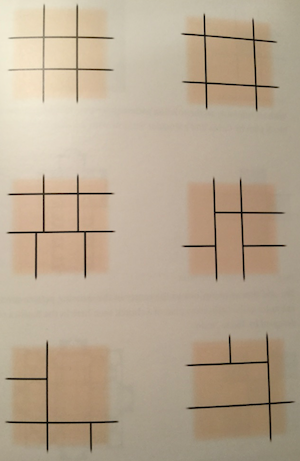
Types of nine-square pattern.

Eventually, assembling the jigsaw puzzle of how the brain works, and with so many examples of beautiful architecture swimming around in his head, he comes up with his own theory, which he calls the nine square. Beauty is achieved when a building façade can be divided into segments that fit into a tic-tac-toe board – that is, a nine square. Its four intersecting lines can be moved up, down or sideways, but they must relate to a configuration of the building’s doors, windows, base, roof, chimneys and such ornamental detail as stringcourses, pilasters and the like – at least on traditional buildings. (On Page 33, however, he sketches out several versions of the nine square that seem highly dubious, but he never uses them in the rest of the book.)

Ruggles does not claim to have invented the concept of the nine square, just says it has been used to create beauty by architects for ages – though he does not, in his extensive quotations, cite any usage of the term. But that’s okay. It is significant that he seems to have identified a phenomenon of human intuition in use for centuries and more, which he has now named, and explained according to the workings of the brain.

So far, so good. He has articulated a characteristic of symmetry.

Screen Shot 2019-02-25 at 9.50.53 PM.png

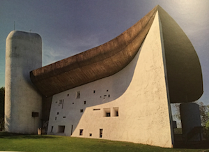
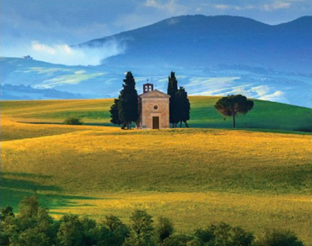
Chapel at Ronchamp, by Le Corbusier.

And yet, it is really not quite convincing. For example, his book has several images of Le Corbusier’s chapel at Ronchamp. Ruggles calls it a beautiful building, and later overlays nine squares on three façades of the chapel, which supposedly demonstrates its beauty. But Ronchamp is notably lacking in symmetry, and in stretching the nine square to fit the chapel he appears to have demonstrated its weakness as a concept. If a nine square can be made to fit the chapel, it can fit any building at all.

Screen Shot 2019-02-25 at 9.54.47 PM.png

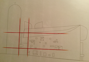
Ruggles’s nine square placed over chapel.

Ruggles’s book reminds me of a similar book, The Old Way of Seeing (1994), by Jonathan Hale, who applies slanted lines across Colonial houses linking important points of their design, structure and detail to illustrate proportion in façades. He writes, “Whether the designer knew he was creating the pattern is less important than that the pattern is there.” Just so. The large degree to which the pattern can be stretched to apply to so many different buildings undermines its utility as a way to identify beauty. Likewise with the nine square. Both pattern types seem too ex-post-facto to fly.

Ruggles next tackles the idea that the human face gets the swiftest and most sympthetic attention from the brain. He claims that the human face is fascinating because (to be brief) it fits the nine square. Well, maybe, but the more likely reason is that from babyhood on, people are always looking at faces, and always have, and that this, not the nine-square nature of a face, explains why they are so alluring – simply because they are faces – and why buildings whose windows and doors seem to make a face are so popular.

Screen Shot 2019-02-25 at 9.57.01 PM.png

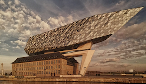
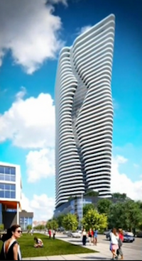
Zaha Hadid’s Port House addition, Antwerp.

Ruggles then strays somewhat from the nine square in order to justify a despicable modernist conceit – the value of modernist additions that contrast severely with the original traditional buildings. Since the nine square seemingly could not apply to these, which are downright anti-symmetrical, Ruggles goes back to his description of how the brain and nervous system respond to stimuli. He cites studies that find that modern architecture, with its jagged edges, is more stressful and traditional architecture, with its continuity of familiar norms, is more relaxing. In this penultimate chapter he cites, with illustrations, several of the most celebrated (by modernists) examples of this – the Libeskind addition to the Royal Ontario Museum in Toronto and the Port House, in Antwerp, with its modernist hulk by the late Zaha Hadid placed atop a 1922 fire station. The implication, stated directly, is that ugliness is not offensive if beauty can balance out its stressfulness.

That is contrary to how people perceive architecture. A modernist building that disrupts a street’s continuity or a modernist addition to a traditional bulding both degrade the street. A place is perceived as the sum of its parts, not item by item, as if it were a museum gallery in which people look at one painting and then go on to see the next. Occasionally they do observe a street building by building as they stroll, and its continuity may be “disrupted” by a singularly attractive building or a singularly repellent one. Consciously or unconsciously they assess the impact of either intrusion – adding to or subtracting from the street’s appeal. A building that subtracts from the street’s appeal may be reliably described as poorly designed.

To justify such a subtraction, Ruggles seems to depart from most of what his book has previously argued, and states: “Fortunately, for every action there is an opposite and equal reaction.” He states it in terms of our nervous system, in which “sympathetic” (stressful) and “parasympathetic” (relaxing) design features compete. Never mind the confusion caused by the seeming inversion of meaning in these two words. The implication embraced by Ruggles is that ugliness is not offensive if it is balanced by beauty. This is simply absurd. I can hardly believe the author really believes that it holds water.

Ruggles’s book places great emphasis on the mistake modernists made when they ousted beauty from architecture. After quoting an architect from the firm of Coop Himmelb(l)au, he describes the damage this has done:

“Ugliness is the next step in the pursuit of beauty.” This attitude is being passed on in many universities most every day. I once attended a jury at an architectural school. During the presentation, one student used the word “beautiful” to describe an aspect of his presentation. The professor’s reaction: “Don’t ever use that word in this class again.” This is the attitude that we are living with. I firmly believe that no one set out to intentionally harm society. I firmly believe that they did not have the information available to properly guide us. We now do.

Yes, we now do. But Ruggles does not seem to understand it. Science is not telling us that we can enjoy both architecture that is natural and architecture that is unnatural. No. Science is telling us which architecture is attractive and which is repulsive, and why, and why we understand the difference intuitively. Ruggles seems to believe – he has many co-believers – that a compromise between the natural and the unnatural, between beauty and ugly, can be perceived as beautiful. His book says the science of neurobiology points the way to that compromise. No, it does not.

Still, the nine squares, parasympathy and all that are secondary to the truth expressed in the best prose of Ruggles’s book – even if its author does not realize it. It is that beauty in architecture is what has evolved over the broad expanse of time, shaped by the human mind following nature’s biological guidance, not the plainly idiotic experimentation of modernism’s founding charlatans and their deluded followers.

It is much more important for an author to express a deeper truth when that truth remains unjustly suppressed by many decades of cultish architectural establishment than it is to add yet another doubtful key to that deeper truth. Don Ruggles’s Beauty, Neuroscience & Architecture – subtitled “Timeless Patterns & Their Impact on Our Well-Being” – does that very important work. It, and not his theorizing about the nine square, etc., is at the center of his beautiful book. It is well worth reading.

Screen Shot 2019-02-25 at 10.21.58 PM.png

Verrieres, Cherry Hills Village, Colorado, by Ruggles Mabe Studio. (RMS)

Posted in Architecture, Art and design | Tagged , , , , , , , | 5 Comments

REX wrecks Brown PAC Rx

Screen Shot 2019-02-22 at 9.56.14 AM.png

Design, by REX, of Brown Univesity’s proposed performing arts center. (REX)

The newly released design for Brown’s proposed performing arts center by the New York firm REX, led by Rem Koolhaas OMA alumnus Joshua Prince-Ramus, can’t be accused of wrecking a swath of campus. That’s already been accomplished. But it can be accused of wrecking any hope that the new facility for performing artists at Brown will be beautiful.

It will, however, be “radically flexible,” says Ramus, “not a ‘one-size-fits-all’ auditorium, mediocre to all and excellent for none.” Naturally, any such nondiscriminatory structural flexibility had to come, as Ramus pointed out, “shrink-wrapped in an extruded aluminum rainscreen, composed of fractal-like fluted geometry.”

Two rival conceits animate the building’s design. Wrapping its shoe-boxy six stories, the aluminum façade mimics a classical column’s vertical fluting. This cannot be intended to qualify it as classical architecture, which is not in the REX tool kit. The other conceit is that a single-story glass lobby, a “clearstory,” projects beyond the first floor on three sides, but, more intriguingly, thrusts far into the building, letting outsiders see into the hall’s five performance configurations to observe rehearsals, set construction and other ancillary artistic operations. The two features split the personality of the building’s design (if anyone cares), giving it a quirky, makeshift appearance.

That’s appropriate, since the art world has for decades favored, above all else, the quirky and the makeshift. The largest performance configuration is called Orchestra, which will seat 625 people. The hall may indeed one day host a performance of Beethoven’s Ninth Symphony, but if so, that music in that venue will foster a state of conflict between art and architecture. The ceiling, floor and walls of the Orchestra configuration can mechanically shift and squeeze into four other configurations for smaller-type performances – recitals, poetry slams, etc. Modernist performances unfit for a classically ornamented space may be more suitable for the bland, sterile, utilitarian spaces inside this facility. Performers and their audience enjoying one or another form of cacophony might better appreciate such spaces. With all their ability to expand and contract, the ambiance created might turn out to be a more dimly lit version of the Walmart distribution centers that we have grown accustomed to seeing on the evening news. The acoustics, says Ramus, promise to be excellent in all five performance configurations. We’ll see.

Screen Shot 2019-02-22 at 11.52.34 AM.png

Granoff Center for the Creative Arts. (Brown)

Once you are inside the lobby, the main thing to be seen outside of it will be the Granoff Center for the Creative Arts, completed in 2011, and designed by Diller Scofidio + Renfro, of New York, a ridiculous firm now well ensconced at the apogee of starchitecture. The Granoff Center will sit right across The Walk, striking a pose reminiscent of a giant accordion struck by an earthquake. It will be interesting to see which the Brown community prefers in this face-off between wacky centers for the arts – the squeeze-box temblor or the SpongeBox SquarePAC. A stroll up The Walk, as Brown calls the three-block greenway connecting the original Brown campus and the old Pembroke campus, will not be for the faint of heart.

Screen Shot 2019-02-22 at 7.18.29 PM.png

Sharpe House, Peter Green House. (Brown)

True, but we can all be happy that the project was relocated to this new site after strong reaction against its previously proposed location, which required razing four historic buildings. No buildings will be demolished to make way for the performance center on the new site, though in December the historic Sharpe House (see video) was moved on an “el” path west to Brown Street, ending up next to the historic Peter Green House, which was relocated in 2007. The History Department will be unified, with a structure connecting the two buildings to be designed by Kite Architects, in a style that, I hope, completes them rather than competes with them. (Fat chance!)

So bringing together the long-scattered performing arts community at Brown preserved four old buildings, and the aesthetic decline of Brown Street was reversed, at least for now, by reuniting the History Department. The result will be an arts facility that fails to beautify the campus, but what else is new? The Providence Preservation Society deserves credit for saving the historic buildings, and Brown does too for agreeing to re-site the project, rising, as it did for its Jonathan Nelson Fitness Center (2012), above the typical terrifying bureaucratic inertia of any university.

Screen Shot 2019-02-22 at 7.46.30 PM.png

“Clearstory” beneath “fluted geometry” of proposed performing arts center. (REX)

Posted in Architecture | Tagged , , , , , , | 13 Comments