“Symphony of a Great City”

Clip from film of three (?) Jewish men, one sporting Hitler moustache and a goatee. (YouTube)

This video of Berlin made in 1927 – halfway between World War I and World War II – by German filmmaker Walter Ruttman, takes viewers through a day in the life of the metropolis, from morning to noon to night. Every slice of German society from high to low is documented, clip by clip, with a sound track rising or falling in tempo with the upbeat or downbeat scenes rolling by. The colorization retains the feel of the historic black and white. A sense of foreboding overcasts much of the film, whether the scenes are happy or sad. I’ve never seen a more subtle evocation of an entire culture and society, and this portrait of the Weimar Republic heralds the coming storm without pity.

As the day opens, shots of a train, trackage and overhead electricity lines push into the rising sunlight as a locomotive speeds toward Berlin. The train passes through suburbs, by factories under construction, and into the city as workers head off toward their plants. A heavy emphasis on industrial automation forms a repeated motif. Trains, trains, trains! Trolleys, traffic, traffic cops in control at busy intersections. Workers with lunch pails enter factory gates. Later, wealthy diners lunch at outdoor cafés. Old man sells little girls’ frocks. Cat rummages in garbage. Elderly Jew sports a Hitler moustache (and a goatee). The sorry plight of work horses. Man harangues crowd at outdoor rally. Fisticuffs in street seen from window above. Young woman looks over edge of bridge into maelstrom. Lunch consumed by rich and poor. Early signs of Nazi party. Young mothers watch as children splash in wading pond. Little girl pulls tail of lion cub at zoo. Dinner consumed by rich and poor. Lovers pair off, embrace on park bench. Nighttime activities. Dancing, drinking, the cinema, Charlie Chaplin’s feet. Show girls in dressing rooms. Acrobats, chorus lines. Man squeezes his girl’s arm as he hands her into taxi. Going home as night descends on city.

At 107 minutes in length, Symphony of a Great City is far longer than most city videos I have posted on this blog, but it is probably the best. Enjoy.

Posted in Old Video, Urbanism and planning | Tagged , , , , , , | 5 Comments

Blake on Corbu’s “furniture”

L-R: Lounge, “easy” chair, British officers’ chair designed by Le Corbusier. (Blake)

Peter Blake, modernist architect, critic and (eventually) apostate, writes about “functional” modernist furniture in his book Le Corbusier: Architecture and Form (1960), which I’m reading as a sort of launching pad to his book Form Follows Fiasco (the best book title I’ve seen), which he wrote 17 years later.

The quality that distinguished Corbu’s [furniture] designs from those of the Bauhaus was exactly the same that distinguished German functionalism from Corbu’s rather special brand: while [Marcel] Breuer’s chairs were entirely rational, technically impeccable, and, incidentally, very handsome, Corbu’s were neither particularly rational, nor especially easy to manufacture. All there were, in fact, was ravishingly beautiful.

Corbusier sitting in chair (of his design?) in unknown location. (allposters.com)

Blake was unabashed in his remarks on Corbusian architecture and furniture alike. He has the modern critical habit of striking directly the note of the obviously not true. He is a fountain of pishposh, to use yet another Menckenian formulation. In short he is fun to read. His apparent critical honesty and charm disarm loyal modernists among his readers. The furniture would out of place in any comfortable room. They are refugees from a torture chamber. He describes his famous lounge chair, the British officers’ chair, and the “easy” chair, and continues:

This and other little details – such as the cylindrical pillow strapped to the head of the reclining chair – make these just about the wittiest, sexiest chairs designed in modern times. The fact is, of course, that much modern steel furniture does tend to look a little grim; all of us who solemnly assert that we like it do so because we think we ought to like it since it “makes sense.” To a Frenchman this is a perfectly silly argument; he would never think of making love to a “nice, sensible girl” as an Englishman might, or to a potentially “good mother” as a German would. Corbu’s chairs are rather like expensive tarts: elegant, funny, sexy, and not particularly sensible. Nobody has improved upon them [the furniture, not the tarts, the reader must assume] to date.

Witty? Sexy? As in S&M, I suppose. Even as more vital topics cool their heels, it’s impossible to get through this book, this fantasia, without quoting passages at length for the reader’s amusement. Is that legal? Stay tuned.

Posted in Architecture, Art and design, Interior Design | Tagged , , , , | 11 Comments

Two rotten eggs and a peach

Rendering of preferable proposal for apartment complex on east bank of Providence River. (Nelson)

The I-195 District Redevelopment Commission, at its Sept. 20 meeting, looked at three proposals for mixed-use apartment complexes on former highway land east of the Providence River. One proposal exceeds the other two in appearance. That should be the primary basis upon which the commission makes its choice.

The preferred alternative comes from the Boston development firm of Parent and Diamond. Nelson Worldwide, a minority-led architecture firm (according to the official submission), designed the complex. It features what, from a drawing (see above), appears to be a more or less traditional building of six stories with a gentle undulation stretching two blocks, clad in brick or brick-shaped stone with mostly regular windows set back into the masonry, sited between South Main and South Water streets, and facing the curved Van Leesten pedestrian bridge. The building’s curvature may raise eyebrows among some purists, but the look of it is quite pleasing – surely compared with the other two proposals.

These, respectively from Urbanica and Eden (both also of Boston and both illustrated below), feature façades, in the first case, of flush, syncopated fenestration (modern architecture’s reigning cliché) throughout plus more curvature and, in the second case, blockish extrusions in contrasting colors with a cockeyed slant roofscape and, once again, flush syncopated windows.  Windows inserted flush with façades make even the sturdiest buildings look as if they were made of plastic. … Yawn!

The Nelson design team also sucked it up and added the seemingly obligatory syncopated windows in a relatively small squarish block at the south end of its complex. This is far from intrinsic to its design, and can be got rid of easily. (Such windows are key to the Urbanica proposal, but could still be easily nixed.)

Usually, design that embraces structure with a lengthy pedigree, such as regular, aligned window placement rather than irregular, syncopated, window placement, is less expensive and more pleasing precisely because builders learned long ago that regularity serves a host of design and construction priorities. Centuries of experience had ingrained the utility of regular forms in practice, and their allure in the eye of most of the public followed, influencing most architecture until the past half century or so. Even today, regularity need not prevent innovation, but innovation with no foundation in regularity raises costs and risks ugliness.

Fortunately, innovation founded on regularity forms the basis of all historical architecture in the city of Providence. The character of this heritage is, indeed, the brand of Rhode Island and its capital city, which were founded in 1636.

Unfortunately, the home truths that should have been the basis of architectural development have been ignored by city officials, not to mention developers and architects, since around 1960. The result has been the gradual uglification of the city and the profound alienation of citizens from their surroundings. This in spite of the fact that the laws pertaining to development here mandate that new construction projects respect the city’s historical character. Just look at a single example, Article 6, Section 606 of the city zoning ordinance, one of many such historical mandates festooned throughout city and state zoning codes:

The purpose of these standards is to preserve the urban fabric of Downtown Providence and ensure that new construction complements the historic character and architectural integrity of existing structures.

The law has simply been ignored by officials up and down the ladder, from city planners and members of preservation committees all the way up to the city’s mayors and the Ocean State’s governors – including the I-195 Redevelopment Commission that oversees development on the land opened by the relocation of Route 195, completed in 2010. I suspect that no traditional architecture firm has ever received a request for proposal (RFP) from the commission. As a result, no building erected under the auspices of the commission has added to the beauty of the city’s skyline or the charm of it streetscapes.

If branding has any rational purpose, it is to guide officials toward economic development that will allow a city (or other entity) to build upon its leading advantages. In the case of Providence, that would be historical character. How has this basic truth eluded generations of civic leaders here?

It should be no surprise: No building erected since 1960, with one exception, has added to the beauty of the city skyline or the charm of its streets. The single exception is the fitness center on Hope Street at Brown, which was planned to be as modernist as every new Brown building in the past half century or so, but was changed at the request of its leading donor, Jonathan Nelson. (No relation to the Nelson Worldwide architecture firm, so far as I know.) The beautiful result was the work of Robert A.M. Stern Architects, of New York City. But then Nelson, a multi-billionaire, turned around and financed an ugly entrepreneurship center of modernist design on Thayer Street, nixing a revival of attractive architecture there. For shame! Entrepreneurship, indeed! Have you learned nothing? You should return the Bulfinch award for patronage you received for the fitness center design in 2016 from the Institute of Classical Architecture & Art.

(Make it two exceptions. The 1990 addition to the John Carter Brown Library on the Brown campus but not part of Brown University, designed by Hartman-Cox, is a beautiful work that respects the original 1904 Beaux Arts design. Or three exceptions: The Ruane Center for the Humanities of 2013, designed by S/L/A/M, is lovely, but subsequent new buildings have shown that even at Providence College, success doesn’t necessarily mean learning has occurred.)

But I digress. Candidates for office in upcoming mayoral and gubernatorial elections should declare whether they are for pushing developers to provide architecture that will strengthen the longstanding brand of Providence and Rhode Island – and, for that matter, to obey the law. It may seem a lost cause in the current 195 innovation district, which is mostly apartment complexes so far anyway, but the public (hint, hint: voters) would approve. Anyway, in returning to the habit of beauty the city and state must start somewhere.

The Urbanica proposal, second best, features a curve but has all screwy windows. (Eden)

The Eden proposal features blocky facade extrusions, misaligned windows, awkward colors. (Urbanica)

Posted in Architecture, Development | Tagged , , , , , , , , , , , , | 10 Comments

Review: “Pollak’s Arm”

“Laocoon and His Sons” at Vatican with “Pollak’s Arm” attached. (vaticantips.com)

Pollak’s Arm, a historical novel by Hans von Trotha, is not about Pollak’s arm but about the arm his protagonist, art collector Ludwig Pollak, found, which had been missing for centuries from the shoulder of Laocoön (pronounced lay-o-coo-on), the central figure of the ancient sculptural group “Laocoön and His Sons.”

Laocoon with falsely raised arm. (Princeton Art Museum)

Ludwig Pollak (1868-1943) was born in Prague, an archaeologist, antiquities collector, museum director and associate of art collectors from Freud to J.P. Morgan. He found the original arm of Laocoön in a stonemason’s workshop.

Lost also in Pollak’s Arm, regrettably, are quotation marks to denote passages spoken by Pollak to the narrator on Oct. 16, 1943, the day on which the action (almost entirely dialogue) takes place in von Trotha’s book. The following day the Jews of Rome were rounded up by its Nazi occupiers. Pollak and his family were shipped by train to Auschwitz and died there, despite an offer of sanctuary in the Vatican. The narrator tried to persuade Pollak to take advantage of that offer, to flee his elegant home under papal protection, but he insisted upon spending the entire night telling stories of his magnificent career.

The absence of quote marks in the book is, I imagine, either an artistic conceit of the author or reflects his reluctance to sanctify his subject’s words with quote marks, for which he may have valid reasons or not. My reviewer’s copy of the book has no preface to explain the decision. Pollak left diaries, but I don’t know whether the author took Pollak’s quotations from them. The absence of quote marks makes it hard to follow who is saying what to whom; moreover, it seems to undermine the credibility of the narrative – already strained by the protagonist’s prolonged refusal to seek refuge. Is that how it really happened? Much of the book’s tension arises from its narrator’s repeated attempts to interrupt Pollak’s story-telling and bring him to act upon or at least recognize his peril.

Still, the stories are spellbinding and eventually the reader (like the narrator) is carried along by the narrative. A reader can try to ignore who’s saying what. To me, the most fascinating parts are Pollak’s descriptions of why finding the lost arm of Laocoön changes the symbolism of the statuary group, which displays the death of Laocoön, a priest, and his two sons at the hands (so to speak) of snakes sent by the goddess Athena to kill him for warning the Trojans of the deception inside the large, hollow, wooden horse filled with Greek soldiers left as a “gift” at the gates of Troy by its supposedly withdrawing besiegers.

Athena, according to the poet Virgil, wanted Troy, under siege for a decade by Athens, destroyed so that Rome could eventually be founded.

What a punishment [says Pollak, supposedly]. Just imagine: the Trojan Horse rolls into a city. A clever ruse. Isn’t that right? Had it failed, the story would have turned out differently. Troy would have survived. Rome would not have been founded. And Laocoön and his sons would have lived. But it wasn’t what the gods wanted. Athena, in particular, was adamant in her desire to see Rome built. The goddess wanted Aeneas to found it. This is why Virgil includes Laocoön’s tale in the Aeneid, because it is central to Aeneas’s destiny as the founder of Rome. Then along comes this priest. He senses something. We know that his intuition is correct, that this thing rolling into the Trojans’ midst will be their downfall. … And Laocoön throws his spear at the wood, angering Athena. It was her plan he nearly thwarted.

It is fair to ask what a priest was doing with a spear, not to mention whether there was a Trojan Horse at all, or whether Athena truly smote Laocoön with snakes. It’s in Virgil, so … such questions are above my pay grade. In any event, the statuary group was discovered in 1506. A supposed copy of Laocoön’s lost right arm, extended upward in exultant contention with a snake, was attached after the group was disinterred and relocated to the Vatican. Long after, in 1905, Pollak found the lost right arm. Pollak says:

The true right arm of Laocoön was back, but it wasn’t extended in exultation; no, the arm is bent, almost twisted. This hero is no hero. That isn’t my fault. I didn’t chisel the arm. All I did was find it. And recognize it. … I immediately saw that it had to be the arm of Laocoön. Now they call it Pollak’s arm. That is how I will be remembered by posterity, as a broken arm.

However, Pollak continues:

While studying the statue, I ascertained that [the lost] arm is too small. Not by much, but it is too small. The surface of the marble is also different, as is the color. The arm I found must therefore belong to a copy; smaller by one ninth, to be precise. The sting of disappointment is never greater than when it punctures euphoria. It is, at least, a contemporary copy. That much is certain. And the message the arm conveys is no different in a copy than in the original, which has yet to be found.

Pollak believes the copy he found is of Laocoön’s arm bent back, not stretched out, as the Vatican had long assumed. “Laocoön’s face is anguish incarnate.One can understand,” says Pollak, “why Vatican priests of the Counter-Reformation would see the suffering of Christ in it.” The alternative story of Laocoön is “far less heroic. It is simpler and more human and true. I am convinced that it’s the tale the three sculptors from Rhodes had in mind as they chiseled, and it is this Laocoön that they carved from stone – not Virgil’s.” Pollak continues:

According to this story, the serpents were sent after Laocoön because he fornicated with his wife on the altar. As a priest, he should not have sired any children. Though the gods pardoned that transgression, his desecration of the altar was different. It meant death for him and his sons. A gruesome death, a disgraceful end for a priest. Meaningless, not heroic. Hence the angled arm. The snake has long since won. The harrowed face shows the suffering of a condemned blasphemer, not the struggle of a courageous hero. Viewers are meant to delight in this hideous ordeal, or perhaps be frightened by it. But he’s no hero, and neither nobility nor grandeur is on display.

Leaving aside that a priest siring children is okay but doing so on an altar is punishable by death, it is understandable why Pollak’s arm caused controversy in Rome. How could Pollak be sure of the authenticity of the arm he found, which he admitted was itself a copy of an original that remains lost? And how can he now (in the telling of von Trotha) be so sure that the outstretched, heroic arm is not the one true arm? Maybe Pollak is not as great as he thinks he is. Maybe the arm he found was not related to the Laocoön statuary group, even though there were attachment holes linking the arm to the shoulder that matched.

Maybe using the literary device that stands for spoken language would help the author communicate the situation better to readers. Maybe the lack of quotes reflects the author’s doubts about the authenticity of the issues with which his protagonist, Pollak, contends. Maybe the lack of quotes will be remedied in a second edition of the book.

Pollak’s Arm is published by New Vessel Press, which brings European books to an English readership. (I reviewed its Villa of Delirium here.) Hans von Trotha is a German historian, novelist, journalist and literary editor who lives in Berlin. His book is a fascinating account of collecting art and antiquities in Rome, of the period of its occupation by the Nazis, and a sad testament of the extermination of the Pollak family, a cloud that hovers over this work of historical fiction.

By Hubert Robert (1733-1808), a romantic depiction of Laocoon Group’s discovery. (Wikipedia)

Posted in Art and design, Book/Film Reviews | Tagged , , , , , , , , , , , | Leave a comment

See how form follows fiasco

From Corbusier’s idea of the Radiant City, from La Ville Radieuse (plan 1924; book 1933). In 1925, Corbusier tried but failed to get Paris to inflict his ideas (Le Plan Voisin) on itself. (Corbusier, Oeuvre)

I’ve just started rereading the late Peter Blake’s slender 1960 hagiography of French architect Le Corbusier, born Charles-Édouard Jeanneret in Switzerland. A far better book on Corbu, as he is known by his many deluded admirers, is Le Corbusier: The Dishonest Architect (2017), but its author, Malcolm Millais, has not (and I’m sure will not) subsequently change his mind and write a book like Blake’s flip-flop, Form Follows Fiasco: Why Modern Architecture Hasn’t Worked, which he wrote in 1977. So it took Blake 17 years to come to his senses.

I have apparently read both of these books by Blake. I can’t recall my first encounter with Le Corbusier: Architecture and Form, but I underlined my copy so I must have read it; in fact, it was once  owned by the late modernist architect Derek Bradford, my nemesis in matters of design here in Providence. I didn’t steal it from him; I bought it for fifty cents at a local library sale. By the way, Millais’s enduring defenestration of modern architecture, written eight years before Dishonest, is Exploding the Myths of Modern Architecture.

Here are a couple of quotes from Blake’s book on Corbu. These should whet your appetite for quotes from his book Fiasco, which I will supply as I read it.

Here at Pessac [a suburban housing project near Bordeaux], as in many other places, Le Corbusier was to run head-on into violent opposition on the part of various authorities, and his buildings stood vacant for more than three years after they were completed because some benighted local bureaucrats, who objected to the uncompromising geometry of Corbu’s open and closed cubes, refused to issue the necessary occupancy permits. …

Here, as at Pessac, Corbu was to meet a degree of hostility hard to imagine today [1960]. … At the Paris exhibition, the hatred for Corbu’s pavilion was passionate and vitriolic; indeed, it is difficult to understand why he was asked to participate in the first place, and the authorities did everything possible to sabotage his efforts. They began by giving him the worst site in the entire exhibition, a spot practically outside the exhibition grounds. Next, they erected a fence some eighteen feet high all around Corbu’s pavilion to keep out visitors altogether. It took the intervention of a cabinet minister to have the fence torn down! Finally, when an international jury decided to award the first prize to Corbu’s pavilion, the French member of the jury succeeded in vetoing the proposal on the grounds that the structure “contained no architecture.”

This is music to my ears. I haven’t had such a glow on toward authorities in a long time. One of the book’s joys, in spite of Blake’s worship of his subject, is its brutal honesty in describing how officials detested Corbusier’s buildings. Of course, Blake no doubt considers the disdain of officials as feathers in his hero’s cap. As a young architect in the 1920s, Le Corbusier ran up against the fact that building regulators in those days were not marinated in the love of ugliness as they are today. They had the sensibility of normal people. It was not until four or five decades later, in the ’60s and ’70s, that architecture schools had purged the intuitive sense of taste from students who attended schools that formed the next generations of designers, who dominate what our cities look like today.

One of the reasons I was not altogether enamored of Form Follows Fiasco was that it was really more about city planning than architectural design. I don’t recall that Peter Blake ended up hating modern architecture as much as I wanted him to. He was a modernist himself and designed about 50 buildings during his career, and, as far as I can tell, they were all modernist. At some point he must have been designing what he knew most people would dislike, following principles he knew were hollow. How did he sleep at night?

He died in 2006, at which point I hope he was finally able to rest.

Posted in Architecture, Books and Culture | Tagged , , , , , , , | 5 Comments

A lexicon of modern facades

Illustration by Thadani of how lexicon can be used on computers. (Dhiru Thadani)

Among the many differences between modern architecture and traditional or classical architecture is that modernist buildings, which often do not look like buildings at all, receive what I call derisive monikers from members of the public. Traditional and classical design, on the other hand, results in buildings that look like what they are supposed to be. Churches look like churches, banks look like banks. Houses look like houses. (What an idea!)

Recently, in Providence, new bus waiting kiosks have appeared in downtown that look like ironing boards, or (to me) like apparatuses that belong in a torture chamber. Other familiar names for modernist buildings are Big Pants, an official nickname for the CCTV headquarters, in Beijing, adopted in order to forestall some other nickname for a building that, to me, looks like it is stomping on the Chinese people. Also in Beijing is the Bird’s Nest, its Olympic stadium. Others think it looks like a massive tangle of barbed wire. I don’t know whether Beijing’s headquarters for the People’s Daily newspaper has a nickname. I’m sure it must. It looks like a giant penis. Not to pick on Red China, London has its own dildo, referred to as the Gherkin, meaning cucumber, which is often used as a … oh, never mind. Urban psychoanalysts, especially female, have for ages referred to all buildings taller than wide as phallic symbols.

You could list dozens more, but you don’t have to because Dhiru Thadani, the D.C.-based architect and urbanist, has done it for you. He has just developed a lexicon for typical styles (or “styles,” modernists might say because they claim not to believe in styles) of modernist building design. The derisive monikers he has come up with for each style are apposite, and for the most part describe with cunning accuracy what most people will see as the clear inspiration for these works to which the profession of architecture has stooped. Many of the styles below probably appear in your own community, buildings that the public rolls its eyes at and wishes were somewhere else.

Here is the lexicon, which also depicts the modernist building styles:

Many readers will recognize the original buildings from which the styles take their names. Despite familiar assertions to the contrary, modernist architects are deeply indebted to copying the past for their productivity. So readers may have seen one or more “derivative” buildings that bow down, or get down on their knees, in deference to the originals.

Thadani expertly explicates his lexicon in text accompanying his article in Public Square, the space usually filled by new urbanist Rob Steuteville. I recommend reading the whole thing, which is relatively brief, but here’s one passage I love:

It is ironic that today’s modernist architecture has reverted to being skin deep with no regard to express the functional use of the building. Many new buildings are designed to be appreciated from the air, as if to assume that all citizens have helicopter access. The pedestrians and street views are ignored. The majority of buildings do not contribute to the beauty of their context but rather try hard to stand out using absurd anti-gravitational strategies.

I will give a prize, of sorts, to the reader who can identify, in my comments section, the most original buildings represented in the lexicon.

Posted in Architecture | Tagged , , , | 12 Comments

9/11: Peering into the abyss

90 West St., circa 1995, from rooftop garden of my cousin’s building in Battery Park City.

My last post quoted briefly my Oct. 4, 2001, column in the Providence Journal called “Peering into the towering abyss,” but the link seems to take readers to a sign-up sheet for the Journal archives instead of the text of the column. That’s what I found when I clicked the link on my iPhone, but when I clicked the same link on my iMac, it took me directly to the text. So I have no idea how this will work out for readers on other platforms. Therefore, I reprint the column in its entirety:

***

Peering into the towering abyss

LOWER MANHATTAN
I am close enough to the ruins of the World Trade Center to know I should be glad I cannot get closer. Pictures hardly prepare you for the magnitude of the wreckage, which smolders still, not to mention the acrid stench that comes and goes but stays with you. A few people outside the no-go zone still wear air filters or hold handkerchiefs up to their noses. They are probably the ones who can’t stop thinking about what they are smelling.

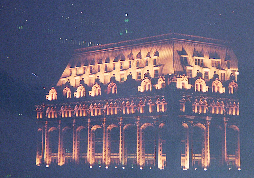
The photograph above was taken in happier days, from the roof garden of my cousin’s building in Battery Park City. The towers loom up, dwarfing the building that engaged my attention even more than the two towers, a lovely old building. The towers were there, for better or worse, and, for all I knew, always would be. Late that night, I went back up to shoot the old building again. The soft lights transformed its ornate roofscape into a golden jewel. In the dark beyond, you could barely see the towers.

The towers were the world’s tallest for only a couple of years, until Chicago’s Sears Tower opened, in 1974. Actually, one of the twin towers was six feet taller than the other. Their architect, Minoru Ya-masaki, stood an inch above five feet.

After the terrorists destroyed the towers, and after the fog of horror cleared a bit from my mind, I thought of that old building so close by. Did it still exist? No photographs or footage had revealed its fate, at least none I’d seen. I mourn the lost towers and the lost lives, but when I visited New York, I had to find out what had become of that old building.

I found a room Sunday at the Gramercy Park Hotel. I went out into the rain, had lunch nearby, returned, tried to arrange dinner with the sister of a friend, and ended up seeing an off-Broadway play, Woman Killer, and, later, saw comic routines at the New York Comedy Club. (“The more Arab the driver, the bigger his flag.” “Instead of rebuilding two buildings with 110 stories each, how about eight buildings with 25 stories each? Call it the Manhattan Projects.”)

The next morning, after checking out, I headed south. I walked, puttering around, marveling at the Beaux Arts municipal district, City Hall Park, the Woolworth Building, etc. Procrastinating.

Finally, just before noon, I reached the edge of the no-go zone, and accepted without protest the assurances of a couple of police officers that there was no way I’d ever get anything like close to “ground zero.” I was directed down Chambers Street to construction headquarters for damage information, but could speak with no officials. They were very busy.

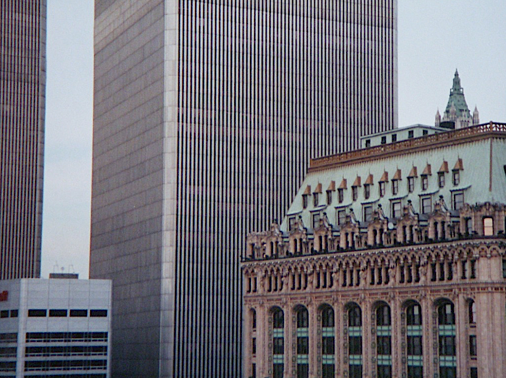
But near the end of Chambers, from a pedestrian bridge, I finally saw my old building. Its address turns out to be 90 West St. It was built in 1905. In the photo at the right, taken with a zoom from the footbridge over West Street, it stands just left of the white crane battered and bruised, but alive. At its foot is the debris of 2 World Trade Center. Between them was tiny St. Nicholas Greek Orthodox Church, built in the 1830s. It was obliterated.

I gaze upon this distressing scene, shoot a few pictures and move on. Back on Broadway, I again head south, peering west toward ground zero at every intersection. First Fulton, then Dey, then Cortland, then Liberty. With the crowds I linger, spellbound, taking pictures of ground zero. We continue to walk only after police lose patience, shouting, “Move along!” and threatening to confiscate cameras.

Thoroughly depressed, I wander toward Battery Park, then take a subway to the Port Authority Terminal (owner of the World Trade Center) and a bus for Providence, where the tallest buildings are less than a quarter the height of the late twin towers.

How curious that so many well-known architects and critics, even after the towers’ demise, can find so little good to say of their aesthetic charms. Powerful symbols, sure, no denying that. Even Ada Louise Huxtable, who in 1972 wrote that “these are big buildings, but they are not great architecture,” held firmly to that stance in writing their epitaph.

Perhaps buildings, like people, can attain greatness if not beauty in death. Many people shrink from the idea of building tall again. I do not know whether the towers should be rebuilt. A colleague says that would be to court a repeat disaster: Imagine two buildings each with 110 13th floors. Only a lunatic would rent space or take a job there.

Well, I’m not sure I agree. Maybe the murder of these two buildings, and their thousands of occupants and hundreds of rescuing heroes, can generate enough unity and strength of purpose in the civilized world to vanquish terrorism. Maybe then we can rest easy, build big, live large and watch the spirit of two buildings rise from tallness to greatness. Abraham Lincoln was no beauty, either.

Posted in Architecture | Tagged , , , , , , , , | 2 Comments

9/11 revisited, 20 years on

90 West St. (right), at Ground Zero in Lower Manhattan, circa 1995. (photo by author)

I saw 9/11 as it was happening on a TV screen through one of the large windows of URI’s Providence campus (the Shepard Building) facing Union Street. I was on my way to work at the Journal – two blocks from my downtown loft – where I saw the two buildings, Tower 1 and Tower 2 of the World Trade Center, topple. Two weeks later I visited the scene and wrote “Peering into the towering abyss.”*

I was determined to learn whether one of my favorite buildings, a 1905 Beaux Arts tower at 90 West St. on the edge of Ground Zero, had survived. Finally I saw it. It had been damaged but was still standing, still beautiful. In my column from a couple of weeks after 9/11, I noted that for all their symbolic resonance after their demolition, few considered the twin towers beautiful. My conclusion:

90 West, damaged during 9/11 (photo by author)

Perhaps buildings, like people, can attain greatness if not beauty in death. Many people shrink from the idea of building tall again. I do not know whether the towers should be rebuilt. A colleague says that would be to court a repeat disaster: Imagine two buildings each with 110 13th floors. Only a lunatic would rent space or take a job there.

Well, I’m not sure I agree. Maybe the murder of these two buildings, and their thousands of occupants and hundreds of rescuing heroes, can generate enough unity and strength of purpose in the civilized world to vanquish terrorism. Maybe then we can rest easy, build big, live large and watch the spirit of two buildings rise from tallness to greatness. Abraham Lincoln was no beauty, either.

Since then I have written many columns and blog posts about rebuilding Ground Zero but none about the terrorist attack on America or America’s wars launched in response to these despicable acts. Three thousand Americans died on 9/11 and more thousands of U.S. soldiers have died in Afghanistan and Iraq. We are still in Iraq, minimally, and have just left Afghanistan, ignominiously. There has been no second major terrorist attack, but after rapid wins in both wars, U.S. and allied forces lost focus and have been in surrender mode for years. We’ve now withdrawn suddenly from Afghanistan, a withdrawal President Biden is calling a victory. His willful obtuseness only deepens the national humiliation.

I have written no columns or blog posts about how America has changed since 9/11. It is not my gig, but I do have my feelings, which grumble occasionally and tangentially in my posts. Life in America has eroded, and America’s prestige in the world has declined. Some people find that worthy of applause. Not me. Large sectors of the nation have officially embraced themes that demonize our citizens, our history, and the principles of our founding. And in addressing the pandemic, our first impulse was to surrender. We shut down our economy, increasing the pandemic’s cost without controlling it. It may be argued that we are not a free country anymore, that the nation lacks a working constitution, not to mention a free and independent press, and that the last election was stolen. Censorship – official, unofficial and self – has largely voided conversation throughout society on the subjects that divide us. The unity we pretend to seek is a joke.

This is a sad indictment of America since 9/11. My gig is architecture, and in architecture things seem no better. Developers continue to construct faceless buildings whose gargantuan size and cold sterility only reinforce authoritarian themes present in our politics and our response to the pandemic. A movement toward a living architecture has managed to carve out a beachhead in the field. It is based on neurobiological discoveries that explain the public’s broad traditional preferences. But classical architects and their advocates are too timid to embrace their very rare opportunities to confront the modernist establishment.

Naysayers used to warn after 9/11 when a policy of caution was advised: the terrorists have already won! I hope not. I like the spirit of Flight No. 93, whose hijacked passengers forced it to crash in a Pennsylvania field on its away to attack either the U.S. Capitol or the White House. As he and his fellow passengers charged the cockpit, Todd Beamer is said to have cried “Let’s roll!” Something like that can-do (indeed, must-do) spirit might be useful in America today.

***

*In some versions of this post, the link to my old column “Peering into the towering abyss” brings readers to a Journal sign-in form, not the column itself. For example, the link works from my iMac but not from my iPhone. I don’t know whether it will work from platforms used by others. I plan to run that column in its entirety as a post in a couple of days, so readers who cannot access it through the link on their screens can read it anyway.

Posted in Architecture | Tagged , , , , , , | 6 Comments

Telosa: The next BIG thing

A street in the proposed new city of Telosa, with 1930s-style aeroplane, or, closer up, a drone. (BIG)

Men have sought to establish utopias for centuries in the mind and even on land. Plato posited his “Republic” long before Sir Thomas More coined “utopia,” but More considered his Utopia (1516) a satire. The founders of successive attempts at utopia in New Harmony, Indiana, failed at least three times. Many other attempts before and since have been made in America and elsewhere: the precise alchemy remains elusive. The founders of modern architecture had utopian conceits but these have resulted almost exclusively in the opposite, as James Stevens Curl makes clear in his 2018 history, Making Dystopia).

Downtown Telosa, with sustainable skyscrapers and same aeroplane. (BIG)

Now, it seems, we have Telosa, a planned utopian community of five million on 150,000 acres, conceived by the tech billionaire Marc Lore, lately of Walmart. Lore has hired Bjarke Ingels, of the Danish firm BIG, to design Telosa along the lines of what Rob Steuteville believes fits under the big tent of the new urbanism. Look at the image on top. Do you see? And at left is Telosa’s new urbanist downtown!

My point is not so much to roll eyeballs at the supposed “agnosticism” of the Congress of the New Urbanism as to illustrate how the fields of architecture and urbanism – beyond the slice of them that unfolds in traditional languages – are little more today than a jumble of words.

If what BIG has drawn for Marc Lore is new urbanism, then new urbanism is just a jargon salad with no real meaning. Of course, I believe that the new urbanism is a real thing, and that, properly conceived, it promotes what would otherwise be called the old urbanism. Too many who have attached themselves to CNU are, in fact, NGO wannabes seeking magic bullets to slay the dragon of climate change with technology that 1) increases the energy output of buildings, and 2) diverts architects and urbanists from their true mission of designing beautiful buildings and cities that work.

However, it’s hard to sustain that belief. In a recent CNU Public Square column, Steuteville wrote: “BIG has revealed only a handful of images, but these make clear that the overall design has a lot in common with New Urbanism.” Huh?

Sustainability would be Telosa’s middle name, if it had one. It does not even have a proposed location yet, though most observers think the idea is to build it in the desert Southwest.

Lore conceives of the city’s plan as based on the latest archispeak buzzword – the 15-minute city, in which all residents live within 15 minutes of their workplace, shopping, or whatever else they need. Another example is the name given to the proposed city’s tallest building, dubbed Equitism Tower, a gloss on yet another, more socially resonant buzzword – equity – which means the exact opposite of equality, which was the conceptual basis for most utopias throughout history. Equality of opportunity is no longer good enough: equity now means equality of result – in other words, a blueprint for dystopia.

Successful cities around the world and throughout history evolved not according to a single plan or central concept but according to the whims of social and market forces, aligning growth with the reproductive qualities of nature. Not coincidentally, the growth of cities resembles the growth of architecture writ large – with thousands of builders adapting the latest advances in design and construction technology, and incorporating the knowledge gained in that ad-hoc manner to an expanding collective wisdom in architecture and city building, most of which has been abandoned by modernists. Marc Lore does not seem to have anything like a traditional urbanism in mind.

Someone online reacted to news of the announcement by Lore of Telosa by pointing out that a city of five millions – or of 50,000 in its supposed first phase – would need a huge system of bringing water to the community. He added that desalinizing water from the Pacific and piping it into the desert might cost a huge chunk of his fortune, leaving him unable to finance the cost of finding a way to finance (and then build) his imaginary city. A couple others speculated at new discoveries that might make that more feasible. Keep on dreaming!

Still, that’s a good idea. Dream on! Lore should indeed throw his money down a rabbit hole. He should hire a top-flight modernist civil engineer to handle whatever highfallutin’ goofy “infrastructure” Telosa might need. Why not hire the London firm that plans to goof up downtown Providence? It is called Arup, which is Swedish for “disrupt.” Or at least it could be.

Meanwhile, BIG should hire as subcontractors a host of great modernist architects such as Frank Goofy, the late Zaha “Ha Ha” Hadid’s firm, Dildo Scrofulus + Rent-free (Diller Scofidio + Renfro), SHoP Architects (does the “o” stand for “of”?), which designed the fitness center rejected by Brown in favor of a facility designed by Robert A.M. Stern (the only wise decision made by Brown in half a century), Renzo Pianofortissimo, and any of many other modernists seemingly as conceited as Ingels regarding the names of their firms.

The idea would be to put them to work designing the biggest nonstarter ever conceived. That might distract them from their normal duties, which seem to be to inflict their designs on as many cities as possible. Telosa has smitten the world of architectural wordsmithy (I plead guilty), spawning a sort of Olympics of the Imagination. Marc Lore fits right in. Let the games begin!

[An engaging take on Telosa by Jessa Crispin ran in the Sept. 20 UK Guardian.]

Gridded layout of Telosa. Could it resemble the new urbanism from a distance? Nah. (BIG)

Posted in Architecture | Tagged , , , , , , , | 6 Comments

WaterFire back in Providence

At WaterFire, view of crowd on pedestrian bridge, with skyline in background.

Providence has gone two years, since the fall of 2019, without WaterFire, the capital city’s signature work of art, a blessing to citizens of Rhode Island and visitors from much farther afield since 1994. It is the event’s usual crowds of people, maybe 40,000 or more, a dozen or so times a year, that doomed it to covid lockdown last year and into this spring and summer. But Saturday night WaterFire returned, full of vigor, and the livin’ was easy.

I would not have missed it for the world. For a long time during the event’s early years, I called myself the “Bard of WaterFire.” One of my old Journal columns was headlined “I cover the waterfront.” My wife googled me before our first date (in a gondola) back in ’04 and found “Sex and WaterFire.” The idea of WaterFire as a sort of mass orgy waiting to happen still pulls me downtown, though only four or five times a year nowadays, not as often as in times past.

For those unfamiliar with WaterFire, it features approximately 85 fires of about 33 pine logs piled pyramid style in metal braziers and anchored every 20 feet or so along the channels of the Providence and Woonasquatucket between downtown and College Hill. Black boats full of black-clad volunteers stoking the braziers chug quietly up and down the rivers. Symphonic, operatic, jazz and other music from distant cultures wafts gently from speakers strategically hidden along the embankments. Sometimes I chide WaterFire’s creator, Barnaby Evans, if the music creeps up too loud. He was there last night to put up with my tut-tutting, but to soften it I noted that a couple years’ worth of graffiti had been entirely scrubbed from the waterfront. Evans pointed out one tag that I had missed, under the lip of Memorial Boulevard’s embankment, testifying to the tagger’s daring in applying his pathetic signature (my words, not Barnaby’s).

The key to WaterFire’s success, aside from the energy and commitment of its maximum leader and his crew and volunteers, is the intimate quality of the Woonasquatucket and Providence rivers. Few cities can boast such rivers, let alone flowing as they do between the city’s downtown and its most historic neighborhood. The continued dominance of classical architecture in the vicinity, while at risk thanks to the lack of imagination shown by decades of city fathers and the city’s art and design elites, is responsible for much of Waterfire’s success. Topping it off is the masterfully traditional design of the city’s new (1990-1996) waterfront by the late architect and planner Bill Warner.

It seems that city and state leaders had to have their arms twisted to dedicate a total of $600,000 to put on this year’s truncated WaterFire schedule. Three more full lightings and five partial ones are planned, including a partial lighting (in the Waterplace basin only) this coming Thursday evening.

Before adding photographs taken during last night’s event, I can think of no better way to conclude this rambling celebration of WaterFire Regained than the concluding paragraph of my long-ago “Sex and WaterFire” essay:

While most cities have a secluded place to go for necking, few cities celebrate romance in the heart of their downtown. In WaterFire, Providence has such a place. How much love has bloomed along these embankments? Strip WaterFire of its final profundity and the intensity remains. Providence is blessed, indeed caressed, by WaterFire.

Posted in Architecture, Urbanism and planning | Tagged , , , , | Leave a comment