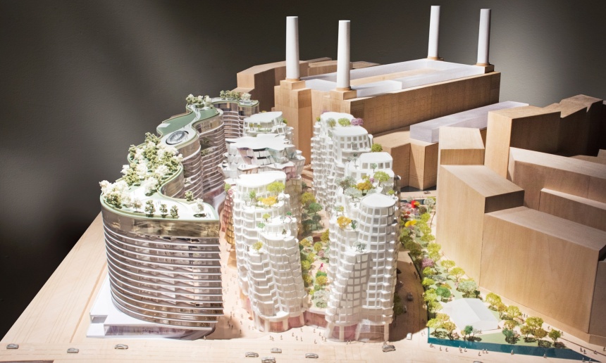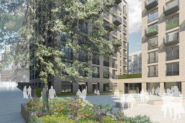
Royal Mail proposal for blocks of flats in London. (Evening Standard)
This piece in London’s Evening Standard by Simon Jenkins may lack the flair of Rowan Moore’s denunciation of the Walkie-Talkie in the Observer (I assure you that Jenkins is quite capable of summoning that flair). But Jenkins takes aim at London Mayor Boris Johnson in a way that I doubt Moore would think of doing.
When Boris Johnson came into office in 2008, he eviscerated predecessor Kenneth “Red Ken” Livingstone for “wrecking London’s skyline.” Johnson turned out to be even worse, at least for the skyline. Jenkin’s criticizes Johnson’s “bland aesthetic of glass towers and rectangles for foreigners to buy-to-leave. … Parliament should be warned: this mayor is a pushover for any lobbyist with a feather.”
In 2008, when Johnson took over from Red Ken, London had 14 skyscrapers in the works. Today there are some 250 skyscrapers of 20 stories or more in the works.
The scheme of residential blocks criticized by Jenkins, to be developed by Britain’s Royal Mail (its USPS) and which Johnson intervened to support, is far less odious than what was proposed by Richard Rogers for Chelsea Barracks – the proposal toppled by Prince Charles. One can imagine replacing its clunky fenestration with dual sets of horizontal, mullioned windows and adding ornamental balconies, a cornice, and a set of string-course moldings every two or three stories. It could be a traditional set of buildings. But that is unlikely, and a better set of buildings has been proposed by a London institute called Create Streets. It has 50 more flats than the 681 proposed, in buildings of seven rather than up to 15 stories. The Create Streets proposal has beaten the Royal Mail proposal by a nine-to-one ratio in local polling. (Imagine that, giving the neighborhood a say over its future!)
Among the leaders of Create Streets, by the way, is Paul Murrain, who back in the 1990s lived in Providence and helped Andres Duany create the excellent Downcity zoning layover plan that has, it seems, so ably blocked modern architecture from being inflicted upon our beautiful downtown. But then came Mayor David Cicilline, who screwed things up in the downtown’s new Capital Center district. But at least by then the old downtown was safe. The city was rescued when Little Cic was booted upstairs to Congress, where he can do little harm to our streetscapes. His successor, Angel Taveras, has had little opportunity to continue Cicilline’s will to ugliness, given the ugly economy. Let us hope that his successor, Jorge Elorza, with an improving economy, has more opportunity to uglify Providence’s skyline – but turns it down. A mayor can grow a city without being so ugly about it. Cicilline did not want to. Boris was aware of that possibility, or so it seemed, but fell prey to the blandishments of foreign billionaires (does he have a Swiss bank account?).
Let us hope Jorge Elorza loves his city better than David Cicilline did. Meanwhile, Simon Jenkins – excuse me, Sir Simon Jenkins – should run for mayor of London.