Kennedy Plaza reopens

Kennedy Plaza earlier today, after reopening ceremony. (Photo by David Brussat)

Kennedy Plaza earlier today, after reopening ceremony. (Photo by David Brussat)

DSCN4888

New Kennedy Plaza waiting kiosk.

Old Kennedy Plaza kiosks.

Old Kennedy Plaza kiosks.

Future plan for Kennedy Plaza ... discarded? (Union Studio)

Future plan for Kennedy Plaza … discarded? (Union Studio)

Kennedy Plaza reopened this morning. Bus passengers are waiting in the newly sanitized bus hub. The view above shows the blank sterility achieved by its redesign. Wind-swept vastnesses of unused space greet us now, no longer the elegant Art Nouveau waiting kiosks that used to march gently up the center of the plaza from the bus terminal installed in 2002. The photo at top left shows the utilitarian quality of the new waiting kiosks. Also, at this end of the plaza the ice-melt system under the pavement was removed to facilitate the introduction of more trees – a trade-off that might not be widely appreciated, especially in winter, however much one loves trees.

Several questions remain. Why was demolition begun before voters were given the chance to approve the referendum that will finance new bus hubs, and whose existence will affect the requirements of the Kennedy Plaza bus hub? Why build a new bus hub at the Amtrak station when a bus loop between it and the plaza would accomplish the same purpose at a fraction of a fraction of the cost? Why change the aesthethics of the plaza to a utilitarian cast even as a more traditional plan, shown at left, in keeping with the existing plaza features, was used to sell the public on the need for a civic square? Why was a new civic square needed with Burnside Park across the street already functioning as a civic plaza?

Tara Granahan, filling in for Buddy Cianci on WPRO, wondered at Mayor Elorza declaring, at the opening ceremony, that Kennedy Plaza was now the new “gathering spot” for downtown. She said that this was a stretch, that “putting lipstick on a pig” would not turn the plaza into a happenin’ place. But, if anything, they scraped much of the old makeup off what had been among the nicest bus hubs on the East Coast, if not the world. She clearly has no idea, and pretty much admitted it, what Kennedy Plaza is like. She planned to try it out with her friends, but speculated that she’d be the only one at that party. Callers debated whether the plaza was safe. It always was, it seemed to me as a frequent user. I sure can’t see the middle class meeting there to play chess though. People who are turned off by people with a scruffy coat will find that scruffy coats still abound. All the city and state have done is to squander $2.4 million. But the plaza’s not yet complete, officials insist. No doubt they have plans to make it even worse.

Posted in Architecture, Art and design, Development, Providence, Urbanism and planning | Tagged , , , , | 7 Comments

Justin Lee Miller: Architecture and the operatic angst

A scene from the original 1935 Broadway production of "Porgy and Bess," directed by Rouben Mamoulian and designed by Sergei Soudeikine. (©Photofest 2012)

A scene from the original 1935 Broadway production of “Porgy and Bess,” directed by Rouben Mamoulian and designed by Sergei Soudeikine. (©Photofest 2012)

Justin Lee Miller, the opera singer, actor and playwright, has sent me a fascinating essay that elucidates the parallels between opera and architecture, especially in regard to the handling of traditional works by their modernist interpreters. Here is the passage that sums up Miller’s thinking: “The argument being made by traditionalists in both the opera world and the architecture world is the same.  Return to craft.  Return to coherence.  And for God’s sake, don’t needlessly alienate the public just to please a handful of academics and critics.”

Miller’s essay coincidentally showed up (at my invitation) in my inbox the day before Martin Luther King Day, and I am happy to publish it on the holiday itself:

Architecture and the operatic angst

By Justin Lee Miller

As George Gershwin’s opera Porgy and Bess turns 80 this year, I’d like to take some space here to reflect on it, and to draw a few comparisons between the worlds of opera and architecture.

Justin Lee Miller

Justin Lee Miller

In 1927, George Gershwin attended a performance of the stage adaptation of Dubose Heyward’s novel Porgy.  If you’ve never come across this hidden gem of American literature, go out and see if you can find it.  It’s a brisk and fascinating read.  The play was a huge success and Gershwin, like many others, was eager to adapt it.  The others wanted to turn the piece into a musical.  In the 1920s and 30s black musicals were extremely popular – and profitable – on Broadway.  Gershwin had something thing else in mind, though. He envisioned a grand American opera.

Gershwin meticulously studied African-American culture.  He knew the jazz scene in New York City, of course, but he wanted to understand the world of Heyward’s novel.  That meant traveling south to the coastal Carolinas, studying the Gullah dialect, visiting Charleston, and exploring other African-American musical traditions like work songs, spirituals and folk songs.

He wanted to create a vernacular American opera, something authentic, something apart from the Al Jolsen-style representations of Southern blacks that were popular at the time.  What Gershwin was after was realism, and the work that he created really belongs alongside such other 1930s examples of American realism as Zora Neale Hurston’s Their Eyes Were Watching God (1937) and John Steinbeck’s novels Of Mice and Men (1937) and The Grapes of Wrath (1939).

At this point, I’m sure you’re wondering what any of this has to do with architecture.  Porgy and Bess is popular with European opera-goers.  It is a perennial favorite at many of Europe’s state-funded opera houses. In fact, the average middle to upper-middle class opera-goer in Europe has probably seen Porgy and Bess more often than her American counterpart. I would attribute its popularity to the genius of Gershwin’s score, to the beauty and complexity of African-American musical forms, and to the fact that most directors simply leave it alone.  The work is presented as American realism and the piece speaks for itself.

So as the European masterpieces have been deconstructed in a myriad of outlandish productions in the post-war era, Porgy and Bess has more or less stayed the same.

Lately, this has begun to change.  Postmodernism and Deconstructivism have finally come to Porgy and Bess.  The first radical departure was Götz Friedrich’s production at the Bregenz Festival in Austria in 1997.  He set the opera in contemporary Los Angeles during the race riots following the verdict in the Rodney King police brutality case.  Suddenly, the piece became more about current events and the personal expressions of the genius-director than about the piece itself.  Did it matter that the African-Americans portrayed on stage were dressed to sing contemporary gospel but instead sang traditional spirituals?  Did it matter that zoot suits were replaced by modern hip-hop clothes, even though the jazz in Gershwin’s score remained?  And did this mash-up of modern Los Angeles and 1920s Charleston help the Austrian audience understand the history, culture, and humanity of African-Americans?

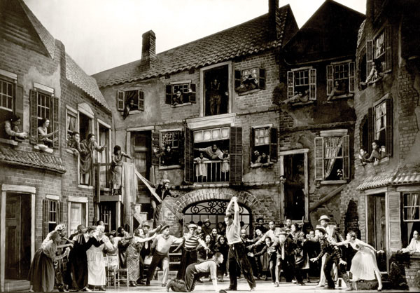
In 2008, not one, but two postmodern productions of Porgy and Bess premiered in France.  The Opera de Lyon production included video art, breakdancing, and clown make-up.  While the production at the Opera Comique in Paris was set in an all-white cube set inside a Johannesburg slum, the original is set in “Catfish Row” a fictionalized version of “Cabbage Row,” which still exists in Charleston today. Why the change?  Because the director Robyn Orlin is South African.  Much as in the world of starchitects, in the world of contemporary European stage directors the personal expression of the director is paramount, everything else is secondary.  

In Orlin’s production, the character Clara, who sings the haunting lullaby “Summertime,” didn’t sing to her baby per se, but sang while holding a white sheet onto which a video of a baby was projected. “Summertime” is probably the most popular song in the score. I’m sure you’re singing it in your head at this moment.  Summertime, and the livin’ is easy. Fish are jumpin’ and the cotton is high! The Parisian audience might have found the digital baby on a white sheet clever and amusing, but in the end, it was merely a gimmick that made the audience step out of the story and giggle.

The argument being made by traditionalists in both the opera world and the architecture world is the same.  Return to craft. Return to coherence.  And for God’s sake, don’t needlessly alienate the public just to please a handful of academics and critics.

Of course, an opera house is not a museum, nor can a city be a museum.  No one wants to go back to the stage lighting of Mozart’s day, when the basic goal was to make the singers visible without burning the place to the ground.  Similarly, no traditional architect working today is advocates the elimination of indoor plumbing, electricity, and the big-screen TV.  What they call for is legibility.  The terms “courtyard” and “square” are legible.  “Open space” is not.  A window and a wall are not interchangeable, and for good reason!  Legibility serves a practical purpose.

Architects can use their positions in academia and the bureaucracy to impose bad buildings and bad urbanism on the public. But when the classical music world produces bad work, the audiences simply shrink and disappear.  Or in the case of state-funded European opera houses, they make themselves highly vulnerable to budget cuts when austerity measures are called for.

I would argue that architects should also be wary of becoming culturally irrelevant with the public. Whether it’s a museum project that looks like a space ship or a new production of Wagner’s Lohengrin set on a space ship, obscurantism has a big price tag.

THE LINKS:

“video art, breakdancing, and clown make-up”:

https://www.youtube.com/watch?v=lmk3w5z7XHc

“video baby on screen”:

http://spectacles.premiere.fr/Exclusivites-spectacle/Videos/Porgy-and-Bess-revisite-par-Robyn-Orlin

Here is his blog that, where you can hear him sing “I’ve Got Plenty of Nothing” from Porgy and Bess, an aria from a Mozart opera, other songs, and elsewhere on the blog other items.

About the author:  Justin Lee Miller is an actor, singer, and playwright based in Brooklyn. He can be heard on the 2006 Decca recording of Porgy and Bess with the Nashville Symphony Orchestra. Justin has appeared with opera companies across the country and in Europe. In 2014, he made his Broadway debut in The Phantom of the Opera, by Andrew Lloyd Webber, and his New York Philharmonic debut in Sweeney Todd, by Stephen Sondheim.

Posted in Architecture, Art and design, Books and Culture | Tagged , , , , , | Leave a comment

See London before the Fire

17th Century London. No artist named. (creativeuncut.com)

17th Century London. No artist named. (creativeuncut.com)

Six students (of history? architecture? illustration?) have produced a 3½-minute video imagining what London before the Great Fire of 1666 must have been like. The animation is lifelike but the buildings are figments of their historical imaginations, variations of the half-timber affairs that bring Shakespeare’s London to mind. In this fabrication the viewer flies through the streets, up and down Pudding Lane and other parts of the town just as dawn breaks upon the ancient metropolis. Londonist.com notes:

Although most of the buildings are conjectural, the students used a realistic street pattern [taken from historical maps] and even included the hanging signs of genuine inns and businesses, mentioned in diaries from the period.

The students, from De Montfort University, are Chelsea Lindsay, Dan Peacock, Luc Fontenoy, Joe Dempsey, Dan Hargreaves and Dominic Bell. They won first prize in the Off the Map contest, sponsored in part by the computer game industry. They’ve done a marvelous job and you really do feel as if you are flying through actual history. I think at one point you may even see the beginning of the fire. The website linked to above also links to animated depictions or models of ancient Rome, Washington, D.C., circa 1814 and other historical cuisine. The Washington project is not far along into production – one hopes to visit the site again in a year – but the Rome product is a final work and fascinating, though not detailed with the quite same graphic lushness as this flight through London, circa 1666.


Posted in Architecture, Architecture History, Urbanism and planning | Tagged , , , , , , , | Leave a comment

Potent rowhouse poetics

Stylistic diversity among rowhouses in Chicago. (Courtesy of Timothy Vaughn)

Stylistic diversity among rowhouses in Chicago. (Courtesy of Timothy Vaughn)

The three sets of rowhouses that I posted in “Survey: Your preferred row” a couple of days ago elicited from William Carroll Westfall among the most evocative lines I’ve read on the differences among types of architecture. He refers to a row of modernist townhouses in Amsterdam, another row of proposed “bad trad” townhouses in Brooklyn, and finally a row of classical townhouses in Boston. (Click on link above if you need to remind yourself of what they look like.) Bill left his poetry in my comment box, so I raise it to the status of a blog post (lofty indeed!) so more can revel in its beauty:

The first example forgot to put the façades on the buildings, and they fail to smile at the public. The second example forgets that wallpaper does not make a façade. It smiles to the public but there is no respect for the public in that smile. The third, in Boston, gets it right. It faces the public with a display of architecture’s mastery of materials to give the buildings substance and a sense that this is a serious place worthy of enduring buildings. It also recognizes that not all people and not all families are the same: some of those buildings are SROs, others are flats.

Townhouse in Chicago by Timothy Vaughn.

Townhouse in Chicago by Timothy Vaughn.

My original intention was to illustrate the classical townhouses with the work of Chicago architect Timothy LeVaughn, but the Boston townhouses were easier to get at quickly (and of course speed is a priority in architectural punditry). So then I had hoped to substitute the Boston townhouses with a set of his Chicago townhouses, except that, he says, his townhouses are not connected in the conventional row-house manner. He sent some extraordinary shots – including the one at left – but up top I place a set from Chicago that he suggested as an excellent example from Chicago. The one by Vaughn at left is simply stunning in its beauty. Looking at it is its own reward.

Posted in Architects, Architecture, Urbanism and planning | Tagged , , , | Leave a comment

Mr. Moses’s Jones Beach

West Bathhouse Pavilion, Jones Beach, Long Island. (cardcow.com)

West Bathhouse Pavilion, Jones Beach, Long Island. (cardcow.com)

Since I expect that my reading of The Power Broker (1974), by Robert Caro, about Robert Moses, New York’s master builder, will summon up more to criticize than praise in its 1,162 page vastness of biography, I will begin with the quote that follows. Caro describes the rhapsodic public reception for the design of his Jones Beach. This was before Moses, the most powerful man in New York, city or state, for almost five decades, became enamored of Le Corbusier and before he began to inflict his Radiant City on his subjects.

Robert Moses. (wikipedia.org)

Robert Moses. (wikipedia.org)

The praise wasn’t only for the size of the park’s buildings; it was for the taste with which they had been designed and the ingenuity with which there had been worked into their steel and stone delicate details which the eye, to its delight, was endlessly discovering. Visitors could see that the nautical theme has been carried out everywhere. Walking along the mile-long boardwalk connecting the two bath houses, they noticed that the boardwalk railing was a ship’s railing. Bending down to drink from a water fountain, they found that the fountains were turned on and off by ships’ pilot wheels. Looking for trash cans, they found them concealed in ship’s funnels. Looking up, visitors saw on the flagpoles crow’s nests in the yardarms, and halyards decorated with long rows of bright semaphore signals. They saw ship’s lanterns swinging on davits from the lamp posts. Looking down, expecting paved walks in the park to be standard gray concrete, they were surprised by mosaics – of compasses, maps and the gay seahorse that Moses had chosen as the emblem of Jones Beach – set into the concrete. The games along the boardwalk were ship’s games: shuffleboard courts, deck tennis, Ping-Pong. Even the pitch-and-putt golf course was made maritime by replacing near every hole some reminder of the sea – a rusty anchor, the keel of an ancient boat, old rum kegs retrieved from the Great South Bay. All Jones Beach employees were garbed as sailors, complete with sailor caps, and their supervisors wore officer’s uniforms, complete with gold braid. And every button on the uniforms was engraved with a seahorse.

Architects exclaimed over the long, low sweeping lawns of the bathhouses and restaurants, their medieval and Moorish cast, the combination of Ohio sandstone and Barbizon brick (“Perfect!” exulted one architect. “Perfect!”) with which they were faced. They were startled when, searching for the water tower, they realized that it was concealed in the 200-foot campanile. They described with delight the diaper-changing rooms, the cutouts of bowmen crouching against the dune that formed the background for the archery range, the symbolic ironwork cutouts on the directional signs, the gay devices of stone and brick – all the touches that Robert Moses, standing alone on a deserted sandbar, had decided he must have in his great park. “It is in the smaller things that Mr. Moses is at his very best,” Architectural Forum was to say. “Usually a public institution of any kind in this country has been the occasion for especially dull architecture and walls of cheerless dimensions which invite only the scribbling of small obscenities. But Mr. Moses, being essentially a romanticist, has revived the handicraft spirit in his designers, with the result that the equipment at Jones Beach exhibits irrelevant [sic, irreverent?] and endearing good spirits. The architecture has the great virtue of “scaled down to the size of a good time.” Even the Herald Tribune could only wax rhapsodic over this “most prosaically named, most beautifully landscaped of beaches.”

“It is in the smaller things that Mr. Moses is at his very best” is a remark that would turn out to be heroic in the degree of its understatement.

Posted in Architecture, Architecture History, Uncategorized | Tagged , , , , , , | 2 Comments

Driehaus for David Schwarz

Schermerhorn Symphony Center, in Nashville. (fda-online.com)

Schermerhorn Symphony Center, in Nashville. (fda-online.com)

David Schwarz. (bizjournal.com)

David Schwarz. (bizjournal.com)

Bass Performance Hall, in Fort Worth. (bisnow.com)

Bass Performance Hall, in Fort Worth. (bisnow.com)

Angels trumpeting at Bass Hall. (gopixpic.com)

Angels trumpeting at Bass Hall. (gopixpic.com)

Concert Hall in Las Vegas. (credit to come)

Concert Hall in Las Vegas. (credit to come)

Sundance Square, in Fort Worth. (albarchitecture.wordpress.com)

Sundance Square, in Fort Worth. (albarchitecture.wordpress.com)

Congratulations to David Schwarz, the classical architect headquartered in Washington, D.C. I first encountered him in person on a trip to see his new concert hall in Las Vegas, and learned that he was the architect of no small number of buildings I’ve been enamored with over time without being familiar with the name of the architect, including the Bass Performance Hall in Fort Worth, which I first saw many years ago on the side trip of a visit to Dallas. And then there’s the Schermerhorn Symphony Center in Nashville, which may be his most exalted work.

The Washington Post’s architecture critic, Philip Kennicott, probably would have been tooting Schwarz’s horn for years if his work had been modernist. And indeed you can find modernist buildings on his firm’s website – hopefully by other members of the firm. The firm of Robert A.M. Stern does that sort of thing, too, regrettably. Even as he congratulates his hometown boy for winning, Kennicott makes sure readers understand that he looks down his nose at the traditional cast of the work.

Another critic, Mark Lamster of the Dallas Morning News, had a few lame remarks to celebrate David Schwarz’s prize. He said that the architect’s “historicist buildings have transformed Fort Worth’s downtown into a hokey Disneyland where new and old are all but indistinguishable.”

The various different types of error in that short line deserve explication, and there’s more in the same paragraph. I will say only that the purpose of architecture, spurned by modernism, is to assemble a collection of buildings erected in one place over time that creates a symphonic whole for a city and its districts. To critics such as Lamster who have imbibed of the modernist credo that exalts novelty and contrast as the central dicta of architecture, that may seem “hokey,” but “historicist” is the wrong word to describe it. Historicist is a term that stresses time rather than the more useful factor of place as the central motive in building design. Historicism is an academic strategy used by modernist architectural historians to peg a building in time according to its style. The chief purpose is to be able to declare, with a fake plausibility, that designing buildings in such styles today is inappropriate because they are from yesterday. That is wrong, and Schwarz’s best work puts the lie to the central credo of modernism.

Lamster also is confused about the word conservative, with which he characterizes the Driehaus Prize. The prize is traditional. It is conservative only if you think that breaking with established orthodoxy is a conservative act. In fact, the predictable work of such modernists as Frank Gehry and Zaha Hadid, and the brown-nosing on their behalf by the critical establishment, are truly conservative in the sense Lamster intends. The Pritzker Prize is an expression of conservatism, if that term is taken to mean resistance to change.

It is past time David Schwarz received his Driehaus, and I congratulate him, the Driehaus jury and its sponsor, the School of Architecture at the University of Notre Dame. Good work!

Posted in Architects, Architecture | Tagged , , , , , , | 3 Comments

Film of foreign cities, c. 1920

Shanghai, circa 1920? Do not know. Image is not from film below. (reflectionsofchina.com)

Shanghai, circa 1920? This image is not from film below. (reflectionsofchina.com)

Here is an amazing series of clips filmed around 1920, apparently during the travels of a U.S. Navy fleet to various port and other cities around the world. When the sailors get out of the way (as they do quite often), footage of ships in harbors, scrambling beggar urchins in Asia, ugly bullfights in Madrid, sailors cavorting with Scandanavian girls, and scenes of urban grunge and beauty, including classical buildings and palaces, etc., are stitched together here. Great shots of London – I imagine that must be the Admiralty that is so fulsomely filmed – and later of Athens, the Parthenon and other ancient Greek ruins (at 32 minutes in, approximately). It’s black and white, about an hour, and the film hops up and down near the top, but this footage from almost a century ago is … awesome.

https://archive.org/details/ForeignCities

The clip, which includes an index of its subjects, is from the Prelinger Archive, sent to the Pro-Urb listserv by Larry Johnson (hats off to him!), who offers footage from just after the 1906 earthquake in San Francisco. Digging further into his links uncovered a trove of film, including this footage titled “Foreign Cities.” With a charming naïveté, the site suggests donating to a veterans’ charity if one intends to use the clip to make money!

Posted in Architecture, Architecture History, Blast from past, Urbanism and planning | Tagged , , , | Leave a comment

Survey: Your preferred row

Borneo Sporenberg townhouses in Amsterdam. (archdaily.com)

Borneo Sporenberg townhouses in Amsterdam. (archdaily.com)

Matthew Johnson, writing in ArchDaily of the furor aroused by the recent Bingler/Pedersen oped in the New York Times, the response by Aaron Betsky as mouthpiece of the American Institute of Architects, and the tart wrap-up of the brouhaha by Justin Shubow in Forbes, ran a shot of a set of modernist townhouses in Amsterdam. He was making the point that modernism does not need to overwhelm or to otherwise wow a street in order to make livable places. But his photograph, above, undermines his argument.

http://www.archdaily.com/586834/architecture-doesn-t-need-rebuilding-it-needs-more-thoughtful-critics/

The fact is that fitting in by way of massing alone is not enough. A set of townhouses that fit in by massing but elbow each other stylistically does not work. Somebody else sent in a photo of a set of proposed townhouses for Brooklyn (below) that also doesn’t work, for reasons that add up to the very descriptive word cheesy. They do not discombobulate as openly as the ones in Amsterdam do, but still leave an empty feeling in the pit of one’s stomach.

I add a third set of townhouses, on Commonwealth Avenue in Boston (bottom), buildings that are stylistically diverse but do not kick each other in the shins. Here is the answer. It is not rocket science. Do not copy it, merely take inspiration from it. It is not illegal. Just do it.

Proposed townhouses in Brooklyn. (curbedny.com)

Proposed townhouses in Brooklyn. (curbedny.com)

Townhouses on Commonwealth Avenue, Boston. (images.metroscenes.com)

Townhouses on Commonwealth Avenue, Boston. (images.metroscenes.com)

Posted in Architecture, Development, Urbanism and planning | Tagged , , , , , | 3 Comments

Brewer rocks in Fayetteville

New wing of Honors College, at University of Arkansas. (RAMSA)

New wing of Honors College, at University of Arkansas. (RAMSA)

Gary Brewer of RAMSA designed a beautiful new wing for an old academic building, the Honors College (imagine that!) at the University of Arkansas, in Fayetteville a while back and I am remiss to have allowed readers to wait so long before exhibiting it.

http://www.ramsa.com/en/projects-search/academic/restoration-and-expansion-of-ozark-hall.html

65017Gary designed the excellent Jonathan Nelson Fitness Center at Brown a couple of years ago. While he was working on that he urged me to write of two additions to historic college buildings going up in Fayetteville at the same time, his and the one below, which, predictably enough, speaks volumes about the architecture school to which it is so awkwardly attached. That the students did not threaten to burn the new wing down (I am taking it on faith that they did not) says even more about them than the wing itself. The wing was designed by Marlon Blackwell, and while they are sufficiently pathetic in their own right, the real villains are the stewards of the school of architecture and their lords and masters among the university’s board of trustees. To look at it one can only wonder what drug the stewards of the Honors College must have slipped into the trustees’ tea to get them to agree to something as beautiful as the wing Gary designed. Maybe it had something to do with the first word in the name of the facility.

sadc-one

Posted in Architecture, Architecture Education, Development | Tagged , , , , , , | 1 Comment

Milwaukee ex-mayor on 195

Milwaukee's waterfront. Photo by Alexandra (Petrova) & Bharath Wootia.

Milwaukee’s waterfront. Photo by Alexandra (Petrova) & Bharath Wootia.

I am gratified to post the comment of former Milwaukee Mayor John Norquist, who revitalized the city’s downtown in the 1990s before spending a decade, I think, as president of the Congress for the New Urbanism. Responding to my post “By the book on the 195 land,” John writes:

The Commission should ask itself what adds value to Providence’s adjacent existing neighborhoods. The proposal looks like an attempt to impose sterile modernism transplanted from Oscar Niemeyer’s Brasilia. It will degrade value and undermines the purpose of relocating the expressway.

The 195ers should listen to someone with real experience and not just opinions. So should Governor Raimondo and Mayor Elorza.

By the book on the 195 land


Posted in Architecture, Architecture History, Development, Preservation, Providence, Urbanism and planning | Tagged , , , , | Leave a comment