Marble Arch’s stupid Mound

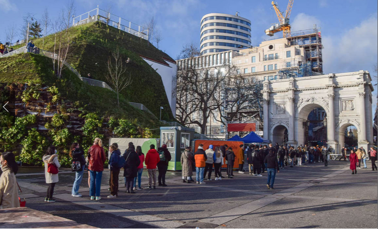
Marble Arch Mound, to the left of London’t famous Marble Arch. (msn.com)

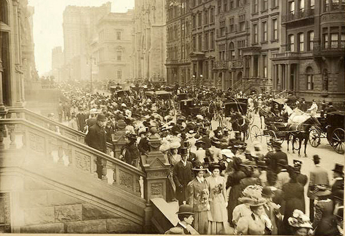
Long ago, in 1979, I visited a friend in London for three weeks while he was a student at the London School of Economics and lived on Great Russell Street across from the British Museum. I often walked down Oxford Street to Hyde Park at its corner with Park Lane, through the Marble Arch and into Speakers’ Corner, where British politicians, divines, writers and cranks have held forth on many subjects, sacred and profane, for centuries.

The Marble Arch was designed by architect John Nash in 1827 as the entrance to Buckingham Palace, completed in 1833, but relocated in 1851 to Hyde Park.

Wikipedia notes that Speakers’ Corner was frequented by Karl Marx, Vladimir Lenin, George Orwell and William Morris, among many others. I assume they spoke when not listening, and I assume also none of them, even Karl Marx, would have been dumb enough to believe that the Marble Arch Mound was a good idea.

The Mound is a steep, hollow, fake hill with some trees. It opened next to the Marble Arch last summer, costing $18 million to build and $6 to climb. It was supposed to be a tourist attraction to help the Oxford Street shopping district cope with covid.

The good news is that attendance was so poor, so widely ridiculed, that yesterday it closed to the public. By that point, tickets were “being sold for free,” according to CNN. The bad news is that no date certain has been selected for tearing the damn thing down. Or, it might be reasonably asked, since bad architecture hates a vacuum, what might be put in its place?

The Marble Arch Mound was meant to be temporary. Not temporary enough, it appears. Its closure has been described as permanent. Thank God! But when will it begone? An interesting but largely wrongheaded essay by Rowan Moore of the Guardian is headlined “Why the Marble Arch Mound is a slippery slope to nowhere“; at least the headline is true!

The moundstrosity (please excuse me) was designed by MVRDV, a firm based in Rotterdam that specializes in stupid buildings, including buildings with trees on top. It also designed a twin residential towers with a central element of a clustered puff of balconies that resembled explosions. The firm denied that it had intended it to resemble 9/11, but it was obvious they had. Maybe because of justifiable horror at the design, it has yet to be built in its target city of Seoul.

Firms like MVRDV cater to the whim of architects and city planners, and idiot developers who are really to blame, for buildings and other structures that don’t look like anything ever built. Most end up looking like bad architecture already imagined and built, but there are exceptions, such as the Twin Seouls. Another, just to name a few, is CCTV headquarters in Beijing, designed by Rem Koolhaas, which looks like it is stomping on the people of China. The Pompidou Center, a museum in Paris designed by the late Richard Rogers and Renzo Piano, looks like it was built inside-out. Another of this ilk is called The Vessel, a “sculpture” designed by Thomas Heatherwick and installed at Hudson Yards, in Manhattan. It closed because some people who climb it like to leap off of it. These oddities were joined by the Marble Arch Mound. So far as I know, nobody has jumped or fallen off it.

It may be hoped that there are plans to take it down soon so people won’t have to look at it anymore. If so, the denizens of Speakers Corner, if they are still allowed to voice opinions, will be saddened by its absence as a splendidly easy object of their derision.

[After publication I was informed that the Marble Arch Mound covered a Blitz-era WWII bunker next to the arch. In a couple of dozen articles from the time of its initial opening last July 26 to its recent closure, including Wikipedia, I could find no mention of such a bunker’s existence or its dubious rationale for the Mound. A bunker near Hyde Park Corner served as a refuge for Winston Churchill during the London Blitz at a corner of the park well away from Marble Arch. It does not show on the diagram below, nor was it supposedly demolished prior to the Mound’s construction. But I did learn that the Mound was originally expected to close on Jan. 9, which it did, that it was to be removed shortly after, and that its trees would be replanted on London streets and school grounds. There remains no thinking that I could discover regarding plans for a replacement, if any. The most extraordinary thing I learned via this additional research is that the original plan for the Mound was for it to cover up the Marble Arch itself. This plan was rejected, not because it would have been insane but because it might have damaged the arch.]

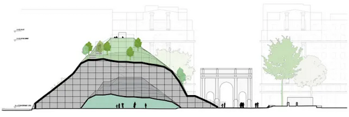
Cutaway drawing of Marble Arch. Marble Arch is at right. (MDRDV)

Posted in Architecture | Tagged , , , , , | 6 Comments

PBS’s “High-Risk High-Rise”

Citycorp Center (1977) is the tallest building in this scene on New York’s Midtown district. beneath it is the Lipstick Building, designed by John Burgee and Philip Johnson. (wirednewyork.com)

A friend alerted me to a “Nova” special being aired today (through Feb. 2) called “High-Risk High-Rise.” I watched it, and it was as slick as you’d expect from PBS, but I could not help noticing its biases and omissions.

Of course, since a condo tower of 12 stories had collapsed last June in Florida, it was mostly about building safety from fires, hurricanes and earthquakes. Oddly, however, the documentary neglected to mention the Surfside disaster that killed 98 and is tied for third deadliest structural failure in U.S. history.

Don’t production schedules allow a line or two to be squished in for something so painfully pertinent? Maybe not. Still, Surfside appears to have fallen of its own accord, for reasons still under investigation rather than the causes that caught the attention of the documentary’s producers. (See “Max building fail in Miami.“)

Here is the show’s thesis statement:

[A]s most major cities become crammed cheek to jowl with tall buildings, as we spend more of our lives looking down on the world below, will we begin to lose our sense of place, of neighborhood, of community? Or can tall buildings begin to embrace a more humanistic vision, one that stresses livability, interactivity, and eco-responsibility?

Some designers are certainly trying new ideas, but as we build skyward at a staggering rate, there is a more basic question. What have we learned, over the decades, about whether we can make tall buildings as safe as they can be? Can we ultimately trust them with our lives?

Will we begin to lose our sense of place, etc.? We already have lost it in so many places. Tall buildings are notoriously sterile. Can highrises, especially skyscrapers, be more humanistic? Perhaps. The easy way would be to make tall buildings less oppressive and more attractive, as was conventional before modern architecture. Architects nowadays seem more interested in challenging the laws of physics.

As to whether highrises can be made safe, why not first try to avoid challenging the laws of physics. Another solution – which seemed to strike many people as obvious in the aftermath of 9/11 – is to stop building skyscrapers at all. That possibility is dismissed out of hand. The documentary suggests that it took years to summon up the nerve to build tall again – not till after 2008 and the Great Recession. Not so. Going up bypassed the terrorist rationale for not going up in a nanosecond. Going up is the only way to achieve the necessary density in cities, according to every expert interviewed for the show. And yet the 54,150 per square mile density of Paris’s cheek-by-jowl six- and seven-story buildings is not all that much less dense than the 74,780 per square mile density of Manhattan. The number of towers set on plazas may explain a lot. They are not “cheek by jowl.” Subtract Central Park and equivalent densities might be achieved.

“[T]he only true way to address it is going up in height” is the refrain repeatedly asserted throughout. Not so, methinks, and given the curb appeal of Paris, heeding its lessons might help city planners kill two birds with one stone – by making cites beautiful without having to make them unsustainable.

Perhaps the major omission of “High-Risk High-Rise” is the eco-irresponsibility of skyscrapers, which are environmentally unsustainable on many different levels. This topic is foreshadowed early in the documentary when it wonders whether skyscrapers might “begin” (again!) “to embrace a more humanistic vision, one that stresses livability, interactivity, and eco-responsibility?” But then the topic is generally ignored, except for a segment about a Bloomberg headquarters building whose elevators stop at only nine of its 25 stories (except for the disabled, who can get off on any floor). Exercise for employees is supposedly the motive.

From all I’ve seen and read, architects believe they are already addressing climate change, above every other concern except perhaps those of “equity” and “inclusion.” Beauty remains the issue that dare not speak its name.

When it comes to safety, the documentary seems to want to have it both ways, declaring that tall buildings have never been safer while, at the same time, raising the hair on viewers’ necks with warnings, backed by scary music, of the dangers faced by those in and around buildings that could tumble at any time.

One segment was especially dire. The Citycorp Center (1977), in New York, which we all recognize from its white triangular prism of a crown set on its side, has an inventive bracing structure to counter high winds. Engineering student Diane Hartley of Princeton (called “Sonny” by the narrator) questioned the bracing designed by prominent structural engineer William LeMessurier. The documentary’s mashup of voices from the narrator and various experts darkly intones the tale in a key of D-minor:

[The student] tells Bill, you know, my numbers say that the building could fall over. And LeMessurier tells the student “Nice story, sonny, but, uh, go check your numbers again. …

LeMessurier began to wonder if the student might be correct. “I pursued this and found out some very awesome and frightening facts.” He discovered that winds striking the building diagonally rather than face-on could increase the stress on some of the V-braces by 40 percent or more. Then he realized that during construction his office had permitted contractors to bolt the braces together rather than welding them as he had originally specified. He calculated that winds in excess of 70 m.p.h. striking the corners of the building could sever the bolted connections. ‘I came to the conclusion that a storm that had a probability of occurring once in 16 years would cause the building to fail, and collapse. I can’t live with that.’ LeMessurier recommended welding six-foot-long steel plates on either side of the bolted connections to strengthen them. This would certainly solve the problem, but would take weeks to finish.”

The city drew up plans to evacuate not only the building but the ten square blocks around the building, “just in case,” states LeMessurier, “the building falls over. Can you imagine!” In August 1978, as work on the fix began, Hurricane Ella headed for New York. There was no way repairs could be done in time.

Thankfully, Ella veered out to sea. “You know, ultimately it worked out,” said the engineer, “but it was a very dangerous situation.”

Whew!

The documentary makes sure we all shudder at the long list of hurricanes and earthquakes that have toppled tall buildings in recent decades. Watch out, California! But really, folks, not to worry!

It seems to me that, brilliant as our corps of building engineers is, not to mention our architects, last year’s lesson of Surfside, with its seeming quantum of human error, rattles my nerves far more than the forces of Mother Nature.

Posted in Architecture | Tagged , , , , , , , | 11 Comments

Best trad buildings of 2021

British Normandy Memorial, designed by Liam O’Connor. (Charles Bergen Studios)

This year’s meagre selection of new buildings designed in traditional styles came close to cancellation, not the first event to suffer that fate lately. It is depressing this year, as it was last year, to contemplate the listlessness of the genre, however lovely the specific works may be. This year I came even closer than last year to throwing up my hands in despair. No doubt there were many new buildings traditional or classical in style erected around the nation and the world: buildings that seem to have looked at their feet, avoiding our gaze, shunning the sort of publicity thrust vociferously at architecture that deserves its embarrassment.

Before I get to cases, let me introduce readers to an essay about the two colleges at Yale designed by Robert A.M. Stern Architects. The writer of this long piece, Belmont Freeman, in Places Journal called “Tradition for Sale,” so thoroughly misunderstands both architecture and university patronage that in condemning Yale’s hiring Stern to design its two new residential colleges, he unintentionally undercuts all of the points he intends to make. Great fun! Read it before or after checking out the best 2021 trads.

***

O’Connor’s memorial takes the shape, seen from the air, of the Union Jack.

The British Normandy Memorial, dedicated to British soldiers who died assaulting the French coast on D-Day, 1944, was designed by architect Liam O’Connor, perhaps best known for his British Bomber Command Memorial, located at Green Park, in London. The Normandy memorial sits 2,300 feet behind the Gold Beach. A grouping of three British soldiers landing on the beach was sculpted by David Williams-Ellis. I was informed of this memorial by Léon Krier.

***

Alumni Hall expansion at the College of William & Mary; original Bright Hall at far right. (G&HA)

The Richmond-based firm of Glavé & Holmes has participated masterfully in the construction of Christopher Newport University, in Newport News, Va., and much more. It continues its good work with an addition, completed in 2021, to Alumni Hall at the College of William and Mary (above) – the original, Bright House, sits at the far right of the photo – and a new admissions building (below) this year at Longwood University, in Farmville, Va. I was alerted to this pair of buildings by G&HA senior principal architect Andrew Moore.

New admissions building, Radcliffe Hall, at Longwood University, in Virginia. (G&HA)

***

Architectural historian Michael Diamant, of Stockholm, who compiles examples of traditional architecture being built in Europe, has sent over a number of buildings completed this year.  Michael’s flow of information enables me to turn my frown upside down at the prospect that new traditional architecture is being built more widely than is apparent from what appears in my humble annual roundup. His Facebook page, New Traditional Architecture, and his website of the same name, are places to find extensive information and links about new trad architecture and the firms that produce it in many nations around the globe. He has formed a nonprofit lobby group called Arkitekturupporet or Architecture Uprising to keep pushing this rebellion forward. What follow are photos from his collection sent to me over the past few days:

This hotel in Bucharest, Romania, was once a bank, described by Diamant as “a ruin.” I am assuming that the hotel, by Cumulus, is tantamount to a new building, completed in 2021.

A monastery inn in North Macedonia completed in 2021 by Studio lelelele in a local vernacular style

Before and after shots of a new block of townhouses, Villa Auriana, by Dominique Hertenberger, completed in 2021 near the Garenne-Colombes train station, in Paris, that replaces a set of demolished modernist structures.

This building, by ADT Project, was completed in 2021. Diamant writes: “In the Russian city of Kazan there are lots of things going on. Whole streets are being renovated and a lot of empty plots are filled with historicist buildings. They are good in scale, mixed use. They let the older historic buildings shine brighter.”

***

150 East 78th St., a 15-story condo tower in New York City. (Rendering by RAMSA)

I am sticking my neck out to include 150 East 78th St., a 15-story condominium building designed by Daniel Lobitz of Robert A.M. Stern Architects. It was described in June on the website YIMBY (Yes In My Back Yard) as set to open “later this summer.” Perhaps I will have to strike it from this roundup if I am informed that it will not actually be completed before tomorrow, as this is written. But it is truly gorgeous, and I am proud to take this risk of violating my own roundup rules, which mandate completion between Jan. 1 of this year and the end of Dec. 31 this year. Pray for me.

***

Don’t forget to read the essay from Places Journal on Yale’s two new residential campuses linked to near the beginning of this post. It is highly amusing. As if universities should avoid above all else designs that might please students and donors alike, the better to produce memories that might lead the former to join the ranks of the latter. Heaven forfend!

Well, it depresses me to think that the powers at Yale should interpret “the best of Yale tradition” to entail the replication of nearly century-old building forms, which were ersatz to begin with. Yale University has another tradition, now sadly in retreat, of taking risks with its architectural patronage.

Enjoy stewing in those juices, Mr. Belmont Freeman, whose name no doubt connotes the distance from which he may look down his nose at the tradition Yale has embraced. Readers, do enjoy wading through his existential angst!!!

Freeman has included a lot of photos of both the types of design that he likes and those that he dislikes, all of which serve to demolish the argument of his article. Here is a photograph of the new Yale colleges (2017) that push his nose so delightfully out of joint:

Posted in Architecture, Development | Tagged , , , , , , , , , , | 5 Comments

Presto! Windows and doors!

Left, original drawing for 67 Williams St.; right, new drawing with windows and doors. (Shed)

On Monday, Dec. 20, the Providence Historic District Commission met for a second time on the proposal for a new house at 67 Williams St. They were to consider conceptual approval that was delayed on Nov. 22, after the developer, who plans to live there, submitted illustrations oddly free of windows or doors. I assume Monday’s meeting took place, but did not attend and have heard nothing of what happened, if anything did. But new plans submitted by Shed Studio of Cambridge to the HDC before the meeting now include windows and doors.

The appearance, finally, of windows and doors enables potential opponents like me to rest assured that the house will be traditional enough to fit into the historic College Hill neighborhood, which has retained much the same appearance it has had since it got built up slowly in the first century after the revolution. In the first block of Williams east of Benefit Street, most and possibly all of the existing houses are the original ones built on that block.

Aside from that, the front yard seems to have shrunk by several feet, pulling the entire house closer to Williams Street, in reply to the commission’s suggestion at the first meeting that the new house to sit as close to the sidewalk as most of the houses nearby, rather than being set back almost as far as the Carrington House, directly across Williams, one of the minority of mansions on the street. This shift may be seen in the ground plans for the first and second versions at the end of this post. Also changed is the porte-cochere, whose roof is now shingled rather than an extension of the front porch’s roof terrace.

Little else on the exterior seems to be different, so unless the developer came to the second meeting with a third and smaller version of the house, I suspect that the neighbors will probably maintain their primary objection to the house: that it is too big for the neighborhood.

Their objection is understandable – no change in the neighborhood, that is, no new house at all, would be preferable. There has never ever been a house on that lot over the centuries of its existence. Leaving it empty preserves its historical character better then building anything on it, however sensitive it might be to the stylistic template and material quality of the neighborhood.

But the neighbors are objecting to the size of the house, not to the plan to put a new house there for the first time. No doubt they’d prefer that the proposed house and its owners – Jeff Hirsch, a developer from Framingham, and his wife, Karen – just go away. But, perhaps recognizing that it might be unfair to deprive the owners of the lot of their right to use it, they are calling merely for a smaller house. Still, there seems little reason for such a demand. Right across Williams, the Edward Carrington House (1810) is larger than the proposed new house, and the Carrington-Coats House (1816) just east of it is larger still.

The small cottage just to its west was successfully preserved by neighborhood opponents last summer, and, even more important, its proposed modernist addition was defeated at the same time. The cottage garage addition was then redesigned to fit in. It has not yet been built, and one trusts that the commission will make sure that promises of quality design and materials are monitored. The opponents of the perverted attack on the neighborhood’s historical character are to be congratulated. Their persistence drove the developer to drop plans for two modernist townhouses in the woods behind the cottage, facing John Street. Since then, however, the land has been purchased and the trees have been cut down.

Shameful.

Maybe the neighbors are objecting to the size of 67 Williams mainly to keep in practice for the next round of hostilities. If so, I wish them well. Their focus after they lose the battle over size should be to make sure that the design and materials are of the highest quality appropriate for construction in a neighborhood of such extraordinarily historic importance and beauty. A new building can add to the historical character of an old street, but the devil is, as they say, in the details.

***

Update: The Dec. 20 meeting was indeed held, and after discussing details including whether the house should be nearer to the sidewalk, the commission voted to delay action until the next meeting.

The original post mistakenly attributed moving the house toward the sidewalk to a suggestion by opponents. It was the commission that suggested this.

Ground plans for first and second versions (l. & r.) of 67 Williams St. show shift in placement. (Shed)

Posted in Architecture, Development | Tagged , , , , , | 3 Comments

Garden of House of Mirth

Edith Wharton in her French garden at St. Claire du Chateau. (newyorkerstateofmind.com)

My last quotation from Edith Wharton’s 1905 novel The House of Mirth offered one minor character’s thoughts on several fancy row houses of Fifth Avenue, including one or two owned by families friendly to Mr. Van Alstyne and his partner in conversation, Lawrence Seldon. After a period of not seeing her, the latter would soon meet the book’s heroine, Lily Bart, a 29-year-old beauty on the verge of old maidenhood (as such matters were calculated in those days), in the garden of a party held at one of the houses under discussion.

Both in its subject and in the elegant prose by which Wharton conveys the scene to the reader, their romantic chat was far more charming than the psychiatry of architecture described in my quotation from the “Wharton’s house of mirth” post on Dec. 2. And in a weak moment I promised readers to reprint the lovelier discussion that was to take place later in the book between Lawrence and Lily. It exemplifies Wharton’s more elegant style of discourse. So, here goes. They approach, shake hands and:

At length Lily withdrew her hand, and moved away a step, so that her white-robed slimness was outlined against the dusk of the branches. Selden followed her, and still without speaking they seated themselves on a bench beside the fountain.

Suddenly she raised her eyes with the beseeching earnestness of a child. “You never speak to me – you think hard things of me,” she murmured. I think of you at any rate, God knows!” he said.

“Then why do we never see each other? Why can’t we be friends? You promised once to help me,” she continued in the same tone, as though the words were drawn from her unwillingly.

“The only way I can help you is by loving you” Selden said in a low voice.

She made no reply, but her face turned to him with the soft motion of a flower. His own met it slowly, and their lips touched.

She drew back and rose from her seat. Selden rose too, and they stood facing each other. Suddenly she caught his hand and pressed it for a moment against her cheek.

“Ah, love me, love me – but don’t tell me so!” she sighed with her eyes in his; and before he could speak she had turned and slipped through the arch of boughs, disappearing in the brightness of the room beyond. Selden stood where she had left him. He knew too well the transiency of exquisite moments to attempt to follow her.

Taken out of context the passage might seem a little bit purplish, something maybe from a cheap romance novel, but the grace of Wharton’s prose is in the authority and concision with which she describes the most delicate and nuanced feelings flitting through her character’s minds. The plot of this novel puts Lily into social circumstances that even we reading today would consider coarse: a scene, for example, in which a wealthy suitor who has lent her money seeks repayment in a baser coin. But the prose never stoops to the level of the action, and from this literary standoffishness arises the lofty sense of architecture – classical architecture, let me be clear – in Wharton’s writing.

I wanted the book to culminate in bliss for Lily and Selden. Spoiler alert: it did not. I was sorely disappointed. I was also surprised. I wonder whether that hints at why so many great novelists tend to avoid happy endings. Well, happy or sad, one can still enjoy the architecture of the English language as one advances through the twists of Wharton’s plot.

Posted in Architecture, Art and design | Tagged , , , , , , | 1 Comment

Albany-on-Hudson again?

“After” view of proposed replacement of I-787 in Albany with boulevard; see “below” at bottom. (ARC)

The capital of the Empire State hopes to do what many cities have done: rip up urban highways inflicted upon them in the 1960s and ’70s. Albany expects soon to remove its elevated eyesore, Interstate 787, which squats between the city and the Hudson River. The aim, according to the Albany Riverfront Collaborative, is to replace the eleven-lane highway, built in the early ’70s, with a ground-level boulevard lined with 93 acres of parks, housing and commercial development.

Begun early this year as a volunteer effort, the cooperative’s mission statement is as follows:

The Albany Riverfront Collaborative will engage our complete community in the creation of an equitable, sustainable, beautiful, forever-vision, and the initial, iterative steps toward this vision. The ARC will forge the robust civic partnerships necessary to nurture a river-connected and sustaining community with a vibrant and interdependent economy, culture, and landscape.

Set of ARC detailed plans, including before/after slides and videos.

Albany’s plan, if undertaken, would open the door to the sort of revitalization its tired downtown needs, much as a similarly conceived plan sparked a return of life, civility and beauty to downtown Providence two decades ago.

Between 1990 and 1996, Providence uncovered its downtown rivers, which were then covered by roads and parking lots known in the Guinness Book of World Records, ed. 1988, as the “widest bridge in the world.” It spanned the daylighted rivers with a dozen lovely new bridges, and lined the embankments with river walks and public parks. The city then doubled down on its “renaissance” by restoring the beauty of its downtown, eliminating its sterile faux-modernist facades, restoring its historic architecture, and installing period lampposts, brick sidewalks and new apartments atop new shops along Westminster Street, its historic main street. As almost an afterthought, Providence removed I-195 from between downtown and its Jewelry district, and rebuilt it 500 yards downriver.

The key to success in Providence was the explicitly traditional style of the plan’s architecture and infrastructure. Rhode Island’s capital city replaced an urban gulch of quasi-modernist style – that is, no style at all – with a set of dependably classicist features that felt friendly to a population used to the traditional tenor of the historical architecture on both the west (downtown) and east (College Hill; Brown, RISD) sides of the intimate Providence and Woonasquatucket rivers.

Albany would be wise to replace Route 787 with a similarly traditional set of embellishments to the boulevard, parks and buildings it erects on the Hudson. If citizens of Albany feel alienated by the gash separating them from the Hudson, the villain is not so much the highway itself but the manner in which urban planners of the era chose – yes, it was a choice – to design its insertion between downtown and the river. In fact, a boulevard was one choice that was rejected early on by the planners of Route 787.

AlbanyGroup Archive of the Hudson riverfront of the past.

Providence’s River Relocation Project, as the new waterfront plan was known, did not spring forth without controversy and compromise. The idea was to open space for traffic from the new Capital Center development to squeeze between the financial district and the Providence and Woonaskquatucket rivers. Their confluence was moved 150 feet to the east. All project elements that were not vehicular, such as the parks and river walks, got a 100-percent match from the U.S. Department of Transportation. However, planners had to add the River Relocation Project to the Capital Center Project, which had already begun in a more typical, sterile design style, by reshuffling private land parcels and grafting a federal transportation project onto a commercial development project – with both elements publicized jointly as a string of public parks. It was not easy.

Leveraging funds for Albany’s project will not be as difficult as it was for Rhode Island in the 1980s and ’90s. Recent federal legislation will open a gusher of money for Albany. Still, planners are always on the edge of taking the wrong step in making big choices for a city’s future – as I-787 demonstrates. The purpose of the Albany Riverfront Collaborative is not just to offer alluring plans for what could replace the elevated highway – detailed plans that were released weeks ago – but to assemble a coalition of interested citizens and groups to make sure that the city’s waterfront receives the share it deserves of the upcoming federal windfall.

As pointed out last month by Albany Times-Union columnist Chris Churchill (“A beginning to 787’s end“), other cities, including Syracuse and Rochester in New York and St. Louis and San Francisco elsewhere in this country have done much the same thing. He writes:

While those efforts are widely regarded as successes, I’m not sure any city could benefit from a highway remake more than Albany. That’s because 787 is uncommonly monstrous in how it completely dominates the riverfront, with its 11 lanes of traffic (including arterials) and all those ridiculous ramps sucking up land and obliterating a resource.

“Interstate 787 is dramatically overbuilt for demand,” adds Churchill, “which is why [the Albany Riverfront Collaborative] believes a boulevard would have only a minimal impact on commute times.”

The proposed boulevard would be much slenderer than the maximalist footprint of the highway system now in place. The boulevard would replace the highway and dozens of dank parking lots beneath it that add to the difficulty pedestrians must face to reach the waterfront. The ARC has estimated that 73,000 tons of concrete would be replaced by 6,500 trees.

Green trees taking the place of gray concrete all sounds very nice, but I cannot sufficiently emphasize the importance of design choices that will face Albany if and when the decision to replace the highway is made. When I was writing about Providence’s waterfront project in the late 1980s and ’90s, I examined the design of waterfronts that had been built in the United States and around the world. A helpful resource was The Waterfront Center, in Washington, D.C., nonprofit and its two volumes (there have been more editions since) that described and photographed scores of new waterfront projects around the world. Almost all of them were characterized by sterile, streamlined, modernist design styles, often replacing industrial environments such as wharfs and railroad yards with styles designed, in a perverse paradox, to reflect the current industrial chic. Those styles were prominent then and are still today. The popularity of Providence’s new waterfront arises in part from its refusal to truckle to such design concepts

Its success includes the now-famous WaterFire art installation, which since 1994 has attracted over 40,000 visitors a dozen times yearly for the last 26 years (the 2020 season was cancelled for the usual reason).

Rhode Island was one of America’s original thirteen colonies, and its new waterfront is traditional in style, which means that most citizens here feel a kinship with a civic project designed to fit in with the city’s historic character.

I dare say most waterfront projects being built today embrace the very same design cues avoided by Providence and highlighted by The Waterfront Center. Planners in Albany will find themselves under great pressure to follow the city’s planning establishment if the project moves forward. Thus it is vital to ensure that the city’s citizens play a role in choosing its design template. The Albany Riverfront Collaborative seems to have made an excellent start in this and other aspects of its commendable effort to end the civic tragedy of Interstate 787.

“Below” view of Albany with current I-787 highway configuration blocking access to Hudson. (ARC)

Posted in Architecture, Development | Tagged , , , , , , , | 2 Comments

The hegemony of architecture

Architecture may be suffering from a hegemonic conundrum that afflicts the major institutions of the whole world. It is not just hegemon vs. hegemon anymore, according to analyst Richard Fernandez in his recent essay “There Is Something Wrong with our Giant Institutions.” Instead, what we may now have is the slow-motion collapse of major societal institutions – whether in the realm of world affairs (such as the U.S. vs. China) or in the operation of one’s local Department of Motor Vehicles.
.
(We all know how the U.S. is collapsing. I would be interested in hearing how China is collapsing. But the CCP is unlikely to satisfy my curiosity.)
.
So what has that to do with architecture? First, please forgive me for using a ridiculously highfalutin word, hegemon, which means an entity of powerful influence in a particular field. Fernandez speculates that the big institutions that run our society have become too complex to manage effectively, leading to the “awareness that bureaucracies have expanded to their level of incompetence.” Fernandez concludes:
.
The world, like a team of wild horses, may have gotten away from the U.N., Xi, Vladimir, and Joe because it’s gotten too dang complicated to control. Going back to historical metaphors, humanity may be reliving, not the fall of Rome but the fall of Babel.
.
Architecture’s hegemon since World War II has been modernism. In the 1950s it replaced tradition’s dominance in building design that had lasted for centuries. Architecture used to be about designing buildings, but in recent decades the field has submerged itself in a broader realm of finance and industry, in which profits depend not on satisfying the needs of individual clients – whether of families or corporate boards – but on advancing interconnected corporate and institutional strategies and agendas having little to do with specific buildings or even, lately, the established purposes of those corporations or institutions.
.
The diversity of such agendas has undermined the single-mindedness of most advanced design firms. The firms themselves have grown exponentially as each item of their expanding agendas has required the hiring of employees to staff a cascading range of new offices and departments, some of which have little or nothing to do with architecture. Urban planning firms have always been more complex than architecture firms, but their expanding agendas also push them further toward unmanagability.
.
A good example, perhaps, is the new urbanism, which started out as a movement that in the 1990s gained popularity by designing new communities that appealed to families seeking traditional homes in walkable neighborhoods of a sort where “grandma used to live.” In recent decades, the new urbanists seem to have sunk their original thinking into a broader agenda where style and tradition are now secondary to such meta concerns as climate change and social equity. The new agenda has introduced complexity into the original movement’s simple program – “the old urbanism revived” – that so many Americans found so compelling.
.
This increased complexity has been embraced by modernist architectural firms but resisted by more traditional firms interested in offering the normal services provided by firms that build traditional houses and buildings. The existence of such firms was almost eradicated by 1960. Today, however, they are experiencing a reasonably robust revival. Such firms operate on a simpler, more direct agenda, that of designing houses and buildings for clients. They are an anchor of stability in a fast-changing field embedded in a fast-changing world. Ditto families who seek an oasis amid the churning sands of this complicated environment.
.
Simplicity is not simplemindedness. Traditional architecture springs from classical forms that are nothing if not complex, and require years of study for architects to master. Buildings without ornament turn out, however, to be more stunningly complex than buildings of refined embellishment. It is difficult for modernist architects to invent new forms without aesthetic precedent, involving novel materials and recourse to computerized manipulation of elements. On top of that consider the added difficulty of navigating the intersection of practicality with the broader agenda demanded of most architects. The head spins.
.
The public often feels alienated from their built environment, and increasingly from the design process at their local level. They feel helpless to press for beauty. Transparency is elusive. Nowadays, drawings of proposed development projects aim more to disguise than to reveal their intended appearance, if not from clients then from possible opponents in the community.
.
Each new attempt at novelty strains the relationship between a building and its intended use. Complexity of purpose challenges purity of form, defeating any pretext of straightforwardness in design. New modernist buildings of high aesthetic intent all bear this out.
.
Traditional architecture, on the other hand, consists largely of taking the same tried and true steps codified over centuries and applied, again and again, in the process of designing and constructing buildings that meet their avowed purpose. In the hands of generations of craftsmen on site, change operates more slowly in the development of traditional styles, materials, technologies and construction techniques than change in modernist practices, which are always in flux.
.
The late Roger Scruton wrote that “[t]he classical idiom does not so much impose unity as make diversity agreeable.” Bringing order and dignity to the stage of human endeavor – including public participation in solving problems from the local level to the global – could and should again become the purpose of architecture. It has been lost but it can be regained.
.
It is hard to know which direction these thoughts could lead if teased out beyond my level of competence. Still, it seems clear that in the battle of styles, in the war between a healthy simplicity and a dire complexity, traditional architecture may boast a decided advantage in challenging a modernist hegemon increasingly tangled in its own Peter Principle.
Posted in Architecture | Tagged , , , , , | 6 Comments

Wharton’s “House of Mirth”

14 W. 23rd St., where Edith Wharton was born.* Bottom, two of 5th Ave. from 1905. (Untapped Cities)

Being about two-thirds through Edith Wharton’s 1905 novel, I am still not quite sure I’ve actually encountered the “house of mirth” she gives as its title. What follows is a passage in which a secondary character, Van Alstyne, in Wharton’s set of Upper East Side socialites, describes to another character, Lawrence Selden, his understanding of the feelings expressed through architectural styles chosen by the families that have built new houses on a stretch of Fifth Avenue across from Central Park.

Van Alstyne prided himself on his summing up of social aspects, and with Selden for audience was eager to show the sureness of his touch. … [A]s the two men walked down Fifth Avenue the new architectural developments of that versatile thoroughfare invited Van Alstyne’s comment.

“That Greiner house, now – a typical rung in the social ladder! The man who built it came from a milieu where all the dishes are put on the table at once. His façade is a complete architectural meal; if he had omitted a style his friends might have thought the money had given out. Not a bad purchase for Rosedale, though: attracts attention, and awes the Western sightseer. By and bye he’ll get out of that phase, and want something that the crowd will pass and the few pause before. Especially if he marries my clever cousin—”

Selden dashed in with the query: “And the Wellington Brys’ [house]? Rather clever of its kind, don’t you think?”

They were just beneath the wide white façade, with its rich restraint of line, which suggested the clever corseting of a redundant figure.

“That’s the next stage: the desire to imply that one has been to Europe, and has a standard. I’m sure Mrs. Bry thinks her house a copy of the Trianon [at Versailles outside Paris]: in America every marble house with gilt furniture is thought to be a copy of the Trianon. What a clever chap that architect is, though – how he takes his client’s measure! He has put the whole of Mrs. Bry in his use of the composite order. Now for the Trenors, you remember, he chose the Corinthian: exuberant, but based on the best precedent. The Trenor house is one of his best things – doesn’t look like a banqueting hall turned inside out. I hear Mrs. Trenor wants to build out a new ball-room, and that divergence from [husband] Gus on that point keeps her at Bellomont [their Hudson River estate]. The dimensions of the Brys’ ball-room must rankle: you may be sure she knows ’em as well as if she’d been there last night with a yard-measure.”

For sheer beauty of language and subtlety of thought I’d rather have quoted from the scene in the garden outside the Brys’ ballroom between Selden and Lily Bart, the novel’s protagonist. Readers of this book will know the scene to which I refer. But I will only say that even though the above passage doesn’t necessarily reflect the noblest thoughts that might spring from façades along Fifth Avenue, Edith Wharton’s deft control of the English language certainly resembles the control applied by the best architects to the façades of their clients’ mansions.

Maybe in the near future I will post the quotation that I have resisted posting this evening, on pages 137-38 (Penguin 1993). It is certainly superior to the speech Van Alstyne, an unartistic man, uses to describe the mansions of his friends. The passage quoted above merely describes how a typical man of the Gilded Age might think of what architects hired by the wealthy design their houses for (pages 159-60). The passage from the Wellington Brys’ garden describing the romantic scene between Lily and Selden (including a gentle kiss and a squeezed hand) comes much closer to the summit of the novelist’s art, and probably suggests, in parallel, a higher level of the architect’s art than the houses along Fifth Avenue, lovely as they were then and, to a degree, still are. (See my recent post consisting of a video of Fifth Avenue in the early 1930s.)

(*Regarding the photo atop this post, I can only assume that among these buildings is 14 W. 23rd. There is no caption, and no way in the text of the article on the Untapped Cities web site to tell which, if any, of them is either where Wharton was born or where she lived with her husband after marriage. The building at the right is 16 so possibly 14 is in the middle with a Starbucks.)

Posted in Architecture, Books and Culture | Tagged , , , , | 5 Comments

Notre-Dame falls to Disney?

Interior of Notre-Dame cathedral before fire in April 2019. (insider.com)

Officials overseeing reconstruction of the Cathedral of Notre-Dame announced, on Sept. 18, that the landmark would open in time for the Paris Olympics in 2024. Good! However, the UK Telegraph has just run an article based on leaked plans to modernize the cathedral’s interior, creating what the newspaper calls a “politically correct Disneyland.”

Might that spark a controversy likely to delay any 2024 reopening? For two years, international attention has been focused on whether the exterior would be an authentic rebuild rather than a modernist mashup of the building. Now it seems that plans to mash up the interior are sneaking around behind the world’s back.

The Telegraph suggests that interior items that survived the fire of April 15, 2019, such as confessional boxes, altars, and classical sculptures, would be replaced with “modern art murals,” plus sound and light effects to create “emotional spaces,” and other features uncongenial to a faithful restoration.

Fild Media reports that a “catechumenal path” – catechism lite – would be used to evangelize visitors, especially those from outside the Christian and Catholic faiths. The path would eventually end at a chapel dedicated to ‘reconciled creation,’ a concept emphasized in Pope Francis’s Laudato Si’ encyclical.

Paris-based architect Maurice Culot criticized the plan:

What they are proposing to do to Notre Dame would never be done to Westminster Abbey or St. Peter’s in Rome. It’s a kind of theme park and very childish and trivial given the grandeur of the place.

Le Figaro, which got “synthesis photographs” illustrating the plan, suggests that new, more colorful stained-glass windows and other lighting effects in various naves “gives an impression of an airport runway, or even of a parking lot.”

Cathedral officials, according to a report in the National Catholic Register (based in Ohio), immediately regretted some of the “exaggerations” in the press. A spokeswoman for the Paris diocese, Karine Dalle, asserted that the details would not be finalized until next March, and tried to put the leaked plan into context:

Some people got wind of some of the options and pounced on it, reducing the project to a battle between tradition and contemporary art but it is much more than that, and it goes without saying that the archbishop has never had any intention to turn the cathedral into an airport or a parking lot!

Sure, maybe it is “much more than that,” but it is also a battle between tradition and contemporary art – one that most observers of (and, you’d think, donors to) the cathedral’s reconstruction thought had already been settled.

The assumption is that many visitors from other cultures do not understand the cathedral and its works of painting and sculpture that miraculously survived the conflagration. Many visitors from Catholic and other western cultures probably understand it just as little. Nor is it clear that the renovation now being planned will help them understand, wherever they are from. It may be that visitors from other cultures want no less than most visitors to experience a faithful rebuilding of the great cathedral, inside and out.

Why ruin the experience for devoted and knowledgeable Catholics and the many, many others who merely seek to indulge a taste for beauty or history, in order to offer a dubious assistance to the uninitiated? Why not instead provide the latter with the sort of headphone guides that museums offer to patrons? Such digital docents, which barely require even literacy, would be far less expensive than the $60 million or so these cockeyed renovations are expected to cost.

I have little doubt that toute la France will rise up and smite this desecration of the Cathedral of Notre-Dame, of which Victor Hugo in The Hunchback of Notre-Dame spoke truly: “When a man understands the art of seeing, he can trace the spirit of an age and the features of a king even in the knocker on a door.”

Posted in Architecture, Preservation | Tagged , , , , , | 5 Comments

Why no windows or doors?

Drawing for conceptual approval of house at 67 Williams St. “Look, Ma! No windows!” (Shed)

Not long after neighborhood opposition prevailed over insensitive development proposals for historic Fox Point and College Hill in Providence, a new developer and a different architect have arisen to propose a new house on the vacant land just east of the adorable Italianate cottage at issue last summer.

The proposed new house is large but not, it seems to me, large enough to cause dismay among the neighbors. The house just east of it is considerably larger, and the cottage to its west is much smaller, even with the addition. Neighborhood opposition blocked a modernist addition this past summer, delaying the process for months and months; the developer threw up his hands and compelled his architect, the celebrated Friedrich St. Florian, to design an addition much more traditional than the architect desired. Up until then, his designs kept getting more and more modernist, though he must have known of the neighborhood’s desire for a house that fit in, or “harmonized,” with its historical character.

That is the natural feeling of neighbors who have invested considerable amounts to live amid that air of history, and, in so doing, themselves become agents of change, change that either contributes to history or rejects it. And most prefer the former category. They would no more want to change their house in a way that seems to reject history than they would want to live next to a house that degrades the beauty of the block they live on. For example, they would never put solar panels on their roof. How gauche!

Well, the house proposed for the lot at 67 Williams St. is pictured atop this post. It has the lines of a traditional house, but it has no doors or windows. You don’t believe me? Look at the illustration, from Shed Studio, in Cambridge. There are no doors or windows! How can that be? Initial renderings submitted by an applicant to the Providence Historic District Commission do not normally lack such items. Even St. Florian’s designs had doors and windows at the earliest stages of the design review process. Doors and windows are vital elements of a design, even if it is submitted for merely “conceptual” approval.

How the windows or doors are designed could reveal whether the style of the house is to be traditional or modernist.

One commissioner noted, out loud, that the applicants (Jeff and Karen Hirsch, of Framingham, Mass.), even as they failed to put doors and windows on the renderings, had managed to sketch in elements such as balcony railings, roof cornices, and columns for the front porch and porte cochere. Why?

My general theory of architectural rendering is that drawings nowadays are meant less to convey information about a design than to disguise it. Modernist architects are quite aware that neighbors in historic districts are likely to dislike whatever they propose, so why not put off opposition as long as possible?

Still, it was no surprise that the HDC, which met Monday, voted unanimously to “continue” the application – that is, put off any decision until the applicant drew in the windows and doors and brought them to the commission’s next meeting. Surely the commission grokked the applicants’ strategy before it was deployed. A question worth asking might be why the application was considered acceptable for deliberation without any hint of proposed windows and doors.

I am heartened, however, by the application itself. It reads in part:

The design seeks to be contextual with the neighborhood in terms of size, scale, massing and basic design language.

That’s pretty straightforward, you would think. But words such as context, harmony and the like are subject to manipulation in a legal process, which is frankly what design review in a historic district is.

Still, maybe my cynicism is unwarranted. Do the applicants, when they finally move into their house, want to be hated by the neighbors, or welcomed as new homeowners who understand and accept that experimentation with the look of their venerable environment is no way to make friends. We may expect to find out at the next HDC meeting, scheduled for Monday, Dec. 20., at 4:45 p.m.

All of the houses near the proposed house were drawn without windows or doors. (Shed)

Drawing of the neighborhood along Williams Street shows different house sizes. (Shed)

Posted in Architecture, Development, Preservation | Tagged , , , , | 10 Comments