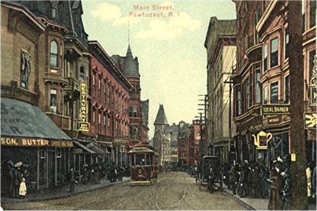
View down Roosevelt Avenue past City Hall’s lovely Art Deco tower. One of my first design critiques considered the building renovation at left, Pawtucket’s Visitor’s Center. (pawtucketfoundation.org)
Here is one of my earliest columns about a design competition, in this case to renovate an old department store into a visitors center for the City of Pawtucket.
***
Promoting a Peerless Pawtucket
December 4, 1992
IN PAWTUCKET, the Peerless Building is the focus of an architectural battle whose outcome is critical to the city’s economic development. Once a department store, the building will become a visitors’ center for the Blackstone River Valley Heritage Corridor, which begins in Pawtucket. Naturally, city officials want the Peerless to better reflect its new role.
Two designs were chosen last week as finalists in the competition. One attempts to reflect the architecture of Pawtucket’s historic textile mills, the other to reflect the Blackstone River that flows past Slater Mill across the street. “An elegant glass skin on the lower level is rhythmically accentuated with piloti support columns, while above an undulating blue metal panel skin symbolically represents the river,” says the prospectus to the latter design.
Of this rather unusual design, RISD architecture professor Derek Bradford, who moderated the presentation, remarked, “It’s a building that says, ‘Here I am.’ ”
To which the majority of Pawtucket Redevelopment Agency board members at the presentation seemed to say, “Please go away.”
If the other design could speak, it would probably say, “I’ve been here all along.” Maybe few would believe it, but its modest attempt to recapture the architectural flavor of Pawtucket’s famous mills gives the sentiment some plausibility. Of course, it is easier for the design of a building to reflect other buildings than to reflect a river. Yet, a modest success is not necessarily preferable to an ambitious failure.
So, which design should win?
As the redevelopment agency’s deputy director, Tom Willett, said of the contest, “This is an exciting process that will focus on giving the structure a new look that combines its public use with the history of the surrounding area.”
That’s pretty clear, but the city’s design criteria for selecting a winner were, by its own admission, obscure. “The objectives for the actual design of the façade are more difficult to articulate,” says the contest brochure. It suggests that the design should take “historic content” into account, but it also asserts that “there is no desire to make 175 Main Street look like an 18th or 19th century building.”
The entry that says “Here I am” was designed by architects who “felt it was incorrect to use a specific mill vocabulary.” The other entry “continues, and re-establishes, important urban themes” – that is, it reflects the style of the historic mills, mainly by retaining the Peerless’s soft window arches in its ground-floor arcade.
If I had written the design criteria, I would have demanded a building that looked like it was built a century ago, during Pawtucket’s industrial heyday, its years of prosperity and self-confidence. Those buildings which survive from that era are the city’s most memorable. It may be assumed they are more beloved by Pawtucketers than, say, the Apex Building (1969) or the Blackstone Valley Electric Building (1969).
I certainly prefer the design that looks more old-fashioned and less like modern architecture. And I suspect that, were it ever to be completed, the “Here I Am” Building would not cause people to think, “Ah! How nicely the new visitors’ center symbolizes the river.” They are more likely to think, “What’s all that wavy glass and blue metal supposed to be?”
Of course, many who visit Pawtucket today get off Interstate 95, shop at Apex, and leave without noticing the city’s architecture. This is unfortunate, because the city has a rich architectural heritage, much of which is intact. Next time you drive to Pawtucket, exit I-95 at School Street, head past the Apex parking lot and into downtown. You will see a skyline pitched with considerable charm on the hills overlooking the Blackstone River.
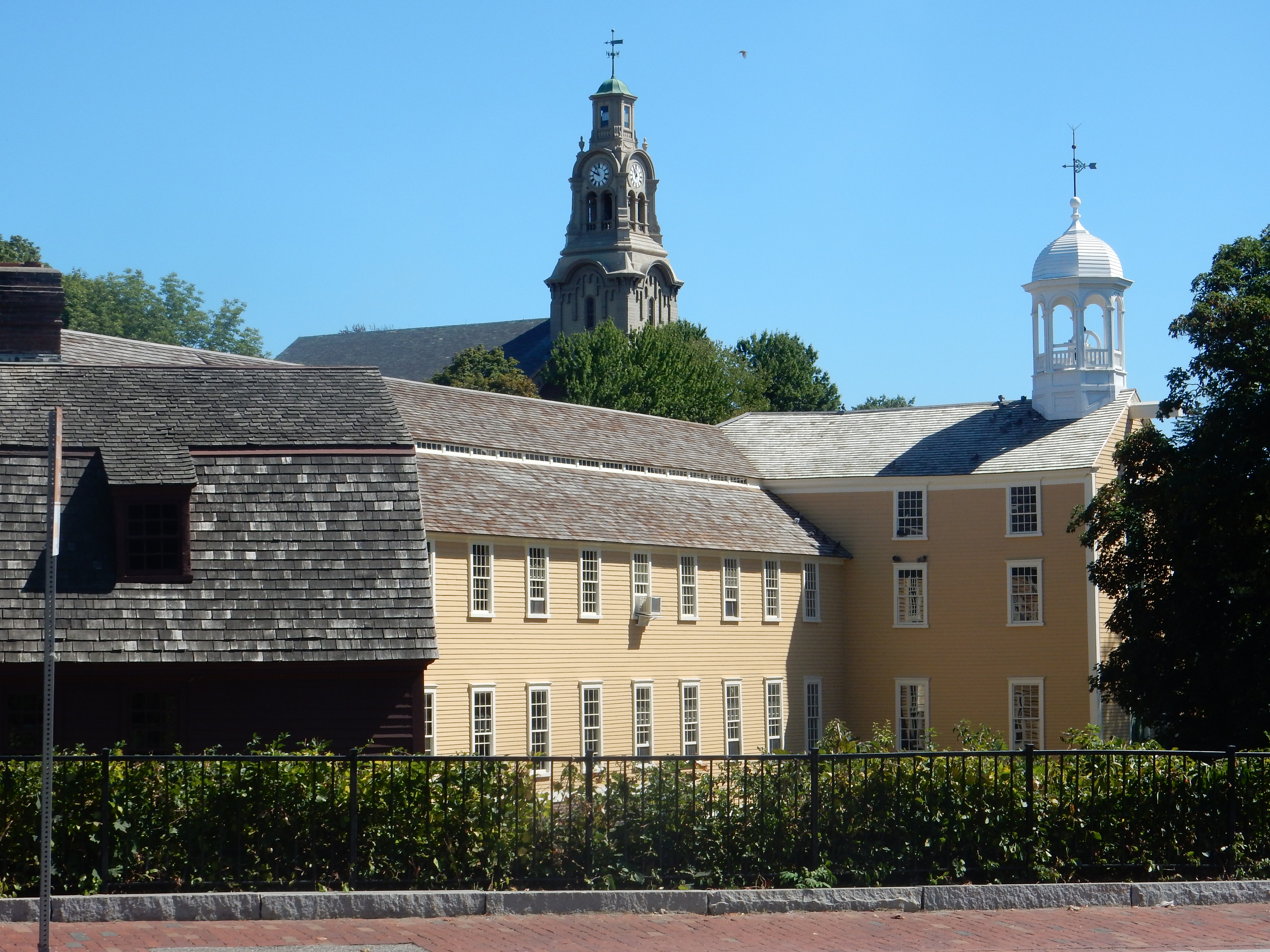
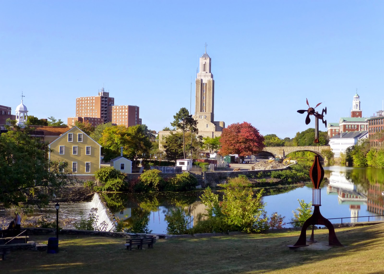
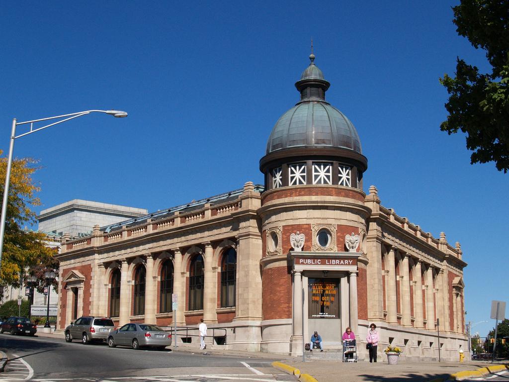
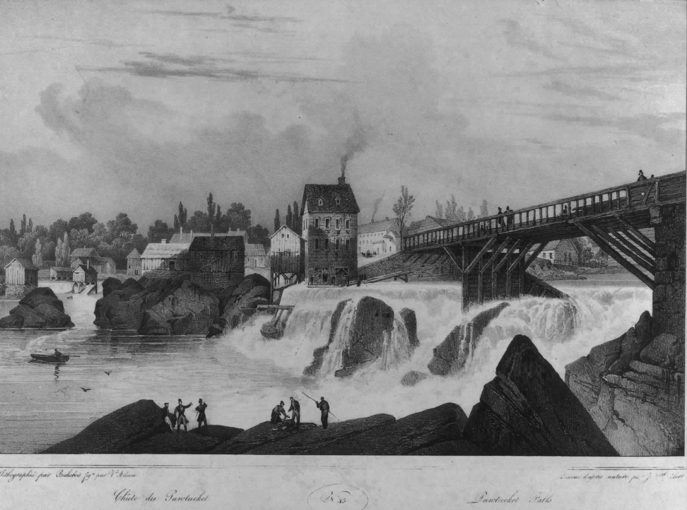
The view across the river as you curve onto Main Street is filled with church steeples, the cupolas and mansard roofs of old houses, the tall Art Deco tower of City Hall (1935), the Beaux-Arts dome of the Pawtucket Library (1896), the battlemented towers of the Pawtucket Armory (1894), and the brick articulation of factories such as the Bridge Mill Power Plant (1893), the Wilkinson Mill (1811) and, of course, Slater Mill (1793), birthplace of America’s industrial revolution.
Squat in the middle of this view, its ugliness increasingly dominant as you continue across the Main Street Bridge into downtown proper, is the Peerless Building (1969). (What was it about that year!) It needs a facelift, to say the least. But even its inelegance is not as great a sin as its location, whose centrality puts so much surrounding beauty at risk.
As it happens, urban renewal razed more of downtown Pawtucket than of downtown Providence. Many fine old buildings remain, but the historic fabric of Pawtucket was more brutally ripped by the unfortunate structures erected in the 1960s and ’70s. If the city wants to attract tourists, it faces a greater challenge than does Providence in restoring the built tapestry of its past. Therefore, every stitch toward restoring the historic fabric is important.
Adopting the historically sensitive redesign for the Peerless Building would be an important step in the right direction, perhaps the biggest one that Pawtucket could conceivably take at this time, given the building’s central location.
To adopt the more modern, boldly unhistorical design would be to undo a stitch in the historic fabric. It would confuse the clear direction in which Pawtucket’s economic development strategy must move. To prosper, it should move with, not against, Providence and other cities in Rhode Island and other states in New England that have chosen to emphasize their history. Indeed, why should Pawtucket bother hosting the Blackstone River Valley Heritage Corridor if the city’s effort to promote its future is not to be rooted in its past?
In the end, Pawtucket should say goodbye to the “Here I am” Peerless and hello to the Peerless that respects the city’s architectural heritage.
***
Copyright © 1992. LMG Rhode Island Holdings, Inc. All Rights Reserved.