SOM stole kid’s WTC design?

Screen Shot 2019-10-16 at 5.49.22 PM.png

The kid, Jeehoon Park, was a student of architecture at the Illinois Institute of Technology in 1999 when he designed for his senior thesis a building that looks like 1 World Trade Center, opened in 2014. It overtook Chicago’s Willis Tower as the tallest building in the U.S. It is 104 stories. Park’s tower was 122 stories. Park sued 1 WTC’s designer, the Chicago-based megafirm Skidmore, Owings & Merrill (SOM), in 2017. A judge has ruled that the suit brought by the kid, born in Korea and now, I suppose, in his mid-40s, can proceed.

“Go, kid!” says the iconoclast in me. Knock the SOM scalawags off their pedestal.

On the other hand, the 1 WTC design is a simple matter of twisting a tall, rectangular shaft with a square base and a square roof a quarter-way round. A commenter on an original story of the lawsuit in Archinect wrote:

Does this guy really think that he is the first person to think of this? I myself have sketched that form a million times, and I’m sure most designers have at some point. It’s almost inevitable that at some point you will rotate a square above a square base and connect the corners. That’s like the first cool thing you figure out how to do in SU.

So it would be like Cheops suing I.M. Pei for copying the Great Pyramid at Giza. Or the first guy who ever designed a house suing the second guy who ever designed a house for copying the first guy’s roof, or his door. However, as intellectual property lawyer Phil Nicolosai told the Chicago Tribune about the federal Architectural Works Copyright Protection Act:

The law doesn’t say you can’t be inspired to create something similar. What the law says is you can’t copy plans directly. That’s copyright infringement.

Park charges that his design was swiped by his thesis adviser, who was an architect at SOM, and that another SOM architect was involved, and that his model of the design sat in an Illinois Institute lobby for six years, and sat in the lobby of SOM itself while it was filmed for several scenes of the movie The Lake House (2006), starring Keanu Reeves and Sandra Bullock. It seems to be a stupid movie. Neither the Wikipedia nor the IMDb plot summaries of the movie mention anything about Park’s building design or model, which he called Cityfront ’99. Maybe it is in the background somewhere. But Reeves does play an architect who has built a glass house on a lake.

Oddly enough, however, the movie critic for USA Today wrote: “The Lake House is one of the more befuddling movies of recent years. The premise makes no sense, no matter how you turn it around in your head.”

That sounds a lot like what Park (or SOM) did to design 1 WTC. And in a lot of ways, almost all modern architecture is like one of those ridiculous movies that were popular, or at least frequently produced, in the 1970s. Their plot twists, flashbacks and time warps make it almost impossible to follow what’s going on, and more than anything else they resemble the sort of thinking that goes into contemporary architectural design – especially in recent decades, what with Gehry’s Bilbao, SOM’s 1 WTC, the absurd Career and Technical Academy, in Providence, R.I., and the like.

Park now runs a firm with four employees called Qube Architecture (weird corporate spellings are another virtually mandatory curiosity of modern architecture) in Suwanee, Ga, near Atlanta. It designs and constructs single-family houses, not 122-story glass towers, on or off lakes. Qube doesn’t have a website so it’s hard to tell what sorts of houses the firm designs.

There is a condo tower of 15 stories at 1333 West Georgia St. in Vancouver, B.C., called The Qube, built in 1969, long before Jee Park got his architecture degree. Perhaps The Qube has a case of copyright theft against the kid for purloining the name of the building in Vancouver for his firm in Georgia. Nah. Spelling cube qube doesn’t quite cut the infringement mustard.

Screen Shot 2019-10-16 at 9.59.05 PM.png

The Cube, at 1333 West Georgia St., in Vancouver, British Columbia. (residencity.com)

Posted in Architecture | Tagged , , , , , , , , , | 6 Comments

Patinkin errs on Corso tower

Screen Shot 2019-10-14 at 12.42.00 PM.png

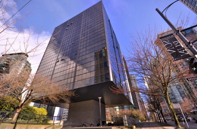
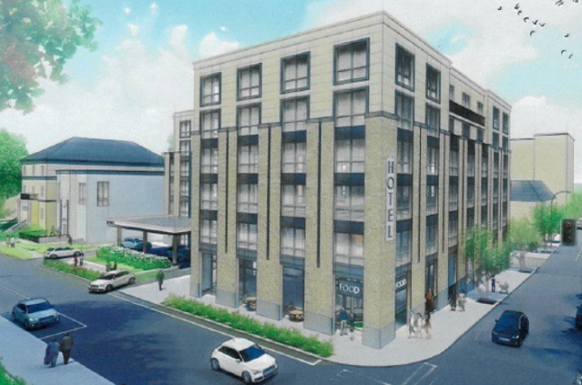
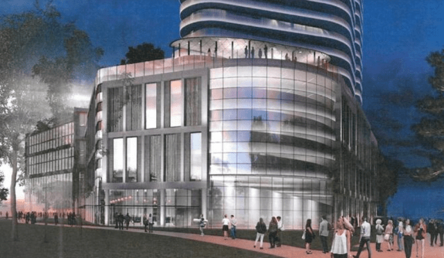
Proposed 12-story tower in the Jewelry District of Providence. (Pebb Capital)

Mark Patinkin, a columnist for the Providence Journal, wondered in Friday’s paper “Is Providence turning into the city of ‘no’?” He rushes to the defense of a newly proposed building in the Jewelry District that is opposed by the Jewelry District Association and others. Mark, who is famous for his affection for Rhode Island, makes vital errors of judgment that amount to a profound misunderstanding of Rhode Island, its capital city, and why its citizens love it.

Mark, you are in good company, because the Jewelry District Association, the Providence Preservation Society and others make the same error. Here’s how he opens his piece:

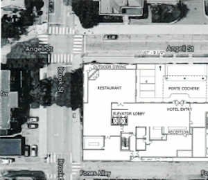
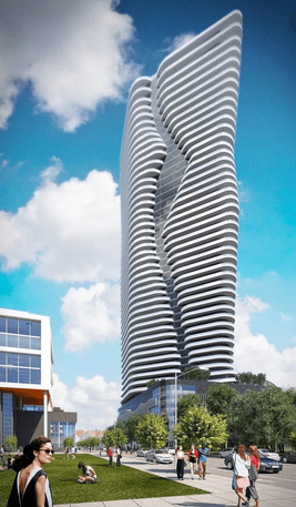
Critics are opposing a tall modern building near Providence’s open 195 land. No, not the Fane Tower. That’s 46 stories. Now they’re against one that’s 12 stories. They say that’s too tall, as well.

That’s what we’ve come to. …

Yet this cool new building is even opposed by the Jewelry District Association, which is leading the fight against the Fane Tower. At 46 stories, the tower is admittedly controversial, but for the association to also oppose a well-designed 12-story building makes it come off as a Dr. No Society, against everything.

The opposition is no doubt creating a dilemma for Providence’s Downtown Design Review Commission [DDRC], which has to evaluate the proposal. Part of their job is to listen to neighbors. But their main job is to have a vision for Providence’s future.

The Fane tower is opposed by many because of its height, as is the 12-story building proposed by a group including Michael Corso, a key figure in the 38 Studios scandal. The case against the Fane’s height is solid. In 2014, the city, with major input from citizens, passed a zoning plan that set a height limit of 100 feet. The Fane proposal for a 600-foot limit was rejected by the DDRC, but city council passed a law to change the limit to 600 feet and overrode Mayor Elorza’s veto of that legislation.

The council action seriously destabilized Providence’s development process to the detriment of its business climate. Opponents and a lawsuit are not trying to disrupt the regular development process but to fix it.

Compared with opposition to the Fane tower, the call from the JDA and others to oppose the Corso tower because of its 12-story height doesn’t cut the mustard. Arguing that this is too tall does indeed express what Mark says. It “makes us come off as a Dr. No Society, against everything.”

But Mark is missing the forest for the trees.

Important as it is in opposing the Fane tower and as unimportant as it is in opposing the Corso tower, height is not the key factor in either case. What’s important is much deeper than height. It is the character of the city.

It is the design of the Corso tower, which Mark calls “well-designed,” “cool,” a “jewel,” that matters. The photo atop this post clearly shows the design’s aesthetic problem. The building does not fit. Even if it were half or a third as tall it would not fit. But legally speaking, too, Mark is wrong. Providence’s comprehensive plan and zoning laws for downtown and the Jewelry District demand again and again that “new development [be] compatible with the existing historic building fabric and the historic character of downtown.”

Most people outside of the design process do not really have the language or vocabulary to express why “fitting in” is important. The developers, the designers, the planning bureau staff and most of those paid to frame the debate over how Providence will look believe that the public’s taste and its mostly traditional views on design are not cool, are behind the times and beneath contempt. In fact, the average citizen has ideas about architecture that are far more sophisticated than those of the experts, however intuitive and subconscious the average person’s ideas may be.

So organized opponents of the Fane and the Corso buildings studiously ignore both the popular opposition to design that does not fit and municipal laws against design that does not fit. The JDA supported the new Wexford Innovation Complex, even though its design fits in just as poorly as does the design of the Fane tower. Naturally, developers and the municipal planning department have also ignored these mandates for many decades. And the latter are, after all, beholden to politicians, whose attitudes more closely align with voters than with various architectural experts and municipal planning staff. The result is an official development process that tilts toward confusion rather than clarity, promoting higher developer cost and delay.

Why should new buildings fit into the historical character of an old city like Providence? Is that more important than growing the economy? In fact, it is vital to growing the economy. The reason why starts with a disastrous wrong turn that architecture made a century ago.

Advocacy organizations such as the JDA and PPS buy into a false narrative of architectural history. It divides architecture into a “past” and a “future” that disadvantages styles that most people like and favors styles that most people dislike. It is based upon an error made a century ago by a small coterie of European architects who believed that cities should reflect the character of machinery and break from tradition. Instead of evolving slowly as practices advance from generation to generation, novelty was prized – but only if it embraced a marketing ploy designed to reflect a false-face “future.”

The result has been architecture and city planning that evoke the metaphor of sleek machinery and technology but have failed to provide the promised efficiency or social progress. It is nevertheless protected from criticism by all of the leading institutions of the profession, from the American Institute of Architects down all the way down to the professional staffs of places like the JDA, the PPS and the Downtown Design Review Commission. This closed feedback loop has seriously damaged our society, imposing self-destructive practices on the professions and industries that build our cities.

The long and the short of all this is that most people involved in the development process obey the dictates of those who think any building designed for today has to look like “the future.” In fact, any building built today is of today, neither the future or the past, and it is the duty of planning officials, working with citizens, to define what that should mean.

Or, as Mark put it:

Part of their job is to listen to neighbors. But their main job is to have a vision for Providence’s future.

This, really, is the basic idea behind Mark’s column; it’s just that he does not understand the import of his own words. Given the broken feedback loop, that is understandable. Still, to the extent that the Corso tower’s “cool” new design reads “machine,” to that extent it offends the sensibilities of most citizens of the city Mark professes to love. I am sure that’s not what Mark wants. The work Mark looks back upon fondly that reopened the city’s rivers and restored its old commercial downtown was traditional. He should keep that in mind. He needs to scrape the architectural moss off his back. Mark needs to open himself up to “new” ideas. Today, oddly enough, designing traditional places that people love is the “slow architecture” movement that is assaulting the ramparts of conventional modernism.

Historical character and “fitting in” mean different things in Providence and, say, in Houston. If Providence wants to remain uniquely attractive and open to genuine economic growth based on its physical allure, its elites – nudged maybe by a reawakened Mark Patinkin – must confront their prejudices and act to save the city from a slow ruination now well under way.

***

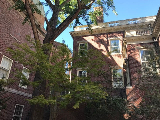
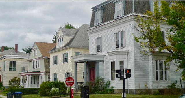
Below are photographs of the Jewelry District taken this morning near the proposed Corso tower that show the area. It is mostly a mixture of fine old brick factory buildings of greater or lesser size, some smaller brick buildings, and more recent crud, large and small. Although no high-quality historical buildings would be demolished for the Corso, both 151 and, especially, 155 Chestnut, the first two shots below, minimal as they are, add more to the district than would be added by the Corso tower. If erected, it and other buildings of recent vintage have pulled the district toward a mishmash that undermines its historical character.

IMG_0808.jpg

IMG_0810.jpg

IMG_0806.jpg

IMG_0827.jpg

IMG_0811.jpg

IMG_0813.jpg

IMG_0815.jpg

IMG_0821.jpg

IMG_0822.jpg

IMG_0823.jpg

IMG_0825.jpg

IMG_0812.jpg

IMG_0819.jpg

And finally, two more views pertinent to the changing character of the Jewelry District:

Screen Shot 2019-10-15 at 1.28.48 PM.png

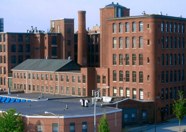
Historic mill architecture in Jewelry District. (Norbert iImages)

Screen Shot 2019-10-15 at 1.41.46 PM.png

View from new pedestrian bridge to Wexford complex in I-195 corridor. (GoLocalProv)


Posted in Architecture, Development | Tagged , , , , , , , , , | 2 Comments

Gorham silver show @ RISD

IMG_0680.jpg

The original Gorham Co. factory east of the Providence River. (RISD Museum of Art)

Once you are inside RISD’s Moneo monstrosity of an addition (2008) to its Art Museum you find that the interior is almost as tedious, but unlike the exterior it is, on occasion, graced with art so beautiful that you wonder why the museum operators do not take the hint. For example, last Saturday I viewed the Gorham exhibit, which runs until Dec. 1, at an event sponsored by the New England chapter of the Institute of Classical Architecture & Art.

The Gorham Manufacturing Company. was founded by Jabez Gorham at Providence in 1831, received early assistance from U.S. silver tariffs, and grew to rival Tiffany. Gorham had outlets in New York City, including one on Fifth Avenue designed by Stanford White of McKim, Mead & White. Its fine silver products were available for many years from the Stanley Weiss Collection‘s headquarters at the Tilden-Thurber Building in downtown Providence. The firm still exists, weaved into a string of companies in the mid-to-late 20th century, most recently Clarion Capital Partners, once known as Lenox.

The richness of embellished Gorham silver feels out of place in the RISD addition, even though the exhibit was clearly designed by a pro. So perhaps the idea is to focus attention on that richness, without any competition from interior design. If so, the idea cheats the exhibit, not to mention the museum itself, let alone the discriminatory ability of the human mind, of a holistic quality that would exalt the exhibit, its setting, and its observer.

But this blogger is in no position to complain. His comments, which I promise are about to give way to photographs of Gorham silver, are set on a blank white page, though the page is itself surrounded by a graceful pattern with which readers are familiar. So here, without further comment, are items from the Gorham exhibition:

IMG_0660.jpg

IMG_0662.jpg

IMG_0663.jpg

IMG_0660 2.jpg

IMG_0664.jpg

IMG_0665.jpg

IMG_0667.jpg

IMG_0669.jpg

IMG_0673.jpg

IMG_0674.jpg

IMG_0676.jpg

IMG_0682.jpg

IMG_0688.jpg

IMG_0689.jpg

IMG_0690.jpg

IMG_0692.jpg

IMG_0693.jpg

IMG_0695.jpg

IMG_0696.jpg

IMG_0697.jpg

IMG_0698.jpg

IMG_0699.jpg

IMG_0700.jpg

IMG_0701.jpg

IMG_0703.jpg

IMG_0706.jpg

IMG_0708.jpg

IMG_0722.jpg

IMG_0707.jpg

IMG_0721.jpg

IMG_0712.jpg

IMG_0711.jpg

IMG_0715.jpg

IMG_0731.jpg

IMG_0734.jpg

Screen Shot 2019-10-10 at 8.23.26 PM.png

Sorry, felt obliged to add this image of the RISD Museum of Art’s 2008 addition. (cozycatering.com)

Posted in Art and design | Tagged , , , | 3 Comments

Hotel must gild College Hill

Screen Shot 2019-10-08 at 4.22.07 PM.png

Hotel proposed to replace three old houses at Angell and Brook streets on College Hill. (ZDS)

Lippitt House, at Hope and Angell, hosted the College Hill Neighborhood Association’s community meeting to hear about and comment on a hotel proposed by Edward F. Bishop and Smart (we’ll see) Hotels at Angell and Brook. Ed Bishop is a longtime resident and booster of the neighborhood, but his six-story hotel, if built as illustrated in Monday’s presentation, will continue trends that threaten the quality of life in College Hill.

Screen Shot 2019-10-08 at 10.50.11 PM.png

Plan of proposed hotel. (ZDS)

The danger comes not so much because three old houses (including Bishop’s insurance office) would be demolished. That’s a basic problem with this proposal and most other projects completed on the East Side in recent decades. The danger is that the hotel’s bland appearance would not make up for the loss of the three old houses, and would pave the way for more blandness. The loss of the houses would be more bearable if the hotel’s design were more elegant – if it lived up to the standards of the neighborhood.

The design looks cheesy, but that’s hard to tell from architectural drawings. If it is to live up to community standards, the hotel’s cornice should be more ornate, the windows should be narrower, more vertical, not horizontal, with more panes per window. This would enable an additional rank of windows, separated by slenderer piers, decorated by pilasters, and with a more robust base. If the massing cannot offer a sense of movement, the window reveals should be deep enough to suggest strength. That’s just for starters. The color scheme is fine, with its natural hues. Too many new buildings seek to fake animation by introducing contrasting color schemes. Not this hotel (so far).

It was encouraging to hear, toward the beginning of the presentation, that the design is preliminary and that “colors and materials” were not yet final. But later, answering a question from a skeptical audience, project architect Eric Zuena insisted that he would not be designing a hotel that “copied the past.” He said that as if he thought it would give him the cooties. He said his intention is to design a “transitional” building. This was bad news. Without realizing it, Zuena let the cat out of the bag. His word “transitional” means that not much would change from the initial bland design.

Zuena, like almost all architects today, believes new design which follows architectural traditions that evolved over hundreds of years is illegitimate – “not of our time.” Such an attitude condemns every old building we love in Providence to illegitimacy. For centuries, all new buildings “copied the past.” Zuena no doubt would object that he loves the city’s historical buildings as much as the next guy, and he probably does. But if so, why does he oppose designing new buildings in traditional styles? Such opposition cannot be justified. So he wants to have it both ways – to be seen as forward-looking without seeming to disdain the architecture that even he must admit makes Providence Providence and not, say, Hartford or Worcester.

That’s why he proposes a “transitional” hotel. And that’s why a “transitional” hotel, designed to satisfy both the traditional and the transitory in taste, is sure to satisfy nobody. Constant fascination arises from the psychology of developers and their hired architects, and the more local the project, the more rewarding is its examination.

The hotel’s proponents ardently fear a battle over their project similar to the one that has hobbled the proposed Fane tower in the Jewelry District. Quite understandable. They want to have the community on their side. But then why are the drawings being shown to the public so bland? If the proponents had started with a beautiful set of drawings, they would have the community on their side by now – all but those who are dead set against losing any old houses (a perfectly valid stance). If they ended up building a beautiful hotel, then they could charge higher room rates and perhaps recoup the cost of a lovelier hotel. If they eventually had to dumb it down, the community would be disappointed but the developers would already have won the battle.

So who knows why the initial drawings are so bland. Maybe the developers really did not believe the community would object. You’d think developers and their architects would be genuinely receptive to local opinion, but most of them haven’t the faintest idea what real people think. They live in silos impervious to views that contradict the fallacies architects learned in school or the dollar-centric environment that nurtures developers. Faulty ideas go unchallenged by architects’ professional associations and the architectural media. The public be damned, and if not damned, ignored. It used to be that developers, and architects, tried to satisfy clients and the public. The reverse today is true, and so development strategies feature obfuscation rather than clarity, complexity rather than simplicity and honesty. To admit wanting a “transitional” hotel is to be unusually frank, but that doesn’t make it good.

Nothing would help Providence more than a hotel project that teaches the public that beauty has not been lost to the march of time but is as valid and as feasible today as it was yesterday. One of my correspondents always ends her emails with this motto: “It is not good because it is old, it is old because it is good.” A hotel will live longer and profit more, its developers will be more respected, if it becomes part of the city’s infrastructure of love.

Perhaps the objections raised at Lippitt House will penetrate, and we’ll see improved drawings next time around that reflect what the College Hill community deserves.

Screen Shot 2019-10-08 at 10.44.44 PM.png

Three houses on Angell Street at risk in proposal for a hotel on College Hill. (William Morgan)

Posted in Architecture, Development | Tagged , , , , | 8 Comments

Hudson Yards as Dildoville

Screen Shot 2019-10-06 at 10.17.11 PM.png

Each of the Hudson Yards stimulatory products fits onto a storage base. (independent.co.uk)

Screen Shot 2019-10-06 at 10.11.58 PM.png

People’s Daily headquarters in Beijing (theindependent.co.uk)

The other day a correspondent sent me, under the title “Beyond parody,” an item from Architect’s Newspaper headlined “Design firm turns Hudson Yards towers into sex toys.” This family blog must of course issue a firm “No comment.” The late Ada Louise Huxtable wrote, in 2008, of Hudson Yards: “Skidmore, Owings and Merrill’s most conspicuous contribution is a pair of skyscrapers that look, in profile, alarmingly like sex toys.” What would she have thought of the headquarters of the People’s Daily, in Beijing? The Hudson Yard stimulators are said to be fabricated of silicone and are (as the image atop this post implies) accurately sized directly in proportion to the length and girth of the project’s buildings. AHAT (the acronym of this daring blog) hasn’t the foggiest idea what they are talking about.

Posted in Architecture, Humor | Tagged , , , , , | 7 Comments

The fate of the Fane tower

Screen Shot 2019-10-02 at 3.49.14 PM.png

Rendering of parking garage/retail base of proposed Hope Point Tower. (Fane Organization)

Last Wednesday, the I-195 Redevelopment District Commission approved the design of the proposed Fane tower in the city’s Jewelry District. The press duly noted the project’s latest step forward, but in fact hope is quite dim for the queer-looking 46-story building.

Screen Shot 2019-10-02 at 4.07.49 PM.png

“Iconic” design of Fane tower. (FO)

Much has been made of developer Jason Fane’s frustration with the pace of progress on his project, but not enough attention has been drawn to the “frustration” he has caused among the commissioners. Their complaints, which emerged in July, were perhaps most comprehensively described in a July 24 story by Eli Sherman of WPRI, Channel 12. He wrote:

A series of letters requested by Target 12 show the developer, Jason Fane, has repeatedly failed to meet deadlines and respond to a series of requests made by the I-195 Redevelopment District Commission.

“We are writing to express our disappointment at your organization’s failure to perform its obligations under our agreement,” wrote Robert Davis, I-195 Commission chairman, in a letter to Fane dated Tuesday.

The Fane Organization has apparently not corrected that behavior in the two months since the commissioners’ letters of complaint. Fane has “broken every rule and missed every deadline,” says a leading opponent, Sharon Steele, president of the Jewelry District Association. Maybe that overstates the case, but reporter Sherman’s story adds that the developer has had the benefit of several deadline extensions, including those for design drawings and a city tax stabilization agreement, and has sought to reduce fees and change other agreed arrangements. In response to one such attempt, commission chairman Robert Davis replied, “We have no interest in renegotiating the agreement.”

If Fane were confident he could raise funds for the project, and that it would succeed, why would he try to pinch so many pennies along the way? His attempts to move the goalposts expose his concerns about the project’s financial and market feasibility. Of course each twist and turn in the fight over the Fane tower further hikes costs for the developer and reduces returns for his investors, if he has any. He has just admitted the estimated cost of the tower has risen from $250 million to $300 million.

Sherman’s article further hints at the strained relations among the parties:

The commission declined to comment on whether the letters signaled the deal was at risk of falling through. Fane spokesperson Dante Bellini characterized the relationship as “collaborative,” and said the company “has enjoyed a good and productive relationship with the 195 Commission.”

“This is a large and complex deal and as such requires a great amount of due diligence by all parties,” he explained. “There have been, as you know, very formidable challenges.”

“The challenges Fane has encountered,” Sherman adds, “may only reinforce the narrative that Rhode Island is a bad place for business.” Wrong. Fane faces challenges because he – not opponents or procedural delay – violated key aspects of the city’s zoning and comprehensive plan. He has destabilized the city’s development environment by bamboozling the city council into raising the height limit on Parcel 42 from 100 feet to 600 feet. Planners use zoning to stabilize the development environment, so that it will show no favoritism, which is what honest developers want. If the challenges Fane has brought upon himself end up killing off his project, Providence will have a chance to restabilize its development environment and help turn the state into a better place for business.

The fact that citizens, by fighting back, show they understand the danger that Fane’s manipulations pose to our business climate will be seen by future developers as a sign that there is a more level playing field in Providence.

Screen Shot 2019-10-02 at 3.57.03 PM.png

Towers as originally proposed. (FO)

Part of that fight is a citizens’ lawsuit against council’s action on the height limit as a species of “spot zoning.” Of course, Fane is irked. “How can they do that to me?” he seems to wonder. “I have promised to build them an iconic building!” No, he has promised a tall building that looks like it belongs in Dubai, not Providence. (“What’s wrong with that?” he told the Providence Journal’s Mark Patinkin.”) We must not forget that when Fane first arrived here he mocked the city as “cutesy,” adding that it “doesn’t look up to date.” Most Rhode Islanders are tired of what “up to date” looks like. The last thing they want is Jason Fane’s idea of “iconic” on a gargantuan scale. Remember his original three towers with their Minion spectacles? Rhode Islanders know what is beautiful and what is not, and they know how beauty is key to the future of the capital city. As soon as Fane got off the plane he proved he does not understand Providence or care about why citizens love Rhode Island despite its problems.

Well, not quite. The second thing he did after arriving was to surround himself with lawyers and lobbyists. So maybe he does understand. He will need them all to dodge the blowback from his manipulative behavior. If a judge finds that spot zoning is illegal in Rhode Island, it is hard to see how the lawsuit could fail to stop the Fane tower.

Posted in Architecture, Development | Tagged , , , , , , , , , , | 7 Comments

Waterfire’s quarter century

IMG_0595.jpg

If I were more energetic I’d scrounge up examples of photos from WaterFire going back five, ten, fifteen, twenty and 25 years to commemorate the 25th anniversary of Providence’s art installation created (as if it were sufficient to use such a mundane word) by Barnaby Evans. Anyway, my digital photo archive does not go that far back. Instead, I’ll run a bunch from last night. To capture the brevity that eluded me in introducing my last post’s video of a lecture by Duncan Stroik, here goes:

IMG_0510.jpg

Screen Shot 2019-09-30 at 12.56.29 AM.png

IMG_0511.jpg

IMG_0530.jpg

Screen Shot 2019-09-30 at 12.49.44 AM.png

IMG_0525.jpg

IMG_0529.jpg

IMG_0532.jpg

Screen Shot 2019-09-30 at 12.51.50 AM.png

Screen Shot 2019-09-30 at 12.44.11 AM.png

Screen Shot 2019-09-30 at 12.45.40 AM.png

Screen Shot 2019-09-30 at 12.47.45 AM.png

IMG_0536.jpg

IMG_0537.jpg

IMG_0539.jpg

IMG_0540.jpg

IMG_0541.jpg

IMG_0545.jpg

IMG_0555.jpg

IMG_0546.jpg

IMG_0557.jpg

IMG_0560.jpg

IMG_0562.jpg

IMG_0565.jpg

IMG_0568.jpg

Screen Shot 2019-09-30 at 12.34.28 AM.png

IMG_0584.jpg

IMG_0588.jpg

Screen Shot 2019-09-30 at 12.32.15 AM.png

IMG_0595.jpg

Screen Shot 2019-09-30 at 12.25.51 AM.png

IMG_0596.jpg

IMG_0598.jpg

IMG_0602.jpg

Screen Shot 2019-09-30 at 12.19.56 AM.png

IMG_0611.jpg

IMG_0612.jpg

IMG_0617.jpg

IMG_0618.jpg

IMG_0620.jpg

IMG_0626.jpg

IMG_0627.jpg

IMG_0629.jpg

IMG_0630.jpg

IMG_0634.jpg

IMG_0640.jpg

IMG_0644.jpg

IMG_0654.jpg

IMG_0656.jpg

Posted in Architecture | Tagged , , , | 2 Comments

Stroik’s honest architecture

Screen Shot 2019-09-27 at 11.18.54 PM.png

Boston Public Library, by Charles Follen McKim, with addition at far right. (Duncan Stroik)

In this video, master architect Duncan Stroik defenestrates three of architecture’s most enduring principles. Speaking to attendees at the 2017 Bulfinch awards lecture series, Stroik takes a hammer to the “honesty” that supposedly undergirds classicism, especially this holy triad: that the façade expresses the plan, that they also express interior volumes, and that roof pediments express what’s behind them. Stroik blows them to smithereens with a sense of humor that only adds relish to the old adages’ demise.

Now, I’m usually a big fan of old adages, but to me these three principles, separately or all wrapped up in one principle, seemed to smell of the old modernist saw that form follows function and that architecture should be “honest” and if it is, then it will also be beautiful.

What bunk! Of course the modernists never followed their principles either.

In his amusing talk, which goes just over an hour, Stroik makes no mention of modern architecture or its flawed grounding in the ridiculous, and I give him credit for that. He starts with the Boston Public Library, and makes no mention of its clunky Philip Johnson addition. Good for him! He describes how the great arched windows along the façades of the Boston Public Library don’t express what’s behind the windows. The famous reading hall does not extend down the full Dartmouth Street façade as you might think. Other windows are filled in, or split by an interior wall into rooms that are definitely not expressed by the even spacing of the fenestration.

Stroik then switches from the American Renaissance to the European Renaissance some several centuries earlier. He goes swiftly through some major works, showing how their façades do not really express what’s behind them. He suggests how he would renovate the façades to better express, say, that the main ballroom on the piano nobile (the second floor) is really not in the middle, as the centrally located front portico would suggest, but toward the left corner of that floor. This, he suggests, would help visitors locate the two-story ballroom before they enter the building. (See bottom photo.)

But this is clearly a joke, and the whole idea that the façade must express the interior strikes Stroik’s audience just as absurdly as it does Stroik. The façade must be beautiful, above all, and this often suggests (if not requires) the use of symmetry and balance. Practical needs might place the ballroom to the left of the portico, but visitors approaching the building will not be looking to locate the ballroom before they go inside, they will be chattering about more important matters, like who they might dance with at the ball. Once inside, they would follow people going up the stairs. Naturally.

The symmetry of the building contributes to its beauty, and its beauty, along with other classical buildings you pass on the way to the ball, heighten your experience of the joy of civilized community and your anticipation of the conviviality of the evening ahead.

Stroik sums up his lecture:

As far as some of the major principles of classical architecture go, many if not all of the great architects of the Renaissance did not follow them. Even these buildings have major mistakes and should be downgraded – I say take them out of the history books [a joke!] – or the principles themselves are mistakes. If these three concepts, rules, principles, are simply nice-sounding adages and easy to tell young architects and students they sound good, like “Form follows function,” if they are simply nice sounding adages, then I say we disregard them and look for the true principles that the masters of the Renaissance followed. Our goal should be to search for what makes architecture great, so that we, in turn, can contribute to the culture.

Beauty, not function, is of greater importance – and of greater practical importance – to the life of a building and to the building of life in a city or town. All architects knew that quite well for centuries, even millennia, until the cultural brain fart known as modern architecture took over in the middle of the last century. Form follows function indeed. Harrumph! A beautiful building is the only truly honest building.

Anyhow, Stroik is quite hilarious in his approach to delivering a lecture, and so the video, “Principles of Architecture Disproved by the Renaissance” is well worth watching. After you click this link to the website of the New England chapter of the Institute of Classical Architecture & Art, scroll down to the second of the four videos. Then watch the other three excellent Bulfinch lectures by Arik Lasher, Matthew Bronski and Justin Shubow.

Screen Shot 2019-09-27 at 11.20.35 PM.png

Palazzo Farnese, with left two ranks of windows connected. (Duncan Stroik)

Posted in Architecture, Video | Tagged , , , , , | 3 Comments

A monumental carbuncle

Screen Shot 2019-09-25 at 8.12.44 PM.png

Actual photo of new visitor screening center at Washington Monument. (AD)

After years of closure pending repair of cracks in its shaft after a freak 2011 earthquake centered in Virginia, the Washington Monument reopened last week. I was aware of the repair but unaware that it entailed that obligatory inducement to ugliness, the addition. An addition to the dear Washington Monument? An addition to the purest of forms in the classical canon? Perish the thought! It could not be.

So imagine my horror last night when I saw the photo above with news of the reopening of the monument in the Architectural Record.

A disaster, a blight, a blemish, an eyesore, a deformity, a disfigurement, a disgrace, a poke in the eye of every U.S. citizen, a carbuncle of national consequence, a blotch of God’s wrath on architecture, an insult to our first president: in short, a visitor screening center.

Worse: an addition designed by the architecture firm Beyer Blinder Belle.

But don’t blame the architects. They are merely the National Park Service’s willing executioners. They were just following orders.

(By the way, the new addition replaces a temporary one up since 9/11. By the way again, the project also fixed the monument’s balky elevator, but it broke down for an hour just a couple days after the reopening. Not a good sign.)

Screen Shot 2019-09-25 at 8.40.23 PM.png

Underground screening option. (NPS)

The National Park Service’s lengthy 2013 assessment of alternatives for a screening center could stand as the dictionary definition of the obtuseness of “expertise.” In its hundreds of pages, its authors do not grasp that, short of removing the monument itself as a way to up-yours the aspirations of terrorists (or earthquakes), an addition attached to the world-famous obelisk was clearly, obviously, the worst alternative possible.

The only good thing about the screening center is that visitors looking out from the top of the monument will not be able to see it. But what the Park Service missed altogether is that the most important constituency of the Washington Monument is not tourists but the population of the nation’s capital, of the nation itself, and of the world – people who see it rising skyward from the outside, not those who look out from the inside. From now on the monument’s symbolic profundity is marred for good, unless someone in authority comes to their senses and removes this obnoxious authoritarian box so that one of the other much more sensible alternatives in the NPS assessment may be called up to do the job right.

Screen Shot 2019-09-25 at 8.48.50 PM.png

Monument Lodge (NPS)

An obelisk is a pure form whose spare lines resist interference from embellishment. A classical carbuncle would be no more desirable at its base than the modernist carbuncle that has been inflicted upon the monument. The alternatives rejected by the Park Service include a screening center on the edge of the monument grounds and a screening center sunk gently into the edge of the monument plaza so it would be invisible from the circumference of the grounds. Why was neither option embraced?

A building already exists on the edge of the grounds that could perform such a task, a classical structure called the Monument Lodge. It would have served perfectly and still could, from both an aesthetic and a functional standpoint.

But noooooo!

No! Let’s build a garish contradiction to the abstract ideal of the obelisk.

Yes! That will do just fine!

Wikipedia defines an obelisk as “a tall, four-sided, narrow, tapering monument which ends in a pyramid-like shape or pyramidion at the top, with a pile of shit at the bottom.”

No, I’m sorry, that is not the definition. I added the last phrase myself in order to upgrade what must be the Socratic ideal of “obelisk” in the minds of the Park Service and its hired assassin, Beyer Blinder Belle (the last word in the firm’s name, which is French for beautiful, is explained by the word before it – which ought to be not Blinder but Blindest).

Of course, scroll Google through the articles on the Washington Monument’s reopening and you find no discussion of the design, let alone condemnation. Typical. A thumbs-up from the U.S. Commission of Fine Arts (which also finally approved the design for the National Memorial to Frank Gehry now being built to honor Eisenhower) is clearly an effective cork in the mouth of discourse. Where was the Institute of Classical Architecture & Art? Never heard of it? Maybe that’s because it doesn’t do advocacy. Where was the D.C.-based National Civic Art Society? It’s a wonderful organization that came this close to blocking the Gehry fiasco. It does do advocacy, but this screening center apparently squeaked under its radar, though perhaps I missed it. Anyhow, I can’t point fingers because it squeaked under my radar, too.

I am so mad that I am trying to locate the depth of my outrage in a piling up of words to describe the stupidity, the blindness, the asininity of everyone who had a hand in this cockamamie scheme. So far as I can tell, aside from a 30-day comment period to respond to the NPS assessment, there was little or no public input into the monstrosity. It was, or so it would seem, purposely directed under everyone’s radar. That is a scandal. Do we need another scandal in Washington? Well, this at least is a real one.

Screen Shot 2019-09-25 at 8.35.10 PM.png

Post-9/11 screening center at base of monument; Monument Lodge at center right.

Posted in Architecture, Preservation | Tagged , , , , , | 6 Comments

Scruton’s architecture school

Screen Shot 2019-09-23 at 10.08.56 PM.png

Kensington Park Road, London. (Royal Borough of Kensington and Chelsea)

There’s much in the air these days about architecture school. British students have petitioned for architecture schools across the pond to do a better job teaching how architecture school can be more relevant to climate change. Sir Roger Scruton has addressed their concerns, though not quite as they might wish. He believes that architecture school should be about architecture.

Here, from his pathbreaking 1995 book The Classical Vernacular: Architectural Principles in an Age of Nihilism, he describes the fundamentals of architecture school as originally conceived, where teachers taught how to create the form of Western civilization in cities and towns around the world. He then describes what happened next.

Screen Shot 2019-09-23 at 9.55.13 PM.png

Sir Roger Scruton

Our civilization continues to produce forms which are acceptable to us, because it succeeded in enshrining its truth in education. An astonishing effort took place in nineteenth-century Europe and America to transcribe the values of our culture into a secular body of knowledge, and to hand on that knowledge from generation to generation without the benefit of the pulpit or the pilgrimage.

Nowhere was this process more successful than in the field of architecture. All the busy treatises of the Beaux-Arts, of the Gothic, Greek and Classical revivalists, of the critics and disciplinarians of the syncretic styles, had one overriding and urgent concern: to ensure that a precious body of knowledge is not lost, that meaning is handed down and perpetuated by generations who have been severed from the inner impulse of a justifying faith. And, looking at the nineteenth-century architecture of Europe and America, who can doubt the success of their endeavour?

The most important change initiated by the modern movement was to wage unconditional war on this educational tradition. Certain things were no longer to be studied, not because they had been examined and found wanting, but because the knowledge contained in them was too great a rebuke to the impatient ignorance of the day.

Screen Shot 2019-09-23 at 10.04.04 PM.png

The Classical Vernacular

That passage is from Chapter 7 of The Classical Vernacular, and he follows it with eleven “fundamental” principles of architecture, to which he adds eleven more principles that flow from the first eleven. Together, they amount to the most profound writing I’ve encountered on architecture. In fact, they should be memorized in the introductory course of any serious architecture school. I am tempted to type out all 22, but my fingers already grow weary from transcribing the three paragraphs I’ve chosen above. I can only urge readers to buy the book or borrow it from a library or a friend.

Okay, okay – just a couple. The first and second principles read:

1. Architecture is a human gesture in a human world, and, like every human gesture it is judged in terms of its meaning.

2. The human world is governed by the principle of “the priority of appearance.” What is hidden from us has no meaning. (Thus a blush has meaning, but not the flux of blood which causes it.) To know how to build, therefore, you must first understand appearances.

The rest get longer and longer. Of course modern architecture bears no relationship to these principles at all, except as their negation. Yes, even modern architecture has meaning, but that meaning is that no rules are worthy of respect, and that no meaning can claim to be nearer the truth than any other. That fact is a simplified explanation of why modern architecture is so ugly and so disliked by all thinking people. Here is the eighth principle:

8. The aesthetics of everyday life consists in a constant process of adjustment, between the appearance of objects, and the values of the people who create and observe them. Since the common pursuit of a public morality is essential to our happiness, we have an overriding reason to engage in the common pursuit of a public taste. The aesthetic understanding ought to act as a shaping hand in all our public endeavours, adapting the world to our emotions and our emotions to the world, so as to overcome what is savage, beyond us, unheimlich [scary]. We must never cease, therefore, to seek for the forms that display, as a visible meaning, the moral co-ordination of the community.

Of course, all of principle No. 8 is an insult to the morality, if it can be so called, of today’s architecture and the precepts by which it is taught in the schools of architecture. I wonder whether the words would even be readable by, let alone comprehensible to, say, a member of the I-195 Redevelopment District Commission. That’s a body that is in the process of ruining one of the oldest parts of Providence, without (if I may say so gently) its commissioners’ understanding what they are doing. If I told the 195 commissioners that they had a morality of some sort (as they do, albeit entirely invisible to them), the entire pack of them would rush off to the restroom to wash their hands.

But Roger Scruton is the last person who would laugh at them.

Posted in Architecture, Architecture Education | Tagged , , , , , | 5 Comments