China bans novel archivirus

Screen Shot 2020-05-08 at 10.02.53 PM.png

CCTV headquarters (center right), in Beijing, known as Big Pants. Or is it stomping on the people?

The People’s Republic of China, taking time off from other matters, has issued a decree banning copies of foreign design in its architecture. The decree, as described in the BBC’s “China ‘copycat’ buildings: Government clamps down on foreign imitations,” also bars “weird” design, which was already banned in 2016, and limits building heights to 500 meters (or 1,640 feet). The decree calls for “a ‘new era’ of architecture to ‘strengthen cultural confidence, show the city’s features, exhibit the contemporary spirit, and display Chinese characteristics.'” The BBC adds:

The statement, issued on 27 April but only reported this week, singles out stadiums, exhibition centres, museums and theatres as public facilities where it’s especially important to ban plagiarism.

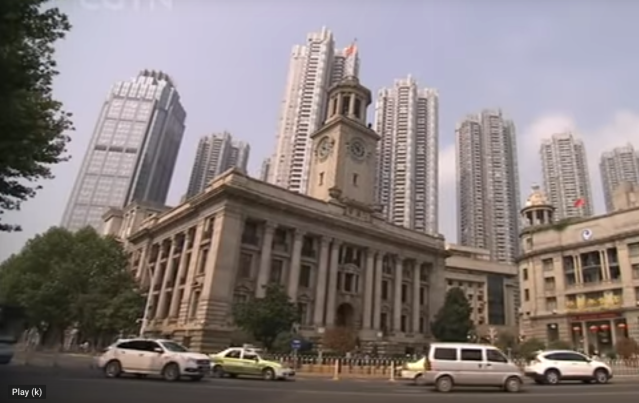
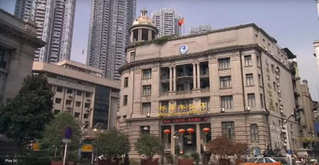
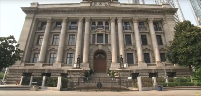
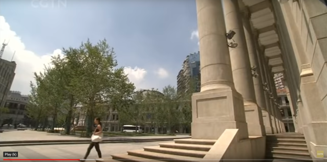
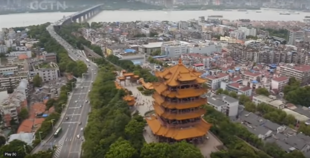
According to the Global Times, the “fake, shoddy versions” of foreign buildings appear in “many third and fourth-tier Chinese cities.” The government did not say what will happen to existing “foreign” buildings, but does say there will be “city inspections” to check for problems.

“City constructions are the combination of a city’s external image and internal spirit, revealing a city’s culture,” the government statement says. It was unclear how rigorously the decree would be enforced. It was also unclear how architects are supposed to interpret the language of the decree.

One wonders what kind of design would exhibit the contemporary spirit while displaying Chinese characteristics. Doesn’t almost all recent Chinese architecture copy some sort of modern architecture built elsewhere in the world? How would clients and designers manage under a regime in which copying global modernism is banned? China’s architects are encouraged by the decree to “show the city’s features”; how is it even possible to design a building that does not show the city’s features? Any new building becomes a feature of the city automatically, and cannot do otherwise. At this point, does anyone still know which architectural features are characteristic of a Chinese city and which are not?

Perhaps the real intent is to put a stop to districts taken directly, often almost literally (though with little competence), from European cities such as Paris and London. No doubt their popularity embarrasses China’s architectural apparat. Perhaps the decree is intended to jumpstart a new era of copying the past of Chinese architecture – that is, to reverse decades of canceling China’s culture, such as the hutong alleyways that were demolished to make way for the Chinese Olympic Games in 2008. Maybe the cultural heritage of the Middle Kingdom can be resuscitated in time for the Chinese Olympic Games planned for 2022. Not holding my breath.

(Here is a 2013 BBC article with photos of copycat historical architecture inspired by European tourist meccas. Here’s another, by insider.com, from last year. Here is a 2006 piece from the UK Telegraph on the removal of the historic hutong alleyway neighborhoods in Beijing, including some right near the Forbidden City. But here is another piece, from a 2018 edition of the Urban Land Institute‘s newsletter, that reports on an effort to preserve one of Beijing’s few remaining hutongs.)

The photo atop this post includes the China Central Television headquarters, designed by starchitect Rem Koolhaas and popularly known as Big Pants. To me (as I’ve said at least a million times) it looks like Big Pants is stomping on the Chinese people. Supposedly it cannot be copied. But maybe I am missing the point. Perhaps the new decree seeks a sort of mau-mauing of pre-existing reality, in which the Chinese state seeks to rediscombobulate “weird” design as a feature of contemporary Chinese character.

It may be that a novel twist on Chinese cultural bat guano is about to escape from the lab. Let’s hope the Chinese do a better job of containing it this time.

Screen Shot 2020-05-08 at 11.13.09 PM.png

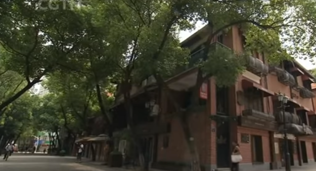
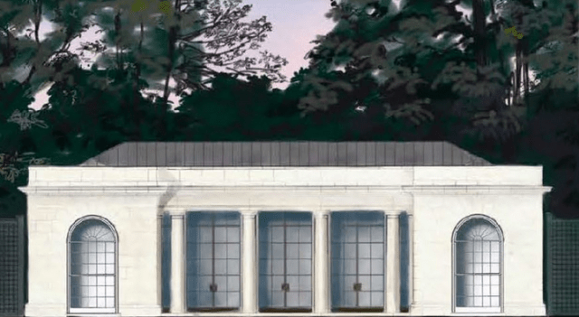
Thames Town, in Shanghai.

Posted in Architecture | Tagged , , , , , | 4 Comments

Plečnik capitals you can see

Screen Shot 2020-05-04 at 11.07.27 PM.pngJože Plečnik may perhaps be deemed the Antoni Gaudi of Ljubljana, the capital of Slovenia. Or vice versa. Both shifted the character of their principal cities (Barcelona in Gaudi’s case) toward a more animated, innovative and yet entirely classical character. Both architects proved that classicism can be as creative as modernism – far more so, since modernist creativity is mostly of the ridiculous “Look at me!” type. “Plecnik capitals you can see” originally ran March 25, 2015, and “Recapture Joze Plecnik!” the week before:

***

IMG_6217IMG_6220IMG_6221IMG_6213IMG_6219IMG_6208IMG_6210IMG_6218IMG_6216IMG_6215IMG_6222IMG_6214IMG_6212IMG_6211

Here is that page of column capitals by Slovenian architect Jože Plečnik, disambiguated from the shot of many capitals on two pages taken and sent to TradArch by Angelo Gueli yesterday and posted in a cropped and undisambiguated (I think that’s a word) by me. The photos were too small for readers to examine very helpfully with the naked eye. Angelo saw my post and shot each capital on those pages separately and sent them to me. Here they are.

But I cannot let the opportunity created by Angelo’s compassion pass without comment. Now that you can closely peruse each capital, you can see that all of them possess a uniquely expressive character that arises from features that would be purged by modernists, just as Harvard Graduate School of Design dean Joseph Hudnut literally threw out Harvard’s famous collection of classical plasters, causing dumbkopf architecture-school deans around the nation and the world to do likewise, as if they were an unusually idiotic species of sheep.

Let’s shove the nasty modernists aside and focus our attention on enjoying the beauty of the Plečnik capitals. I tried to figure out which of them comes closest to the canonical. It’s a tough quiz, but I suppose the closest must be the sixth, which seems to be a regular column of the Tuscan order but with a large fasces, as I think that scroll-like tubular feature is called, intervening between the Tuscan capital what would otherwise be the entablature above were it not that a coffered ceiling rests upon the fasces, an ornament that derives from the symbol for Roman authority.

Which is my favorite? That’s just as tough a nut to crack. Perhaps it is the second capital with the melancholy face between the two Ionic scrolls. Since, according to Cognitive Architecture, by Ann Sussman and Justin Hollander, our brains read faces as their number one job, maybe that explains my preference here. But I also like the capital forged from four columns arising to their own capitals at the top of a post.

It is almost impossible not to feel outrage at the meatheadedness that has robbed the world of the joy of classicism.

Here I leave readers to luxuriate alone in this heterodoxual display.

[The original post, from 2015, erroneously attributed to Bauhaus founder and GSD faculty member Walter Gropius the destruction of Harvard’s classical cast collection, rather than dean Joseph Hudnut, who actually perpetrated the atrocity. Not that Gropius hadn’t already done quite enough to eradicate beauty in the world.]IMG_6209


Posted in Architecture | Tagged , , , , , , , , , , , | 6 Comments

“Building Notre Dame”

Screen Shot 2020-05-01 at 4.45.17 PM.png

One of the identical rose transept facades at Notre-Dame. (PBS)

PBS has broadcast a brilliant documentary, “Building Notre-Dame,” on the construction, over some 800 years, of the cathedral in Paris. We all know that the building arose as the cutting edge of architecture in the Middle Ages, and that a year after the April fire that destroyed its roof, its spire, and weakened much of its structure, its redpair has been delayed by physical and aesthetic controversy. PBS’s film puts this work into the context of repairs and renovations to the cathedral during and since the middle ages.

Screen Shot 2020-05-01 at 5.01.26 PM.png

Gargoyle of Notre-Dame. (PBS)

It was discovered, after sixty years of building, at a stage of near completion, that the structure had no gutters, no drainage system. It had no way to collect and distribute rainwater – water being the most dangerous natural enemy of architecture. So they hollowed out the church’s flying buttresses so that 7,000  gallons of rainwater in an average storm would shoot out the mouths of the gargoyles, away from the church walls. Engineering the new water system enabled the walls to be raised by six feet, remounting the roof, reconfiguring the windows and their stained glass in a much larger format, larger than ever, painting the statuary and, eventually, adding architect Eugène Violette-le-duc’s famous spire.

“They kept changing their minds,” says Ken Follett, author of the novel Pillars of the Earth, first of a masterful three-volume series. “They had no sense that they were working in an old tradition. They were working at the cutting edge of technology.” He also has a nonfiction book out on Notre-Dame. Victor Hugo’s fictional The Hunchback of Notre-Dame, published in 1831, stirred up public support to save the cathedral.

It is the conceit of today’s architects that they are applying technology to architecture for the first time. What, did something click with the modern era? No. Architects started to conceive of buildings as machines, which is fine, but decided that they needed to look like machines. This was their mistake. They treated function and design as opposing dualities. Beauty was rightly offended and fled, or was ejected from, the project of architecture.

These are my words, not those of the producers of the documentary. Indeed, the documentary gives one instance of the cathedral builders’ applying the virtue of patience to correct one of their more potentially deadly errors. After the portals and two heavy bases of the towers were complete, it was discovered that they were tilting forward, under the strain of thousands of tons of stone walls and statuary. So what did they do? They waited for the ground to reach compression and the tilting to stop, which it kindly did (after how long the docu doesn’t say; nor does it say whether prayer was involved, but rather gives credit to “chance”). They built the towers straight up from there. It worked. You can still see the tilt of the base today.

The documentary opens a view to the complexity of what must be done to restore the beauty of Notre-Dame for tomorrow. I am sure that what has come before will ensure that history is respected by the principles of repair. You cannot watch this film without shuddering at the schemes afoot among modernists today, but you cannot understand this documentary without feeling confidence that the good, the true and the beautiful will prevail.

Screen Shot 2020-05-01 at 4.56.50 PM.png

View of the roof and spire, with the saved towers at left. (PBS)

Posted in Architecture, Video | Tagged , , , , , , | 3 Comments

Dickinson vs. Dickinson

Screen Shot 2020-04-27 at 4.31.12 PM.png

House by New Haven architect Duo Dickinson, featured on his website. (www.duodickinson.com)

Duo Dickinson is an architect in New Haven whose work, primarily private houses, is creative yet overwhelmingly traditional in appearance. I like his architecture very much. His firm’s portfolio and productivity are impressive. However, when writing and speaking about architecture he seems to diss his own work by asserting that all design inspired by tradition misappropriates history. His career seems to embody an inexplicable personality split.

Screen Shot 2020-04-27 at 4.32.05 PM.png

New theater in Doylestown, Pa.. (Ranalli)

He and I have gone back and forth on this in the comments section of my recent blog post, “Eyed by Ranalli’s theater.” He approves of New York architect George Ranalli’s two projects seeking a “third way” between modern and traditional architecture, and so do I, though I think it makes more sense to revive the traditions interrupted in the 20th century. I applaud Ranalli for departing from his modernism, however rarely he has traveled his third way. Dickinson’s belief that he also seeks a third way is mistaken. Why he insists on that I do not know.

In Dickinson’s first comment on my post, he urged me to visit his website. I did, and at its top was a lovely, rambling, asymmetrical traditional house (see above) that he described as “Too Mod for Trad; Too Trad for Mod.” I wrote back saying the house was in fact too trad for mod but not too mod for trad, and indeed not mod at all.

He replied that I was supposed to look at his whole website, not just at that one house. So I did look at his whole website, and with very few exceptions I found that it was all very creative and yet highly traditional, not bending in the least toward modernism, or at all seeming to advocate a third way. Duo urged me and other readers to watch a video he linked to of a recent lecture he gave to the New Haven Preservation Trust entitled “Lost New Haven: Traveling Through Time.”

I watched it last night. It is 45 minutes, and is very engaging, but to me it was confusing. Dickinson’s eloquence enables him to express confusion in terms that seem, in passing, to be logical and straightforward.

Screen Shot 2020-04-27 at 4.33.46 PM.png

Yale Art & Architecture Building.

I am not going to address his lecture point by point. But he begins by asserting that history is not a style – an assertion nobody has ever made, and whose meaning, now that he has made it, seems obscure. He admires buildings from New Haven’s past, but scorns buildings erected recently that have been inspired by tradition, yet admires modernist buildings that scorn tradition. He describes the Brutalist Yale Art & Architecture building, by Paul Rudolph, as “incredibly beautiful.” Huh? Just look at it.

To me, this is baffling. He opposes the proposal to rebuild Penn Station as it was originally designed by Charles Follen McKim in 1910. He casts aspersions on Yale’s beautiful new Collegiate Gothic residential colleges by Robert A.M. Stern. Again, Dickinson’s work is traditional, but most of his thinking favors modernism, though occasionally he sniggers at it. Go figure.

Dickinson says he does not care about style, but whether he does or does not care, he cannot escape having a style. His style is traditional. The fact that much of it is also very creative does not mean it is any less traditional. Traditional and classical architecture have featured the widest range of creativity for thousands of years. By the same token, modern architecture can be entirely lacking in creativity; anyhow, modernists like to think that rejecting the past is by definition creative. It is not.

Screen Shot 2020-04-27 at 8.23.19 PM.png

Project proposed by Mies van der Rohe.

Dickinson looks back wistfully at projects in New Haven by modernist founder Ludwig Mies van der Rohe (“Elysian fields of universal buildings in space”) and postmodernist Charles Moore (“intricate and perspectival that actually deals with words from the Renaissance”). Even he admits these were failures. But of the years of thinking and planning that went into them, he gushes: “It was that level of heroism, that level of ‘we can make things better’.” Not likely. The very names of modernist styles – Brutalism, Blobism, Deconstructivism, for example – seem to affirm their disruptive nature.

Dickinson’s lecture was accompanied by slides, and even though I was not there, I can assure readers that a groan rolled through the audience whenever he showed one of New Haven’s lost historical buildings. And a groan laced with laughter rumbled whenever he showed the modernist building that replaced it. You can hear some of it on the video. Over three decades I’ve been to countless slide lectures featuring the old and the new (and even given a few myself). This happens at all of them.

Such reactions reflect a ubiquitous sensibility that most of the profession, including Duo Dickinson, refuses to acknowledge: the past was dominated by beautiful architecture, which is being replaced all too swiftly by modern architecture, almost all of it ugly. The replacement of the old by the new is inevitable – “make, kill, make, kill, make, kill,” as Dickinson puts it. But the ugliness he seems so willing to accept (occasionally with some regret) is not inevitable at all. Beauty is not necessarily a thing that has been lost to the past; it seems so only because the ideology of modernism is so well and so widely publicized by know-it-alls like Duo.

There has always existed a broad, intuitive respect for conventional beauty; all people feel it at some level. No amount of fancy rhetoric – and Duo Dickinson can serve up the fanciest – can evade this truth. It is a universal fact of history, however eloquently it is denied. Because indeed history is not a style. It is the story of style. All architects should be listening and learning.

Most, alas, are not. Dickinson listens and learns when he builds but when he speaks, his wisdom goes in one ear and out the other.

Will the real Duo Dickinson please stand up!

Posted in Architecture, Preservation, Video | Tagged , , , , , , , , , , | 32 Comments

Is Wuhan China’s Chicago?

Screen Shot 2020-04-24 at 8.10.58 PM.png

Introductory art etches architectural opening to Wuhan video. CCTV is left of center. (CGTN)

Wuhan, the Chinese city where the Wuhan virus originated, is sometimes called “The Chicago of China” for its size (pop. 11.8 million), its central location, its setting on the Yangtze River and its historic buildings and its modern architecture. Here is a 28-minute video made in 2018 called “Is this the Chicago of China?” The video doesn’t answer that question. Chicago is 250 years old. Wuhan is 2,500 years old. The CGTN video is, at least in part, a product of the Chinese government, and admits it, so this video is certainly not the truth, the whole truth, and nothing but the truth. Yet who would not wonder about this place now so damned in the annals of history? What does it look like? We’ve seen the wet market and the virology lab, but we’ve seen little else. For those who are curious about its classical architecture and traditional places, the first 14 minutes of the video should suffice.

In its second half, we learn about its opera, its nightlife, its Han embroidery and its 1911 Revolution Museum, commemorating Sun Yat-sen’s creation of the Chinese Republic. Little is said of what came after, but note, amid the video’s introductory art, in creeps the vile CCTV tower (China’s propaganda ministry, designed by starchitect Rem Koolhaas). Why is the CCTV tower even there? It is not in Wuhan but in Beijing. It’s the building that seems to be stomping on the poor Chinese people. The pandemic of recent months certainly cannot be blamed on the city or the people of Wuhan, even though it started there. But what about Beijing, five hours by train to the northeast? We won’t get into who can be blamed for this disaster, except to say that the CCTV tower may be responsible for part of that regrettable story.

To answer the question posed by the video’s title, I’d say no, Wuhan is not China’s Chicago, though both have been sullied by modern architecture.

Below, from the video, backdropped by what could be Corbusier’s proposed Plan Voisin for Paris, is some of what remains of Wuhan’s historical cityscape.

Screen Shot 2020-04-24 at 4.45.00 PM.png

Screen Shot 2020-04-24 at 4.45.31 PM.png

Screen Shot 2020-04-24 at 4.45.55 PM.png

Screen Shot 2020-04-24 at 4.46.37 PM.png

Screen Shot 2020-04-24 at 5.18.17 PM.png

Screen Shot 2020-04-24 at 4.47.55 PM.png

Screen Shot 2020-04-24 at 4.47.03 PM.png

Screen Shot 2020-04-24 at 5.19.18 PM.png

Screen Shot 2020-04-24 at 5.17.13 PM.png

Screen Shot 2020-04-24 at 5.22.47 PM.png

Screen Shot 2020-04-24 at 5.23.29 PM.png

Screen Shot 2020-04-24 at 5.26.20 PM.png

Screen Shot 2020-04-24 at 5.28.52 PM.png

Screen Shot 2020-04-24 at 7.47.06 PM.png

Screen Shot 2020-04-24 at 7.50.54 PM.png

Screen Shot 2020-04-24 at 7.52.20 PM.png

Posted in Architecture | Tagged , , , , , , , , , , | 8 Comments

Your face as face mask art

Screen Shot 2020-04-22 at 8.59.27 PM.png

Face mask designed to activate facial-recognition on wearer’s iPhone. (Architectural Digest)

Years ago, I urged Providence artists to create murals designed to look like the buildings on which they were painted. A façade with no windows could be painted to look like the rest of the building. Humans could be leaning out the fake windows, or a lower corner of the wall could be painted to look as if it were curling up – as on a downtown mural facing the Providence River.

I thought, for example, that the ugly fourth Howard Building should get a facelift with a mural covering up its modenist fenestration with a classical façade. But nobody was listening, and my building mural campaign fizzled.

Screen Shot 2020-04-22 at 9.58.30 PM.png

Cat face mask. (L.A. Times)

One of the defects of our Covid era is that as cities ramp up the mandate to wear face masks in public, the public grows more and more boring. We can’t see each others’ faces. Not that we can go outside much anyway, but why should face masks make it worse? Instead we see face masks that employ blank, striped, polka dotted, flowered or some type of goofy abstract imagery. Or made to look like the faces of dogs or cats – cute! My own is a bandana cut out of one of my wife’s old nighties. Why shouldn’t our face mask be designed to look like our own face?

It seems that Architectural Digest has just beat me out on this idea with “Design goes viral: Coronavirus face masks that work with face recognition technology.” This article, by Sofya Shatokhina, was published an eternity ago: on March 11. You’d think by now facial face masks would be ubiquitous. But I’ve seen no one wearing masks that look like faces real or fictional, even without the high-tech angle. The article summarizes how to make a face mask whose wearer can log on to an iPhone’s facial recognition program:

The new mask by [Daniel] Baskin displays the lower half of the face, to help create a seamless flow of tech usage. The artist manually translates the 2D images into 3D so that depth sensors react to it, and prints it on the mask.

Screen Shot 2020-04-22 at 9.30.00 PM.png

Facial face mask. (Arch. Digest)

In fact, masks designed for use by specific individuals need not be facial-recognition friendly. The face on the mask could be tweaked to make it more beautiful than the owner’s true face, as if it were an oil portrait of an aristocrat from Edwardian England. The face mask’s mouth and nose would have to fit into the context of the eyes on the actual head of the person, whether it was a regular or improved version. You could sport a beard as a sort of disguise. You could have your usual frown turned upside down, or vice versa – you decide. The possibilities are endless.

Or, if you find that wearing a mask gives you a pleasant sense of traveling incognito, you could make yourself look completely different. You could even abandon the facial stuff altogether (as is the convention for face masks thus far). You could wear the grille of a sports car, a bumper-sticker slogan, the Grand Tetons, the American flag, or even the façade of a building. You could use an existing building, or your own house, or you could have one designed using the eye-tracking computers employed by Massachusetts researcher Ann Sussman to demonstrate why traditional buildings are so beloved compared with modernist ones, which is because their windows and doors tickle our brains’ hard-wired attraction to faces.

Actually, I think I’ll take a mask with my favorite building printed on it: the New York Yacht Club national headquarters, designed by the firm of Warren & Wetmore and completed in 1899. Its front windows look like the elaborate sterns of 18th century naval galleons. Cover me up in that and I’ll be happy.

Screen Shot 2020-04-22 at 10.05.31 PM.png

First story of New York Yacht Club headquarters in New York City. (iamnotastalker.com)

Posted in Architecture, Art and design | Tagged , , , , , , , | 6 Comments

Melania’s tennis pavilion

Screen Shot 2020-04-19 at 10.16.46 PM.png

Rendering of tennis pavilion proposed for White House. (National Capital Planning Commission)

It will be of some modest good cheer for most readers of this blog to learn that a classical tennis pavilion is under construction in the back yard of the White House. The project has been led by First Lady Melania Trump, who, before leaving school to pursue a modeling career in Milan, was enrolled in architecture school at the University of Ljubljana, in her native Slovenia.

Screen Shot 2020-04-19 at 10.17.35 PM.png

Elevations for all sides of pavilion (NCPC)

Fortunately, she did not get a degree in architecture (as she initially claimed); in most cases, such a document confers upon the graduate little beyond poor taste. Mrs. Trump did not design the tennis pavilion, but her taste appears to have influenced the design created in-house by the National Park Service. After submittal to the National Capital Planning Commission last year, it was approved.

The facility is described in the June 6, 2019, approval of the project as “heavily influenced by the White House architecture,” adding that it will “incorporate architectural elements such as a colonnade, large floor-to-ceiling windows and fanlight windows in the façades, [will be] clad in limestone and have a copper roof.”

No doubt the White House boasts all of those features (except that it is sandstone painted white), but to me the tennis pavilion looks less like the Executive Mansion and more like a tiny version of Marie Antoinette’s Petit Trianon, her hideaway (or cottage, as they say in Newport) on the grounds of the Palais de Versailles. The Petit Trianon was completed during the Louis XV administration, 32 years before the White House opened in 1800.

Of course, Antoinette, queen to Louis XVI, was guillotined during the French Revolution. She was not exactly a woman of the people. She redesigned the Petit Trianon to minimize contact with her servants. Her “Let them eat cake” remark, even if falsely attributed, further damaged her reputation. America’s current first lady has committed no such sins against propriety, and indeed, in spite of her experience in architecture school, has superb taste – especially compared with her husband, whose taste for classical interiors is marred by a fetish for gold leaf. His taste in exteriors is, it seems, not even classical.

Nevertheless, the Donald has been implicated in a plot to inflict beauty on Washington, D.C. On Feb. 5, a proposed White House executive order entitled “Making Federal Buildings Beautiful Again” was leaked to the architectural press. The leak inspired a raucous debate between modernists and classicists that has evaporated since the onset of the coronavirus crisis. Still, classicists hope that the first lady’s tennis pavilion is evidence that the White House supports the E.O., that it has not been strangled in its crib, and that the discussion of its merits will resume when the coronavirus departs, after which the order will be signed by the president.

The National Civic Art Society, a Washington think tank, is believed to have drafted the executive order, but who, if anyone, put the bug in its ear?

Dezeen, a magazine devoted to bad architecture, in a March 11 article “Melania Trump unveils classical Tennis Pavilion at White House,” with no evidence, blamed the E.O. on the president himself:

President Trump, Melania Trump’s husband, expressed his love for classical architecture earlier this year in a proposed draft order that would require all new federal buildings to be built in the style.

Well, I hope so. I hope that rather than leaping to conclusions from the mere existence of a proposed White House executive order, Dezeen’s Eleanor Gibson has ironclad sources able to confirm that it arose from President Trump’s “love for classical architecture.”

Maybe. But I think it more likely that his wife put him up to it.

Screen Shot 2020-04-20 at 9.08.05 PM.png

Location of tennis pavilion site. White House is on top. (NCPC)

Posted in Architecture | Tagged , , , , , , , , , , , , | 8 Comments

Eyed by Ranalli’s theater

Screen Shot 2020-04-11 at 10.17.42 PM.png

George Ranalli addition to the County Theater, in Doylestown, Penn. (Ranalli)

Do the citizens of Doylestown, Penn., feel as if the new addition to their theater is giving them the eye, following them closely as they walk by? Sort of like the Mona Lisa or some dark portrait of an old patriarch on the wall of a haunted house in a horror movie?

If so, then the citizens of Doylestown probably like the new addition.

Screen Shot 2020-04-09 at 4.34.25 PM.png

Detail of theater addition.

Buildings in whose façades faces can be found capture the attention of most people because their brains are fixated on faces, as they have been for millions of years. Architectural theorist Ann Sussman’s eye-tracking research on what human beings like and dislike about buildings demonstrates that the public’s preference for traditional architecture is hard-wired into our brains’ neurobiological atavism.

The addition to the County Theater was designed by George Ranalli in a style different from his firm’s usual fare, which, to put it mildly, is not quite my cup of tea. Some five years ago I wrote highly of his Saratoga Avenue Community Center in Brooklyn, but so far it and the cinema addition are the only two projects of his I could possibly like. (You can actually see a face in the rec center: it’s upper corner windows as eyes, the protrusion as nose and the window beneath it as mouth – at least from the angle in the first photo below the text of this post.)

Are they classical? Surely not. Traditional? Well, hardly. They seem to be some sort of “third way” between traditional and modern architecture, but in both cases bending the curve toward tradition and beauty in a way that even the late modernist critic Michael Sorkin was unable to resist. (See my 2014 post “Michael Sorkin’s Saratoga.”)

Not that I’m really a fan of a “third way” as a strategy for resolving the style war between the modernists and the classicists in architecture. I believe the correct way forward is to resume the classical and traditional evolution in style that was snuffed out by modern architecture in the late 1940s and ’50s. But Ranalli’s third way is far superior to anything modern architecture has to offer, as his Doylestown theater demonstrates. The theater addition has real personality, not the usual fake “Gotcha!” personality that is really tedium on stilts. Doylestown now has a building that can stand tall among the historical buildings that make it a beautiful town.

Screen Shot 2020-04-15 at 9.22.57 PM.png

Earlier versions of theater design.

The citizens of Doylesville could have fared much worse. Two earlier versions of the theater addition would have been abominable. Doylesville civic leaders outlined a set of principles under which design work should proceed. Two earlier designs offered by another firm thumbed their noses at the character of the town, which the design principles said must be respected. How could architects possibly think they could get away with that? The town appears to be a delightful place. If its Wikipedia images can be taken at face value, Doylestown has dodged decades of modern architecture. (A deeper look elsewhere shows that modernism has not completely failed to undermine Doylesville’s beauty, but this is not evident from the Wiki images. Like postcards, tourist pamphlets or promotional videos, these often strive to portray any given city or town at its most attractive, so images of modernist buildings are often left on the cutting room floor.)

Ranalli had better be looking back over his shoulders as he approaches his office. The ornament of his Doylestown theater addition is almost Art Deco in its flouting of the modernist canon (if there may be said to be such a thing). Indeed, the detail in the inset photo above shows a set of Doric columns that will strike modernists right between the eyes. Watch out, George! Your work had already risked opening the eyes of the likes of Michael Sorkin (RIP). Don’t think the deeply modernist portfolio of your firm’s more typical work will keep angry modernists at bay. A single insult, even unintentional, can cancel out an entire career in the groves of modern architecture. No Pritzker for you, old boy!

But maybe this challenge will, in fact, serve you well. It’s about time that the world’s most moribund architectural prize program had a winner with something truly different to offer: something one might like.

But no. I’m afraid Ranalli’s work is mostly right down the Pritzker alley. These two examples of third-wayism are a sure bet not to win the second most lucrative laureateship in architecture. But if they do, I will be right up in front clapping my hands. (By the way, in case any of you modernists are wondering, the most lucrative prize, at double the money, is the Driehaus prize, worth $200,000. It is for the best classical architects.)

Screen Shot 2020-04-15 at 8.58.04 PM.png

Saratoga Avenue Community Center, by George Ranalli. (George Ranalli Architect)

Screen Shot 2020-04-09 at 4.31.26 PM.png

Screen Shot 2020-04-09 at 4.32.39 PM.png

Screen Shot 2020-04-09 at 4.33.47 PM.png

Posted in Architecture | Tagged , , , , , , | 23 Comments

Review: “Villa of Delirium”

Screen Shot 2020-04-12 at 11.42.23 PM.png

Ionic columns (l.), Doric (r.) at Villa Kerylos. (http://ee.france.fr/en/discover/greek-villa-kerylos)

In our reading of the novel Villa of Delirium, we last left our hero, Achilles, hanging on the ledge of beauty at Villa Kerylos. Would he fall?

As a boy, Achilles was adopted by a wealthy French family and raised on the Riviera in a château inspired by an ancient Greek villa. A lofty academician family instilled in the boy a love of Greek culture. Once of age, he had a brief but transformative affair with Ariadne, wife of the surveyor to Emmanuel Pontremoli, the Reinach family architect, who designed Villa Kerylos.

Achilles is fictional – the book is written as a fictive memoir – but the villa, his adoptive family, Pontremoli, and Gustave Eiffel, who lives next door, where Achilles’ mother was a servant, are genuine figures from the Belle Époque, and much of the plot, action, ancient lore and details of late 19th and early 20th century contemporary society and archaeological scandals revolve around historical events.

Fine. But did Achilles manage to hang onto the ledge or did he drop off? Well, it seems he let go.

I needed something new. I moved away. I couldn’t stand this absurd passion for Greek antiquity anymore. I became a painter, I wanted to be of my time, I exhibited many paintings, destroyed others. I loved purity of shape. I was a Cubist.

I was dismayed. Of his time? The canard of an unthinking modernist. My eyes rolled, and I almost placed the book on a pile near my chair.

What had I got myself into? I had agreed to read the novel, written in French by Adrien Goetz, an art historian at the Sorbonne, to be published May 5 by New Vessel Press, as a favor to Michael Z. Wise, founder of the firm and an acquaintance of my years at the Associated Press long ago. But did I want to invest time in a novel whose protagonist reveals, early on, his eventual rejection of beauty in favor of Cubism, of all things? Good grief!

Onward I read, nevertheless. And I’m glad. I did not want my architectural prejudices to ordain my opinion of the book’s literary and cultural merit, yet they did add a layer of suspense. Would Achilles regain his aesthetic compass in the end? It was hard to guess from his recollection of a youth spent as the family confidant amid the objets d’art and erudition of one of France’s most accomplished families. Théodore Reinach‘s entry in Wikipedia describes him as “French archaeologist, mathematician, lawyer, papyrologist, philologist, epigrapher, historian, numismatist, musicologist, professor, and politician.” His two brothers, Joseph and Salomon, are barely less impressive, and together they rival the Rothschilds in wealth and social respectability (more perhaps the former than the latter, in the book and in history).

I was delighted by how Goetz uses imaginative rhetoric to vivify the aesthetic arcana that might otherwise suffocate his plot. For example, luxuriate in this passage, inspired by the entryway to Kerylos:

The broad columns without a base are Doric. On the vestibule side are slender Ionic columns, with capitals that coil like reels of cotton. One of the most commonly repeated banalities in architecture studies, I once heard Grégoire explain to an attentive Ariadne, is that the Doric column, with its unadorned capital, represents virility, while the more graceful Ionic column represents femininity. Seeing her sardonic smile, he hastily added that he had no idea how true that was, but you read it everywhere. The ancients believed it, repeated it, but actually, said Ariadne, why might a woman not resemble a Doric column? She said she thought the painting by Cézanne of a cook in a blue apron was Doric. And why would the Ionic style not be used to describe the elegance of a young Zouave in a blue jacket embroidered with coils of red braid?

Such passages explain why the novel is entitled Villa of Delirium.

But it seems, as Achilles slowly discovers, that there is scandal in the family background, including an allegedly fake archaeological discovery that infects the plot like a virus. Alongside, there is romance. Boy meets girl, boy loves girl, boy loses girl, boy seeks girl. Finally, after achieving some success as a modernist, does Achilles reassess his inconstant relationship with beauty? However you slice it, Goetz is a master at weaving together the two plots (or three, if you count my suspenseful overlay) as they wind toward a conclusion with, it seemed, no perceptible resolution of narrative.

I don’t want to let any cats out of any bags here, but it does not undermine the suspense to assure readers that Villa of Delirium is a fine novel – and it may be that it is even finer because it was translated by Natasha Lehrer. My devotion of two blog posts in addition to this review (see “Tale of a Greek villa rebuilt” and “A deliriously lovely chapter“) suggests the degree of my admiration for both novelist and translator, and of New Vessel Press for its upcoming publication of the book.

Posted in Architecture, Book/Film Reviews | Tagged , , , , , , , , , | 1 Comment

Rouchell: Case for classicism

Screen Shot 2020-04-10 at 8.55.29 PM.png

The second St. Charles Hotel in New Orleans, 1853; burned 1896. (N.O. ICAA/Franck Collection)

Michael Rouchell is an architect in New Orleans and a founder of the Louisiana chapter, one of 15 regional chapters of the Institute of Classical Architecture & Art. On March 30, he posted the following remarks in an online discussion of the proposed executive order on the classicization federal architectural style. Public discussion of the E.O. has disappeared almost entirely since the coronavirus hit, but in time the debate will resume. Rouchell’s thoughts constitute one of the most compelling descriptions of the case for traditional architecture, so, pending the resumption of the E.O. issue, here is what he had to say:

***

The message to architects and the architectural establishment is this:

  1. The world is full of traditions, holiday traditions, religious traditions, local traditions, traditions related to sports such as wearing your team’s uniform and tailgating, traditions related to life events such as weddings and funerals, and we all participate in these traditions and think nothing of them, yet the architecture profession is forbidden to participate in traditions. Traditional architecture is discouraged in architecture schools. (I’m sure that architecture students wear a traditional cap and gown during their graduation ceremonies like all the other university graduates; I wonder why.)
  2. Creativity was not invented 100 years ago, and designing classical buildings is not copying. I could easily argue that classical architecture requires an exceptional amount of creativity. Take a window design, for example. Imagine all the types of traditional window shapes that exist from simple rectangular, arched, circular, elliptical, Serlian, etc., and imagine all the surrounding treatments that can be provided around each of those windows from simple, unadorned openings, casings, aedicules, etc. Imagine the profile variations and the ornamental dressings that can be provided. The variety is nearly infinite. Now what variations of window treatment exist with Modernism? Ribbon window, curtainwall, vertical windows, etc. How many variations of those exist?
  3. The history of architecture is full of renaissances, neo-styles and revival styles; what’s the big deal?  Greek Revival architects were inspired by architecture that came two millennia before them, Gothic Revival architects were inspired by architecture that came approximately one millennium before them. H. H. Richardson was inspired by Medieval architecture and McKim Mead & White were inspired by Renaissance architecture, etc. So what’s wrong with being inspired by buildings built 100 years ago? What’s important is that their inspiration didn’t prevent them from building buildings that were of their time. I see many wood-framed Greek Revival buildings with clapboard siding and double-hung windows, but don’t know of any such examples from Antiquity.

The message to the general public is this:

  1. All commercial buildings and a good percentage of residential buildings are designed by architects. The commercial buildings include the fast-food restaurants, the strip malls, the suburban chain hotels that all look the same, the big box stores, the storage warehouses, etc. I think that there is an assumption that architecture only exists where the prominent commissions exist, not realizing that all these lesser buildings were done by architects as well. That said, what happened to aesthetics and creating beautiful streets and neighborhoods like those of the past? If all the buildings of a typical suburban highway strip were all designed by architects, why doesn’t it look beautiful? I think that 100 years of co-existing with modernism has inoculated the general public to the ugliness and therefore they don’t see it right away unless it is specifically pointed out to them.
  2. Why do historic districts and some neighborhood developments have architectural review boards to review an architect’s plans? In the case of historic districts, how did the builders and architects of the past manage to design such great buildings without these architectural reviews? Architects are required to go to architecture school and then take a test to be licensed, yet they need to have a board review their work.  Why can’t architects design buildings that fit in with the neighborhood?
  3. The architecture profession is the only one where past practitioners by and large out-perform and out-design current practitioners.  No one would want to go to a hospital for treatment using outdated medical procedures, yet there is a demand for historic traditional architecture.  As Andrés [Duany, a leading New Urbanist] would point out, try to find an ugly building that was built more than 100 years ago, and then see how easy it is to find an ugly building built within the last 100 years.
  4. Most importantly, traditional architecture is an option.  If you are opposed to the design of, for example, a V.A. hospital because it is ugly does not mean you are opposed to a V.A. hospital; it means the design is terrible.  Often we have no choice but to accept the design of whatever architect was hired, and this is the case with large federal projects.
Posted in Architecture | Tagged , , , , , | 3 Comments