Waterplace and WaterFire, II

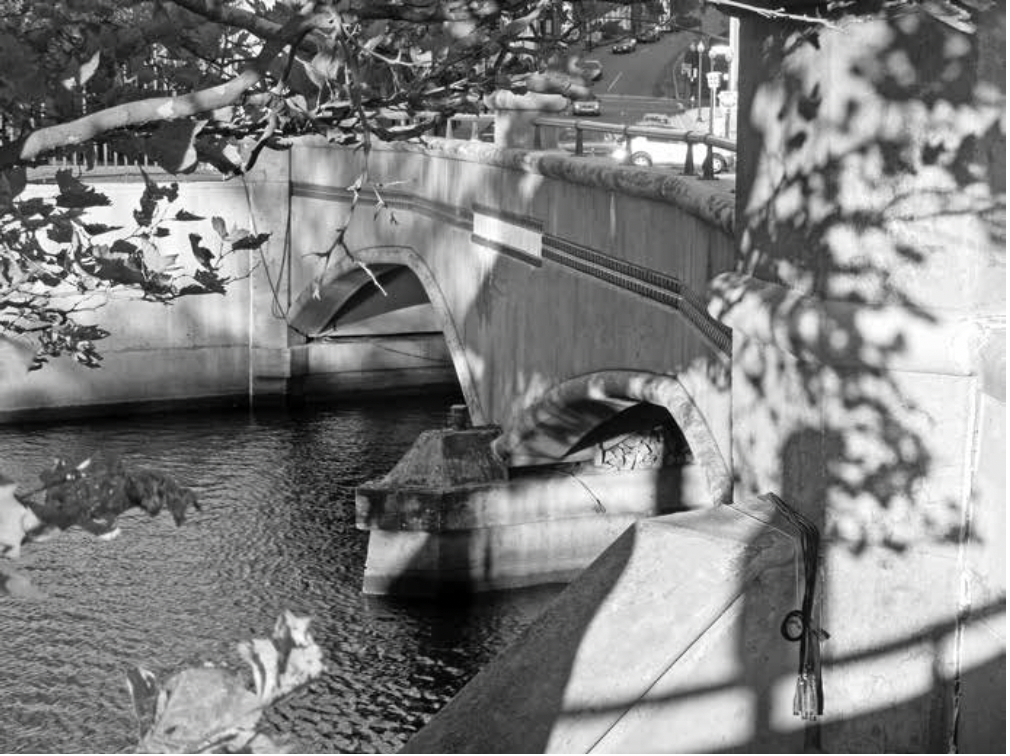
This tiny park sits at the relocated confluence of the Woonasquatucket and Moshassuck rivers forms the Providence River. The old confluence was under the old post office, some 200 yards west (left) of the new confluence. (Photo by author)

This post reprints the second half of Chapter 21, “Waterplace and WaterFire,” from Lost Providence. The Waterplace design by Bill Warner was so good that many experts were confused. It reminded me of the what several recent tour guides of London had to say about Richmond Riverside, designed by Quinlan Terry (King Charles’s favorite architect) in the middle 1980s. They said it looked as if it had been around for hundreds of years. Waterplace has caused similar confusion. Here is the rest of Chapter 21:

***

In fact, one very savvy urban theorist, James Howard Kunstler, seems to have been hoodwinked by Warner’s design into committing an error in his book Home from Nowhere, published in 1996 to follow up on his bestselling The Geography of Nowhere. Of the new waterfront, he writes:

Finally, in 1993, the state of Rhode Island liberated the little Woonasquatucket River, which had been decked over by a six-lane highway in the 1950s. Its fine granite embankments with pedestrian paths, dating from the nineteenth century, remained intact.

Leaving aside the minor mistake of inflating the river decking into a “six-lane highway,” Kunstler’s description of embankments less than a decade old as “dating from the nineteenth century” demonstrates the beauty of the River Relocation Project far beyond the abundant praise of mere awards and prizes, even from the White House, which has honored the waterfront. The possibility exists that Kunstler, who coined the brilliant word crudscape to describe suburban strip development, was pulling his readers’ legs by purposely misconstruing the age of the embankments.

Perhaps, to be generous, a similar excuse may be made for River Relocation winning the silver medal in the 2003 Bruner Awards, which recognize civic cooperation in the creation and use of urban space. River Relocation involved the full range of public, private and institutional organizations working together over the span of a quarter century to relocate, revitalize and reuse an abandoned trio of downtown rivers. To piggyback a beautification project on top of a transportation-infrastructure project was an achievement of Promethean creativity that continues to revitalize the city and the state. This project got the Silver medal. The Gold medal went to a Los Angeles charter school in a vacant, inner-city mini-mall. Did its students invent a new form of penicillin? Who won the Bronze? God?

River walks along the Woonasquatucket River, supposedly a century old and discovered when an old highway was removed, were actually completed in 1996. (Robert Magina)

During the final year of building the park, on my way to work from my apartment in Benefit Street or on postprandial excursions by foot with dinner guests – a sort of forced march of the captive audience led by Dr. Downtown (my journalistic nickname) – I would visit Waterplace to view the latest wrinkles in its construction. When it was completed I would venture down on a weekend evening and sequester myself just beyond the passageway under the pedestrian bridge east of the basin and listen to strollers emerging from under the span, all of whom would express astonishment. “This is not Providence, this is Paris,” they’d say, or, “This is Venice.” I heard it again and again.

To the magnificence of the waterfront may be attributed much of the popularity of WaterFire Providence. WaterFire is an art installation by Providence artist Barnaby Evans, the first of which was lit on New Year’s Eve in 1994, the year that Waterplace Park was completed. Two years after its first lighting, WaterFire was relit for an international conference of sculptors. Since then, it has grown to a dozen or more events annually, spaced every two weeks or so from May through October, with an average attendance of over forty thousand per lighting.

The events consist of up to one hundred braziers lined up mid-channel, their cedar and pine logs stoked by volunteers, dressed in black, plying black boats up and down the channels all evening long, from Waterplace Park to the (new) Crawford Street Bridge. Amplifiers hidden along the embankments play classical, operatic and traditional music from a range of cultures around the world. Food, art, music and ballroom dancing are featured nearby. WaterFire has raised the global visibility of Providence beyond that of the waterfront itself, but its setting along such a beautiful, intimate waterfront is the key ingredient of WaterFire’s success.

For years, I have told anyone who would listen that “I cover the waterfront.” Few have attended as many WaterFires as this correspondent. The mixture of water and fire, music and serenity, people and buildings has no parallel. I often see Barnaby Evans there, walking up and down the embankments, putting out the “fires,” so to speak, that inevitably arise in conducting a complicated event. I call him “Generalissimo.” I would estimate that my own attendance at WaterFire averages upward of ten a year, or maybe two hundred since 1994. When I first met my wife, she googled me, and found an essay I wrote in the late 1990s called “Sex and WaterFire.” It read in part:

Many have noticed that WaterFire turns the Providence waterfront into an Italian piazza, where people sit and walk and talk and watch others sitting, walking, talking, and watching. Romance suffuses the evening along with the aromatic smoke. After most of the crowds have gone home, after the crush on the river walks subsides at midnight, there still remains a devoted throng of quiet lovers enthralled by each other and the fires – lost in each other’s eyes or gazing together over the city skyline. These souls, for whom WaterFire is the cheapest date in the state, the stage for grand passion, or some delicious thing in between, reflect the work of art at its most profound intensity, not to mention its most intense profundity.

Visitors to a WaterFire event couple up along the Woonasquatuckert River (richardbenjamin.com)

So, yes, WaterFire may be an interesting metaphor for the various mixtures that stoke human combustion. but none of it would be imaginable without its sensual setting.

Few cities have the cozy rivers that WaterFire requires to achieve its greatest subtleties of aesthetic and symbolic resonance. Many cities have a wealth of carnivals, recurring festivals and other “programmed” events that bring hundreds and even thousands to their downtowns. New York, Boston, Chicago and San Francisco mix sizable populations and an abundance of tourist attractions to create a tourist mecca. Providence, whose population has stabilized after decades of decline, relies on its beauty to hook tourists and on WaterFire to reel them in. The event arose in the nick of time, because WaterFire counteracts the waterfront’s modern architecture. It enforces congeniality on what might otherwise be the waterfront that shot itself in the foot.

***

The first segment of Chapter  22, “The Downcity Plan,” will appear in the next blog post. The three following photos are from WaterFire, James Turner, and anonymous.)

Posted in Architecture, Lost Providence | Tagged , , , , , | 4 Comments

Waterplace and WaterFire

Downtown Providence as seen from northeast, from a spot on College Hill. For some reason, its skyline, which is best seen from the east, is nowhere pictured as viewed from the top of College Street on College Hill. Perhaps because the view of the Industrial Trust is obscured. (photo by N. Millard)

***

Editor’s note: Here this blog resumes republication of chapters from Lost Providence, published in  in 2017. I took a break from that series in order to write about pressing new matters. At that point I had published chapters 15-20, from Part II. I had decided not to republish Part I of the book. I may change my mind at a later date, but I should leave new readers with some reason to buy the book, right!  I resume today with the first half of Chapter 21, “Waterplace and WaterFire.” Please excuse the absence of this editor’s note in last night’s post. WordPress forced me to switch from the effective WordPress app to something called Jetpack, which was a train wreck in progress. I am still working with their chat people to get it fixed. Wish me luck! Here is the first half of that chapter:

***

The encirclement of Waterplace Park by sterile modernism terribly degrades the experience of visiting the park, but objectivity requires admitting that in one sense even these buildings serve a useful purpose (aside from housing people and their activities). In surrounding the park with their bulk and height, they provide it with “walls” that transform the park into the sort of outdoor living room that best defines public space in a city. This creates the sense of enclosure that people crave in a civic square.

But even this service might have been inadequate to the needs of the park as a public space were it not for the extraordinarily attractive infrastructure designed by [the late] Bill Warner [The Rhode Island architect and planner hired by the state DOT to design the city’s new waterfront]. The soft edges of the pond; the many ledges to sit on; the rusticated granite abutments salvaged from the old embankments; the cobblestone pavements; the old and new stone of the walls between the multiple levels of walkways; the gentle arcs of the classically inspired bridges flanked by arched openings to passageways carrying river walks beneath twin pedestrian spans; the stylish and often witty embellishment of bollards, lampposts, tree grates and railings lining the rivers, walkways and parks – all of these humanist features forge both a conscious and an unconscious simpatico among the project, its buildings and the people who stroll amid its precincts.

Steeple Street Bridge with its array of curves. (Photo by author)

These features serve as a saving grace at Waterplace Park, since they form an aesthetic bulwark against the glass-and-steel chill of the buildings that make up its outdoor room. The charm of the beauty that we walk by and see close up overwhelms the sterility of the buildings that occupy that western section of the waterfront. The “deep structure” of infrastructure softens the superstructure of Waterplace’s architectural build-out. It ties the two sections of the riverfront together, to the advantage of both. All these elements that save the bacon of the modernist western riverfront serve to lift its more traditional southern stretches to a degree of beauty unknown in contemporary waterfront redevelopment around the world.

Unlike the waterfront’s stretch along the Woonasquatucket, its stretch along the Providence sits between parts of the city fully built up for many years. Heading south from the confluence, a row of historic institutional and academic buildings along the east embankment, including Market House, heads into Memorial Park, whose central feature is the World War I monument by Paul Cret, relocated from Suicide Circle. The buildings that create the “room” of architecture around Memorial Park are Market House (1773); RISD’s College Edifice (1936); Providence County Superior Court (1933), with its cupola and its gabled wings climbing up College Hill; and the commercial buildings down South Main Street, starting with the counting house with the baroque ogee gable that was originally designed as his own residence by Joseph Brown in 1774, and concluding with the domed Old Stone Bank (1898) and its neighbor, the Benoni-Cooke House (1828).

Old Stone Bank building on South Main Street, seen from Memorial Park. (Carol M. Highsmith)

The panorama of these buildings amply displays the symphonic aspirations of classical brick. As an accomplishment of two centuries of creative architectural craft, the cityscape of College Hill is downright inspirational. The clunker at its southernmost terminus, Old Stone Square, is insufficiently obnoxious to destroy the view. The building is tremendously obnoxious, but not enough so to ruin the masterpiece of its setting.

It is a setting that looks across the river to downtown’s Financial District, a crescendo of new and old towers that epitomizes what a city skyline should look like. This skyline has been remarkably stable, its last tower arising three decades ago, the Fleet Center – a postmodern building whose stepped gable is said to pay tribute to the Industrial Trust “Superman” Building (1928). Joined by the city’s first high-rise, the Banigan Building (ten stories, completed in 1896), the Turk’s Head Building (seventeen stories, 1913) and the Old Hospital Trust Building (eleven stories, 1919), the skyline’s modernist contributions are conservative, upstanding fellows that do their duty, contributing to the civic crescendo to the best of their ability, which reflects modern architecture at the utmost of its potential for achievement. They are the Textron Building (twenty-three stories, 1969) and the Hospital Trust Tower (thirty stories, 1974). The Textron’s windows are deeply recessed into a concrete-aggregate grid that rises with more solidity than the seemingly insubstantial glass and travertine of the Hospital Trust, which looks as if a stiff breeze could push it over. Yet both contribute admirably to the skyline – far more so, however, as seen from College Hill or downriver than from Kennedy Plaza or Waterplace Park. From the latter angles, the skyline seems less to lift the heart than to toe the line of march. (Oddly enough, it is this less-appealing angle that seems to enchant most of the city’s iconographers.)

Providence skyline as viewed from the east, at Memorial Park. (Photographer unknown)

Although the Providence River stretch of the waterfront runs through a mixed architectural environment of traditional and contemporary buildings, both the immediate vicinity and wider context are dominated by historical buildings. Thus the generally traditional elements of Warner’s waterfront design reinforce rather than undermine the dominant theme of the city, of diversity amid unity. It is very important to keep in mind that innovation, whether old or new, is baked into an environment in which those artists called architects paint beauty onto a canvas that evolves over generations of work, often with one building replaced by an even more attractive building. In turn, that context strengthens the allure of the waterfront infrastructure and all of its ornamental paraphernalia. Turning the pages of the several compilations of new waterfronts around the world, published over several decades by the Waterfront Center in Washington, D.C., one learns to appreciate the unique beauty of Providence’s new waterfront.

***

Editor’s note: That concludes the first half of Chapter 21, “Waterplace and WaterFire.” The next post will conclude the chapter.

Providence skyline as viewed from top of College Street.
Same view, circa 1940. Superior Court on left, RISD College Edifice on right. (Photographer unknown)
Posted in Architecture | Tagged , , , , , , , , | 7 Comments

Going for the ugly at RIPTA

Proposed new transit center at Doorance and Dyer streets. (RIPTA)

The Rhode Island Public Transit Authority has finally got with the program, or so it seems. It has apparently ditched its relatively attractive new transit hub on Dorrance Street for a plug-ugly center that checks all the boxes for what passes for the latest in contemporary architecture. Cheesy materials and even cheesier factory generated design. Look at how thin the exterior walls are. Got it.

Good work, guys! This may only be a computer generated prototype put out by RIPTA to illustrate its latest request for proposal (RFP), but the mere fact that the agency has decided to replace its more or less traditional building proposal with something like the above shows that it has bought fully into the ugly club.

My skepticism of RIPTA’s reasons for relocating its bus hub out of Kennedy Plaza remains. My doubts have been moderated until now by the enticement of a relatively attractive proposal. I still do not believe that the buses need more room to expand, because, first, there is less room to expand at the proposed center on Dorrance Street than on Kennedy Plaza. KP already has a building (and quite attractive) where the public can wait for buses or buy bus tickets. And there is no compelling reason for moving out of Kennedy Plaza in the first place. Moreover, Rhode Island is not exempt from the national trend, post-covid, of working from home rather than the office. RIPTA may need to contract rather than to expand.

RIPTA’s decision to embrace a modernist design should encourage bus riders to double down on their opposition to the proposed new hub on Dorrance. It is nothing but a way to spread around the buckets of federal covid relief funds – essentially, a scam to rob the public of needed post-pandemic services in order to give more money to designers, developers, city and state officials, public art commisars and private-sector busybodies who don’t need it.

RIPTA’s announcement of the RFP last week states that it “invites qualified and experienced entities from the private sector to submit proposals to design, build, finance, operate and maintain the Transit Center through a progressive joint development project delivery model.”

What in blazes is a “progressive joint development project delivery model”? It probably means that the agency will place such dubious goals as equity and inclusion ahead of quality and utility (not to mention beauty). Whatever it is, it sounds like a waste of public funds and a further dilution of quality in public service – in short, same old same old.

Below is the original drawing of the proposed Dorrance Street hub. It is not perfect but is much better than the newly released design and, for that matter, the usual designs for buildings that have been proposed to serve the public in recent decades, in Providence and most other places. No architect has been identified for either design, though the original design has all the earmarks of illustrations by the firm Union Studio, which is located downtown.

Illustration of the original proposal for a new transit hub on Dorrance Street. (RIPTA)
Posted in Architecture | Tagged , , , , | 11 Comments

Bringing beauty to Australia

The winning design of the “Sydney is Beautful” competition, from Sydney-based M.J. Suttie architects.

Australia has incredible nodes of beauty. It has to. It is its own continent, right? The fact that 80 percent of its population in 1820 consisted of convicts should not matter in a nation, or rather a British colony, founded by Britain as place to receive transported prisoners from its crowded gaols – that should not matter one whit. On my bucket list is to read Fatal Shore, Robert Hughes’s epic history of Australia’s founding (628 pages).

I recall a photo from Street Design (2013) by Victor Dover and John Massengale of Centre Place, a street or alley in Melbourne that gripped me. A shot of Collins Street in 1950, of which I wrote in 2014 (“Heritage thought experiment“), is also terribly evocative, and makes me yearn for a trip to Melbourne. Same, I assume, with other cities in the land down under.

The National Museum of Australia. (historyhit.com)

But then there is an article, “10 of the Best Historical Sites and Heritage Locations in Australia,” which includes the National Museum of Australia, which looks like a military bunker in an earthquake. The National Museum of Australia! C’mon, guys! This is all too typical of such articles. And most of the other sites, including several prisons, don’t seem to be located in historic districts, though I could be mistaken about some of them. And no historic districts are listed in the article, either.

Recently, however, an organization called Street Level Australia held a competition to reimagine a district in Sydney called Woolloomooloo. (Wow! Woonsocket wants to hold your beer!) Street Level Australia was founded by Milly Main and is dedicated to building new places of beauty in Australia’s cities and towns. Its competition was covered by the Sydney Morning Herald in “From Bleak to Beauty: Grand Designs to Transform an Unloved City Block.” The competition generated submissions, 13 in all, from traditional architects half a world away; Historical Concepts, the erudite firm in Atlanta led by Andrew Cogar; Robert Adam, the famous British architect; as well as M.J. Suttie, from Sydney, whose design won the competition. On the judging panel was Richard Economakis, the celebrated professor of architecture at Notre Dame, who commended the design by Winston Grant-Preece as the “most Sydney.”

The designs pictured in the Herald article, by Michael Koziol, seem excellent to me. Let the experts decide (as indeed they already have).

Cities Minister Rob Stokes (oh! to have a “cities minister”! Um, on second thought, maybe that’s not such a good thing) presented the winners. In the words of the Herald’s Koziol, Stokes “lamented that Sydney was chosen as the set for the 1999 film The Matrix because the CBD skyline is so generic and bland. ‘We want places that are not vanilla but toward a vernacular,’ he said.”

The Matrix? Ghastly movie. Most unfortunate indeed. It tells you everything about where architecture is headed around the world today.

But, writes Koziol, “The government did not solicit, approve or oversee the competition, and there is no suggestion any of the designs will ever see the light of day.”

What?! Such a shame. Such a waste. But maybe not. It seems the competition was held in order to raise consciousnesses about whether it is still possible to build beautiful places. The attitude summarized by “They don’t build it like they used to” imprisons whole societies under the assumption that “They can’t build it like they used to” when in fact they can indeed build it like the used to: They merely need to want to build it like they used to.

Perhaps, in time, under the gentle persuasion of Milly Main and her organization, the cities minister, the Melbourne government, and the Australian continent will come to its senses and build Woolloomooloo and many other places down under as places of beauty. What an idea!

(“Heritage thought experiment,” my 2014 blog post linked above, includes a long passage explaining why this situation prevails to this day.)

This entry from Winston Grant-Preece was judged the “most Sydney” of all the ideas. (Herald)
Design by U.K.-based ADAM Architecture received commendation. (Herald)
Design by Atlanta-based Historical Concepts also received a commendation. (Herald)
Posted in Architects, Architecture | Tagged , , , , , , , , , , , , | 2 Comments

Video: Industrial Trust Bldg.

A train zooms through Providence, with the Industrial Trust building in the background. (YouTube)

Here is a video produced, apparently seven years ago, by Matthew Bird, a videographer who hails from the Rhode Island School of Design. For those of us who love the Industrial Trust Bank Building, including many who roll our eyes when it is referred to as the Superman Building (it is not), it is a fascinating look at the history of the building that has been the state’s tallest since its completion in 1928.

The video is excellent, witty and a joy to watch. Except, perhaps, for one thing.

I have a good friend who has studied the Industrial Trust very closely and who disagrees with Bird’s contention that the building was not erected to serve as a mooring station for airships. Noah believes it was. Airships were thought to be the future when the Industrial Trust was under construction in the mid-1920s. Charles Lindbergh did not cross the Atlantic until the year before its completion. Airships were at that time a genuine rival to commercial shipping for freight and passengers. Of course, all that ended with the Hindenberg zeppelin disaster in 1937, nine years after the ITBB opened in 1928. Jump forward to recent years. The upper stories of the building were redesigned within the past two decades, I believe. My friend Noah Schwartz says the upper stories featured interior design that reflected the interiors of a commercial airship, the British airship B-1, but no longer. He says the Industrial Trust has other structural and mechanical features of any building contemplating a role as an airship docking station. But this is very difficult to confirm with the building now being renovated as apartments.

You can read Noah’s rebuttal to Matthew Bird’s comments, from the video he made, about the docking station issue at the end of the comments section at the site inhabited by the YouTube video.

Whatever the truth of the legend of airship moorings atop the building, I hope that its current renovation goes forward and that the Industrial Trust – which has been empty since 2013 – will come to life again and bring more life to downtown Providence.

Ad from a takeout section of the Providence Journal in 1928. Another ad is just below. (Journal)

Posted in Architecture, Video | Tagged , , , , , | 5 Comments

Pentreath, Driehaus laureate

A house designed by Ben Pentreath in Moscow. (Ben Pentreath Ltd.)

I believe I first heard of architect Ben Pentreath from a video called “Three Classicists” in which he, along with George Saumarez Smith, and Francis Terry drew, in 2010, a classical scene on the walls of the Kowalski Gallery, in London. It was videotaped in stop action, or time-lapse, shrinking the time of drawing to about three minutes. They first remove some bad art from the gallery wall, and when finished drawing they chat together while someone paints over their drawing. The architects are accompanied by a cellist.

Well, Ben Pentreath has just been awarded the Richard H. Driehaus Prize for 2023. The jury citation reads: “As a luminary within a rising generation of architects, his work encompasses what the prize celebrates most: beauty, durability and commitment to place.”

All three architects in the “Three Classicists” video are among the young architects associated with classicist Quinlan Terry (Francis Terry is his son), who are now among the leading classical architects in Britain. Pentreath, no doubt along with his two fellows, has had commissions at Poundbury, the new classical town founded by Prince Charles (now King Charles III).

The Pentreath citation continues:

The designs unerringly establish a sense of place, whether new or in the transformation of the existing. The durable construction, arrangement of interior spaces to take advantage of natural lighting and ventilation and placement and siting in mixed-use, walkable cities and towns and villages offer alternatives to the current notions of green architecture which typically rely solely on technological solutions.

Not to mention that the green architecture is almost uniformly ugly.

Pentreath is to be congratulated for his prize (which brings $200,000, as compared with a $100,000 award for the notorious Pritzker Prize). Also to be congratulated is this year’s winner of the Henry Hope Reed Award ($50,000), which was bestowed by the Notre Dame jury on Adele Chatfield-Taylor, who directed the American Academy in Rome for 25 years. She has been steadfast in her stewardship of preservation and the classical revival. I wrote a paean to her work and her beauty before she spoke at the Providence Preservation Society in 2016. My devilish post is here.

Also to be congratuated and, in addition, blessed are the School of Architecture at the University of Notre Dame, which has continued to bestow the Driehaus Prize in the wake of the death, in 2021, of the late Mr. Driehaus. Whether the Driehaus Foundation is behind this continuation, or the School of Architecture has taken up its financial as well as its administrative burden, I have no idea. Bless them both. Bless them all.

My 2015 post on the “Three Classicists,” mentioned also a website founded by Charleston, S.C., classicists Jenny Bevan and Christopher Liberatos. I signed up for their “Vision for Civic Conservation.” It is still there and you can still sign up, but whether there has been action on the site I am not sure. It’s worth checking out, at least for the engaging videos in its collection. Visit the site in celebration of Ben Pentreath and Adele Chatfield-Taylor.

The American Academy in Rome, designed by McKim, Mead & White.

Posted in Architecture | Tagged , , , , , , , , | 6 Comments

Professor Curl’s revenge

1933 competition entry by Mies van der Rohe for new Reichsbank. (Stevens Curl collection)

Since the publication of his masterly evisceration of modernist architecture in 2018, Making Dystopia: The Strange Rise and Survival of Architectural Barbarism, James Stevens Curl has been attacked relentlessly by the British architectural establishment. He has responded with considerable verve and vivaciousness to these vicious attacks, almost all of which demonstrate that the critics have not read or understood his book. Now he has issued a blast that should obliterate them all, published recently in The Critic.

Sibyl Moholy-Nagy as actress in Weimar. (Places)

This blast, “Hitler’s Revenge: The RIBA Journal confuses architectural history,” takes its title from the title of a much earlier blast against modern architecture, itself entitled “Hitler’s Revenge,” published in the Sept/Oct. 1968, issue of the journal Art in America. Its author, Sybil Moholy-Nagy, was an actress who married the Hungarian painter, photographer and professor at the modernist Bauhaus school, László Moholy-Nagy. He suppressed his wife’s acting career, and after emigrating to America, she took up architectural criticism, and wrote as a longtime insider about the Bauhauslers she knew so well. She is perhaps most notable for her essay “Hitler’s Revenge.” (Places journal reprinted this essay in 2015)

Moholy-Nagy compares her husband’s emigré colleagues, mostly refugees from the Bauhaus, which was (not!) closed by the Nazis and who ended up in America, to the legend of Johnny Appleseed, planting modern architecture in this innocent nation. She demonstrates that these bastards, led by Ludwig Mies van der Rohe, a former director of the Bauhaus, were truly bastardly. They aborted then-current trends in American architecture, which had finally broken from its dependence on European architecture to embrace an eclectic range of styles built upon America’s invention of the skyscraper. The Woolworth Building (1902) was a good example of this style.

Moholy-Nagy wrote that modernist Functionalism was

recoined by eager American converts as ‘The International Style,’”  and effectively destroyed what was “the most important era in American public architecture … [when, for] the first time in its history, [the US] was on the way” towards an original architectural expression from which “the eggshells of historical styles” had been dropped, and what emerged was a “native delight in articulation, ornamental detail and terminating form, born from steel and concrete.

Stevens Curl, in his book and his article, lays out not only the misdeeds of the Bauhaus school and its Johnnies, but the details of their relationship to the Nazi party and how American modernists – especially the architect, influencer and Nazi acolyte Philip Johnson – were able to invert that relationship into the absurd charge that tradition in American architecture is tainted by Hitler’s preference for traditional architecture over modern architecture. In fact, the truth is that Miës (Stevens Curl returns the original diæresis over the “e”, which Mies dropped after arriving in America) attempted to persuade Hitler, through Goebbels, that modernism would be an appropriate stylistic template for the Third Reich. But Hitler preferred to stick with architecture that had signified authority (plus dignity and beauty) for centuries. Still, Hitler encouraged modernism for factories, the Autobahn and other utilitarian architecture.

Stevens Curl adroitly summarizes modernism’s malign impact on America by describing one of its greatest crimes: the demolition of Pennsyvania Station, whose proposed resurrection was discussed at a forum at the Cooper Union last night. He writes:

Gropius dismissed what Sibyl Moholy-Nagy called “the most important era in American public architecture … with a uniquely American profile.” Indeed, he insultingly referred to that great era as “a particularly insignificant period in American architectural history, … a case of pseudotradition.” He was referring then especially to the Pennsylvania Railway-Station, the masterpiece of the distinguished American architects, McKim, Mead & White, built 1902-11, the demolition of which (1963-5) was certainly a low point in American cultural life, and America is the poorer for its loss. I have had the misfortune to find myself in the subterranean rat-run of what is now called Penn Station, a hell on earth: if you want to see Modernism as it really is, go there. That any nation could destroy a Sublime masterpiece of Classical architecture and rational planning as great as McKim, Mead & White’s superb American creation, and then make a reality that is wholly dystopian, unpleasant, disorientating, and truly vile, suggests not only a massive failure of national self-confidence, but a pathetic eagerness to embrace the assertions, dogmas, and demands of unscrupulous leaders of a Cult from which reason, sensibility, and appreciation of beauty are entirely absent.

Stevens Curl has the goods on Miës, Walter Gropius and Le Corbusier, the holy trinity of the modernist cult. They were scoundrels, and the architecture they exported to America has seeded this nation and the world with ugliness. The mission of modern architecture – even if most modernists are ignorant of it – is to use its allegedly utilitarian sterility to transform Americans into cogs and America into a machine (Corbusier’s hatred of street life and his term for housing – “machines for living” – betray this intent) with a tendency toward authoritarianism.

We see these trends in America today in efforts to suppress freedom of speech, pervert American education at every level (in part via modernist architecture schools) and other issues. You need not take sides on these issues to understand the anxiety they sow. Stevens Curl and Moholoy Nagy have bracketed modern architectural history with accurate descriptions of architecture as it is so widely practiced today. That is why the architectural establishment, and especially the supposedly neutral Royal Institute of British Architects, hate James Stevens Curl. But they can’t get away from Sibyl Moholy Nagy.

Left: Proclamation listing Ludwig Mies van der Rohe among supporters of Hitler. Right: Mies closes his letter resigning from the Prussian Academy of Arts with “Heil Hitler!” ((Völkischer Beobachter [18 August 1934] and Akademie der Künste, Berlin, Archiv der Preußischen Akademie der Künste, Pr.AdK 1106 p.37))
Posted in Architecture | Tagged , , , , , , , , , , | 6 Comments

Attend Penn StationPalooza!

Next Thursday, Jan. 26, the three main alternative proposals for restoring some sense of dignity to Pennsylvania Station will duke it out at a forum to be held from 6:30 to 8:30 p.m.. in the Great Hall of Cooper Union for the Advancement of Science & Art’s Foundation Building.

The event is sponsored by ReThinkNYC and will pit the architect Vishaan Chakrabarti of the Practice for Architecture & Urbanism (PAU), who wants to refashion Madison Square Garden into a big skylight to enlighten the station; architect Alexandros Washburn, a former city design czar, representing the Grand Penn Community Alliance, who proposes to replace MSG (whose lease is up in a year) with a grand classical space inspired by the old Penn Station; and architect Richard Cameron, architect of Atelier & Co., where he originated the idea of rebuilding Penn Station according to the design of Charles Follen McKim, of McKim, Mead & White, in 1910.

That station was torn down in 1963-’67, an act of cultural vandalism that inspired the architectural historian Vincent Scully to declare, “We entered the city like gods; now, we scurry in like rats.”

The architectural historian Lorraine B. Diehl, author of The Late, Great Pennsylvania Station, will also lecture on the original building’s history.

Cooper Union’s Foundation Building is at 7 East 7th St. Free tickets for either an in-person seat or registration for the Zoom presentation of this three-ring Penn StationPalooza can be reserved at this ReThinkNYC link. Scroll to the bottom. Samuel Turvey, of ReThinkNYC, is leading this forum. You may find my numerous posts on this topic by typing “penn brussat” into Google.

As readers of this blog well know, I favor the rebuild option, which, if accomplished, would enable New Yorkers and their visitors to “enter the city like gods,” not like “rats.” Bringing beauty back to America requires a project of this sort. “Make no small plans,” wrote architect Daniel Burnham, who led the 1893 World’s Columbian Exposition – which led to the City Beautiful Movement, which created the civic architecture that led to the American Renaissance. If we want to bring beauty back into our cities and towns, we must build an example that will impress the entire world – and such an example would be to rebuild Penn Station.

My second preference is the proposal by Alexandros Washburn, which is a late-comer to the sweepstakes, and whose proposal is tremendously beautiful. It might be less expensive, but what it lacks is the Penn Station Waiting Room, which was like stepping inside the anteroom of God, and achievable only by rebuilding the old station, which is eminently feasible, both to build and to finance.

Please attend this forum. Kathy Hochul, the governor of New York State who holds the future of New York City in her hands, needs to know how much New York and indeed the nation and the world want this to happen.

Again, to attend this event, next Thursday, Jan. 26, click here.

Posted in Architecture, Development | Tagged , , , , , , , , | 29 Comments

Britain embraces tradition

Buckingham Palace, official residence of King Charles III. (Architectural Digest)

Dezeen reports that, in Britain, the Tory government’s minister for housing, Michael Gove, has thrown his support behind the idea of a university-level school for classical and traditional architecture and urbanism. He even wrote the foreward to a private think-tank paper backing the proposed university. If built – as seems likely – it would be the first of its kind in the kingdom in years.

King Charles III, former Prince of Wales.

The move comes at what some consider an awkward moment in British history. The former prince, now King Charles III, has for years been an outspoken advocate of traditional architecture and a sharp critic of modernist architecture. Britons wonder whether, in the wake of the death of his mother, Queen Elizabeth II, will the king stand up for tradition?

British monarchs are not supposed to express opinions. That’s Gove’s job, and it is a blessing that he seems to be doing it. Gove’s foreward for “A School of Place” states:

We must do all we can to ensure a new generation of built environment professionals are armed with the best skills and techniques possible to enable them to go out and build beautiful, sustainable places in which people and communities can thrive.

Those lines will be properly interpreted by both modernists and traditionalists as an attack on modernist placemaking, and will surely irk modernists, who include most of the staff of Dezeen. The government paper itself is by a think tank called Policy Exchange, and written by an architect named Ike Ijeh. It further states:

The new School of Place will seek to wholeheartedly revive traditional architecture from the annals of obscurity to which contemporary architectural education has unfairly consigned it. It will further make rigorous attempts to ensure that none of the institutional or professional bias that can be said to have been waged against classicism or traditionalism is reflected in either its syllabus or curriculum.

Michael Gove, Minister of Housing

This quote, among others, is sure to irk modernist architects and most of Dezeen’s staff, who are worker bees carrying out the institutional bias of the architectural establishment. Its initial reaction against Gove’s support for the creation of what he refers to as “beautiful places” calls to mind the brouhaha that accompanied the foundation of a government commission several years ago, the Building Better Building Beautiful Commission, whose purpose was to devise a new development structure for Britain that would incentivise developers to build with an eye toward beauty. It was to bring more input from communities into the process, and was initially chaired by the noted conservative philosopher Roger Scruton. He was sacked after a scurrilous supposed “interview” of Scruton that was later repudiated by its editor, leading to the subsequent reappointment of Scruton, who led the commission to produce a government paper called “Living With Beauty.” Scruton died in 2020, but his spirit seems to have been very much behind “A School of Place.”

The paper’s author, Ijeh, seems to understand fully and is willing to confront the biased attitudes of the architectural establishment. But he calls for the school to teach architecture outside the realm of classicism and tradition – though presumably not modernism; maybe he is thinking of Art Deco or the work of such outliers as Antoni Gaudi. In any event, he states:

Such diplomacy is necessary because the unfortunate fact remains that any perceived political bias towards traditionalism would provoke an immediate and hostile reaction from many within the architectural community, as seen by the hysterical response in some architectural circles to the government’s inauguration of the Building Beautiful Building Better Commission.

He is certainly correct, and perhaps wise to suggest a degree of diplomacy in the curriculum of the proposed school. But please, let him not go overboard.

The situation of King Charles may be part of his thinking. Charles may be reluctant to again take up the gauntlet of his princely crusade for beauty as king. But the forces pressing Charles to keep mum on architecture and planning are, I suspect, purposely misinterpreting the custom of non-intervention by the monarch in politics to dissuade him from intervention in the culture, which, I believe, is another matter altogether.

It is fair to ask whether a British king must stand mute and helpless, forced to say and do nothing as his dominion falters under the sustained attack of cultural warriors for whom Britain is the enemy. How can this be so?

Most Britons would have no problem with Charles’s taking up his crusade in favor of bringing beauty back to the cities, towns and villages of Great Britain.

Posted in Architecture | Tagged , , , , , | 6 Comments

Ancient progress in concrete

The Pantheon, in Rome, is thought to be almost 2,000 years old. (getyourguide.com)

A number of publications have run stories describing the recent discovery of how the ancient Romans made their concrete structures last so long. For example, the dome of the Pantheon, in Rome, survives intact to this day. It is still the world’s largest dome of unreinforced concrete. And Roman aqueducts remain standing, some still transporting water slightly downhill over long distances.

Researchers found that Roman concrete contained small white chunks of lime known as lime clasts, which were treated with slaked lime to produce quicklime, which had the quality of curing and setting more quickly, thus reducing production times. But longstanding theory was that the existence of lime clasts in the concrete at many Roman sites was the result error arising from poor quality control. Researcher Admir Masic of MIT thought this might be a bit off. He told Michelle Starr of Science Alert:

The idea that the presence of these lime clasts was simply attributed to low quality control always bothered me. If the Romans put so much effort into making an outstanding construction material, following all of the detailed recipes that had been optimized over the course of many centuries, why would they put so little effort into ensuring the production of a well-mixed final product? There has to be more to this story.

After further research, his team at MIT discovered the lime clasts were a feature rather than a bug. The lime clasts also have the property of naturally expanding to fill and repair cracks that emerge in concrete over time.

At first I didn’t think this should be of any interest to me. Is it surprising that the Romans had construction methods superior to those of our own age of fake expertise? Hardly. The Romans were real people, with serious ideas on how things were and how they should be. But it occurred to me that this was exactly why we should care how they made concrete.

The key is in Masic’s use of the phrase “detailed recipes that had been optimized over the course of many centuries.” What today is “optimized” over the course of many centuries? Not much. The iPhone? After 14 model series, they still drive us crazy with their ineptitude. No. Instead of trial and error leading over time to higher quality of materials and production techniques, we seek rapid eyeblink advancements, usually assisted digitally, without the long slog of productive endeavor. To sneer at the past and its products is the big idea now. Quality control? What a concept! Planned obsolescence is more like it these days.

You can see this most directly in works of architecture. In architecture, as this discovery shows, the Romans got the big things and the little things right. Their buildings incorporated standards to ensure consistent beauty, and their concrete hardened more quickly. Pop quiz: Which is the big thing and which is the little thing? Answer: It was a trick question. Both are vital to ensuring quality. Frank Gehry’s mickled up pieces of paper don’t quite cut the mustard. Extra credit: Will today’s construction managers incorporate the techniques of Rome in modern concrete manufacture? Will they even bother to make themselves aware of these “advances”?

The aqueduct at the Pont du Gard, near Nimes, France, or 12 miles from its source. (USGS.gov)
Posted in Architecture, Architecture History | Tagged , , , , , | 10 Comments