Let’s vote on Penn Station

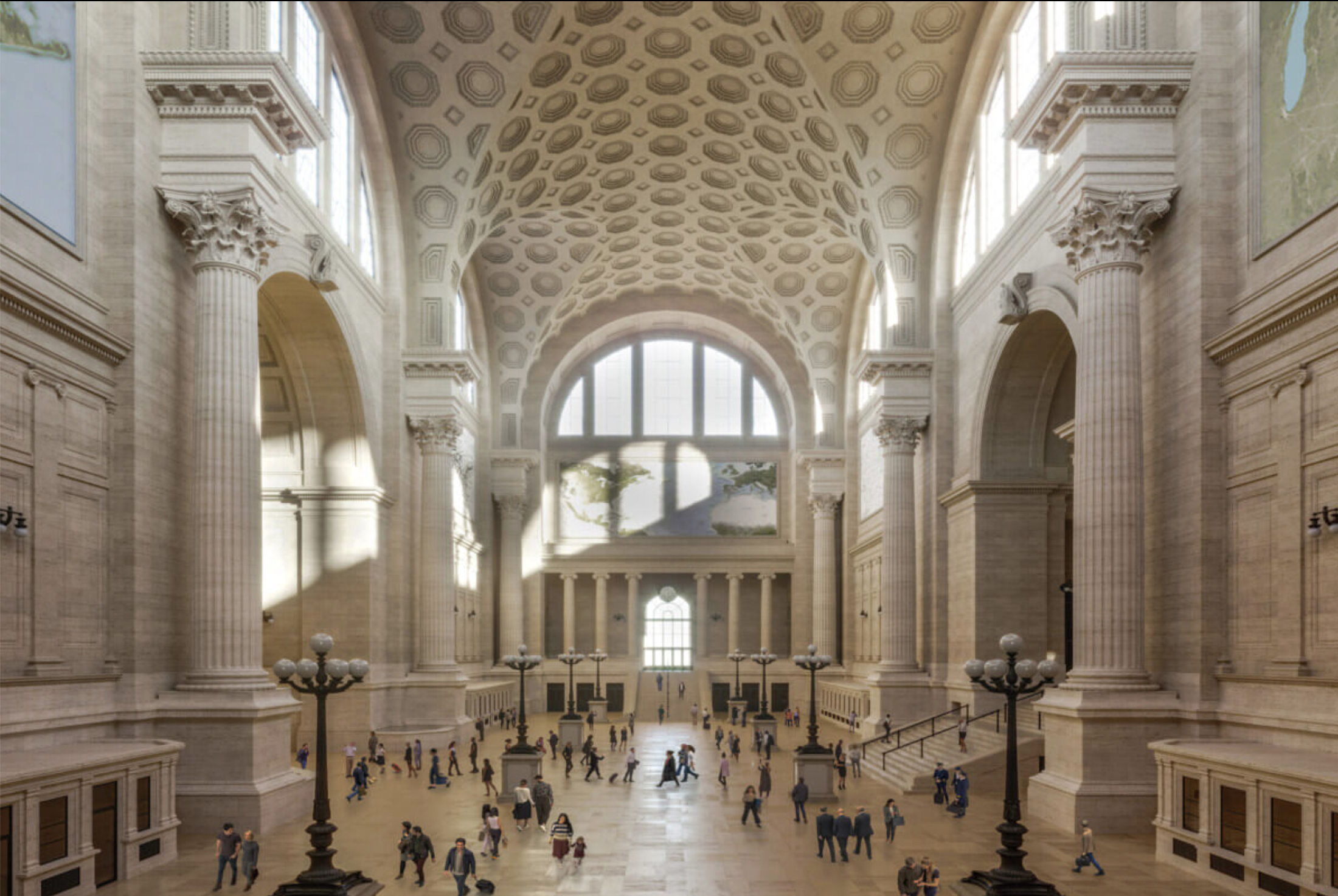
The waiting room of a rebuilt Pennsylvania Station. (Nova Concepts/courtesy of Atelier & Co.)

Rebuilding Pennsylvania Station, built in 1910 and demolished in 1963, is the single act that can best help bring beauty in architecture back to the United States and the rest of the world.

It would directly boost the beauty of the city itself, and as an arrival point for millions of visitors weekly, its accomplishment would inspire cities around the nation and the world to build their own versions of civic beauty. Think of the City Beautiful Movement that was inspired by the 1893 World’s Columbian Exposition, whose Beaux-Arts design inspired developments over a span of decades that remain the most beautiful parts of many cities in the U.S. and globally.

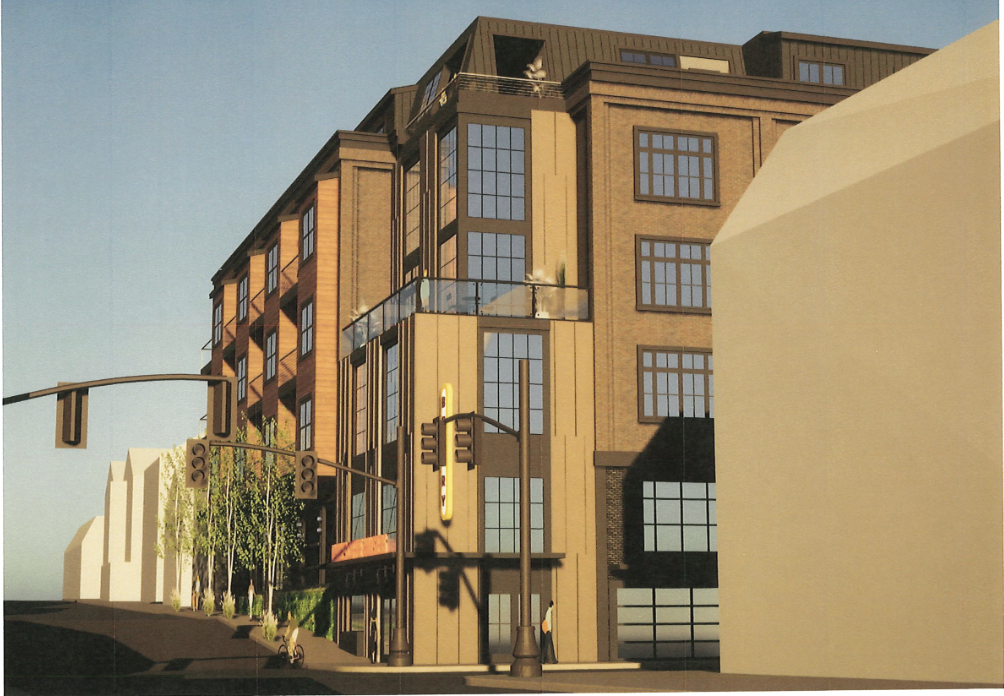
It is understood that this will be a gigantic undertaking. N.Y. Governor Kathy Hochul has declared that her plan to surround the station with tall office towers, while demolishing the neighborhoods needed to build those buildings, is off the table. Some observers doubt the honesty of her cancellation of the plan (known as the GPP), but the fact of her announcement can take on a life of its own, combined with the post-covid wreckage of the market for office space done by private “work at home” policies.

Now it is time to make sure that New York City authorities give the boot to Madison Square Garden, which pays no taxes, squats atop the station and inhibits any real plan to renovate it, let alone rebuild it as originally designed by McKim, Mead & White. The deal that extended MSG’s lease expired in June, and a new lease of just three years – time enough for MSG to vamoose – is to be voted upon soon.

John Massengale, the chairman of CNU/NYC, the local chapter of the Congress for the New Urbanism, and a friend of many years through my role on the board of the Institute of Classical Architecture, has summed up comprehensively and elegantly the status of the project to Rebuild Penn Station, as it has been called. This plan was conceived and carried forward by architect Richard Cameron of Atelier & Co., in NYC, now with the assistance of ReThinkNYC.com and its chairman, Sam Turvey.

The plan to rebuild Penn Station in its original design, with modifications to account for different engineering and commercial conditions that prevail today, is joined by another classical plan to renovate the station in a way that would be quite satisfying to most of a classical bent. It has been proposed by Alexandros Washburn for the Grand Penn Community Alliance. His plan would not rebuild the old station, but would create a train hall reminiscent of the wrought-iron begirdered hall of the original Penn, and add a classical colonnade encompassing the rest of the Penn footprint, enclosing an outdoor park inspired by the redesigned Bryant Park to the rear of the New York Public Library.

(Two other plans are totally inadequate. They are both neo-moderenist plans for minimalist renovation, one generated by former N.Y. Gov. Andrew Cuomo and offered by the state’s Metropolitan Transit Authority (MTA), and the other offered by an Italian firm, ASTM, whose allure, if any, is largely financial.)

Click here to read Massengale’s magnificent article.

Posted in Architecture | Tagged , , , , , , , , , , , , , | 16 Comments

Industrial Trust lit up again!

The Industrial Trust Bank Building lit up on Augustj 7, 2023. (photo by author)

I don’t know how long this has been going on behind my back, but it sure does make me happy. After visiting a friend this evening and driving home in the dusk down Route 95, heading south, I got off the exit to India Street and noticed that the Industrial Trust, long known (wrongly if understandably) as the Superman Building, had had its glorious amber exterior lights turned on. Their glow had been extinguished since 2013, after Bank America, its  tenant, absquatulated from the glorious Art Deco masterpiece to a chorus of boos.

People debate whether the Industrial Trust or the Rhode Island State House is the most notable building in Providence. I side with the latter, but the Supe is a genuine marvel – though less so without its beautiful exterior lighting, which emphasizes its careful massing and the shoulders that give it strength.

I have frequently called for the lights to be turned back on. I can’t recall exactly what I recommended at the time, and any number of times over the years, but I think it had something to do with how the building’s owner, David Sweetser of High Rock Development, in Boston, should be taken to Kennedy Plaza to be drawn and quartered.

I hope someone will let me know when the lights were turned on. I have not been downtown at night for a few days at least, and I would like to know when the building owner’s stay of execution went into effect.

The Industrial Trust was completed in 1928 to the design of Walker & Gillette, a firm headquarted in New York City. The developer, High Rock, and the state of Rhode Island have entered a deal to turn the building into apartment, a great idea that will help the city in every way. Maybe the new lights are part of that project. Hurray!

Posted in Architecture, Providence | Tagged , , , , , | 4 Comments

Bad advice for Wayland Sq.

Wayland Square, on the east side of College Hill. (Photo courtesty of the Providence Journal)

Wayland Square, named for Brown University’s fourth president, on land owned long ago by one of its founders, Moses Brown, is one of the most delightful neighborhoods in the city of Providence. It has fine shops and restaurants, and hundreds of elegant single-family houses, built mostly in the vicinity of 1910-1920. It’s no surprise that developers want to take every available space and build apartments.

490 Angell St., a brick apartment building in the Mediterranean style. (Photo by author)

And that might not be such a bad thing if they were inclined to model their proposals on the brick residential towers that are Wayland Square’s most notable architecture. Wayland Manor and its even more ornate neighbor, 490 Angell St., flank Wayland Avenue as it heads south into the square. How easy it would be to copy the past, the beautiful past.

Instead, developers want to give us this:

New apartment block near Wayland Square. (Will Morgan)

And that’s okay with architecture critic Will Morgan, who describes the abomination above, inflicted upon Wayland Square by architect Andrew Hausmann, of the Chicago firm Perkins & Will, as “a handsome composition with a commanding sense of presence … whose monochromatic gray facade provides an air of elegance.” He urges the developer of proposed new apartments at 128 Wayland Ave. to take a similar tack, to “push their comfort zone a little.”

That is a term that architects understand as “give the client something he is not going to like.” This is a preferred sales technique of modern architects going back to Ludwig Mies van der Rohe. The final director (1930-1933) of the modernist Bauhaus school, in Germany, said “We should treat our clients as children, not as architects.” This is what architect Hausmann has done, but he probably didn’t expect Will Morgan to give him a boost. Morgan says that the new building “could be wrapped in a metal façade or some sort of scrim echoing the red and blue colors of the vintage sign.” Huh?

.
In short, Morgan urges the architect to treat the developer as if he were a child.
.
A stroll down Wayland Avenue starting from four or five blocks north of the square reveals a number of very pleasant single-family homes erected in recent decades. They look like the traditional houses that have long characterized the neighborhood. They were designed by architects who did not treat their clients like children. Andrew Hausmann and his ilk can afford to treat their clients like children because, unlike clients who want an architect to design their own home, their clients’ future tenants have no say in what the building will look like. In all probability, the developer is a fool who wants his building to demonstrate that he is on the cutting edge … of what?
.
And why is Will Morgan giving him the thumbs up?
.
Below is an early version of the design for 128 Wayland Ave., long the home of the wonderful Wayland Bakery. Let us hope that developer Kyle Seyboth and his architect, Ed Wojcik, decline to take Will Morgan’s advice. They should make it better, not worse.
.

Early design for apartment building to replace the long-time home of Wayland Bakery. (Ed Wojcik)

Posted in Architecture, Providence | Tagged , , , , , , , | 1 Comment

Classic movies to the rescue!

“John Waters puffs out a mixed message.” Wrong decade, but no matter. (Joaquín Aldeguer)

It seems that Turner Classic Movies is at risk of being canceled. A trio of superheroes (mega movie stars and producers) has ridden to the rescue, for now, of the channel for people who like old and relatively old films, but the battles between streaming giants for audience share keeps TCM in a perpetual shadow.

I don’t know or want to know anything about the competition for audience share, which seems to me to involve too much reverence for people with minimal taste, whose need for extremely loud and tedious content seems to override the needs of those with a little more taste, at least in the minds of those who set the parameters of this battle of post-Hollywood titans.

But I do know that life will be poorer for me if I cannot have my usual fix of old movies. My patience generally dictates a cutoff at 1970. The decade beginning with that year produced an absolute minimal number of watchable films, or so it seems to me. But never mind. Nobody’s holding a gun to my head as I decide what to record on my wuddayacallit.

The best movies were produced between the early 1930s and the late 1950s. Mostly in black and white. Sometimes it seemed that every film opened with a shot of the Manhattan skyline. You could learn a lot about how people got into and out of cars during those years. That was before central consoles prevented people in the front seats from sliding over to the side of the car at the curb. Men did not rush to open the passenger door for women. Women opened their door and got out, followed by the man, who slid over and climbed out after her. The permutations of this seated dance depended upon whether the man was hot for the woman, or vice versa. Getting out first was a sort of defense mechanism to thwart the early manifestations of romance, assuming that the front seat had not already been the scene of hanky panky. Getting into a car was a different story, and here a man did always open the passenger-side door for a woman, although, depending how much in a hurry they were, the man might squeeze in first and slide under the wheel, perhaps copping a feel as the woman got in and closed the door for herself. After a while, seeing endless romances play out in the front seat (or the back of a taxi) and out on the curb, you begin to notice these things.

The lighting of cigarettes and their consumption was also an art form practiced when a man and a woman, whether in a car or indoors, had something in mind. How to deploy smoke during exhale was a subgenre of this art form. Some stars in Hollywood were better at it than others. It was less a matter of blowing smoke rings than of directing the smoke in lazy swirls into the vicinity of the other person in the scene. Equally vital was the subgenre of lighting a cigarette for oneself or another, especially for a female. So far as I know, women never had to light their own cigarettes unless they were by themselves, waiting for a man to show up and do it for them, with panache. A solitary cigarette? What’s the point? Nor was lighting a cigarette ever anything but a binary activity.

The sex play in these movies, in spite of the codes developed to thwart such menacing diversions, may or may not have been noticed or understood by those charged with enforcing these codes. But they were probably understood by audiences. The social graces displayed by the actors and actresses in these films swim together in my mind. I could never really catalogue them with any sort of rigor. No doubt others have undertaken to research and understand them for me. I am sure that, taken together, these nuances enhance the viewing pleasure for me every night without having to understand them, just like the doohickeys that line the whatchamahoogers on a length of classical architecture.

Ahh! It feels so good! Don’t stop!

Addendum: An essay about smoking in the movies, “Waiting to exhale,” by Michael Atkinson in the Feb. 7, 2022, Village Voice is definitely worth a read, but his distress at film smokers wasting his time is overwrought and ridiculous. Read it. The essay and the images by Joaquín Aldeguer are fun.

Posted in Art and design | Tagged , , , , | 2 Comments

Congress to legislate beauty!

FBI headquarters (1975) in Washington, the sort of federal building we usually get. (FBI)

Washington, D.C., should be built in a manner that seeks to exalt Americans’ reverence for the principles of our founders, as embodied in the Constitution, the Declaration of Independence, and the Bill of Rights. Congress seeks to accomplish this lofty goal for federal buildings via legislation. The two bills follow the failed effort by executive order under President Trump, which was cancelled by President Biden, who added insult to injury by illegally sacking classicists in the upper reaches of the federal bureaucracy, including members of the U.S. Commission of Fine Arts, who were ejected before their legal term limits were up.

It is likely that the two bills in the House and the Senate will fail to make it into law. But the effort is meritorious whether it succeeds or not. Mandatin classical architecture for federal buildings will cause a furor not just in Washington but among architects around the country, just as it did in 2020. Even if most of the noise comes from the bills’ opponents, the fact is that they will inevitably be seen as attacking beauty. People really yearn for something to be for. Surveys show that the public prefers classical architecture to modernist architecture by huge margins. Every time the modernists open their mouths on this issue, they score an “own goal.”

Kriston Capps’s article on the two bills at Bloomberg is a case in point. He wonders how such law would be administered, and describes a proposed courthouse in Fort Lauderdale, Fla., as “an elegant, symmetrical design for the $196 million courthouse featur[ing] fluted columns of metal and glass as well as an arcade supported by a colonnade.” It “draws on” principles of classicism with “a contemporary interpretation of Corinthian columns.” But aha! There is a drawing, the description is a lie, and what it shows (below) is far from any plausible interpretation of classicism. How should it be administered? It should be administered right into the trash can.

Design by modernist firm of SOM for courthouse in Ft. Lauderdale, Fla. (SOM)

When the modernists say they don’t want a federal thumb on the scales of beauty, what they mean is they prefer the status quo, which places a federal thumb on the scales of beauty. Except their definition of beauty is ugliness. That is where this thumb has been since 1962, when the agency in charge of federal architecture, the General Services Administration, adopted guiding principles mandating that federal courthouses and other U.S. buildings “provide visual testimony to the dignity, enterprise, vigor, and stability of the American Government.” A worthy goal, perhaps, but it has been ignored for six decades. War is Peace, Freedom is Slavery, Ugliness is Beauty, to paraphrase Orwell.

What we get is various versions of the FBI Headquarters in Washington, whose design is called Brutalism. With few exceptions, federal buildings have been designed using modern architecture, which generally features elements that cause citizens to snicker, and which certainly do not inspire respect. If you go back into the annals of architecture history, you will see that this was the idea behind modernism; and it is working.

.

The buildings that represent the American government at the local, state and federal levels have been designed for decades to undermine the values of the founders. In order to build a new society the old one must be torn down – that is the modernists’ credo. Disrespect has reached a high water mark. Appointees dedicated to promoting dysfunction in their own agencies have been chosen to run every department. Things cannot possibly get worse. But they can get worse if our leaders will not put their foot down. That is why a congressional effort to restore dignity to American architecture must go forward. The legislation offered by Rep. Jim Banks (R-Ind.) and Sen. Marco Rubio (R-Fla.) may not make into law but it is likely to stir the national conversation. That is step one, and its about time to step up.

Posted in Architecture | Tagged , , , , , | Leave a comment

Nix on new archives building

Proposed design for a new Rhode Island Archives and History Center. (Office of R.I. Secy. of State)

By proposing to build itself a new headquarters, the Rhode Island State Archives has revealed itself capable of the self-aggrandizement conventional in most government bureaucracies. Granted, there has never before been a designated state archives building in Rhode Island.

The state archives has been housed in several locations over the centuries (once at the bottom of a pond for safekeeping from the British, if my memory serves), most recently in an abominably tedious office building at 33 Broad St., known colloquially as the Black & Blue Building, in which it rents space from Paolino Properties at $248,000 a year. For all its dour appearance, at least it is not in a flood plain, as was its predecessor since 1990, until 2020, at 337 Westminster Street (which was at least an attractive Art Deco style, c.1927). Officials at the archives, which operates under the Office of the R.I. Secretary of State, claim that Rhode Island and Providence Plantations is the only state without an officially designated state archives building.

The proposal for a new building has surfaced several times in recent years, only to be shot down by the General Assembly. In the last go-round, the proposed facility took the form illustrated above, with its hackneyed off-kilter floor levels. This is not the current design, if there is one. It was to have been located on vacant land across Smith Street from the State House.

The proposal’s aesthetic demerits probably did not sink it in the assembly. Even with federal covid funds threatening the state’s financial probity, this facility was deemed too extravagant. But even a state legislator might sense that the facility was not a proper look for so exalted a purpose as a state archive. A building boasting such a use ought, one might suspect, speak to us of history, that is, it should be housed in a historic building, in an old building of  traditional design, or, dare we way it, a new building of traditional design.

Earlier proposals to move the archives to the Cranston Street Armory were found to be too costly. News of a study deploring the archival situation was published in the Providence Journal in 1924 under the headline “Urges More Safeguards for State’s Archives.” If only the writer of the article had known that 99 years later the state would still be struggling (if that’s the right word) to tackle this problem.

A committee chaired by the deputy secretary of state, Rob Rock, has been convened to address this longstanding issue. State Archivist Ashley Selima is also involved. Its next meeting is scheduled for Tuesday, Aug. 15, at the State House. The Rhode Island Historical Society holds a certain portion of the state’s historical documents collection. It should be part of the discussion about where to relocate the state archive, if it has not already been involved.

A site across from the State House would be perfectly appropriate, if the design were also appropriately historical – but as that is unlikely, the committee should look again at existing buildings that are appropriate from a fiscal, safety, and aesthetic standpoint.

Posted in Architecture | Tagged , , , , , , | 9 Comments

How modernism got square

Editor’s note: Here is a post from December 2013, almost a decade ago, shortly after the Providence Journal booted my Journal blog from its roster of staff-written web logs, which is where the word “blog” comes from. I used to write two or three of these per day, even while I was also writing editorials and my weekly column. Maybe that is why the Journal put a stop to it.

***

The title of this post harks back to one from this blog’s Providence Journal days, when I linked to a long piece in Metropolis magazine by Michael Mehaffy and Nikos Salingaros, and then did a column about it called “How modern architecture got square.” Now a piece by Robert Adam, the British classical architect, approaches the same issue from a different direction. It is called “The Institutionalization of Modernism,” in his blog at Building magazine, published in the U.K.

[Adam’s article is here.]

The piece follows Adam as he rifles through a series of official British planning documents going back years, which trace the growth of language in planning regulations there that force planning officials to favor modern rather than traditional architecture.

Typical U.K. modernist planning propaganda, circa 1960

Typical U.K. modernist planning propaganda, circa 1960

Planners in Britain must adhere to national planning policy summed up in official documents since passage of the Town and Country Planning Act of 1947. The latest version of the document, which he describes as “quite good,” states: “Planning policies and decisions should not attempt to impose architectural styles.” Maybe so, but a lot of official policy in prior years had similar language yet nevertheless favored or even mandated modernist styles, whether the wording of the rule stated so expressly or hinted it. (In bureaucracies, hints are often hazardous for lower-level officials to ignore.)

One example comes from planning regulations in two historic towns, Winchester and Chester. In Winchester, planners must abide by language that reads: “New development should complement but not seek to mimic existing development and should be of its time.” The first part sounds sensible to the average citizen, but the code words of “mimic” and “of its time” suggest very straightforwardly to planners that modernism is to be favored. Regulations in Chester beat even less around the bush: “The boldest and most successful designs are those which clearly express the ethos to which they relate, and do not refer to the language of earlier periods.”

In his piece, Adam describes planning language widespread in planning documents that may seem unobjectionable to many but is interpreted with great specificity as pooh-poohing new traditional designs by those charged with carrying out the law.

Adam concludes: “This is all part of the creeping institutionalisation of modernism. For half a century it has been the style of the architectural establishment. It is now becoming the style of the bureaucrats.” That’s bad news, but Adam hopes that Britons who want to rescue their built environment from modernism will send him examples from their jurisdictions that can be used to illustrate today’s reality and thereby encourage top planning authorities to even the playing field.

“I have spoken to the government’s chief planning officer,” advises Adam in a note to readers who want to join in the fun, “and he [is willing] to receive [letters] on the subject. [They] will need to be very cool and factual.” Well, readers, I guess that means it’s up to you!

Please send any examples to Robert Adam at adam.pightle@GMAIL.COM.

***

[I believe this is Robert Adam’s current email address; the one originally published with this column, robertadam@adamarchitecture.com, no longer works. I wonder whether Mr. Adam will enjoy receiving examples drawn from contemporary planning documents.]

Posted in Architecture, Blast from past | Tagged , , , , , , , , | 4 Comments

Move over, historic character!

Parcel 2 proposal offered by Urbanica and approved by state office of preservation (!). (RISHPO)

New and dubious projects (the only kind permitted in Providence, it seems) have crossed my desk, perhaps belatedly. One is for an 11-story residential building in the Jewelry District, appalling in its design as is apparently now mandatory under official city and state design directives, and the other is for a five-story building on Wickenden Street, in Fox Point. News of the latter comes to me from Providence Monthly and William Morgan’s April column in GoLocalProvidence.

Also, courtesy of the Providence Preservation Society’s advocacy update, comes news of the latest version of the apartment complex slated for Parcel 2 (above), which obeys the city design mandate noted above. The City Plan Commission offers a lengthy description. The link includes dozens of images, and I’ve taken my best guess as to which offers the clearest idea of what is likely to be built. As you’ll see, it was not easy.

Here is the dubious proposal for Parcel 14, in the Jewelry District, or Innovation District, or whatever it is called these days:

Proposed residential tower on parcels 14 and 15 in Jewelry District. (CV Properties)

The proposal for a five-story residential building (pictured just below) would be built on the south side of Wickenden and east of Brook Street. It would replace a bland building whose loss would be regrettable only to the extent that the proposed building ignores the character of Wickenden. It does, but possibly less so than recent additions to the street. Who knows what it will look like once what is approved becomes what is built? (This is called damnation by faint praise.)

The proposed design for a residential building at 269 Wickenden Street. (Providence Architecture Co.)

Still no movement on the new version of the Duck & Bunny, whose owners promised to rebuild it after they tore it down on Easter weekend of 2021.

The photo below of Sheldon Street, a block north of Wickenden, comes from Will Morgan’s excellent GoLocal review of the situation in Fox Point, and serves to remind people of what a typical Providence residential street looks like. This photo is an error, originally described by me as Wickenden Street; but it is not much different in some stretches from Sheldon. To replicate such historical character should not be difficult. In the case of 269 Wickenden, there is plenty of room in the rear to build apartments to make up for what ought to be improper to build along Wickenden. But people have to know what historical character is, and whether they really want to preserve it.

Wickenden Street, in Fox Point, showing historical character. (William Morgan) Actully, this is Sheldon Street. Sorry!

Providence Monthly reflects the establishment view of the city, although publishers Barry Fain, Richard Fleischer and John Howell are unlikely to be pleased with that description. The articles in PM suggest that the adults have left the building, with only fashionistas to take their place. Many articles show little understanding of why Providence is a great city or the forces that place it at risk.

For example, in its “Hot Topics” section, after describing the 11-story building proposed for Parcel 14, plus other recent and planned projects, mostly appalling, in the Jewelry District, the neighborhood association note from the Jewelry District reads that “the future never looked brighter for the Jewelry District.” Plasticky generic architecture is the law of the land. Of course, the leaders and staff of every city and state body overseeing these developments are modernists (though, again, they’d be reluctant to admit it). Modernism may be fine in its place, but that place is not a city that thrives on its historical character. These “experts” are trained to hold historical character in contempt, and to see what most people love as a bulwark against what the experts consider “progress.” Every hearing before these bodies is an exercise in trying to appear friendly to historical character without revealing their true colors.

Another example from the same source – an organization I’d had high hopes for – the Mile of History Association, which supposedly protects Benefit Street (where I lived for 14 years in 1985-1999) from attacks against its voluminous historical character, reads: “MoHA is also pleased to report the restoration of the streetlights along Benefit Street is complete. The new lanterns look similar to the old ones, but cast brighter, whiter light … .” In short, this is not restoration but modernization, replacing the soft amber glow of the old lamps with a filament of white glare. All of Benefit Street will rue this attack on their neighborhood’s gentle ambiance.

In the same section, the headline for the note from the Fox Point Neighborhood Association reads: “Fox Point residents fight for their neighborhood character.” Here Providence Monthly takes a different tack in reporting on the proposed Wickenden Street building. The left hand doesn’t know what the right hand is doing: “This proposal could forever change the environment and sensibility of what it means to live in a small, historic community.”

But neighbors throughout Providence do not seem to know what that means. Opponents of projects, even including the mercifully defunct Fane tower, have voiced a willingness to put up with the sort of “generic” design that is eating away at the city’s character. Most opposition groups in Providence do not understand that preserving the historical character does not mean refusing to move into the future.

This false attitude is that of the staff of the City Plan Commission and other panels that neighborhood preservationists should be able to rely on. It is taught in architecture and planning schools throughout the country. And those whom elected officials appoint and hire for those commissions and agencies directly and actively oppose the sentiments of voters who put those elected officials into office.

Too bad this anti-preservationism is also taught, with occasional accidental ventures into sanity, to readers of Providence Monthly. Its publishers – especially Barry Fain, who was once the sole sane voice on the Capital Center Commission’s Design Review Committee – should know better.

Posted in Architecture, Preservation | Tagged , , , , | 9 Comments

Can high court ban copying?

Photo by Lynn Goldsmith of Prince, left; art taken from it by Andy Warhol, right. (Business Insider)

The U.S. Supreme Court ruled the other day in a decision about art that could have a negative influence on classical architecture. The 7-2 decision in a case involving the art (I use the term out of politeness) of Andy Warhol, considered the age-old question of when copying earlier art is by inspiration or merely theft, unprotected by copyright law.

Obviously the question is complicated, and the high court added to its complexity by minimizing the role of a copied work’s “transformational”  effect on the new work of art. The element of transformation is key to the “fair use” exception to copyright law’s ban on the use of prior artists’ work. According to the Art in America blog (artnews.com), “not only did the Court downgrade the importance of whether a new work is transformative, whether it “adds something new and important” (to use the Supreme Court’s words from a previous case). The Court also painted a bizarre picture of Warhol as an inconsequential artist.”

Andy Warhol was not an inconsequential artist, he was a bad artist. His unearned reputation as an artist has been a disaster for art everywhere, part and parcel of the decline of beauty’s role in its production. Warhol’s far from alone in his complicity, nor can he be blamed for successfully making a fools of an already foolish art establishment. But as Art in America writer Amy Adler states, “Nowhere in the majority opinion would you recognize Warhol as a once-radical artist, the one de Kooning drunkenly approached at a cocktail party to utter, ‘You’re a killer of art, you’re a killer of beauty.’”

Artist Willem de Kooning was right about Warhol. De Kooning, with his abstract expressionism, may not have been the artistic paragon who had any right to say it. But that does not lessen its truth. Andy Warhol was merely a commercial product, no more truly transformative of art in their copies as in the originals. Justice Kagan, in her dissent, said the majority had “reduced Warhol to an Instagram filter.” I am not sure exactly what that might mean, but I applaud the sentiment. Minimizing Warhol to any degree begins to grasp the elements of an important truth. If anything, Kagan did not go far enough. And if copying such art as that by Andy Warhol is made more difficult by the majority ruling, then it must be conceded that, however unintentionally, they are on the right track.

I noted in my opening line that the ruling may pose a problem for classical architecture, in that classicism is based on the classical orders, and each classical building owes a debt to the past, and more specifically to whomever among the ancients created the orders. In writing that line, I may have unintentionally heightened the anxiety of some readers. How this matter could ever be addressed legally, given that the original creator of the orders is unknown, is a knotty question. Classical architecture may never be targeted by the judicial system or its minions.

If Pennsylvania Station is ever rebuilt, it would be a direct copy of the original Penn Station, designed by architect Charles Follen McKim, who is dead, and whose heirs are hardly likely to protest a monumental work in his honor. He understood beauty.

Digital image of the Main Waiting Room of Penn Station. (ReThinkNYC)

Posted in Architecture, Art and design | Tagged , , , , , , , , | 4 Comments

A tour of new Penn Station

The Main Waiting Room, as proposed, of the rebuilt Pennsylvania Station. (ReThinkNYC)

It remains possible that the Pennsylvania Station completed in 1910 and infamously demolished in 1963 – “We once entered the city like gods, now we scuttle in like rats” (Vincent Scully) – will be rebuilt to its original design by James Follen McKim of McKim, Mead & White.

The new station would substantially resemble the old one, but the design of the old station would be slightly changed to accommodate differences in the way people live today – for example, pedestrian ramps with outdoor dining instead of automobile ramps carrying vehicles around the building, and a revitalized retail arcade between Seventh Avenue and the Main Waiting Room. The new station would fit into an existing panoply of McKim, Mead & White buildings, including the Amtrak Train Hall (the old Farley Post Office) and the Hotel Pennsylvania, the latter now being illegally demolished by the evil Vornado Real Estate Trust, which should be forced to pay to rebuild the hotel if its demolition cannot be stopped in time.

ReThinkNYC, under the direction of Sam Turvey, has assembled an admirable collection of recent images to display the virtuosity of a new Penn Station, if it is rebuilt. The images by Jeffrey Stikeman, Richard Cameron of Atelier & Co., and Nova Concepts, including a digital reproduction of the Main Waiting Room, which Thomas Wolfe described as “vast enough to hold the sound of time.”

Each image is accompanied by a vivid caption that orients the reader within the station complex.

Before this all can be accomplished, however, New Yorkers must halt the existing plan of New York Gov. Hochul to slightly modify the station, squashed down by Madison Square Garden, and surrounded by a phalanx of super-tall, super-ugly, super-empty new towers, the absent market for space in which has rattled even the cold-blooded Vornado criminals. More urban renewal: that’s what New York City needs!

But ultimately the people of the world’s city will make their feelings known. And then the gate will open to an unexpected resurgence of beauty and prosperity. The whole world will be impressed by what New York can do. Click here to see how it will look.

View from Seventh Avenue of ceiling of Main Waiting Room through clerestory windows. (Richard Cameron/Nova Concepts)

Posted in Architecture | Tagged , , , , , | 10 Comments