
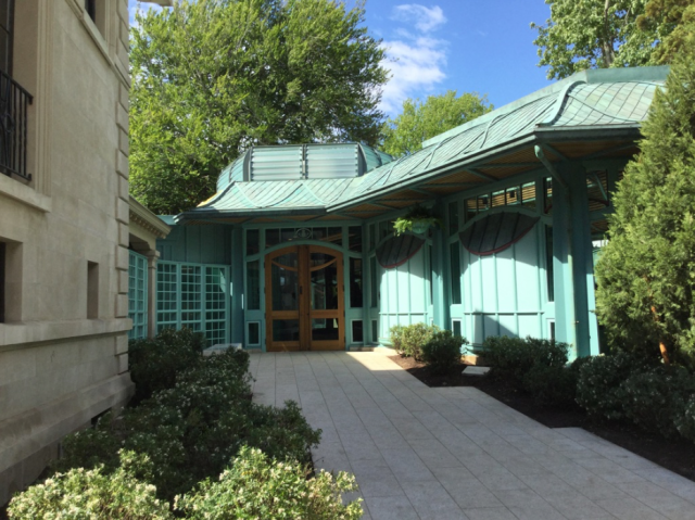
The new Welcome Center at The Breakers, in Newport. (NewportRI.com)
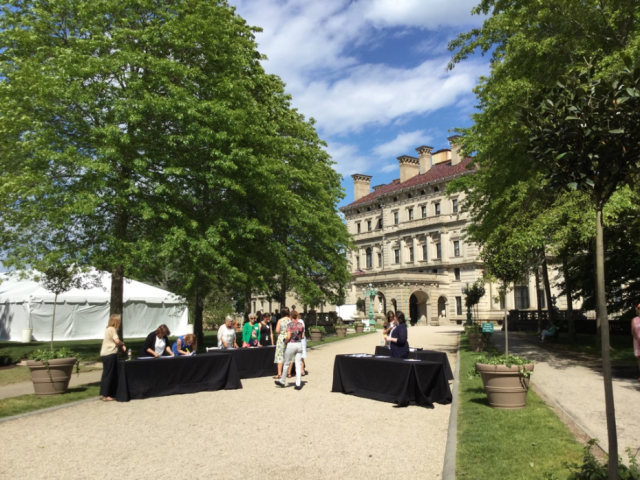
Yesterday’s ribbon-cutting for the Welcome Center at The Breakers unveiled a tourist attraction in its own right. That’s saying a lot in Newport.
It is that beautiful.
In the weeks leading up to its completion, I kept trolling online for recent photographs to get a hint of its appearance. All I saw were the same pretty renderings – which meant nothing, as projects often slip between cup and lip. The Preservation Society of Newport County kept such a tight lid on that I felt some concern the building might not look as lovely as promised by its renderings. But when I stepped through the gate on Ochre Point Avenue and glanced left, my sense of relief was almost punishing – O ye of little faith! My relief was as great as my joy at its loveliness.
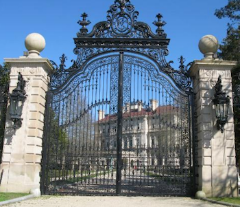
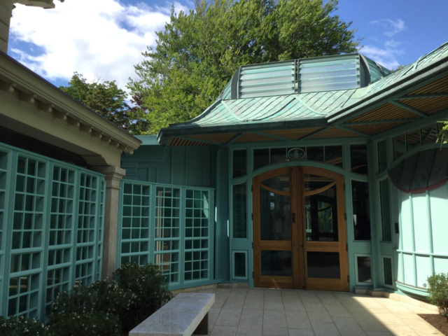
Gateway into the Breakers. (TripAdvisor)
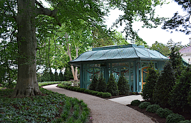
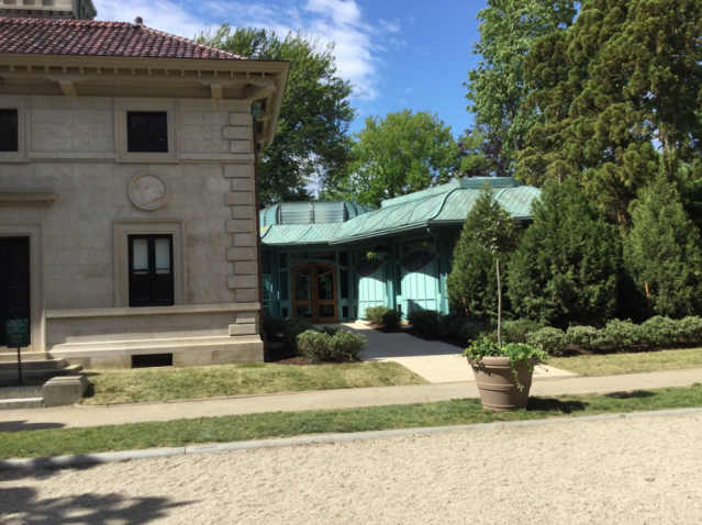
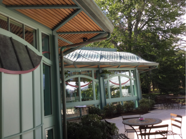
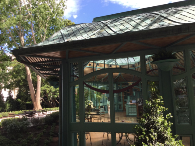
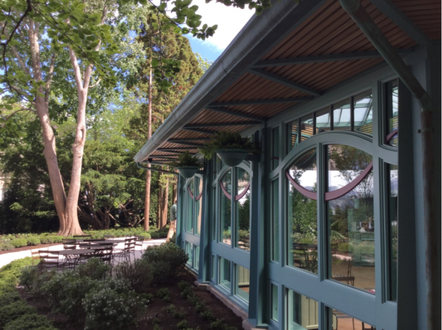
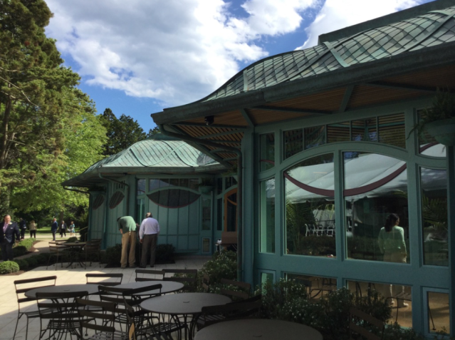
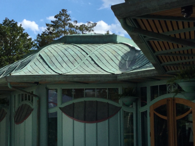
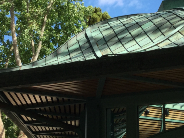
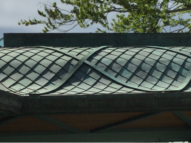
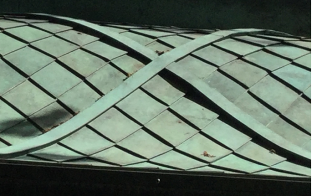
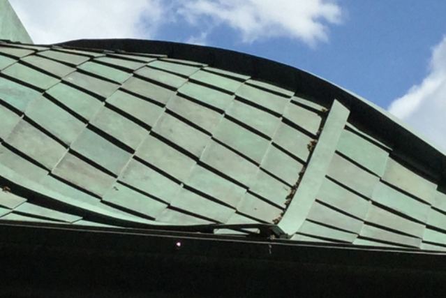
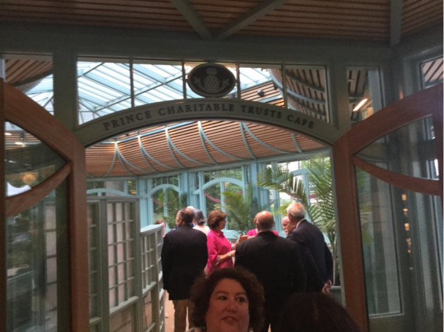
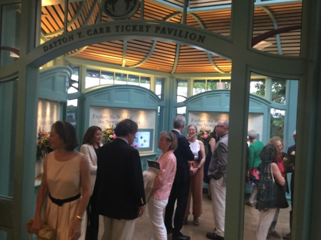
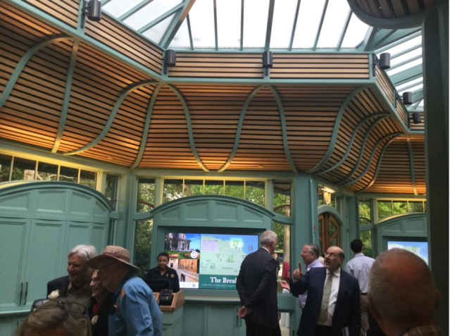
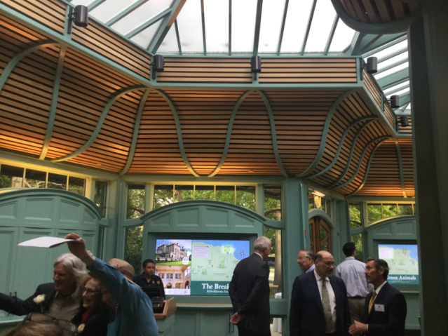
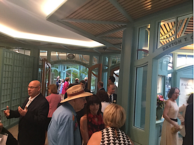
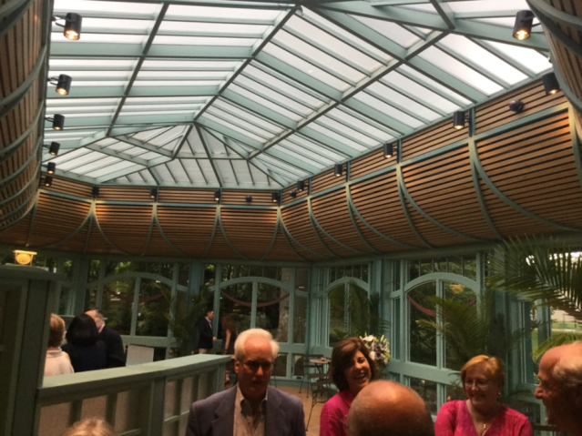
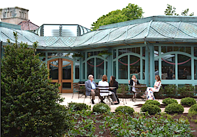
Just beyond the caretaker’s cottage, the Welcome Center sat beneath an undulating roofscape of hand-shaped copper tiles held down by crossed copper ribbons. It was the first hint that this was no ordinary tourist services facility. It was a work of art whose virtuosity grew the closer I approached. Each delicately mullioned window featured a surrounding structure of multiple levels of molding, attesting to the designers’ recognition that this was “false history” at its finest. When is the last time you enjoyed a new building that wallowed in a profusion of its own detail? The Welcome Center does exactly that.
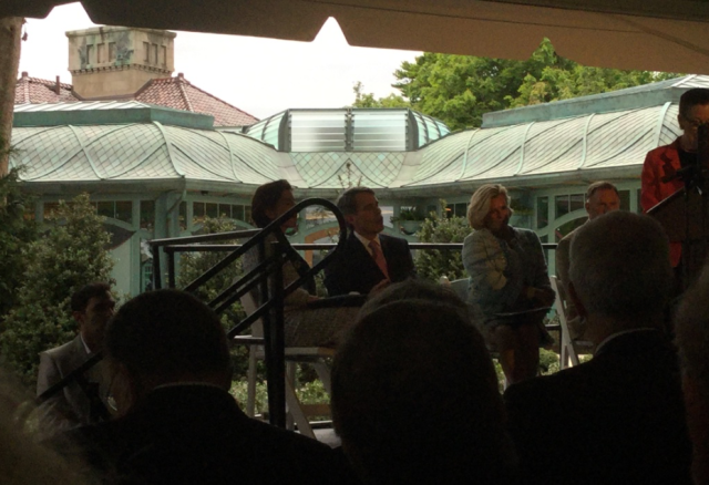
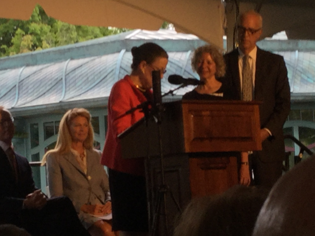
“False history” is a concept that modernists use to demonize new buildings inspired by the best techniques of architecture’s past. Modernism prides itself on its refusal to learn the lessons of history. The lessons of history are exactly what new traditional buildings embrace. They try to strengthen rather than to weaken a city’s brand, and that’s what the Welcome Center does. Among remarks by society grandees under a nearby tent, PSNC chairwoman Monty Burnham noted its “complete harmony with The Breakers.” Precisely.
The Welcome Center and The Breakers, designed by Richard Morris Hunt in the 1890s, are very different in style, but their styles are an outgrowth of centuries of tradition, which is why they harmonize naturally. Part of this is aggressive attention to detail. That’s why the builders at Behan Bros., the architects Alan Joslin and Deborah Epstein, the landscape designers of Reed Hilderbrand, and a large host of subcontractors – all of whom brought the project in on time and on budget – got such spirited applause when they were recognized under the tent for their work. Their work proved, said society director Trudy Coxe, that “you can put a beautiful building on a historical property without ruining it.” They sure did.
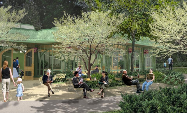
Posted below are photographs I took yesterday, except for one. The shot atop this post, which captures a telling angle I missed, is from NewportRI.com. Ditto the wide shot, from Newport Buzz, just before the last. At the end is a rendering by Epstein Joslin from 2013, after a design was chosen and before groundbreaking, delayed by opposition, led to completion in barely a year.


Let’s hope it stays as innocuous as it is now. Somehow it does remind me – dare I say it – of the thing that sits in the middle of Kennedy Plaza – but let’s hope the original intent stays just as it is…
LikeLiked by 1 person
Nancy, the intermodel center at Kennedy Plaza is not as ambitious in its elegance as the welcome center, but in an era when far worse is par for the course, its relatively subdued charm is far, far better than we have reason to expect. We were lucky to get that rather than an intermodal center that tries to do somersaults in the name of false creativity.
LikeLiked by 1 person
“False history”? Not here, I think. As far as I can tell from the photos, it apes no particular era, while creatively using traditional forms and materials. As I haven’t been in a McD’s in 30+ yrs., can’t judge that. And what does the result have to do with the opposition, which I understood to be purely based on its location, which was understandable to a point. NIMACBY (not in my ancestor’s caretaker’s backyard). And thanks, David, for the images of the original “Edge” designs-I somehow missed them. Even uglier than what we’re going to get.
LikeLiked by 1 person
A hint of this and a hint of that, stylistically, is in the longstanding tradition of architecture before it was transformed by idiots who do not know the meaning of artistic creativity. The real meaning of “false history” is “architecture we love because we haven’t had enough bad education to eradicate our respect for beauty.” That the opposition would stoop to that argument was pathetic – equally pathetic was that proponents of the project bought into that silly tactic as well, denying that they were engaging in “false history” but treating it nevertheless as a valid critique. Fortunately, the architects did not listen.
LikeLiked by 1 person
I’ll concur, there’s a tad of Mickey D’s rest-stop vernacular in those wood slat soffits, but by and large its lovely. Oh, and the sky didn’t fall!… Congratulations PSNC!…
LikeLiked by 1 person
No, Michael. The wooden slats are among the best parts of the design. If they were plastic I might agree with you, and if they were not so finely wrought. But you are right, the sky did not fall – actually, the sky did fall (on the opposition) when it turned out to be such a lovely building. I am sure they are disappointed that I’m not wringing my hands! But they were mostly worried about parking, not design – that’s my guess
LikeLiked by 1 person
Fair enough, David. I pre-judge.
I look forward to seeing it in the round. Stay tuned!.. : )
LikeLiked by 1 person
From your photos I would say it is an adequate design with a rather good roof design.
The curves at the top of the doors and some windows are certainly less than good and those shapes protruding to the right of the entrance door are horrendous – more McDonald’s than Breakers.
It is best to revisit the early meetings in which the opposition, mostly full-time residents of Newport, questioned the need for such a structure. This opposition was right based on the results.
Wait for the day – coming up soon – when this structure has to be ‘repaired’ and while they’re at it expanded to include a gift shop and a restaurant. These ‘repairs’ will drain the funds meant for the Breakers.
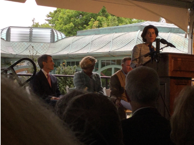
What does it look like from the Breaker’s interiors?
LikeLiked by 1 person
Beg to disagree! There is not a jot of McDonalds in this design. In the quality of the detailing it is far closer to The Breakers than to McD’s. The curves you dislike give it an Art Nouveau flavor that links it to the Gilded Age. They are among my favorite elements. There is a gift shop in The Breakers so there need not be one in the welcome center. From the Breaker’s interiors it probably does not look very different from the greenhouses that once were there.
LikeLiked by 1 person