
 Jože Plečnik may perhaps be deemed the Antoni Gaudi of Ljubljana, the capital of Slovenia. Or vice versa. Both shifted the character of their principal cities (Barcelona in Gaudi’s case) toward a more animated, innovative and yet entirely classical character. Both architects proved that classicism can be as creative as modernism – far more so, since modernist creativity is mostly of the ridiculous “Look at me!” type. “Plecnik capitals you can see” originally ran March 25, 2015, and “Recapture Joze Plecnik!” the week before:
***


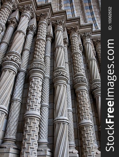
Here is that page of column capitals by Slovenian architect Jože Plečnik, disambiguated from the shot of many capitals on two pages taken and sent to TradArch by Angelo Gueli yesterday and posted in a cropped and undisambiguated (I think that’s a word) by me. The photos were too small for readers to examine very helpfully with the naked eye. Angelo saw my post and shot each capital on those pages separately and sent them to me. Here they are.
But I cannot let the opportunity created by Angelo’s compassion pass without comment. Now that you can closely peruse each capital, you can see that all of them possess a uniquely expressive character that arises from features that would be purged by modernists, just as Harvard Graduate School of Design dean Joseph Hudnut literally threw out Harvard’s famous collection of classical plasters, causing dumbkopf architecture-school deans around the nation and the world to do likewise, as if they were an unusually idiotic species of sheep.
Let’s shove the nasty modernists aside and focus our attention on enjoying the beauty of the Plečnik capitals. I tried to figure out which of them comes closest to the canonical. It’s a tough quiz, but I suppose the closest must be the sixth, which seems to be a regular column of the Tuscan order but with a large fasces, as I think that scroll-like tubular feature is called, intervening between the Tuscan capital what would otherwise be the entablature above were it not that a coffered ceiling rests upon the fasces, an ornament that derives from the symbol for Roman authority.
Which is my favorite? That’s just as tough a nut to crack. Perhaps it is the second capital with the melancholy face between the two Ionic scrolls. Since, according to Cognitive Architecture, by Ann Sussman and Justin Hollander, our brains read faces as their number one job, maybe that explains my preference here. But I also like the capital forged from four columns arising to their own capitals at the top of a post.
It is almost impossible not to feel outrage at the meatheadedness that has robbed the world of the joy of classicism.
Here I leave readers to luxuriate alone in this heterodoxual display.
[The original post, from 2015, erroneously attributed to Bauhaus founder and GSD faculty member Walter Gropius the destruction of Harvard’s classical cast collection, rather than dean Joseph Hudnut, who actually perpetrated the atrocity. Not that Gropius hadn’t already done quite enough to eradicate beauty in the world.]


Hi David. Thanks for turning me on to Plecnik. I hadn’t really heard of him though I likely came across him at some point. Actually, I came across his remarkable Church of the Sacred Heart in Prague a few years ago. It was in a park just outside of our hotel and I wandered in wondering what this remarkable building was. It is gratifying to discover another truly original and eccentric architect, somewhat in the vein of Gaudi, Sullivan, and Furness. But he is clearly no Gaudi. Who is? Gaudi’s work is far richer and more original and more engaging. Plecnik seems quite eclectic in his style which is a mixed bag. He might actually be the first postmodernist! What do you think of that idea? Most of his work is lacking in detailing and texture and richness though it is unusual. His earlier stuff is more art nouveau and perhaps the most beautiful. Anyway, now a trip to Ljubljana will be in order some time years from now. Something great coming out of Slovenia in contrast to the disgusting phony (who lied about finishing architecture school!) married to the piece of dreck president. But enough on that depressing topic!
LikeLike
David,
I heard a similar but distinct story. I’m sure someone can correct us on this. The bus drove by in front of the MOMA, and the architectural ornamenters waived their fists and cursed at the Museum building, saying that it had driven them out of business. This was some time after Philip Johnson’s 1932 exhibit that established Minimalist Modernism as the universal standard.
Best wishes,
Nikos
LikeLiked by 1 person
Thanks, Nikos. Yes, the MoMA, not their factory. Sad story. Drives me nuts.
LikeLiked by 1 person
If you’re into changing up the status quo, classicism could attract more likers with new designs.
THE critique of the modernists is defiance of conventional norms. In the US we modified the “Classical order” with different plants, like tobacco, corn, magnolia.
Art Deco is classical now, but a century ago, was the New modern at the time, more outlandish than the classical. Took design cues from China, Japan, Persia, Wright, etc.
And made use of materials that did not exist just a few years prior..
– Stainless steel
– Nickel/chrome
– Shagreen
– Plastics
– Aluminum
Begs the question “What could classical architects today do with contemporary materials”
Titanium, composites, carbon fiber.
Classical or not there’s an entire Host of new building materials out there.
Or how it should be designed. Classicism remains but Ideological “orders” are straightjackets to design freedom.
Cast iron architecture was the first look how mass production met with classical motif, but not it’s order. The geometric capacity was abandoned for more floor space or narrower streets.
Don’t mistake affinity for conformity.
LikeLiked by 1 person
What a joy life should be for construction workers if they were allowed to make something such beautiful:-)
LikeLike
Yes. I always think back on the story of Henry Hope Reed driving with workers from a stone fabricating plant (I think it was) in New York City. He tells of the workers raising their fists in anger and shouting imprecations at the plant, which had newly abandoned ornamental workmanship and, I guess, thrown them out of their jobs. I hope a commenter will provide a more factual account of this incident than I can recall.
LikeLiked by 1 person