
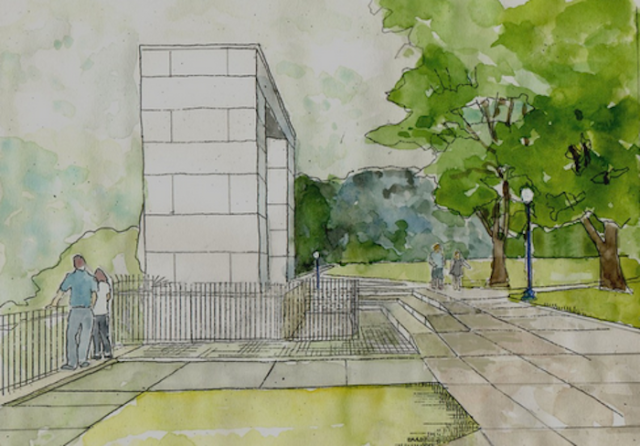
Rendering of Prospect Terrace restoration project. (Bradford Associates)
Landscape architect Sara Bradford led the recent restoration of Providence’s Prospect Terrace, in its College Hill neighborhood near Brown University. Her late husband, RISD professor of architecture and modernist Derek Bradford, was my nemesis as I covered the city’s Capital Center Commission design review panel for the Providence Journal. For years, as a member of the panel, Bradford did his best to keep the sort of traditional buildings I favored out of Capital Center – a new district on acres of parking between downtown and the State House. More often than not, he succeeded.
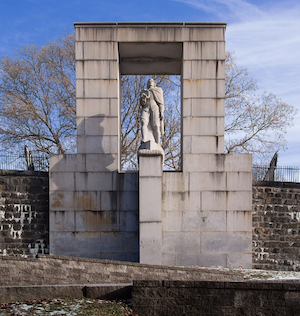
Roger Williams memorial. (Wikipedia)
Bradford died in 2017. I was concerned when his widow, who had designed a modernist plaza between Waterplace Park and downtown’s old Union Station, was tapped to design the restoration of Prospect Terrace. I imagined the worst. Kooky, newfangled benches, sleek lampposts that cried “Of Our Time!” God knows what else. Roger Williams would weep.
Sara’s design was carried out and the park reopened on a rainy day last summer. Not long after, I visited, expecting the worst. I found instead that the new benches looked like the old benches, ditto the lampposts and wrought-iron fences. New concrete paths were speckled gently with pebbles, and the area around founder Roger Williams’s memorial was resurfaced with granite pavers. The curbing and gutters along the Congdon Street edge of the park, so hazardous for so many years, were also done up elegantly with granite pavers. Several signs describe the history of the park, one even identifying the array of buildings on view from the terrace.
It was beautiful! Pleasure and relief suffused my entire being!
How easy it is to imagine the pressure Sara Bradford must have been under to introduce some sort of twist designed to assert the park’s independence from the shibboleths of the past. The College Hill community would press for a timeless restoration rather than a timely renovation of the park. After all, the College Hill Neighborhood Association was the project’s leading sponsor. Still, the shadow cast by the design apparatchiks of Brown, RISD, the city’s planning office and the state’s I-195 commission is long and deep. I figured that Sara Bradford would know which side her bread was buttered on.
Thankfully, my anxiety was overblown.
Perhaps Sara Bradford was influenced by another long shadow, that of Roger Williams, who, cast out of the colony of Massachusetts, created Providence and Rhode Island in the spirit of the Independent Man, who can be seen from Prospect Terrace standing tall atop the State House.
In our modern era, tradition is the transgressive principle that fights for independence of mind against a hidebound design establishment. Today, Howard Roark, the renegade hero of Ayn Rand’s The Fountainhead and long the model for modernist architects, would be a classicist. I don’t know if Sara Bradford would agree, but I like to think her Prospect Terrace reflects the better angels of Rhode Island and its capital, Providence.
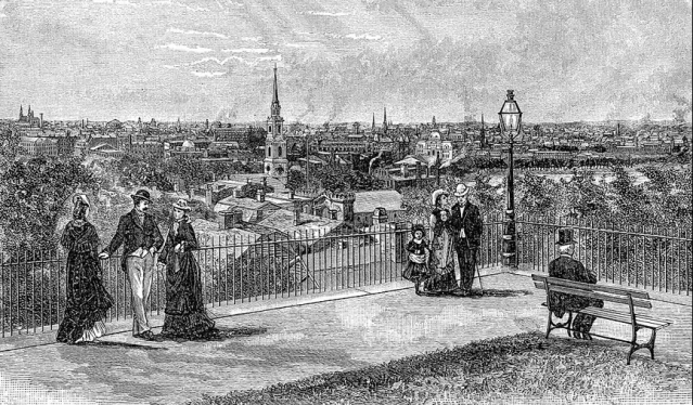
Historical view of Prospect Terrace, looking southwest to downtown Providence. (Wikipedia)


HI David, Nice to see that the good guys win sometimes. I like your comment about Roark! Michael Behrendt
LikeLike
Thank you, Michael. I think I first used that reversal (that today Roark would have been a classicist) in a column about the fiftieth anniversary of the book back in the 1990s. I have been continually amazed since then at the degree to which that book influenced modernist architects. Of course, it was written just as modernists were beginning to realize that traditional architects had pretty much abandoned the field without a fight. It is also amazing how the movie itself, with Gary Cooper as Roark, did not boomerang, given how absurd Roark’s work was made to look compared to the traditional work that was under attack in the movie and book. That should have been a dead giveaway, undermining the book’s role as modernist iconography, but its influence was not diminished one iota, not at all.
LikeLike
On a side note. After reading this article through the mail, I suddenly realized why reading on this site is always so tedious, and that it is tedious. It is the black fat and (therefore) cluttered font, which compared to the mail version looks even brutal and appeared to be shouting from the screen. Then perhaps in combination with the small horizontal size of the reading pane, it makes the reading too vertical due to small sentences fitting on a line.
LikeLike
Interesting comment, John. I don’t see that at my end. What do you mean by reading it “through the mail”? As for thick fonts, etc., my understanding is that the appearance of text in posts is different for different people depending on what type of computer or what type of screen they have. Possibly the problem is at your end. The font I use is Times-New Roman, which is one of the most popular, possibly the most widely used. If reading these posts is so tedious, maybe you should read something else!
LikeLike
Read something else, well, no need to be offended here, publishing on the internet is difficult in terms of controlling the style in which it is finally rendered yes, but not to the extent that the difference is very big. I realize though that blog systems can get overcomplex.
The font size of the web version being 18.9 pixels is already considerably large (12 to 16 pixels is more common).
The font is actually a ‘”lemonde-journal-1″,”lemonde-journal-2″‘ which has this tendency of being large and prone to become fat and cluttering.
Two examples on a windows system using Firefox, the browsers Opera and Chromium browsers render it slightly less fat bold and cluttered, but still too ‘stressed’:
LikeLike
John, please rest easy, I am not offended. I have been writing this blog for over a decade using the same font and design, and yours is the first complaint I’ve received about readability. I would hate to think of all that writing wasted! I hope if others agree that my text is difficult to read, they will kindly let me know. If I am convinced it is so, I will try to change to a different font.
LikeLike
At some point in historical time one or two individuals, due to a developmental process of acquisition of taste thought cannibalism (eating those who had died because of other reasons than being consumed) to be unfit, of which then in time the rest of society followed, by now all would complain when confronted with it.
So far the validity of the general popular appeal to ‘others’, the collective, in relation to the first, the individual.
I am sure then that the content is consumed, regardless of the style and its form, and thus not wasted at all 🙂
LikeLike
Nothing a steam clean cant fix.
LikeLike
David, my friend,
Derek was one of the most important people in the trajectory of my career… allowing me to discover the importance of traditional and classical architecture,
https://www.traditionalbuilding.com/features/paths-to-traditional-architecturehttps://www.traditionalbuilding.com/features/paths-to-traditional-architecture
He was my professor at RISD (you know, that renowned traditional architecture school :^) where I took two life changing courses from Derek in the 80s; one on Beaux Arts watercolor rendering and another on vernacular architecture. Always a gentleman.
Architecturally we didn’t see a lot in common as we got older, but I will always owe him a deep debt of gratitude for the way he helped guide me to a life committed to traditional and classical design.
Fondly,
David
LikeLike
Very good, Dave. I agree that Derek was a gentleman. His back and forth with me was always contentious but not rude – I refer to discussions at the CCC design panel meetings, which were relatively frequent. My columns in the Journal must have been irksome to him, since we disagreed so diametrically. Once we debated before elderly residents of Buff Chace’s Laurelmead. Derek, deploying his English accent, wiped up the floor with me, but the audience was heavily on my side nonetheless. You should read his long interview with John Castellucci in the Journal years ago. But he was a good man and I regret his passing in 2017. I can easily imagine his influence on you. No doubt he taught his hated classicism straightforwardly to his students. A true professional, something so much rarer in academia today.
LikeLike
A small corrective: the benches are the same as before. The Parks Department takes the old benches into the shop, repaints the cast iron, and installs new wood slats.
LikeLike
I would say they qualify as new benches, Peter, but I take your point. They were recreated rather than replaced with ugly versions of the same thing. However, for the sake of art I will sacrifice the literal truth on the alter of prose parallelism. Is it possible that other features, such as the lampposts, were likewise refurbished?
LikeLike
While that may be true of some restoration project, the benches are all new and not refurbished old benches. As part of the project team, we worked closely with the city to insure the new benches reflected the period of the park and surroundings.
The old benches will be used as replacement parts by the parks department to help extend the life of broken benches in the city.
LikeLike
Rick, my error. The Parks Department rebuilt some benches in Waterplace, so i assumed they did the same here.
LikeLike
A very reasonable assumption, Peter. You hear “Never assume” in j-school, but it is impossible not to rely on assumptions. So far I’ve been pretty lucky. Either I’ve always been correct in my assumptions or nobody’s called me out on them. My guess: more the latter! … And I am thankful to Rick for chiming in.
LikeLike