

Eddie Warburg’s Manhattan apartment designed by Philip Johnson. (USModern)
Philip Johnson, the modernist architect who tricked America into embracing modern architecture, was a nasty piece of work according to Mark Lamster’s book, The Man in the Glass House. But there are some humorous passages whose inclusion reflects Lamster’s ability to use modernist silliness to tickle the funny bone of his readers. Johnson’s first real commission as an architect, in 1933, was to design a Manhattan apartment for his wealthy friend, fellow libertine and son of a Jewish banker, Eddie Warburg. Of Johnson’s design for the small fourth-floor walkup on Beekman Place, Lamster writes:
Risky desk chair at Warburg flat.
When he was done, the apartment was transformed into a statement of nearly clinical modern gravity, with whitewashed walls and an exposed radiator. The floor was linoleum, shiny and efficient, but the whole was not without luxury. A dividing wall of macassar ebony and space-defining floor-to-ceiling silk curtains brought a sense of material richness, borrowed directly from [Ludwig] Mies [van der Rohe]. Johnson designed much of the furniture, which was decidedly foursquare, as was his thinking. In the living room, two squared-off club chairs faced a squared-off sofa over a rectangular coffee table in black lacquer.
“The discipline was so violent,” Warburg recalled. “If you moved an object an inch it threw everything off kilter.” There was so little sound baffling that a dropped spoon sounded like a gunshot. Another problem surfaced when a dubious Felix Warburg climbed the four stories to inspect his son’s new digs. He sat himself at his son’s desk to make a phone call, and when he leaned forward his tubular chair clipped out from under him, slamming his chin into the desk. Eddie was mortified, but his father had a sense of humor. “That’s what I like about modern art,” he said. “It’s so functional.”

Speaking of functionality, Johnson had recently curated the famous exhibit on the so-called International Style at the Museum of Modern Art, and followed it up in 1934 with an exhibit at the MoMA on “Machine Art.” In its catalog, Johnson tried to persuade visitors to the exhibition that functional machinery shorn of decoration was inherently beautiful. Perhaps some of it is, but it must actually be, unlike the chair above, functional.
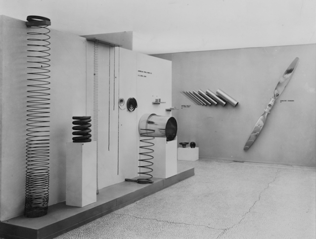
“Machine Art” exhibition curated by Philip Johnson in 1934 at MoMA. (moma.org)


Due to a bad internet connection, the background pattern of this site did not load, so I was looking at these photos with a sort of the interior befitting dark grey site background color surrounding the whole thing, and I felt a sense of great unpleasantness, and very pleasantly relieved when after reload the site’s background pattern appeared.
Makes you wonder what kind of people flourish in such environments..
LikeLike
I knew a Johnson Intern whose job was first to fully document all furniture locations in Johnson’s Glass House, and then, after floor and wall refinishing, supervise the precise “reinstallation” of said furniture. It took many, many hours.
LikeLike