

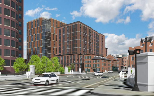
Rendering of Edge College Hill 2, as revised, looking up North Main St. (Greater City Providence)
Some people might think the “cover up” in the headline refers to the legally dubious swap of air rights for extra height that would have enabled 15 stories for Phase 2 of the proposed Edge College Hill apartments on Canal Street.
No, I refer to another cover up.
The most important function of Phase 2 is to cover up Phase 1.
Edge College Hill 1 is a plug-ugly 15-story tower with ridiculously stacked windows that’s already under construction. How did it manage to swing 15 stories? Did it do a swap? And why didn’t opposition to it materialize, since its aesthetic flaws were no secret? Good questions! Anyone?
Opposition to Phase 2 has thankfully led its developer to shrink the tower from 15 to 11 stories. Good! But don’t go too far. Eleven stories is tall enough to block views of Phase 1 from along important street-level view corridors. At the Downtown Providence Design Committee meeting on Monday, revisions were announced that will lop two stories off the seven originally sought for the North Main Street wing of the tower, and two stories off the five-story Steeple Street wing, so that they’d fit in better with the historic buildings nearby. Good!
Since it makes no sense to block an ugly building with another ugly building, it is equally important that revisions appear to be shifting the façade design of Phase 2 toward fitting into the historical setting. And the design of the tower itself has also improved, changing from a pair of grayish materials to something that looks like brick, and changing the original weird pattern of fenestration, akin to Phase 1, to something more regular.
Since Phase 1’s primary material will also be of brick (or a brick-lookalike substance), it seems as if the assemblage of new buildings will at least form a backdrop more congenial to the historical buildings than seemed likely at the outset of the process. Average the two designs together – their massing, their coloration and their detailing – and it may be that the two new buildings will be considerably less of an affront to the oldest neighborhood in the city – a district originally known as Cheapside, after the one in London.
And let’s not forget that each building fills a parking lot. They squash old buildings in spirit but not in fact. No old building needed to be razed. A parking lot represents hope that a lovely new building might be built in the future. We will not be so lucky this time, but it could have been worse.
It would be much better if both of the new buildings were unapologetically traditional instead of the el-cheapo split the difference between old and new style to which edgy-wannabe developers have become addicted. But trying to push developers to do the right thing is to engage in the art of the possible. Those who have opposed Phase 2 have done a very good job. They are to be congratulated. But they must keep up the pressure. That would have been easier if they had first taken aim at Phase 1.

Rendering of Edge College Hill 2, as revised, looking from Thomas down to Steeple. (GCP)

Earlier version of Edge College Hill 2 looking from Thomas down to Steeple. (DBVW)
View of Edge College Hill 1 (left) and 2 (right) after height reduction and other changes. (GCP)

View of Edge College Hill 1 and 2 before height reduction and other revisions. (DBVW)

Massing study of original 15-story Edge College Hill 2 program. (DBVW)


David, I’ll add that these blocks are too big to masquerade as “ancient brick fabric” such as what adjoins. This is why variegation of a different strategy is warranted. The incursion should be unabashed traditional, but give it a different shade of masonry -limestone veneer even- just don’t pretend (ECH/DBVW) that it’s an 18th Century fabric you’re re-introducing to North Main Street. Reflecting further, look at the 2nd image you posted and compare it to the first. The latter image blends better due to the variety at foreground (namely the Art Club). Whereas in the first image the whole vista is terminated by a giant and disproportional red brick blob. And of course DBVW knows better.
LikeLiked by 1 person
Good assessment, David. I will reserve comment on Phase 1 -not because I love it, but because it has a consistency that Phase 2 lacks. As you say, make it unapologetic (and less “remedial”!). The low corner block at Steeple and N. Main is awkward and should gesture spatially to its neighbor, the stacked, gable-profiled 7 Steeple Street (Where New River Café is located -talk about a cover up!).
Why not create a small plaza in the foreground to ensure a view corridor -and as importantly- relieve pedestrians crossing that crazy intersection from College Hill? Add two or three stories if you must, but suck that massing away and into the taller block. The effect is clunky otherwise, and a historic building is needlessly obscured.
Further, retain the masonry color change seen in the “modern” scheme. The A-B-A effect breaks up the massing of the overall block, appearing much less overwhelming to Steeple Street when viewed from the hill.
I’m glad Providence is having a boom, but some of these designs, including the new Marriot Residence Hotel on Fountain Street, are remarkably bland and timid in concept. A legacy goes wanting.
LikeLiked by 1 person
Agree with you on the plaza at North Main and Steeple, but disagree on your desire for an ABA effect vis a vis the color of Phase 2. Every other model in Providence, such as that same area and the area along South Main Street and the RISD watterfront, shows how much better a largely unified brick color scheme – with all its variations – is preferable to what you see in the “modern” scheme. Not sure which you mean by that, but the mixed color scheme of the early Phase 2 is abominable. Color variations between buildings, as among buildings on Westminster, are fine but broad color variations within a single building, usually not. Certainly not in this case!
LikeLiked by 1 person
Haha… we can agree to disagree on “coloration”, David, but if not A-B-A per se, in this instance these abutting blocks are just too big for a single color, imo. At minimum Phase 2 should not be a matching shade to phase 1. I see some variation in the facades, but it all looks way to monolithic. To your point, yes, Westminster’s variation leads the way. : )
LikeLiked by 1 person
David, I’ll add that these blocks are too big to masquerade as “ancient brick fabric” such as what adjoins. This is why variegation of a different strategy is warranted. The incursion should be unabashed traditional, but give it a different shade of masonry -limestone veneer even- just don’t pretend (ECH/DBVW) that it’s an 18th Century fabric you’re re-introducing to North Main Street. Reflecting further, look at the 2nd image you posted and compare it to the first. The latter image blends better due to the variety at foreground (namely the Art Club). The whole vista is terminated by a giant and disproportional red brick blob. And of course DBVW knows better.
LikeLiked by 1 person
Good analysis.
Sent from my iPhone
>
LikeLike
Thank you, Stan!
LikeLike
Moving in the right direction. Maybe my comment to one of DBVW that the first building is hideous helped….
LikeLike
It takes a village to make a city!
LikeLike
Sad
LikeLike