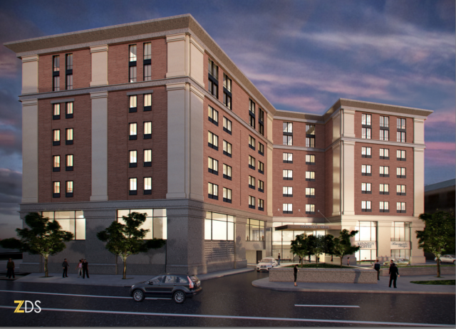
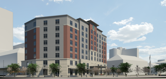
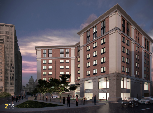
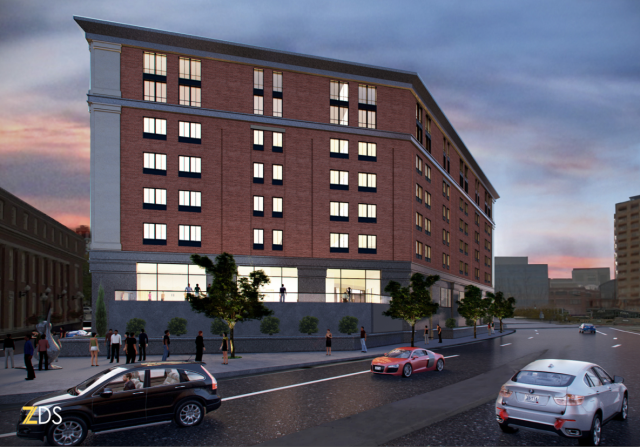
The Capital Center Commission’s design-review panel took a look Tuesday morning at a pleasant, forthrightly classical hotel design presented by architect Eric Zuena, of ZDS, in Providence. There’s a lot to like in the new design for an eight-story extended-stay hotel on the triangle-shaped Parcel 12 downtown. It is one of two being proposed for downtown. The design of the other one, on Fountain Street, seems hopeless. The one on Parcel 12 is being developed by James Karam of First Bristol. It appears to simply want to be an attractive traditional building like the best of its neighbors. Imagine that!
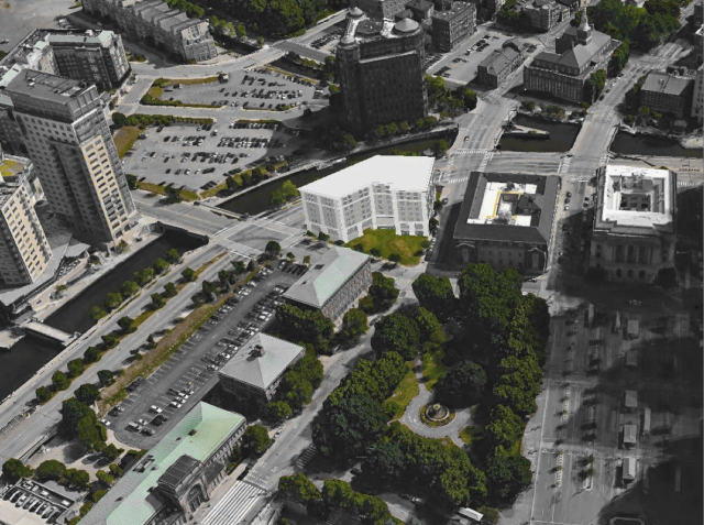
The design improves upon an earlier, more suburban-looking version that was rejected by the panel before it could reach a higher potential. Just putting a triangular building on that triangular land might be best, with a gentle curve along Memorial Boulevard and a courtyard in the middle. Still, the new design by Zuena, who grew up in Rhode Island but has practiced overseas, makes up for this missed opportunity with a building that, while oddly shaped, has a distinctly classical base/shaft/capital arrangement fortified by pilasters, stringcourses and a bold (although not quite yet an elegant) cornice on top.
Nice. That’s progress. I offer recommendations for further improvement:
- The moldings of the pilasters should feature curved lower lips rather than sharp edges. Maybe that is the intent, and it is merely the computer-aided design (CAD) program used by Zuena that suggests otherwise. Anyhow, since such elements are often fabricated on a machine these days rather than chiseled by stone carvers, it should cost little or no more to tweak the programmed settings and curve those moldings.
- Ditto the moldings of the stringcourses.
- The cornice wants more articulation, not necessarily dentils – squares lined up under the lower edge of a cornice that look like teeth – but at least more levels of molding. Importantly, the cornice should be extended entirely around the roof. Let’s not cheat Memorial Boulevard and, for that matter, the Woonasquatucket River.
- Some of the windows could use more verticality, either by extending each window downward a foot or so (there seems to be room), or by replacing the central steel mullion of each with a thicker mullion of brick – or a mixture of those strategies.
- The windows should also be set more deeply into the façades to increase the building’s sense of strength and authority.
- The stone of the pilasters bracing the base’s two stories shouldn’t be so much darker than the stone (or precast?) of the pilasters as they rise the rest of the building’s eight stories. Ditto the stringcourses and the cornice. The high quality of the stone used will create a more pleasingly subtle differentiation even if they are the same color. (That appears to have been accidentally accomplished in part of the rendering (see Kennedy Coffee) on top of this post, and it looks better.
If greater quality of detail is achieved, that absence of curvature along Memorial will be less of a lost opportunity. A building that merely uses traditional methods to aspire to the beauty of its neighbors is doing an awful lot these days. Union Station, the Post Office Annex and the Federal Building are probably feeling pretty optimistic about this design. It could set the bar much higher in the sweepstakes here in Providence for daring design – yes, a quest for plain old beauty is daring these days.
Here is a PDF of the development proposal presented on Tuesday morning.
Architect Zuena reports that the design panel of the often-clubfooted Capital Center Commission seemed to like it. Good. Let’s see what happens next.


Really wish I had the time to do a quick counter-proposal just to illustrate the basic ideas I’m trying to convey. . .
LikeLike
Hey, Soundslike: You’re spot on(!)… That said, I’ll maintain that there’s hope… and glad our Dr. Downtown is calling attention to the problems -and their potential solution.
LikeLike
True, David. Its not right to demonize. Your suggestions can help. As I suggest above, this project could well prove exceptional -however, its just not “there” yet. I say kudos to them for moving in a healthy direction (Classical inspiration), but lets bring discipline and rigor (however loudly expressed ; )… into the dialog. Otherwise, after we’re long gone, this building will continue to say “LaQuinta”, “Paramus”, and “Olive Garden” vs, say, “RISD”, “Aldrich”, & “Narragansett”, if you catch my drift. : ) Again, kudos. Its a slippery slope. We need to chime in.
LikeLike
Right on to all that, Michael, and I say it’s about time for a beer.
LikeLike
David, yes, a beer soon…! (And please pardon my passion -such an important parcel… I hope Zuena isn’t annoye. He needs to press his client). Cheers.
LikeLike
Nail on the head with “LaQuinta,” Mr. Tyrrell. This is essentially the traditionalique version to the Moderniste of the hotel Mr. Brussat wrote about a week or two ago meant to replace the Brutalist heap on Fountain: an indifferent suburban bit of flotsam that would instantly outlive its welcome in Providence’s should-be urban centerpiece, even if they only lasted the 30 years they’re designed to last.
LikeLike
Tradition – Expectation – Nothing offends about this building – as you would drive into the city – or around it, you would “expect” to see a building that looks pretty much like this one does. Like the suggestion, David, of curving edges…make it a tad more modern…recognizing, too, that there are about to be many more new buildings not very far from this one…
LikeLike
“Nothing offends” is a pretty low standard, Nancy, but it’s a lot higher than we’ve come to deem acceptable in our built environment. A curve in the Memorial Boulevard would be to die for – but I don’t get calling it “a tad more modern.” How is that so? Just curious.
LikeLike
This design is painfully weak, both in terms of the clunky and only very vaguely classical detailing, and (perhaps even worse) the very odd choices in terms of massing and form in relationship to the site and context. It doesn’t hold any of the sites street edges, presenting an especially indifferent and diffuse response to the corner presented to Burnside Park–the truly key corner to hold. Where it should present a strong entrance at that corner and hold the two adjacent street faces, or at least create a carefully shaped entry court, it instead presents an oddly shaped, car-oriented void lacking any spacial containment or any symmetries. It also fails to hold the Memorial Drive side in any significant way, presenting an indifferent facade and two random angles to the bend in the canal.
Essentially this building looks designed in a haphazard way from its interior program out, with only the most cursory response (a single “kink”) to the interesting and important shape of the site. The only thing it maybe gets right is its height, which is more or less contextual; but that’s probably the least important aspect of the building given its location–a tall building could probably be great here, tying into the heights of the Biltmore and the buildings on the south side of Kennedy Plaza, if its form and detailing weren’t so ham-fisted. This is the sort of milquetoast Classical-ique (TM) fakery that gives ammunition to Modernists when they want to dismiss tradition-based architecture as “pastiche”–and the sort of thing that’s almost always designed by Modernists who lack all sensitivity to the detailing, massing, and arrangement techniques of classicism and traditionalism.
LikeLike
An entirely convincing critique, I’d say. It is important, however, to avoid allowing the perfect to assassinate the possibility of the very good. This is far from very good, but it’s already far better than what we’ve come to expect in Providence.
LikeLike
I live by “don’t let the perfect be the enemy of the good,” both as a designer and as a person–so I’m 100% with you on that one. And to be honest, I think something pretty simple and not particularly ornate could do very well here, as shown by the adjacent stripped classicism and simple (but choice) detailing of the train station buildings–it’s possible something as intense-though-good as this (https://architecturehereandthere.com/2015/07/30/hotel-providence-spartanburg-sc/) would be too much. I just think the same amount of money and similar materials could be put to *much* better use in terms of the detailing, with a modicum of precedent study and understanding of proportions. And the opportunity to do a both very unique and very rational “French hotel” sort of plan is just so self-evident in the shape and context of the lot, that to see the essentially random approach used here–well, I’d almost rather see a steel and glass Modernist extrusion that at least held the corner and addressed the adjacent streets (something like the building at the fork in the canal) than this. This actually *is* the pastiche Modernists think we’re all doing–and like I said, probably because it was done *by* Modernists who don’t understand or believe in traditions as living languages capable of solving every possible architectural and urban problem.
LikeLike
David, the direction is traditional, and that’s good. But lets be frank: this design is very clunky. Again, this is not the “ring road” in Schenectady. Homewood ignores basic principles of urban form. The exterior detailing (and pilasters in particular -lol) are so ill-proportioned and under articulated as to cause alarm. Lets pause on the “polite button” -don’t settle for less. Homewood and Zuena can take it. They should sit down with an advisory team. Excellence is close/within reach, but they need to listen harder. Cheers.
LikeLike
I believe, Michael, that in an atmosphere where the local design apparat is likely to hate a proposal such as this for all the wrong reasons, and where TradArchers and ICAA’ers routinely condemn “bad trad” – often justly – that when it comes down to cases, designs that could be made acceptable with a reasonable effort should not be demonized but encouraged and provided with the advice their designers need. As a local in this case, that is my strategy here. You cannot say that I have not laid it on with an ax often enough around here!
LikeLike